
Design President
@Covey_desi... •2d
🚨FIRST DESIGN OF THE YEAR🚨
Most fintech apps treat failed transactions like a dead end. As a user, that moment is stressful-you don't know what happened, if your money is gone, or what to do next.
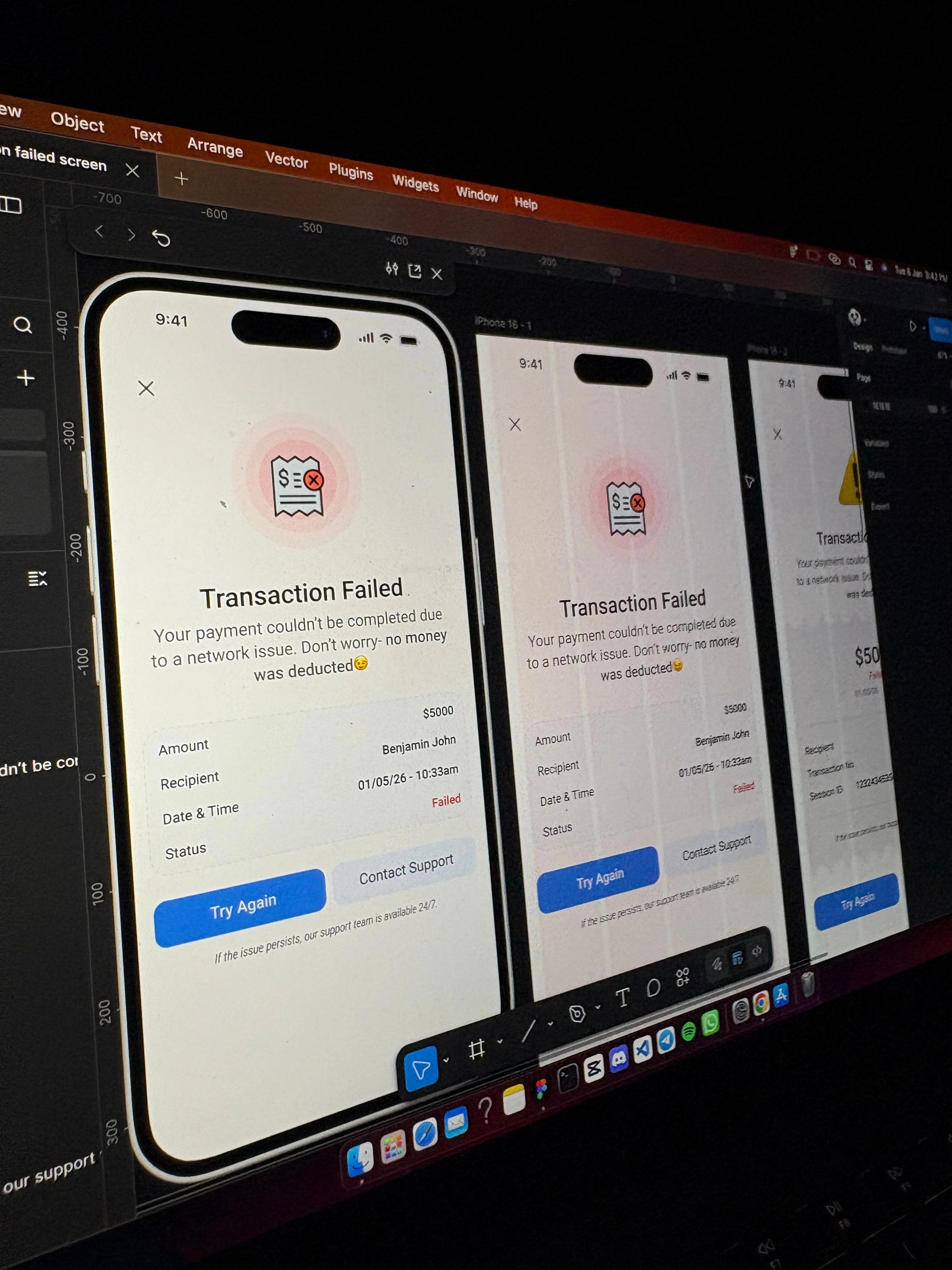
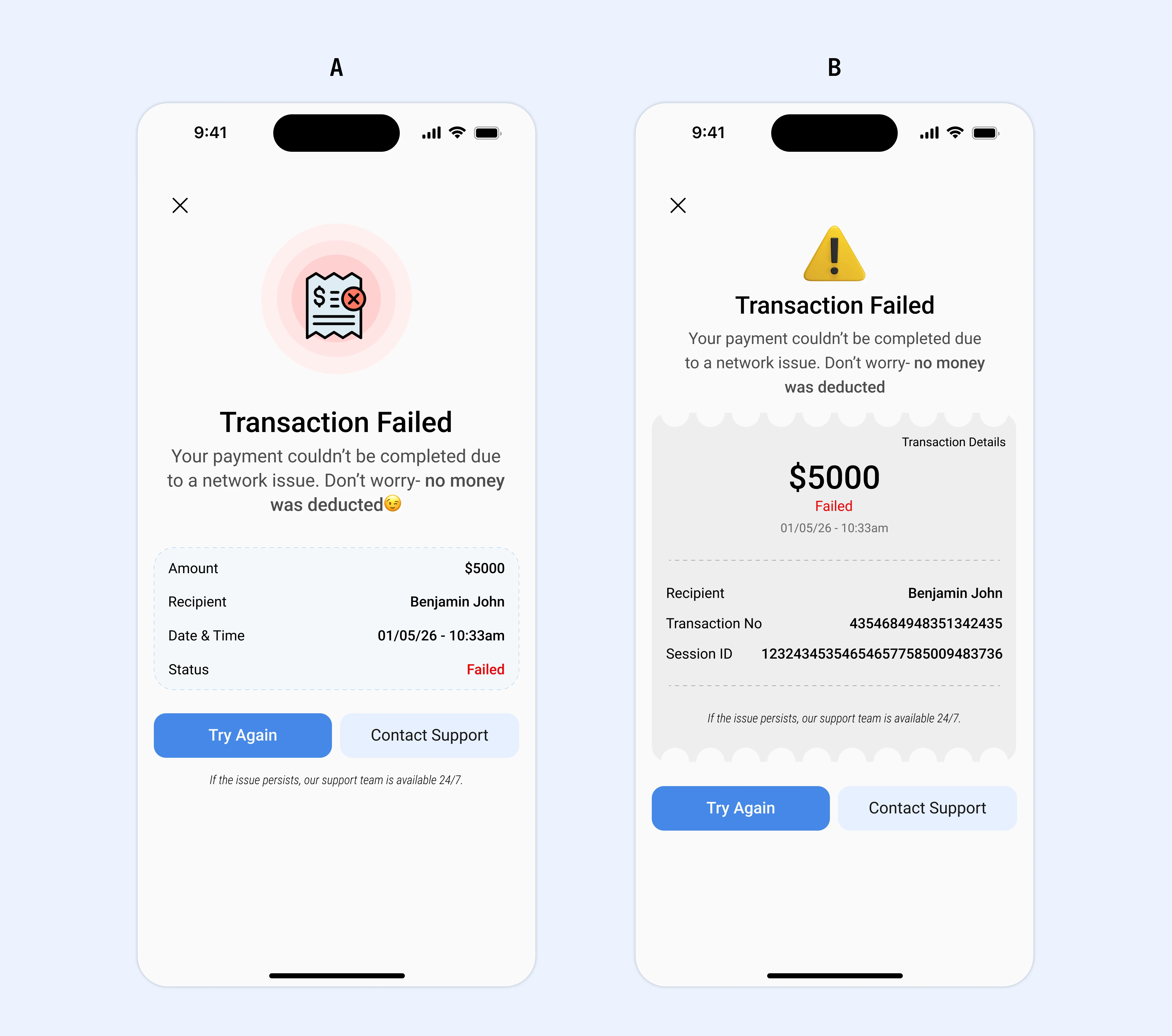
I designed 2 different 'transaction failed' screens for mobile view to focus on clarity, reassurance, and next steps.
- Good UX doesn't just celebrate success, it also supports users when things go wrong.
A or B, which do you prefer and why? Please let me know what you think.
0 likes · 0 views · Jan 9, 2026
Design President @Covey_desi... •2d 🚨FIRST DESIGN OF THE YEAR🚨 Most fintech apps treat failed transactions like a dead end. As a user, that moment is stres...
