Branding for a fertilizer firm
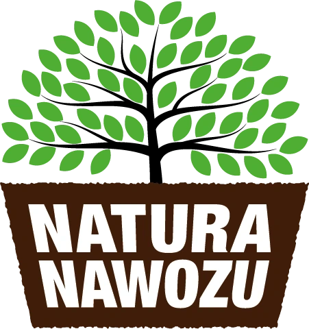
logo
Goals
My client needed sell fertilizer, but he had only "product", which was packed only in box.
We needed to create a brand which resonate with a nature
Then we needed labels for existing products
Branding
logo
For the firm called like Nature of Fertilizer we can't show product directly 💩
Instead of that we can show benefits of using product. What are the benefits of using this? Of course big and healthy plants, but we can't put only this one. So I putted a plant into a "pot". There is no pot, but only it's irregular shape to mimic a soil. To emphacize we sell something combined with a soil this "pot" takes almost a half of surface.
Additionally, I created a second version of the logo intended for smaller areas.
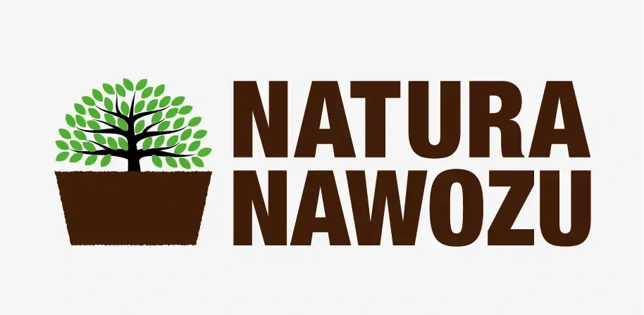
colors
To create association with the nature we used natural colors: dark brown for soil and green for leaves. Due to intend for printing we couldn't use to vivid green because it would change during printing and we used CMYK colorspace.

RGB to CMYK convertion
Labels
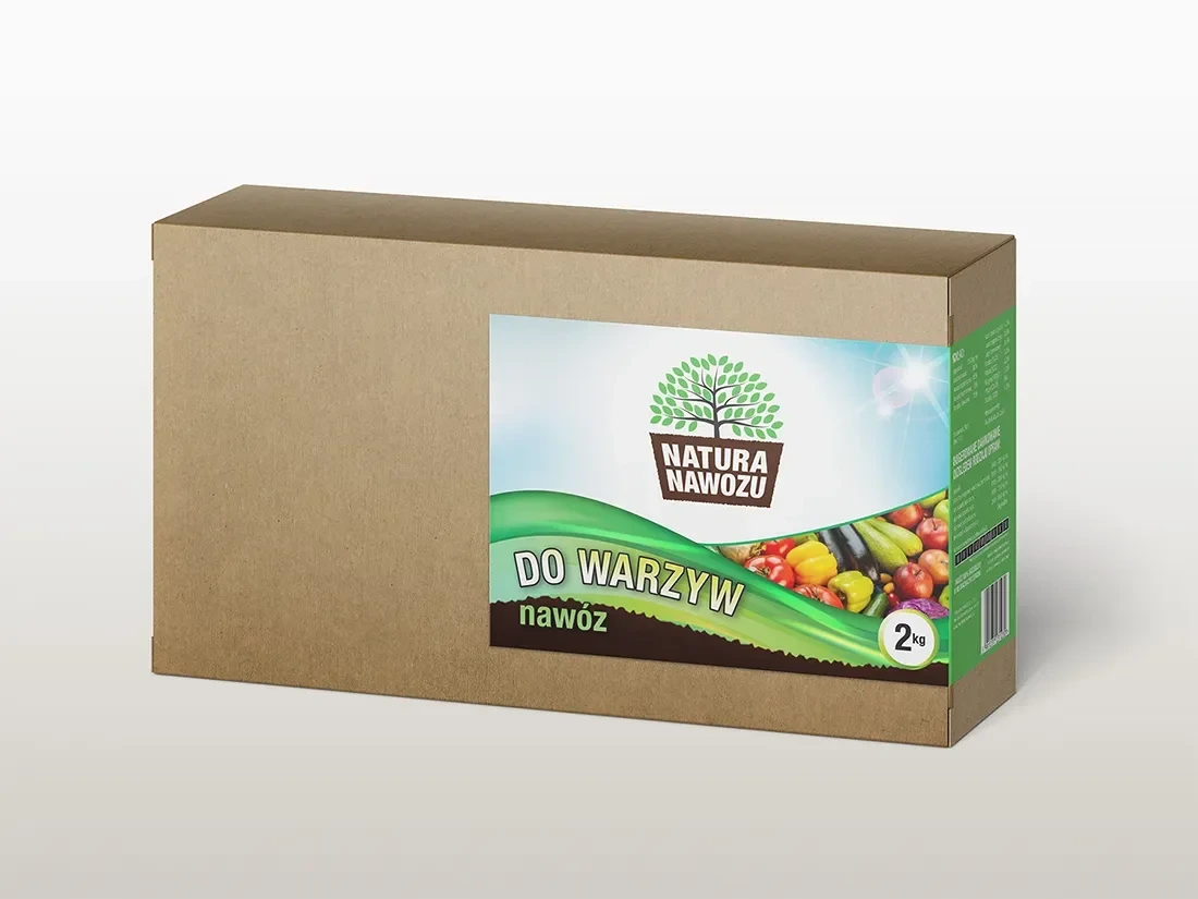
When we have branding set already, we can design visuals. Product represent natural mood with blue sky, green grass and dark soil.
Once we have the branding set, we can design the visuals. The product presents a natural mood with blue sky, green grass and dark soil. There is a visible photo of juicy vegetables to further suggest the purpose of the fertilizer and the final effect that can be achieved
Like this project
Posted Oct 15, 2024
The project assumed making labels for fertilizer packaging, not whole packaging due to costs. They also needed a logo.

