Frixion | Branding & Logo Design
Godwin Jimreevs
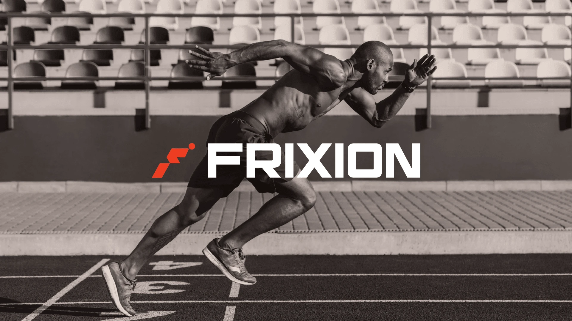
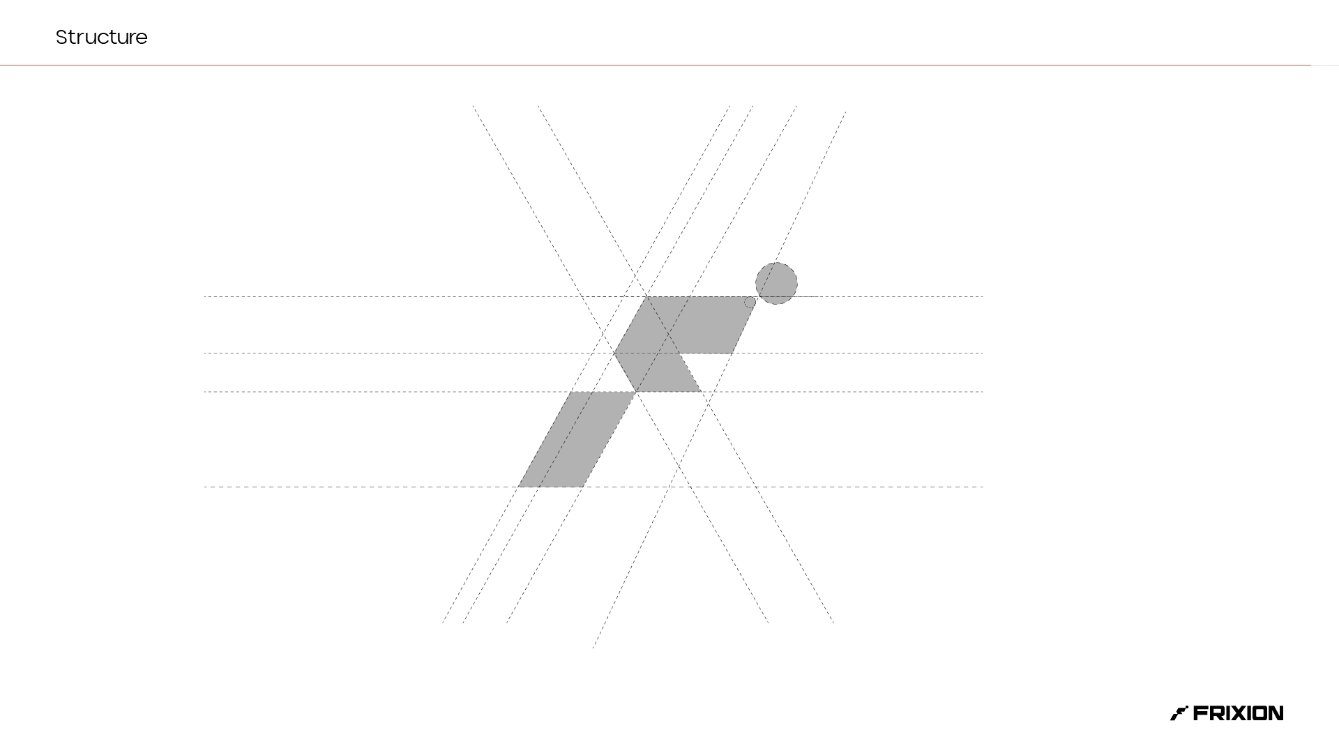
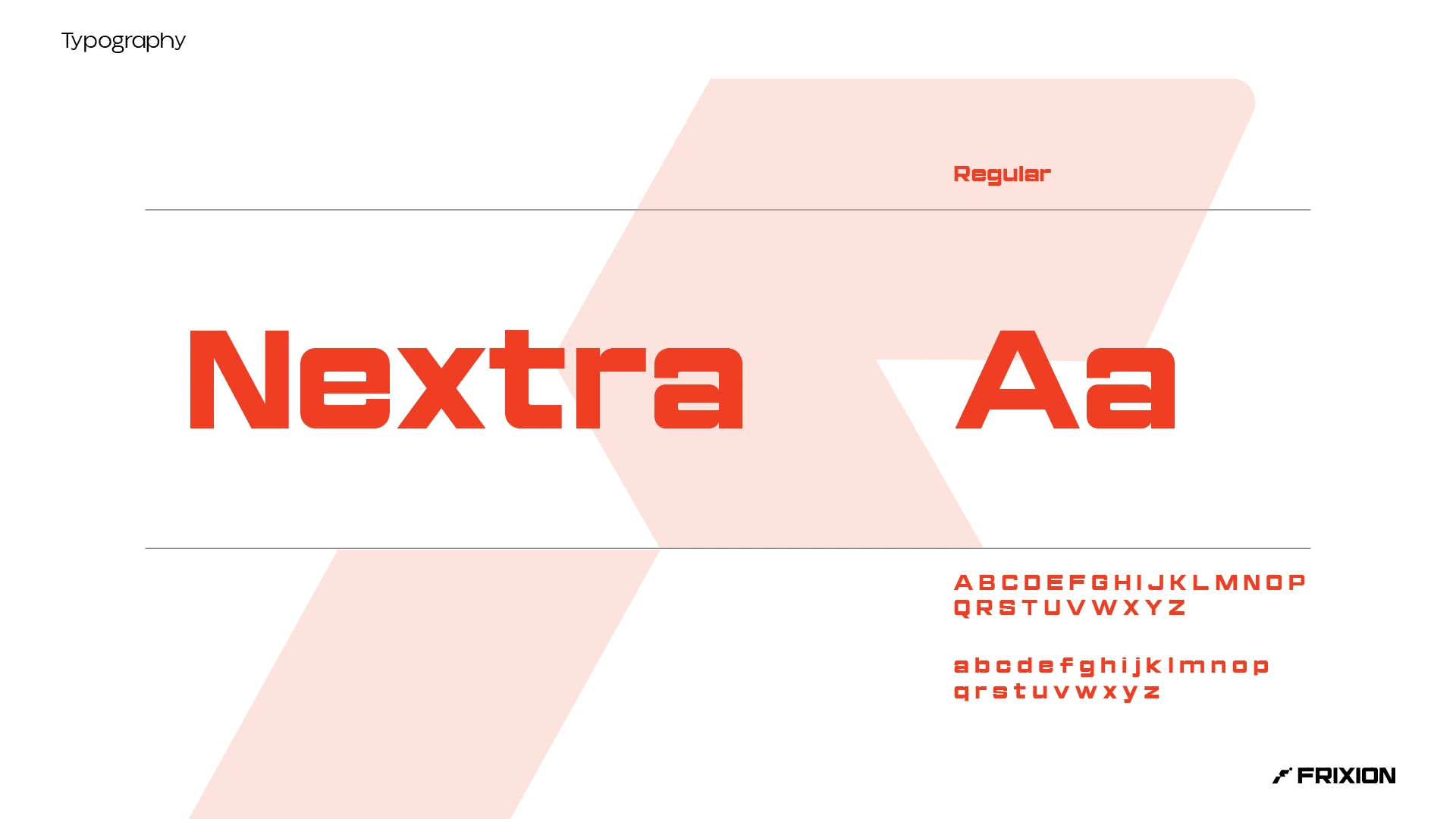
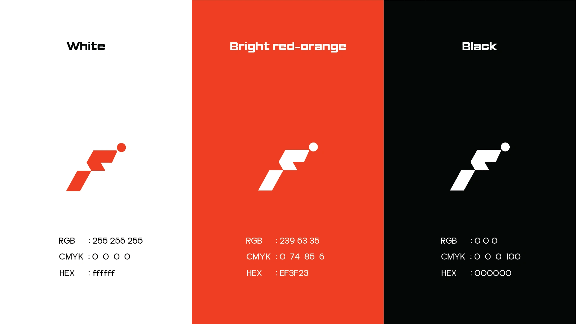
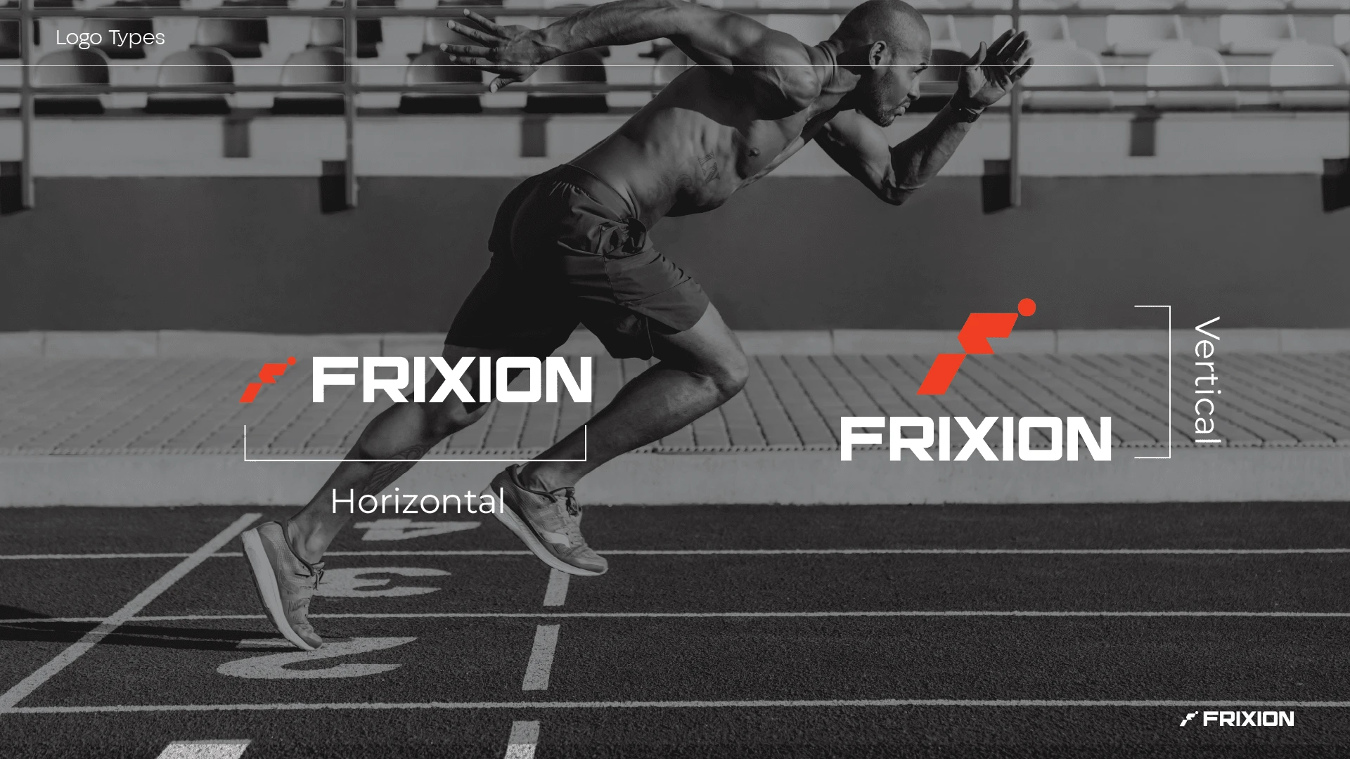
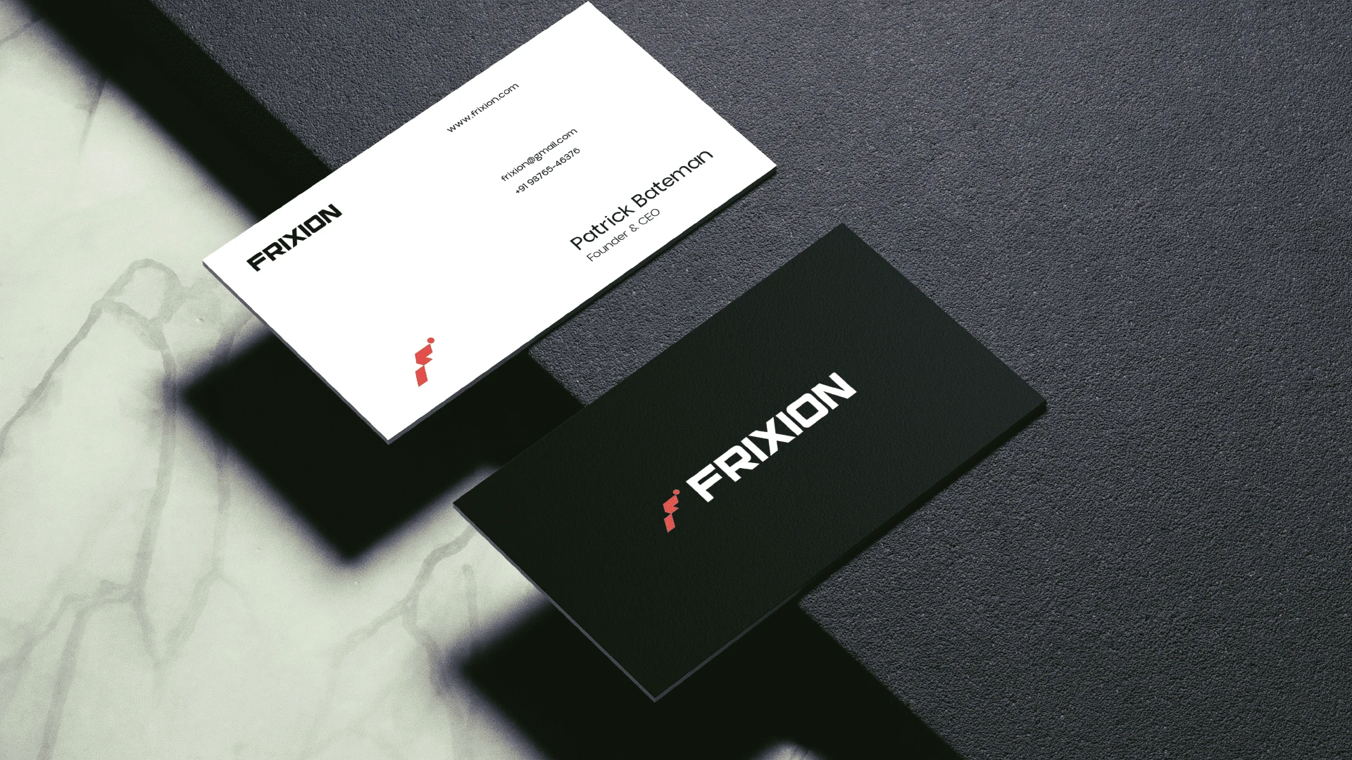
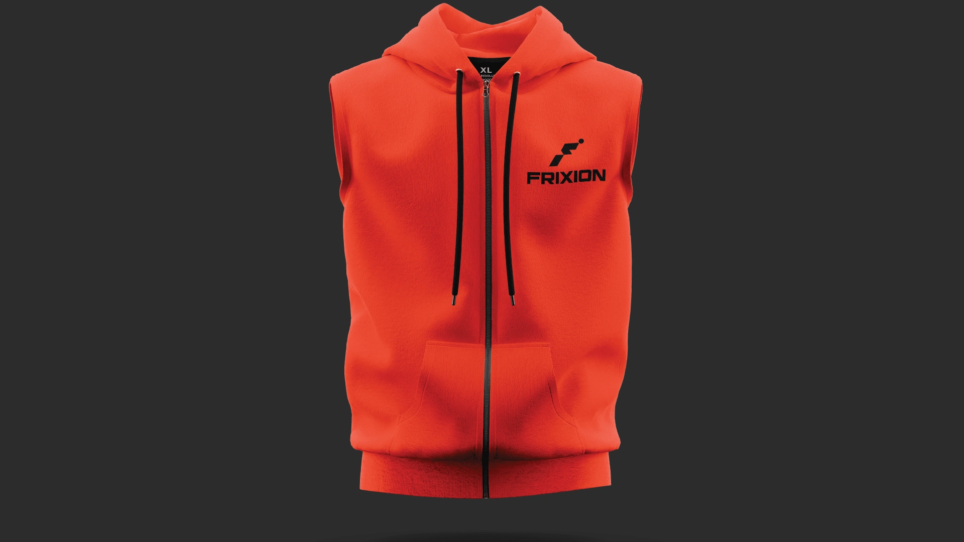
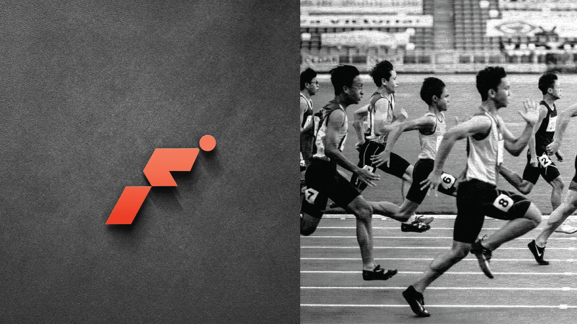
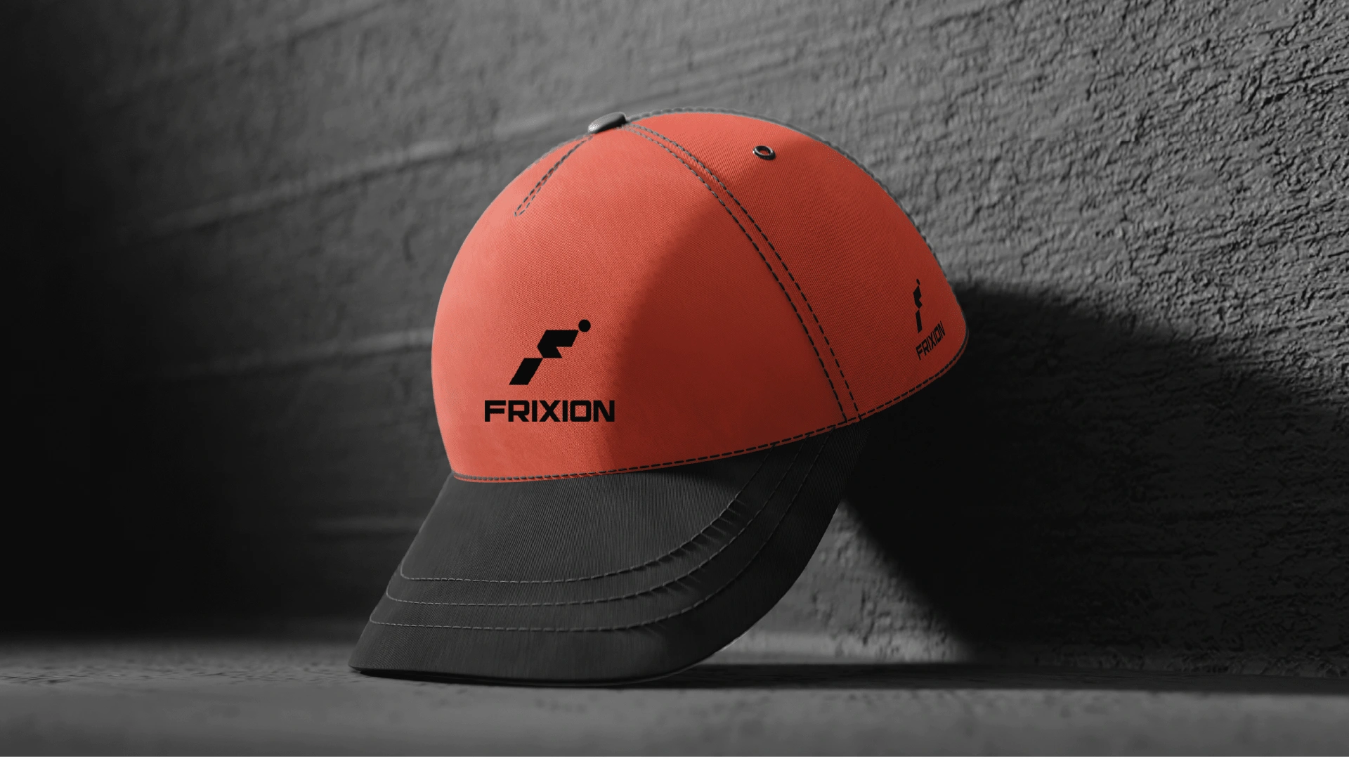
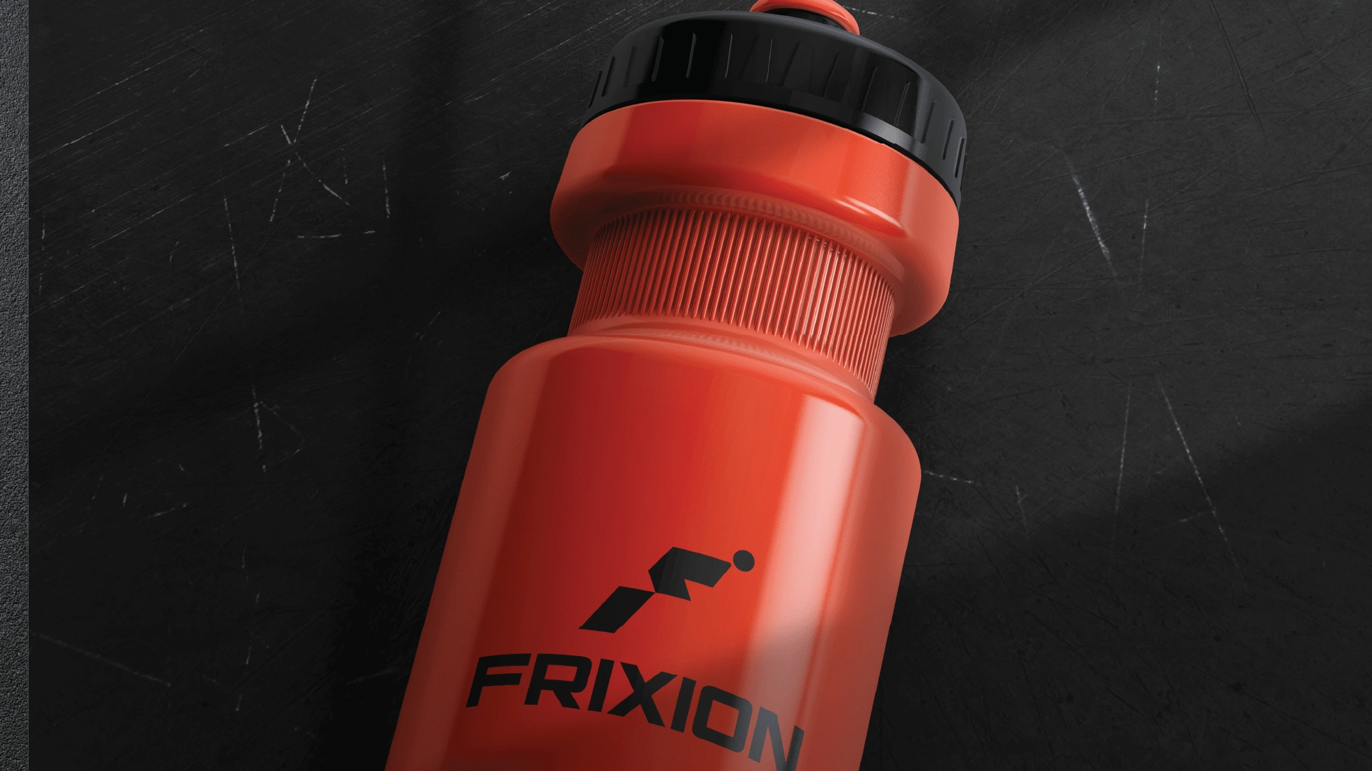
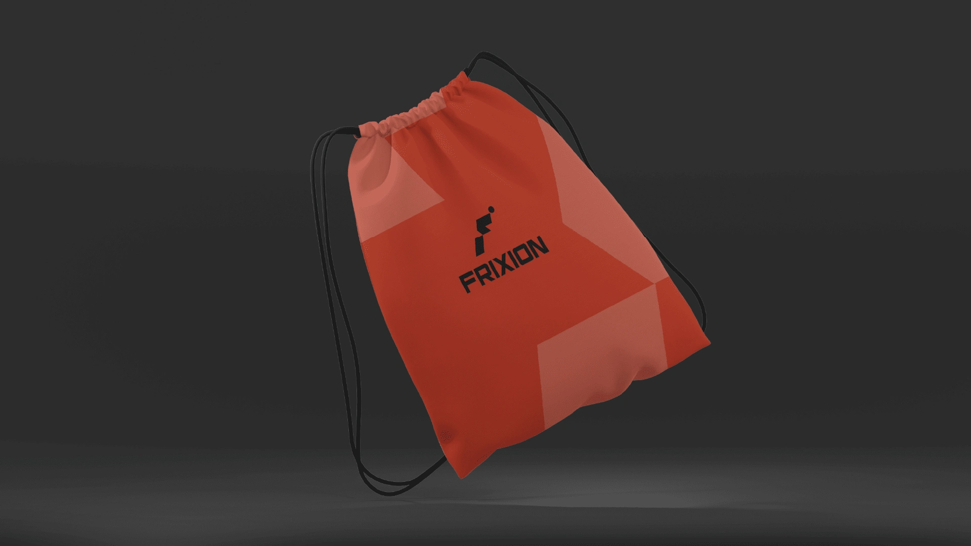
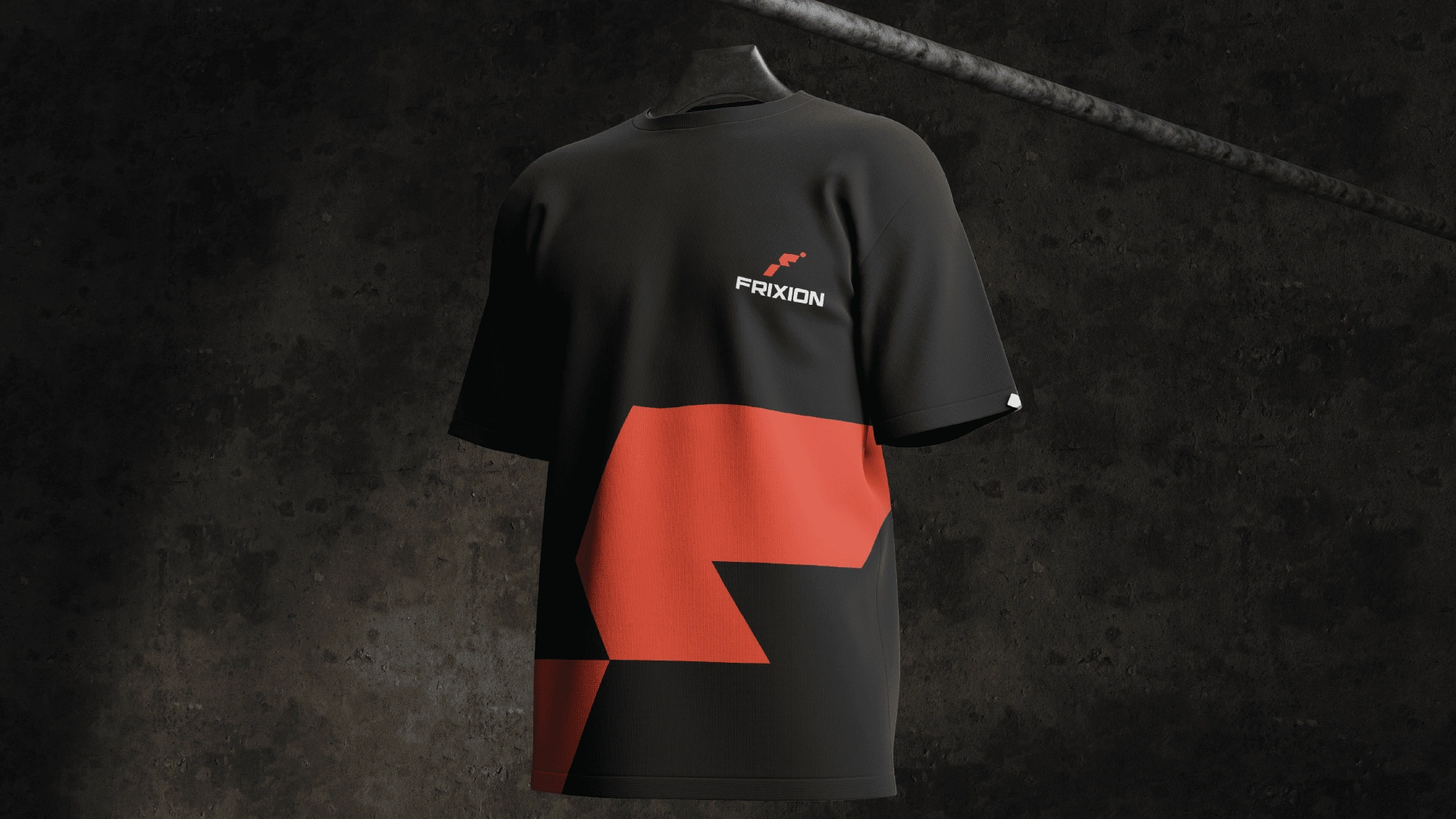
The Frixion logo combines bold typography with a dynamic symbol to convey motion, energy, and innovation. The sleek, geometric sans-serif typeface ensures clarity and strength, while the angular red mark represents acceleration and friction, perfectly aligning with the brand’s name. The contrast of red and black reinforces a sense of power and precision, making the logo versatile and impactful across digital and print applications.
Like this project
Posted Feb 25, 2025
Frixion's logo features bold typography and a dynamic red mark symbolizing motion, energy, and precision, ensuring versatility across all platforms.