Brand Identity Development for EAT TOKYO

Snekha Gopalakrishnan


Brand Identity Project - EAT TOKYO
EAT TOKYO is a new Asian delivery kitchen entering Delhi’s premium segment, built around two key ideas: everything is made in-house and ingredients are sourced from Japan.
The challenge was to create a brand that feels fun yet premium, while making Asian food feel exciting, contemporary and instantly recognizable.
I built the identity around the idea of bold flavour with a playful visual attitude.
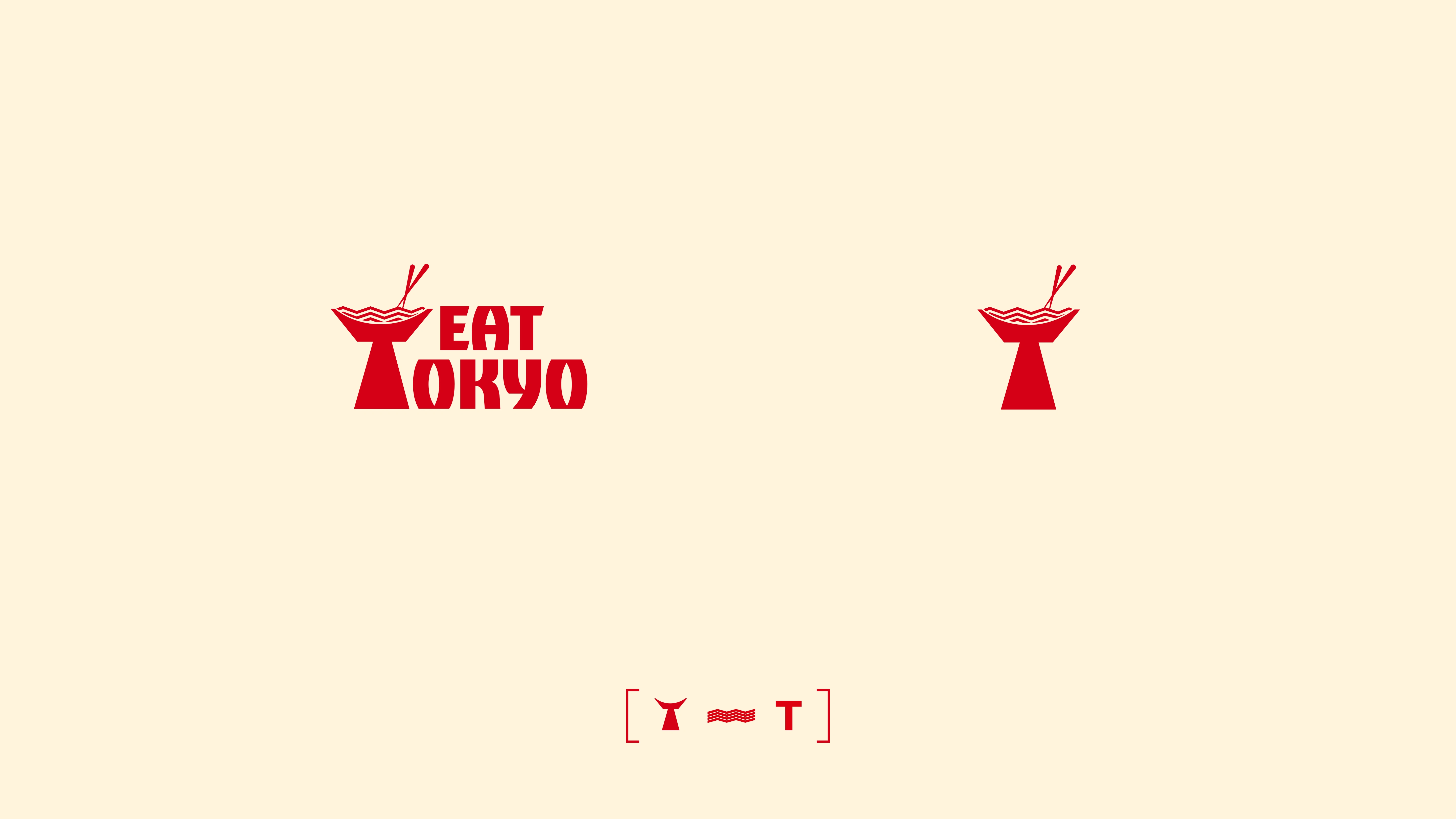
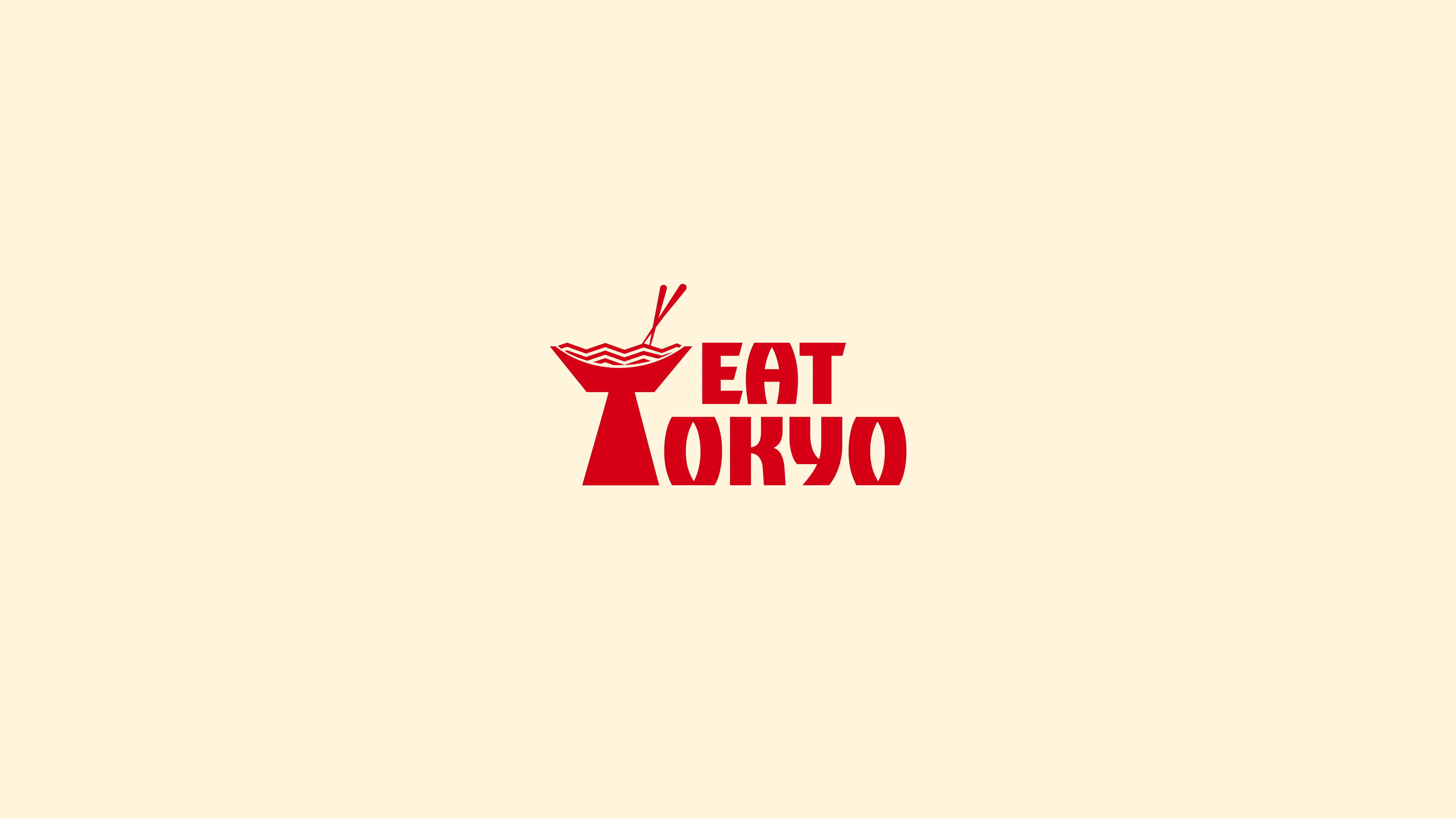
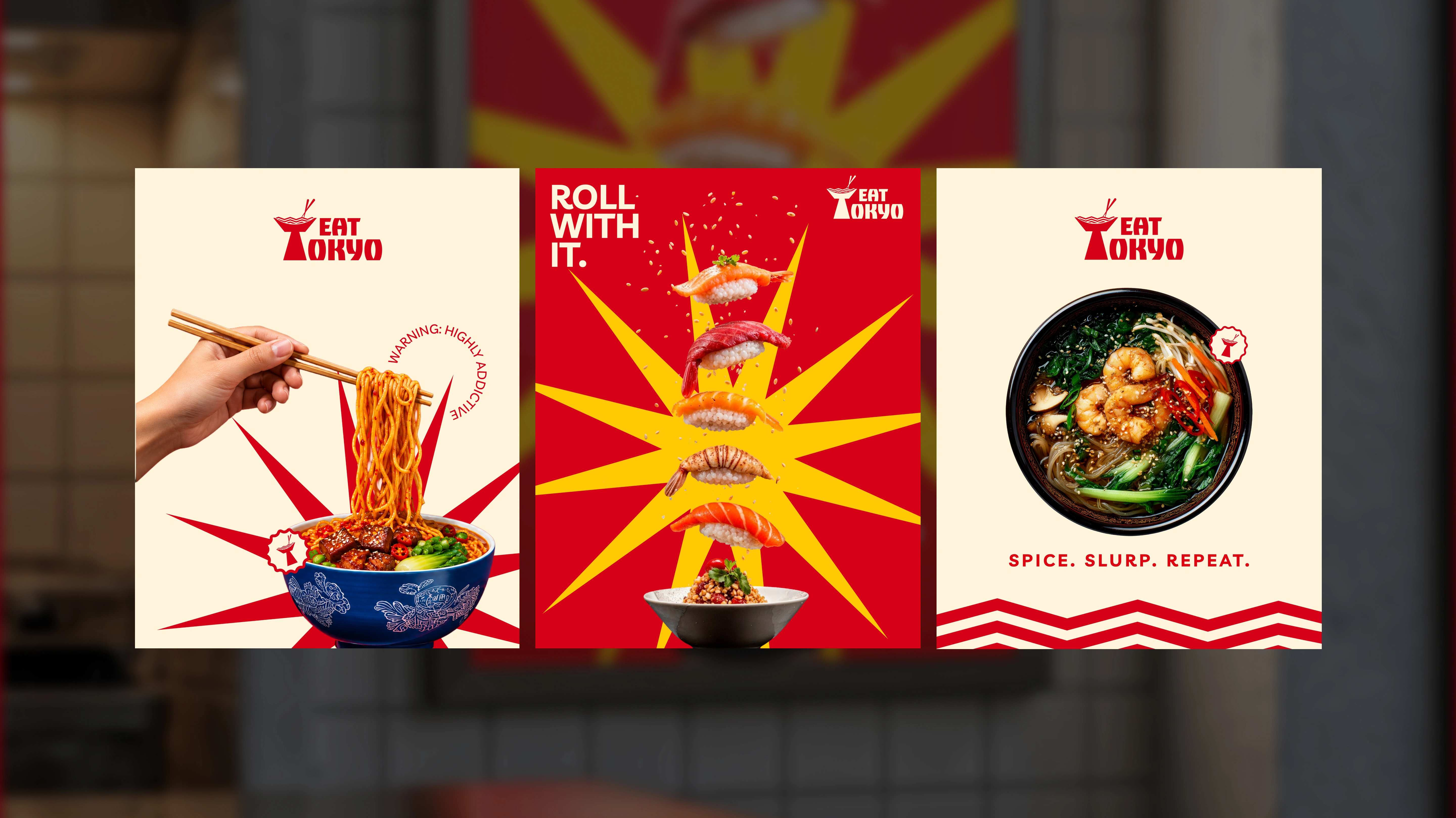
The “T” in TOKYO transforms into a bowl, bringing the food experience directly into the wordmark.

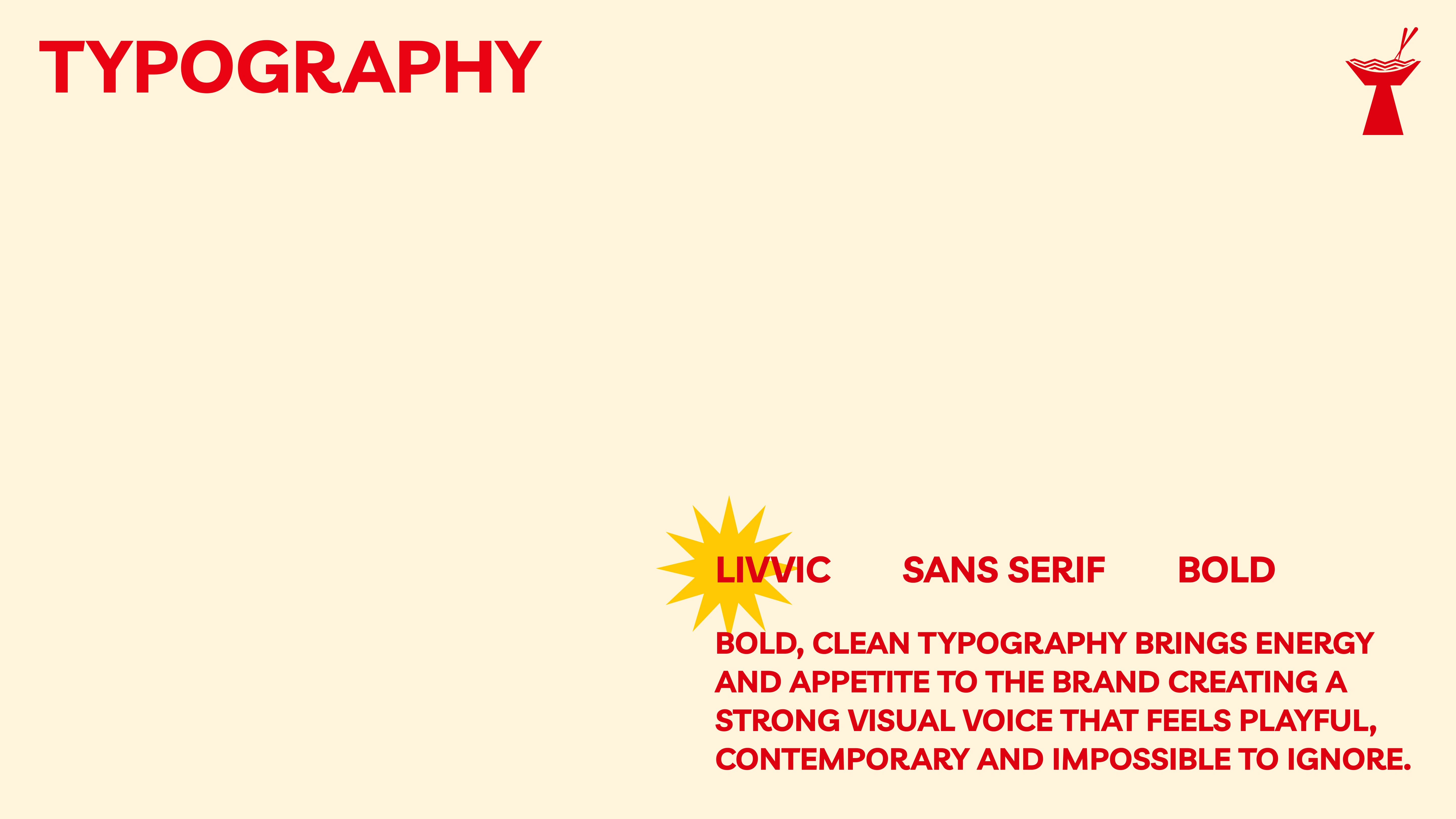
The typography uses a bold sans-serif direction to create strong impact across different applications while remaining clear and legible.
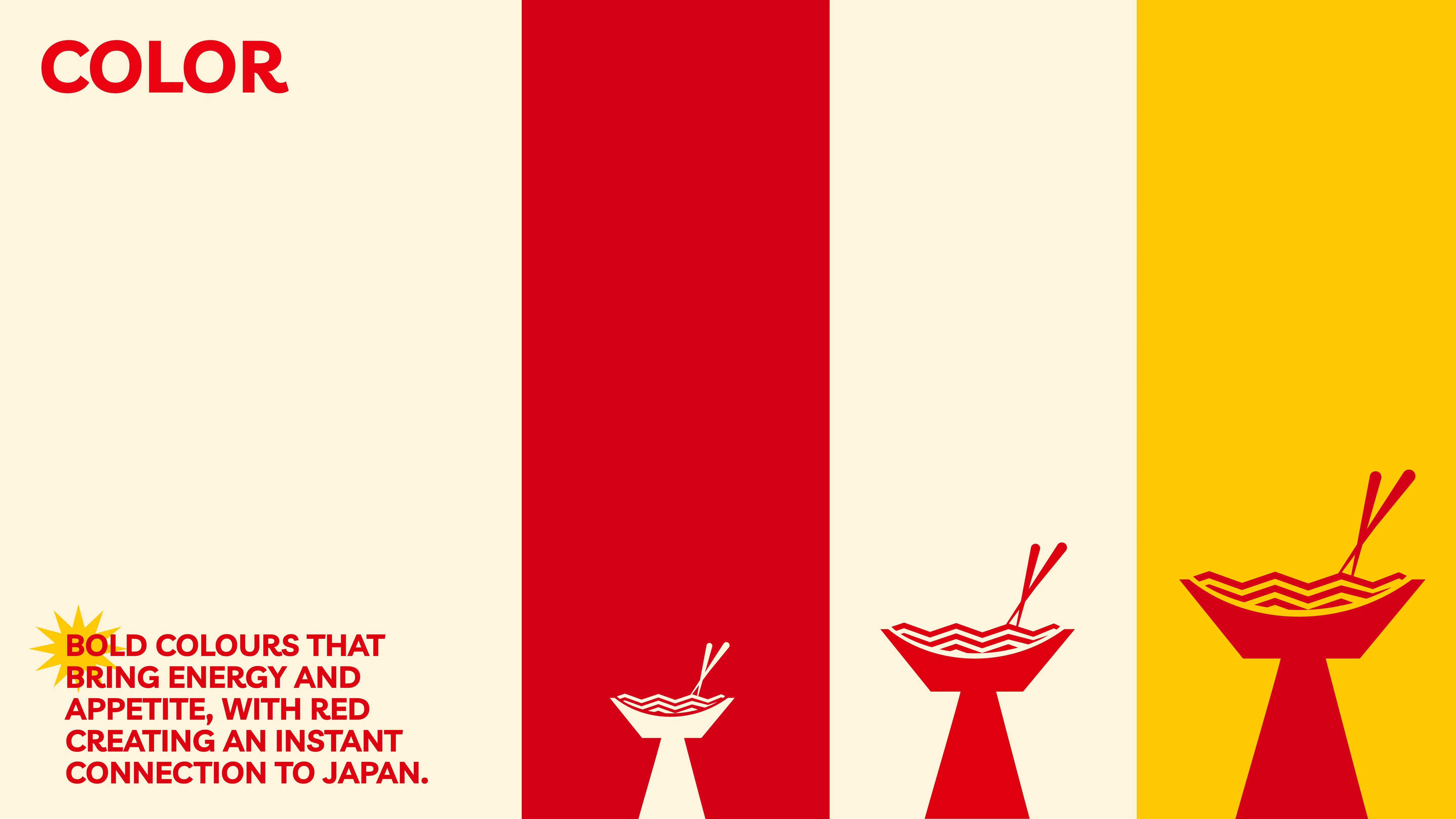
The palette combines fiery red, warm cream and yellow accents. Red creates an immediate visual connection to Japan while bringing appetite and energy; cream adds warmth and balance, while yellow introduces a more playful layer.
Bringing the Brand to Life
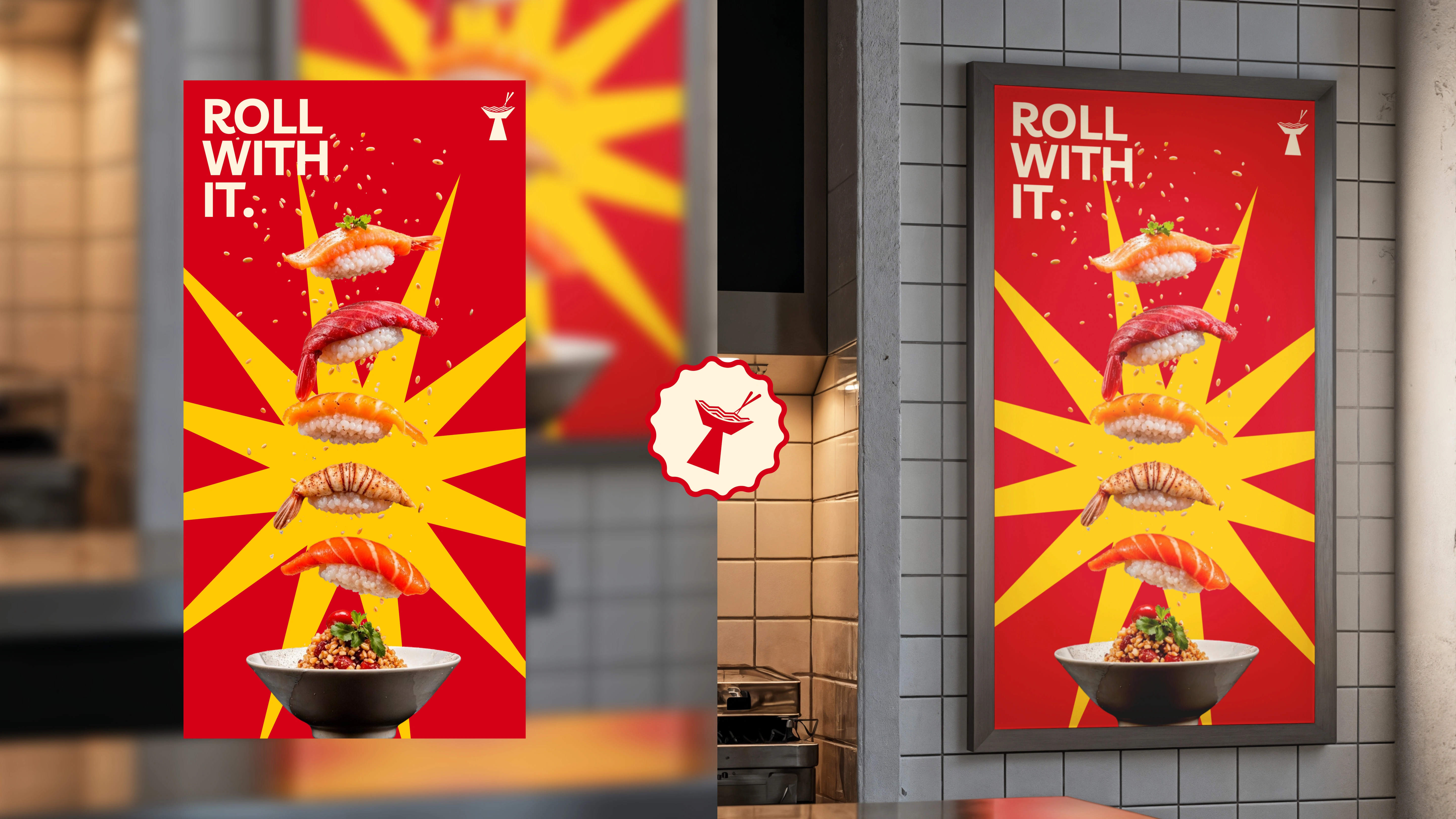
The visual system was applied across campaign posters, social media and delivery-focused brand touchpoints.
Campaign lines such as “SPICE. SLURP. REPEAT.” and “ROLL WITH IT.” allow the same visual language to adapt to different dishes and moments, showing how the system can grow beyond a single product.
The Outcome
The final identity balances premium structure with playful energy, giving EAT TOKYO a distinctive visual personality designed to stand apart in a crowded food category.
The focus was not only on creating a logo, but on building a brand system that can scale across different formats, dishes and customer touchpoints.
Like this project
Posted Aug 24, 2026
Developed a playful yet premium brand identity for EAT TOKYO.