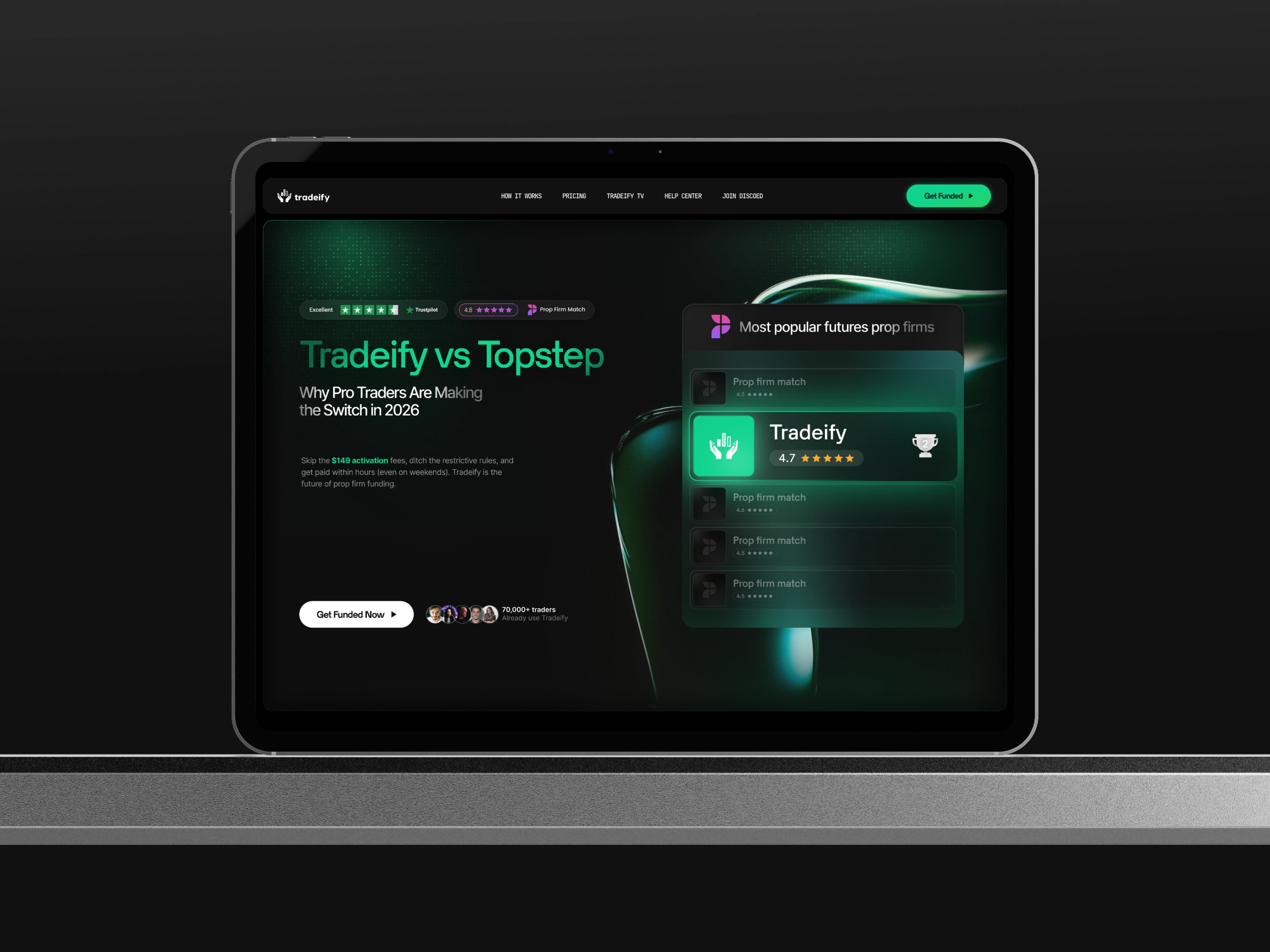
Tradeify vs. Topstep - Comparison Landing page Design
Kanvas Studio
2 collaborators
Tradeify vs. Topstep - Comparison Landing page Design
Tradeify is a leading futures prop trading firm designed to empower traders by providing rapid access to capital and a streamlined path to payouts. Unlike traditional firms with lengthy evaluation periods and hidden costs, Tradeify offers Instant Funding or 1-day evaluations, allowing talented traders to start earning in record time.
The Challenge
The prop trading industry is saturated with established players who often impose "trader traps", complex consistency rules, hidden activation fees, and frustratingly slow payout cycles that can take weeks.
The core challenge was to design a high-conversion landing page that:
Disrupted the Status Quo: Clearly positioned Tradeify as the superior alternative to industry giants like Topstep.
Simplified Complexity: Distilled complex financial comparisons (payout timelines, fee structures, and profit splits) into intuitive, "at-a-glance" visuals.
Overcame Skepticism: Used aggressive social proof and data-driven transparency to prove Tradeify’s claims of 60-minute payouts and higher profit potential.
Driven Immediate Action: Created a sense of urgency and "The Race" mentality, highlighting that every day spent with a competitor was a lost opportunity for higher earnings.
Design Strategy
The design strategy for the Tradeify vs. Topstep landing page focuses on High-Contrast Persuasion and Data-Driven Credibility.
Aggressive Visual Comparison:
The "Tradeify Green" (#00FF85) is used as a primary "success" color against a deep obsidian background, creating a high-tech, premium feel.
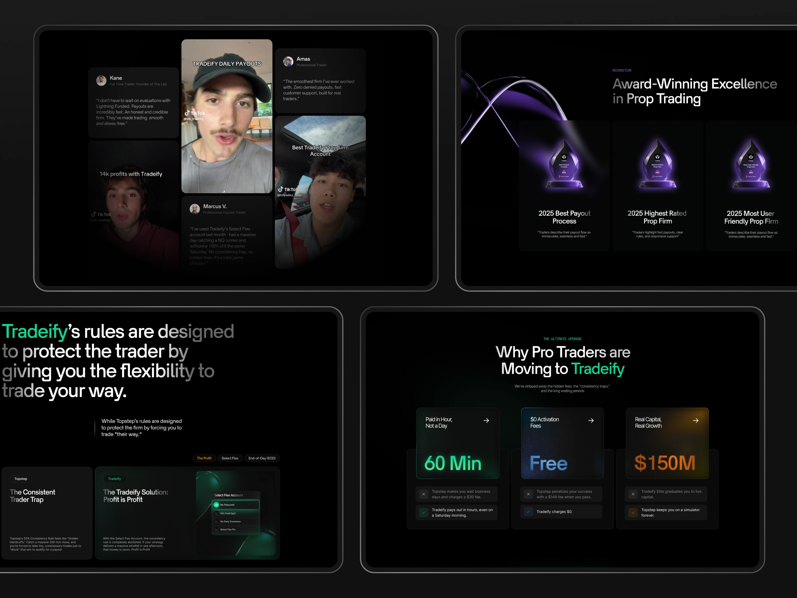
Side-by-side comparison tables ("The Cold, Hard Facts") and the "Consistency Trader Trap" vs. "Tradeify Solution" modules use clear iconography (✅ vs ❌) to make Tradeify’s advantages undeniable.
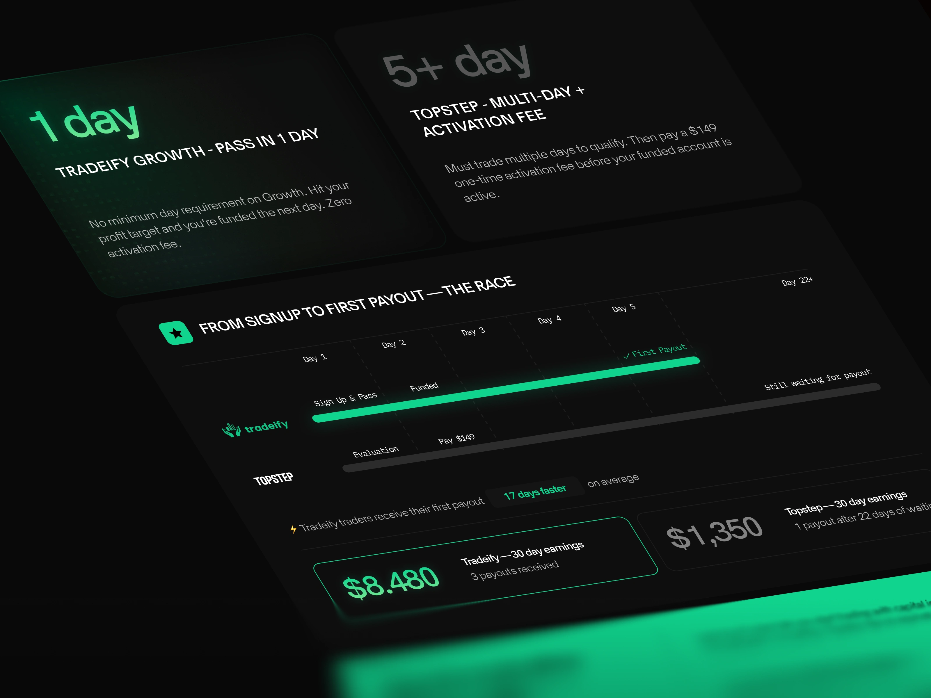
The "Race" Timeline Visualization:
A standout design element is the "FROM SIGNUP TO FIRST PAYOUT" timeline. By visualizing the 17-day difference between Tradeify and Topstep as a literal race, the design triggers a psychological "fear of missing out" (FOMO) regarding time-to-profit.
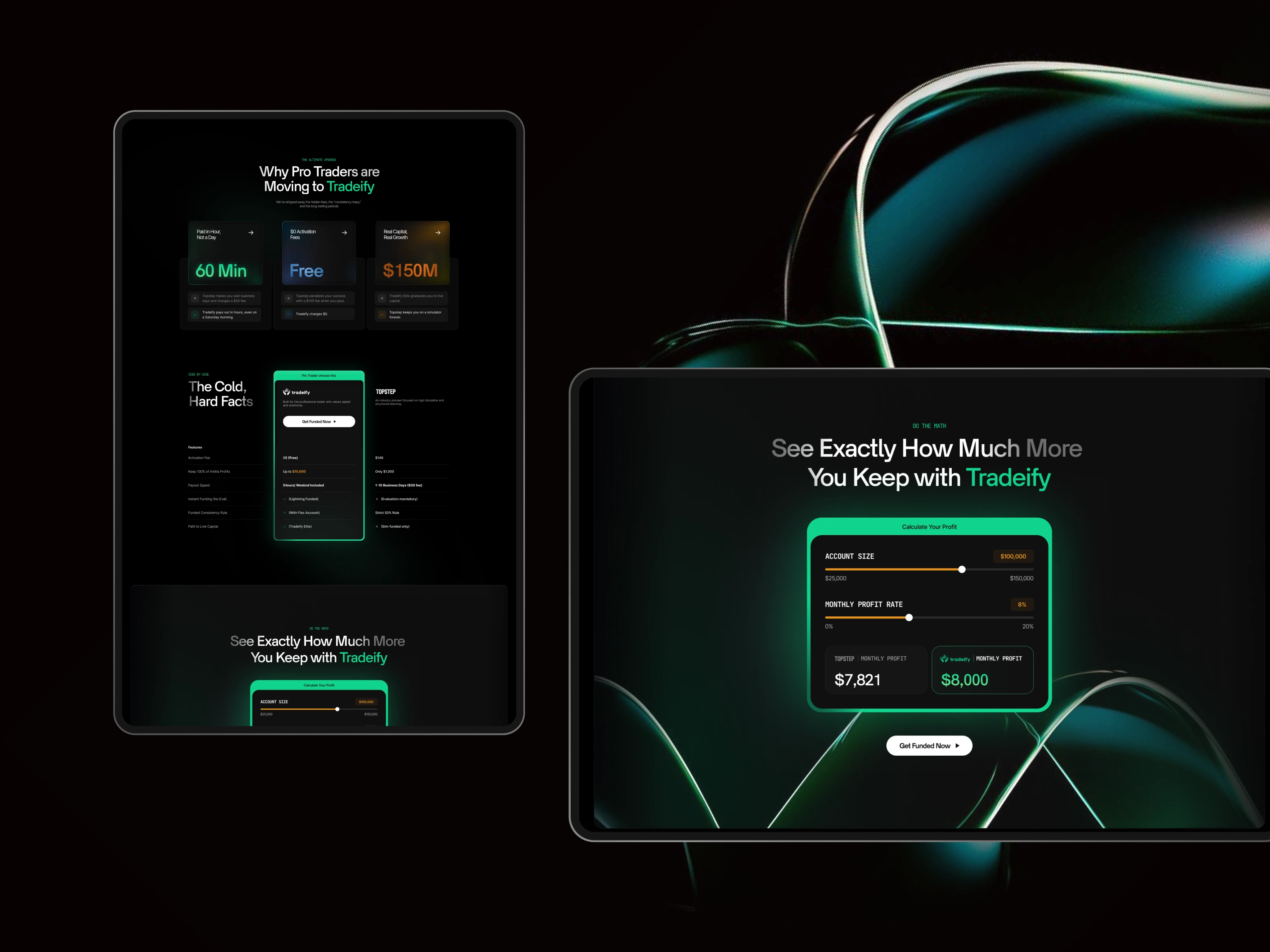
Interactive Profit Proof:
The "See Exactly How Much More You Keep" calculator module uses interactive sliders to let users visualize their own potential earnings. This shifts the user's mindset from "passive reader" to "active participant" in the Tradeify ecosystem.
Modern Social Proof (The "TikTok" Grid):
Instead of static text testimonials, the design utilizes vertical video formats (TikTok style) to appeal to the modern, tech-savvy trader. This adds a layer of authenticity and "real-world" energy to the brand.
Glow & Depth Effects:
Strategic use of "glassmorphism" and green neon glows around key CTAs and value propositions (like "$0 Activation Fees") ensures the most important selling points are the first thing a user sees, even when scanning quickly.
Are you a founder ready for a high-converting landing page or an agency looking to productize your workflow?
At Kanvas, we bridge the gap between aesthetic excellence and functional growth. From bespoke design templates to full-scale UI/UX transformations, we provide the design infrastructure your startup needs to scale.
Whether you need a one-off project or a dedicated Design Retainer to act as your in-house team, let’s bring your vision to life.
📩 Reach out directly to discuss your next project.
Like this project
Posted May 2, 2026
Designed a high-conversion landing page comparing Tradeify and Topstep.
Likes
2
Views
11
Clients
Tradeify