Eterna - Minimalist Jewelry
Like this project
Posted Jul 4, 2024
Eterna is a minimalist jewelry business that creates simple, dainty pieces to compliment effortless and elevated looks.
BRAND IDENTITY | PACKAGING | STATIONARY | SOCIAL MEDIA FEED DIRECTION
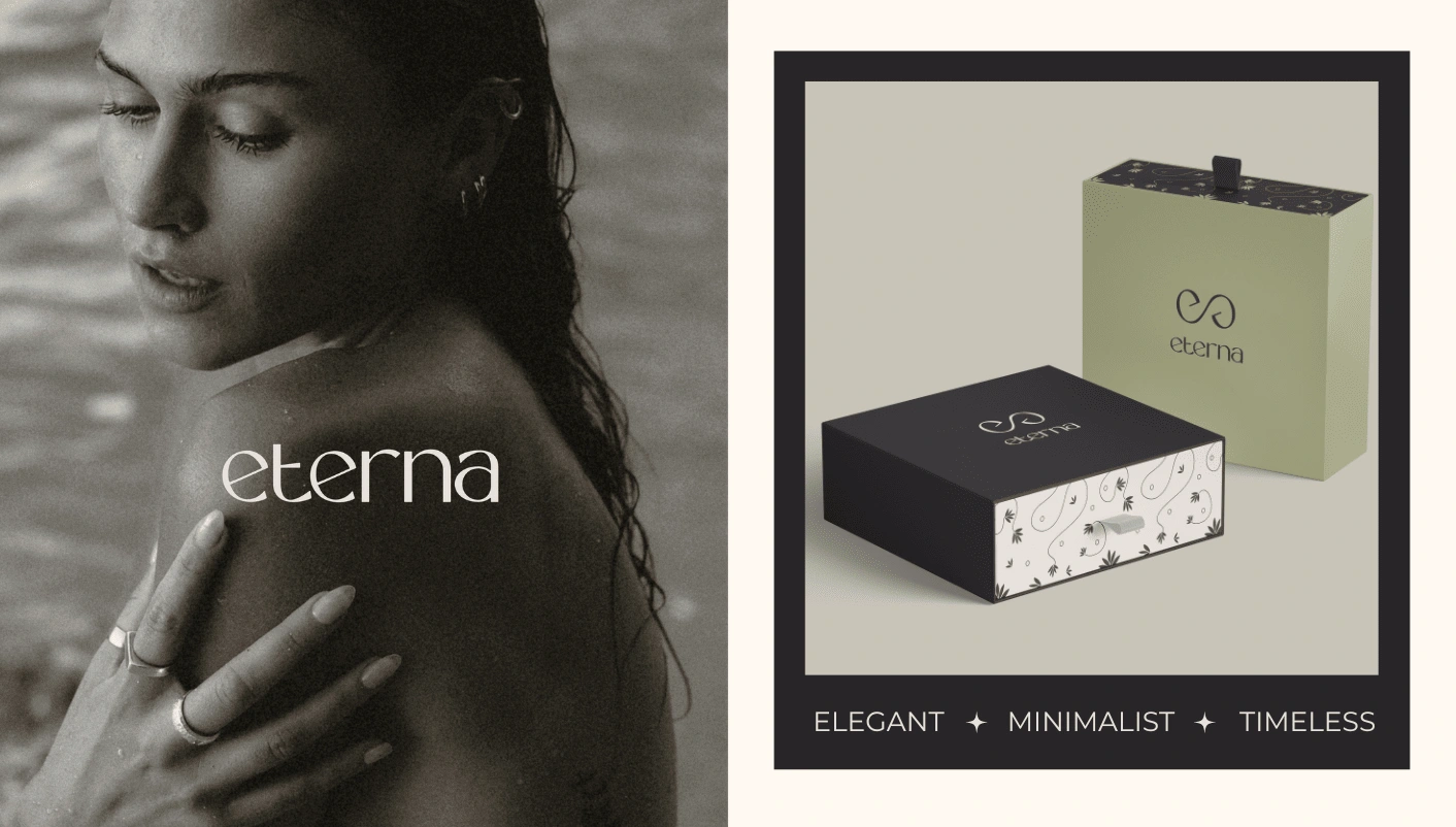
Logo & Packaging
BRAND CONCEPT
Eterna is a minimalist jewelry business that creates simple, dainty pieces to compliment effortless and elevated looks. The word 'Eterna' is short for 'eternal', which speaks to their timeless, dainty jewelry items that are elegant and minimalist.
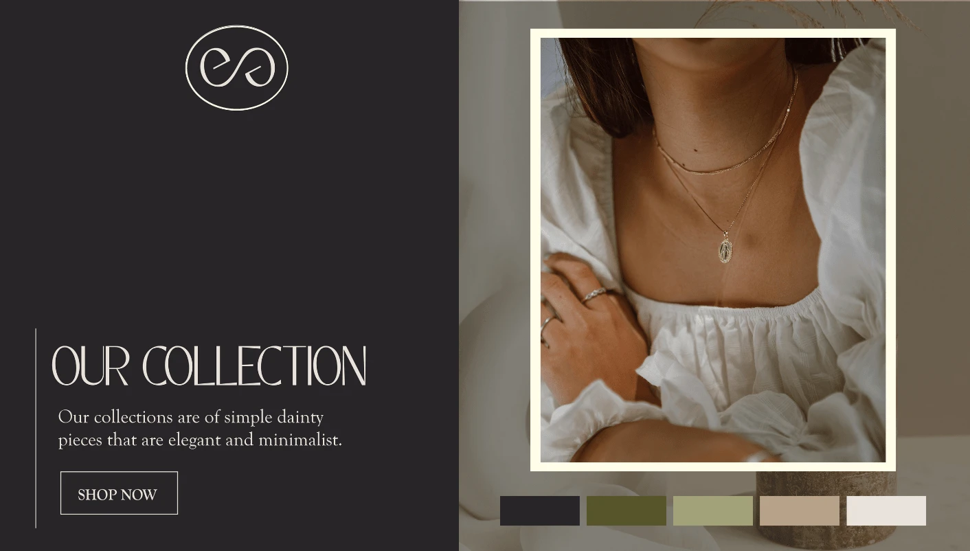
Typography & Colour Palette
BRAND IDENTITY CONCEPT
Eterna wants to lean more towards contributing to their environment by supporting sustainable actions and environmentally friendly packaging. The colour palette was chosen to bring out the natural earthly tones with the soft pastel colours.
The custom logo is simple and minimalist to convey a sense of sophistication. The submark is the combination of the letters e and the infinity symbol which represents eternity. It was inspired by the meaning behind the brand name.
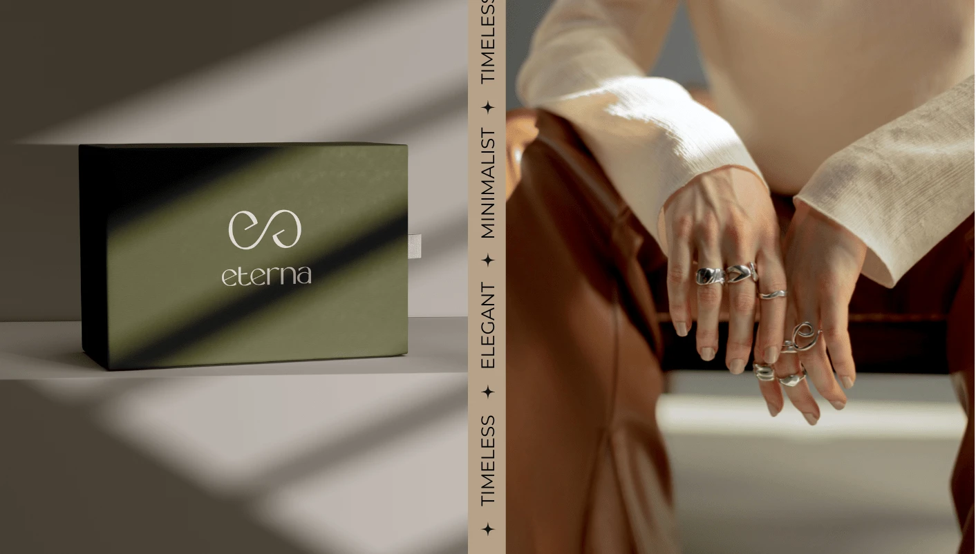
Packaging & Photography Style

Social Media Feed Direction & Brand Packaging
Add a little gold, silver, or sparkle to life with Eterna's jewelry pieces.
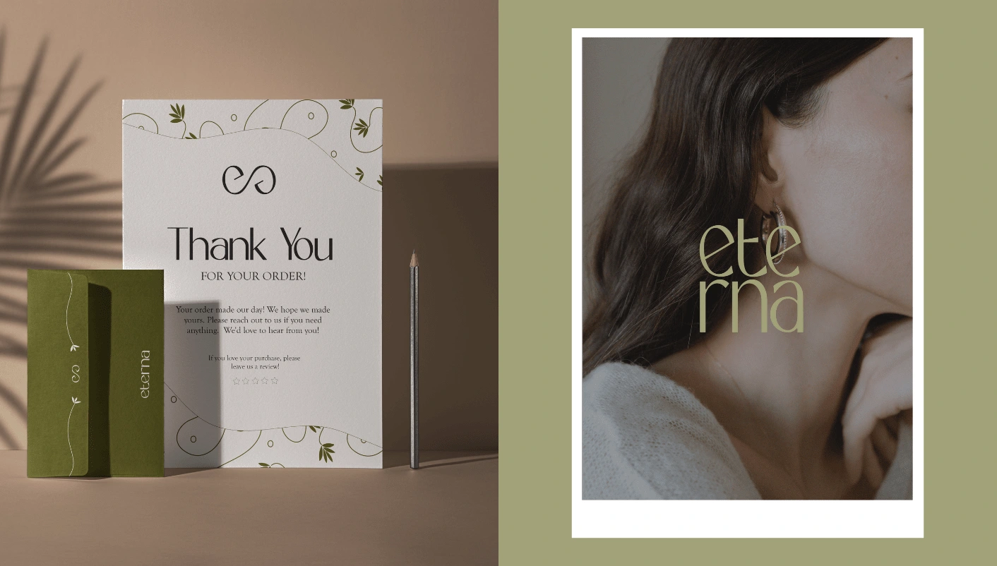
Brand Collateral & Logo and Photography style


