Epic Art Story - Naming, Brand Design and Visual Identity
ABOUT
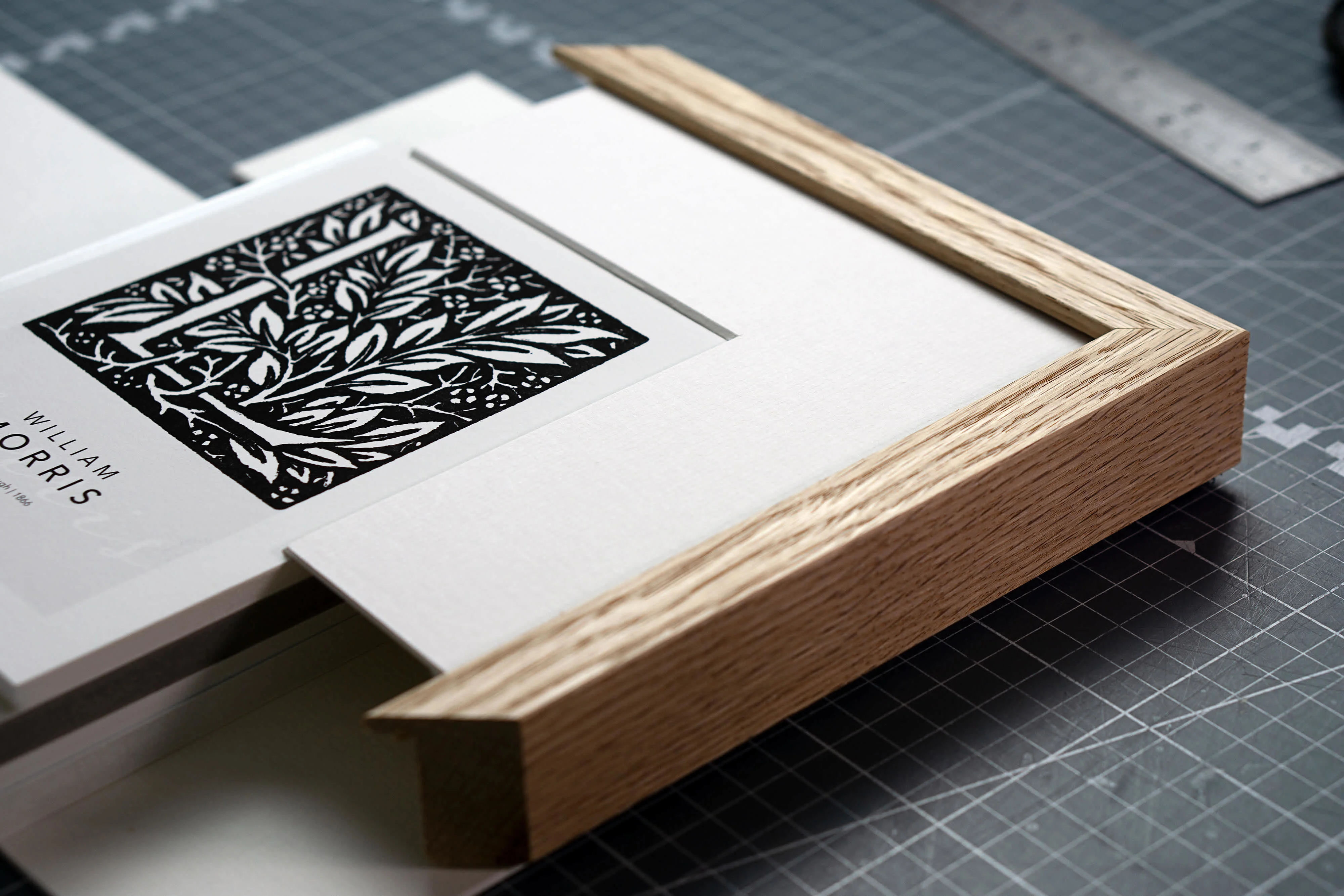
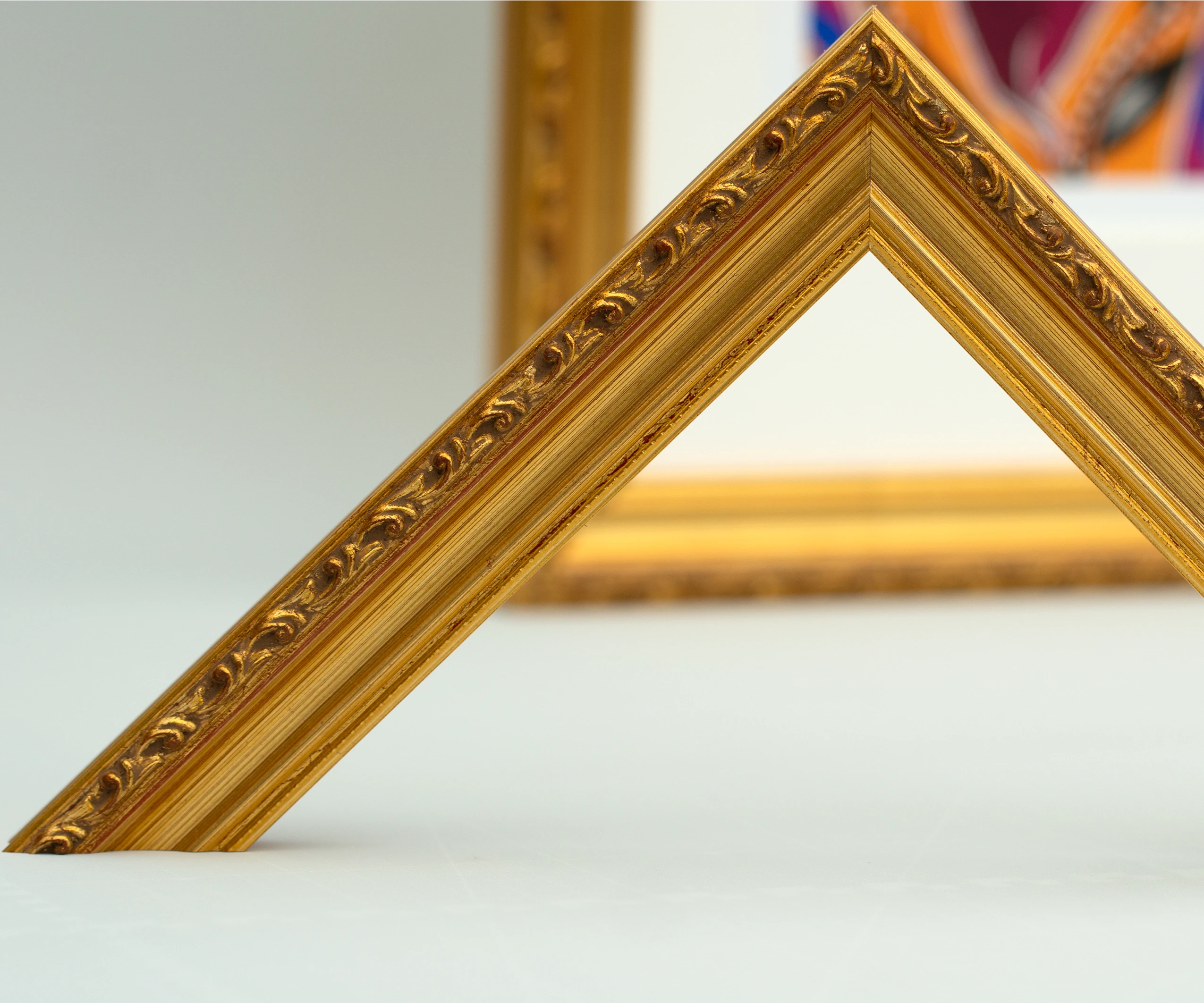
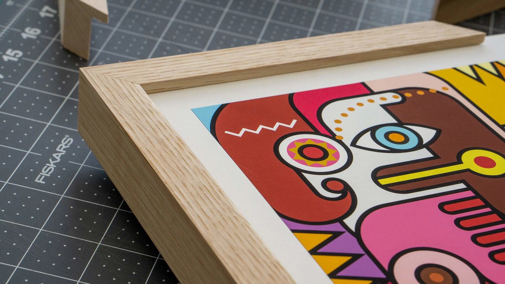
Brand name, brand design and visual identity, art direction and photoshooting.
The name "Epic Art Story" was chosen to reflect the essence of the business – one that specializes in Fine Art Print and framing, helping artists and photographers share their unique stories through their artwork. The term "Epic" suggests grandeur and significance, while "Art" speaks to the creative aspect, and "Story" emphasizes the narrative behind each creation. By combining these elements, the brand name itself becomes self-descriptive, hinting at the meaningful stories each artist's work can convey.
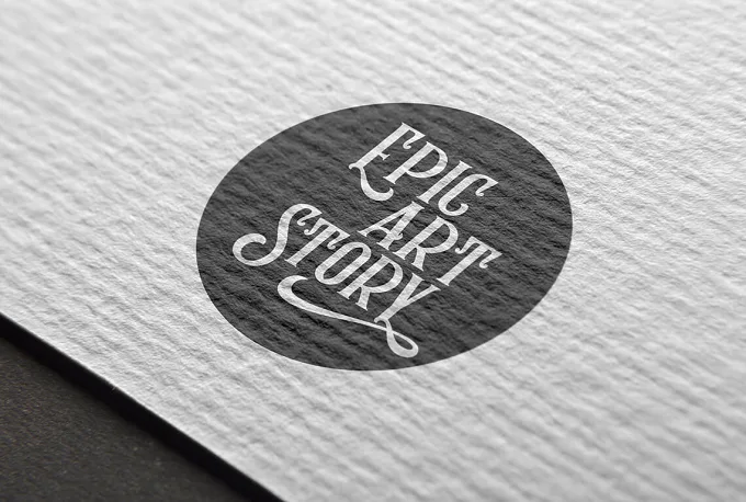
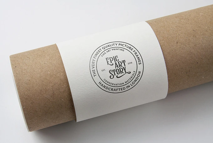
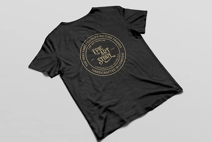
The brand design centres around old-style lettering to evoke a sense of heritage and timelessness. This choice of typography gives the brand a classic and artisanal feel, reinforcing the idea of preserving and honouring artistic traditions. The emphasis placed on "Epic," "Art," and "Story" within the lettering visually highlights these essential components of the brand's mission.
The colour palette is simple, black and white. The chosen elements – from typography to colour palette – are carefully curated to reflect a sense of timelessness, sophistication, and deep appreciation for the creative process. This approach aims to resonate with both artists and their audiences, making Epic Art Story a bridge between the creators and those who appreciate their work.
Like this project
Posted Oct 10, 2024
Epic Art Story Brand name, brand design and visual identity. The name Epic Art Story was chosen to reflect the essence of the business – one that specializes .…

