Built with Framer
Able's Visual Identity Rebranding
Akinbinu Akintayo
Brand Design
Problem
Able understood that it needed a new visual identity and positioning compatible with its technical excellence. The previous identity was no longer aligned with its key audience, a logo that was misrepresenting, had some application problems and did not cover the entire context of the healthcare. It was time for some expert refinement of Able’s identity with a complete rebranding.
Challenge
My challenge was to develop a unique, modern visual identity that is coherent with its mission and that could be applied in the main contexts of the brand.
Services
Brand Strategy
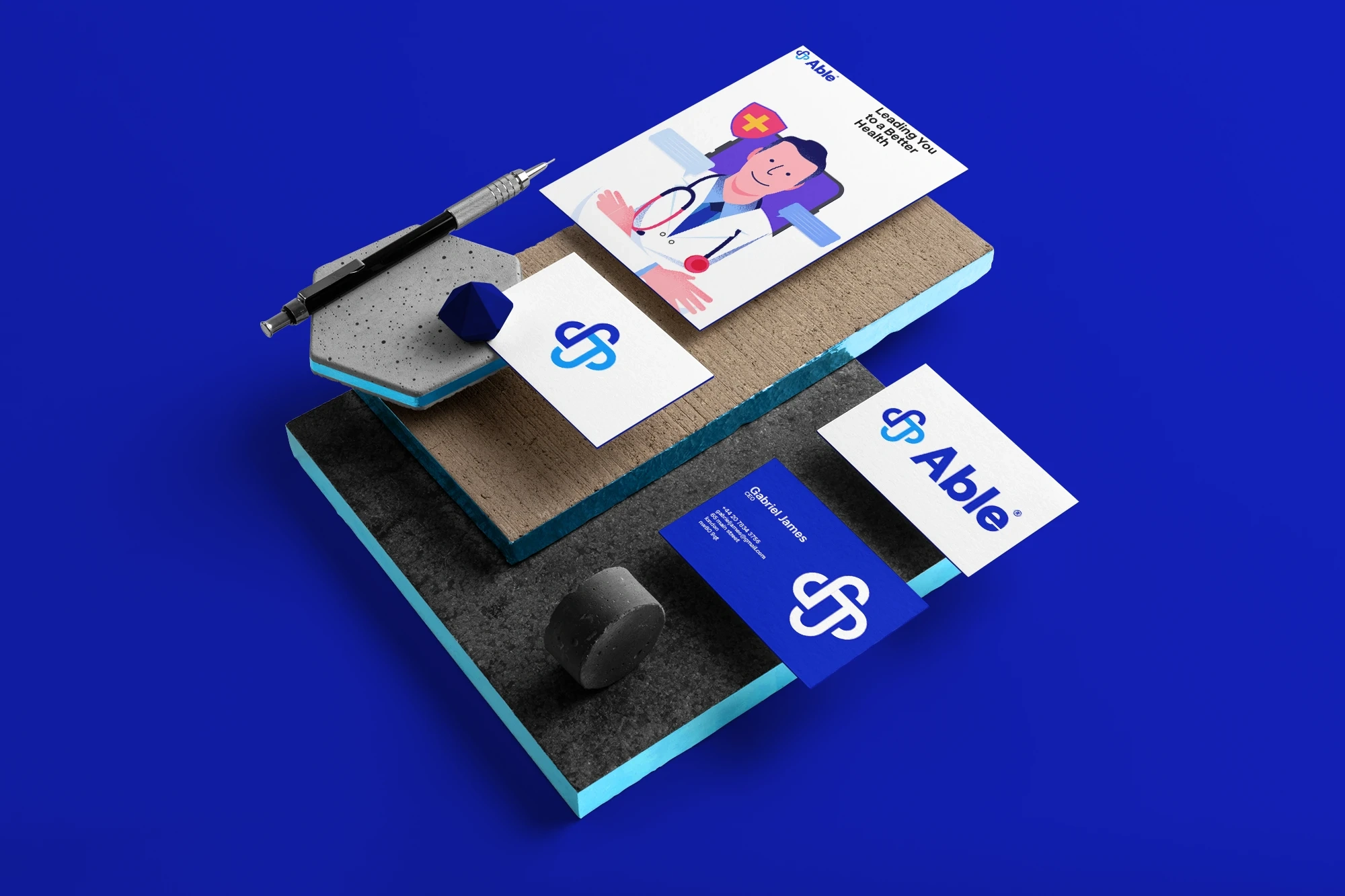
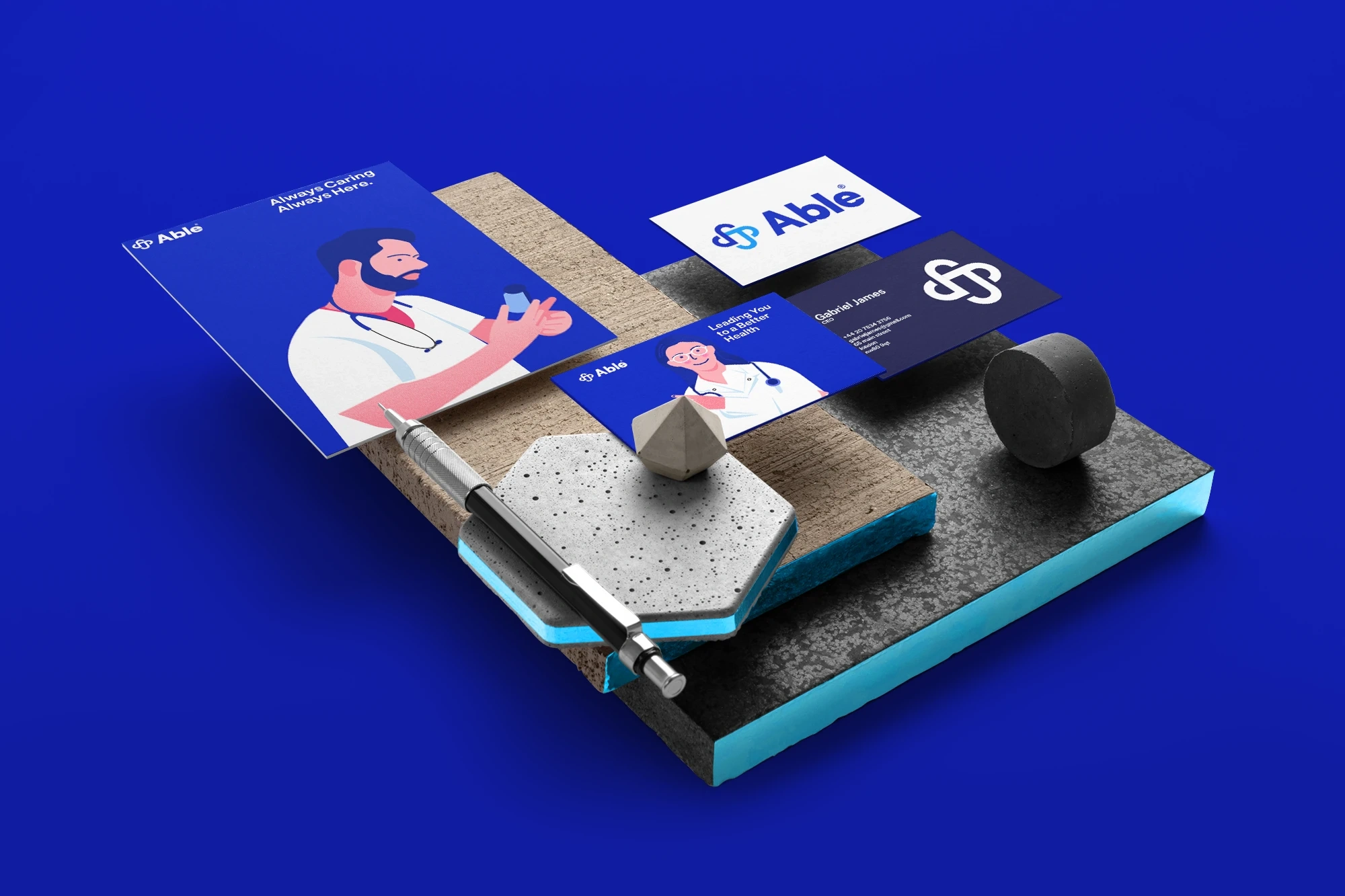
Logo & Identity System
Brand Guidelines
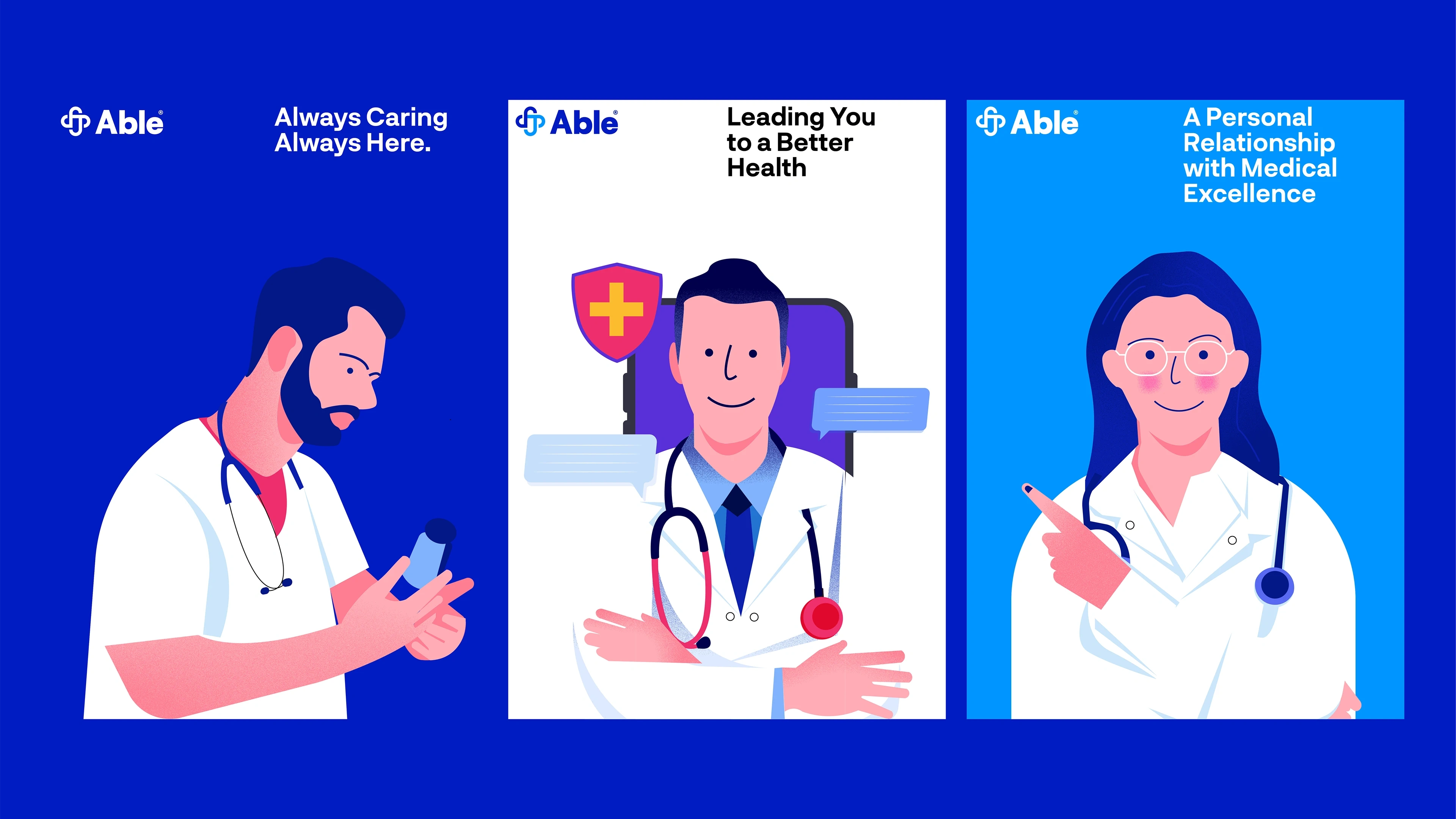
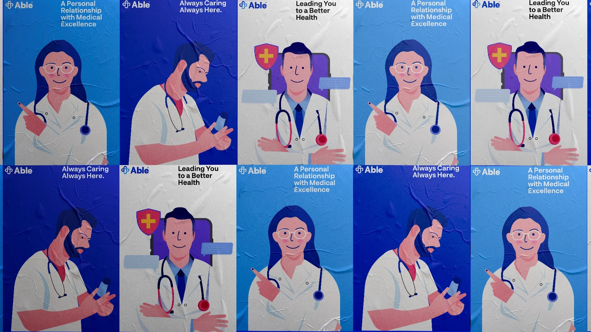
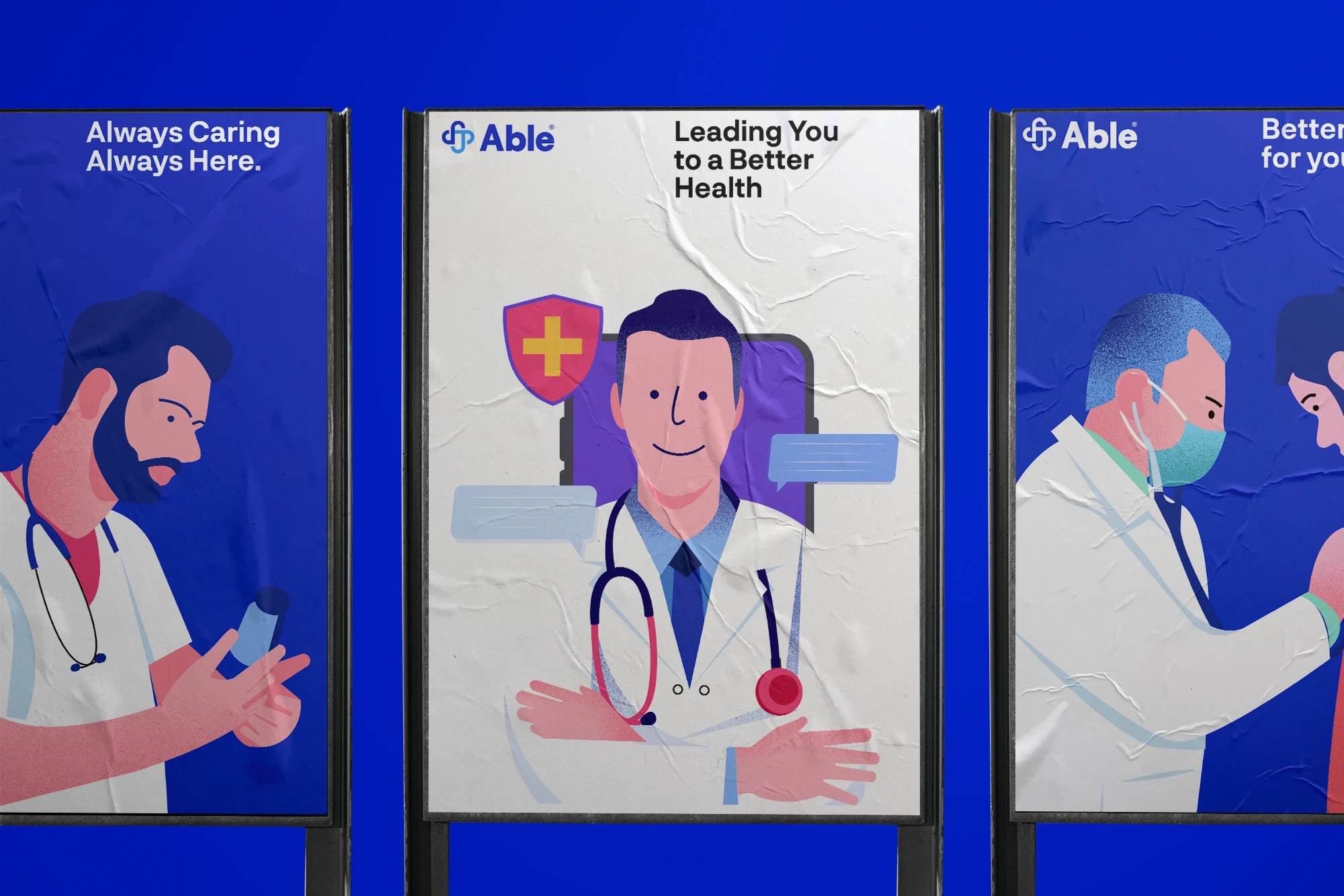
Illustrations
Iconography,
Landing Page, Onboarding Screen
Solution
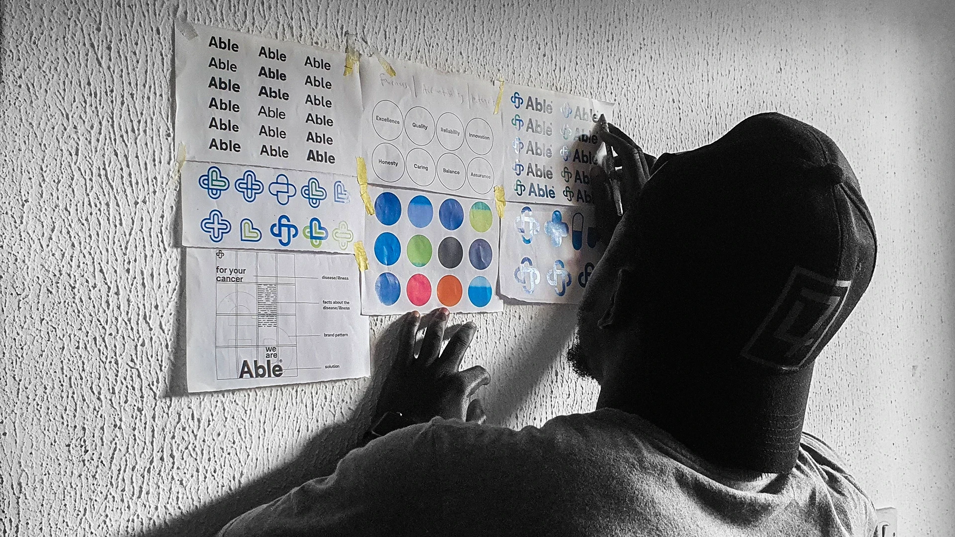
I began by organising an intensive strategic phase to create the brand foundations and identify all touchpoints.
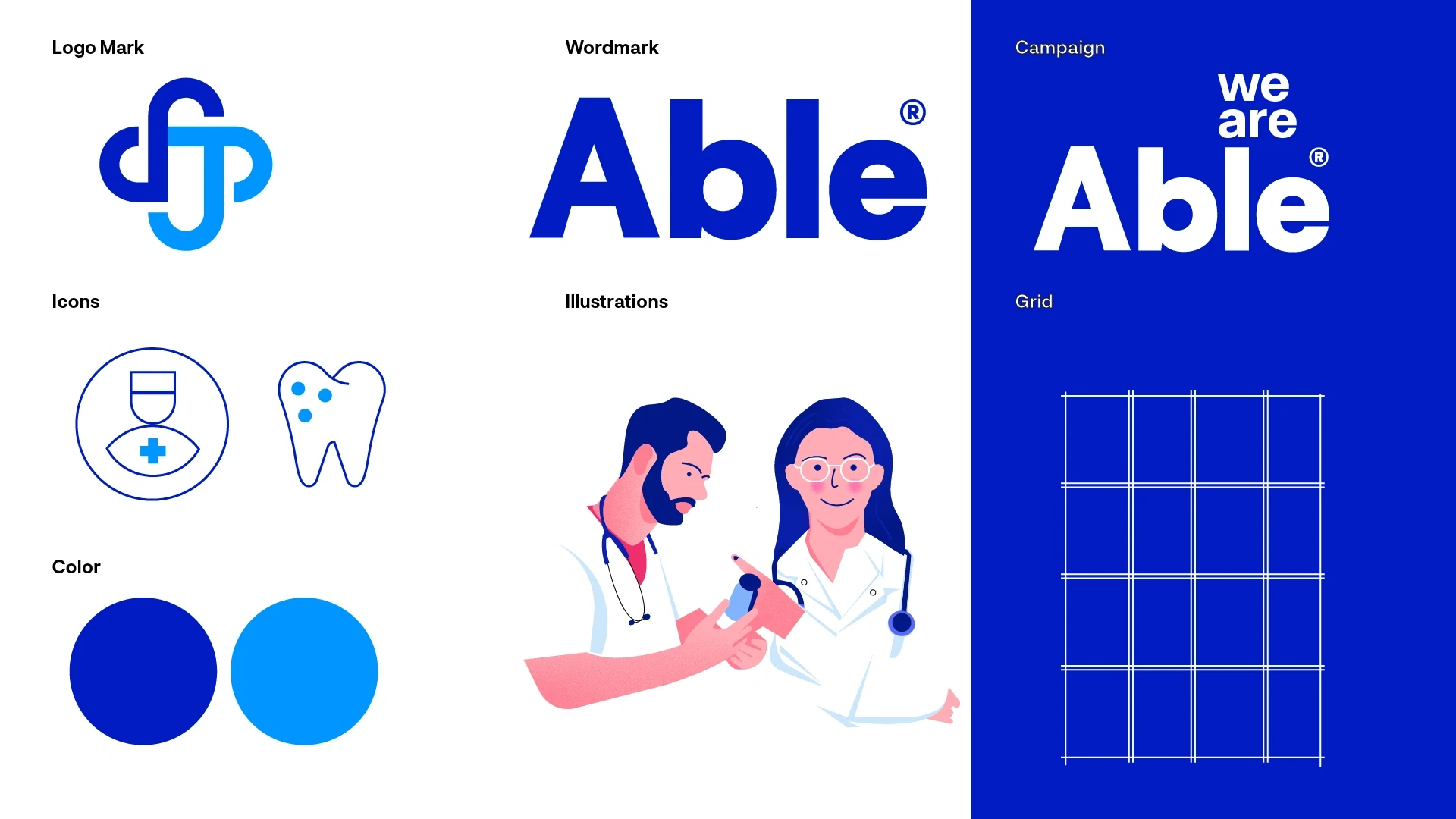
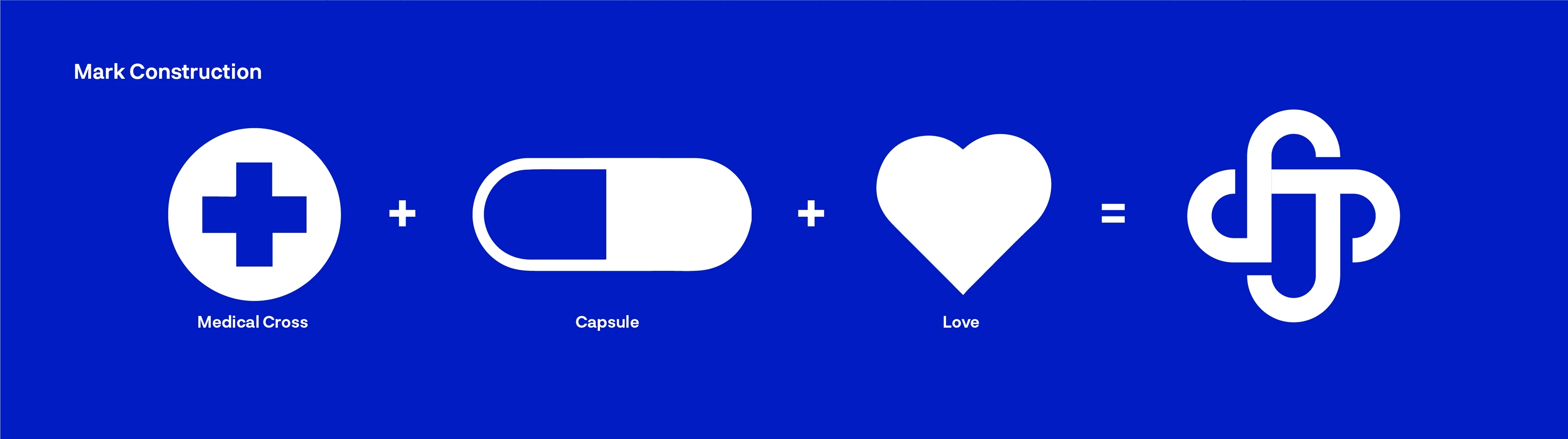
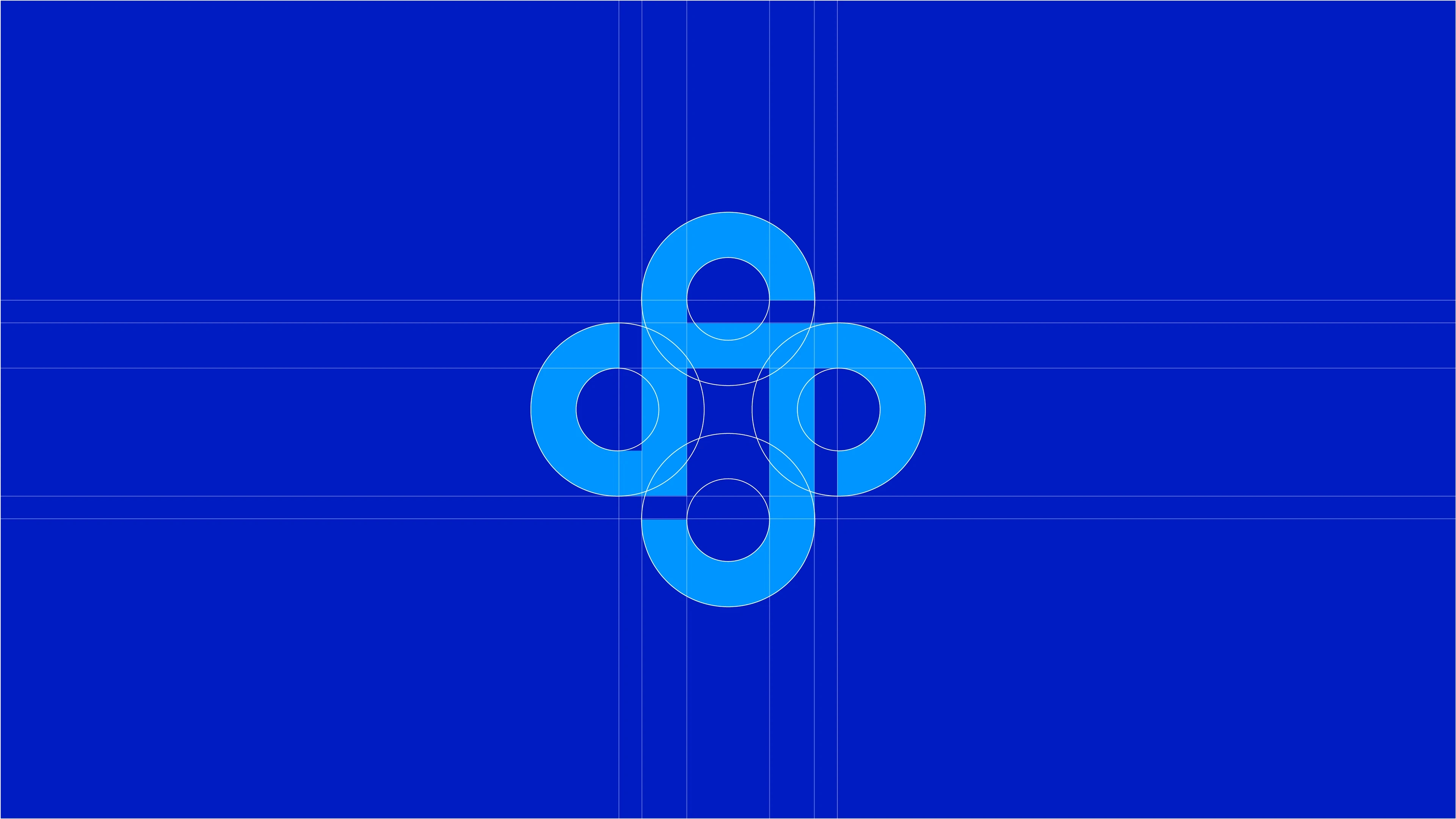
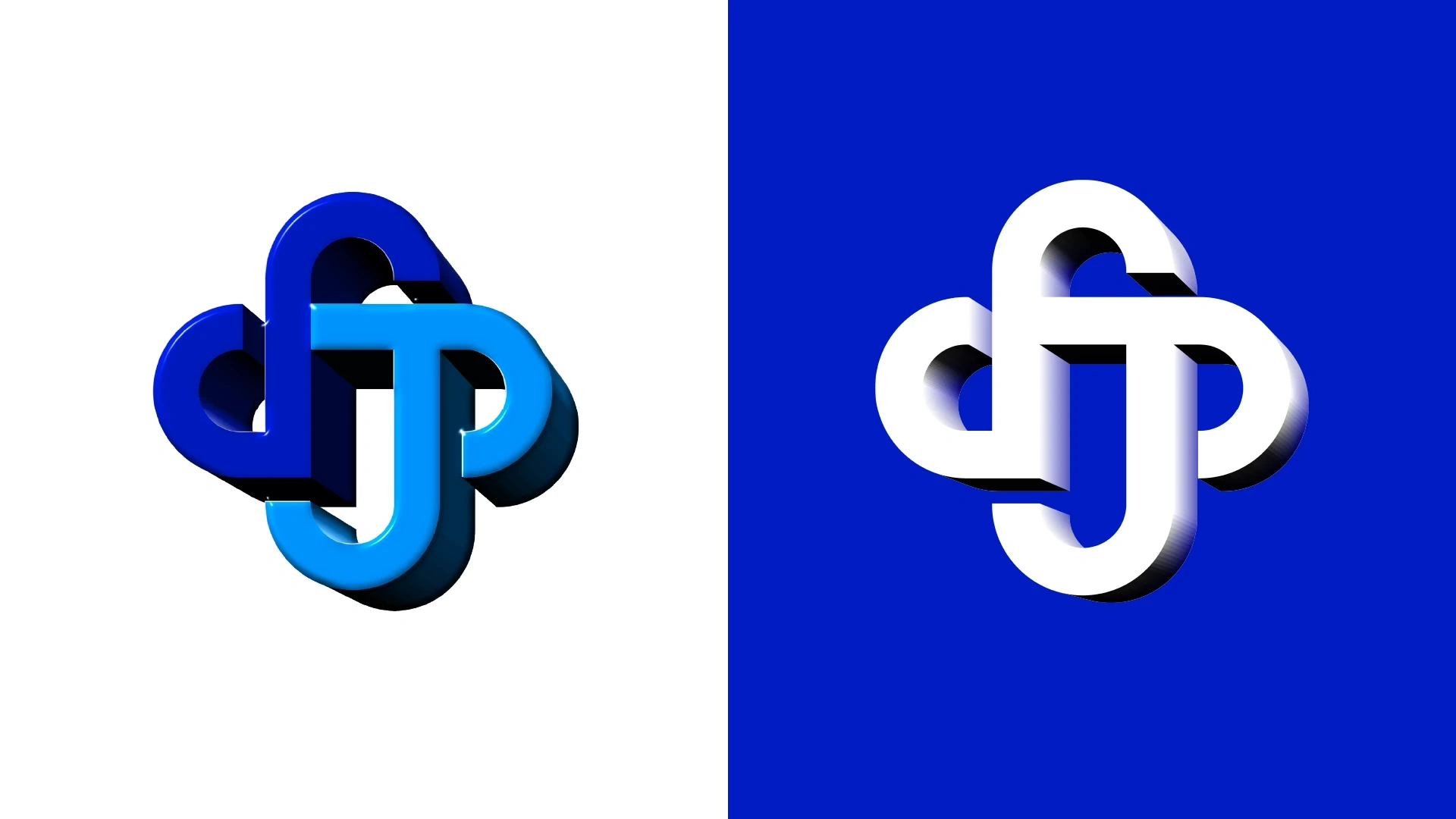
My inception was to create an icon that holds symbolic representations and visualizes everything they do.
The color palette was inspired by tranquility that represent the brand’s core values - trust, security, loyalty.
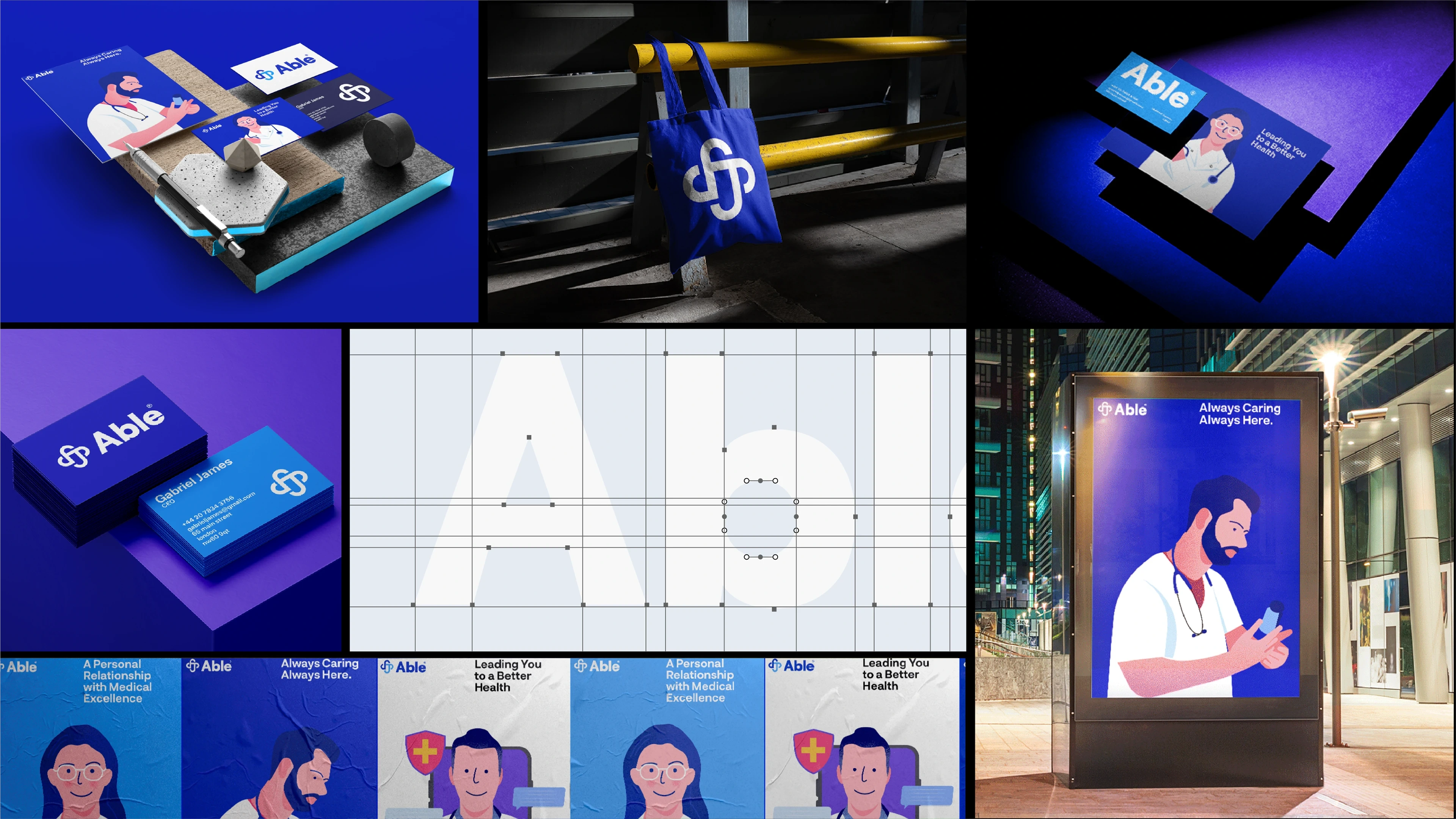
I created an identity system capable of expanding to different communicaton channels, connecting Able to its potential customers while transmitting the brand’s value.
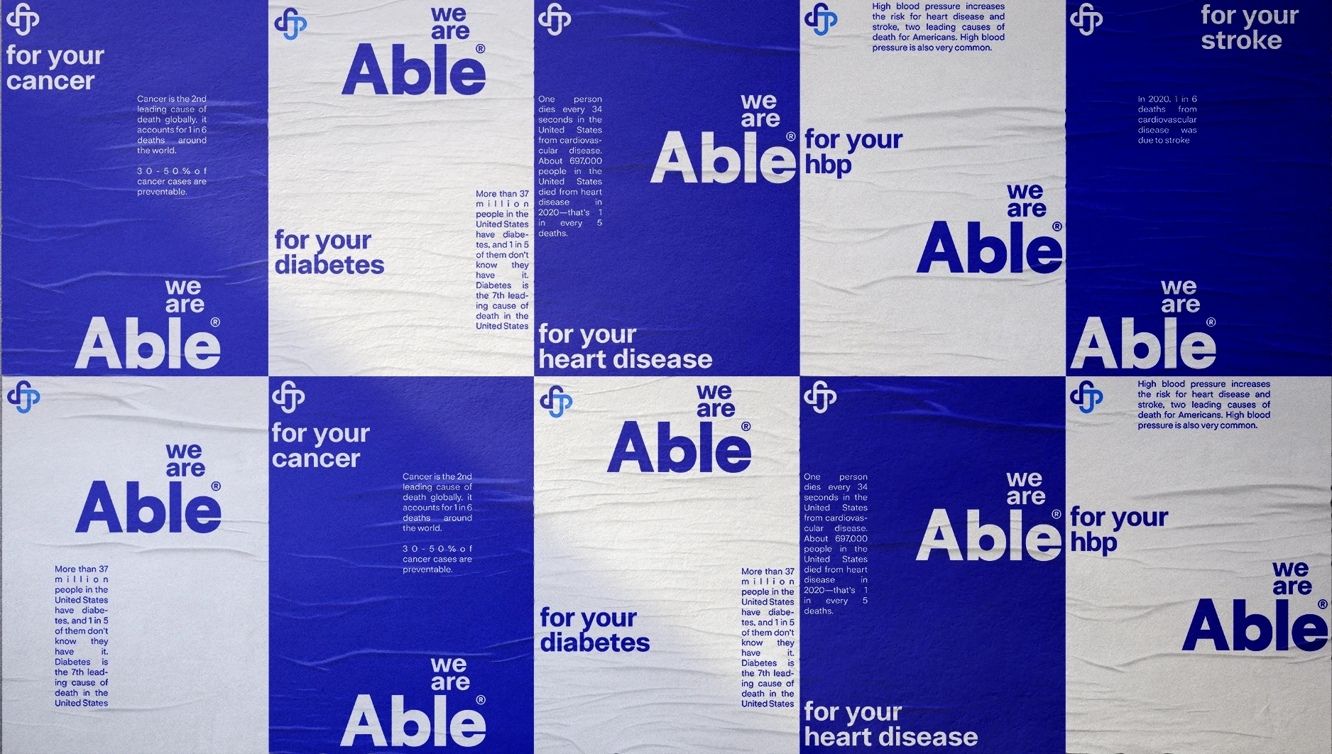
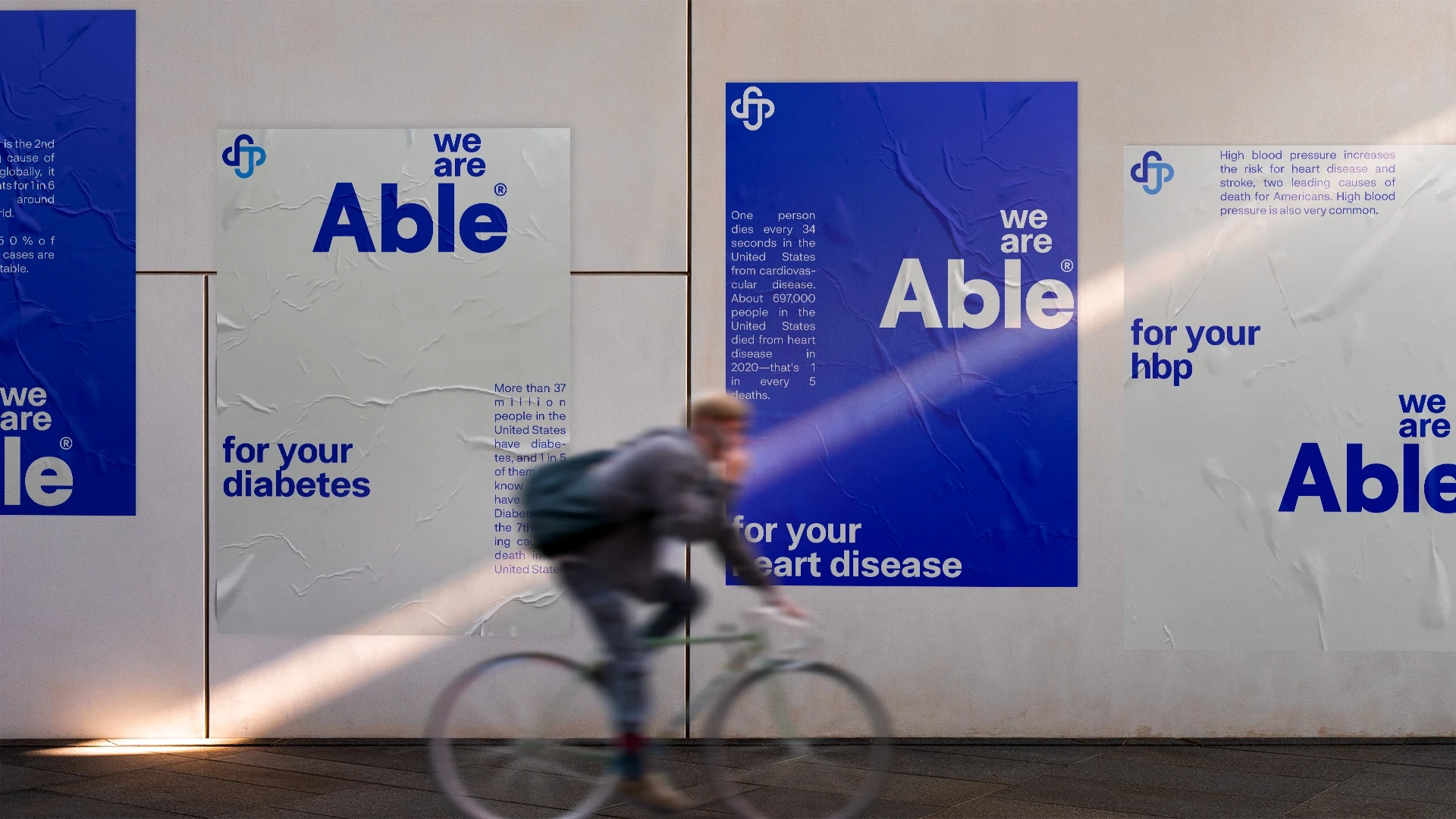
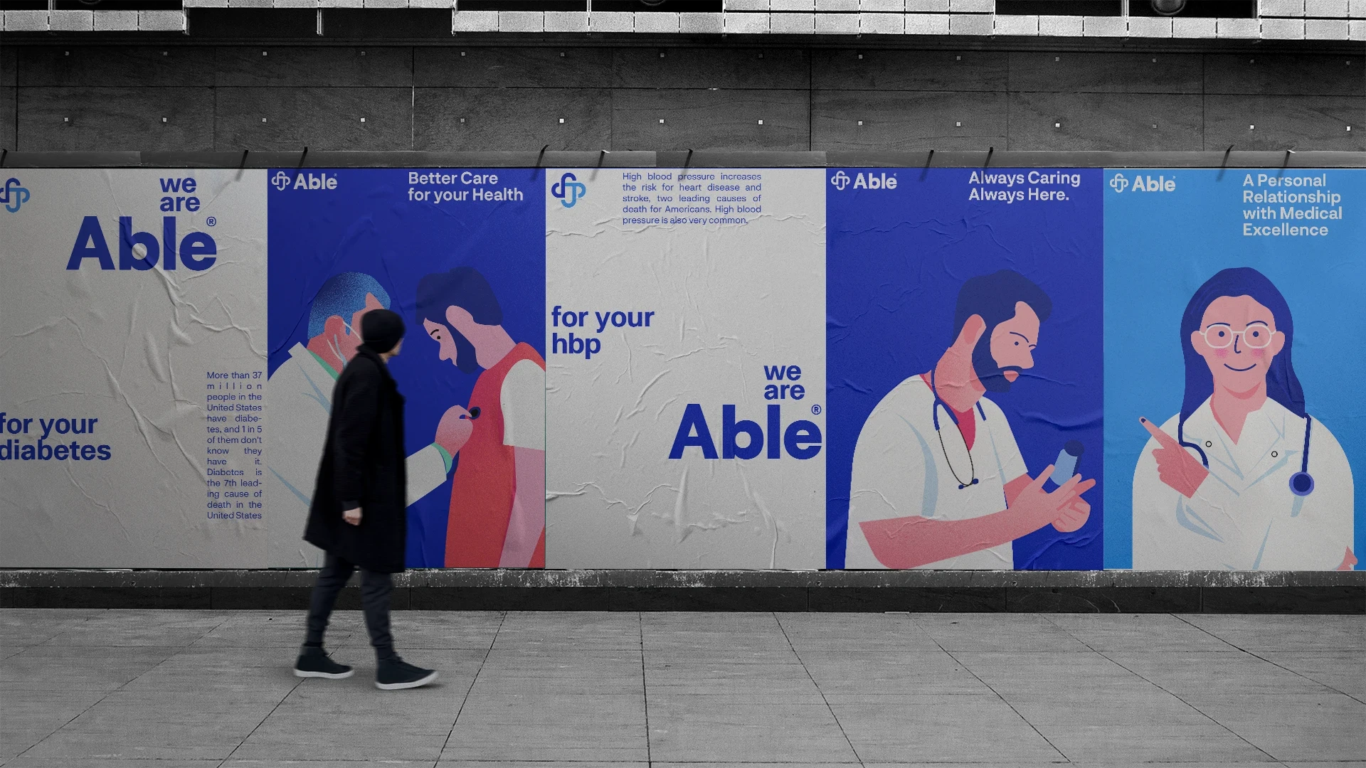
Complementing the charm & relevance of the name "Able" was a beautiful tagline, "We are Able". This perfectly captured the essence of their purpose & set strong foundations for the narrative used throughout the identity.
A New Star is born!
Brand Design
Brand Design
Brand Design
Brand Design
Brand Design
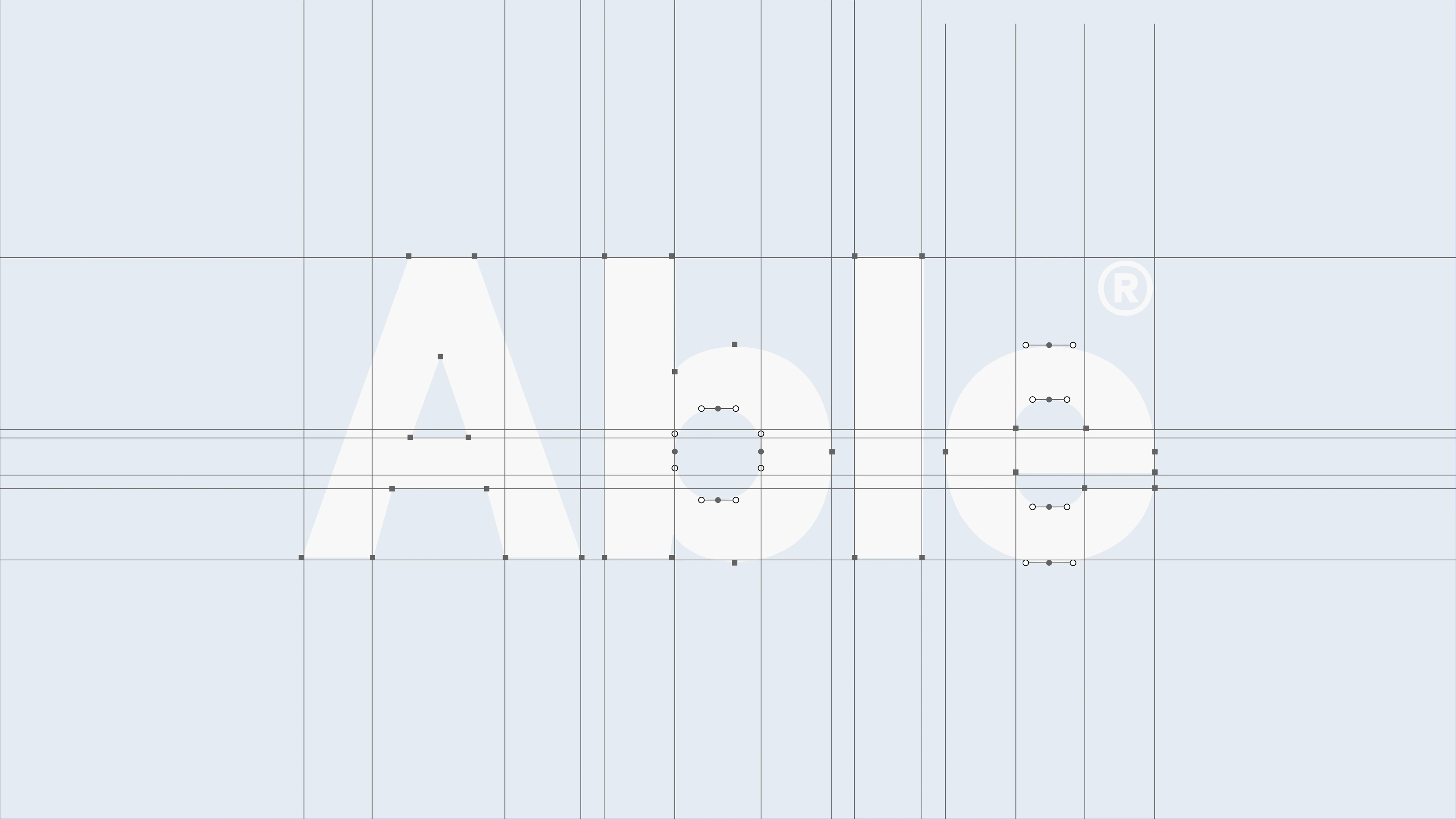
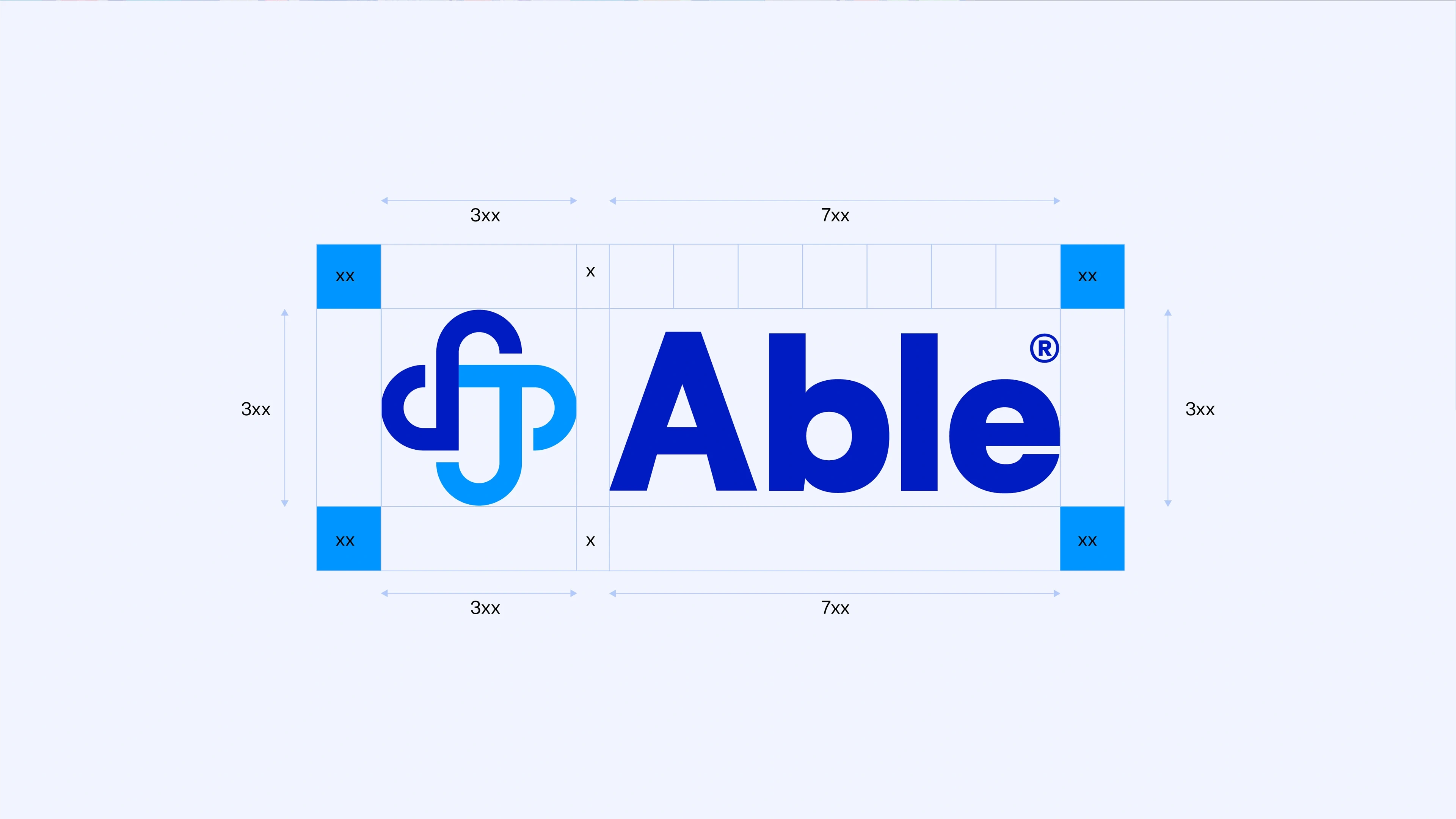
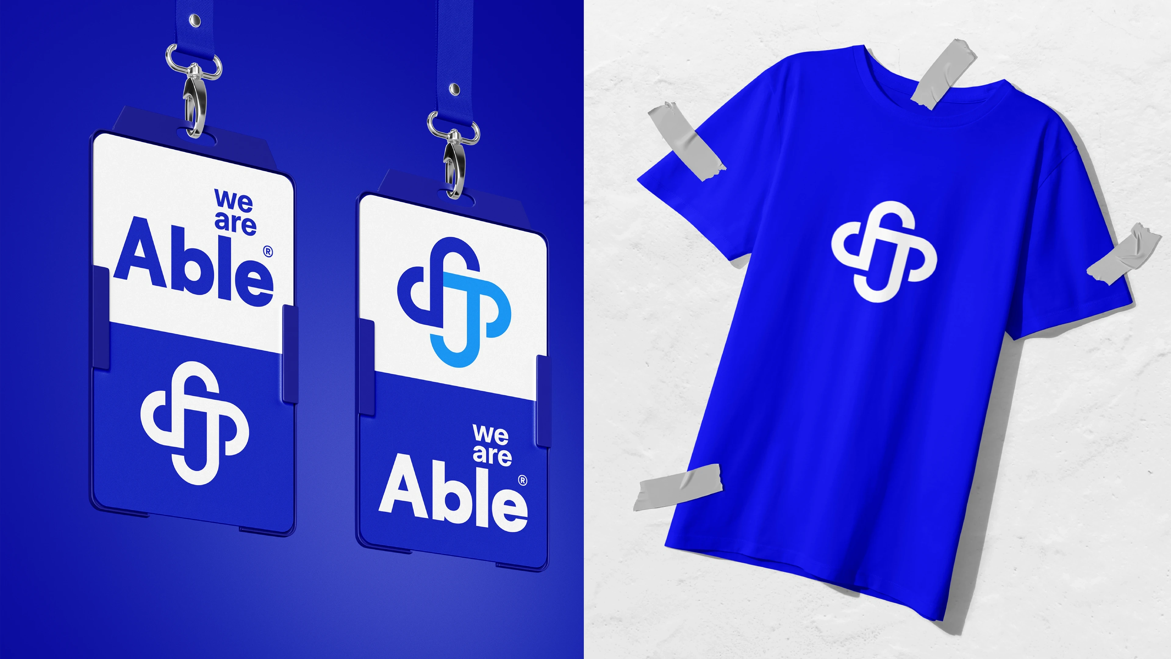
Logo Design
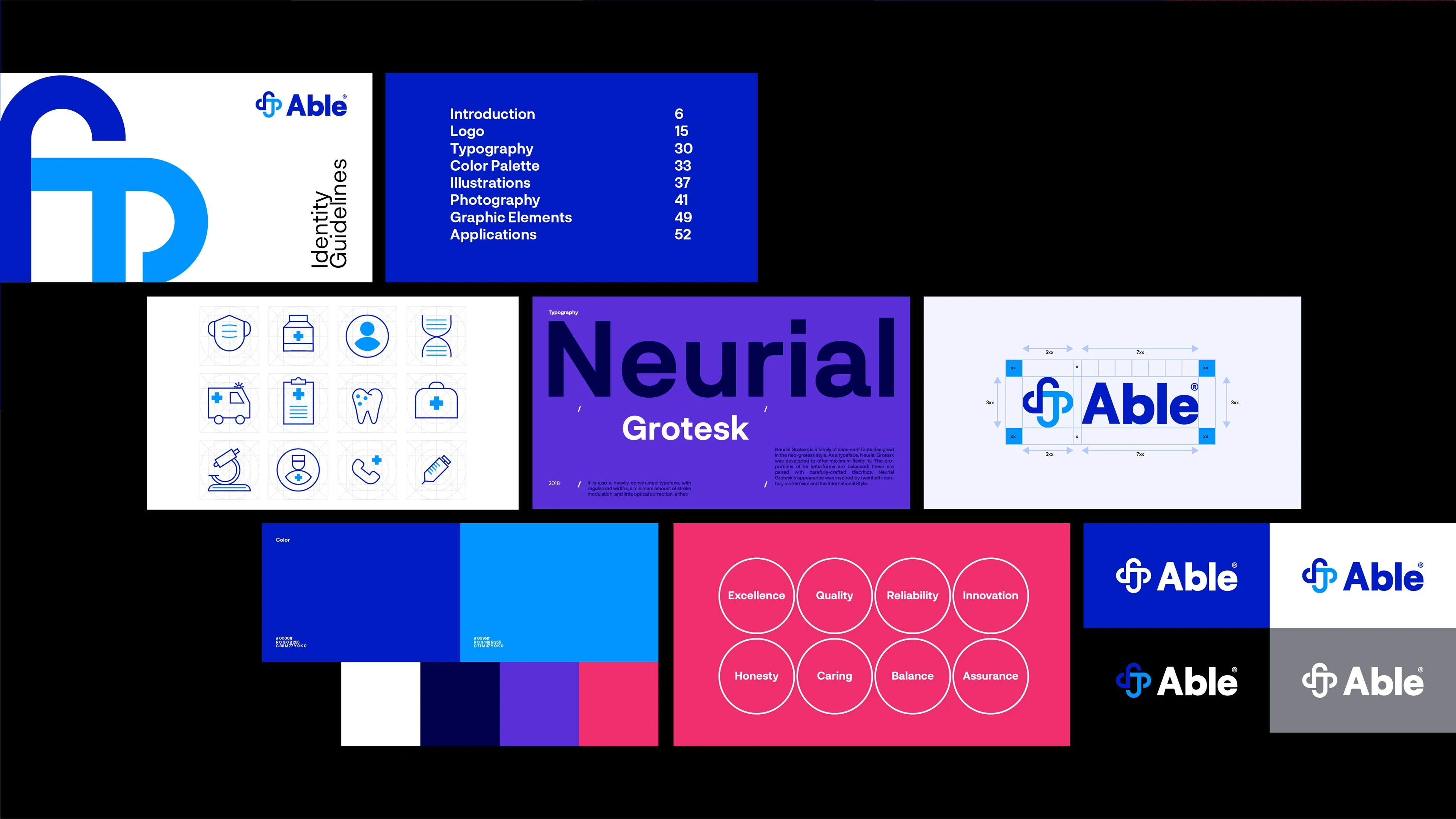
Brand Guidelines
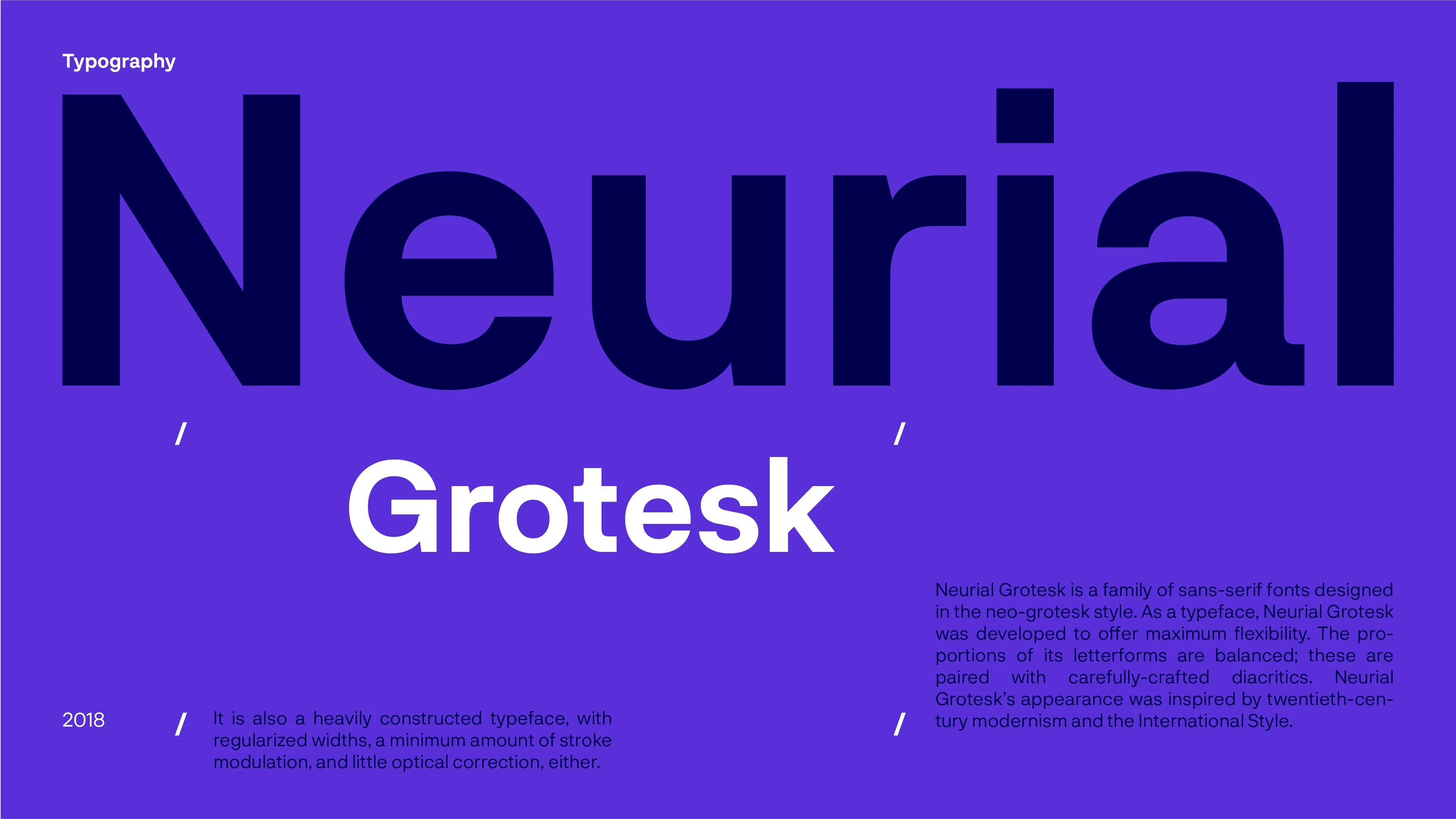
Typography
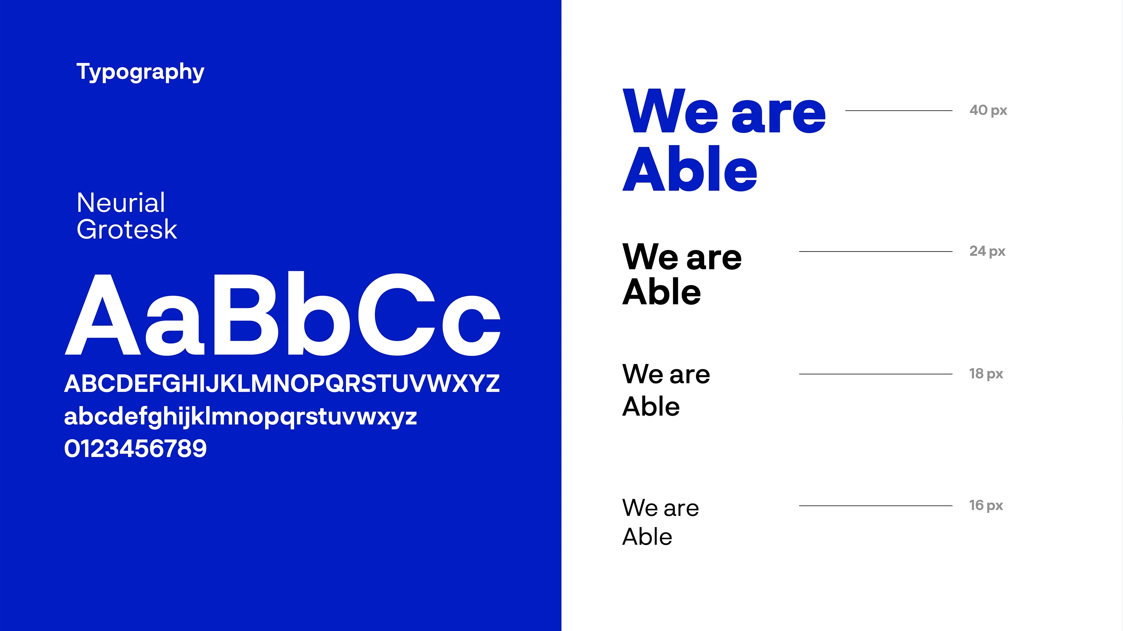
Typography
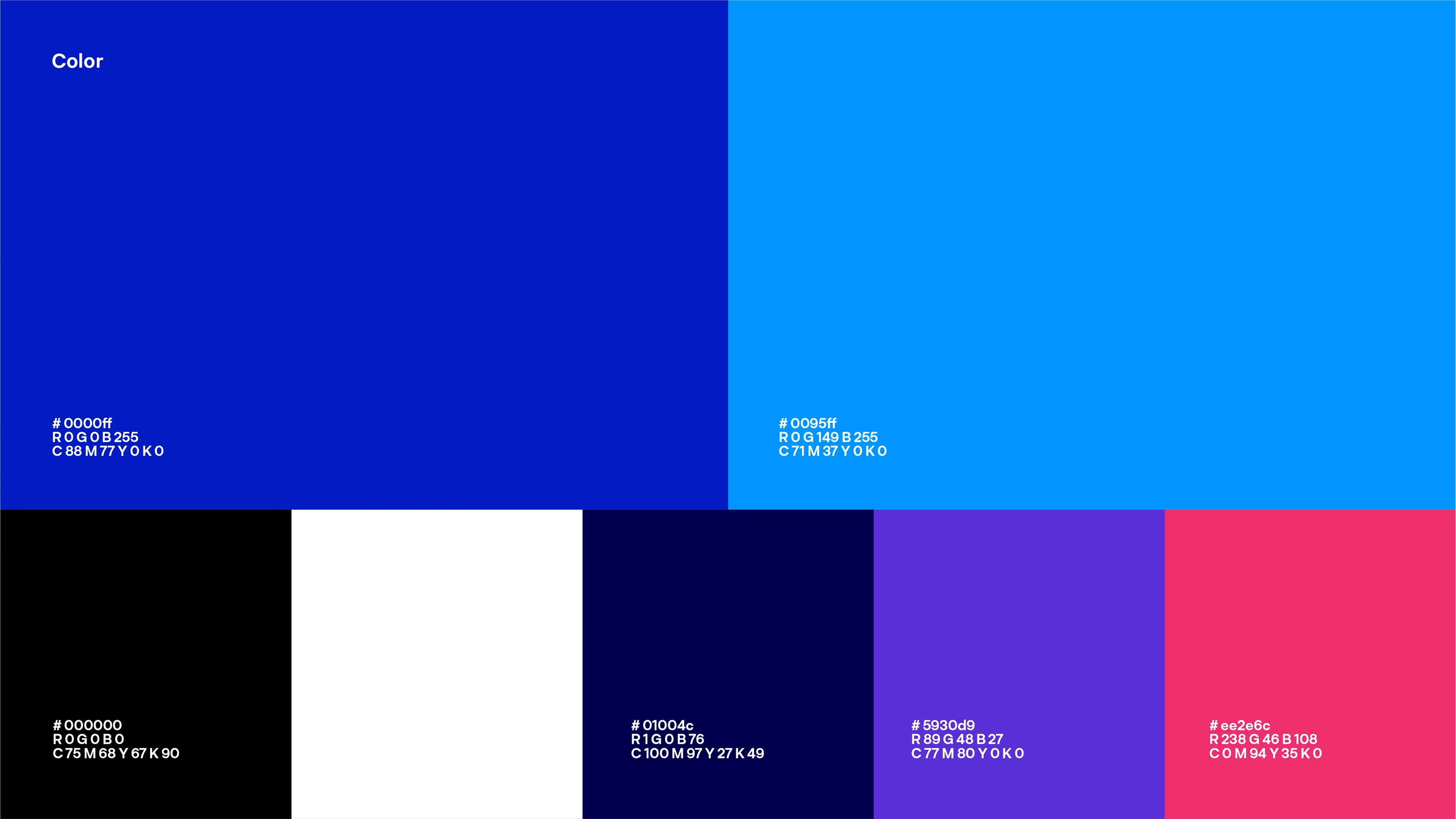
Colors
Icon Design
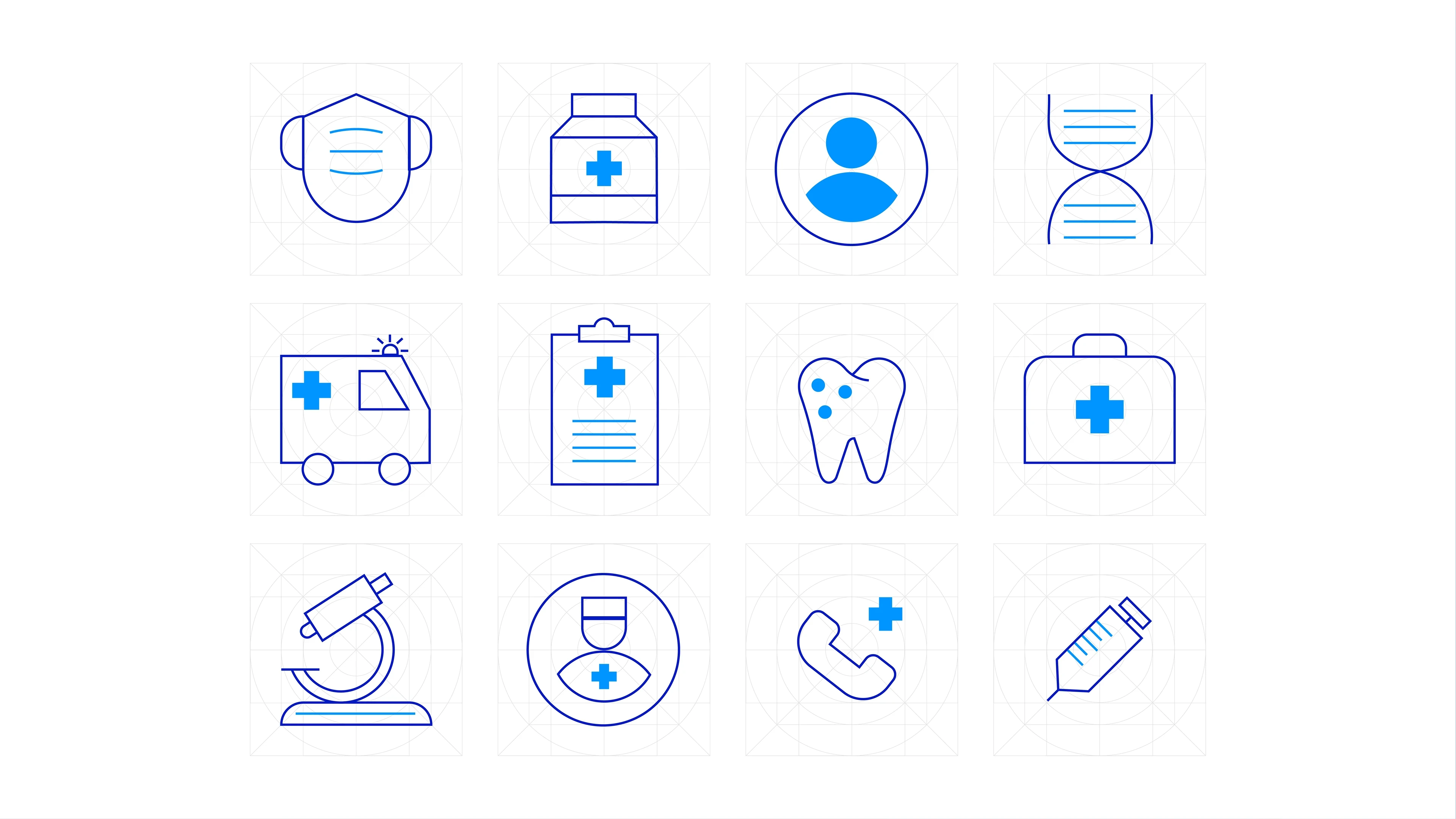
Icon Design

Icon Design
Brand Design
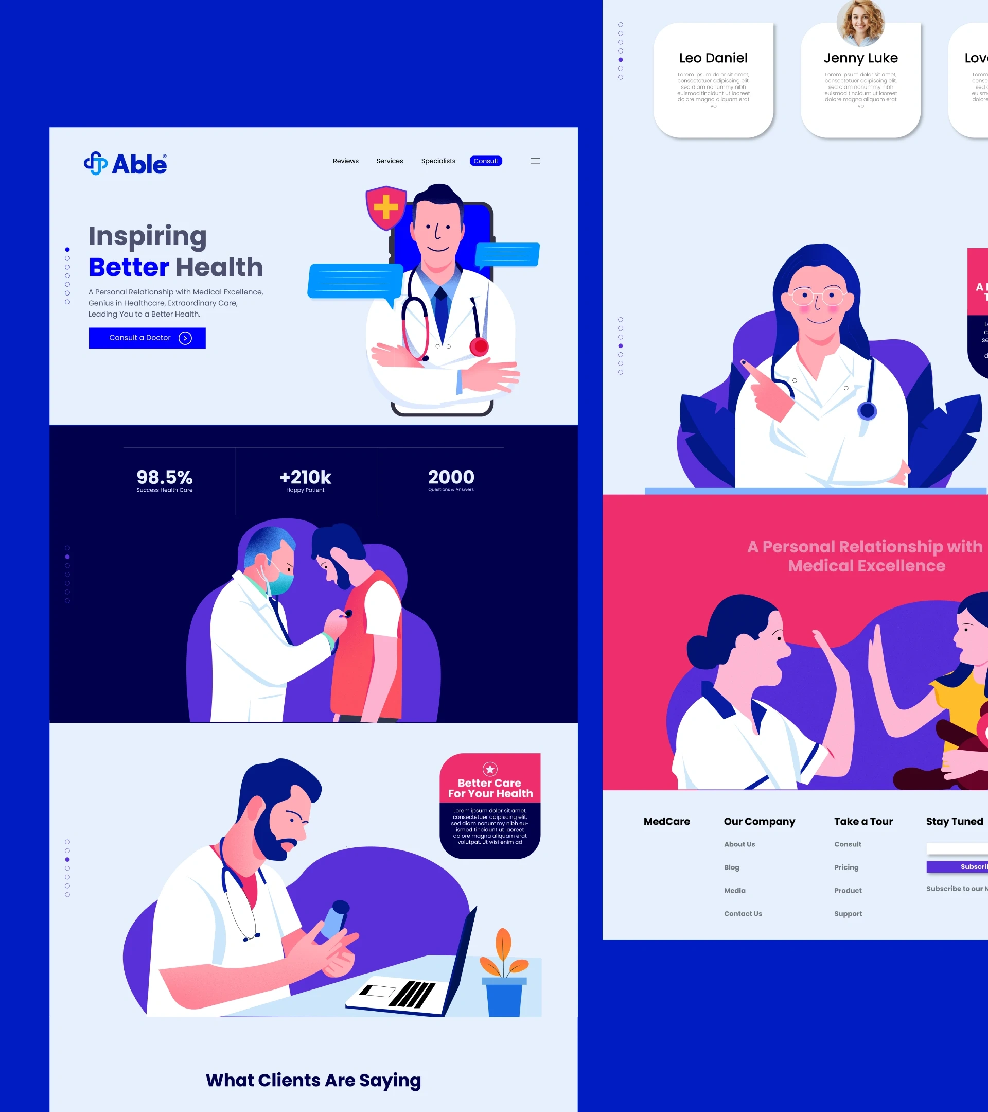
Web Design
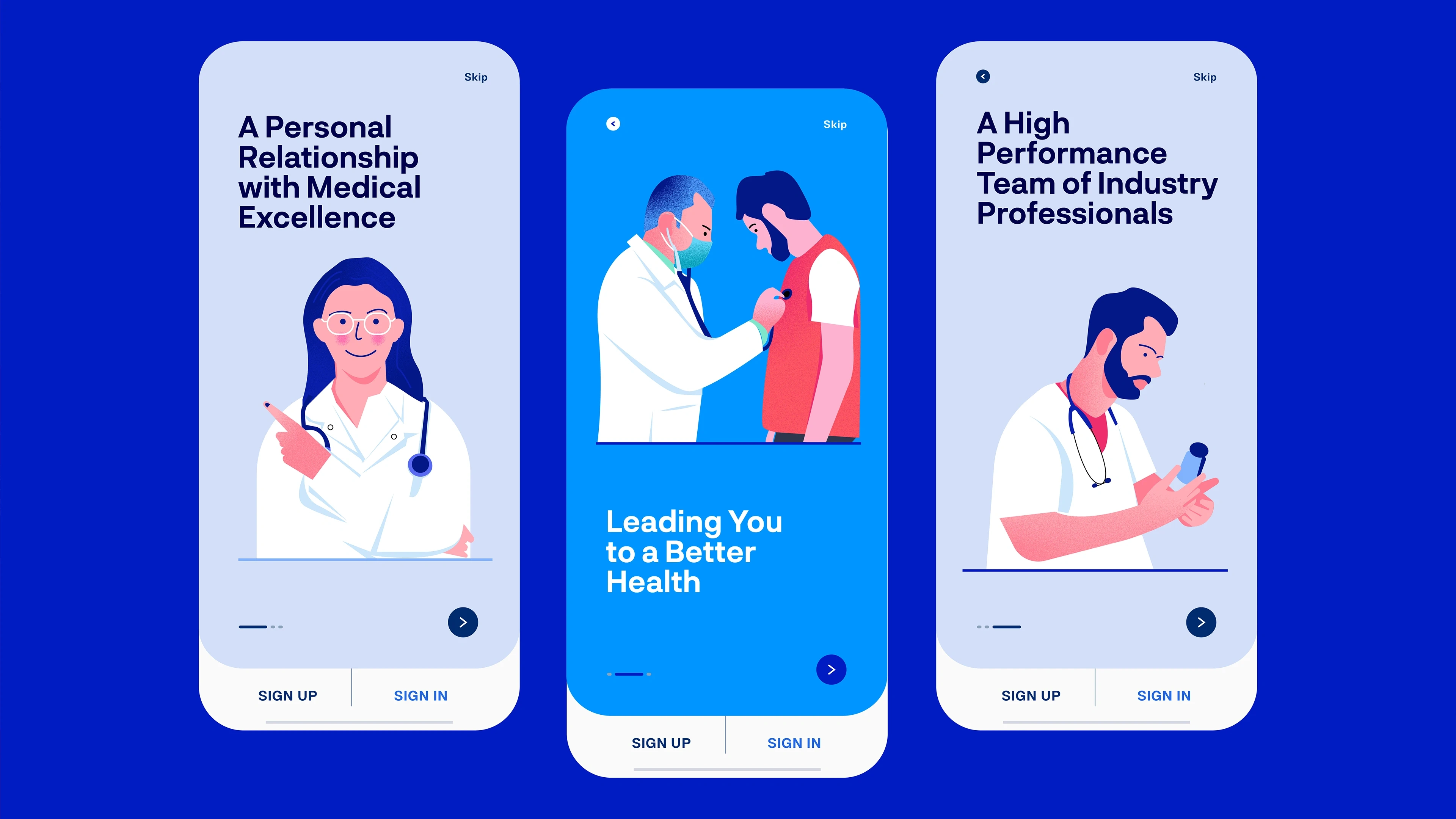
App Design
Brand Design
Brand Design

Brand Design
Brand Design
Brand Design
Brand Design
Brand Design
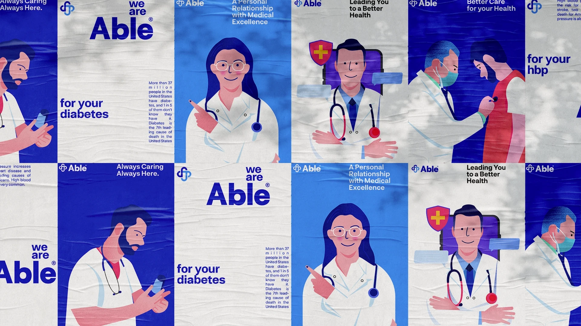
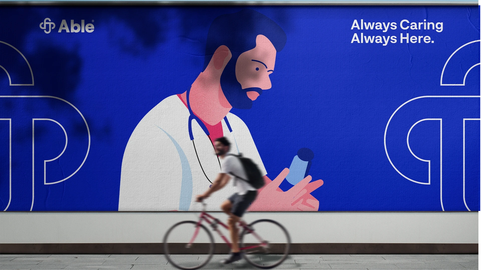
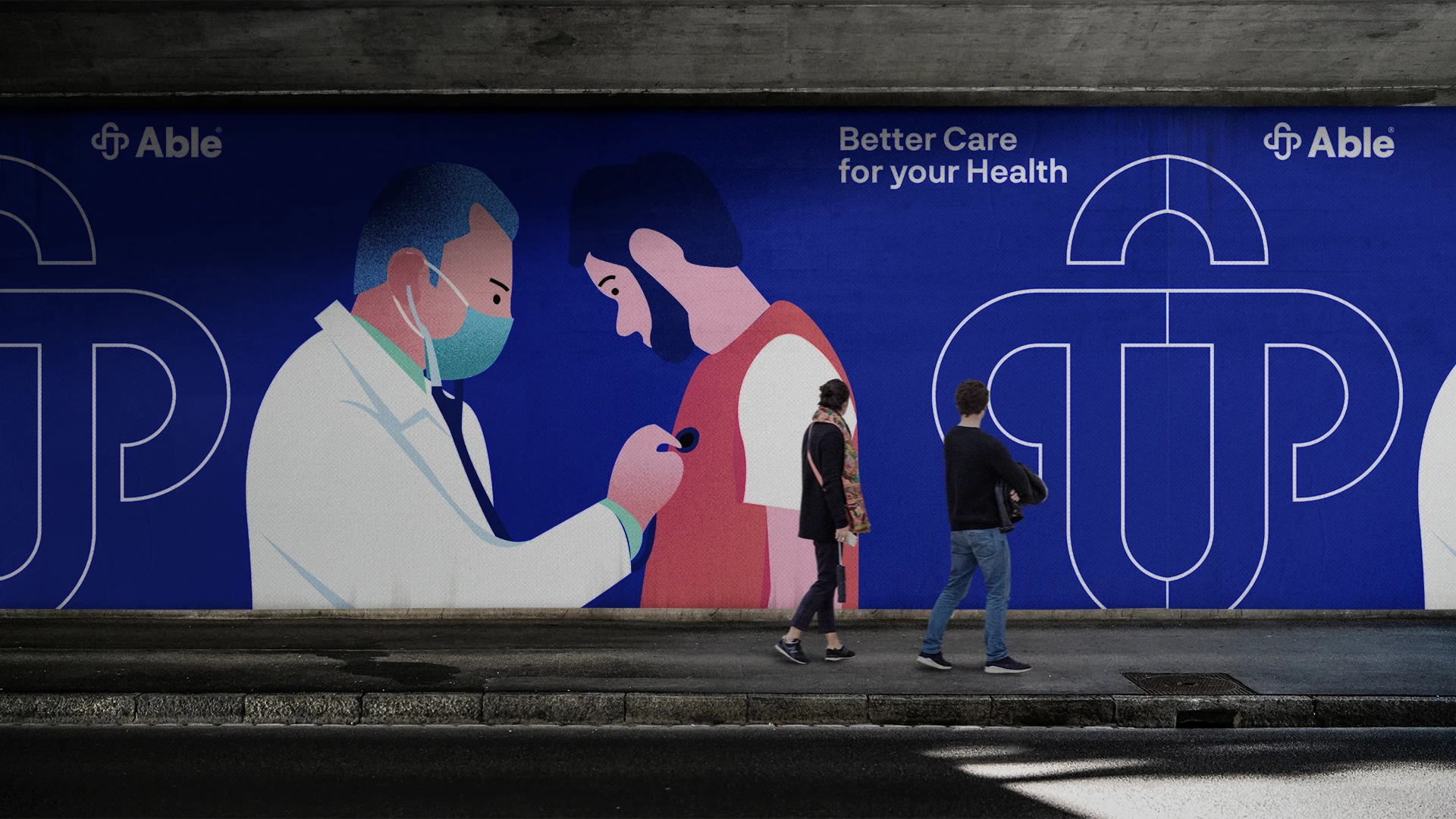
Illustration
Brand Design
Brand Design
Brand Design
Brand Design
Brand Design
Brand Design
Brand Design
Results
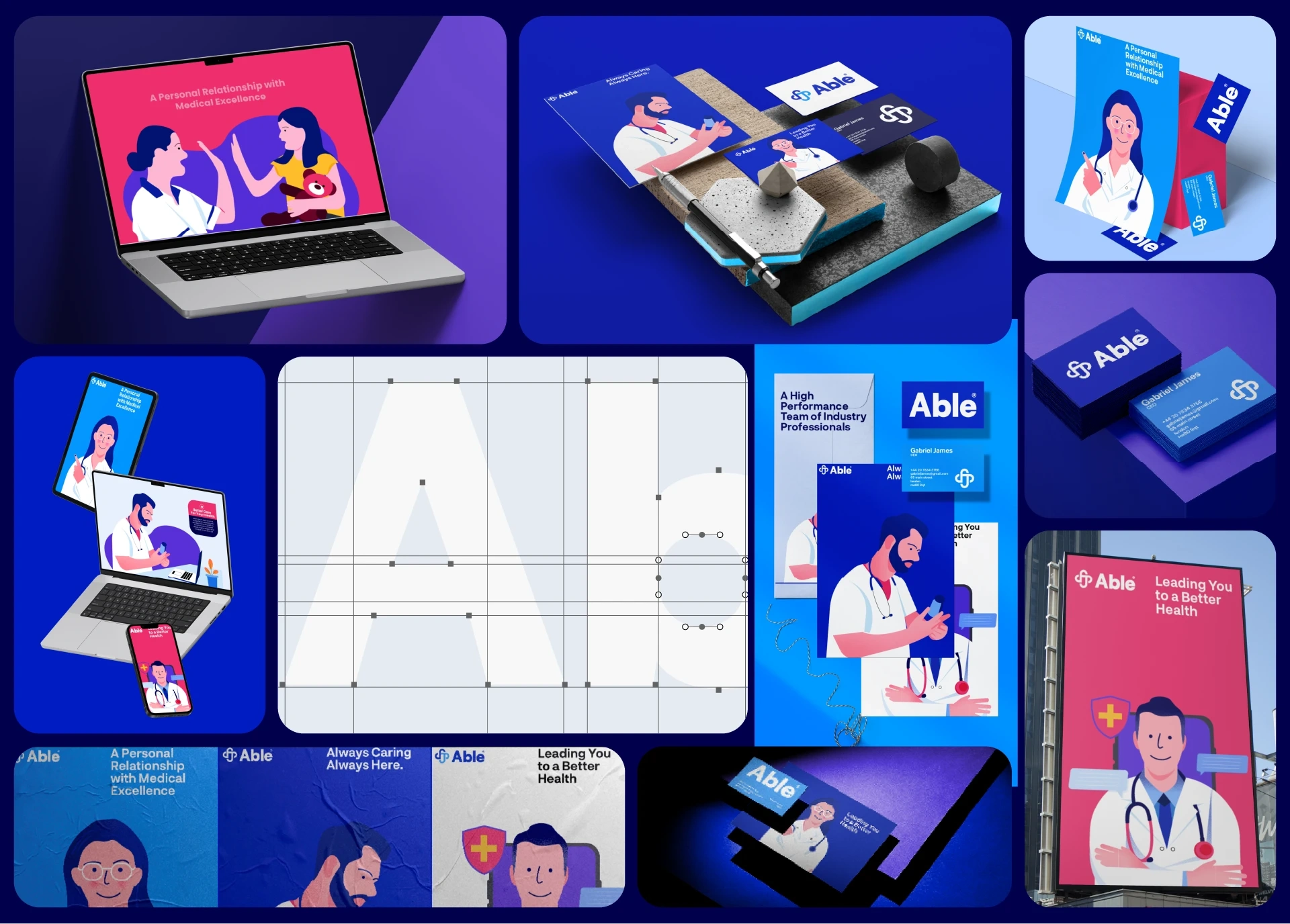
Able's brand identity seamlessly combines the elements of medical expertise, innovation, empathy, and empowerment. The logo's integration of a medical cross, capsule, and heart symbolizes Able's commitment to cutting-edge medical care with compassion at its core. The tagline "We are Able" becomes a driving force behind the brand's narrative, campaign advertising, and messaging. With consistent stationery, flat medical illustrations, typography, color palette, and icon design, Able presents a unified and impactful brand identity that resonates with patients, healthcare professionals, and stakeholders alike.
Like this project
Posted Sep 22, 2025
I developed a modern visual identity for Able’s rebrand in healthcare, aligning design with its mission to innovate and build trust in the medical space.
Likes
0
Views
6
Clients
Able