Pocket Properties - Landing Page

Introduction & Objective
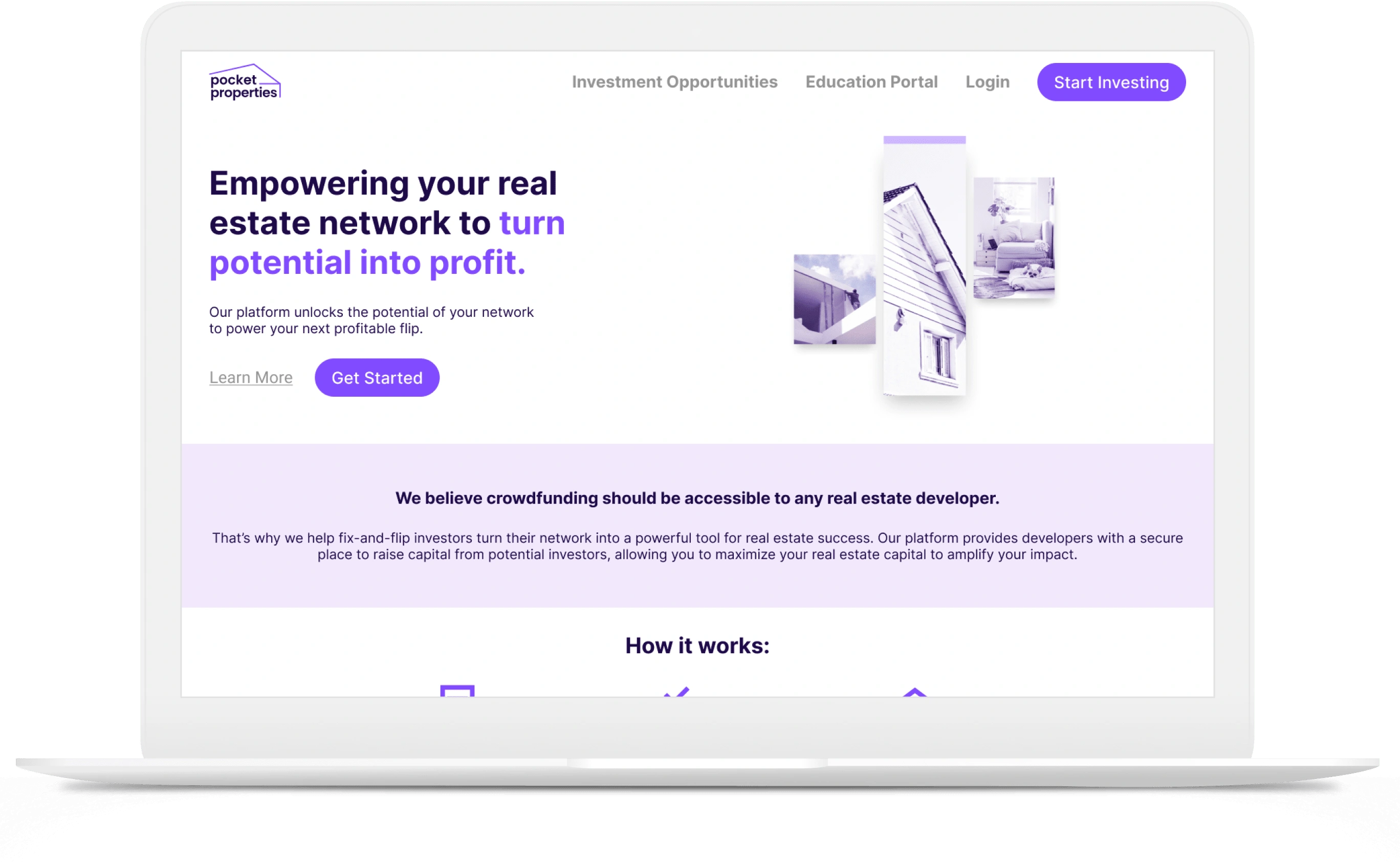
Real estate investment startup Pocket Properties tasked me with crafting a landing page that would provide potential users with an overview of the platform, its value to users, and how to get started on the platform.
Defining the Audience
Target audience: Experienced real estate developers with small or midsized portfolios looking to scale their operations and investments.
Challenges: Targeting an audience with an existing level of experience and success gives way for a need to effectively convey the platform's value directly to users.
Opportunity: Establish the primary focus of the page on conveying the value of the platform to users and give a singular call to action to engage potential investors.
Strategy
Research and inspiration: To ensure the landing page effectively resonated with our target audience of small real estate developers, I conducted thorough research, drawing inspiration from successful platforms with similar goals.
Positioning and platform: The messaging strategy centered on positioning the platform as an accelerator for existing capital, emphasizing the value of leveraging one’s network to raise additional funds. I crafted a clear, compelling narrative that highlighted the platform’s unique benefits, ensuring the copy was both informative and persuasive, while guiding users through a seamless conversion process.
User Journey

Page Structure & Wireframes
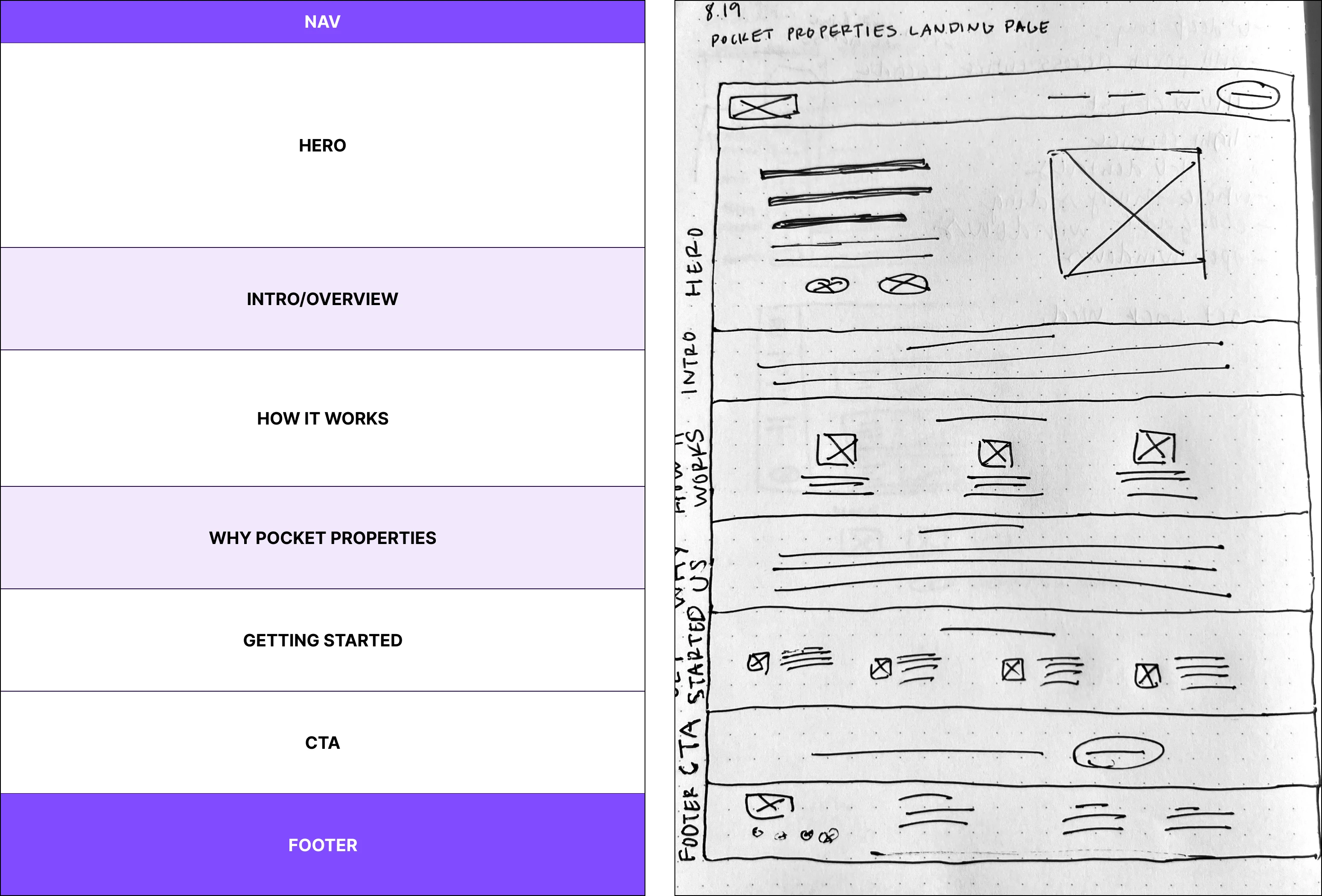
The page structure and wireframing were meticulously designed to align with the user journey, guiding potential investors from initial interest to action. Each section of the landing page was strategically placed to build trust, starting with an engaging hero section, followed by a clear explanation of the platform’s value, and culminating in a strong call to action. The wireframe ensured a smooth, intuitive flow, making it easy for users to understand the process and take the next step—filling out the interest form.

User testing & Refinement
User testing was integral to refining the landing page, ensuring it met the needs of our target audience. Through A/B testing and feedback loops, we identified areas for improvement in messaging clarity, visual design, and call-to-action effectiveness. These insights led to iterative refinements, optimizing the page for better user engagement and higher conversion rates.
Implementation & Results
The finished landing page was exported from Figma and successfully handed off to the team's software engineer to integrate it into their existing website.

Like this project
Posted Aug 20, 2024
Created a landing page for a real estate investment platform, with a strategic user journey geared toward the target audience to convert interest into action.


