Photo Manipulation on Fast Fashion's Human Toll
Apollo Spencer
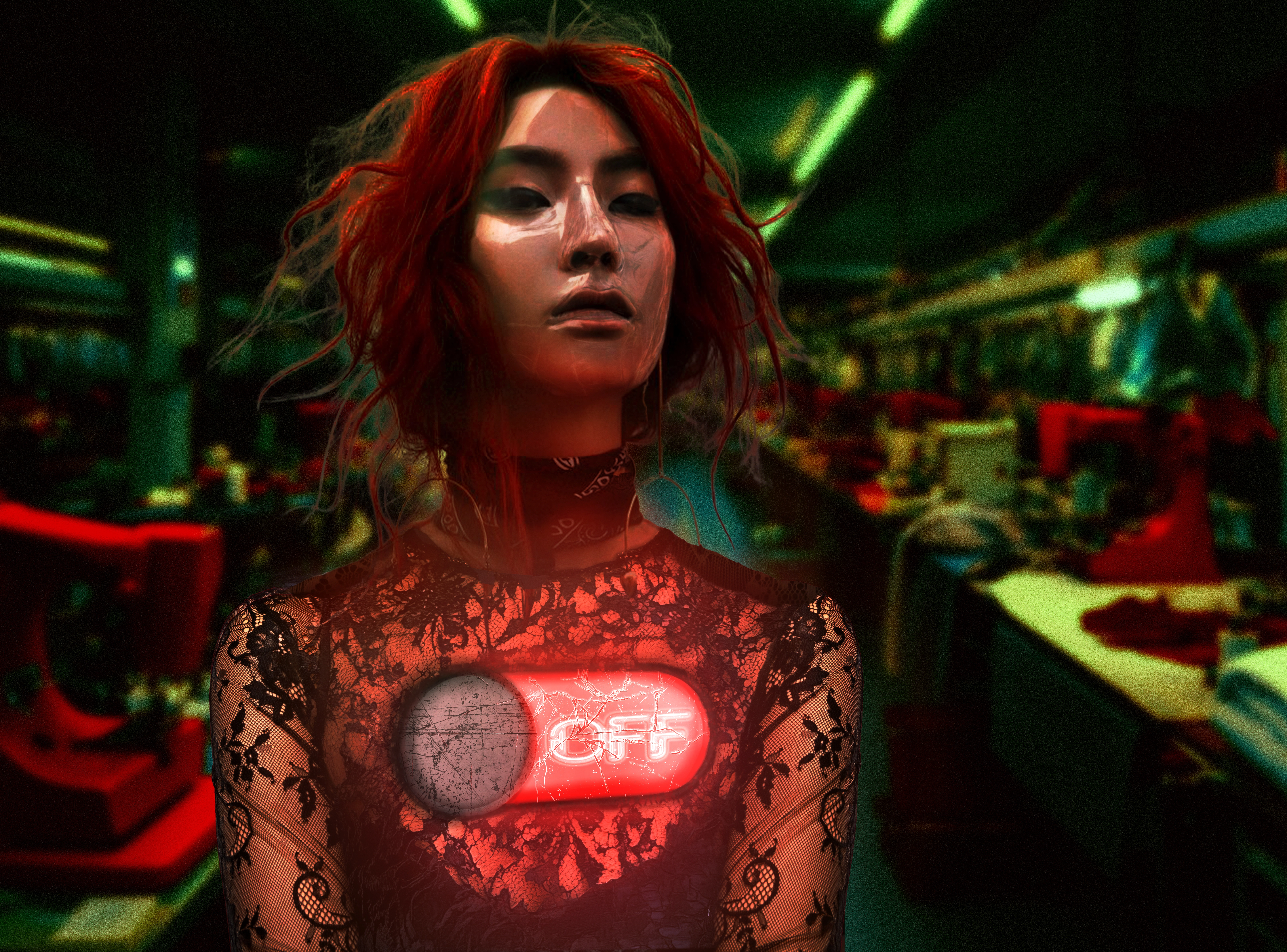
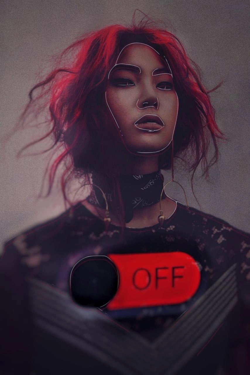
This photo manipulation explores the human toll of hyper-consumerism. The concept was to create an image that showed fast fashion from the perspective of the people expected to produce large quantities of clothes in exchange for pennies, often under impossible deadlines and inhumane conditions. The client's main concept was to design a woman with an 'off' button on her chest and edits on her face that made her appear less human. Their rationale was that it symbolised the automated nature with which we regarded these individuals' labour.
Earlier iterations
Development
Conceptualisation
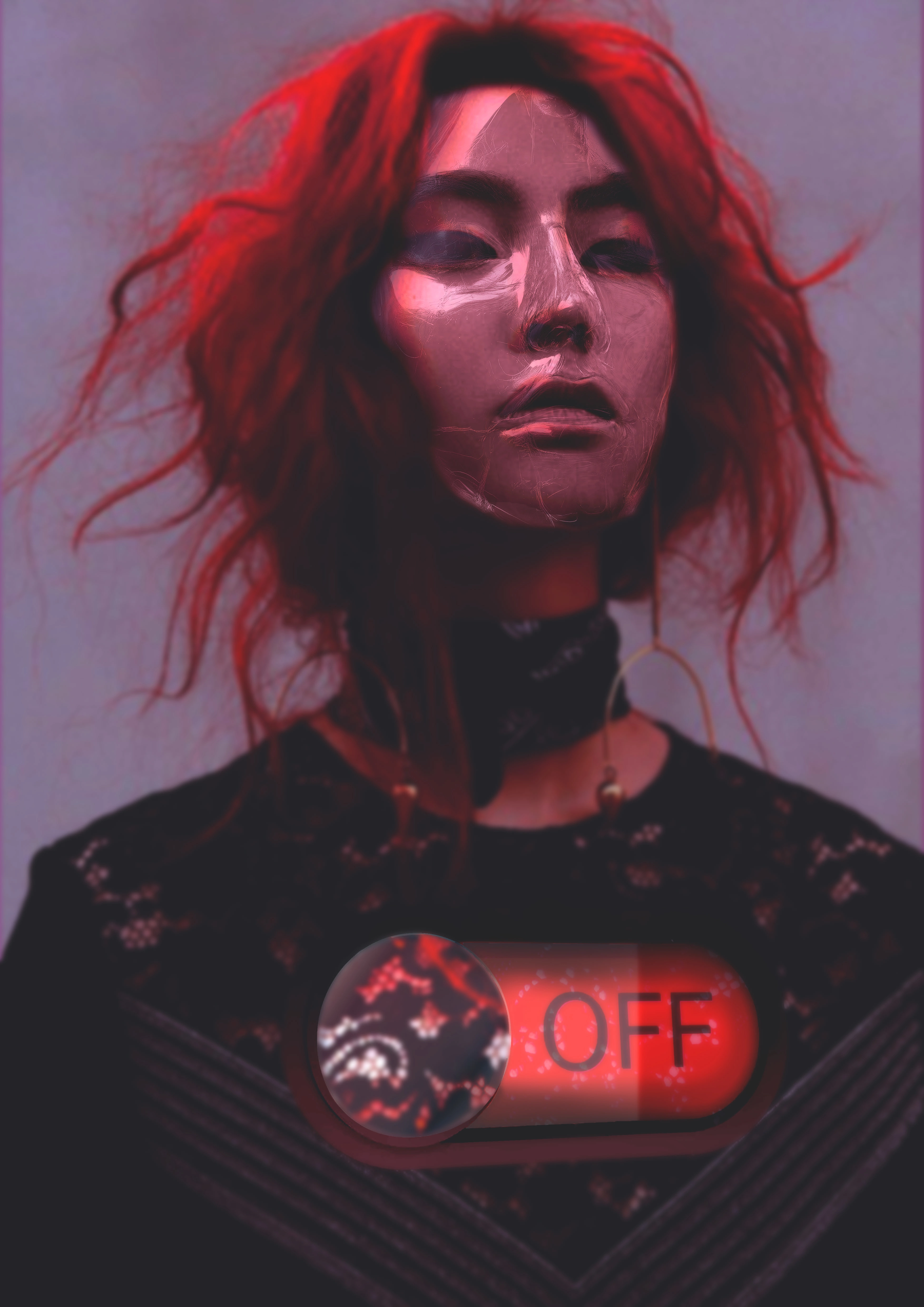
The first and second iterations of the design stayed very close to the brief, with the second iteration attempting only to improve upon the off button and plastic texture we had settled on for her face. For the final version, the client felt the background could be utilised more to tell the story. In addition, they asked for the button to appear more 'worn' to show overuse and to have similar textures to an iphone's slide switch. To accommodate their requests, I worked on the button specifically, and added a broken glass texture and a worn-in metallic switch to symbolise the overuse. The main challenge was making the button look like it was part of the chest and skin. To do this, I had to replace most of the torso and composite two other stock images to achieve a believable lace dress effect that mirrored the original image. I also incorporated a textile factory into the background and made the colours harsh and fluorescent to symbolise the harsh working conditions.
Like this project
Posted Jul 24, 2025
Created a photo manipulation highlighting fast fashion's human toll.
Likes
0
Views
6