
Two letters. One bold identity.
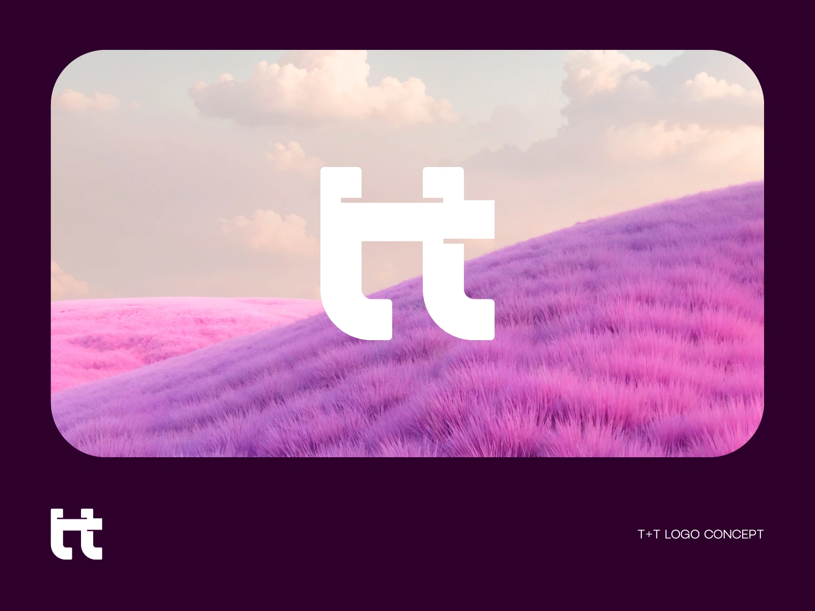
A T+T monogram logo concept built around simplicity, balance, and connection.
By merging two T’s into one distinctive symbol, the mark creates a clean and memorable visual identity. Minimal form.
Maximum recognition. What do you see first—two T’s or one symbol?
0 likes · 9 views · Jul 20, 2026
Two letters. One bold identity. A T+T monogram logo concept built around simplicity, balance, and connection. By merging two T’s into one distinctive symbol,...
