
Premium Golf Brand Identity
Project Overview,
The client approached me with the idea of creating a premium, modern, and professional golf brand called “DrGolf.” The main requirement was to build a visual identity that would immediately communicate golf, precision, confidence, professionalism, and a premium lifestyle.
The client did not want the brand to look like a typical golf club or generic sports company. They wanted something that could work across digital platforms, mobile applications, golf apparel, business materials, accessories, and physical golf environments.
The overall goal was to create a brand that feels luxurious enough for a professional golf audience but modern and approachable enough for a younger generation of golfers.
( My Design Approach )
I started the project by focusing on one important question:
How can DrGolf be instantly recognized as a golf brand without relying on a complicated illustration?
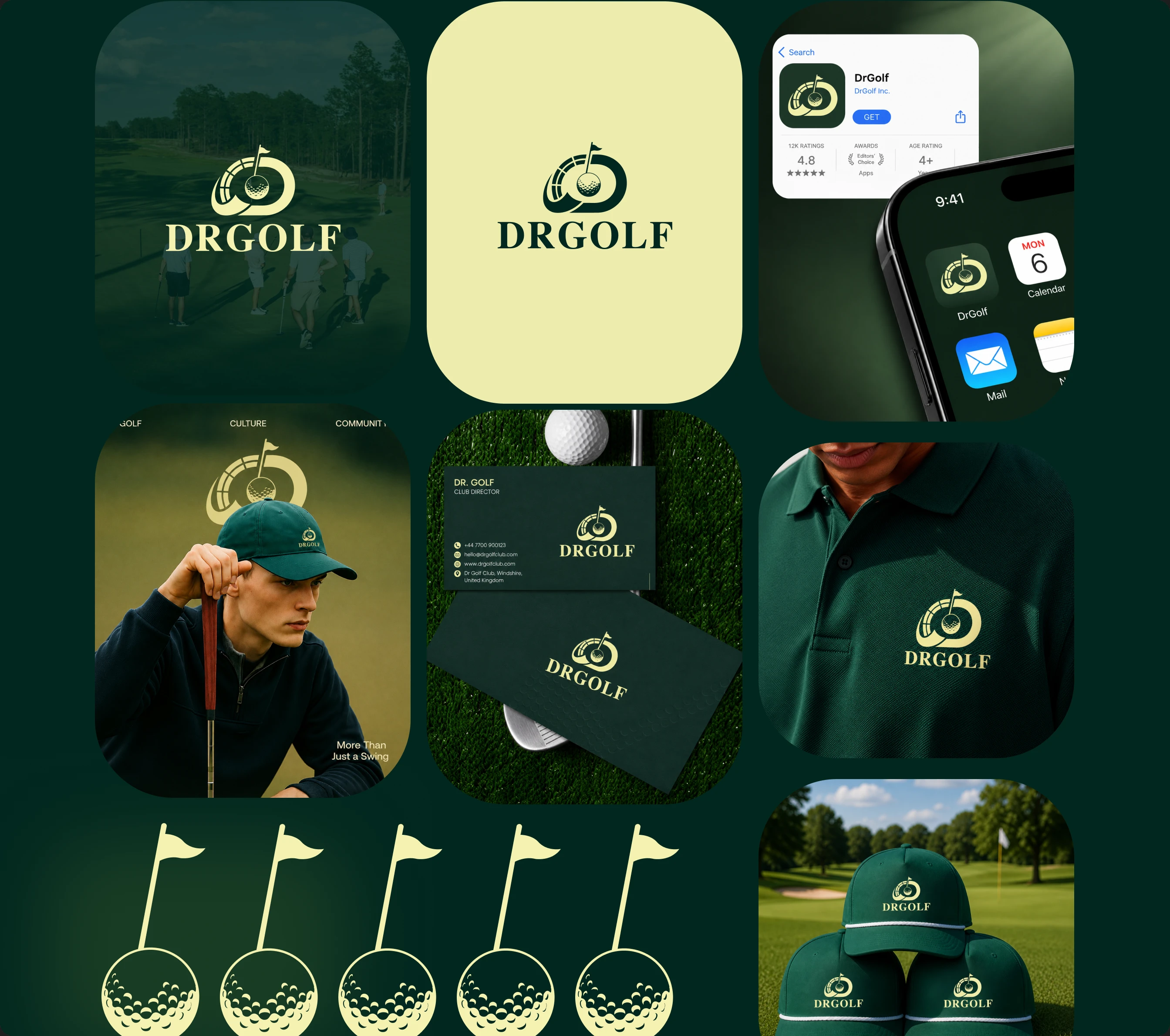
Instead of creating a traditional golf logo using only a golf ball, golf club, or golfer silhouette, I developed a more distinctive symbol that combines golf-related visual elements with a strong circular/emblem structure.
The idea was to create an icon that could work independently from the wordmark.
This was especially important because DrGolf was intended to have a mobile application. The logo therefore needed to remain recognizable even when it was displayed at a very small size, such as an app icon.
( Typography )
For the wordmark, I used a bold and classic serif-inspired typography style. The main purpose of this typography was to create a perfect balance between traditional golf culture and modern premium branding.
Golf has a long history and a strong sense of tradition, so choosing a classic typographic direction gives the DrGolf brand an established, trustworthy, and sophisticated feel.
At the same time, the clean and simple construction of the logo keeps the typography from feeling old-fashioned. This allows the brand to maintain its traditional character while still appearing modern, fresh, and relevant.
The final typography creates a visual identity that feels both classic and contemporary, while strongly supporting DrGolf’s premium brand positioning.
( Brand Application on Apparel )
After developing the core brand identity, I applied the branding to realistic golf apparel to evaluate how the DrGolf identity would look in a real professional golf environment.
I placed the DrGolf logo on a dark green polo shirt. The dark green color complements the overall brand identity perfectly while giving the apparel a premium, professional, and sophisticated appearance.
The logo was placed on the chest in a small embroidered-style treatment, creating a clean, subtle, and refined look. The goal was to make the logo noticeable without making the apparel feel overly crowded or visually heavy.
Using the same logo system, I also created branded golf caps to ensure that the brand identity remained consistent across different types of golf merchandise.
My main objective was to make the DrGolf merchandise feel like more than just a design concept. I wanted it to look like realistic, professional golf apparel that could confidently be used by an actual golf club, golf academy, or premium golf company.
Thank you for taking the time to explore the DrGolf brand identity case study.
0 likes · 0 views · Aug 29, 2026
Premium Golf Brand Identity Project Overview, The client approached me with the idea of creating a premium, modern, and professional golf brand called “DrGo...

