The Winston (Brand Identity Design)
Rahul Kumar
Name: The Winston (Work In Progress)
Project Description: The Winston is a high-end luxury residential project, comprising of 4 BHK apartments of 8000 sq feet in size, located at Ambli Road behind Iscon Temple, Ahmedabad. The ticket size of an apartment is 7-8 crores. The budget of the project is 400 Crores.
The project aims to cater to highly affluent individuals who are looking to purchase rare and exclusive possessions.
Problem Statement: The project is facing a challenge of creating a strong brand identity that will appeal to the target audience and differentiate it from the competition in the luxury real estate market. The brand needs to communicate the exclusivity, sophistication, and luxury of the project to potential buyers.
Objective: The objective of this branding project is to create a strong, distinct, and compelling brand identity for The Winston that will appeal to the target audience and differentiate it from the competition. The brand should communicate the exclusivity, sophistication, and luxury of the project to potential buyers.
Scope: The scope of the project includes creating a brand name, logo, visual identity, brand guidelines, and messaging that accurately reflects the brand essence, purpose, and archetype of The Winston. This will involve conducting market research, developing a brand strategy, and creating visual assets such as a logo, color palette, typography, and imagery. The branding will be applied to all marketing and communication materials, including the website, brochures, billboards, and social media platforms.
Brand essence: "There's nothing like this"
Purpose: "Bringing the rarest".
Delivery
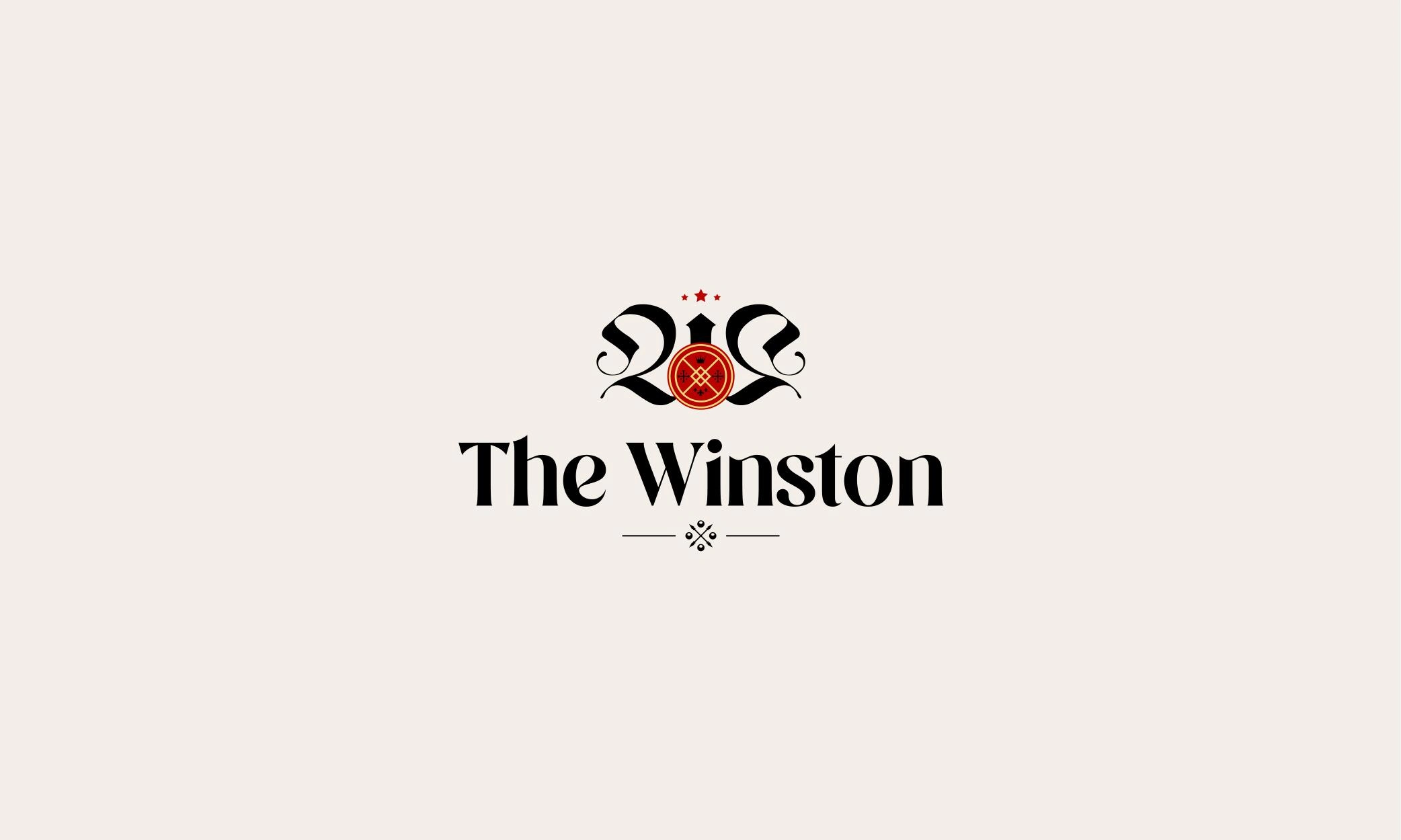
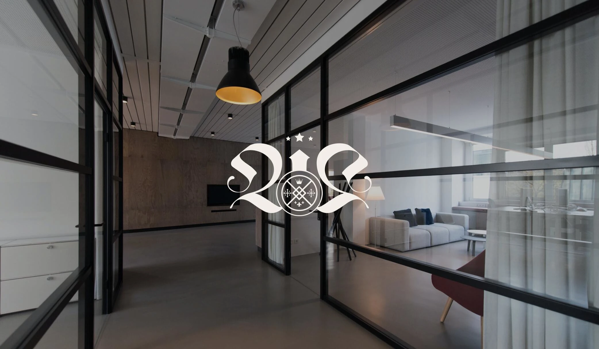
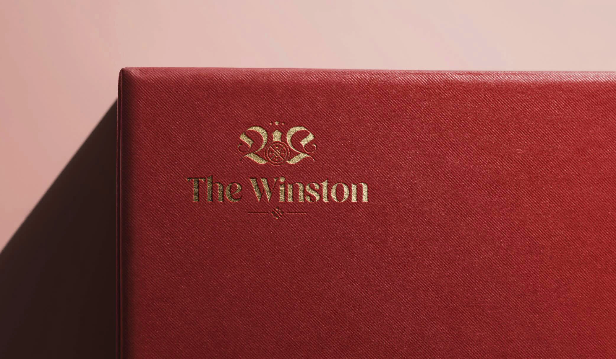
The logo of The Winston, set on a cream background. The logo is a combination of a geometrical emblem and logotype, which evokes the architectural ambience of Art Deco and hints at the word "W" from Winston.
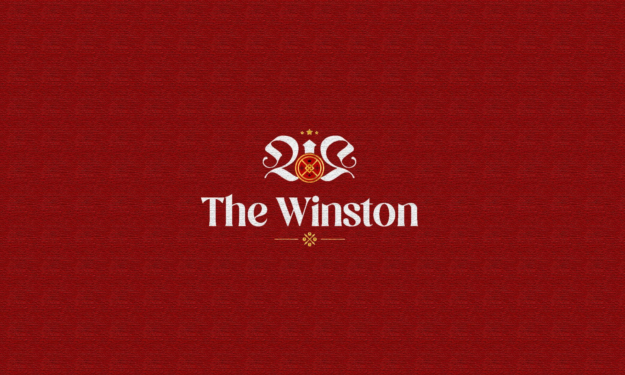
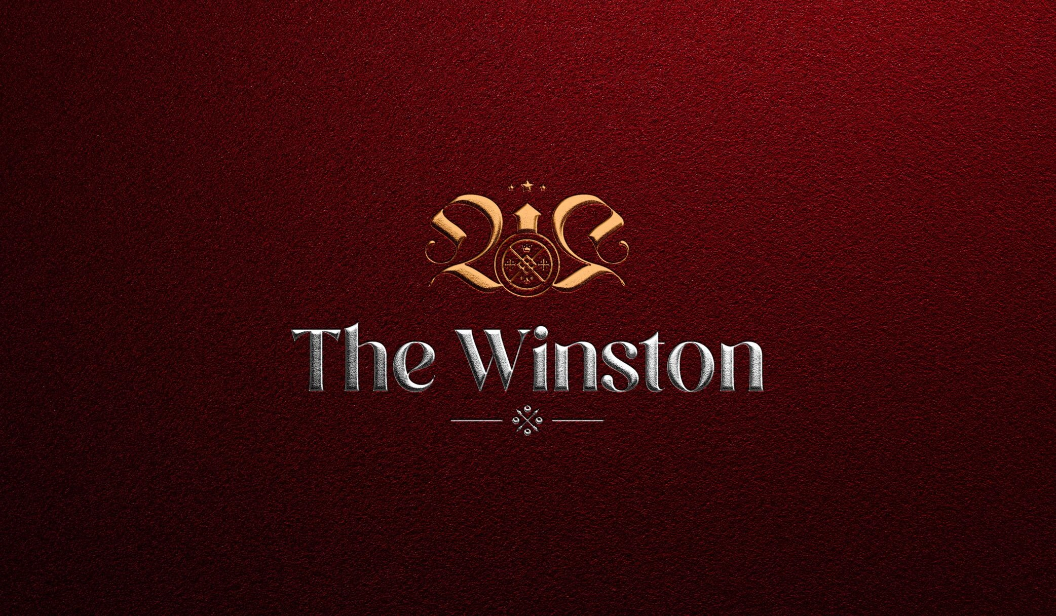
The same logo but on a Megan coloured background, which is one of the brand's main colors.
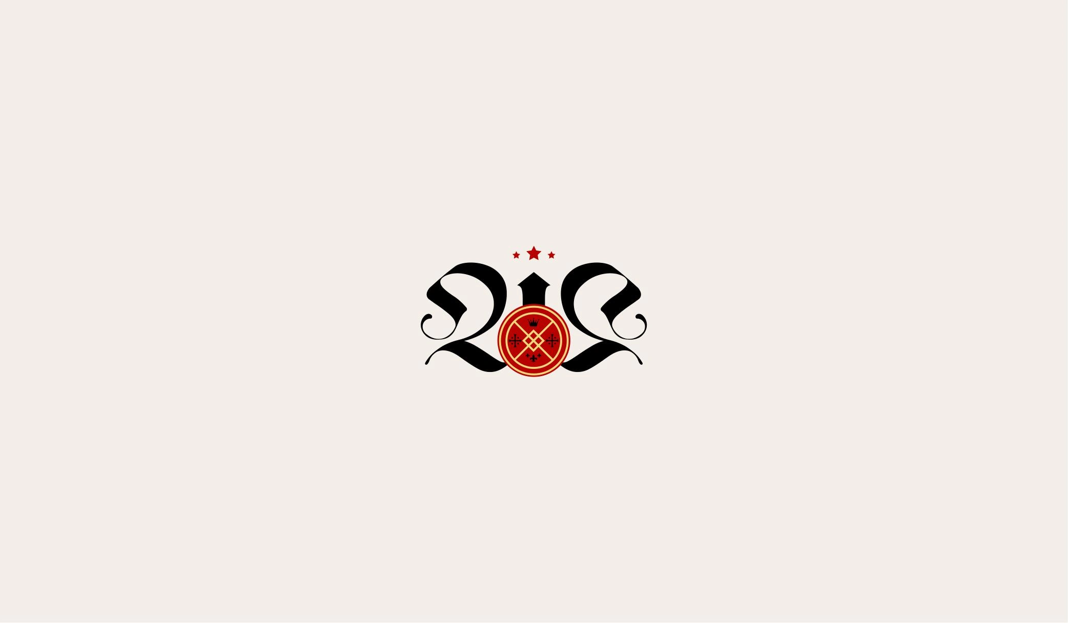
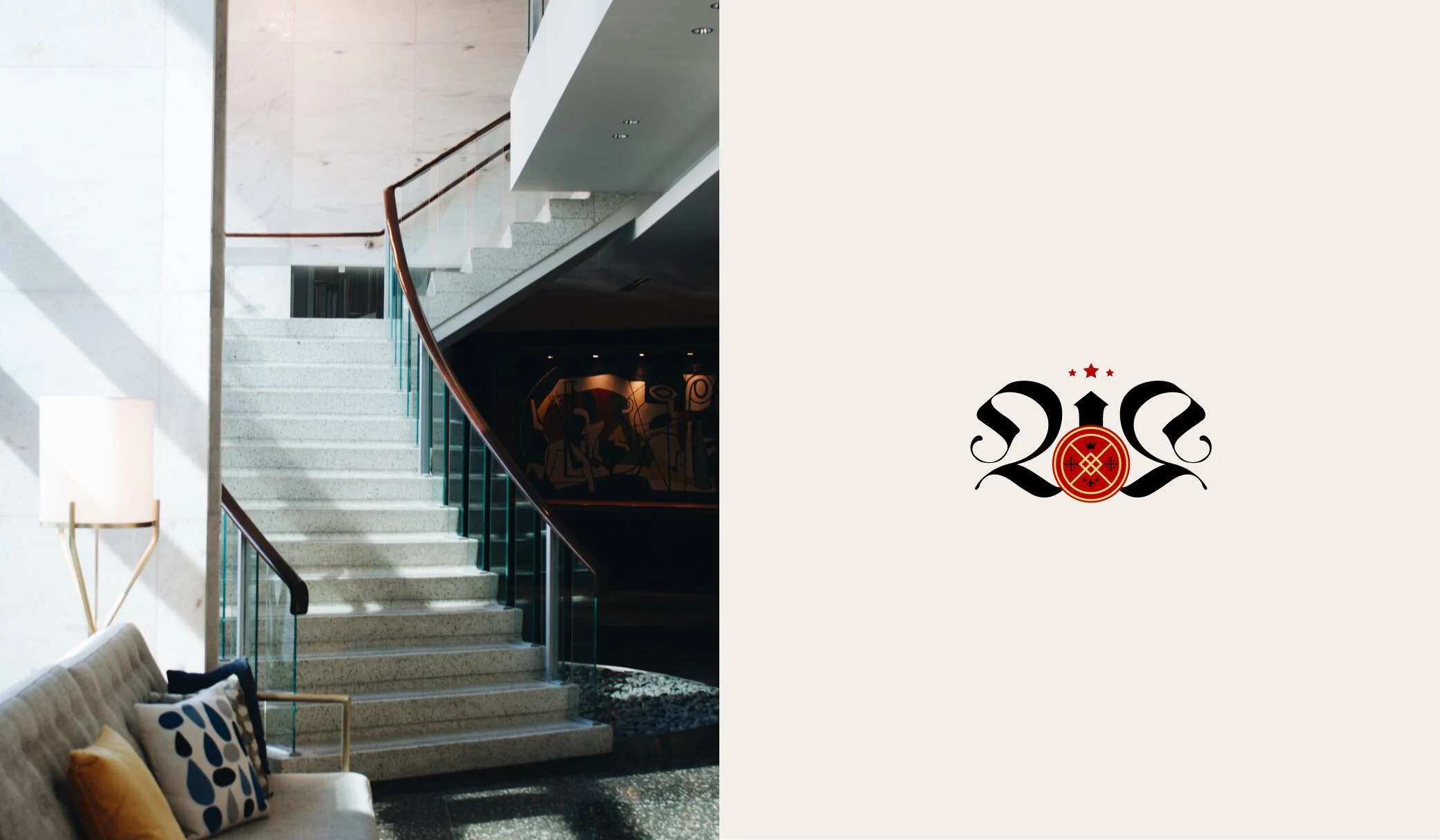
The emblem of the logo on its own, set on a cream background. The emblem is a combination of geometric shapes that are inspired by Sir Winston Churchill's pocket cigarette case.
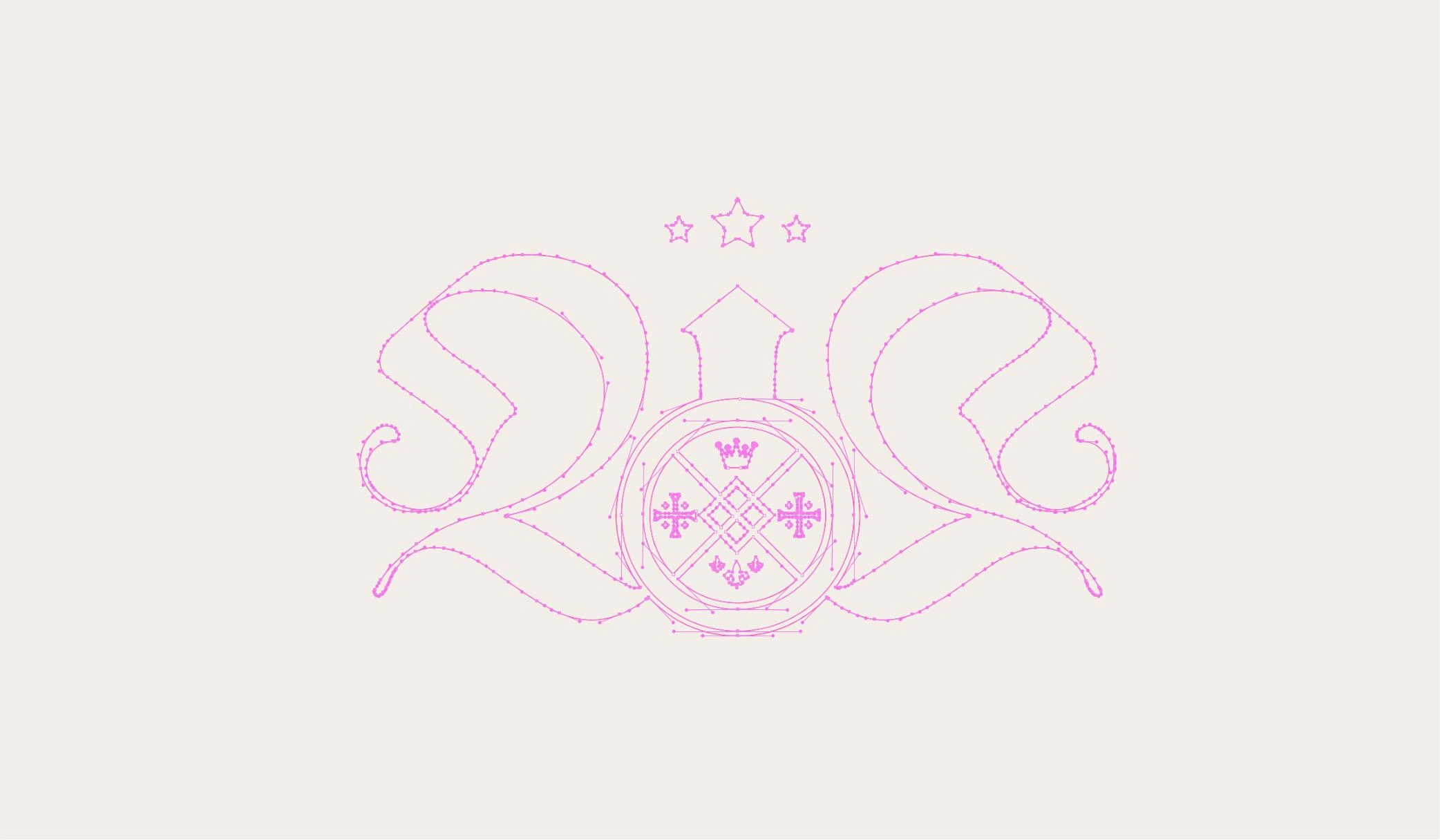
The emblem construction using anchor points, highlighting the process of how the emblem was created.
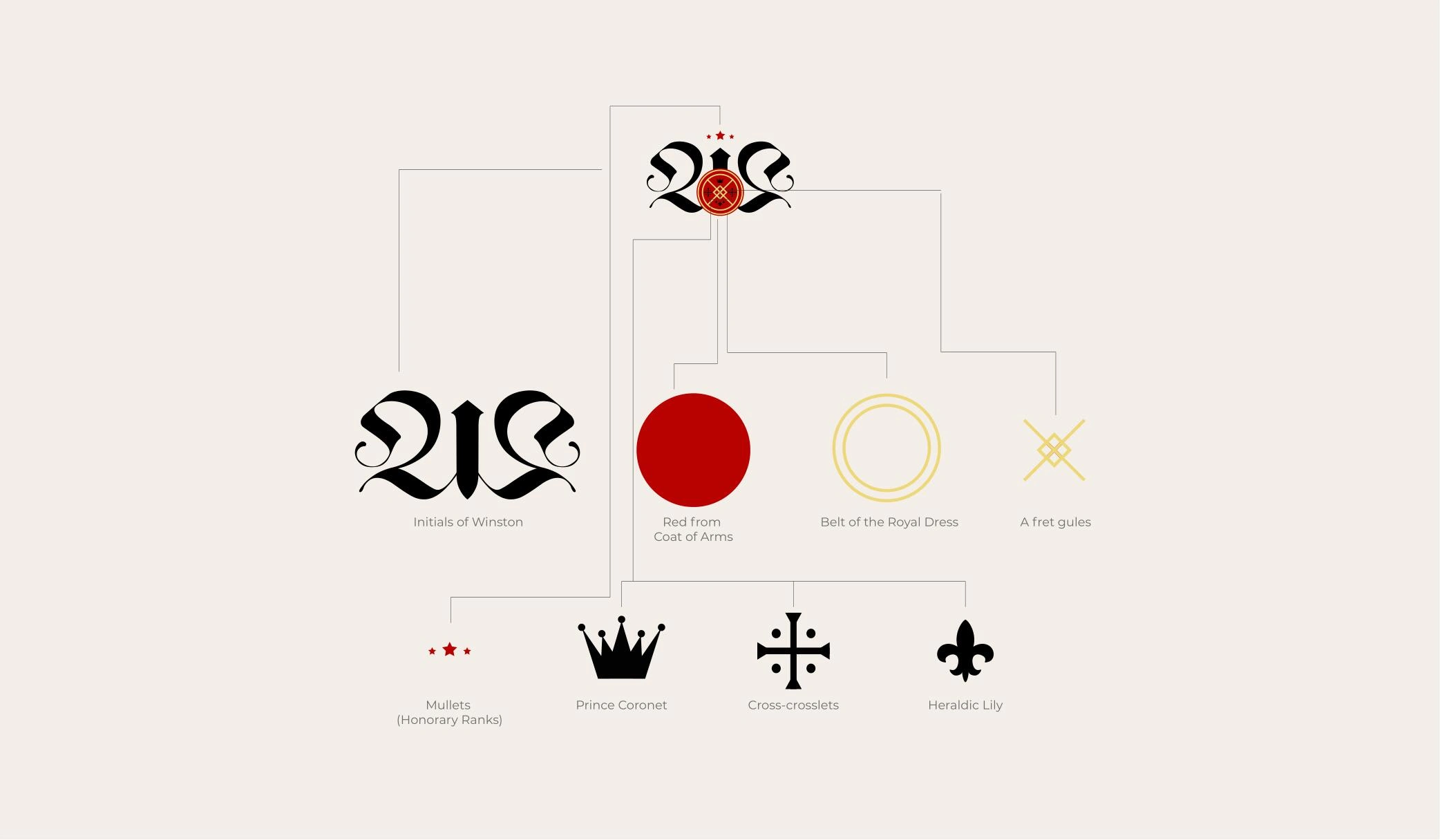
Explaining the different elements of the emblem, such as the red seal in the middle which is equipped with the royal belt, heraldic fret with Harrington knot, 3 Mullets, a princely coronet, cross crosslets, and 3 heraldic lilies.
Displaying the emblem in context, next to an image of a property. The emblem serves to communicate the luxury and exclusivity of the project.
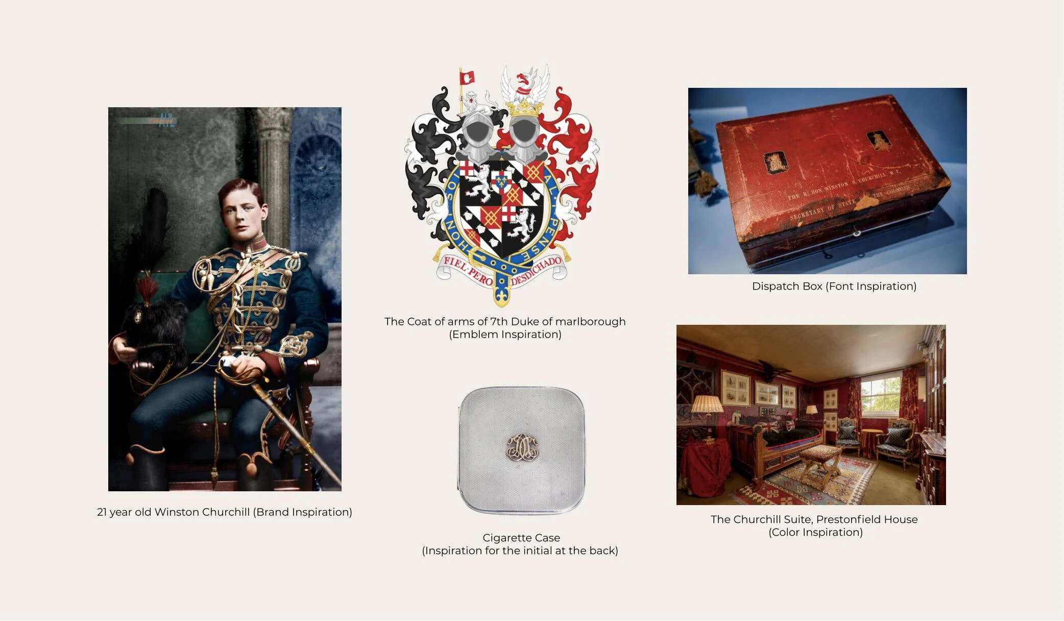
The brand inspiration, font inspiration, color inspiration, and icon inspiration. The brand inspiration is based on Sir Winston Churchill, while the font, color, and icon inspiration is based on the Art Deco era.
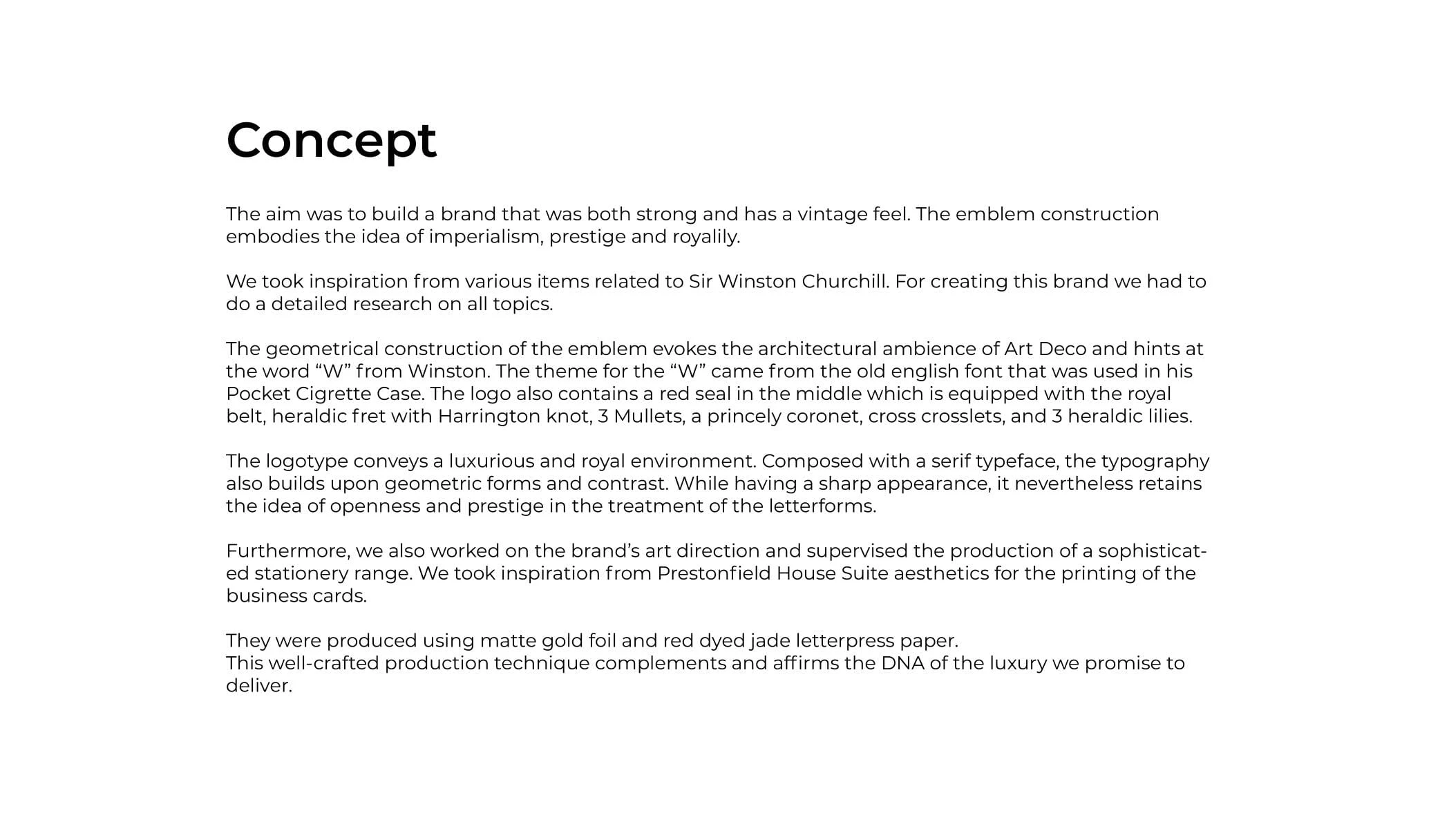
The concept behind the brand, which is to build a brand that is both strong and has a vintage feel. The emblem construction embodies the idea of imperialism, prestige, and royalty.
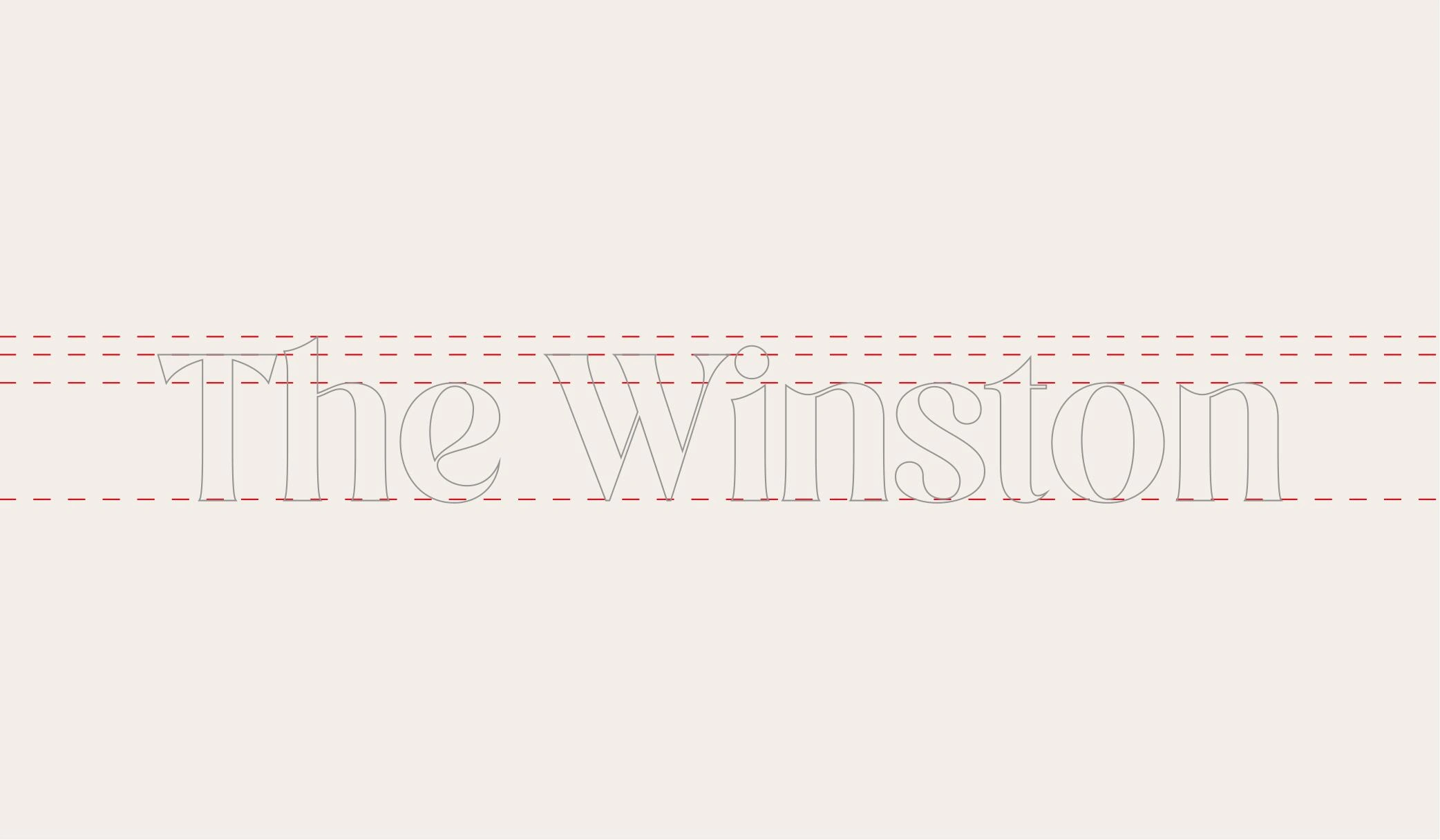
The typography edits and scale, showcasing the serif typeface used for the logotype and how it was designed to convey a luxurious and royal environment. The typography builds upon geometric forms and contrast, while also retaining an open and prestigious look.
The emblem next to an image of a property, to show how the emblem represents the luxury and exclusivity of the project.
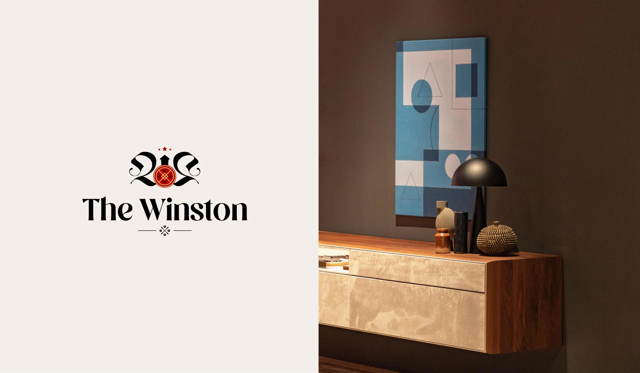
The logo next to an image of a luxury wall with cabinets, to showcase how the brand's aesthetic can be incorporated into the design of the property.
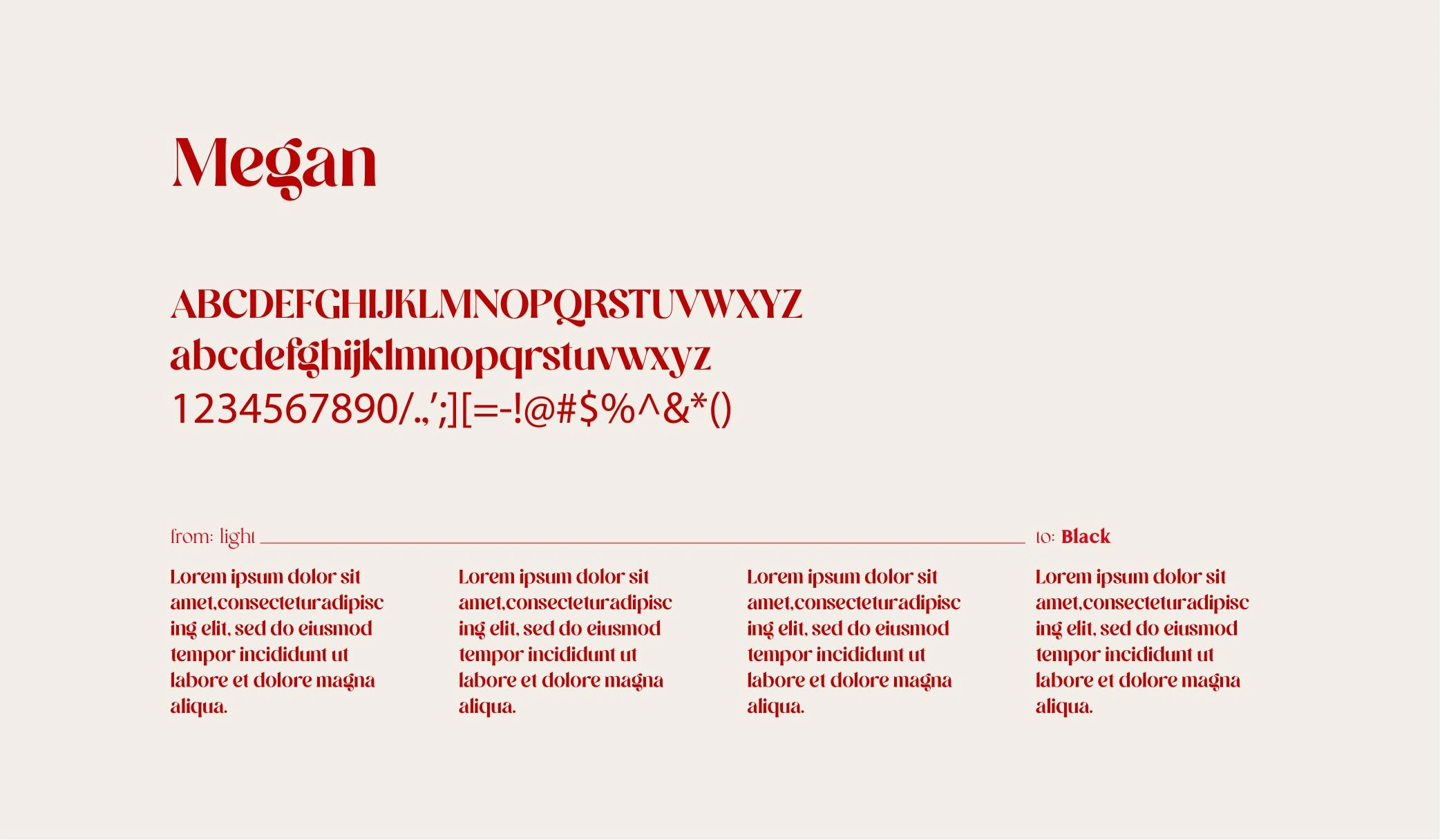
The font used for the logotype, Megan, showcasing its elegant and sophisticated look.
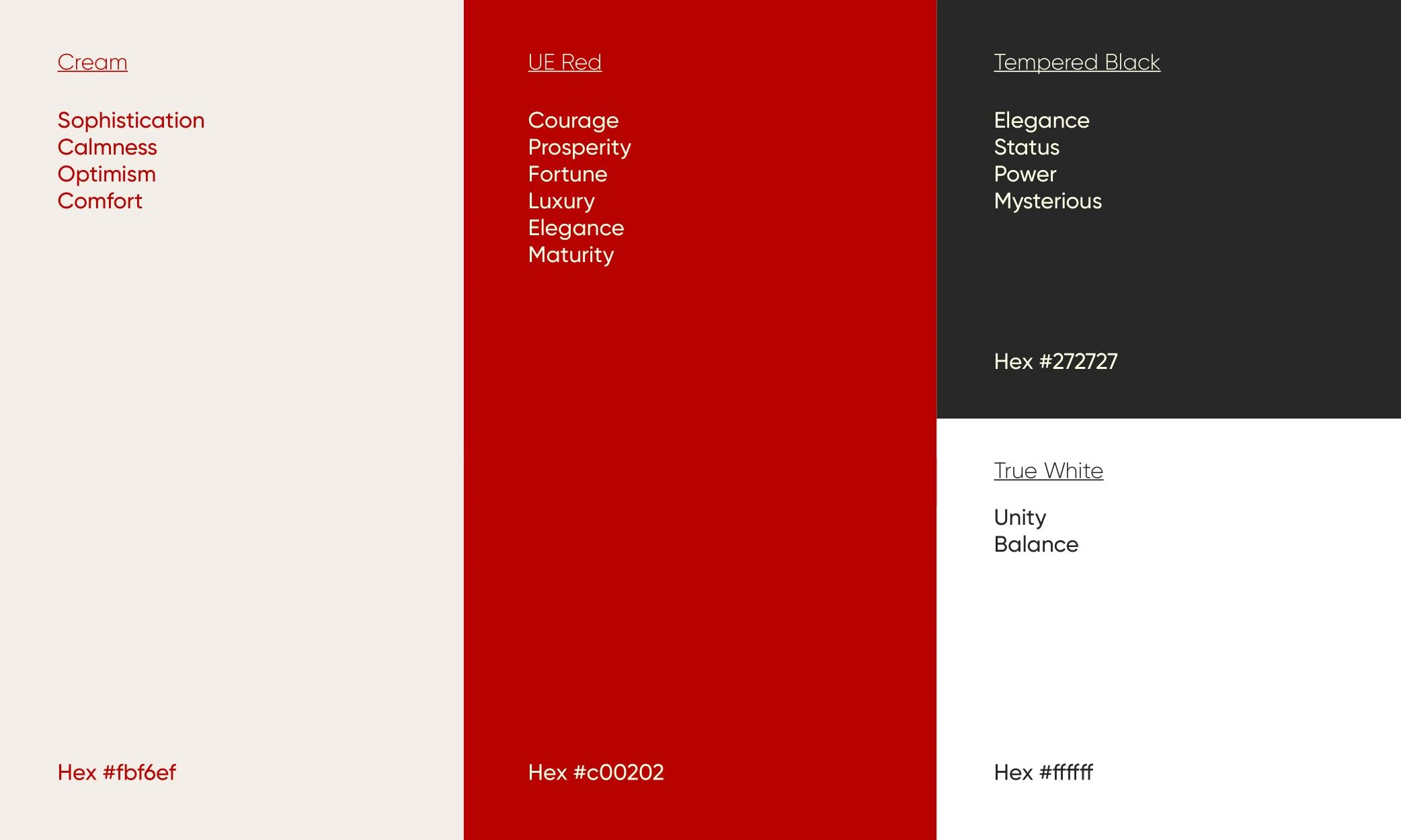
The color palette used for the brand, including Megan, Cream, Black, and White, which are used to convey luxury and exclusivity.
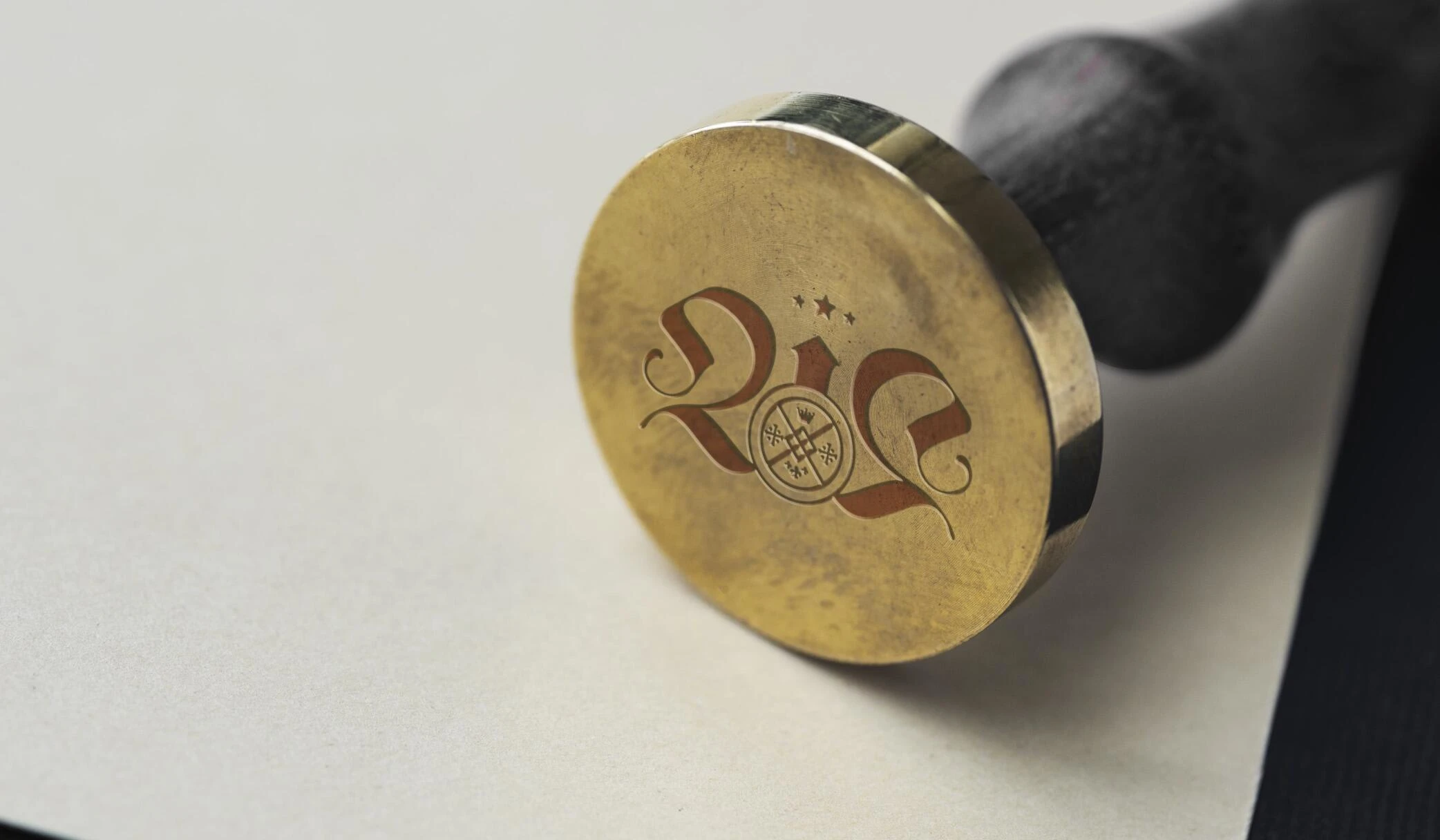
The emblem on a seal stamp, to show how the brand's identity can be applied in various ways.
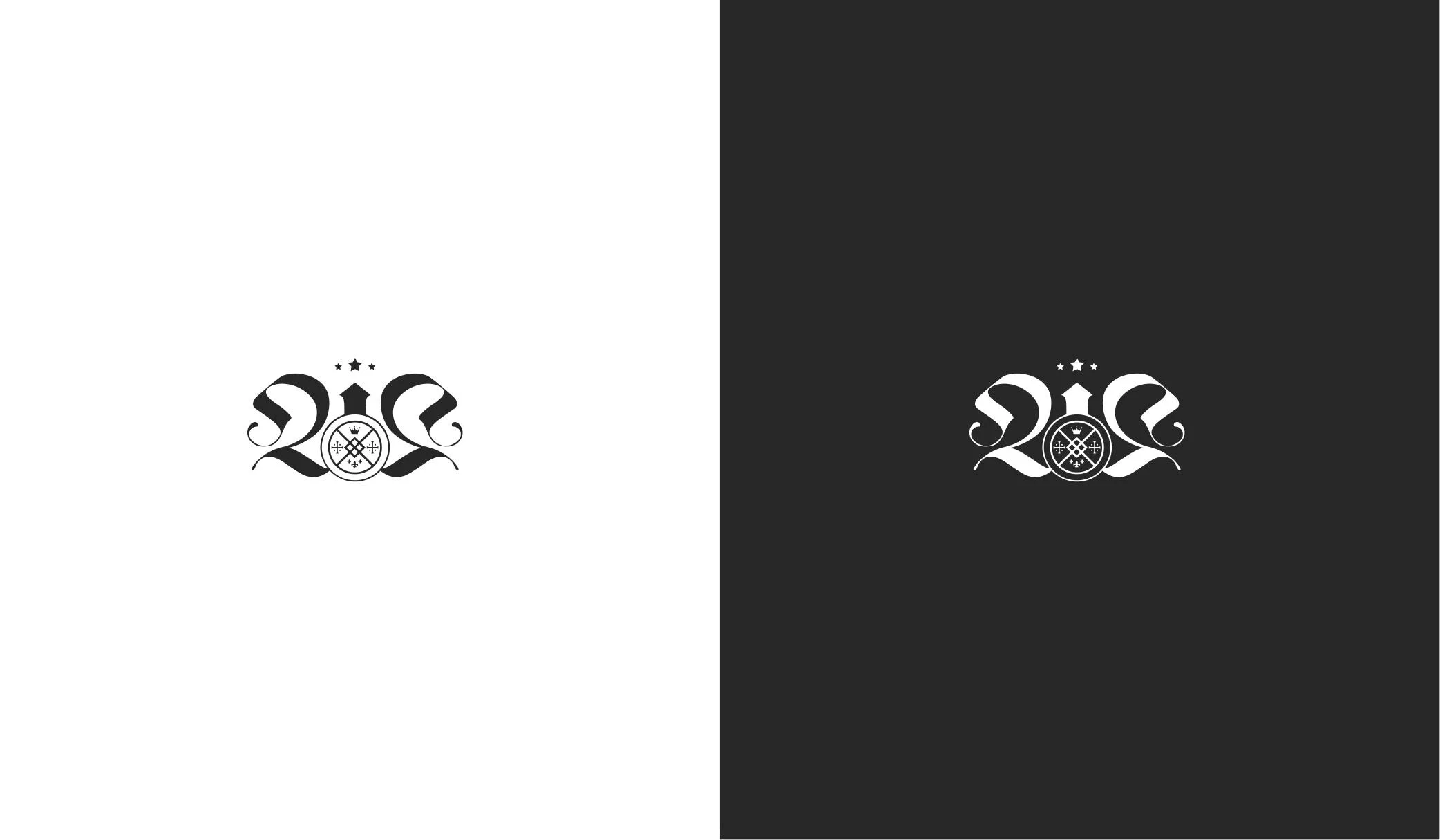
The emblem in black and white, to show its versatility and strong visual impact.
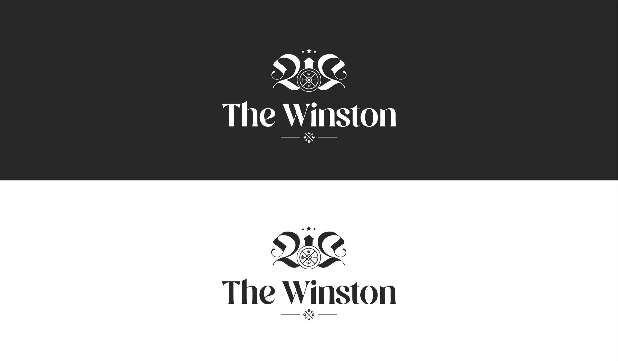
The logo in white and black, to showcase its ability to stand out in any color scheme.
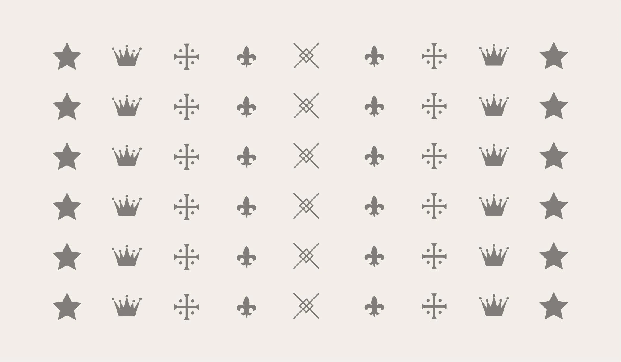
The brand pattern, to show how the brand's visual elements can be used in a cohesive and consistent way throughout different materials.
The logo printed using gold letterpress on a Megan colored box with texture, to show how the brand's aesthetic can be applied in packaging and other physical materials.
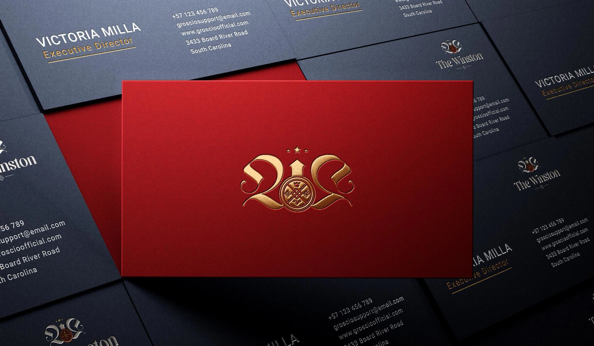
The business card, designed using inspiration from Prestonfield House Suite aesthetics, produced using matte gold foil and red dyed letterpress paper. This well-crafted production technique complements and affirms the DNA of the luxury we promise to deliver.
The logo on a wine bottle, to show how the elegant feel and luxury can be associated with the brand.
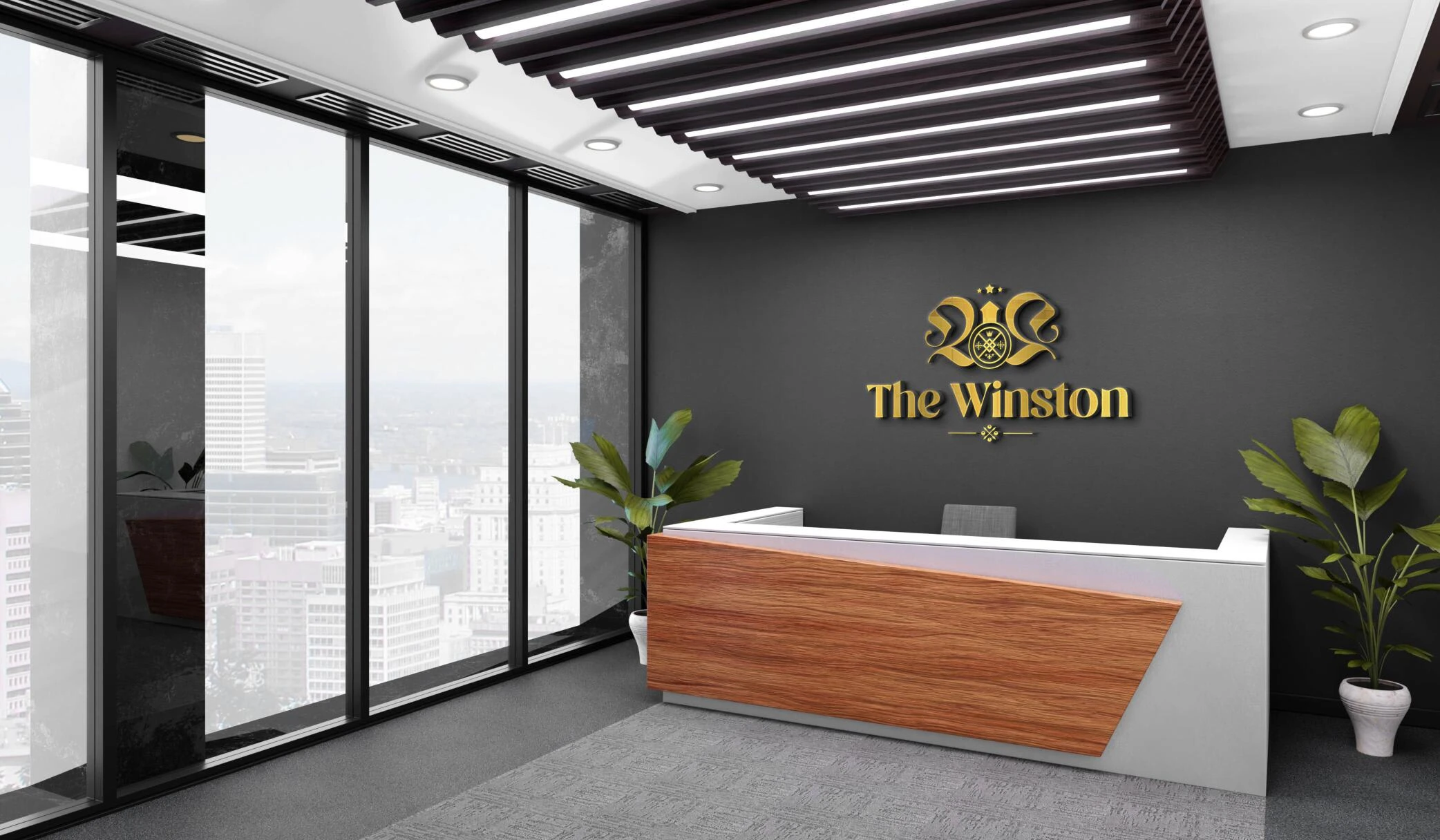
The logo on the reception wall, showcasing how the brand's identity can be incorporated into the design of the property in a prominent way.
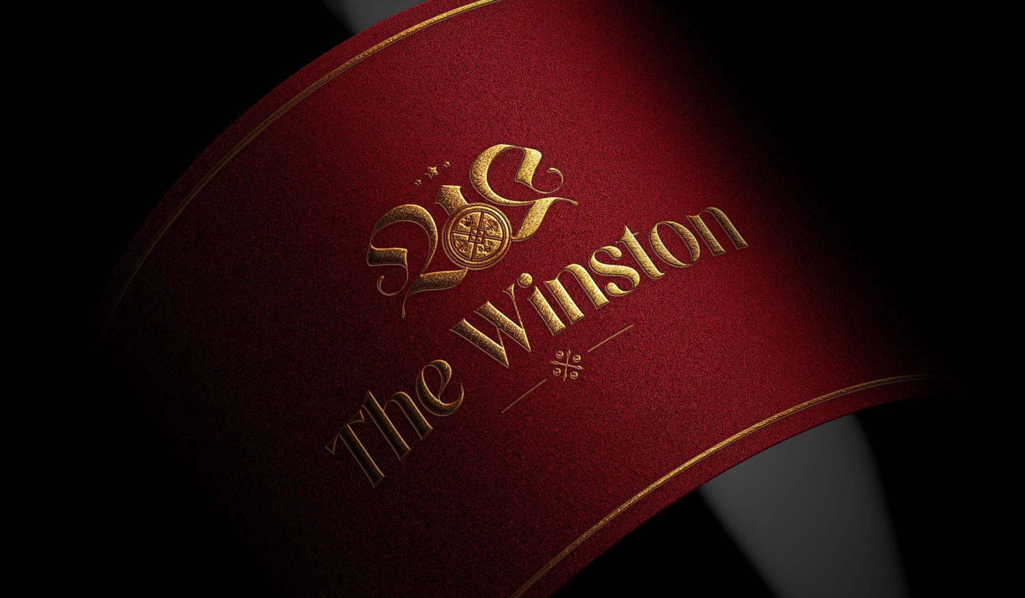
The logo on a textured Megan paper, to show how the brand's aesthetic can be applied in various materials and finishes.
Overall, the branding project for The Winston was focused on creating a strong and vintage brand that embodies the idea of imperialism, prestige, and royalty. Through detailed research, inspiration from Sir Winston Churchill and Art Deco, and a sophisticated use of typography and color, we were able to create a brand that represents the luxury and exclusivity of the high-end 4 BHK apartments. The branding concept was designed to evoke emotions of confidence, boldness, wit, classiness and gracefulness that aligns with the targeted consumer. The brand essence of "there's nothing like this" and the purpose of bringing the rarest of luxury to those who deserve it the most was at the core of the branding project.
Like this project
Posted Jan 26, 2023
Branding for a company making Luxury 4BHK apartments. Targeted at affluent buyers seeking exclusivity. Vintage brand with imperial, prestigious & royal elements