I designed the identity for

View completed workwww.behance.net
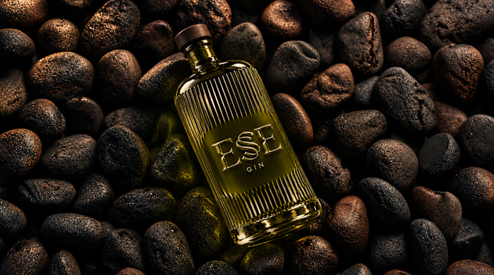
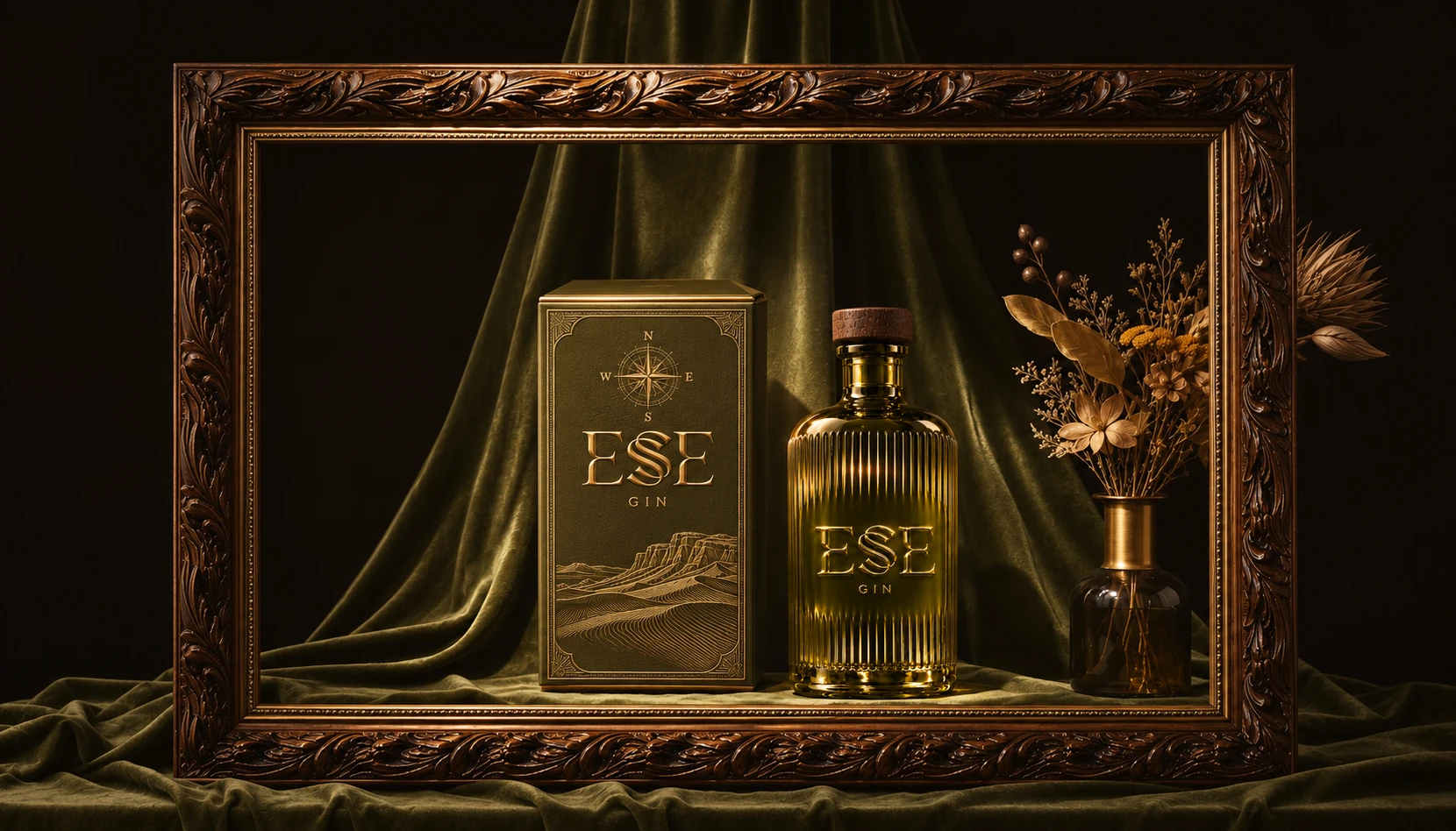
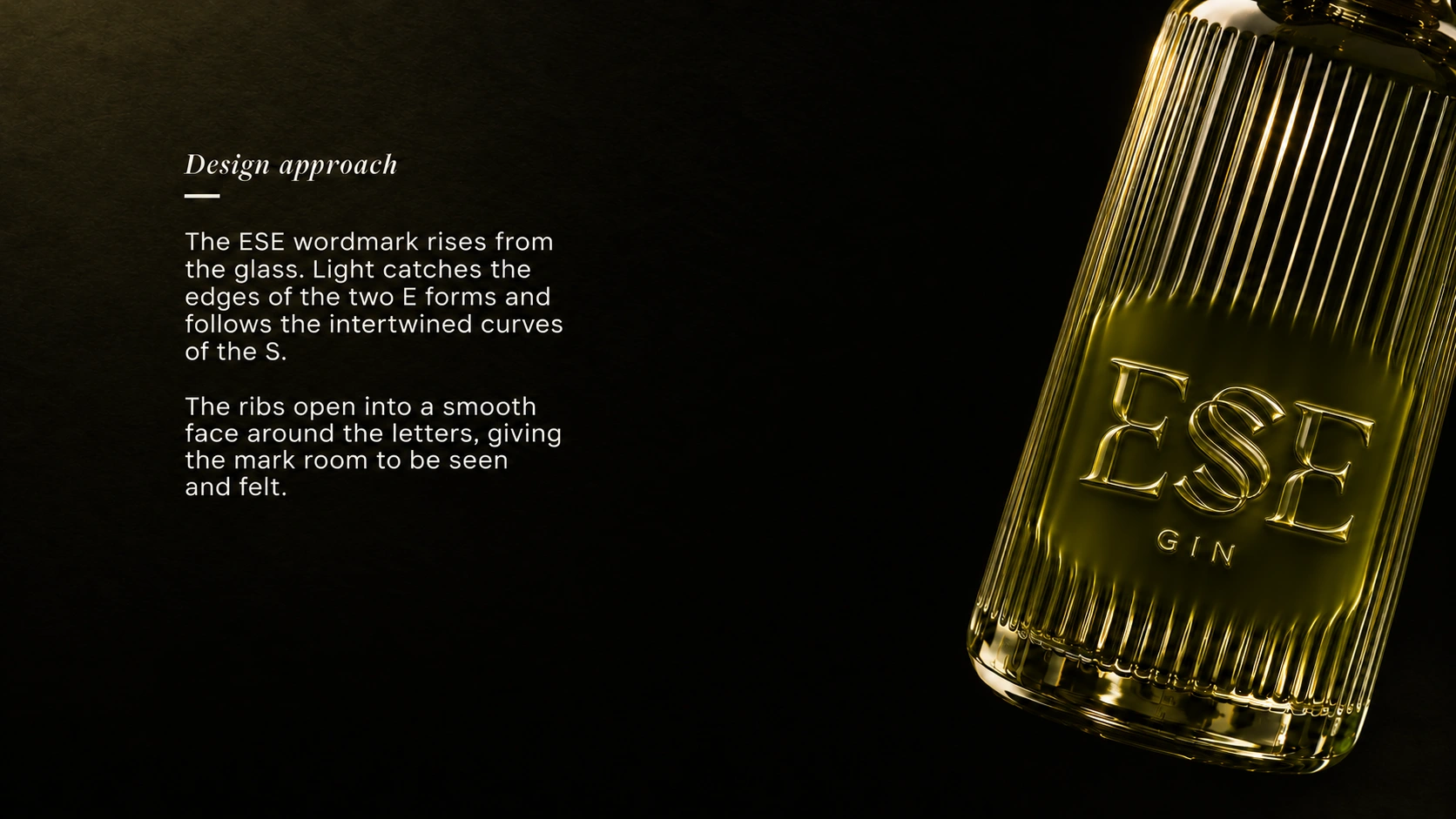
I designed the identity for ESE GIN around the curve of a dune ridge. In the custom wordmark, two sharply cut E forms frame a sweeping, double-stroked S. On the bottle, the letters rise from the olive glass itself. As the light shifts, it catches one edge of the S and then the other.
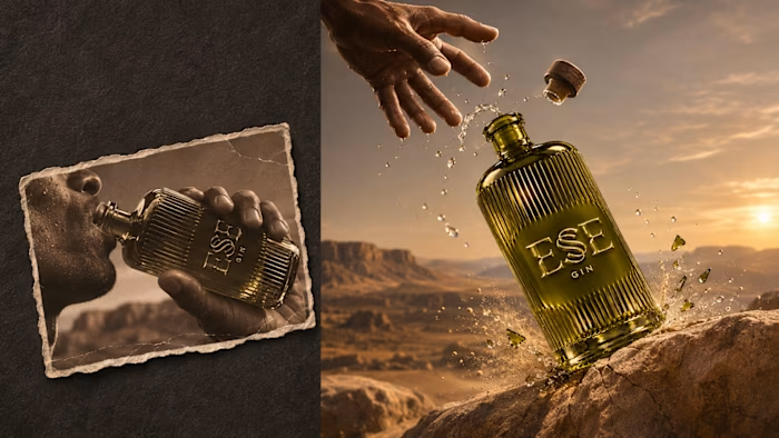
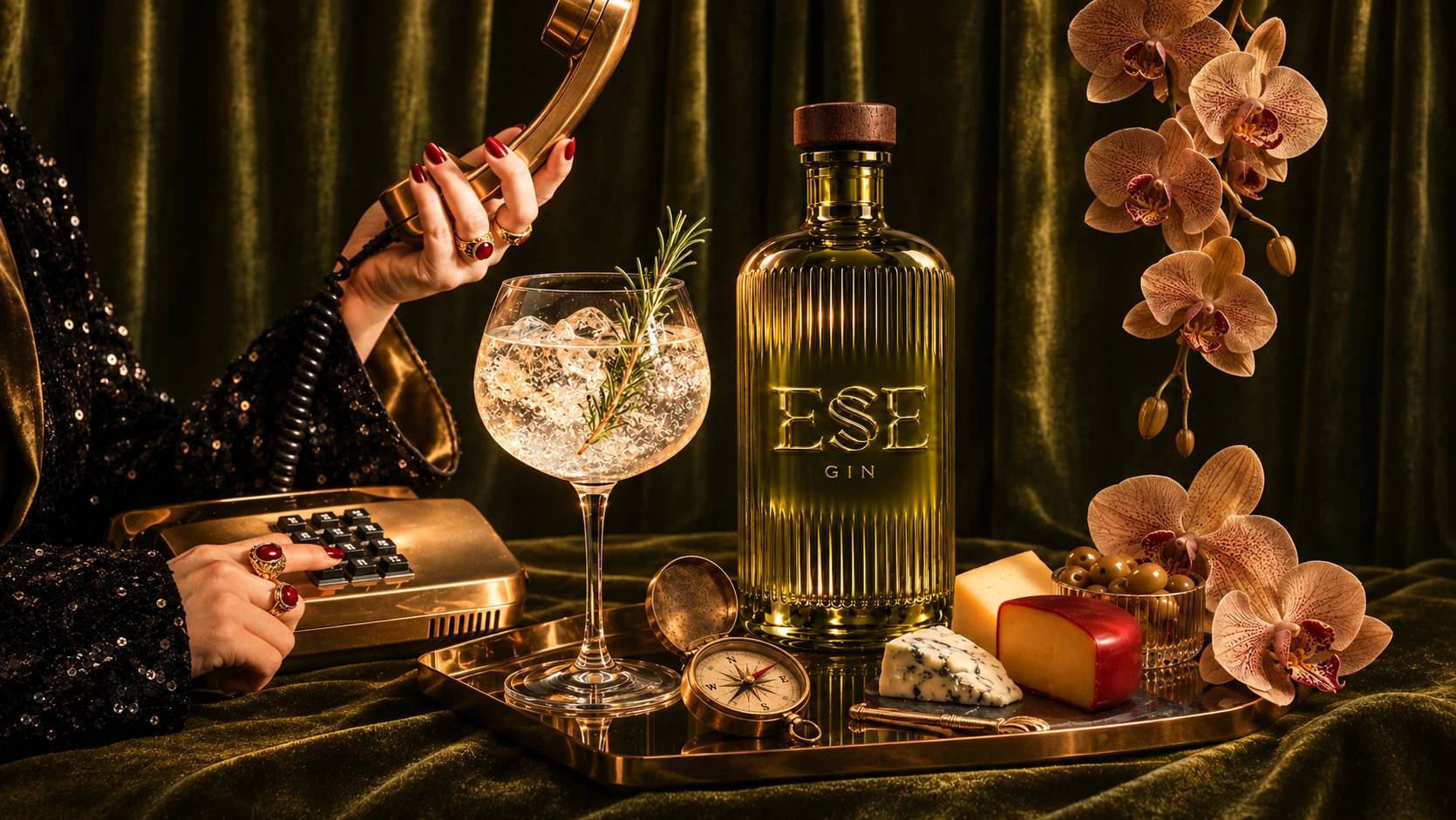
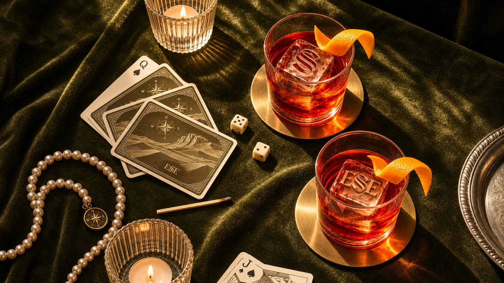
Across the packaging, the curve of the S returns in contour lines engraved on walnut cases and traced across warm ivory paper. A brass compass sits beside the bottle in the presentation box, and its compass rose reappears on the neck seal. The campaign follows the same bottle from sunlit sand to a lantern-lit camp at dusk, letting the desert light reveal a different detail in each scene.
0 likes · 0 views · Nov 8, 2026
I designed the identity for ESE GIN around the curve of a dune ridge. In the custom wordmark, two sharply cut E forms frame a sweeping, double-stroked S. On ...