Seyo Launch Animation

Kamil Betterside
Verified


The Challenge
Restaurant Management From Alert to Action.
We needed to visually prove how an operator can go from receiving a high-level notification to deep-diving into a specific location’s performance, and finally, deploying a solution, all within a fluid, comprehensible user journey.
The primary challenge for the Seyo product video was illustrating the platform's seamless A-to-Z workflow without overwhelming the viewer.
The Approach
We built the motion narrative around the exact flow of resolving an operational issue.
By carefully controlling the speed of the animation, we guided the viewer’s eye through the app's hierarchy. We used swift, sweeping motions to show geographic scale, and deliberate, slower pacing when the manager needs to read detailed location feedback and take action.
Keyframe #1
Keyframe #2
Keyframe #3
Keyframe #4
Key Animation Highlights
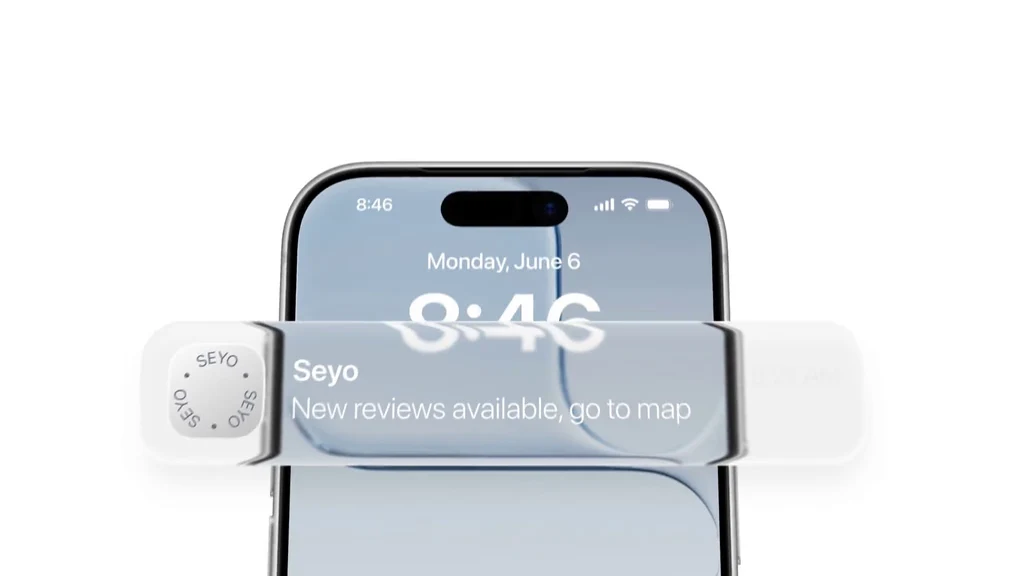
App Notification
The video opens in a real-world context with an iOS screen notification. This immediately grounds the viewer in the manager's daily routine, transitioning smoothly into the app's high-level dashboard.
App Notification motion
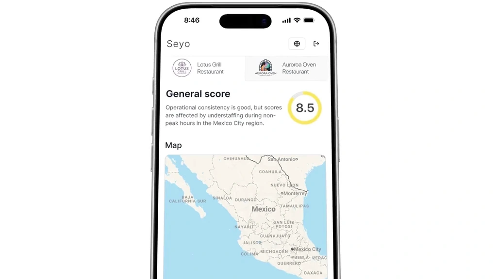
The Macro to Micro Zoom
We utilized a map transition sweeping from a country-wide overview of regional scores down to street-level performance pins in Mexico City. This dynamic scale change visually communicates the platform's power.
The Macro to Micro Zoom motion
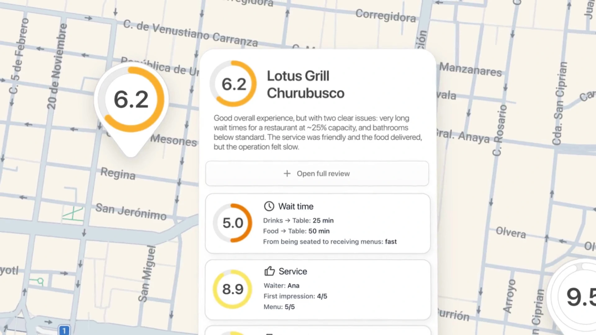
Time for Data Digestion
When the user selects the restaurant the motion intentionally slows down. This slower fragment gives the audience time to get familiar with metrics.
Time for Data Digestion motion
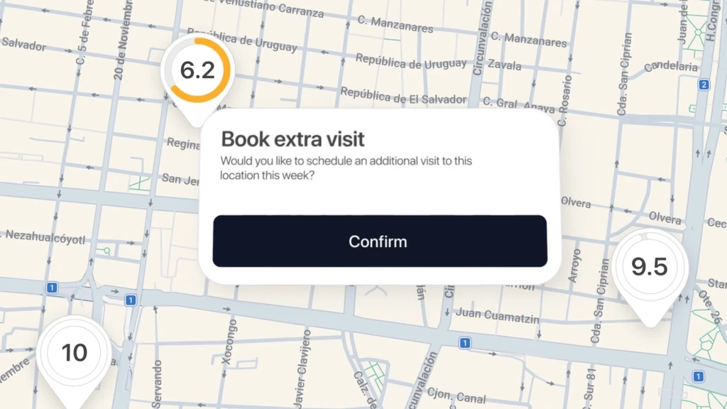
Closing the Loop
The animation show the core functional goals. We smoothly animated the AI-message drafting and the intuitive flow of booking extra visit, showing how effortlessly an operator can schedule a visit to correct dropping scores.
Closing the Loop motion
The outcome
The final animation doesn't just show how the Seyo app looks it successfully demonstrates why operators need it, seamlessly connecting high-level oversight with immediate action.
Like this project
Posted Aug 25, 2026
A product animation showing how Seyo turns restaurant alerts into insights and action through a seamless operator workflow.
Likes
2
Views
28