Built with Framer
DeepMark (YC F26) Landing Page Redesign

Shivang Shah


This is a passion project (I wasn't hired to design the landing page; this is only to show my skills)
deepMark (YC F26) had a great product.
Their landing page didn't clearly convey what the product does.
It didn't look like a YC-funded company.
I wrote the copy and redesigned the landing page to solve those problems.
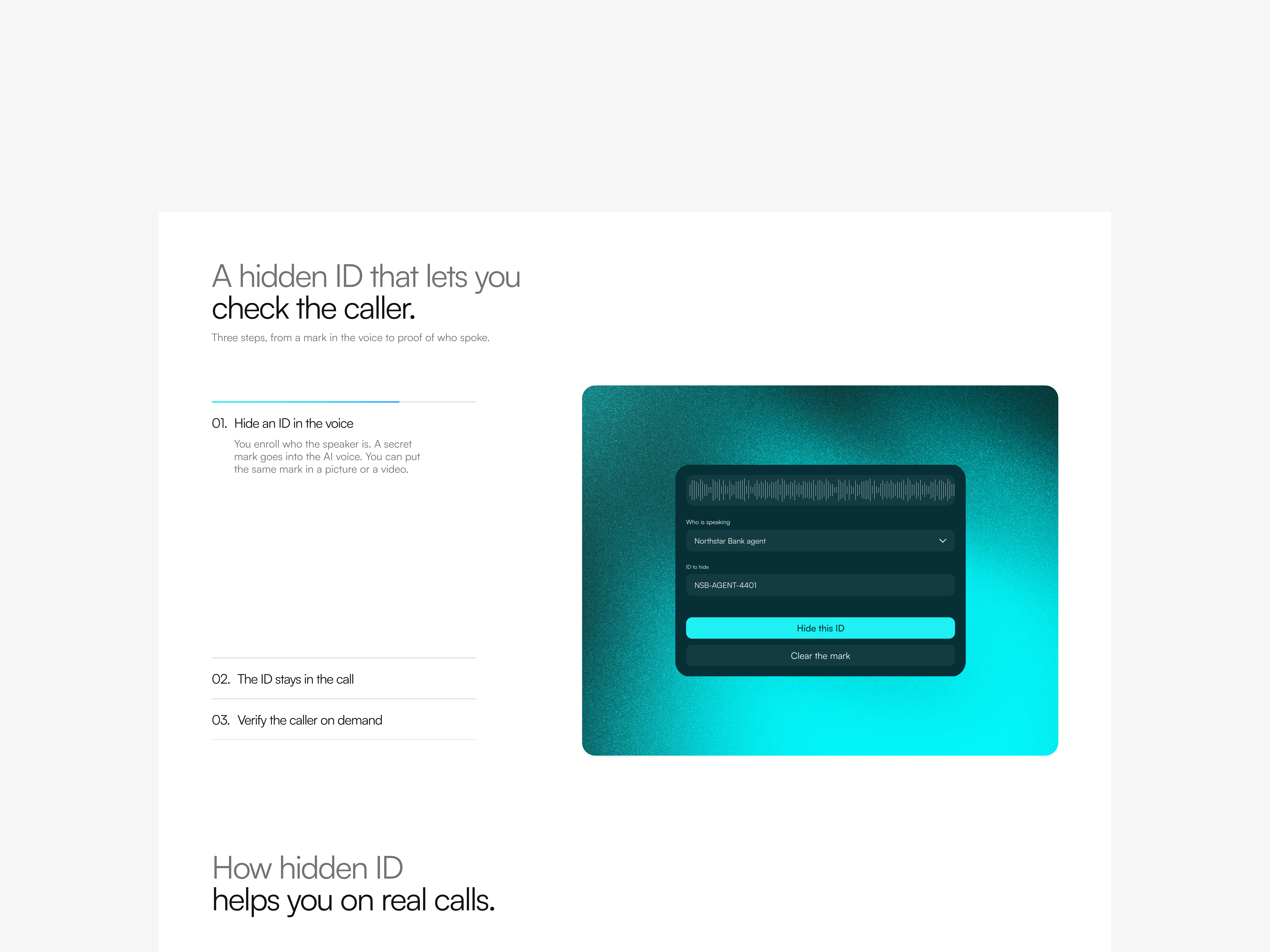
What the product does: deepMark embeds a silent ID in an AI voice.
So that a bank or call center can check if the agent is real. even after the call goes through a phone line.
The ID sits in the sound, not in a file tag, so it can still be read after a phone call.
hero section
What it currently looks like:
YC is mentioned twice (more than once sounds like bragging)
The headline is good but would be easier to read if it were split into two lines
The subheading is too complex (it must be below grade 5 level)
The text in the subheading is not balanced
UI looks like just another startup
I like the visual concept; it's clear, and you get an idea of what the product does
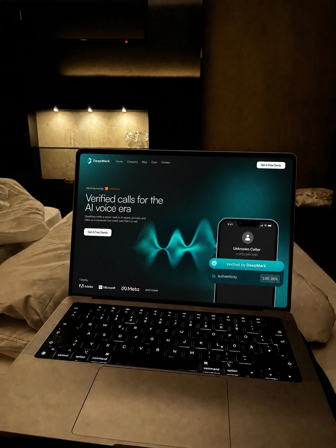
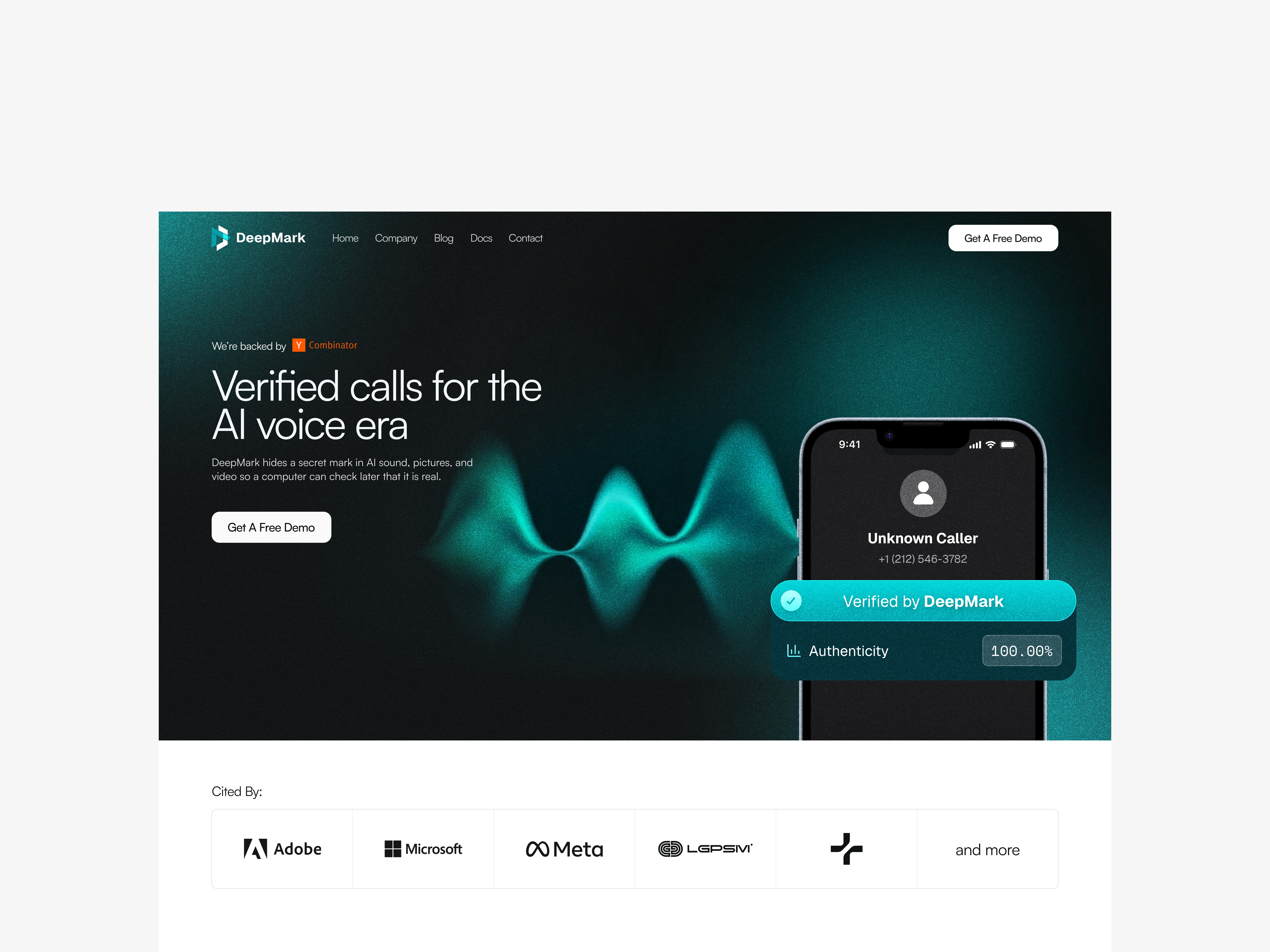
What I changed in the hero:
use YC once for credibility
keep the headline in 2 lines
simplify the subhead and balance the text
put social proof above the fold
use a much simpler font instead of the initial futuristic one
improve the visuals and overall UI
copy
I didn't just start writing.
First I learned what the product does -> looked at any similar products -> restructured the landing page -> wrote the copy.
old page order was a bit random
hero -> what it does -> how it works -> use cases -> features -> resources -> proof -> blogs -> FAQs -> CTA
new page order
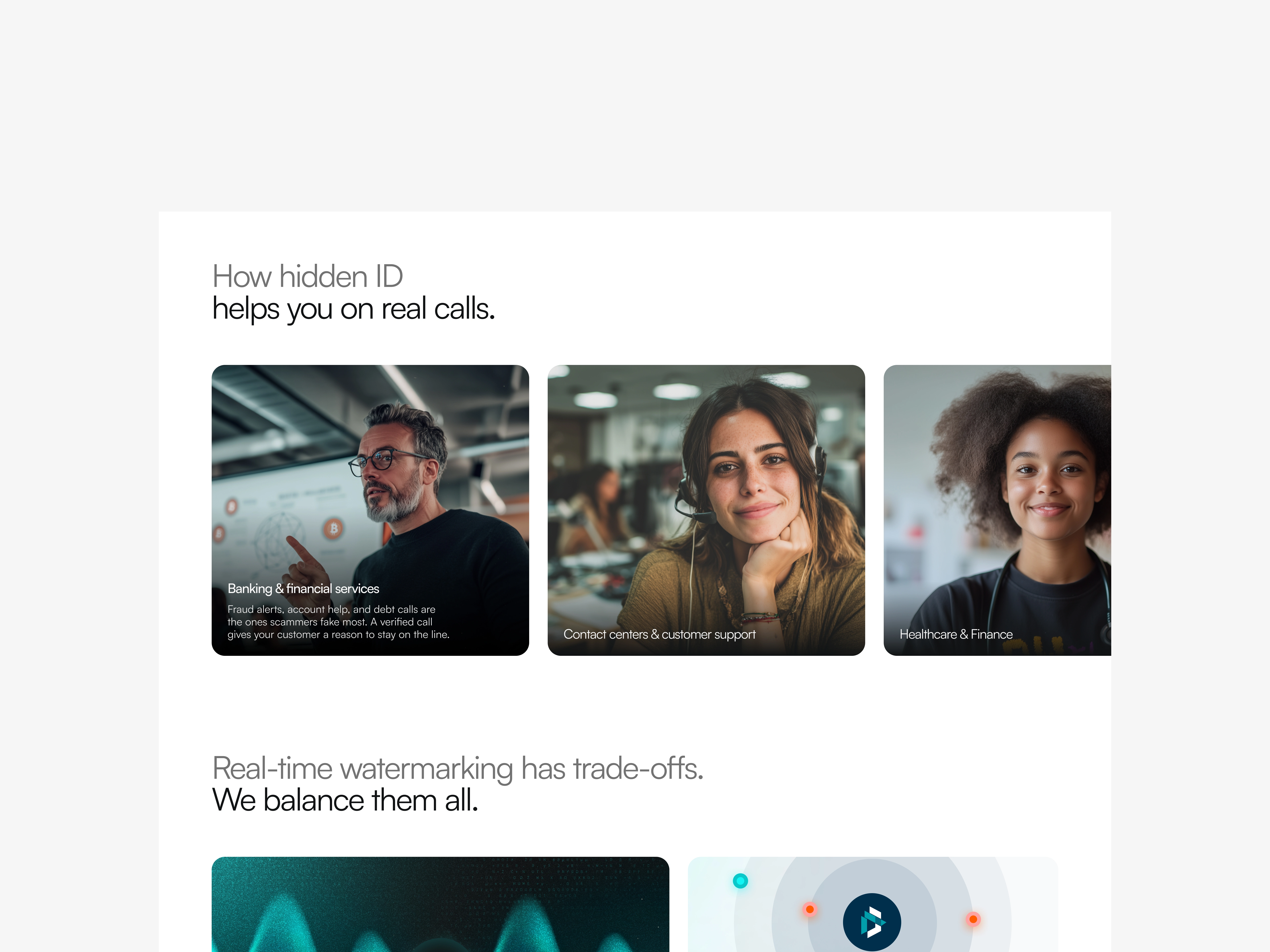
hero -> problem -> how it works -> use cases -> features -> proof -> resources -> FAQs -> CTA
added the problem right after the hero so people know the problem that the product solves
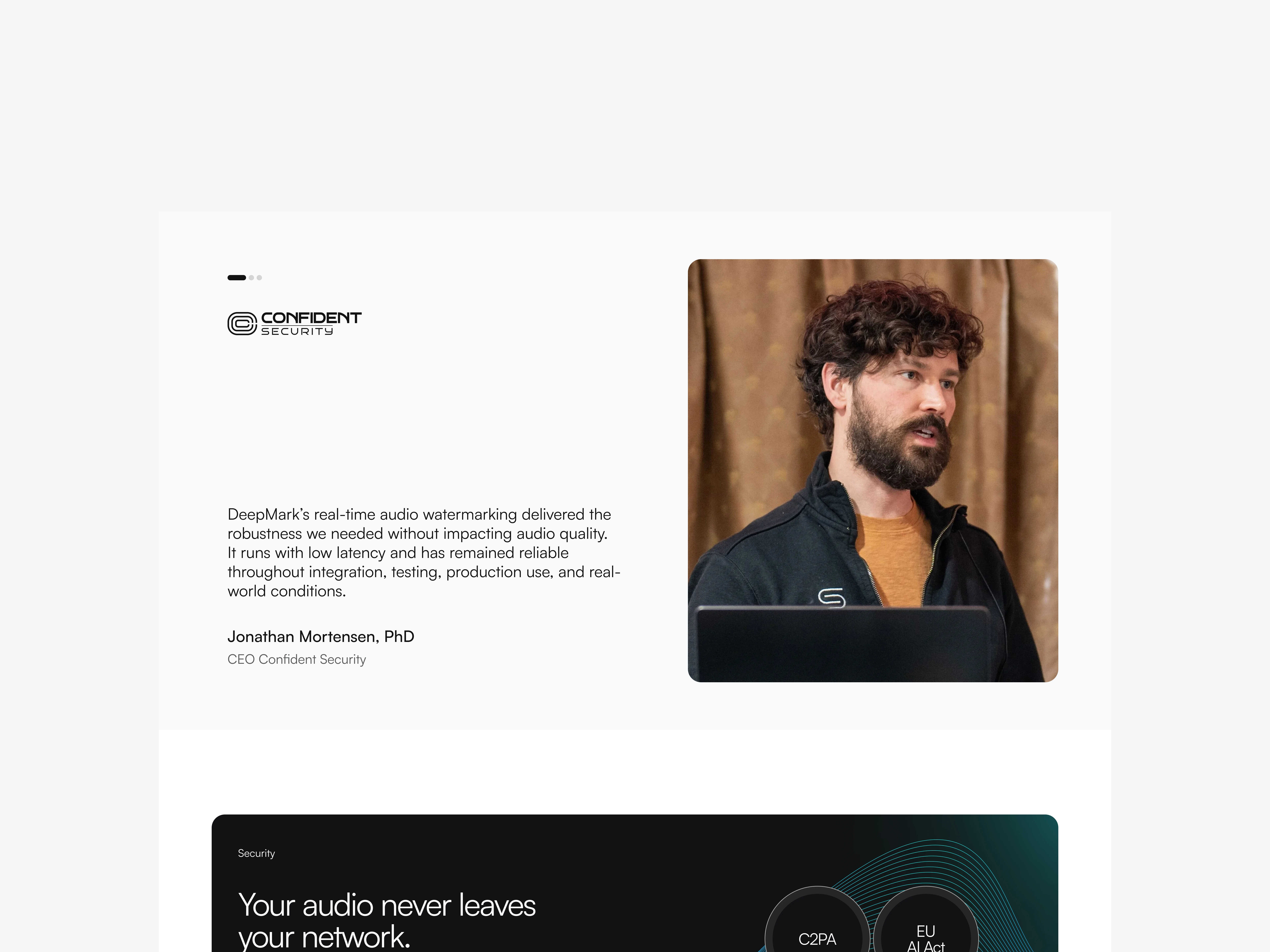
moved the testimonials up, after the features. The old page sat it too low
. Resources and blogs were two blocks. I joined them into one block
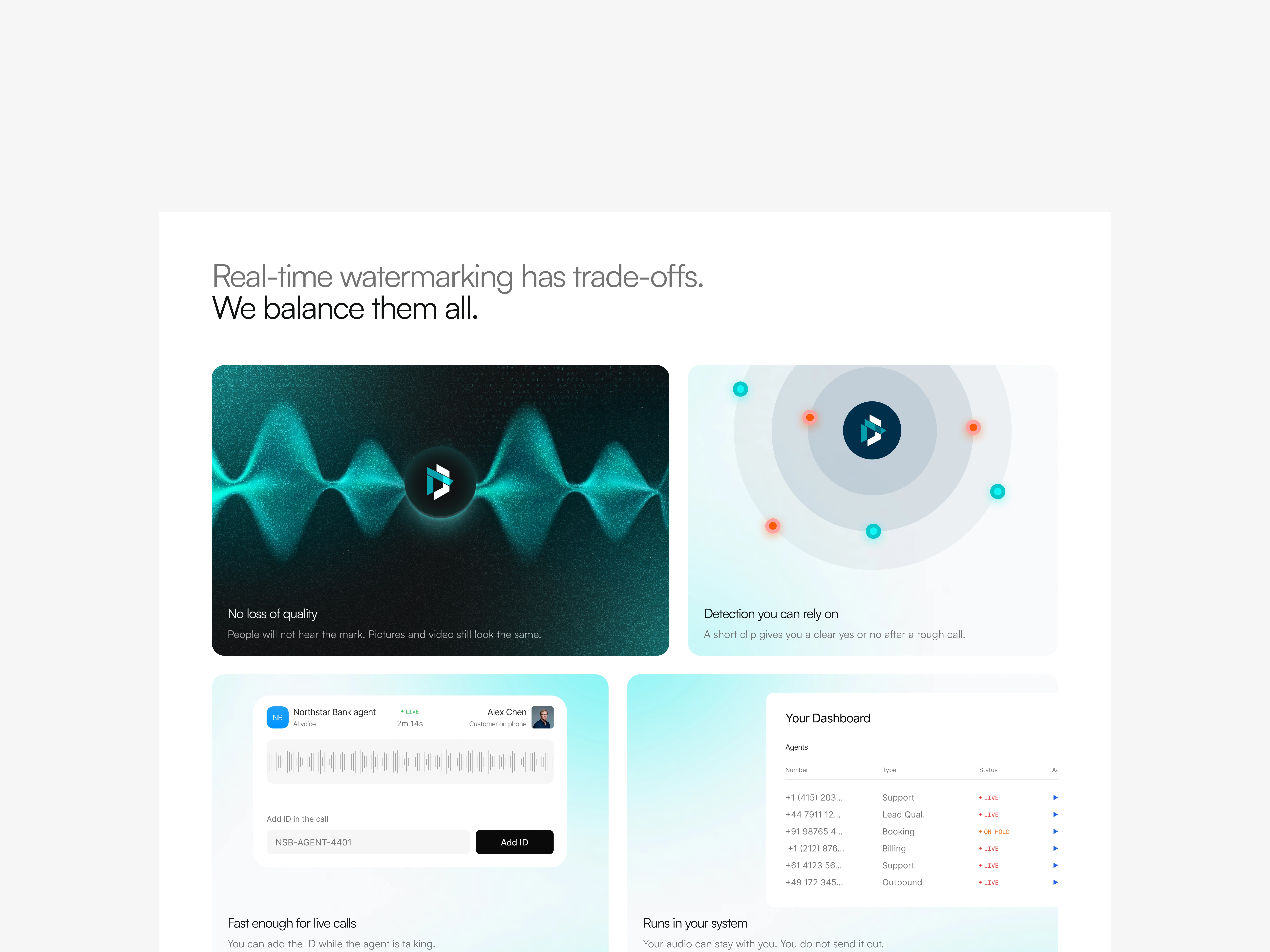
. Features went from 6 to 4.
I cut the ones that did not help a founder decide, and I joined the ones that said the same thing.
kept the copy below a 5th-grade level.
Short lines.
no hard words.
a founder should understand the product's job in one pass, then share the page with someone who isn't technical
design
tried to keep the layout simple and clean
added human faces to improve trust and conversions - simple and cool illustrations to make the product feel premium
That's how a YC startup should look
Like this project
Posted Oct 11, 2026
Redesigned deepMark's landing page to convert more and look more credible for enterprise clients.
Likes
1
Views
0