CaseStudy : Designing a landing page for an Internet Creator
Divya Pabbisetty
A glimpse of project
I joined 10kdesigners Cohort 5 recently. We were assigned a project to design a landing page for an Internet Creator giving us the space to identify the real problem and solve it. The goal of this assignment is to practice visual design and apply design process to curate a website.
Process Followed
This is the process followed to achieve to my final solution. This didn’t happen in a linear way instead there are a lot of instances I had to come back, recheck, iterate and redesign

P.S. This didn’t happen in a linear way
Explore
With the freedom given to explore more and choose our own creator, I decided to utilize it to the fullest extent. I started scrolling through my Instagram and Youtube to find out the creators I follow. I wanted to pick the ones who are genuinely trying to create a difference. From my curated list of creators, I picked Dr.MananVora as he is trying to build a health conscious community.
Research
I started out by knowing more about him which helps me identify the actual problems and the target audience I am trying to build a website for him. But, wait!! Does he really need a website? Let’s see if he really does:
Who is he?
Dr. MananVora is an Orthopaedic and Sports medicine specialist who is also trying to create an impact through Instagram by building a health conscious community. He is like a one time guide to healthy lifestyle : from exercise to diet, from physical health to mental health.
Why does he need a website
Validating the problem is important before actually trying to solve it. I explored more about what is he doing to achieve his goals of building a health conscious community. Then, started having an overview of why website would be helpful to him:
Consultation — In his lot of DMs, it might be difficult to go through all and differentiate between those, remember, get back to them.
Brand Collaborations — Allows to pitch easily and showcase all his works and achievements
Meetups — Keep easy track of people
This gave me an insight of why am I really doing. Now, I went deeper to understand the target audience.
Who are we building this for?
Having a basic understanding of what he does explained about the target audience we are going to focus on
B2B — Brands who want to communicate with him
B2C — For the followers (or) people trying to follow him
How is this going to help them?
I didn’t have the time to talk to users, the creator and know more as the timeline is only 1 week. These are the assumptions that were made:
Brand collaboration — If brands want to know more about him (or) his works and collaborate with him, going through all the reels, knowing his previous collaborations with what brands is difficult
Help people know him — Make people aware of his content, start changing their habits.
People might not be aware of his next meetup if he puts up only on his stories
Follow (or) not — For people thinking to follow him (or) not, instead of having grids of photos and reels, website might give a better understanding.
Analyze
After validation of problem and identifying the target audience, I started to analyze the patterns from various websites of internet creators who were doctors.
Observing helped me identify the common patterns and kept me on track regarding what I want to do
Pattern Identification
What do we want to do here?
After carefully observing the patterns, I have identified the major tasks I want to accomplish through this website. Depending on the target audience and goals of the creator, the main tasks are:
Build a community by speaking through our achievements. — The basic user thought — If he’s more famous and successful, we can follow him
Help users navigate through articles, know clearly and help make decision for new users to follow (or) not.
Help brands discover him.
Breaking down the goals and identifying the sweet spot between what we want the users to do and business goals:
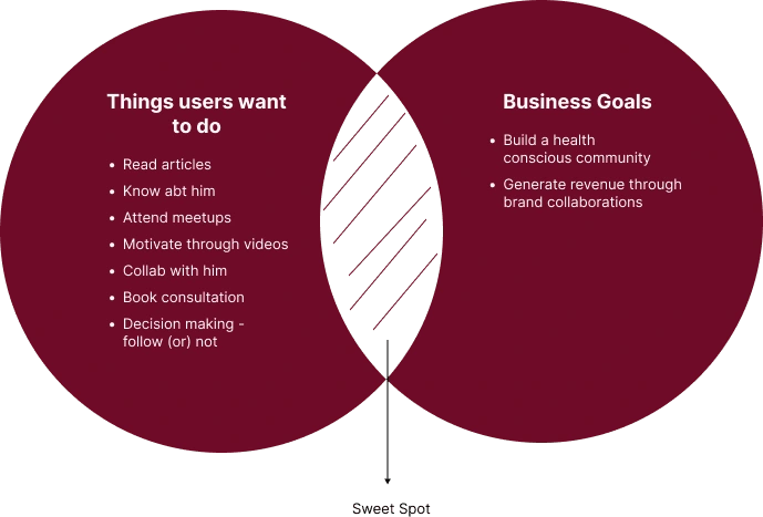
Sweet spot we are trying to aim
Ideate
Analyzing and identifying the sweet spot helps us in ideating clearly and takes us a step forward to our goals. With the business goals laid out, it has become easier to narrow down the problem statement. With solving for the business goals, we are solving for the user goals. It’s basically solving for users through business goals
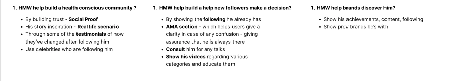
HMW Ideation
Information Architecture
Deciding on what to show in the home page and structuring it has been a rollercoaster ride, where I got lots of feedbacks and need to iterate. Eliminating the solutions from ideation and learning what’s important is essential for a converting landing page.
Well, how did I do that? I relied on the emotion that I want to evoke: trust and the curiosity to explore about him.
Now, the real question of structuring around and visual design begins!!
Deliver
With my amateur knowledge, I just looked what would look good and placed the IA elements one by one. Wireframes helped me picturize the content, what and why.
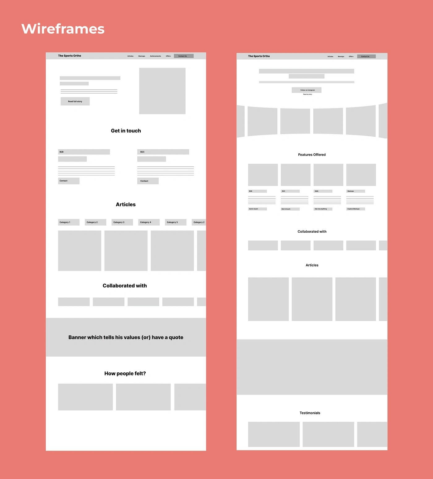
Wireframes Iterations
There are a lot more iterations in the visual design phase as I felt I’d more likely be able to take a decision when I see it in shape.
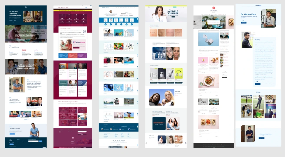
Competitive Analysis
Wait, this is there at the top, why is it here again? To gather visual and structural cues of how other landing pages were.
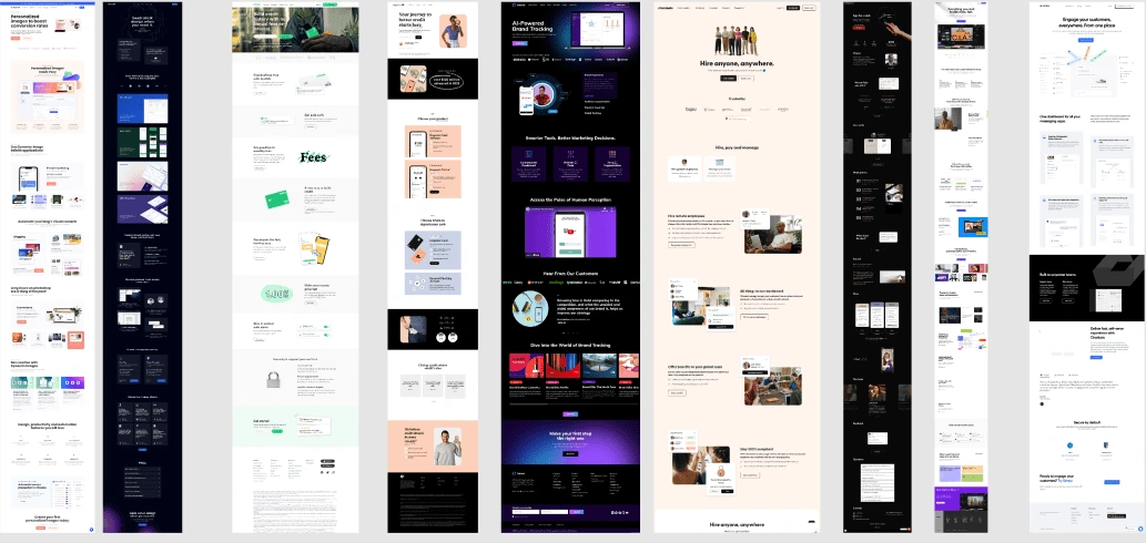
Visual inspiration
I jotted down what I liked, what I didn’t like from each of the screenshots to apply them for my landing page wherever necessary. After taking the inspiration, I still wasn’t sure of how to structure my content on the landing page. That is when AIDA model came to the rescue.
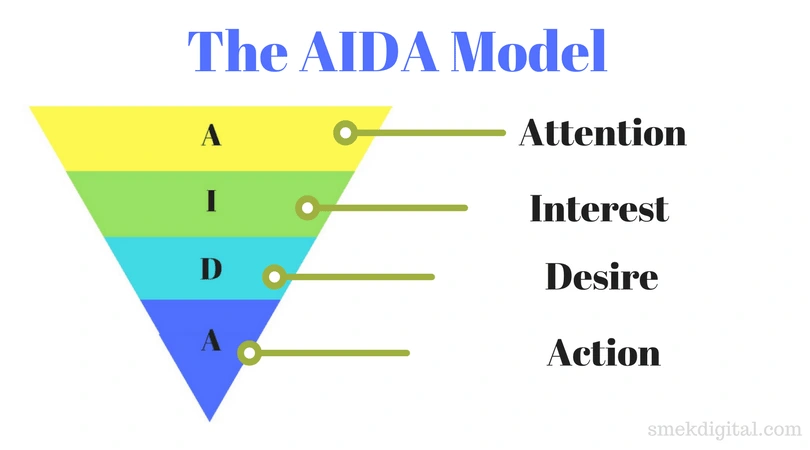
AIDA Model
How did I use the AIDA Model?
Before using this, I tried a variety of structures to see if they worked but it lacked the train of thought. AIDA model made my life easier, I must say. I picked my Information Architecture and divided the sections accordingly.
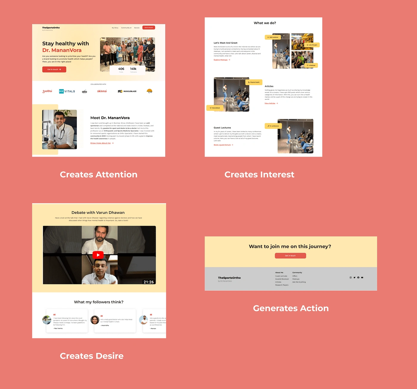
My Landing Page according to AIDA framework
Style Guide
What feel must this website have? What must be conveyed through this website?
Personalized yet clean, Simple, and look a bit modern too
I drew inspiration from his instagram posts where most of the time he’s in scrubs
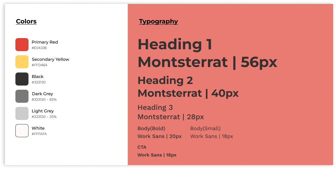
Style Guide
Visual Design, Feedback and Iterations
After many iterations, I got my first version of this landing page ready. Each section has been designed keeping in mind both the business and users. In this section, let us go through some of the iterations:
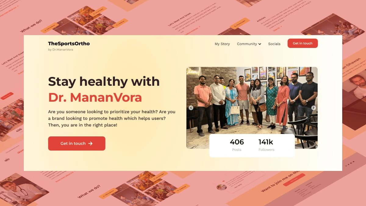
Hero Section
This is the most important part of a landing page. I thought of highlighting his instagram handle as one of our goals is to improve the followers which helps in building a health conscious community and thought of showing his achievements as that acts as a leverage for people to follow him
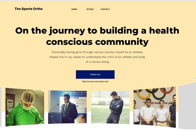
Initial hero section
Feedback received :
CTA is not helping the user discover him by scrolling. It takes the user to instagram which doesn’t serve the purpose of creating a website. That copy is not the best design decision.
Wanting to show everything on the hero section makes us end up showing nothing.
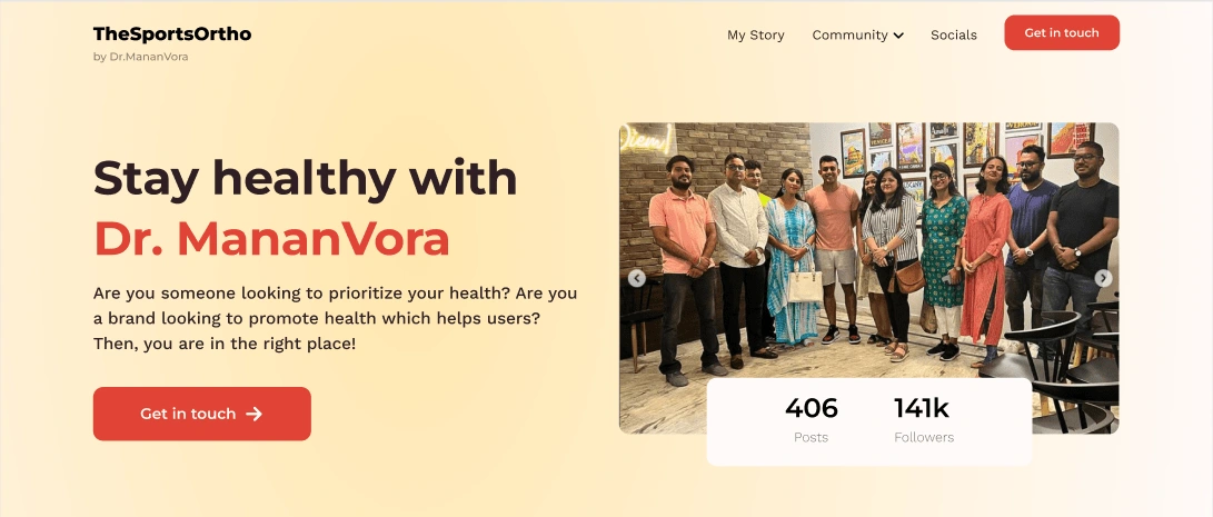
Hero Section after iterations
What Changed?
CTA — Get in touch — This helps improve the conversion rate which satisfies the business.
To show trust, instead of having achievements, something skimmable would be easy which is why we have shown numbers
Collaboration with Brands
Initially, this was at the middle, but with AIDA framework and through structural inspiration taken, having the brands right under the hero section adds value. It helps businesses identify his previous collaborations and gain trust for his new gigs.
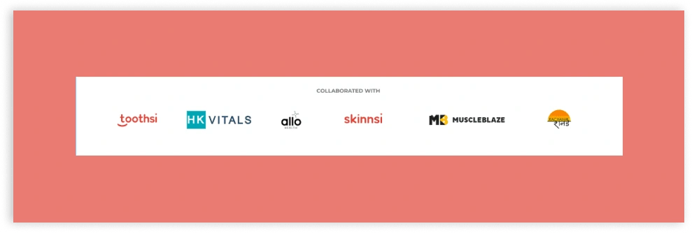
Previous Collaborations
About Me
In the previous iterations, there isn’t about me section.
Feedback received :
If I am a new user who directly opened the website, how do I know who he is, how he looks and all
If a business wants to know more about him, some brands who never came across his instagram but directly coming to website needs an introduction
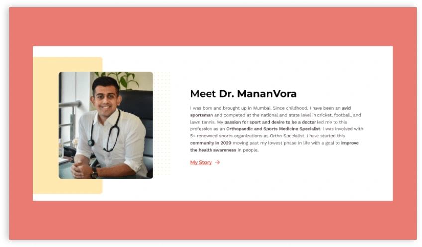
About Me Section
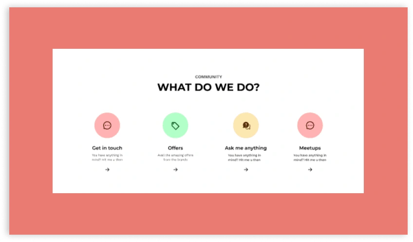
What’s in there?
What does he have to offer for the community is one of the most important sections as it acts as a Unique selling point for him
Initial design
Feedback received :
These look unrelated and instead of creating interest, they are creating confusion.
Instead of having all of these, having only the most important ones makes sense
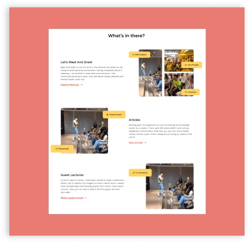
After iterations
What Changed?
Ask Me Anything is what anyone does but Meetups are exclusively done by him which no other creator does.
Same as his articles. It’s his kind of content unique to him
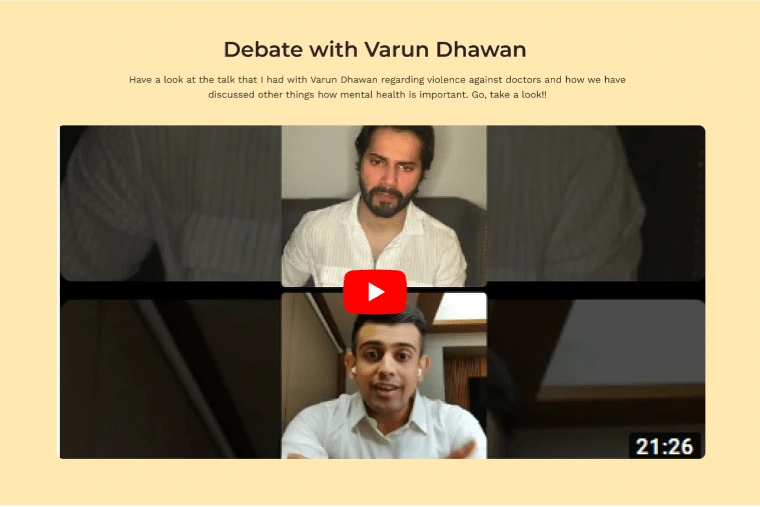
Celebrity Talks :
Various celebrities follow Dr.MananVora. I thought of making use of this create desire. This is a common cue I picked up when speaking to people.
Woah! Aliabhatt’s following him, let me check him out
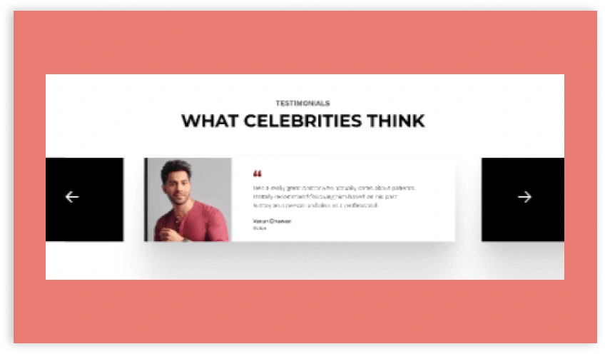
Initial Design
Feedback Received:
Consistency isn’t being maintained with user testimonials and celebrity testimonials. And, having 2 kinds of testimonials makes it a bit confusing too.
After iterations
What Changed?
Instead of confusing the users, having an impactful single celebrity interaction will be useful to create the desire.
Varun Dhawan being a great actor with many followers also lets brands know that their brand promotion will be going to next level.
Testimonials
Testimonials help improve trust and create desire looking at other people’s success of healthy life
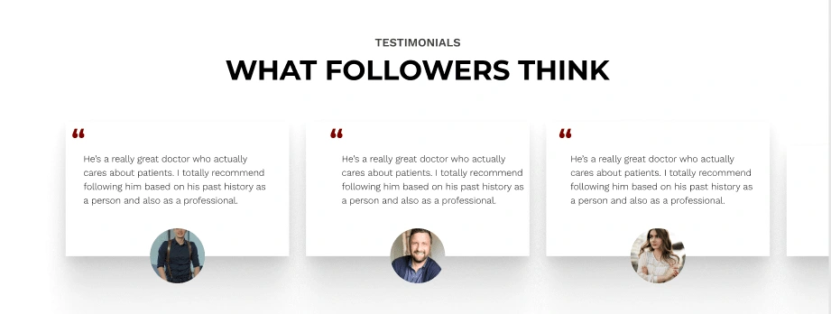
Initial Design
Feedback Received :
Shadows are too harsh
Not having the details of the person who gave testimonials is going to create a less impact and rather worse, it’s going to create a sense of doubt whether it is really true (or) false.
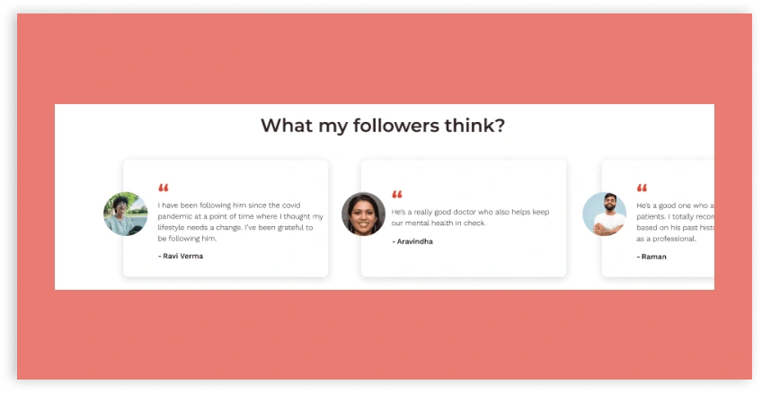
After iterations
Final Section
This is the section where we have chance to create an action
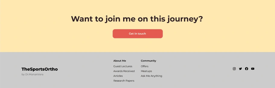
Final Design
Final Note
There are a lot of iterations that have been tried out in terms of layout, structuring, color and typography. I wanted this page to be as minimalistic and neat as possible to create a doctor’s vibe. Again, there’s a difference between undersimplified page and a minimalistic one.
This is pretty much it with the case study. Hope you had a good time reading it
Feel free to reach out for any queries: divya.pabbisetty@gmail.com | Twitter
Like this project
Posted Jan 25, 2025
I am going to take you through my process and explain my design decisions in the journey of designing a landing page for an internet creator Dr.MananVora
Likes
0
Views
6