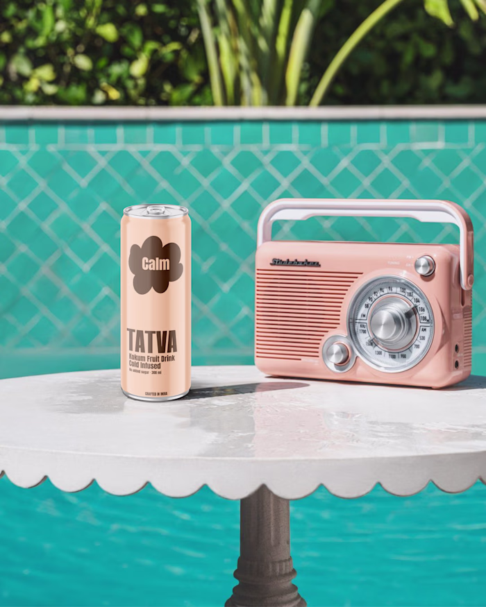
Tatva _ healthy drink brand Pacakging
Aneri Shah
Tatva
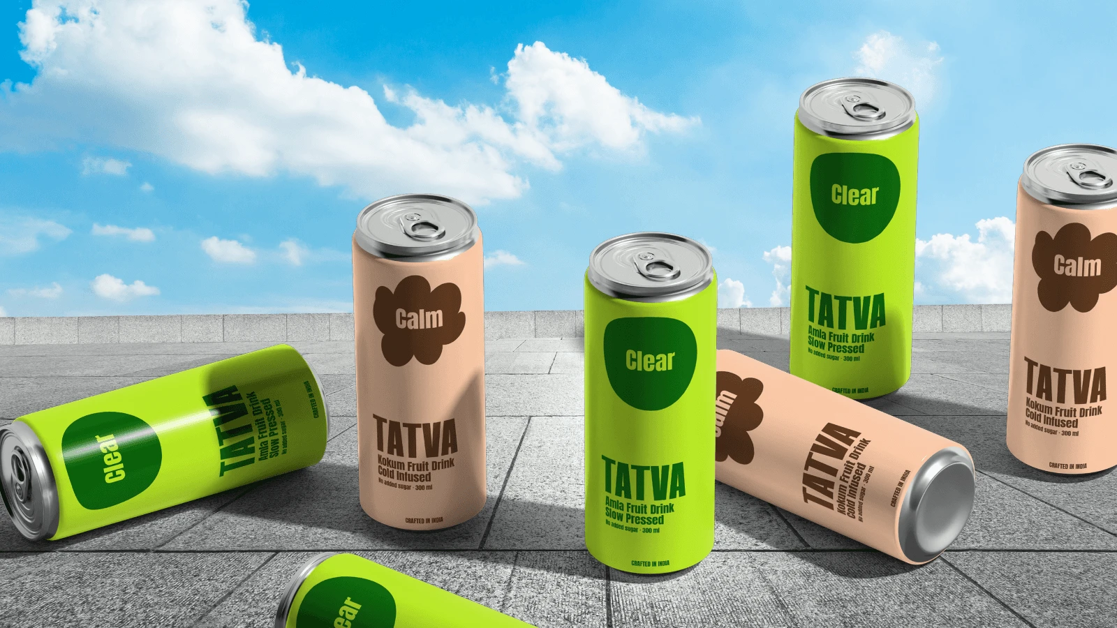
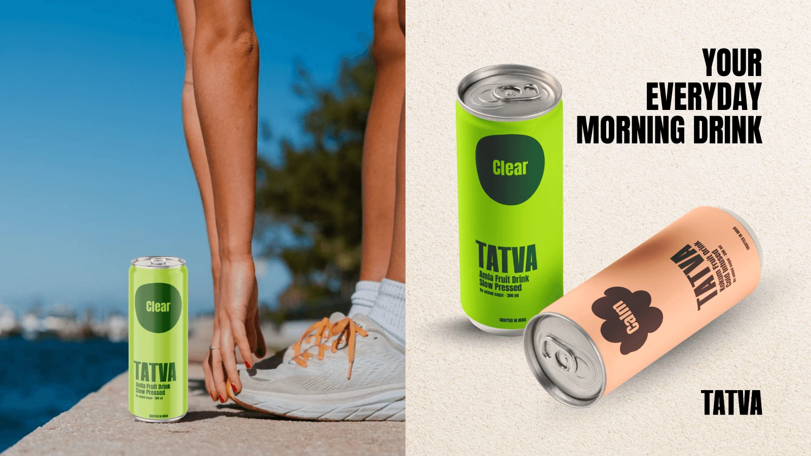
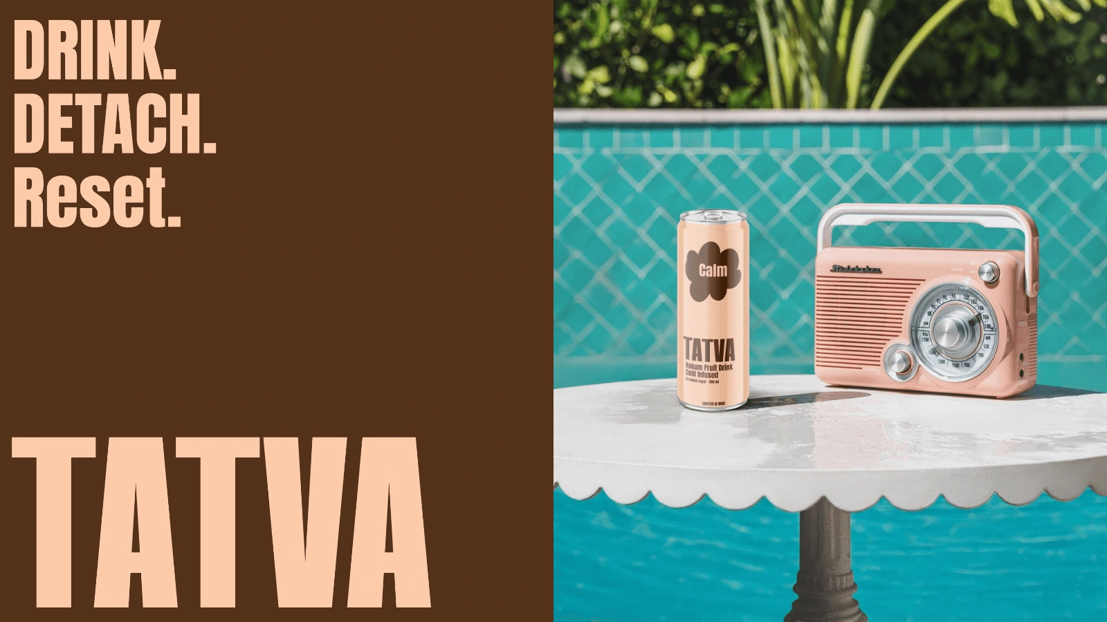
A vibrant functional beverage brand designed to translate emotions into everyday rituals. "TATVA" brings clarity and calm into a bold, modern packaging system that stands out and connects instantly.
Food & Beverage
2025
THE CREATIVE APPROACH
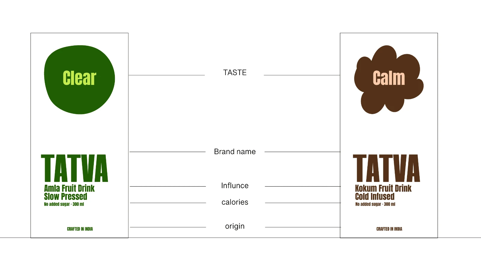
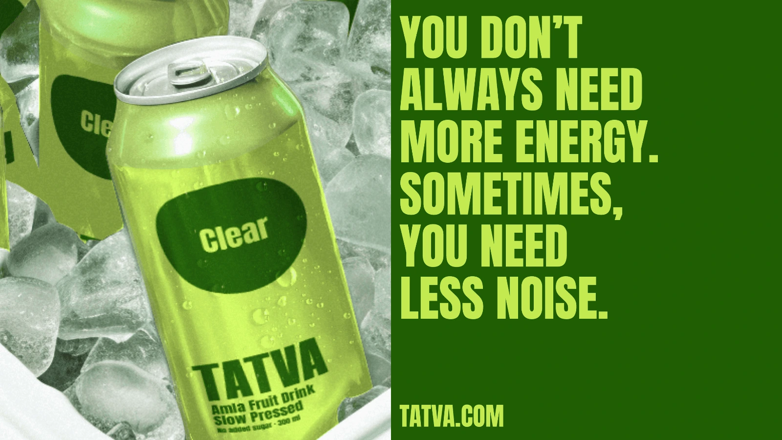
The direction is built on emotional minimalism—where each product is not just a drink, but a feeling. The visual system uses bold, flat colors paired with large organic shapes to represent moods like Calm and Clear, creating an immediate emotional hook. Typography is strong, clean, and unapologetic, allowing the brand to feel confident and contemporary. The contrast between soft shapes and structured layouts adds a sense of balance—mirroring the idea of inner alignment. The goal was to create shelf impact while keeping the design intuitive, memorable, and deeply human.
Logo design
Packaging design
Social Media Design
This project involved crafting a distinctive and scalable packaging-first brand identity. I designed the logo system to be clean and adaptable, ensuring it works seamlessly across cans, multipacks, and brand extensions. The packaging design was the core focus—developing a bold visual language using color coding, expressive shapes, and clear typography to differentiate flavors and emotions while maintaining a cohesive system.
In addition, I defined the overall creative direction—establishing the color palette, typography, layout structure, and visual tone for campaign imagery and brand applications. From single cans to multi-pack compositions, every element was designed to maximize visibility, emotional connection, and consistency across retail and digital platforms.
Like this project
Posted Jun 23, 2026
A vibrant functional beverage brand with bold packaging design translating emotions into everyday rituals through modern visual identity.