Savoury heaven- brand identity.
SavoryHeaven is a boutique culinary brand dedicated to creating an immersive dining experience that transcends the ordinary. Melding culinary artistry with visual appeal, SavoryHeaven crafts a world where every dish is a heavenly delight for the senses.
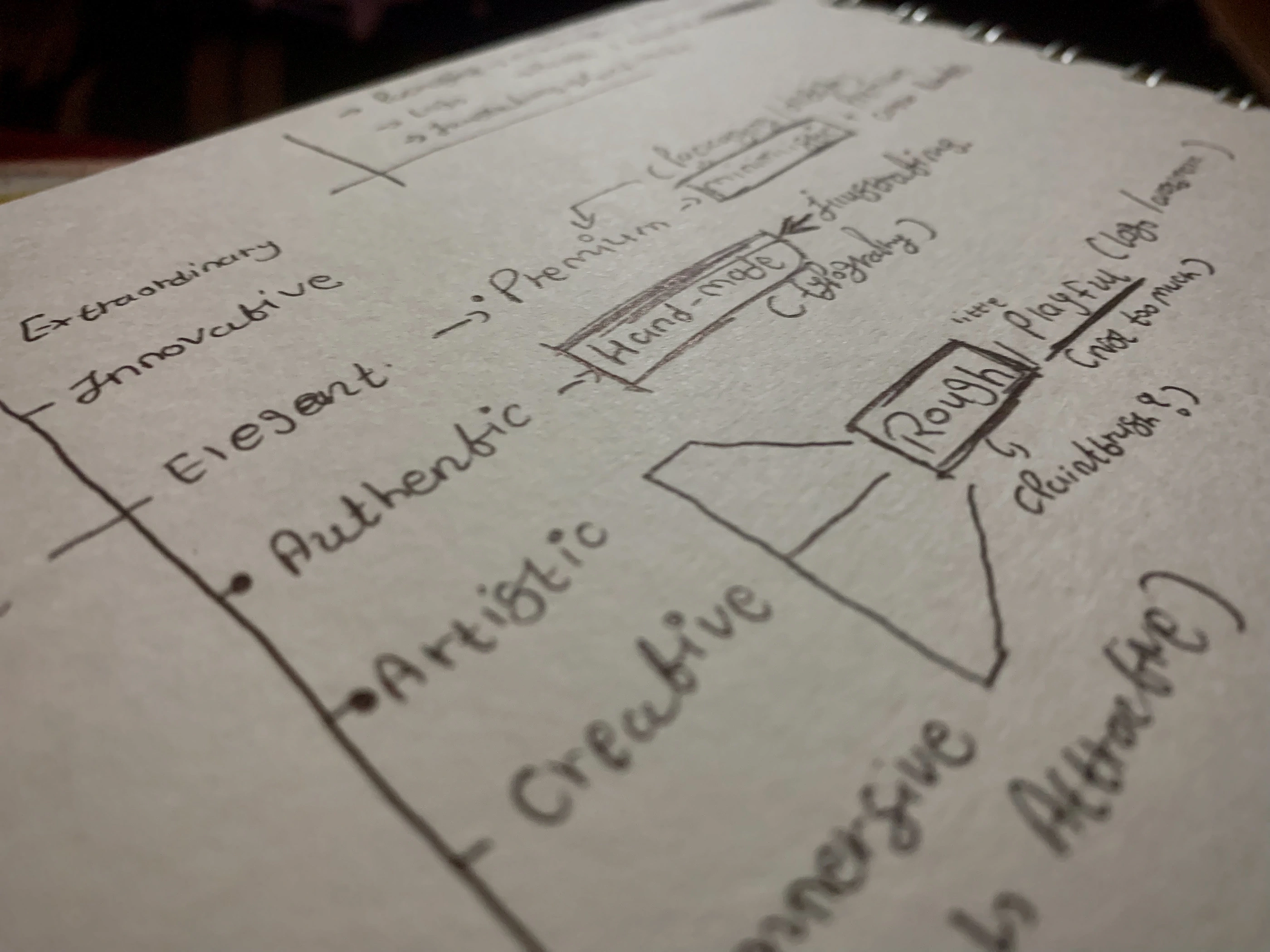
Despite crafting divine culinary creations, SavoryHeaven lacks a unified visual identity that mirrors its commitment to both artistic presentation and heavenly flavors. And as a result, a cohesive design system with an attractive and memorable logo becomes necessary.
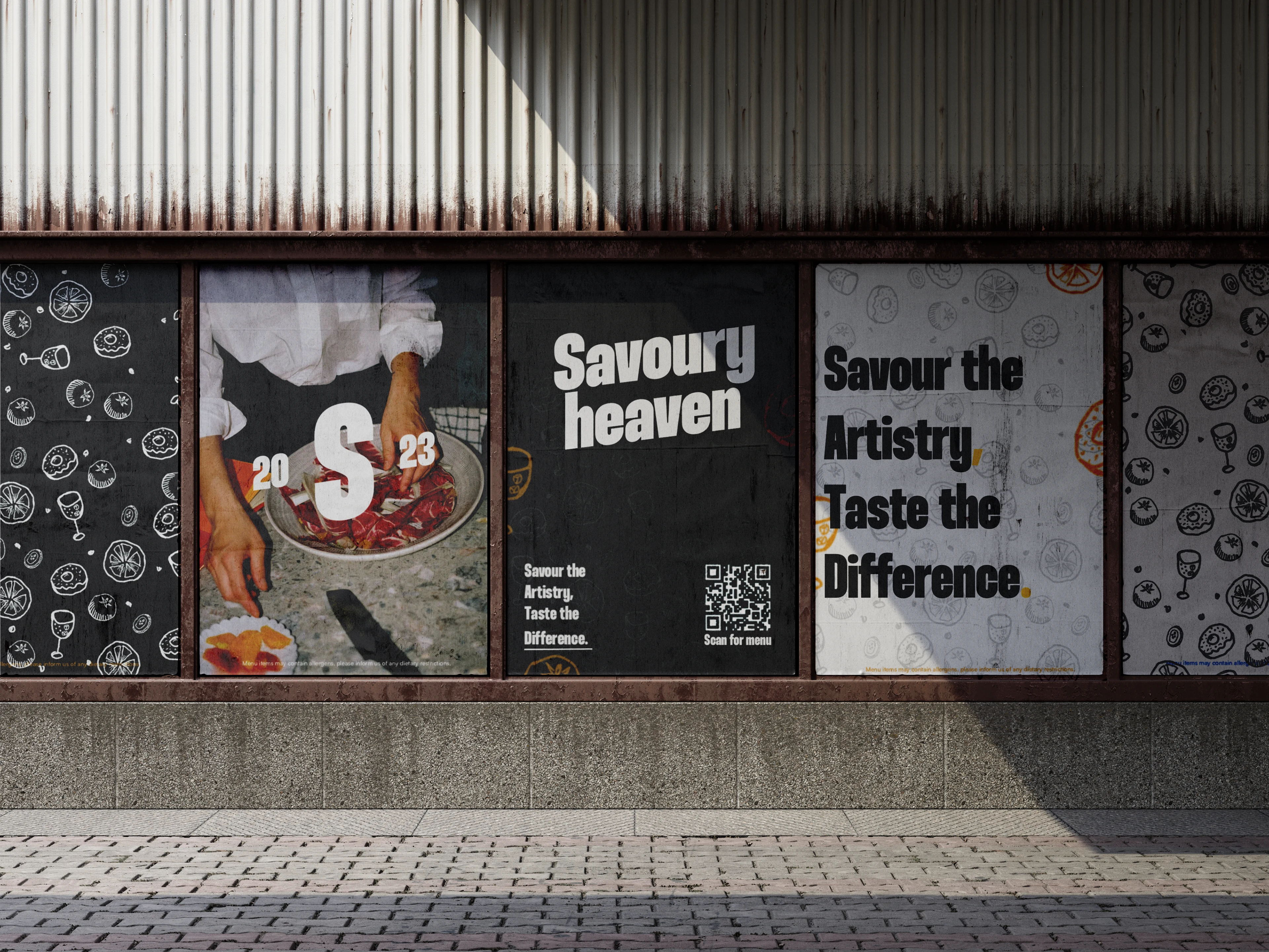
The majority of competition of the brand relies on heavy cluttered design elements as their visual identity. Savoury heaven takes an approach of minimalism while also conveying a sense of something that is hand crafted, which helps the business stand out from others.
The research led to the few characteristics that are necessary to be a part of the brand’s design system, namely Elegance, artistic, passionate and Authenticity. These have been implemented throughout the brand’s designs to make it be more cohesive as well as consistent. All this adds up to make the brand be more memorable and something that is more than ordinary.
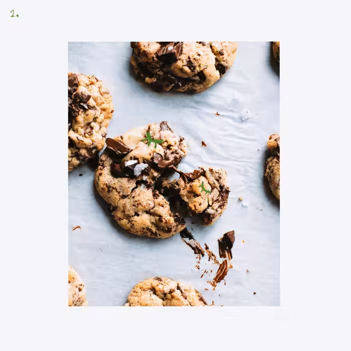
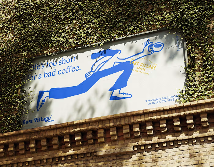
Hand drawn elements have been used extensively throughout to convey the artistic as well as the authentic feeling which provides a sense of comfort and are visually appealing. As a result, Savoury heaven becomes more distinguished and easy to find among many.

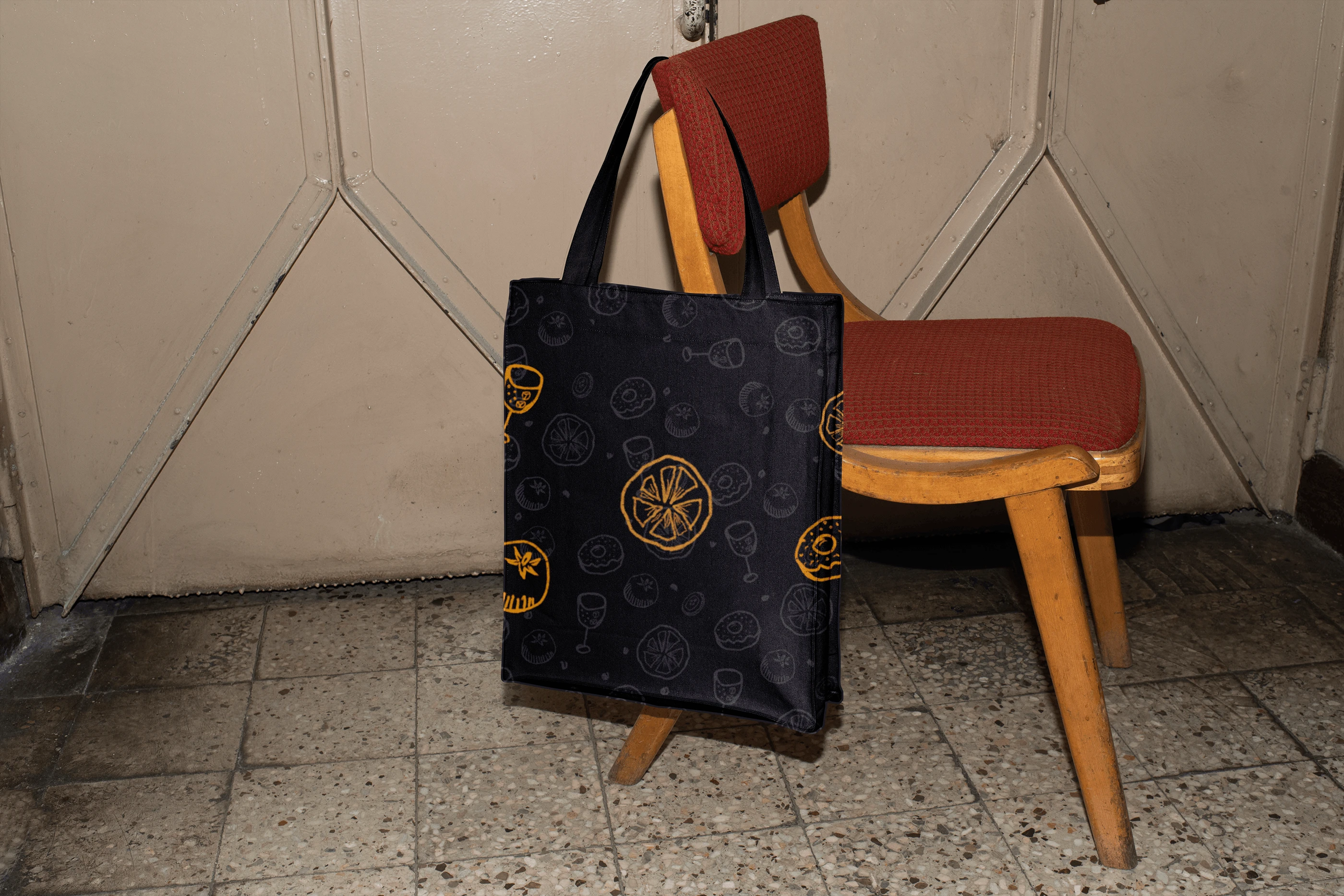
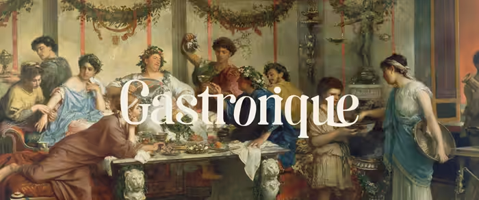
The wordmark is scalable and works across many applications and is recognisable throughout. The wordmark is simple yet bold. Which conveys a feeling of crafting something new which is a core philosophy of Savoury heaven. It catches the attention of the viewers in a very subtle and effective manner.
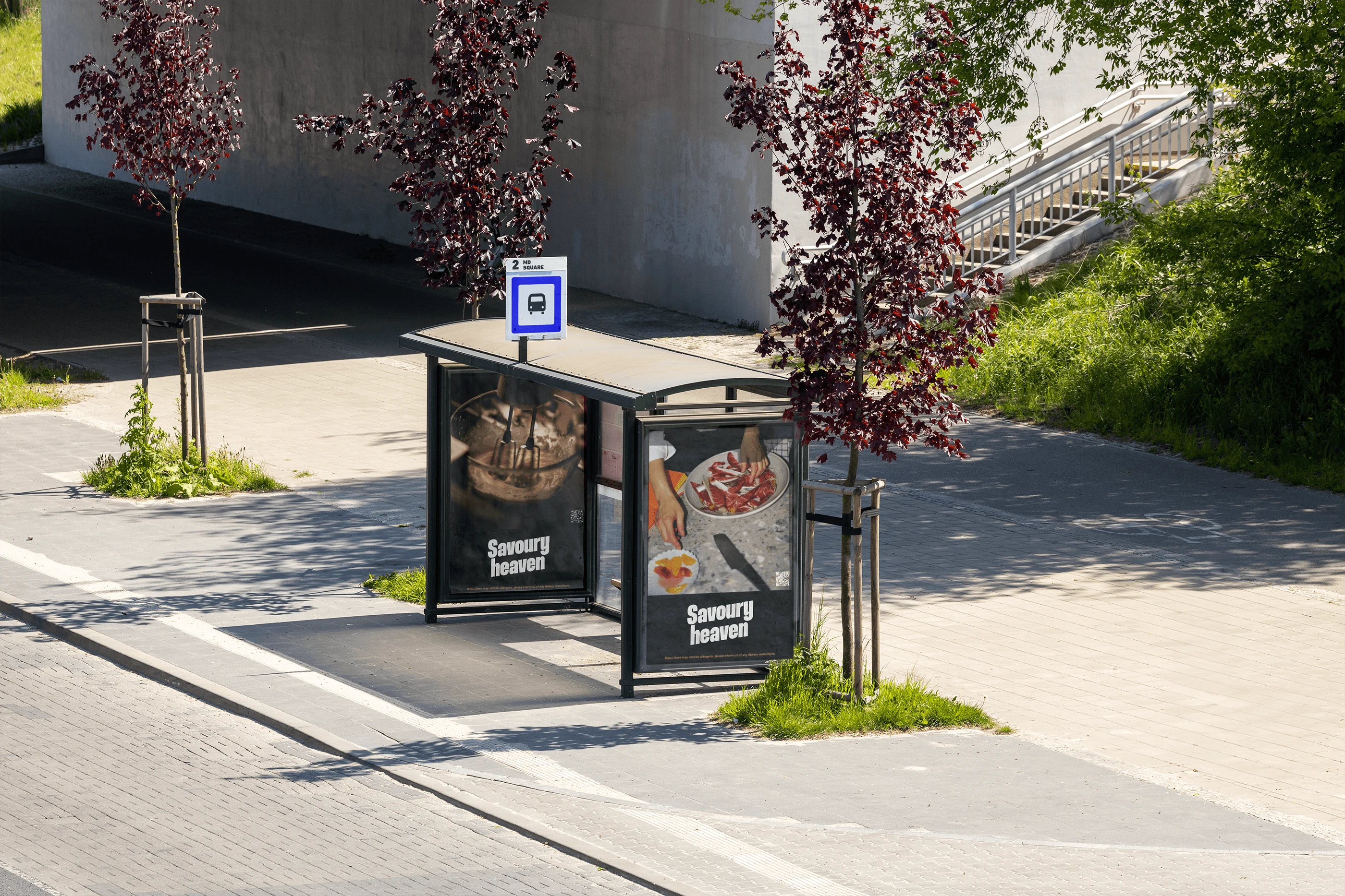
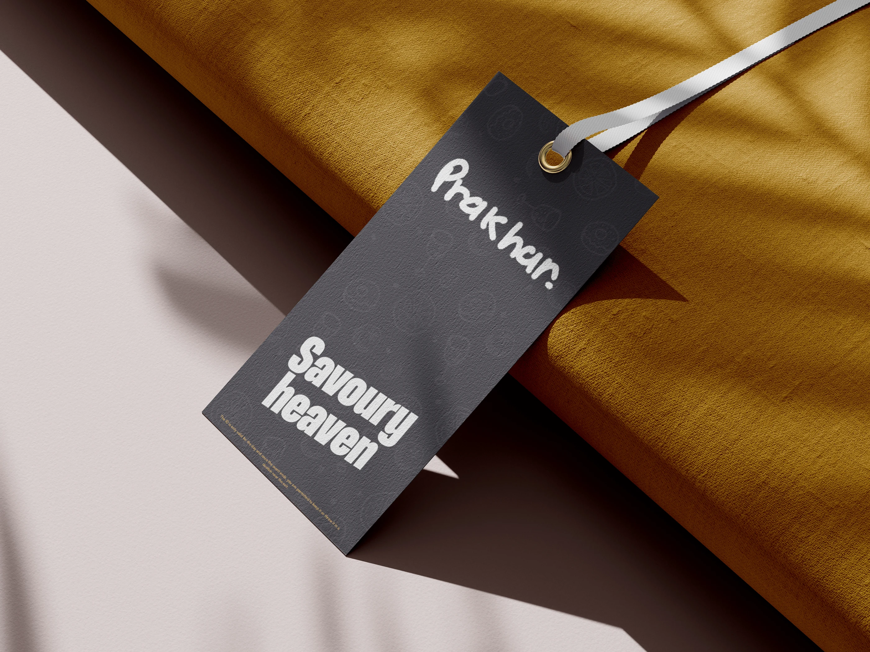
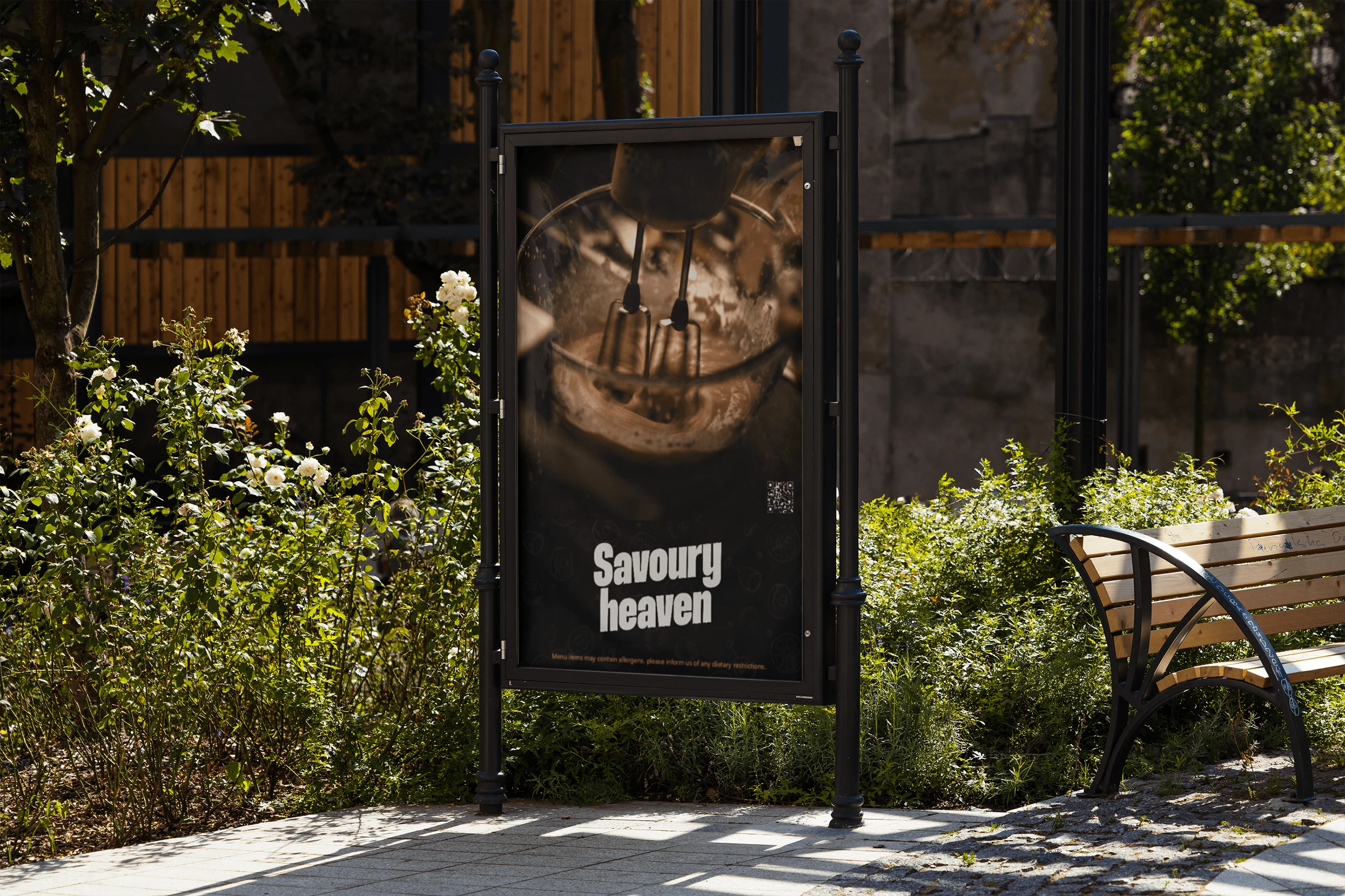
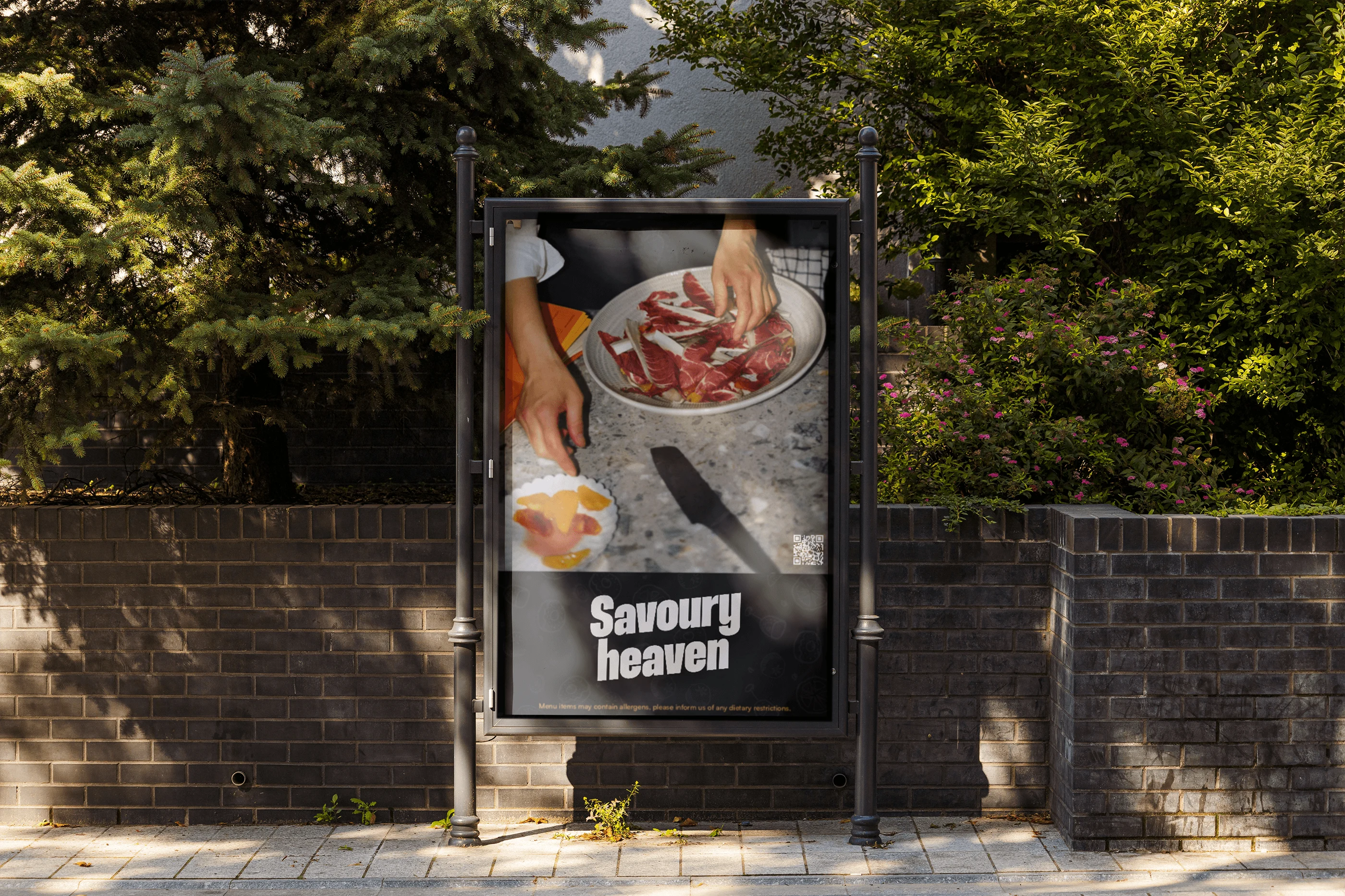
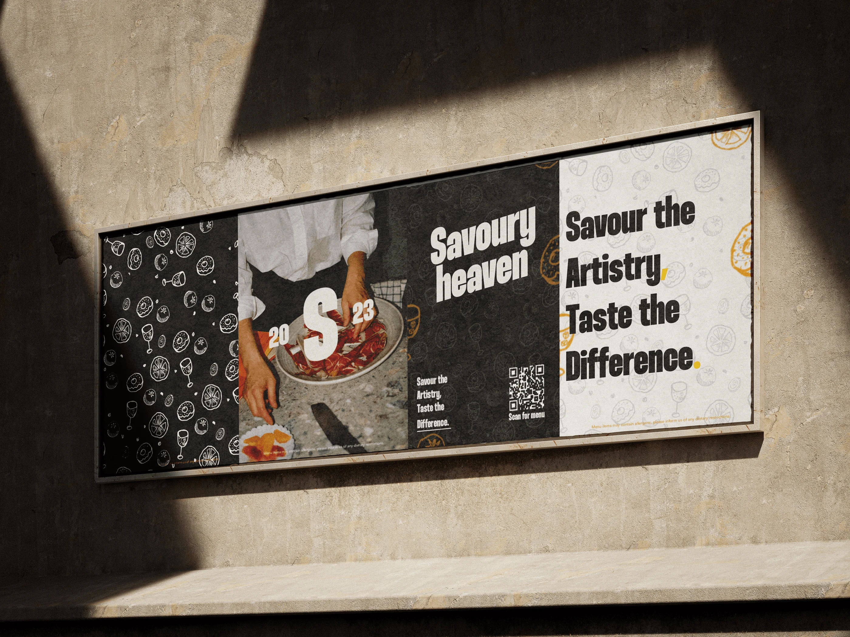
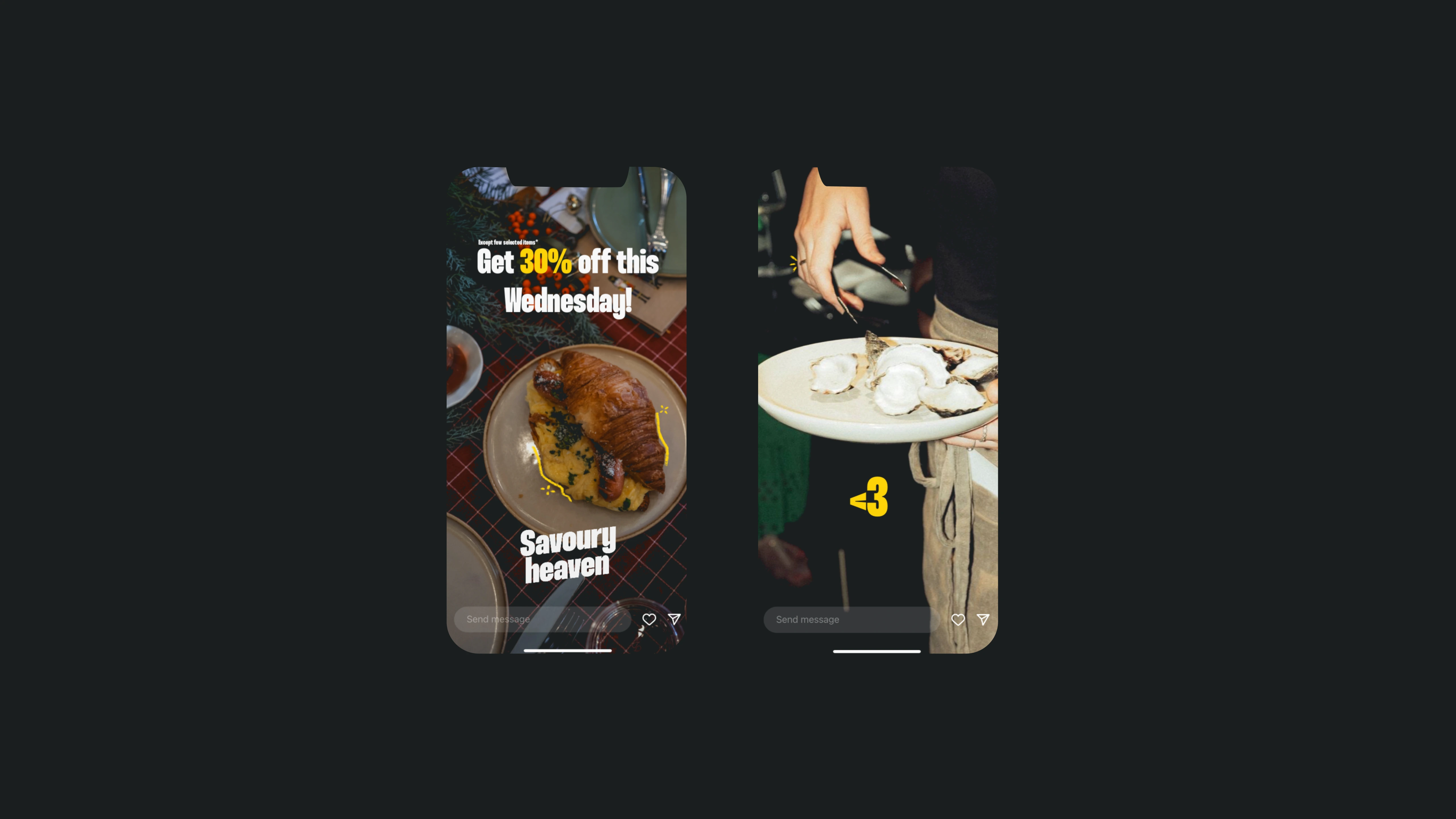
The provided elements as well as the colours can be utilised to let the viewers instantly be familiar with the posts or the content uploaded by Savoury heaven.
Overall, the design of Savoury Heaven not only ensures memorability and artistic distinction but also strategically positions the brand as a standout entity within its competitive landscape. The meticulous selection and thoughtful utilization of every design element underscore a commitment to enhancing the overall brand image and fostering a positive impact on the business.
Like this project
Posted Jan 22, 2024
The entire visual identity for Savoury heaven, which is a culinary brand dedicated to creating an immersive dining experience that transcends the ordinary.

