Elea Skincare Brand Design & Packaging
Elodie Fontaine
Elea, A skincare ritual designed for stillness
The brief called for something rare in contemporary beauty: a brand built around stillness rather than claims.
In a market crowded with transformation promises, Elea was conceived as a quieter proposition: a skincare ritual designed to slow the moment down.
The central design challenge was one of restraint. Softness can easily read as emptiness. Calm can tip into cold. The work required finding the precise weight: visual, tactile, typographic, that would make slowness feel intentional, and silence feel rich.
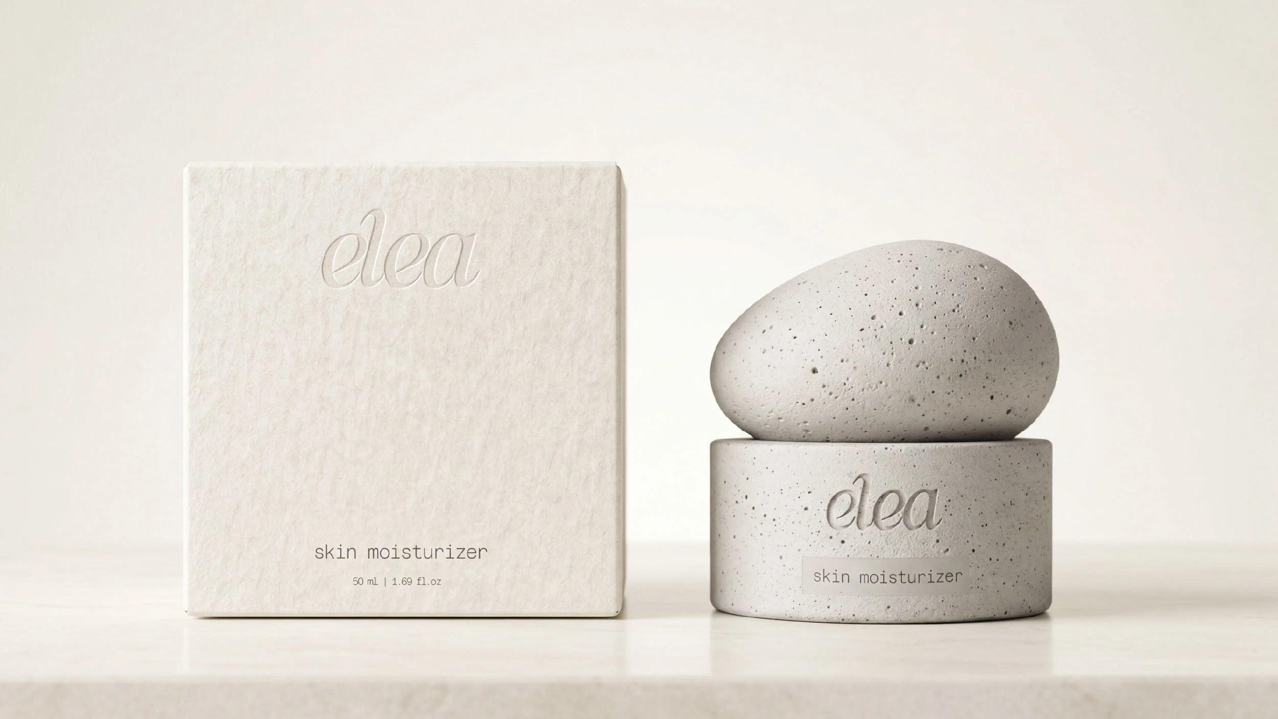
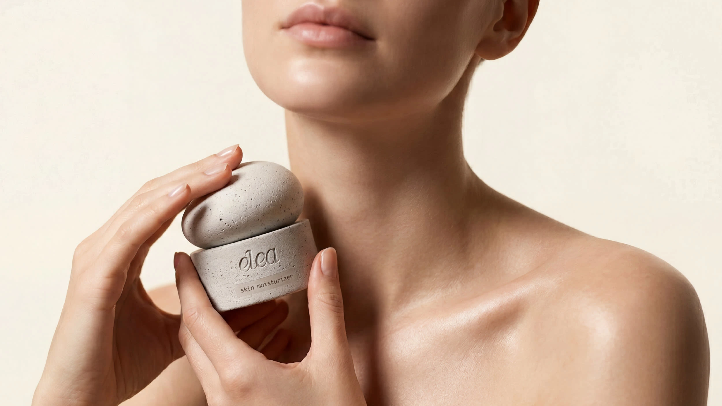
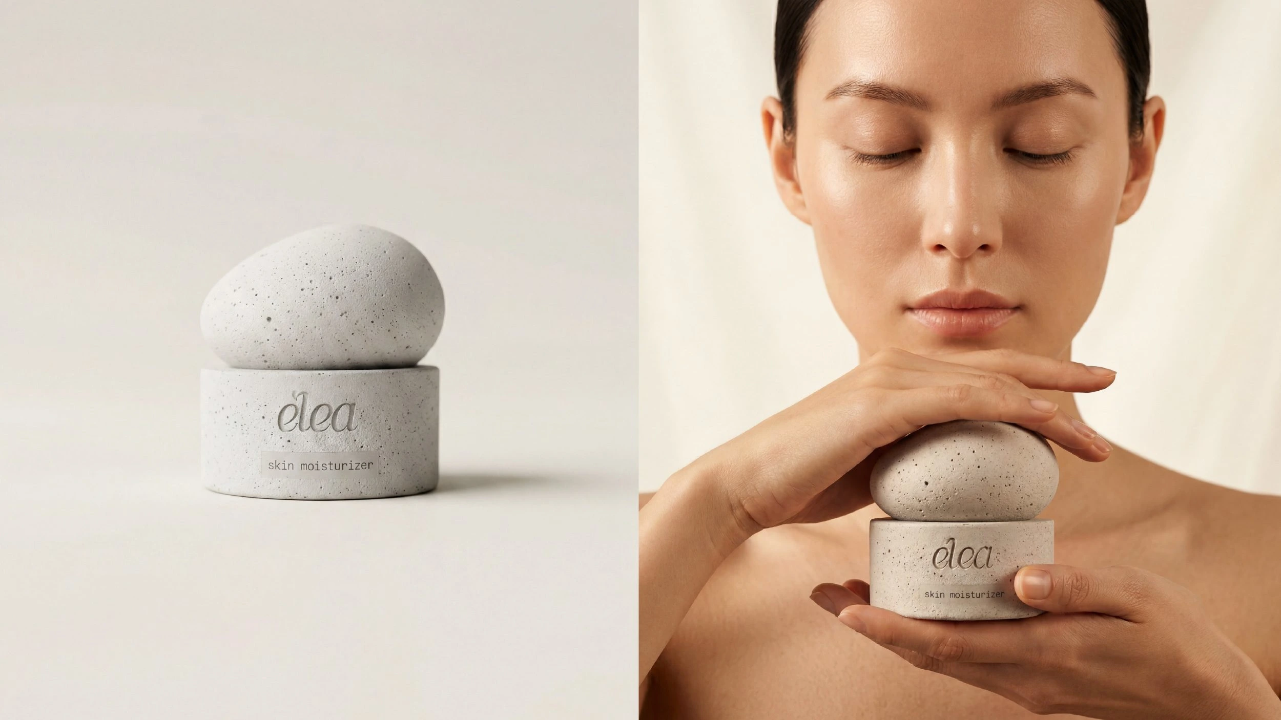
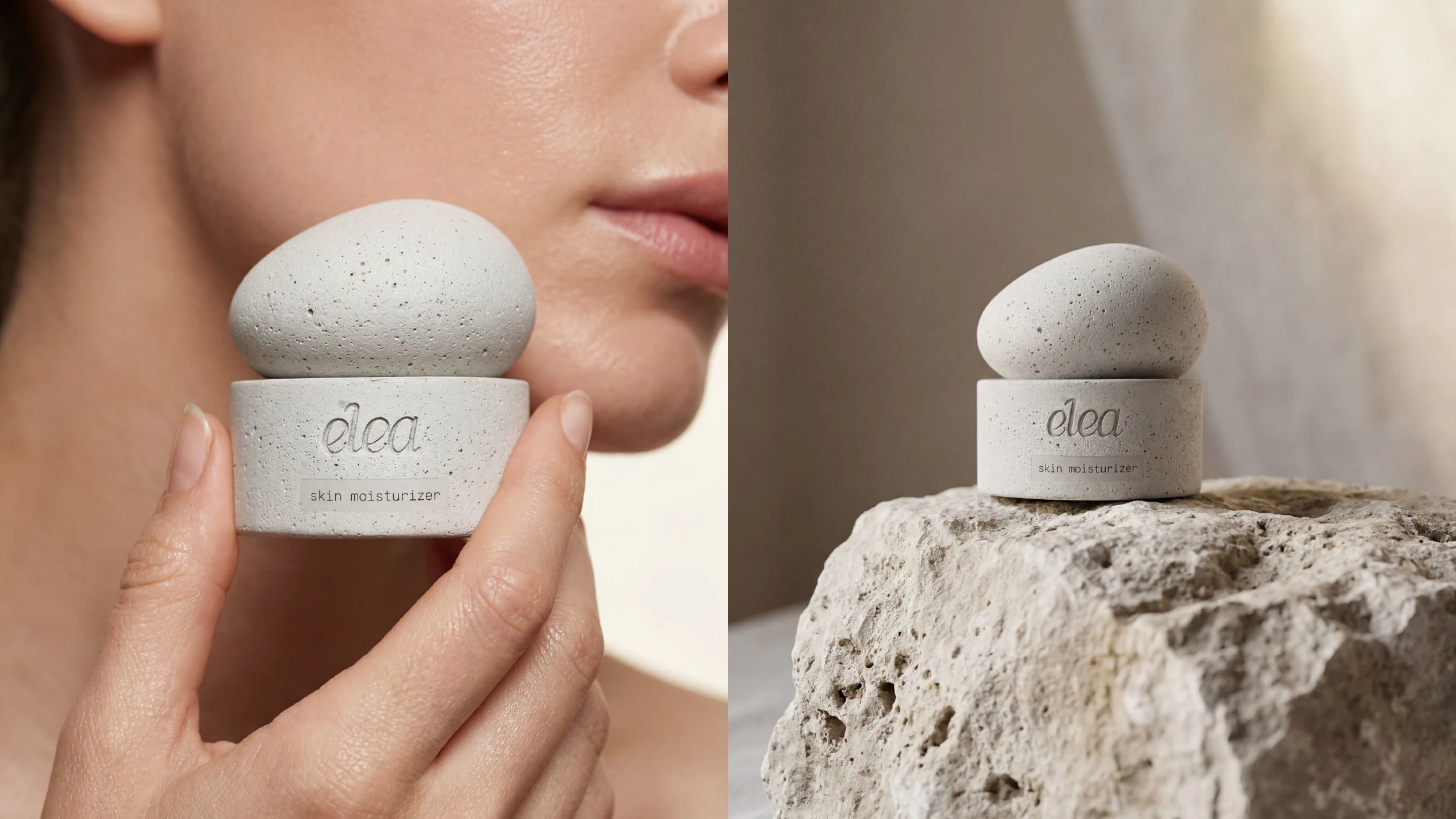
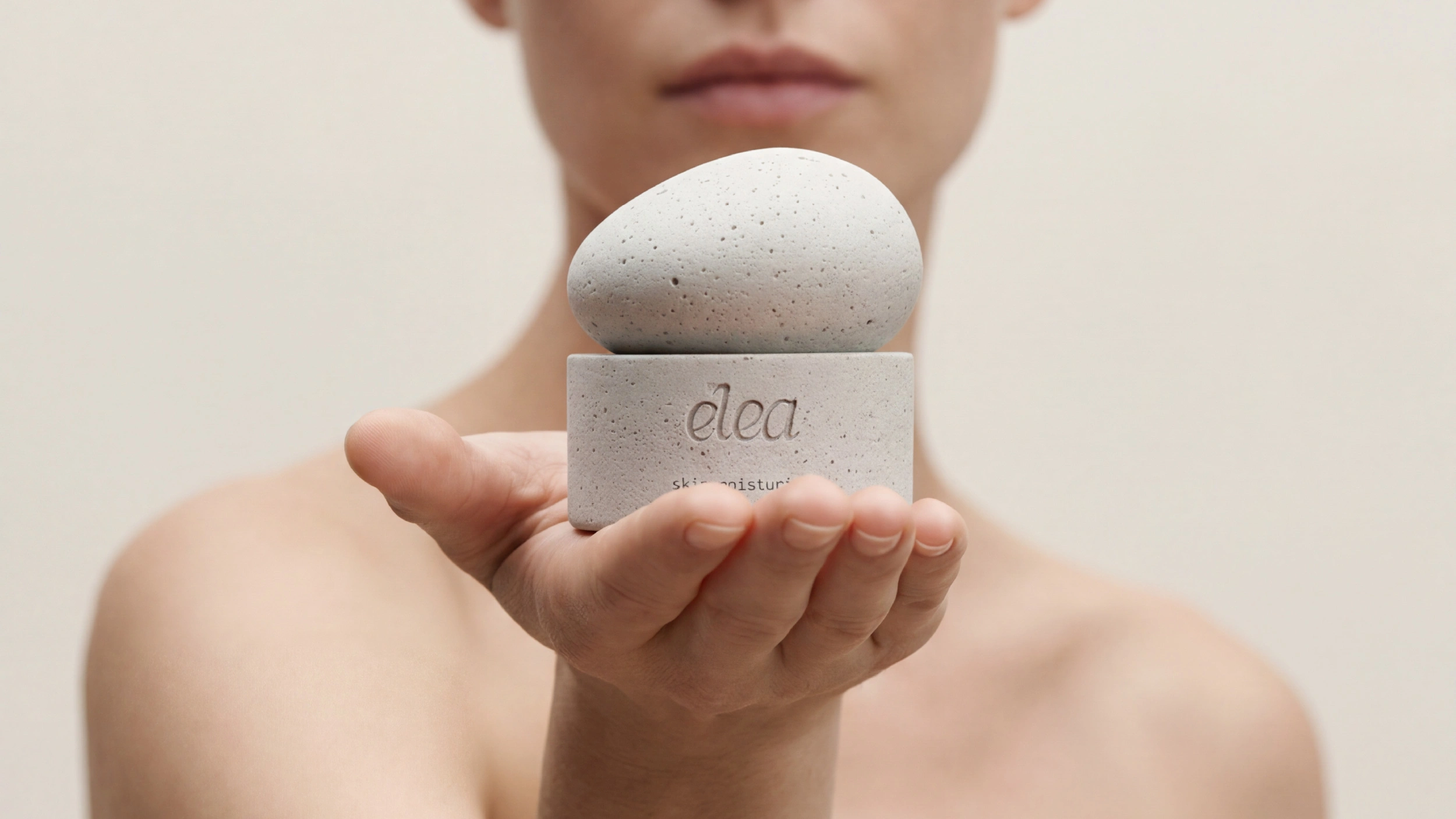
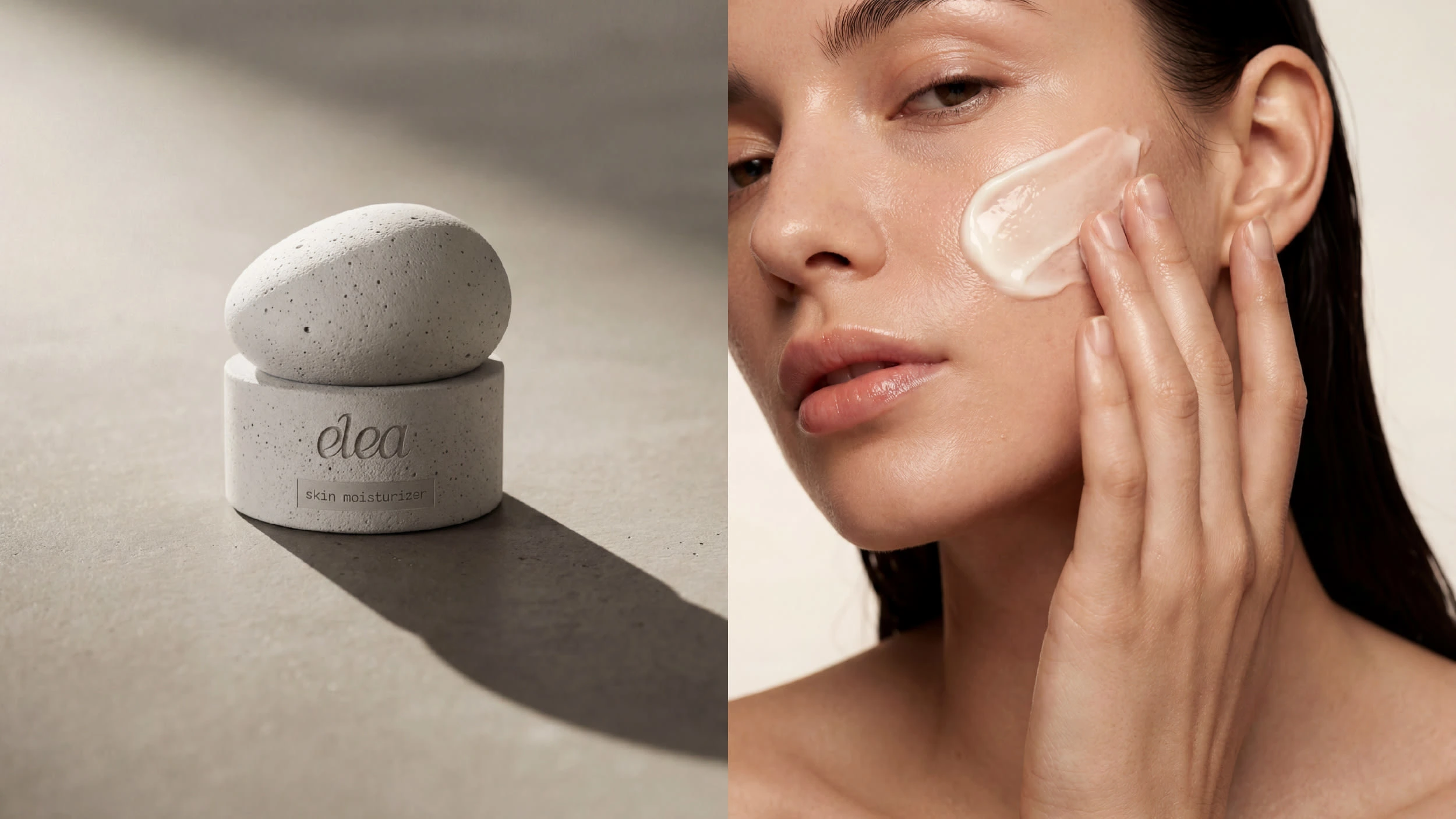
The jar was conceived as an object worth keeping. Its form borrowed from river stones, smooth and grounded in the hand. The matte mineral finish suggests stone without mimicking it: a texture that invites touch rather than display.
The visual language was built on restraint: a palette of soft neutrals, generous white space, and a photographic direction rooted in light, materiality, and quiet composition. Nothing competes. Everything resonates.
Typography was chosen for its stillness, letterforms that hold their ground without demanding attention. The result is a brand that communicates through atmosphere as much as through words.
Elea doesn't compete for attention. It earns it through restraint: a brand coherent enough to feel inevitable, and gentle enough to disappear into the ritual it was made for.
A moisturizer that doesn't overwhelm the skin. A design that doesn't overwhelm the space it lives in.
Like this project
Posted Apr 14, 2026
Elea is a skincare brand built on one idea: care should feel like a pause, not a performance. A quiet alternative to beauty's transformation promises.