Logo & Visual Identity System for Craft Brand
Vera Rodrigues
Logo & Visual Identity System for Craft Brand
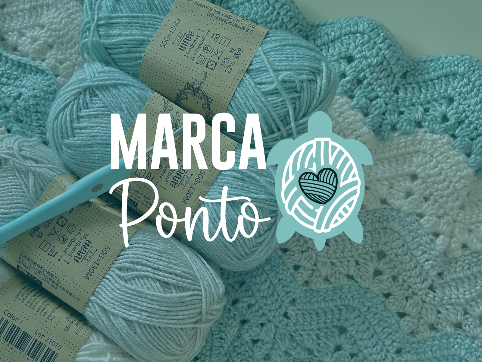
Marca Ponto is a handmade craft brand focused on slow, meaningful creation. The goal was to develop a visual identity that reflected patience, care, and artisanal quality.
The brand required a logo that could communicate handmade authenticity while remaining professional and scalable across digital and physical applications.
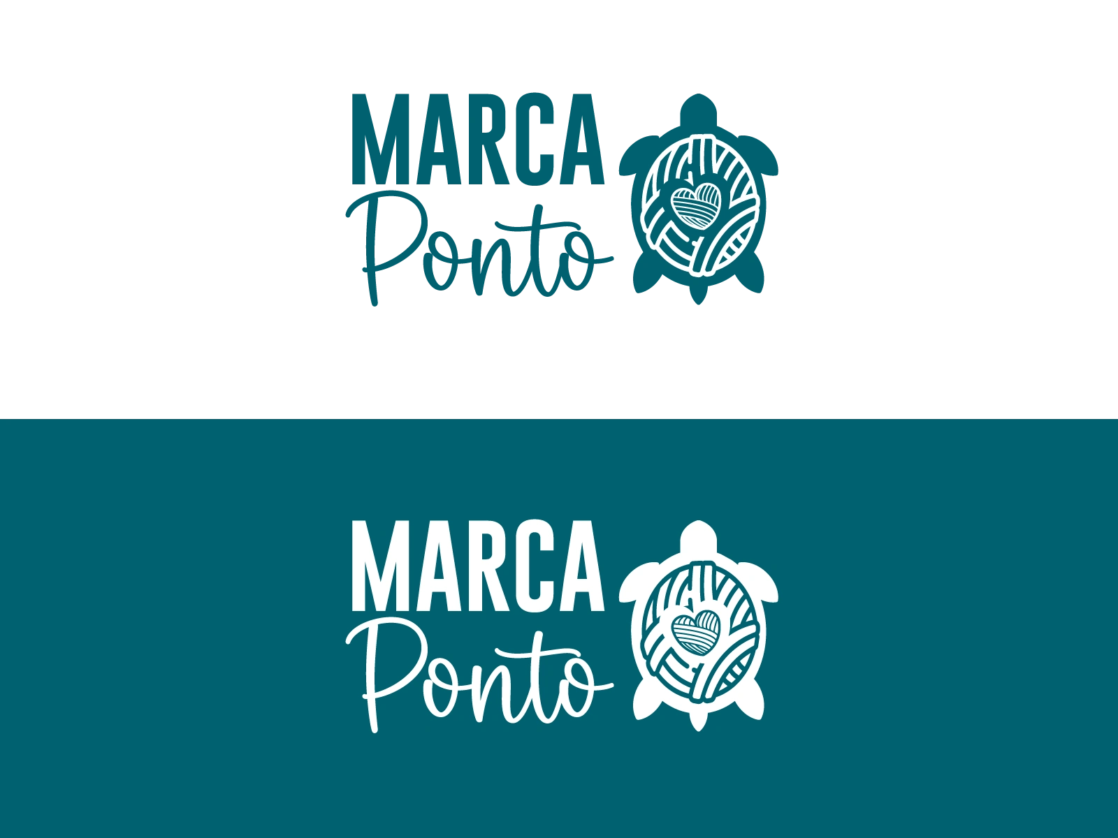
I developed a symbolic mark combining three core elements: a turtle representing patience, a yarn ball symbolizing craft, and a heart expressing care and emotional connection. The typography pairs a bold sans-serif with a handwritten script to balance structure and human touch.
The result is a cohesive brand identity system including primary logo, monochrome variations, typography pairing, color palette, and real-world mockup applications.

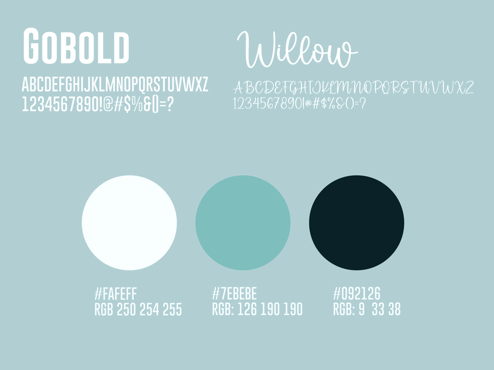
Soft Teal (#7EBEBE)
Represents calmness, trust, and creativity. It connects directly to the handmade craft world while maintaining a modern and professional tone.
Deep Teal (#092126)
Adds depth and structure to the identity. It strengthens contrast, improves legibility, and supports the brand’s more refined positioning.
Off-White (#FAFEFF)
Introduces softness and warmth, preventing the palette from feeling too cold. It mirrors natural fibers and raw materials used in craft.
Together, the palette balances warmth and professionalism, supporting a brand that is both emotionally expressive and visually structured.
Like this project
Posted Feb 10, 2026
Designed a complete brand identity system for a handmade craft business, including logo, color palette, typography, and scalable visual assets.
Likes
0
Views
6