Gamified UX Dashboard | Engaging EdTech Design
🧠 EdTech Dashboard with Gamified UX
UI/UX Design for Educational Platforms to Boost Engagement and Retention
Project Overview:
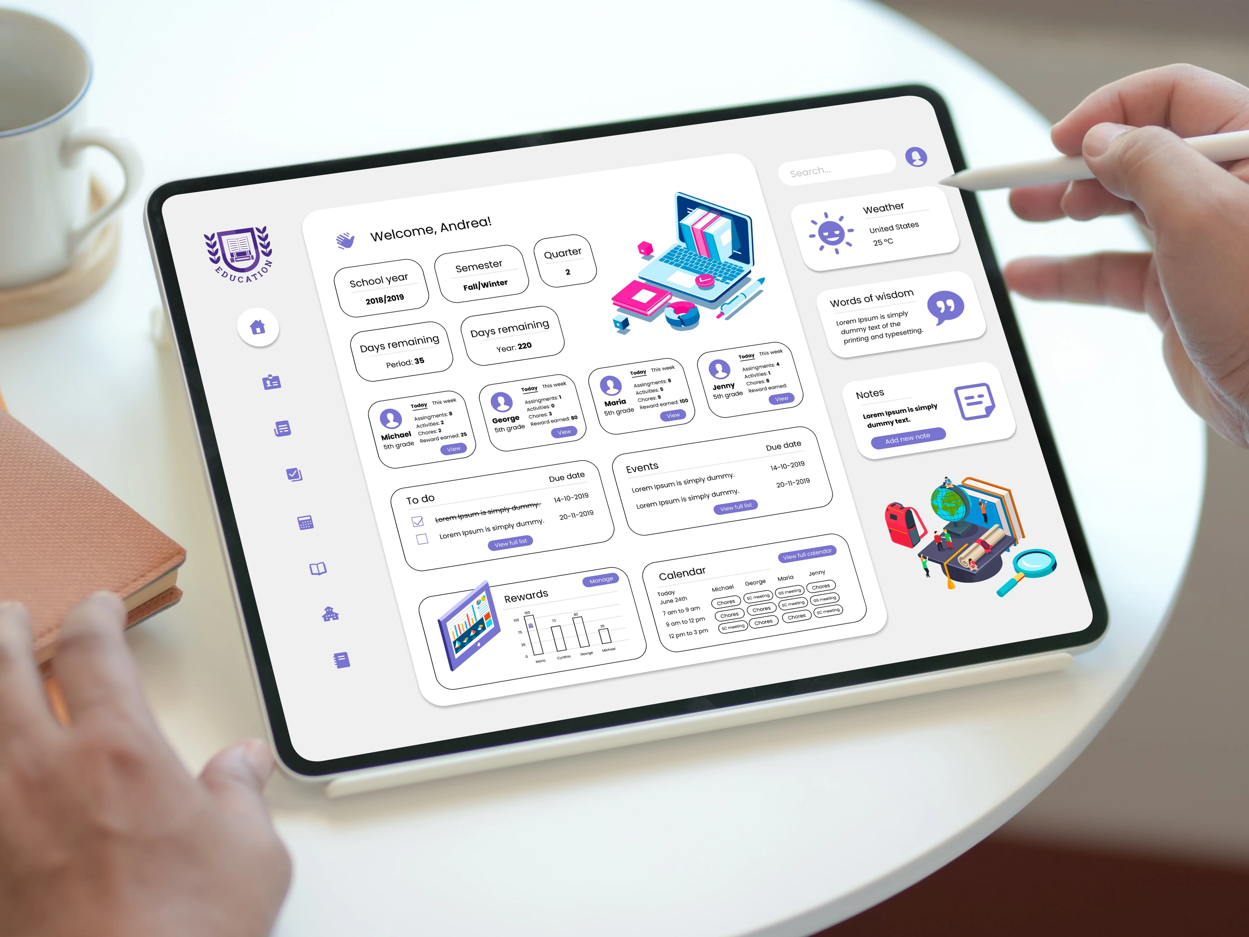
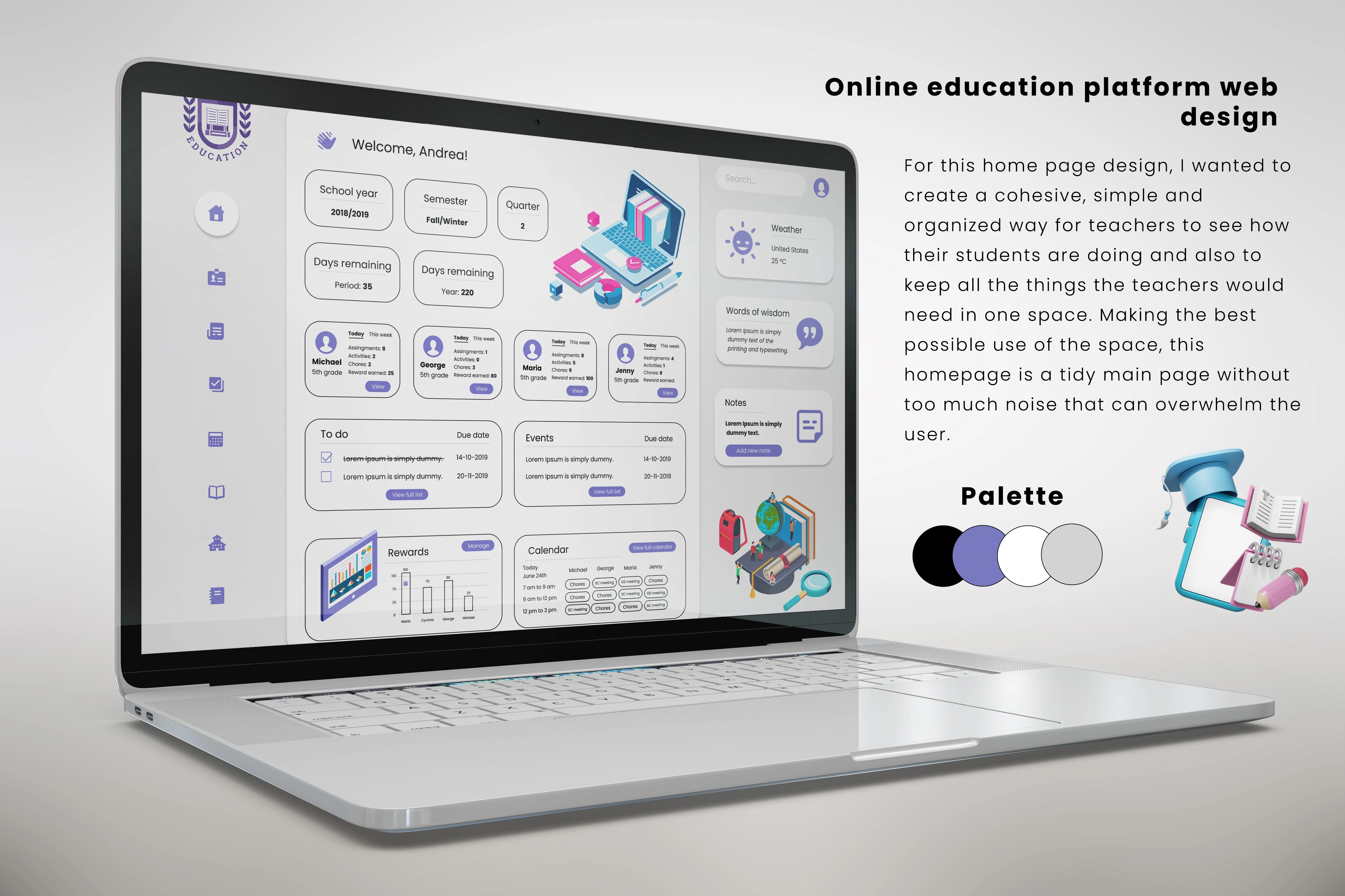
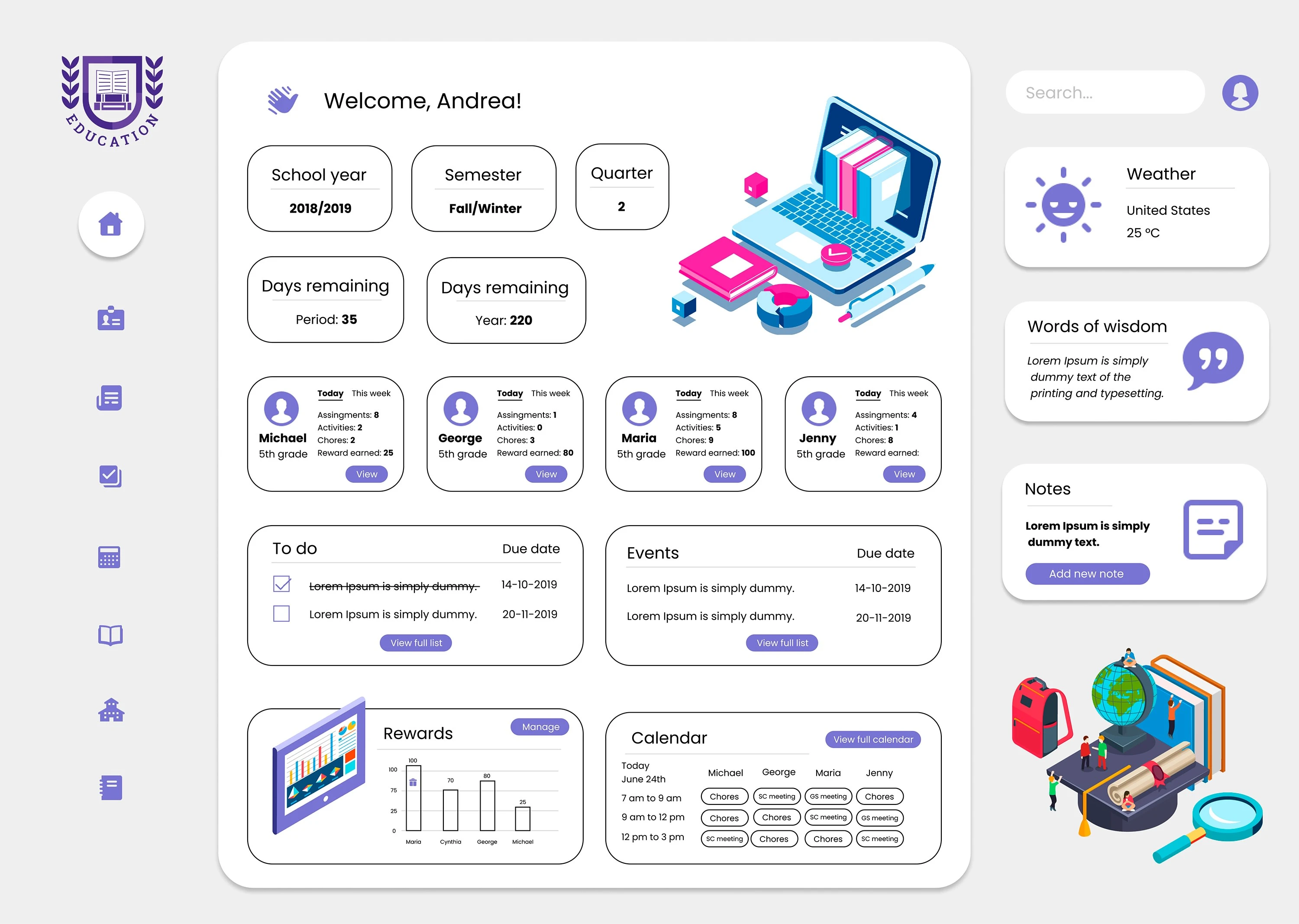
I designed an EdTech Dashboard with gamified UX and neuro-inclusive accessibility, tailored for educational platforms, Learning Management Systems (LMS), and SaaS solutions aiming to improve student and teacher experience. This dashboard combines interactive data visualization, game mechanics, and intuitive interfaces to transform routine learning tasks into engaging and meaningful experiences. (View project)
🎯 Key Objectives
✅ Increase student engagement through gamification elements.
✅ Create an intuitive interface for neurodivergent users, including ADHD-friendly design.
✅ Reduce cognitive load and enable progressive learning.
✅ Provide teachers with a centralized panel and actionable analytics. (View project)
📌 Dashboard Features
🧩 1. Integrated Gamification
Includes progress bars, badges, XP points, and leveling systems, turning tasks into motivating “missions” that enhance intrinsic motivation and student retention.
📊 2. Teacher Analytics Dashboard
A responsive panel for real-time metrics, allowing instructors to:
Track progress by class or student
Adjust learning strategies using data
Manage live sessions, assignments, and grades all in one place.
♿ 3. Accessibility & Inclusive Design
Strategically designed to reduce sensory overload and support executive function, critical for users with ADHD or other neurodivergences.
💡 Key Benefits of Gamified UX
🔹 Higher Engagement: Purpose-driven gamification motivates and retains users.
🔹 Intuitive Navigation: Visual hierarchy and user-centered design speed up platform adoption.
🔹 Universal Experience: Accessibility best practices ensure inclusion for diverse learners.
🔹 Better Course Completion: Rewards and instant feedback foster a sense of achievement.
🛠️ Tools Used
🎨 Figma (Components & Auto-layout)
🖌️ Adobe Creative Suite
💡 User-centered and motivation-driven UX principles
📌 Why This Project Stands Out
This dashboard is not just visually appealing; it’s strategically designed to make learning fun and accessible. Gamification isn’t decorative—it’s grounded in psychological principles to boost motivation, progression, and user retention.
If you want to implement strategic gamification and inclusive UX in your educational product or LMS, let’s collaborate!
💬 Available for freelance projects or partnerships.
Like this project
Posted Feb 19, 2024
Gamified EdTech dashboard designed for student engagement and teacher analytics. Inclusive UX, intuitive UI, and data-driven design for modern educational LMS.
Likes
1
Views
18


