HPC Casas | Brand Identity & Web Design
HPC Casas is a turnkey home design and construction company based in Buenos Aires, Argentina.
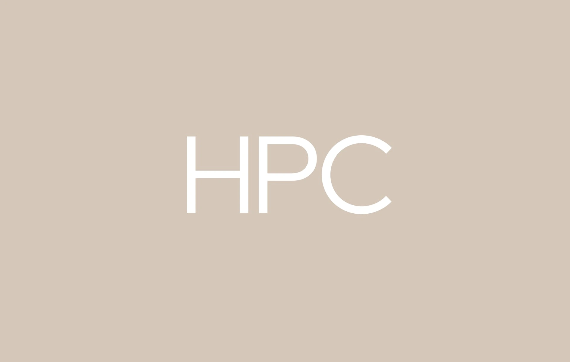
Logo Design for HPC Casas
We worked on the creation of the branding, as well as photography, social media design and planning, and website design.
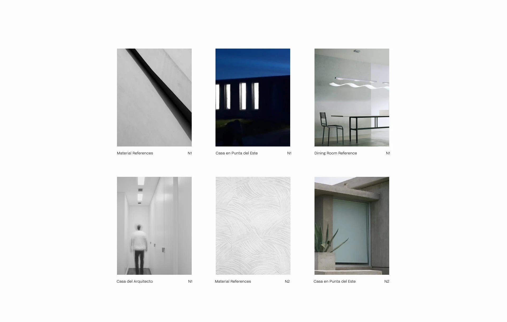
Element Research for HPC Casas
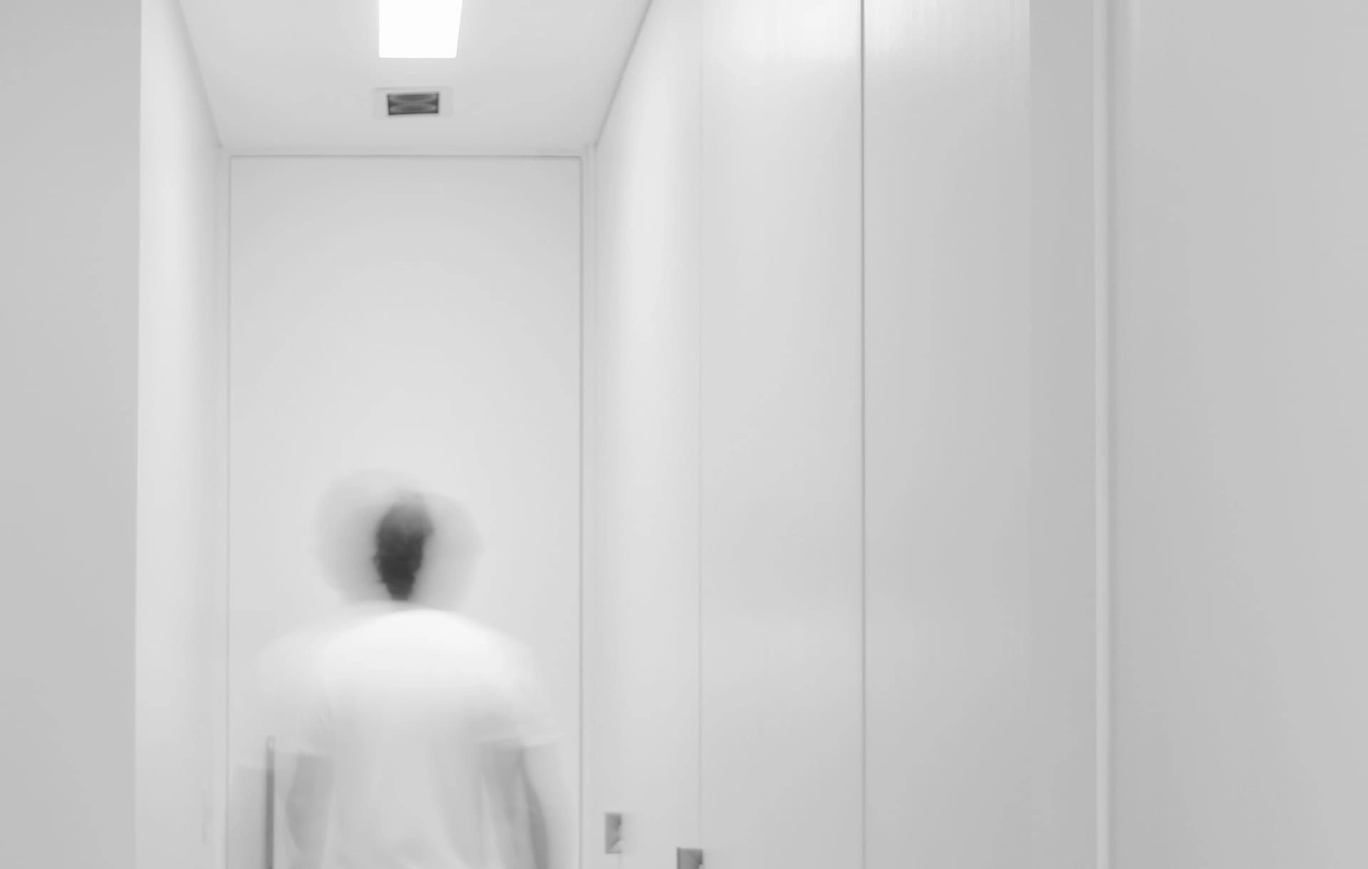
Photography for HPC Casas
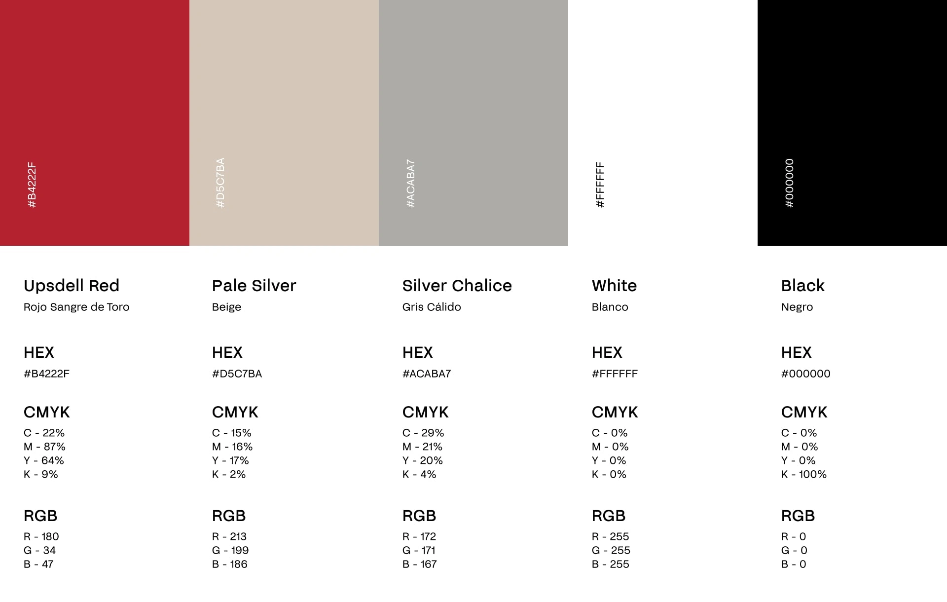
Color Palette
The direction we took was a minimalist aesthetic, with a geometric typography for the logo, and one with a bit more personality as a supporting font. We came up with a clean and clear branding, but also approachable to the consumers. The color palette has an intense red as the main color, followed by a range of grays and neutrals, with the addition of black and white.
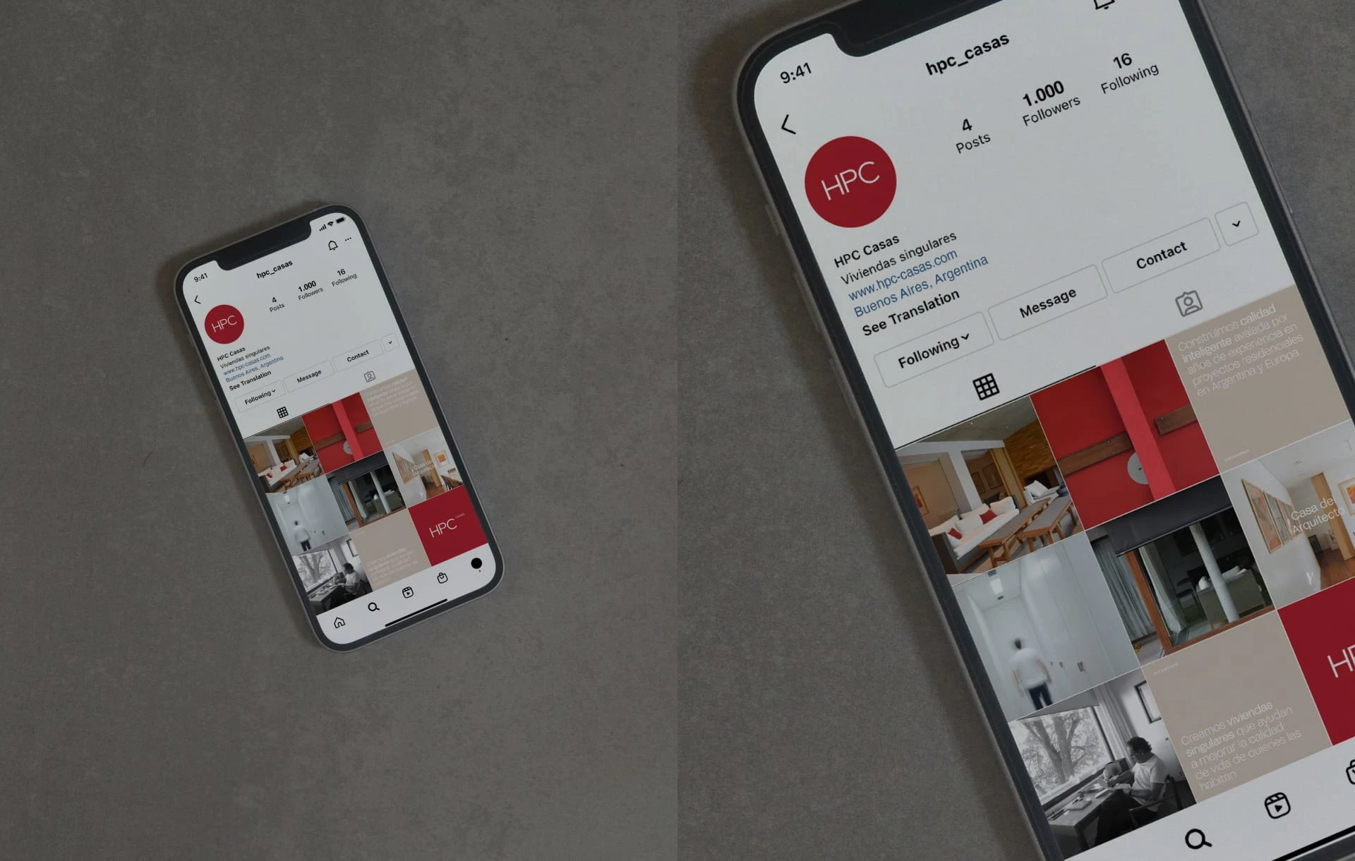
Social Media Design and Planning
These concepts were also applied to the design of social media posts and website, where we prioritized clarity, so that each of the pieces could be understood to the greatest extent possible.
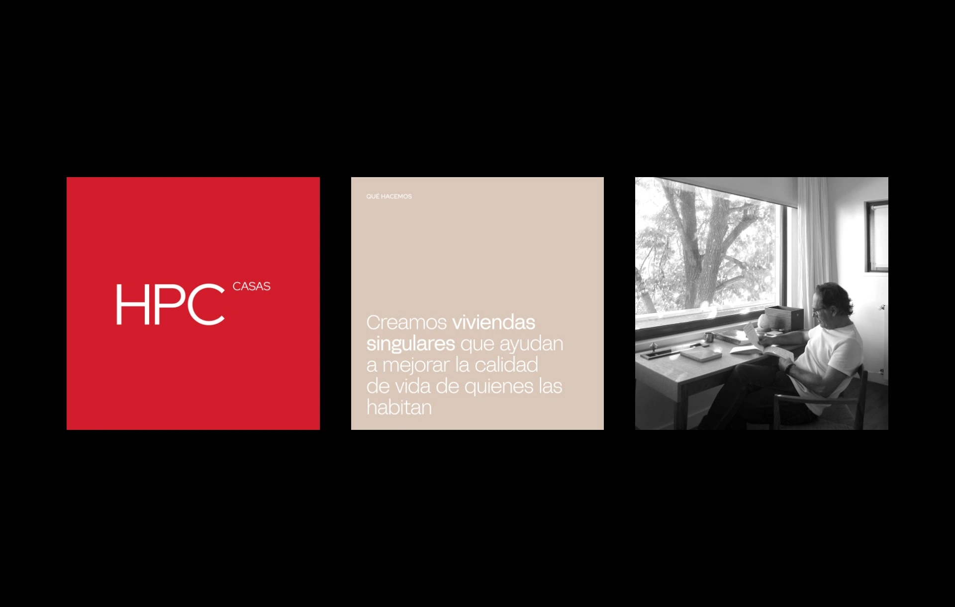
Instagram Posts Design
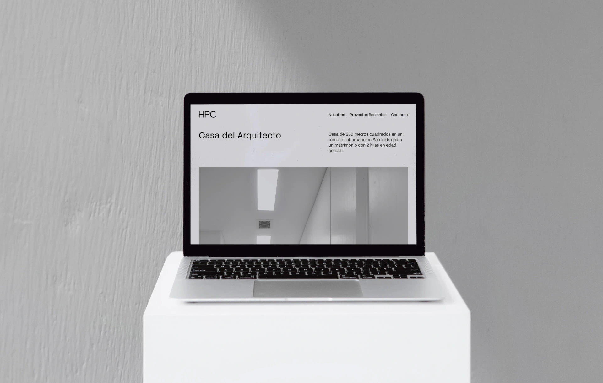
Web Design
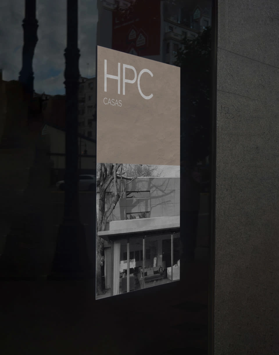
Poster Design
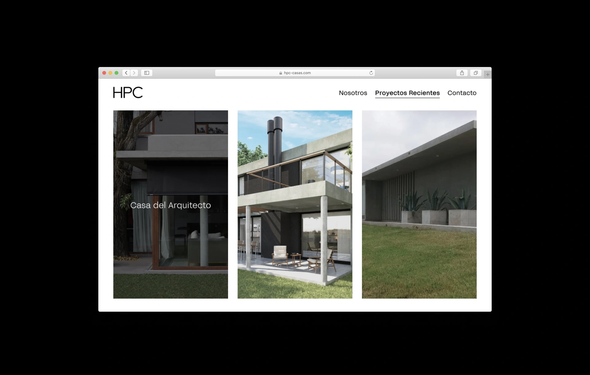
Web Design
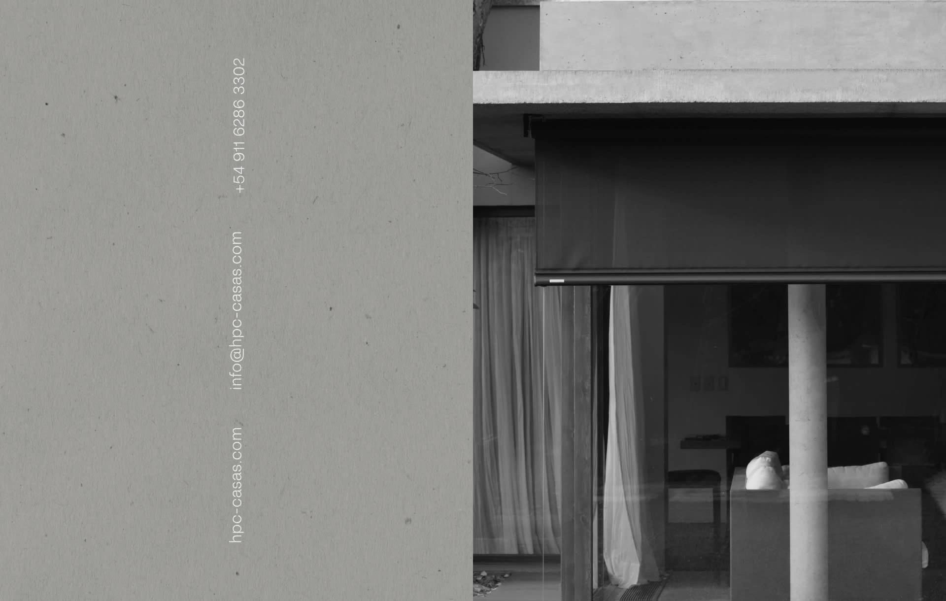
Photography of 'Casa del Arquitecto'
We shot and made the retouching and editing of the project "Casa del Arquitecto", where there was a strong emphasis on making the natural light of the spaces the leading protagonist, followed by the home's colors and warmth, where the interior design was also an indispensable focal point.
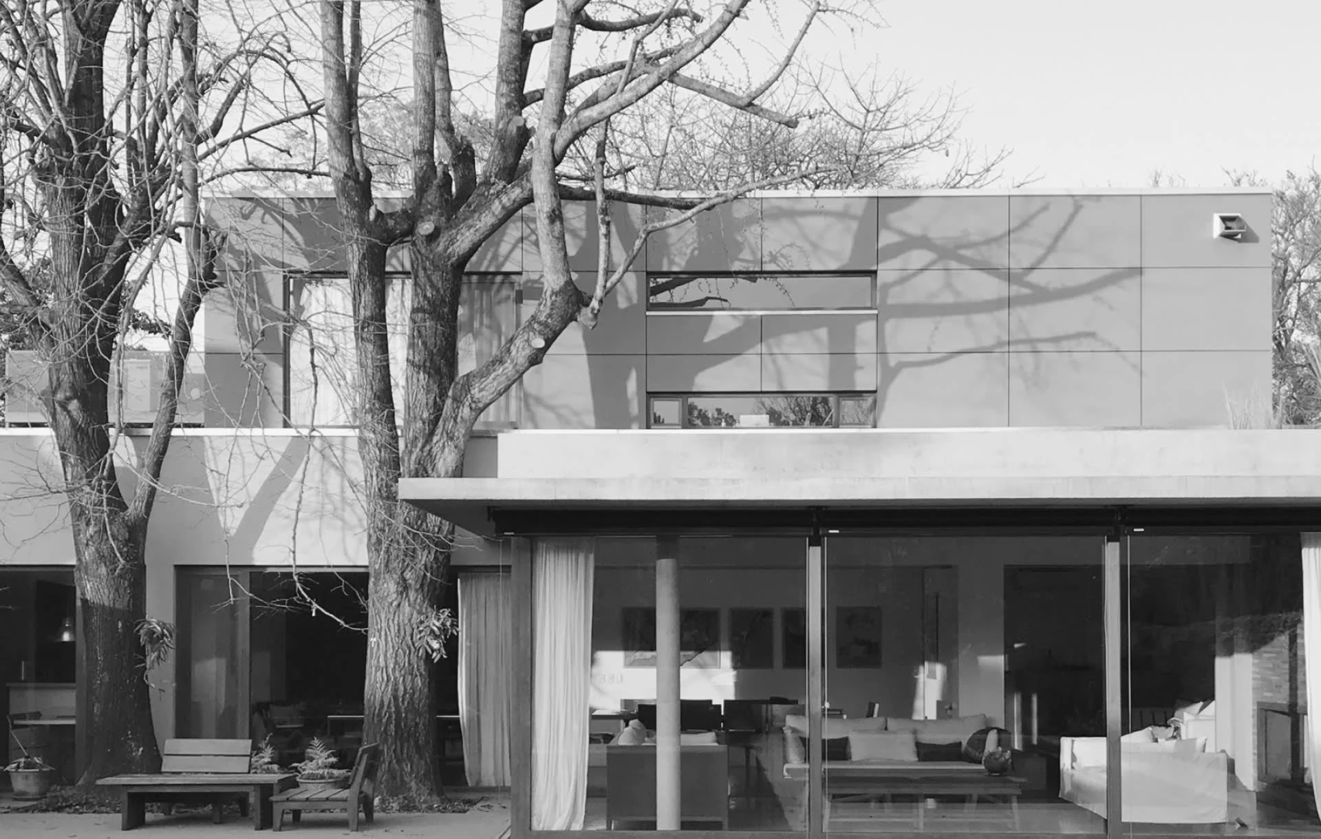
Photography of 'Casa del Arquitecto'
If you liked this project, make sure to check out our profile for more!
Like this project
Posted Apr 4, 2022
HPC Casas is a turnkey home design and construction company based in Buenos Aires, Argentina.
Likes
0
Views
47
Clients
By Beyond
