Oronamin C Billboard
Wing Yin Chui
THE BRIEF
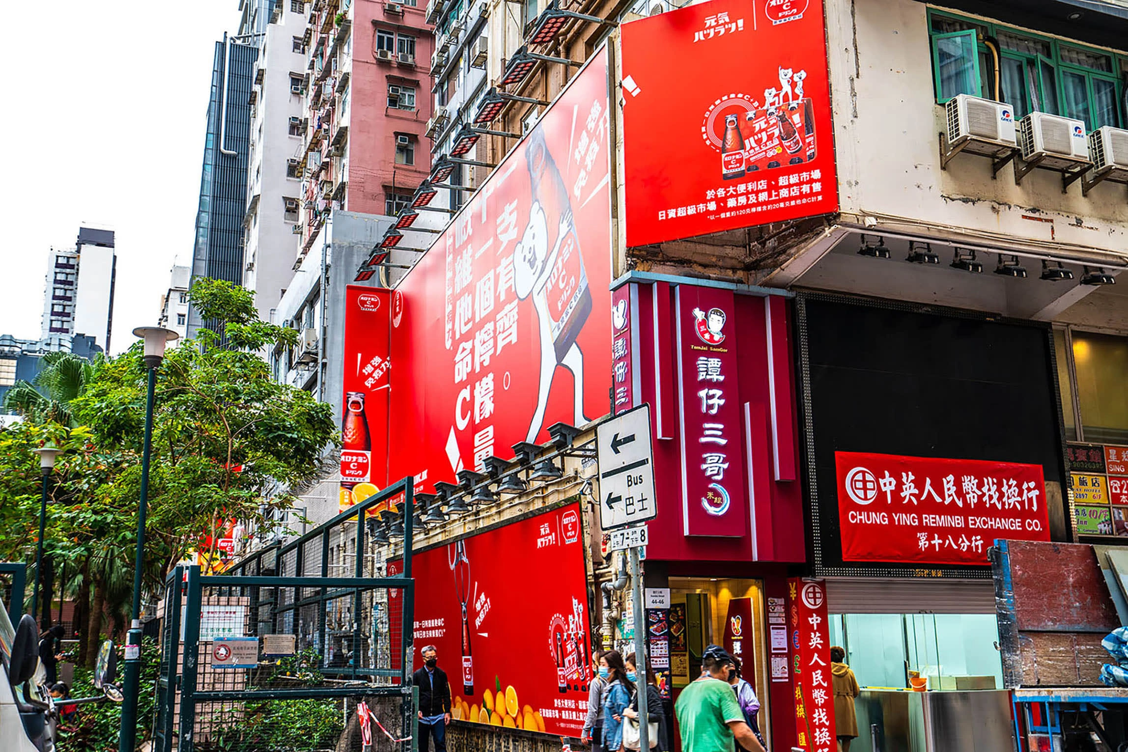
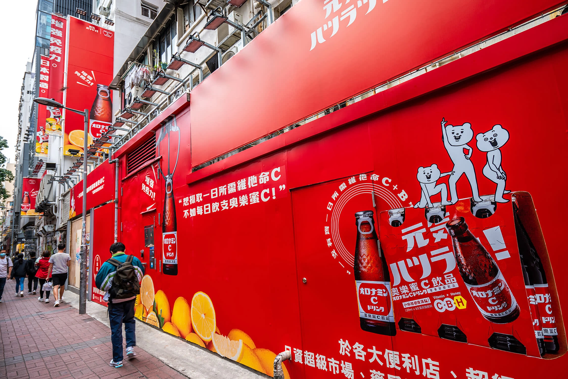
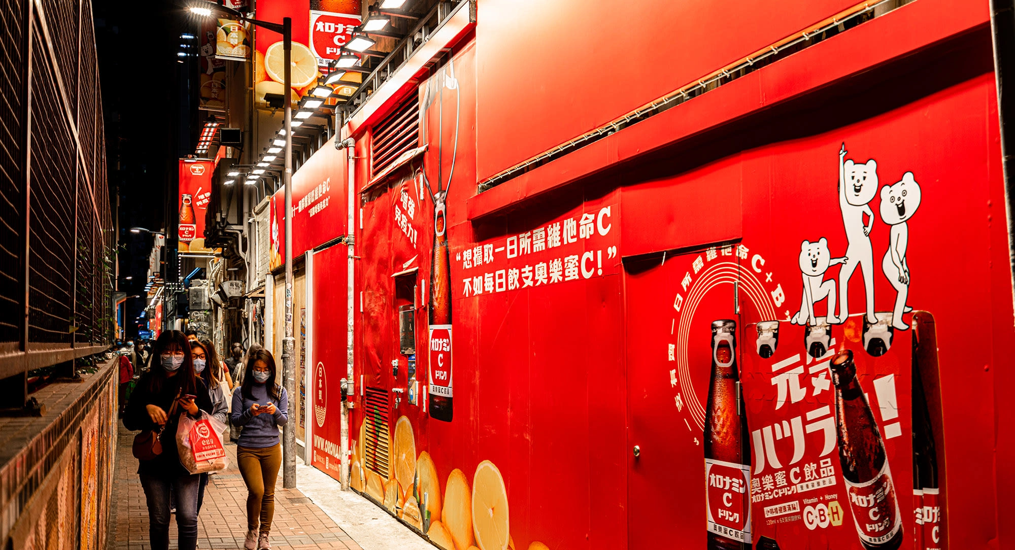
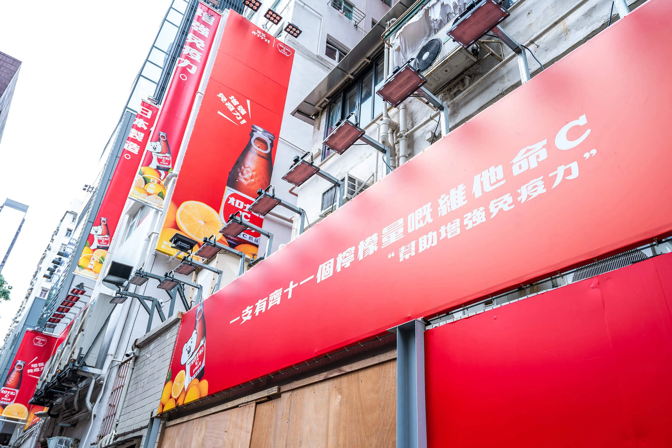
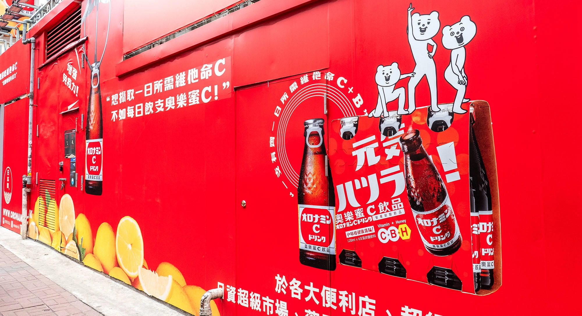
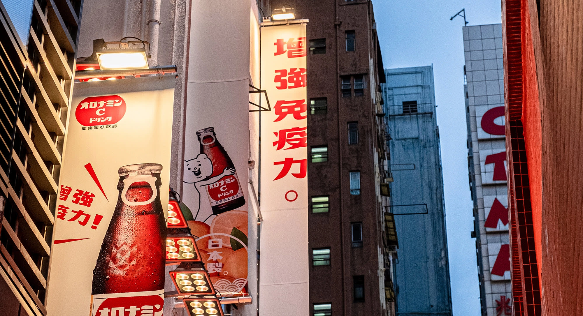
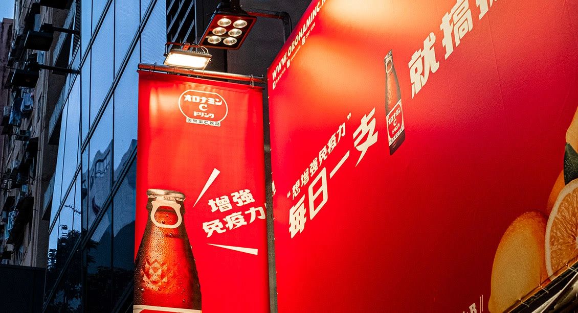
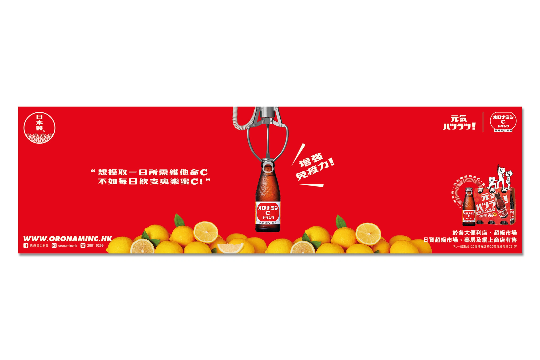
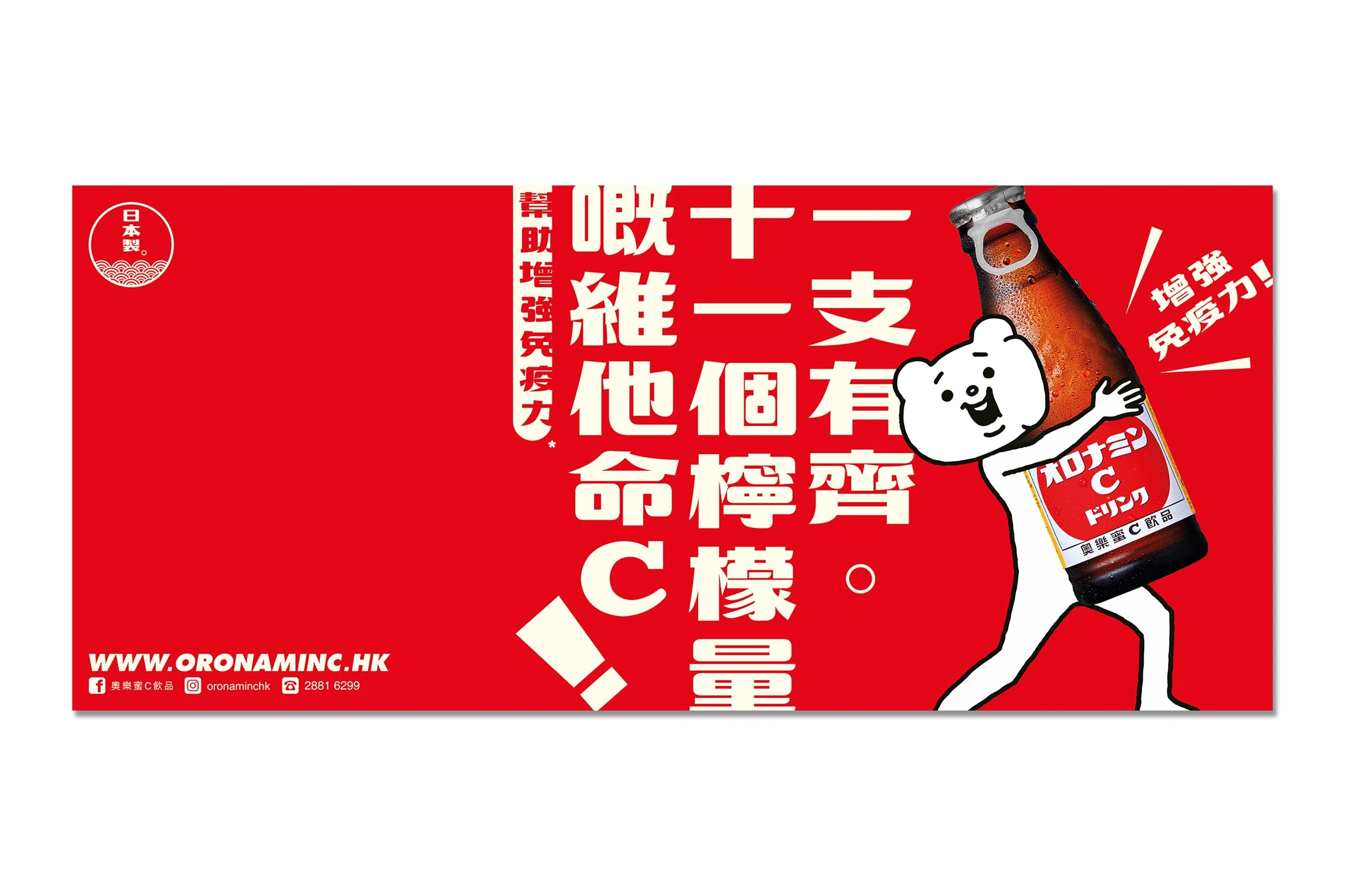
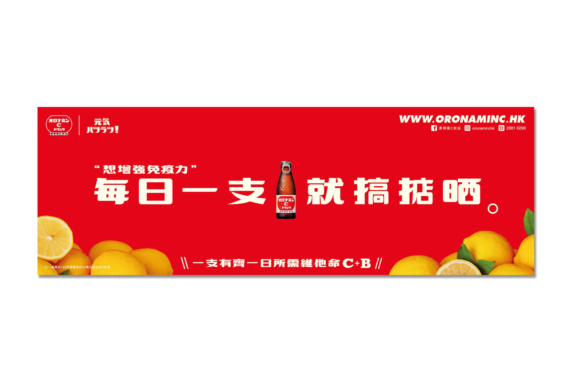
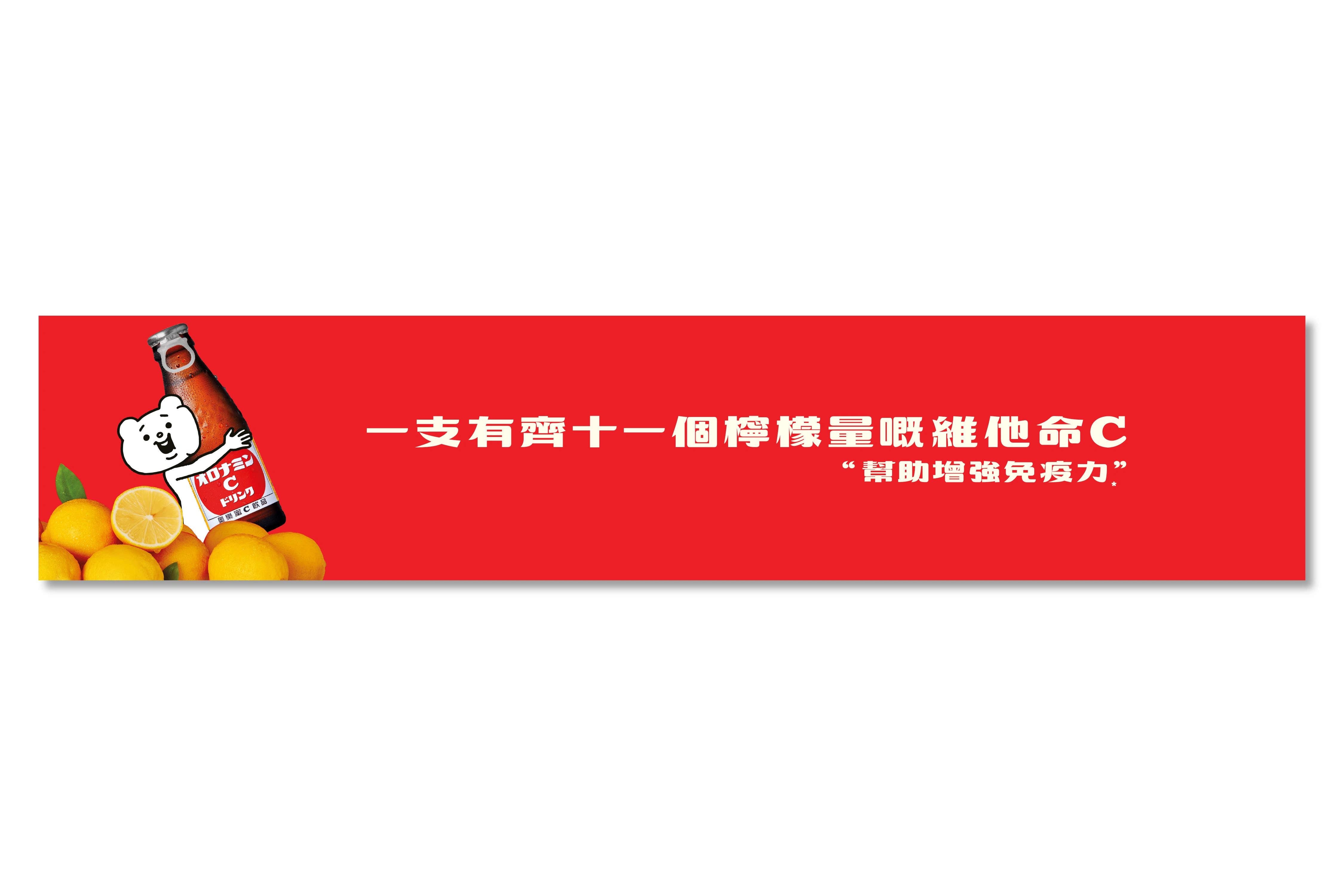
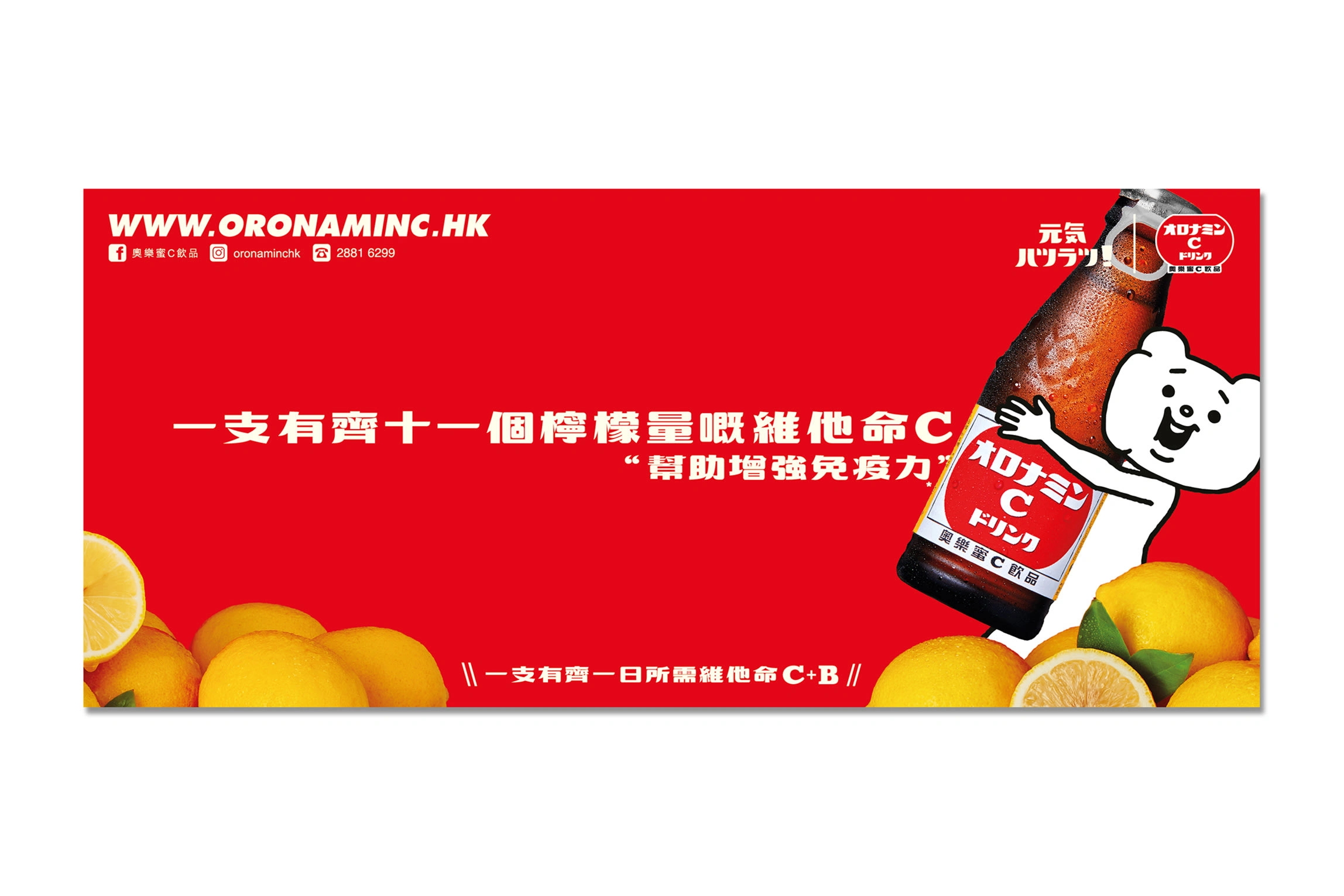
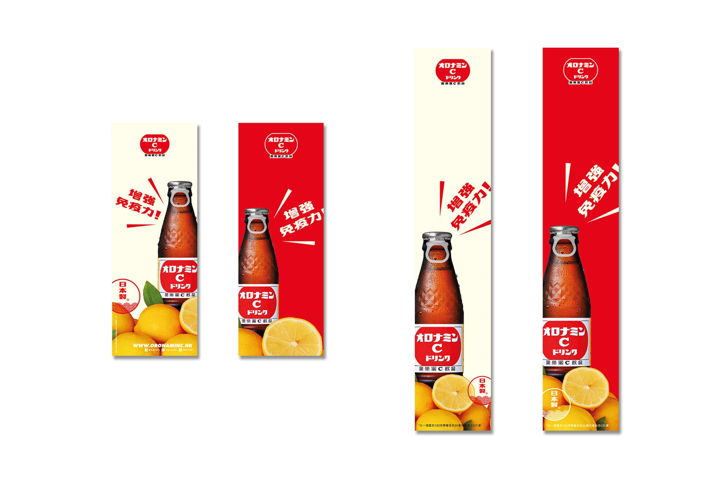
Oronamin C’s Japan headquarters provided a simple but strong message: “One bottle contains the vitamin C of 11 lemons.” My task was to translate this into a visually powerful billboard design tailored for a busy Hong Kong street, using the brand's iconic red color and energetic identity while staying consistent with Japanese advertising style.
THE CONCEPT
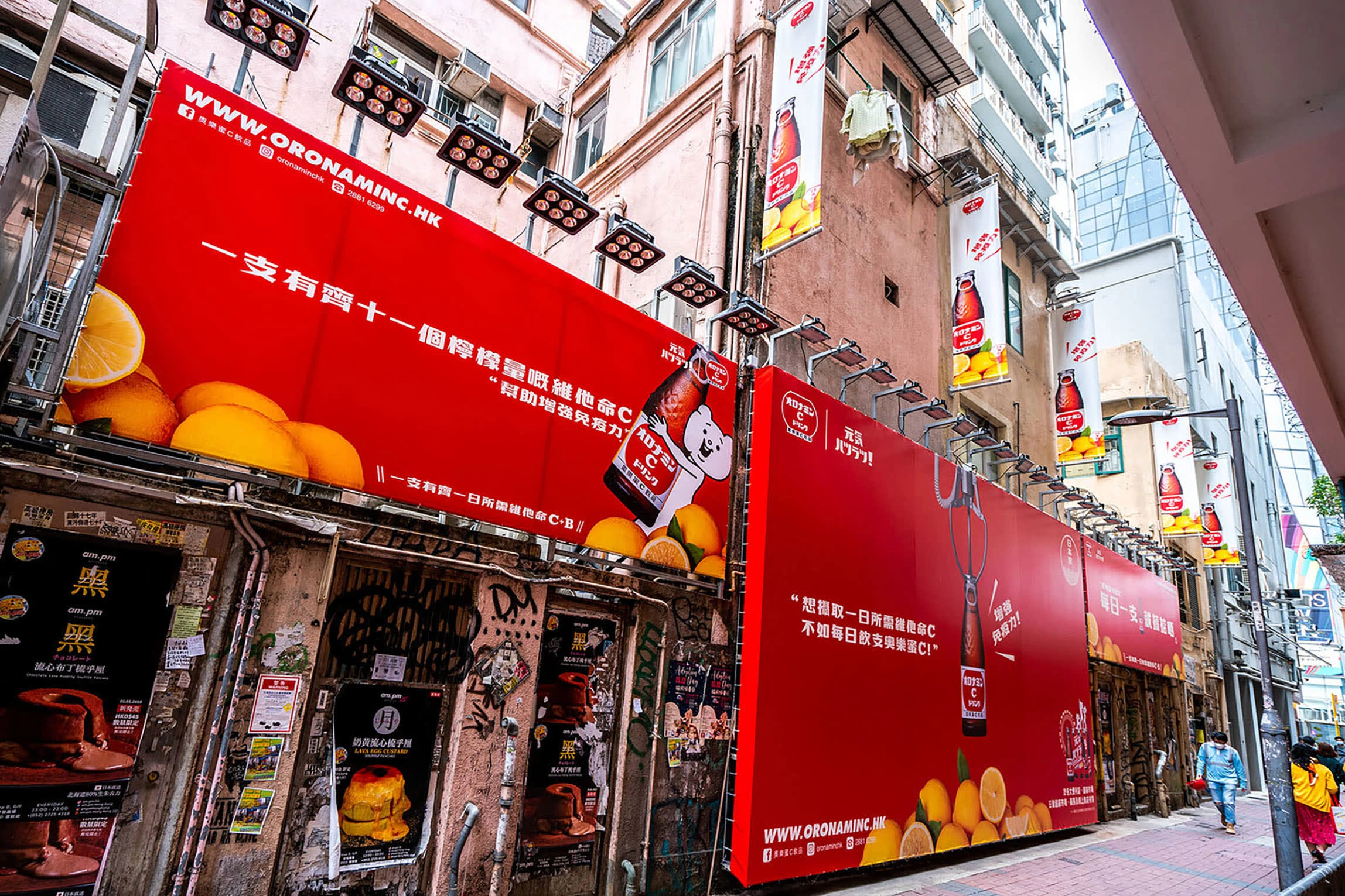
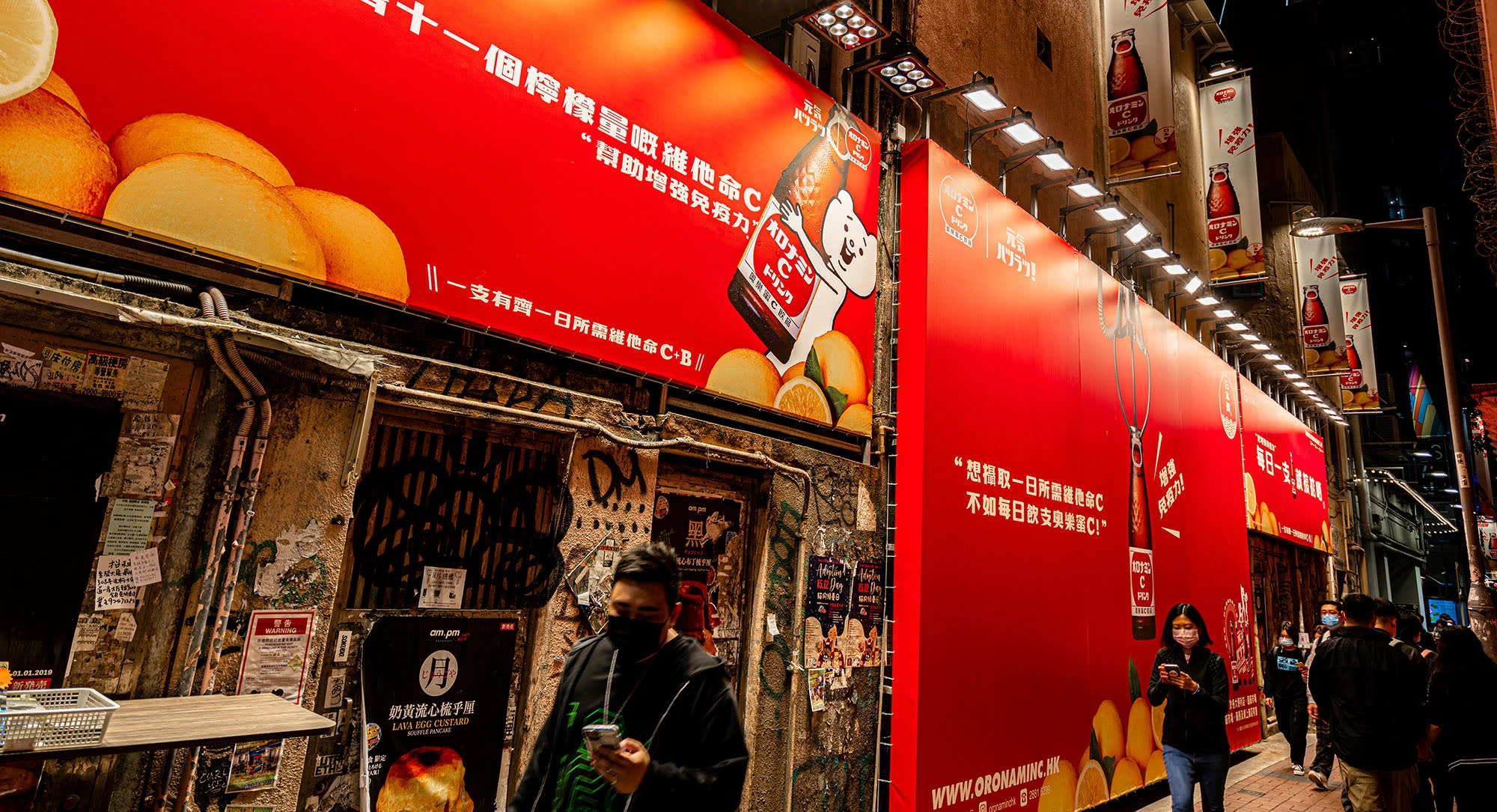
To localize the concept, I drew inspiration from Mong Kok's trend at the time—many shops had become claw machine arcades. I used this idea and visualized a bottle of Oronamin C being clawed out from a sea of lemons, symbolizing how one drink replaces the need for multiple lemons.
THE DESIGN
The background was entirely red, reinforcing the brand’s identity while standing out in the narrow, crowded back alley where the billboard was placed. The bold color helped deliver the message instantly and matched the lively energy of Japanese advertising aesthetics.
I also directed the shoot, managed layout designs, and adapted the key visual for various billboard sizes. Different dimensions required thoughtful resizing to preserve visual impact and legibility—a skill I’m confident in and enjoy applying across formats.
The CHALLENGE
The billboard was placed in a narrow, visually noisy back alley in Mong Kok, so making it stand out was a key challenge. I had to consider distance, viewing angle, and lighting when designing the composition. Additionally, adapting the key visual across multiple billboard sizes without losing impact or clarity required strong layout and typographic skills, as well as close attention to detail.
THE OUTCOME
The concept was well received by the client, who appreciated its simplicity, cultural relevance, and bold execution. The use of the brand mascot further enhanced engagement. I was proud to lead both the creative and technical aspects, and the project became a strong example of design that bridges message and market.
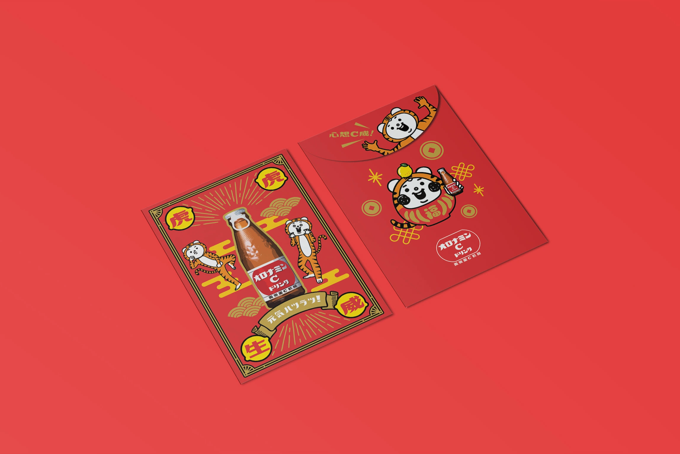
After I left the agency, the client continued to work with me as a freelance designer. I was invited to design a red packet for a Chinese New Year promotion, themed around the Year of the Tiger. The red packet was part of a festive gift-with-purchase campaign for their beverage line. I focused on blending traditional elements with a modern, playful style that aligned with the brand’s identity while capturing the energy and spirit of the holiday season.
Like this project
Posted Jul 2, 2025
Designed a billboard for Oronamin C in Hong Kong, using bold visuals and cultural relevance.
Likes
0
Views
8
Clients
Otsuka Pharmaceutical