Designing a visual identity for

pas_swo _rd


Designing a visual identity for an urban streetwear brand that actually scales. ⚡
Pretty logos don’t convert—cohesive, system-driven brand systems do. For Obsydian, the goal was to bridge the gap between raw, fast-paced street culture and a structured, premium visual identity.
Here is how we built it:
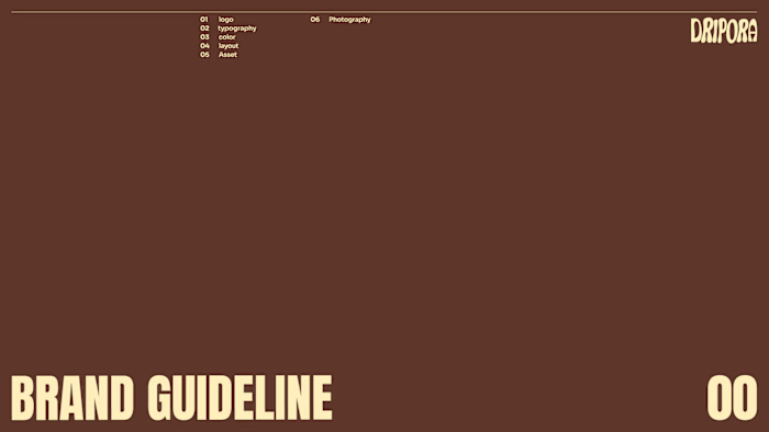
📍 Custom Logotype: A bold, fluid wordmark anchored by a signature detached "O" to introduce expressive energy while keeping high recognition.
📍 Typography Pairing: High-impact display (Anton SC) paired with technical precision (Geist Mono) to balance edge with legibility across digital interfaces.
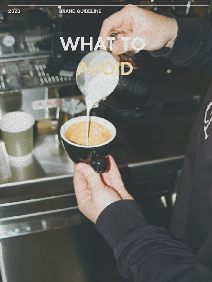
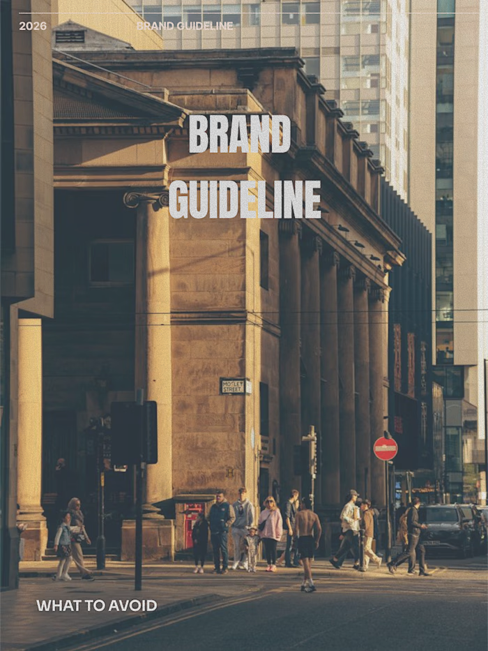
📍 Color & Art Direction: Deep tones and rich earthy accents paired with high-contrast, flash-driven photography capturing authentic city grid energy.
Want a brand identity built to scale your business? Send a message or check the link in bio to book a project spot for Q3/Q4. 💼
Like this project
Posted Aug 16, 2026
Designing a visual identity for an urban streetwear brand that actually scales. ⚡ Pretty logos don’t convert—cohesive, system-driven brand systems do. For Ob...