Giving an Italian Coastal Town a Whole New Meaning

Arnold De Guzman


Giving an Italian Coastal Town a Whole New Meaning
Brand New Branding
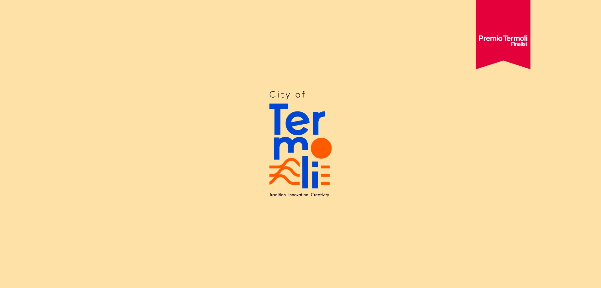
In April 2025, the city of Termoli launched an international competition through the Terraviva website to reimagine its brand identity. Out of more than 400 submissions from around the globe, my entry was honored to be one of the finalists.
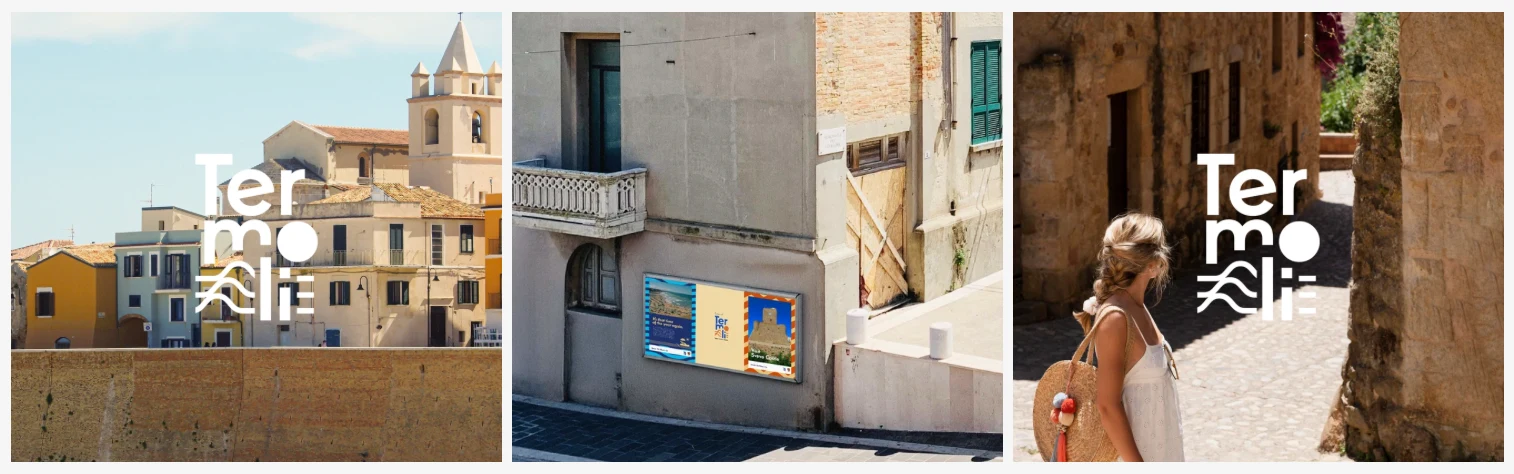
The TerraViva "Rebranding Termoli" competition challenged creatives to develop a new place branding strategy for Termoli; a historic coastal town in southern Italy. The goal was to craft a contemporary visual identity that honors the city’s rich heritage while embracing its future as a cultural and artistic destination. The brand needed to be authentic, inclusive, and adaptable across physical, digital, and experiential touchpoints—transforming not just how Termoli looks, but how it’s experienced.
Key Takeaways
Finalist among 400 global entries
One Coast, Three Stories: TER (Terra), MO (Momentum), and LI (Life)
Built for physical, digital, and experiential touchpoints
One coast, three stories
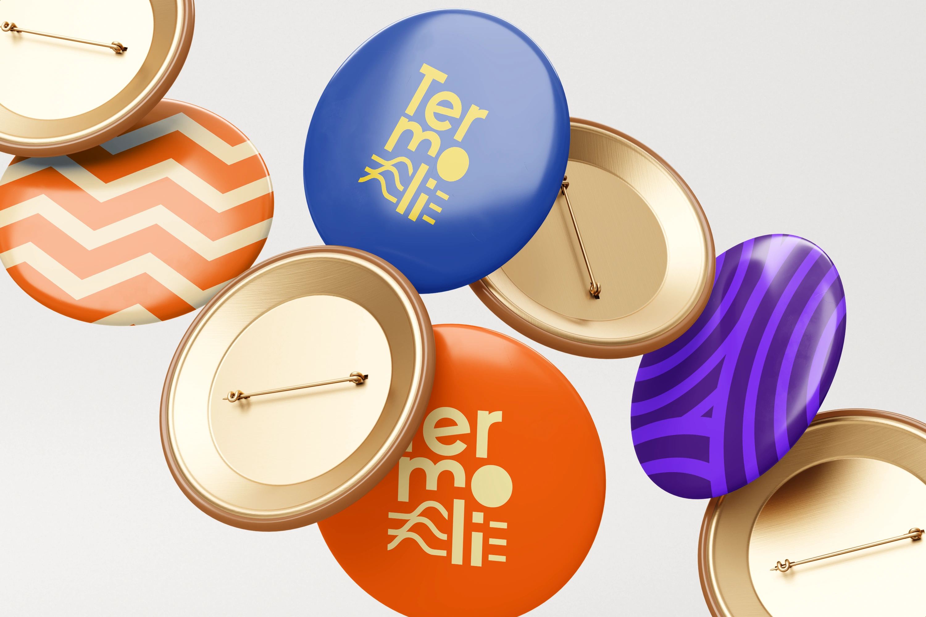
My response to the challenge was built around the concept TER–MO–LI: One Coast, Three Stories. By breaking the name into three syllables, I created a flexible identity system that represents Termoli’s layered personality: TER for its historical roots, MO for its cultural momentum, and LI for its vibrant, community-driven spirit. The visual language combines wave patterns, sun motifs, and modular typography to reflect both the town’s Adriatic setting and its forward-looking ambitions. The result is a brand that feels grounded in tradition yet designed for the future—evoking emotion, movement, and meaning at every touchpoint.
A system that flexes by theme
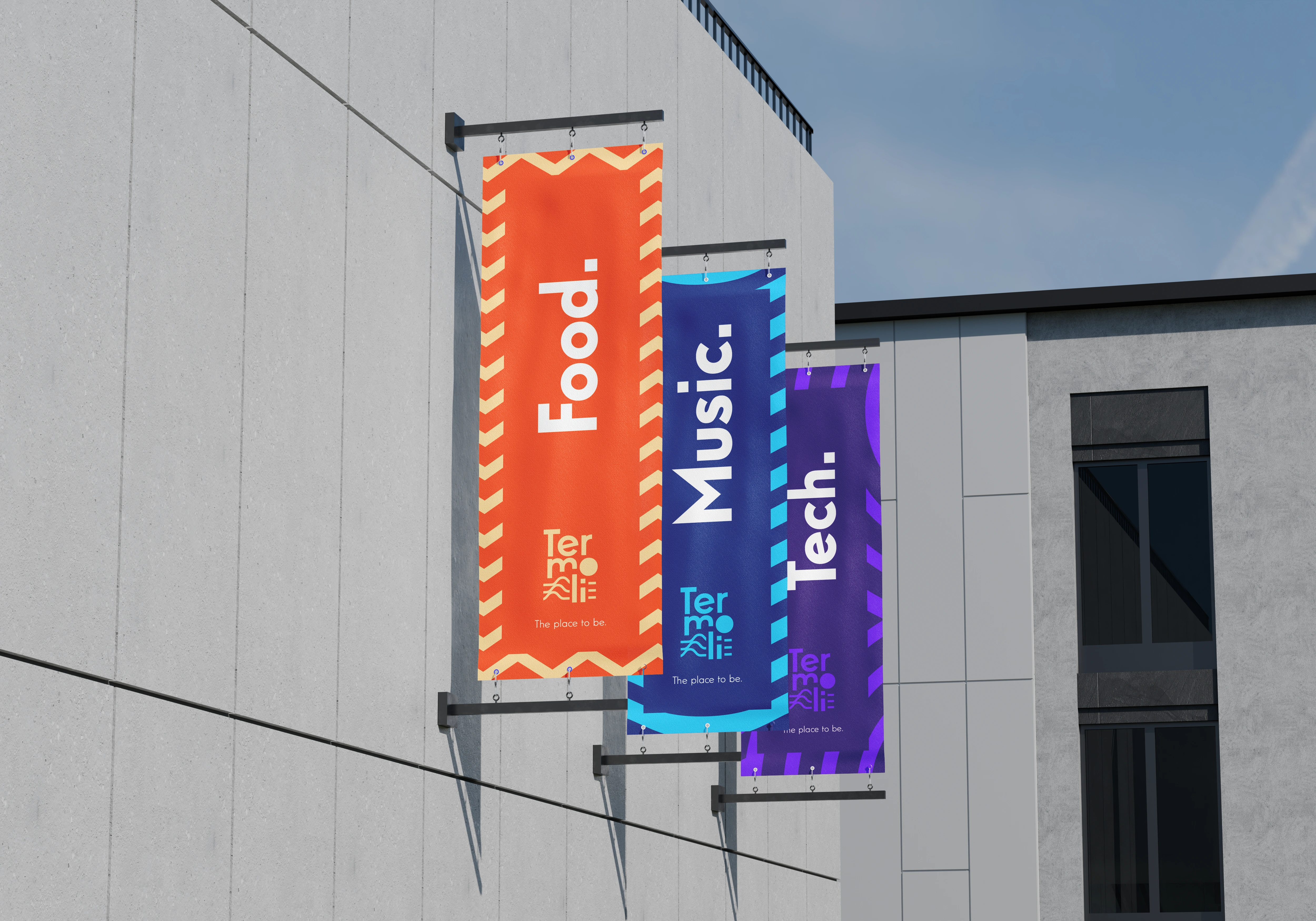
Colour-coded banners for food, music and tech show how the identity shifts tone for each part of Termoli's cultural life while staying unmistakably one brand.
Wayfinding with a sense of place
Signposts for the Town Center, Svevo Castle and Beach Village carry the wave pattern and pictograms, showing how everyday navigation could become part of the brand
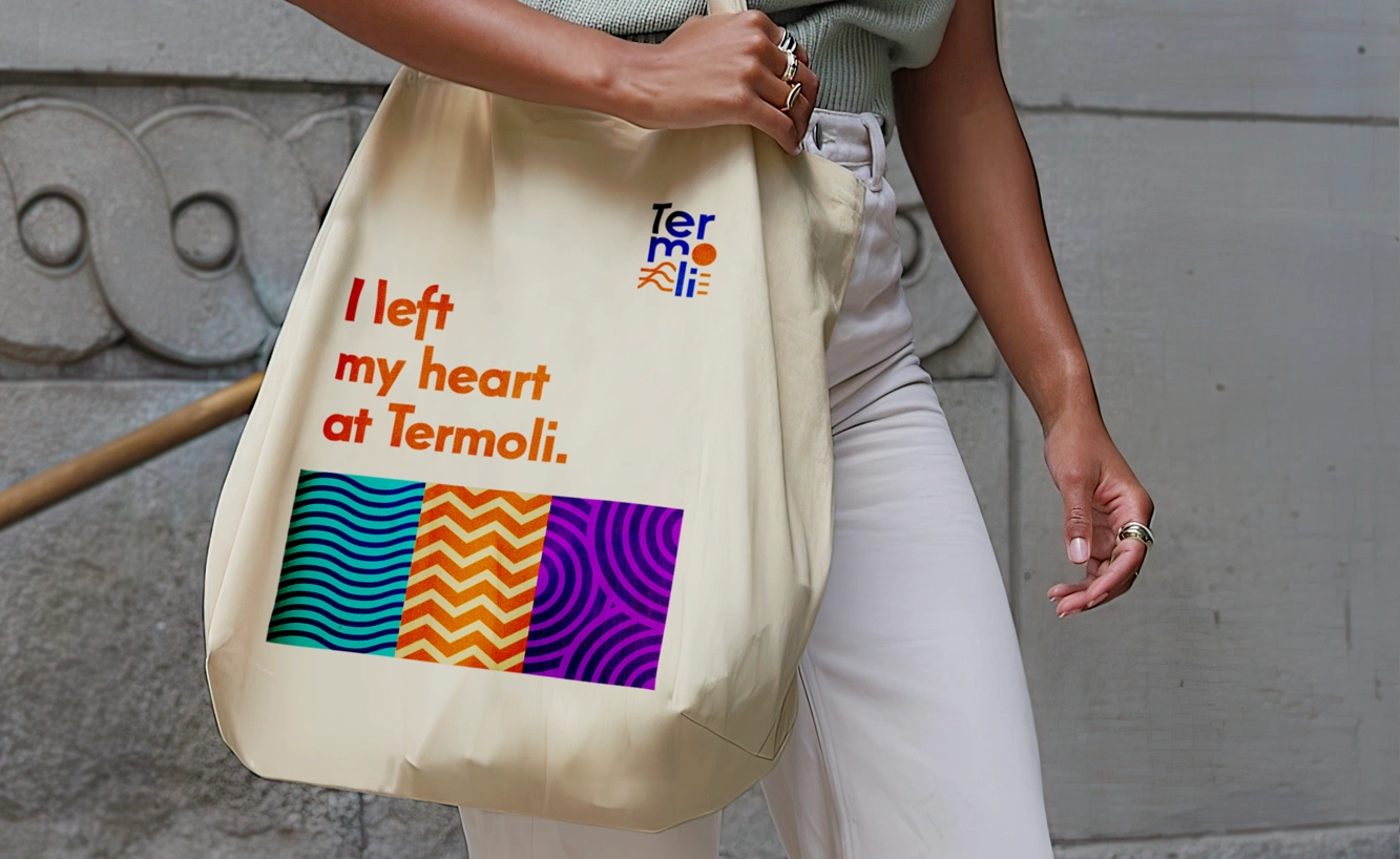
Something to take home
Totes, tees and caps extend the identity beyond the town, with lines like I left my heart at Termoli written for visitors to carry with them.
A brand in motion
Wave graphics wrap buses and city cars, showing how the identity could move through the streets and stay visible across the town.
A finalist from 400+ entries
As a result of this work, I had the incredible honor of being selected as one of only 30 finalists from a pool of over 400 entries submitted from around the world. It was a humbling experience and a meaningful milestone that reaffirmed my passion for this kind of work.
Like this project
Posted Nov 9, 2026
Rebranding project where I was a finalist from a pool of over 400 entries submitted from around the world.
Likes
0
Views
2


