Brand Identity for Construction Steel Manufacturing
tsedenia getachew
Overview
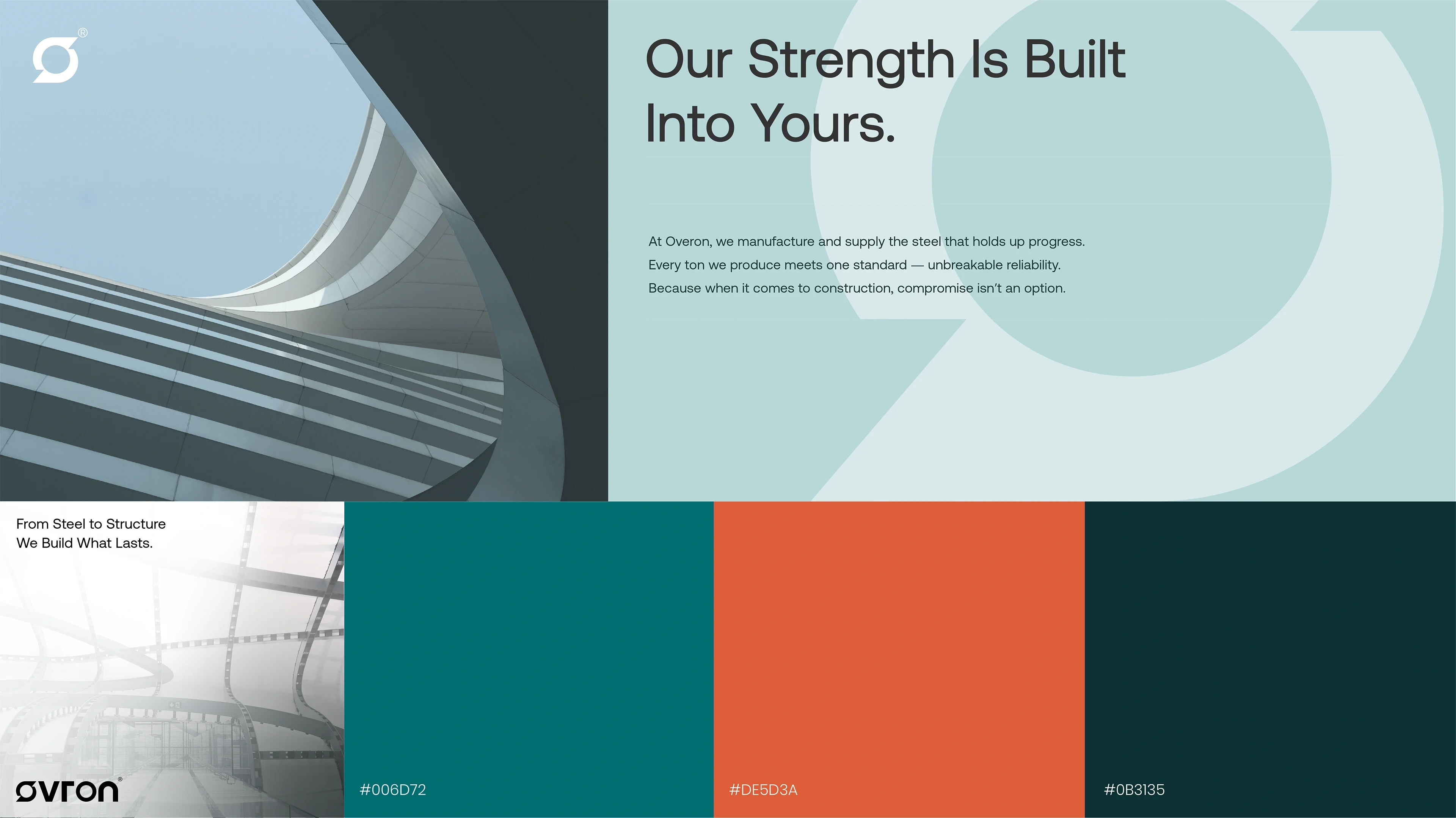
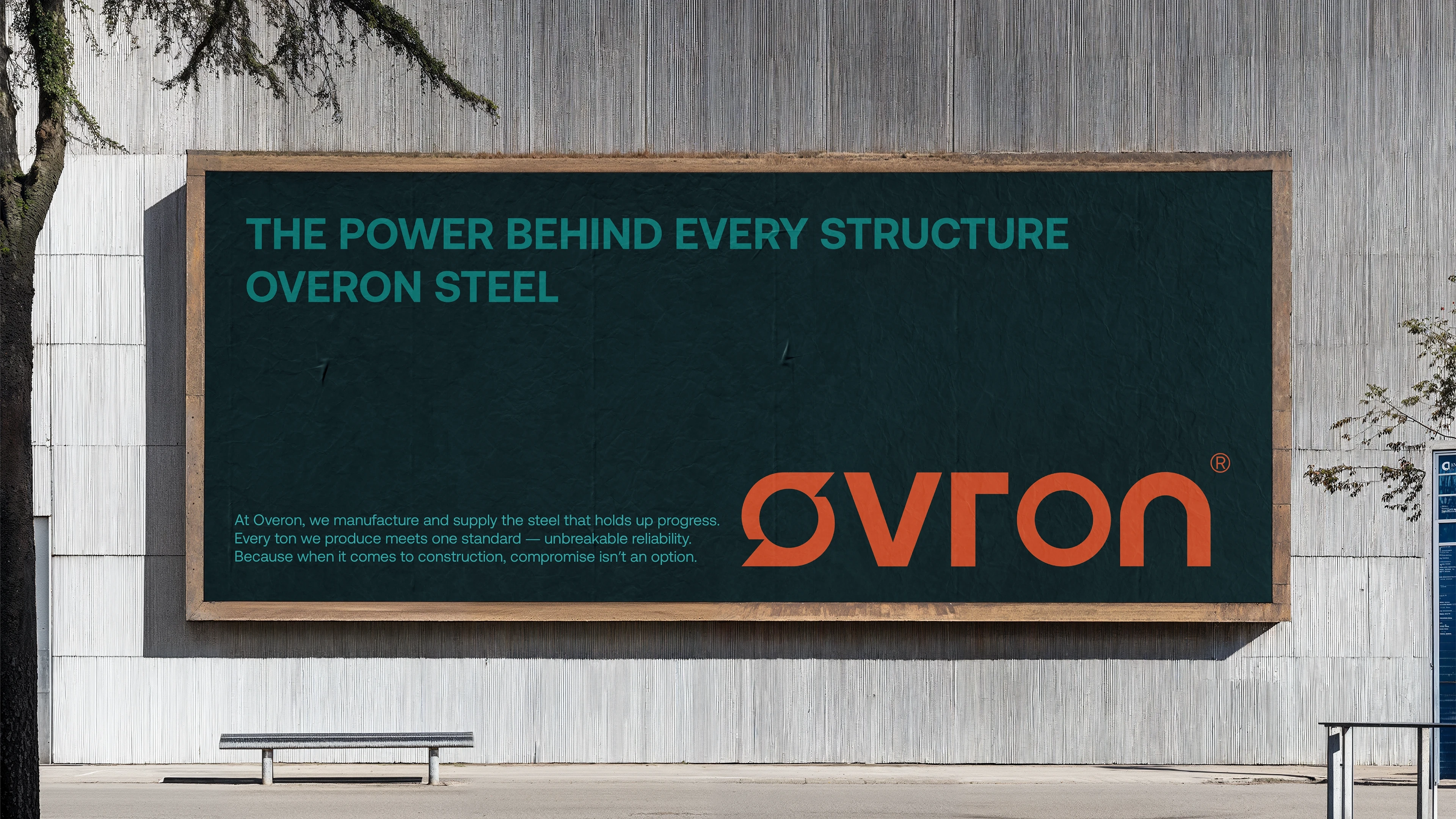
Ovron is a construction steel manufacturing and supply company built on the values of strength, reliability, and precision. The goal was to develop a complete brand identity that brought warmth and clarity to a traditionally industrial sector, turning steel into a symbol of trust and progress.
The Challenge
Steel brands often struggle to connect emotionally. The challenge was to create an identity that would make Ovron feel alive, not just strong, but seen.
We needed to express industrial power through design while maintaining a human, modern, and credible tone that could stand confidently across factory spaces, digital platforms, and large-scale environments.
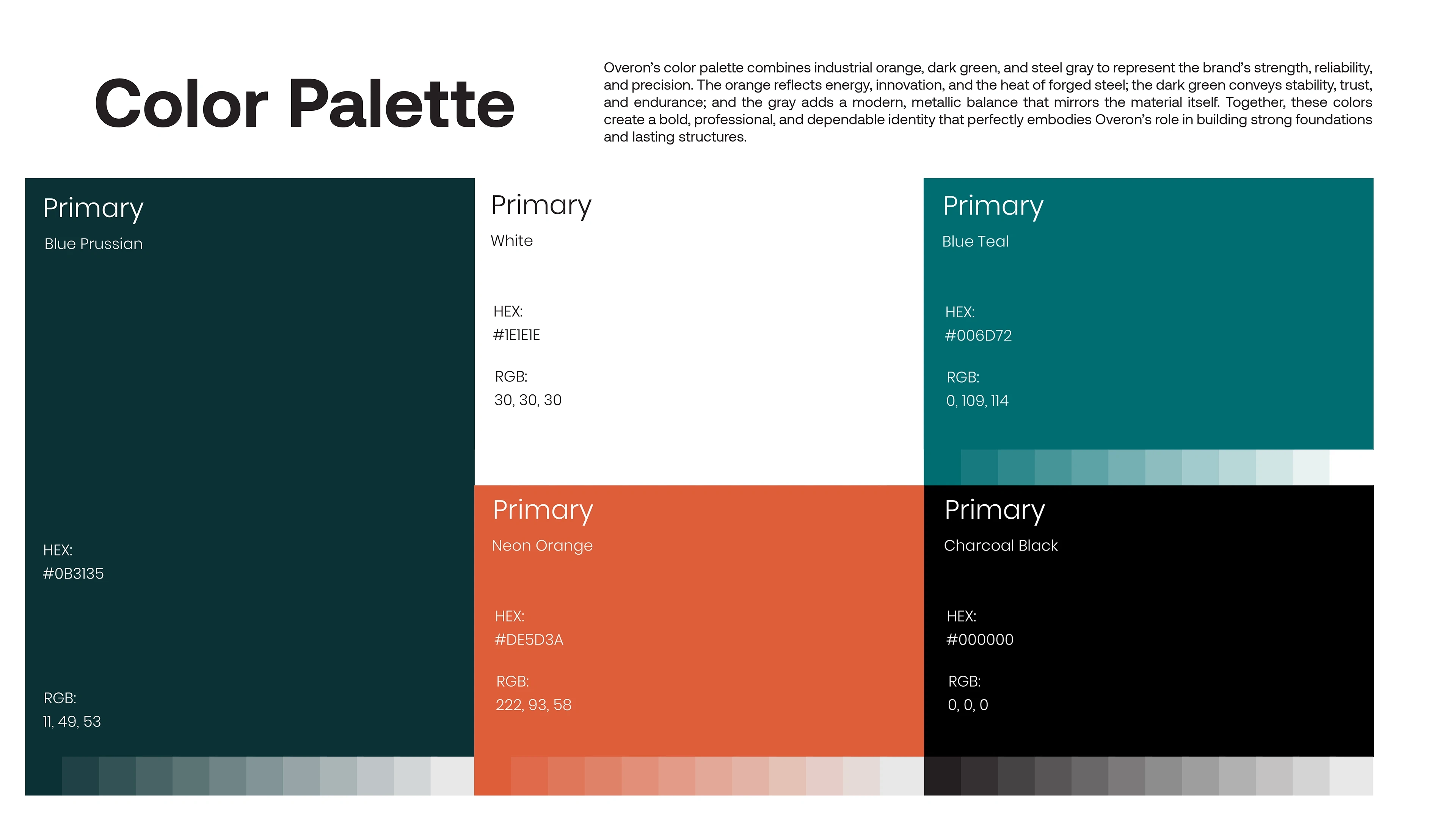
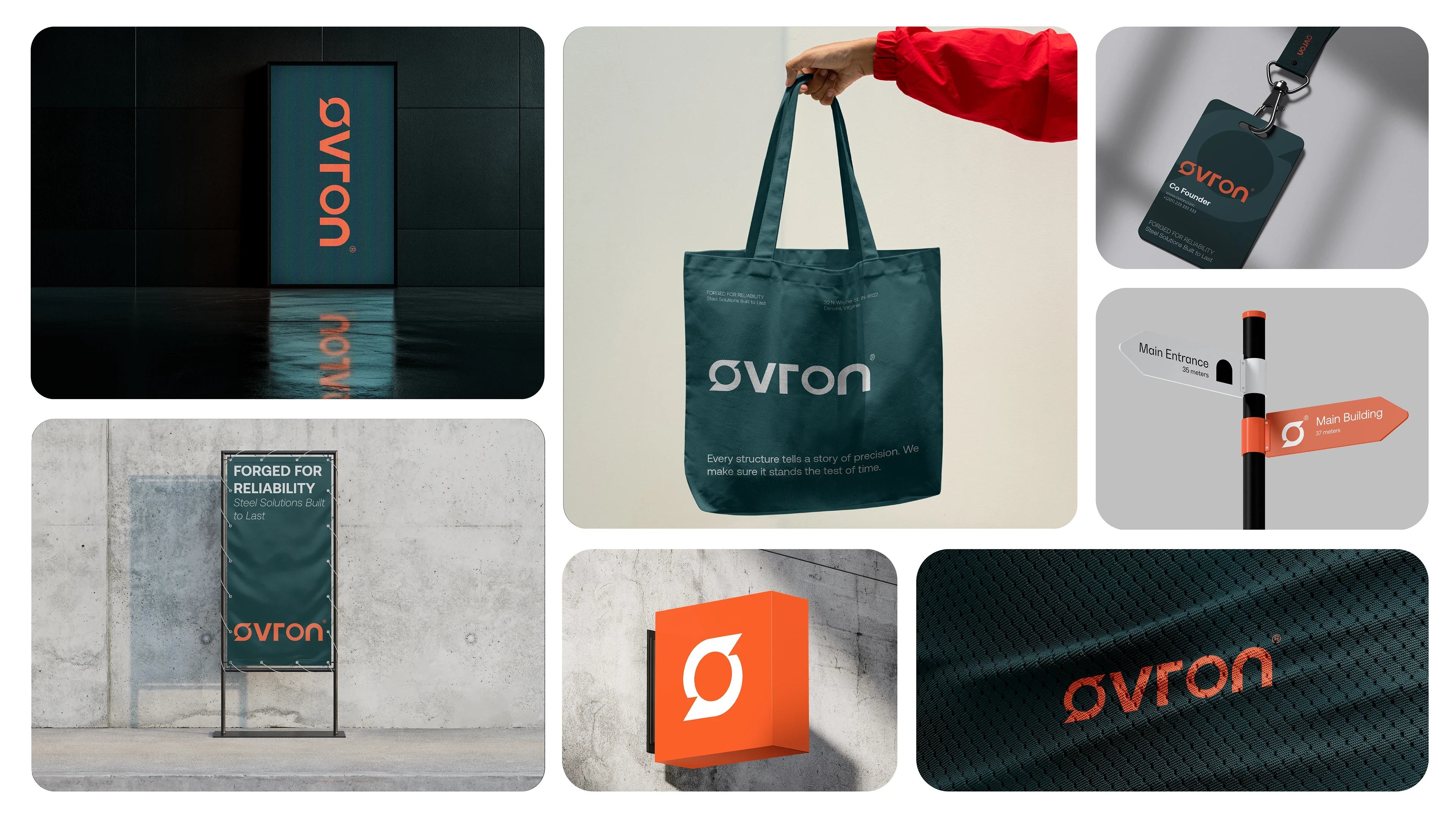
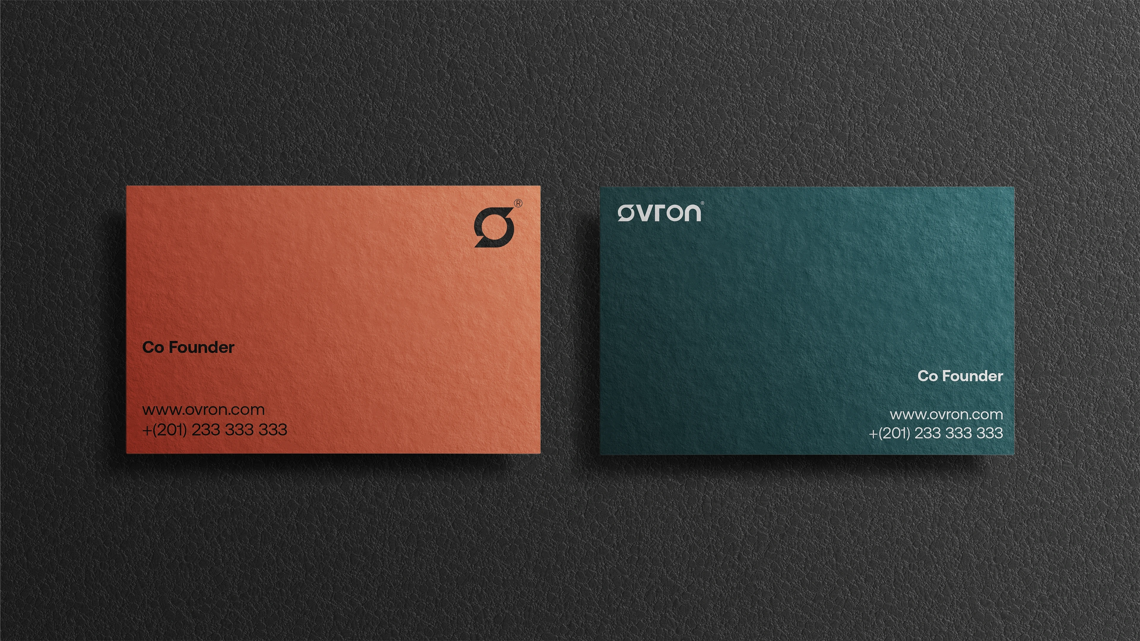
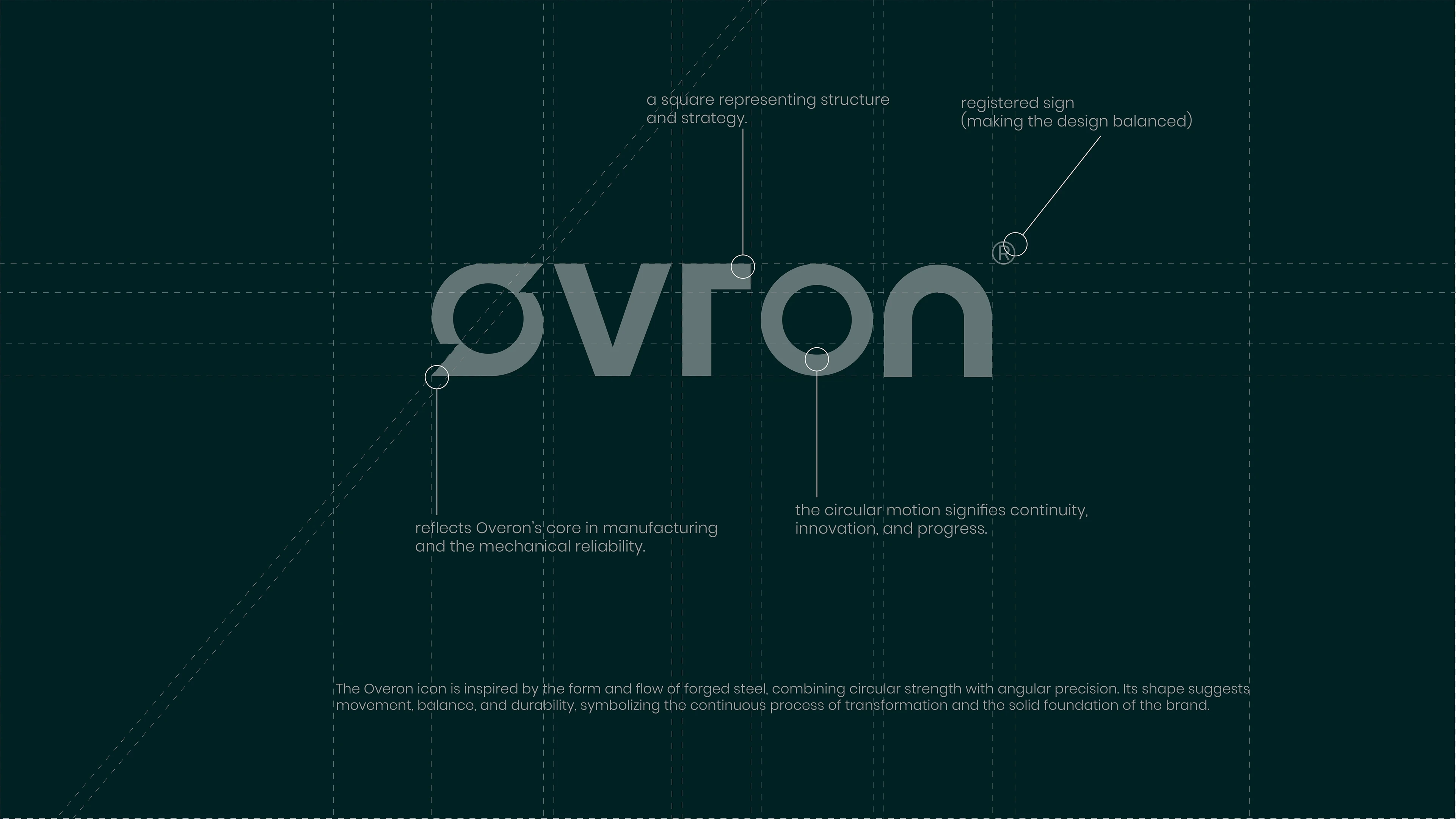
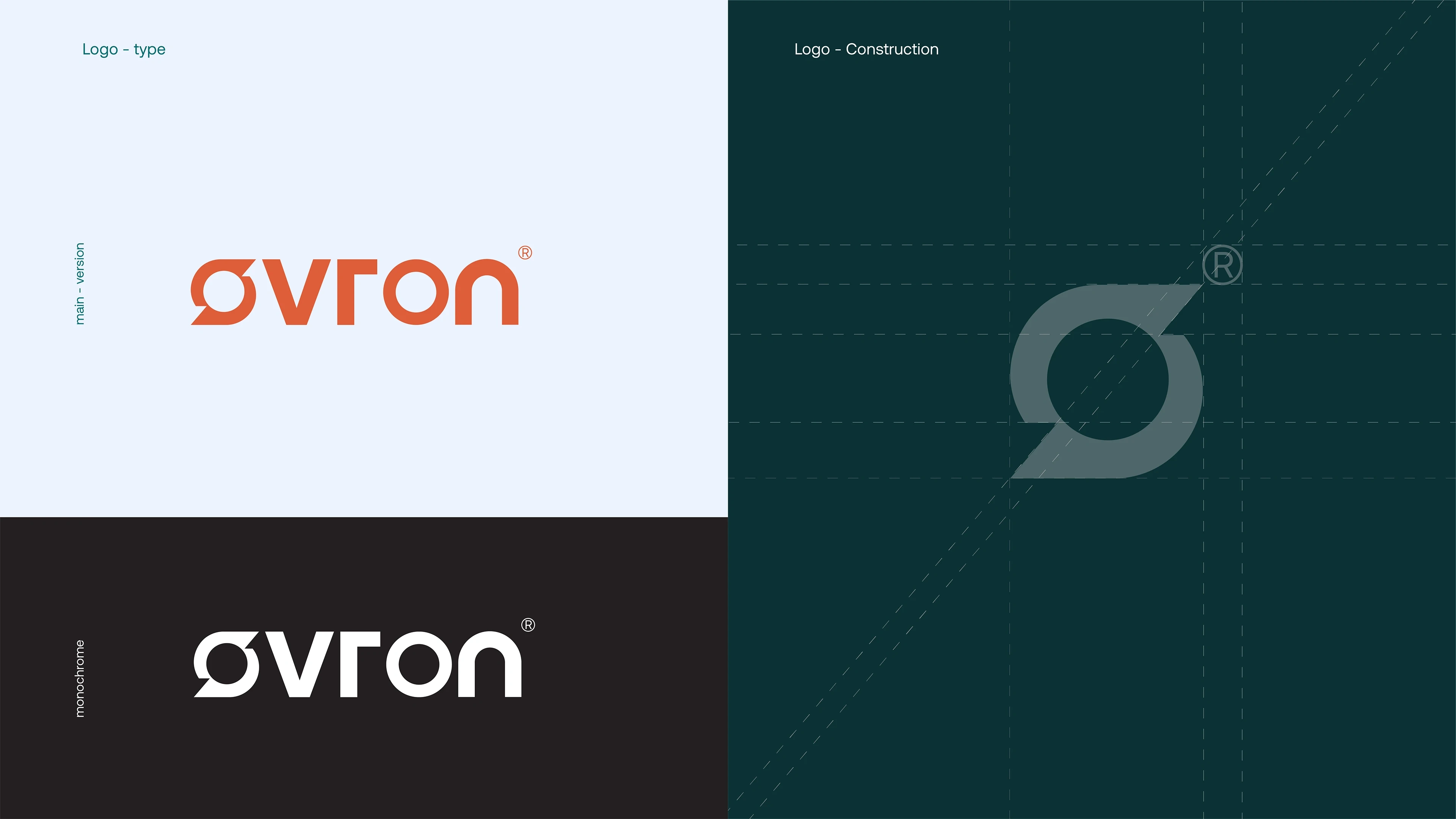
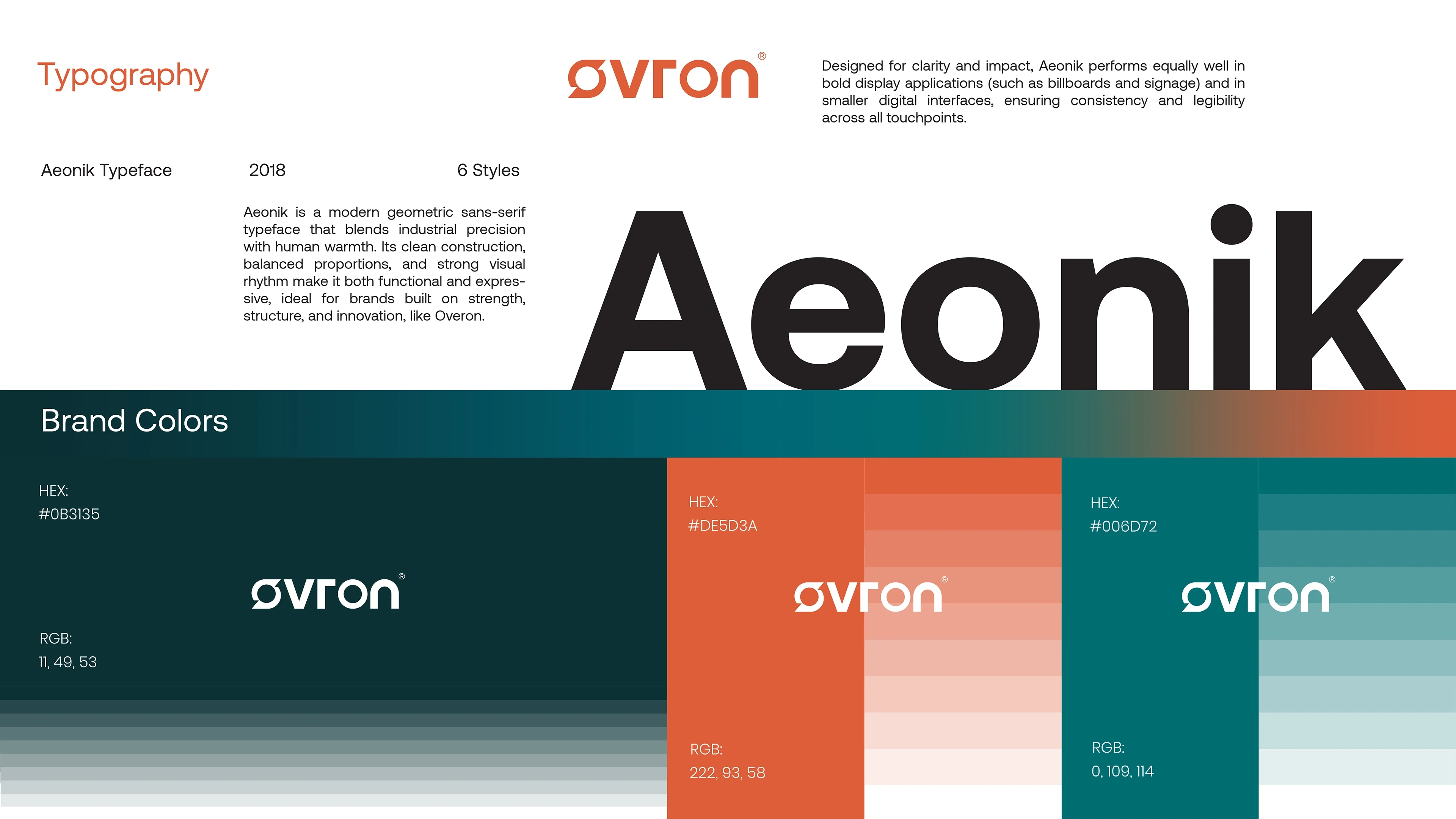
Colors: Deep green for stability, gray for structure, and orange for energy.
The Solution
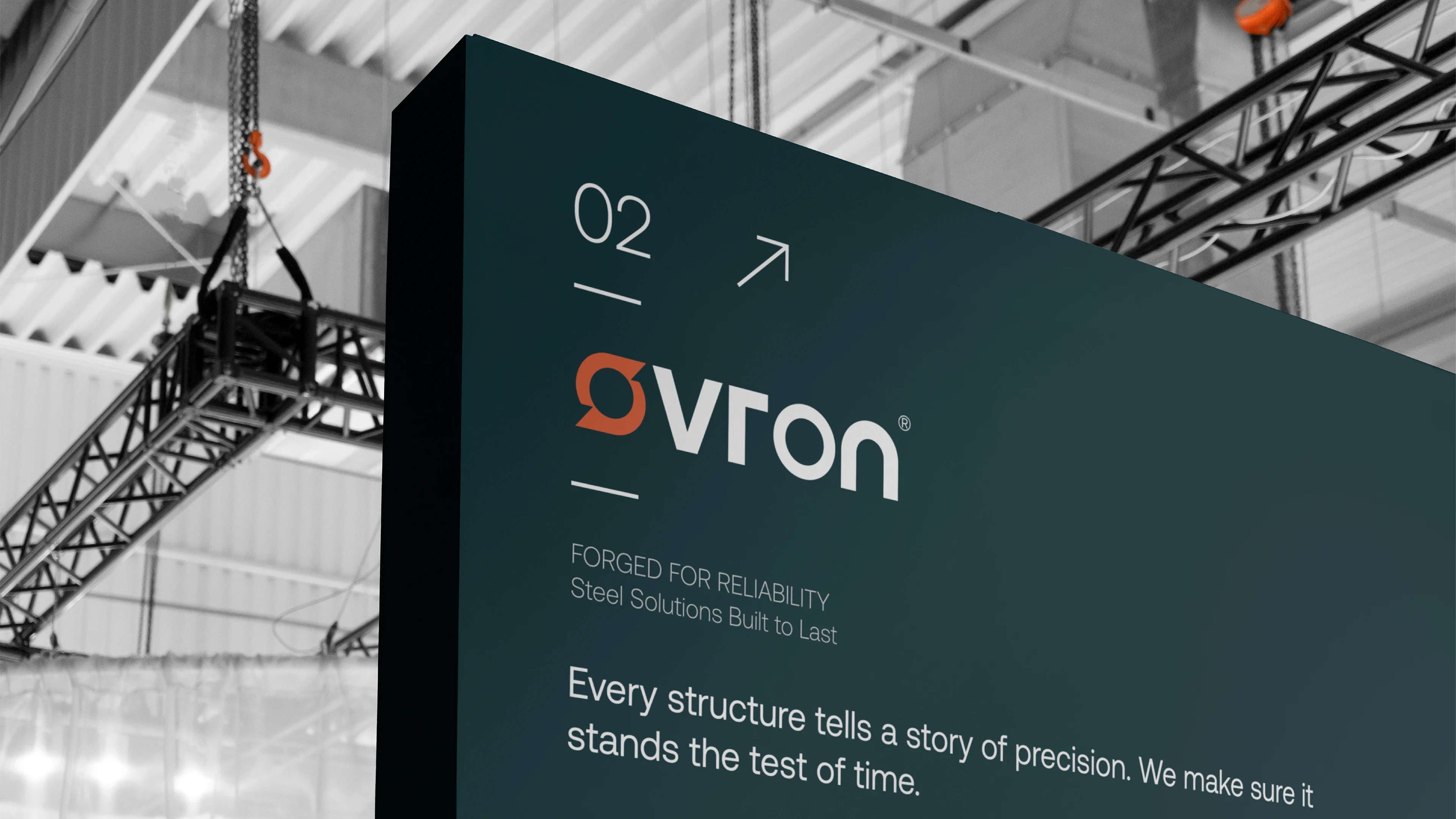
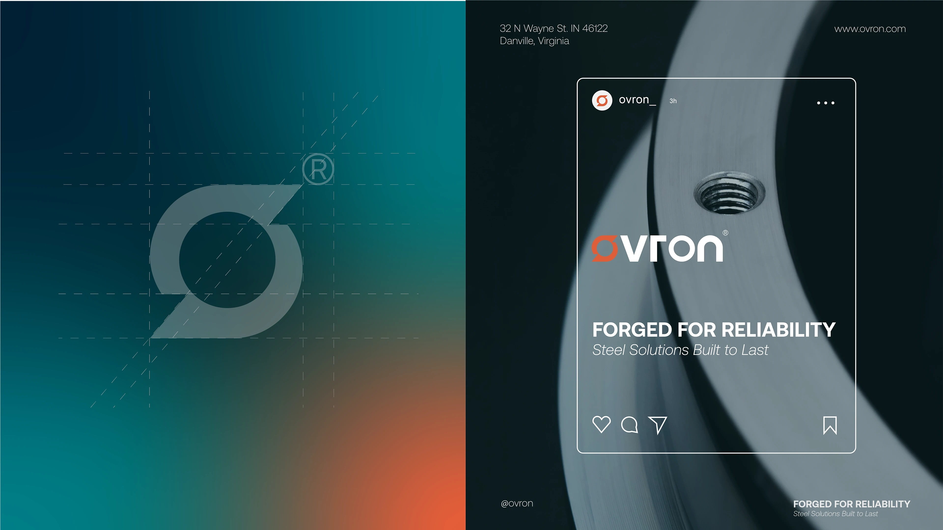
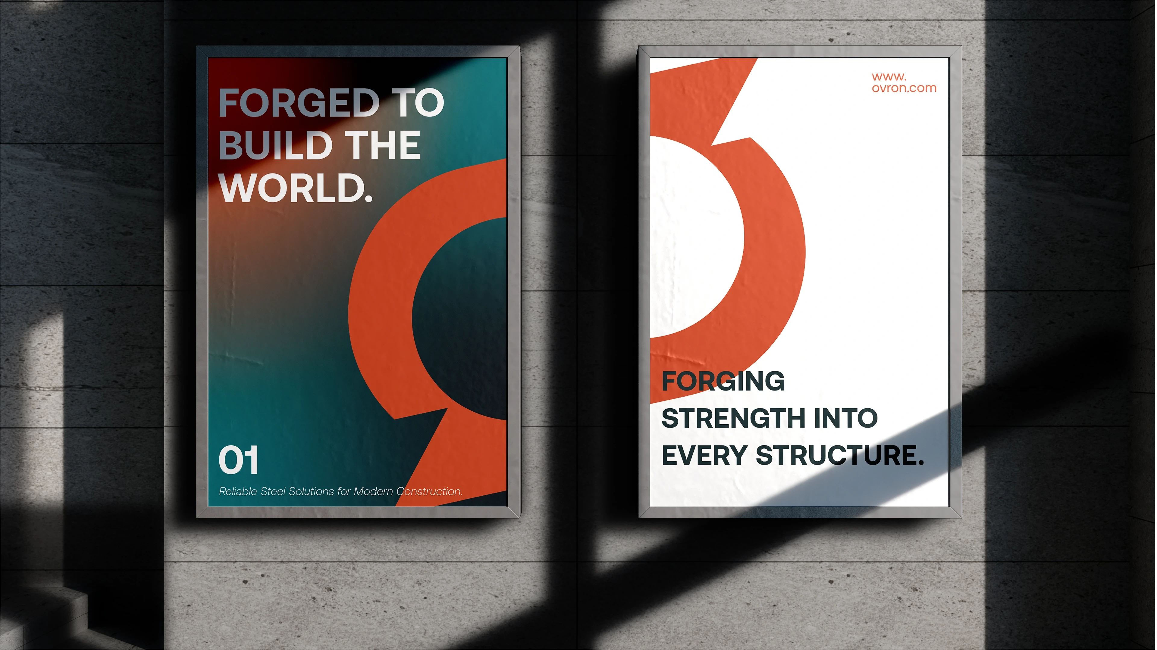
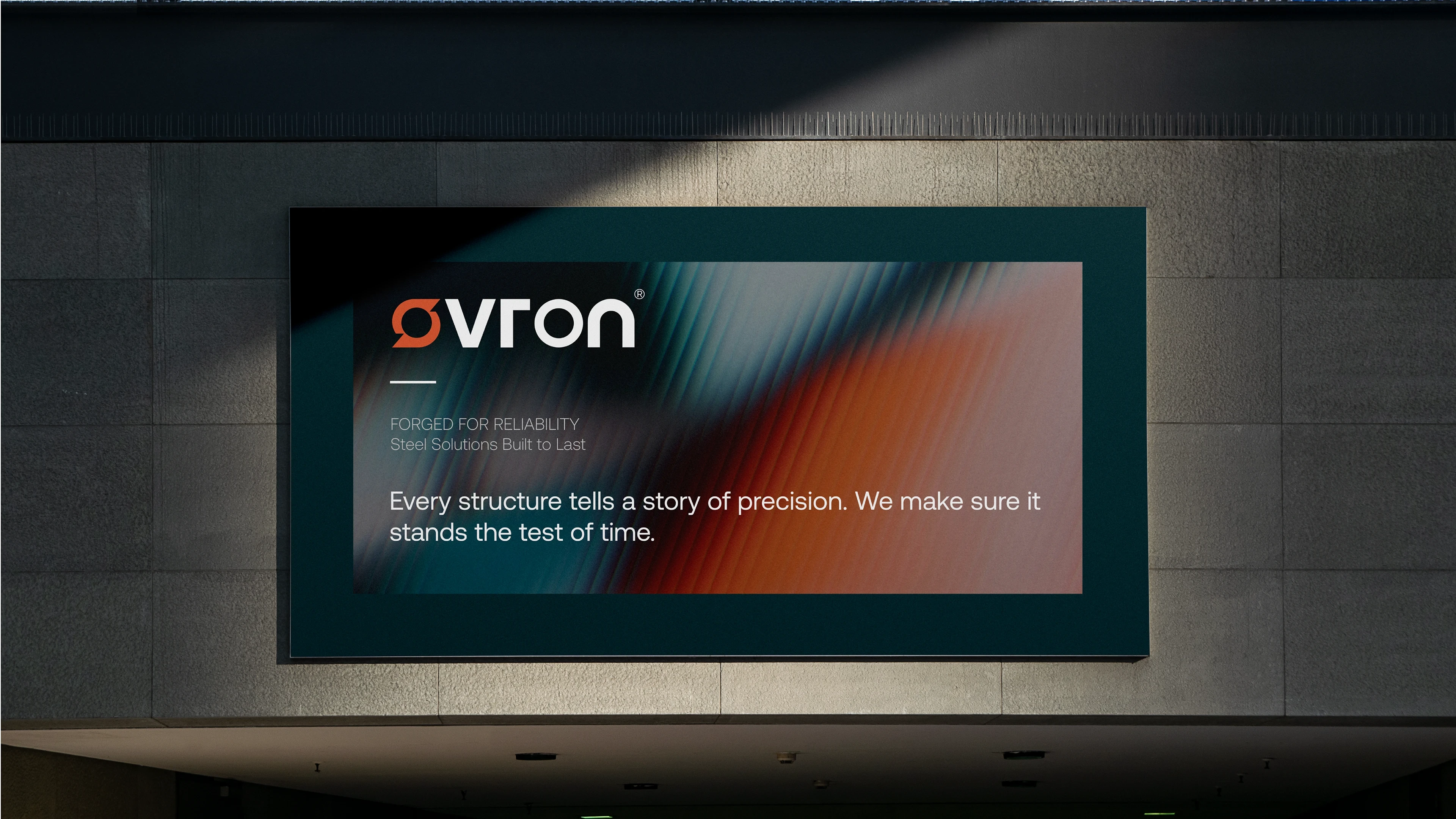
The concept was built around “Forged Reliability”, a narrative that captures both the material strength of steel and the precision of engineering.
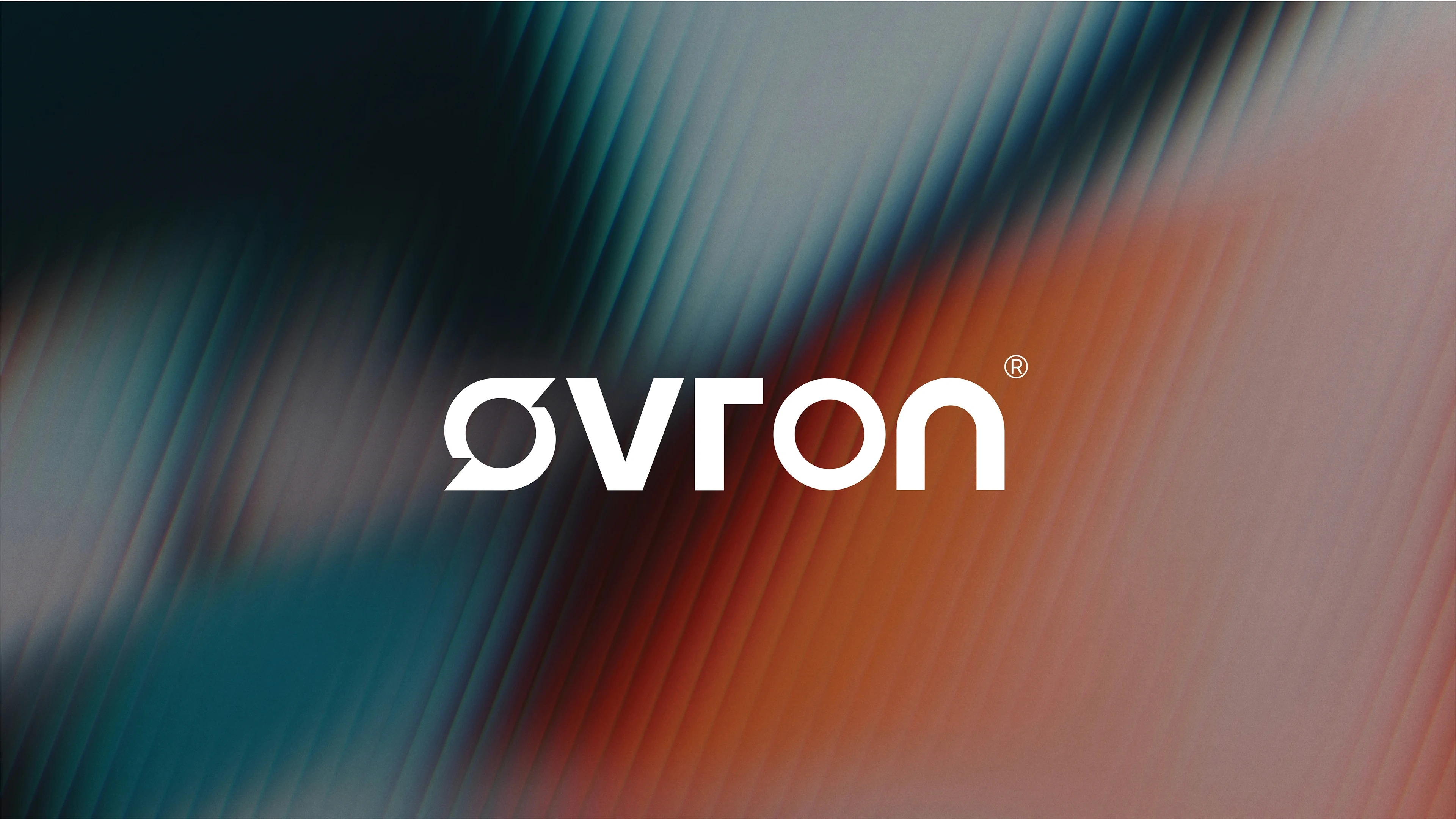
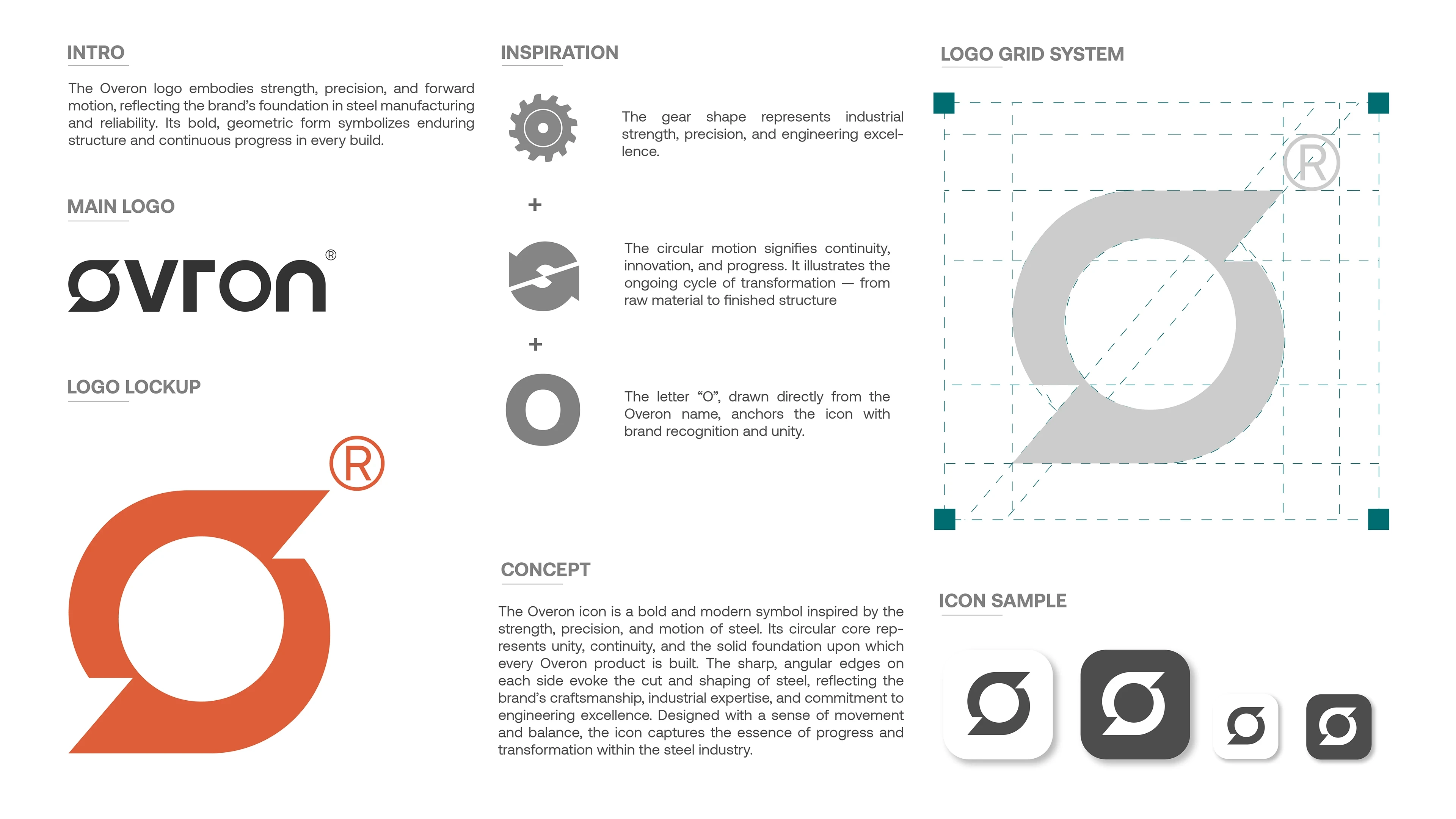
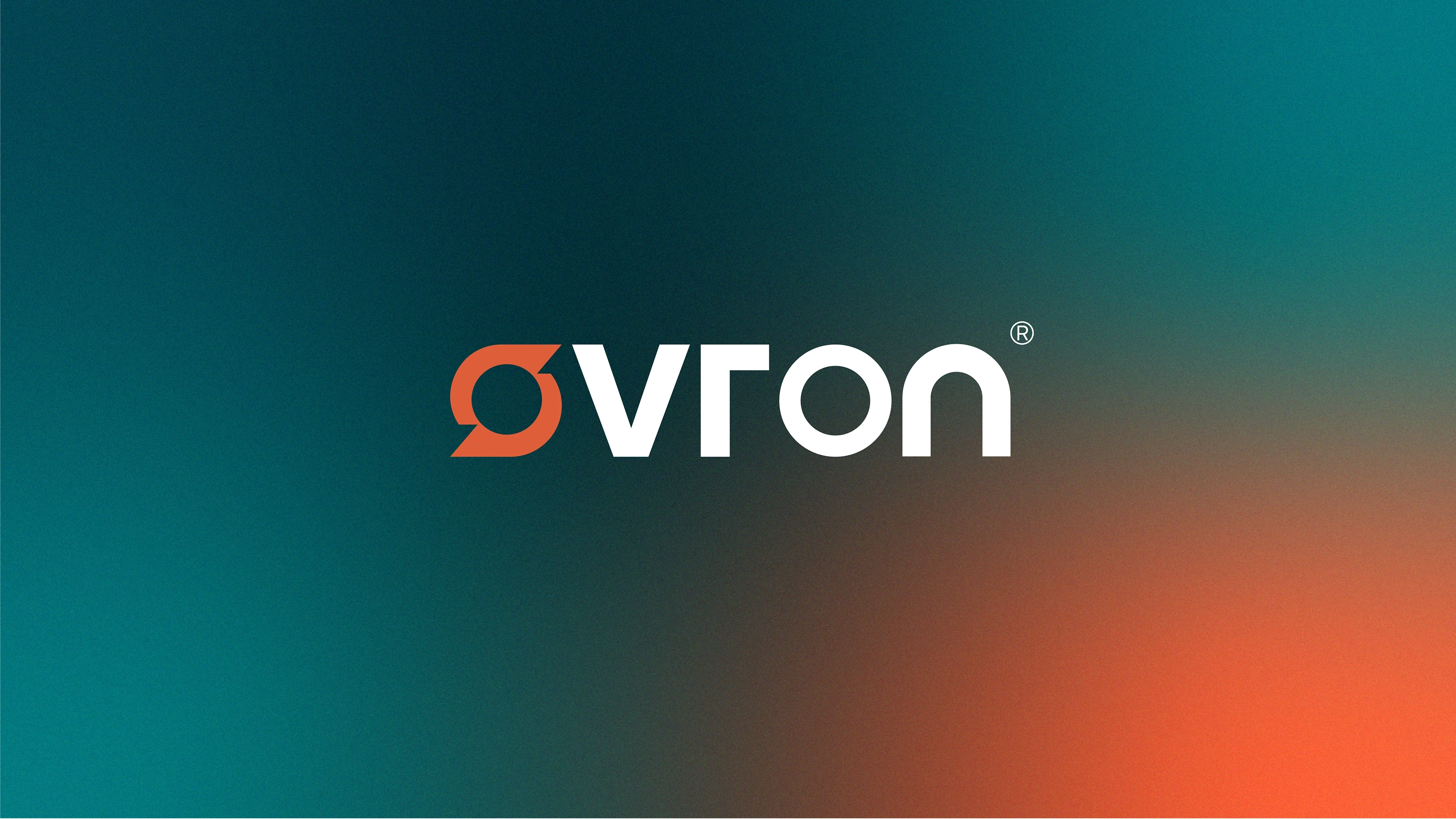
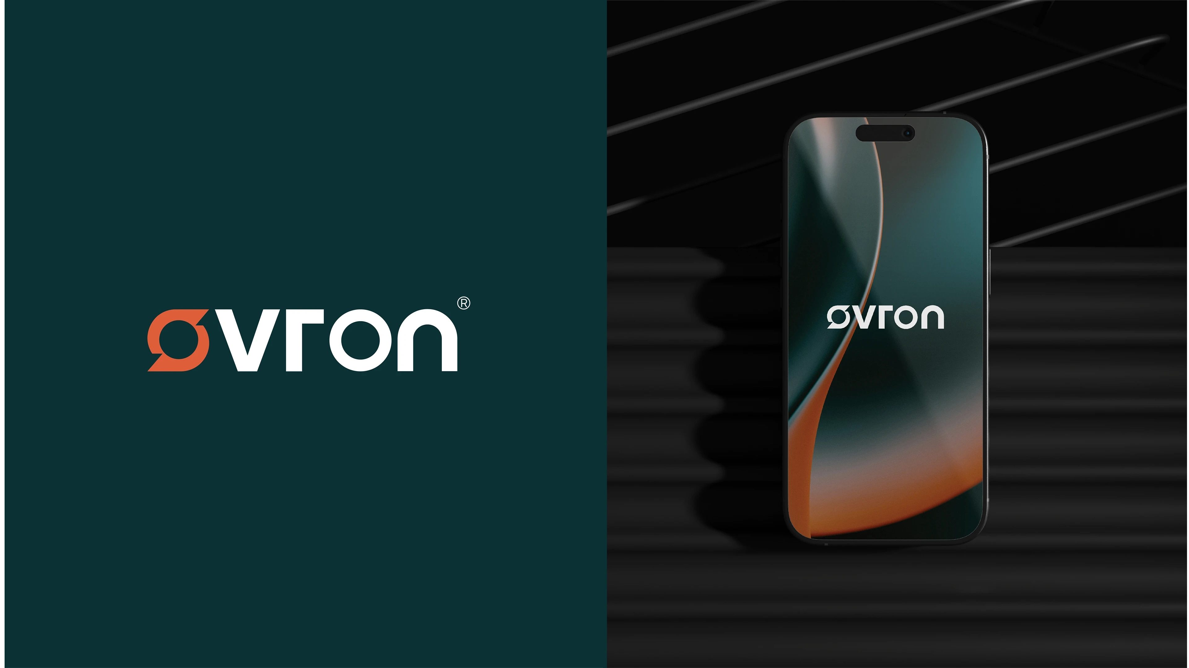
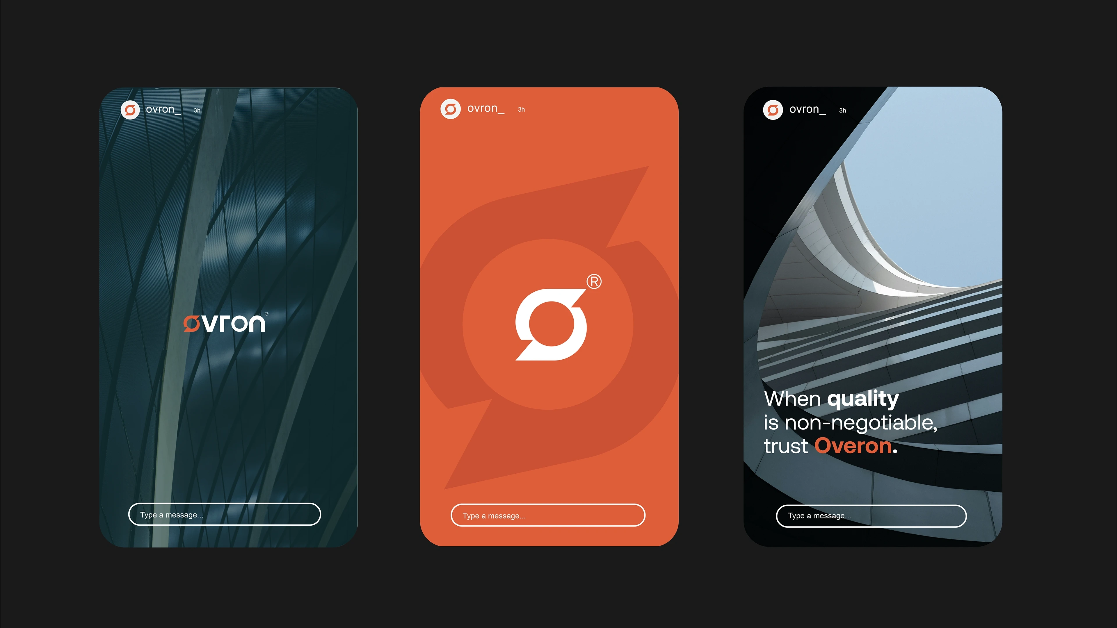
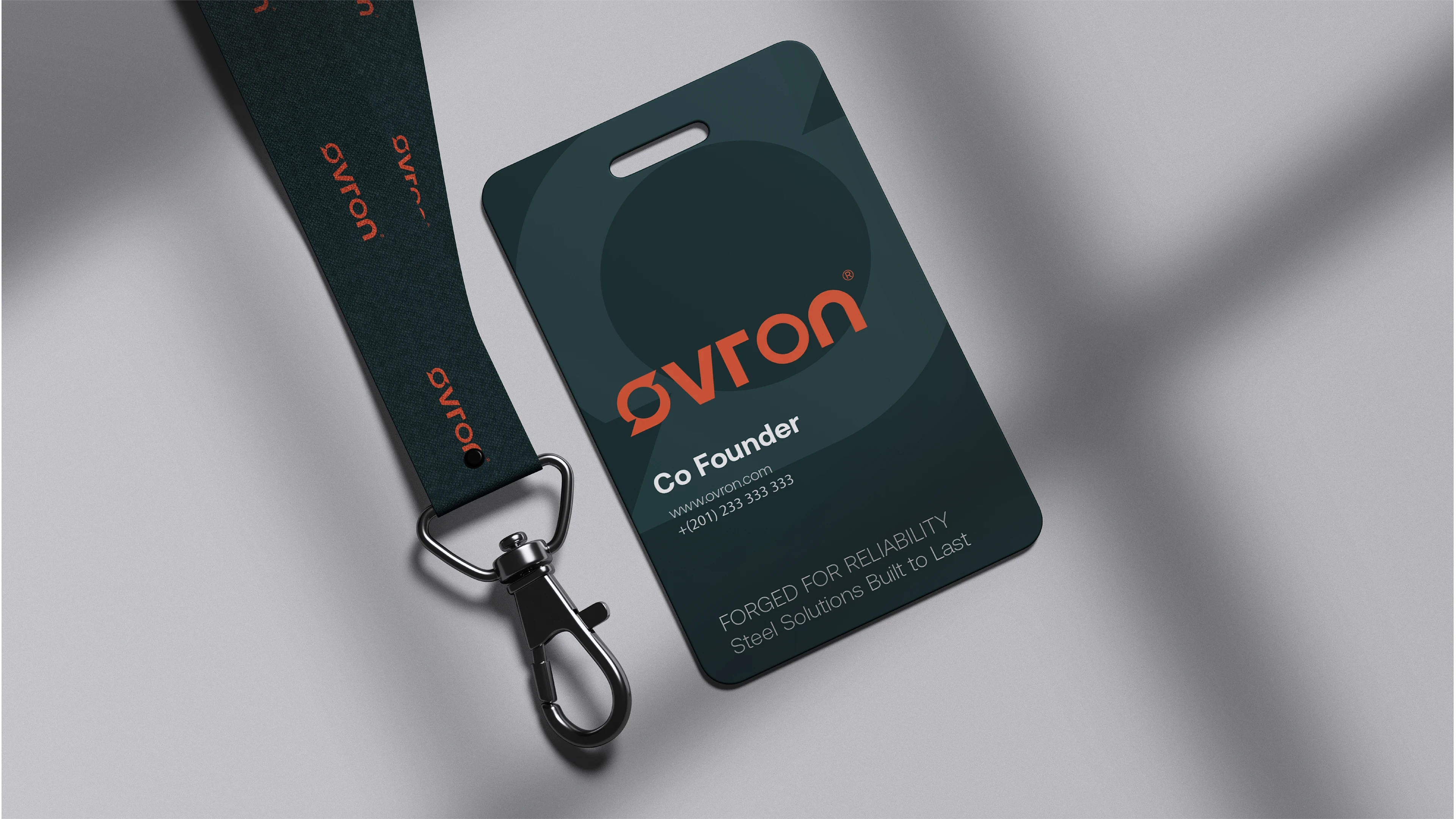
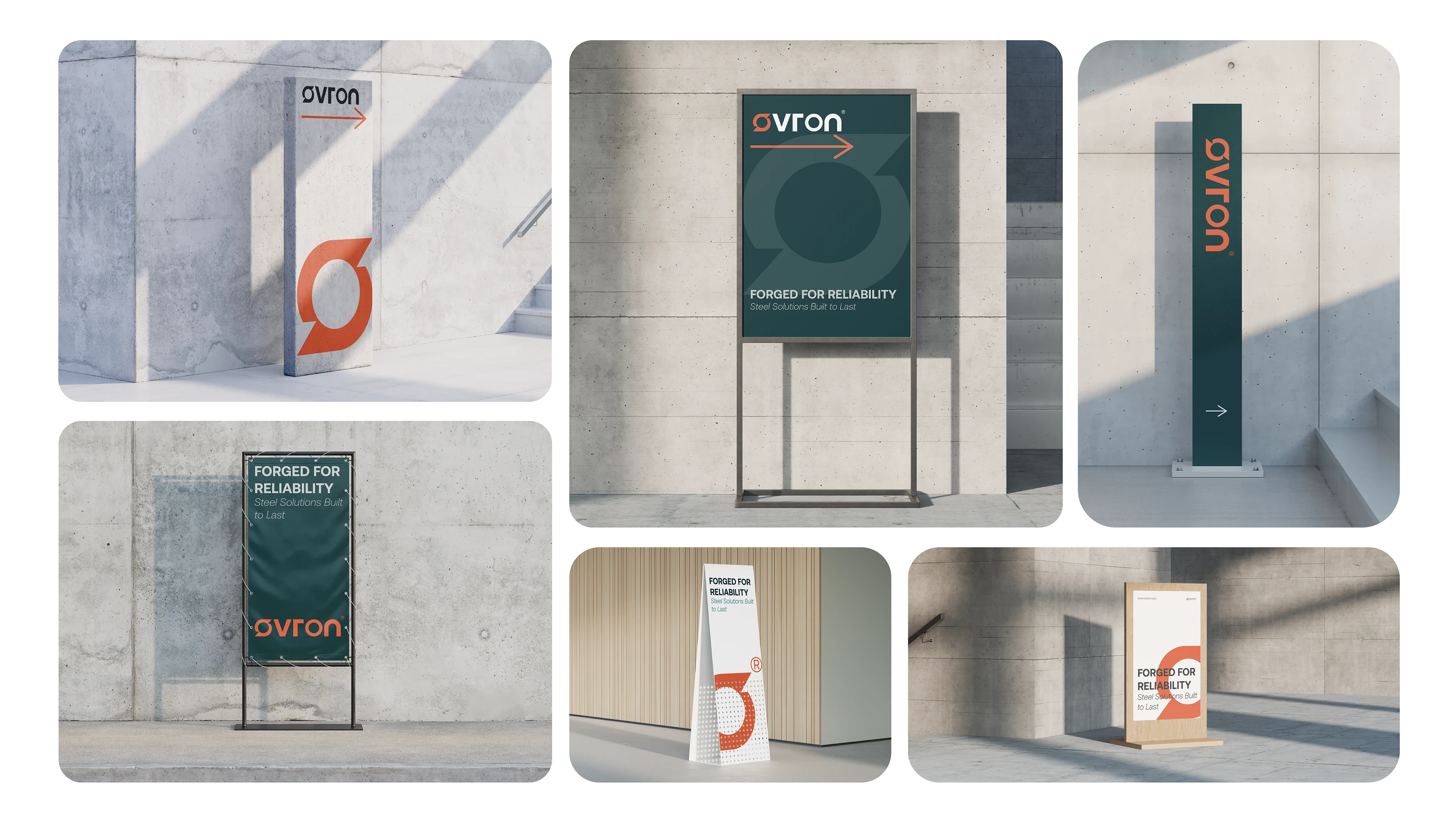
Logo: A gear-inspired “O” represents motion, balance, and structural strength.
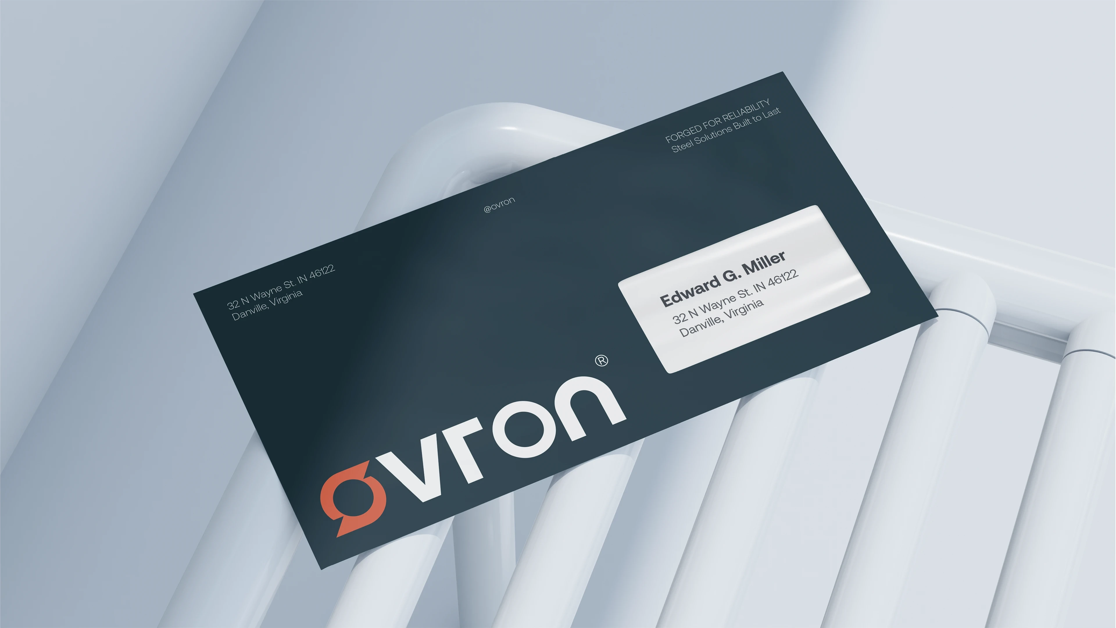
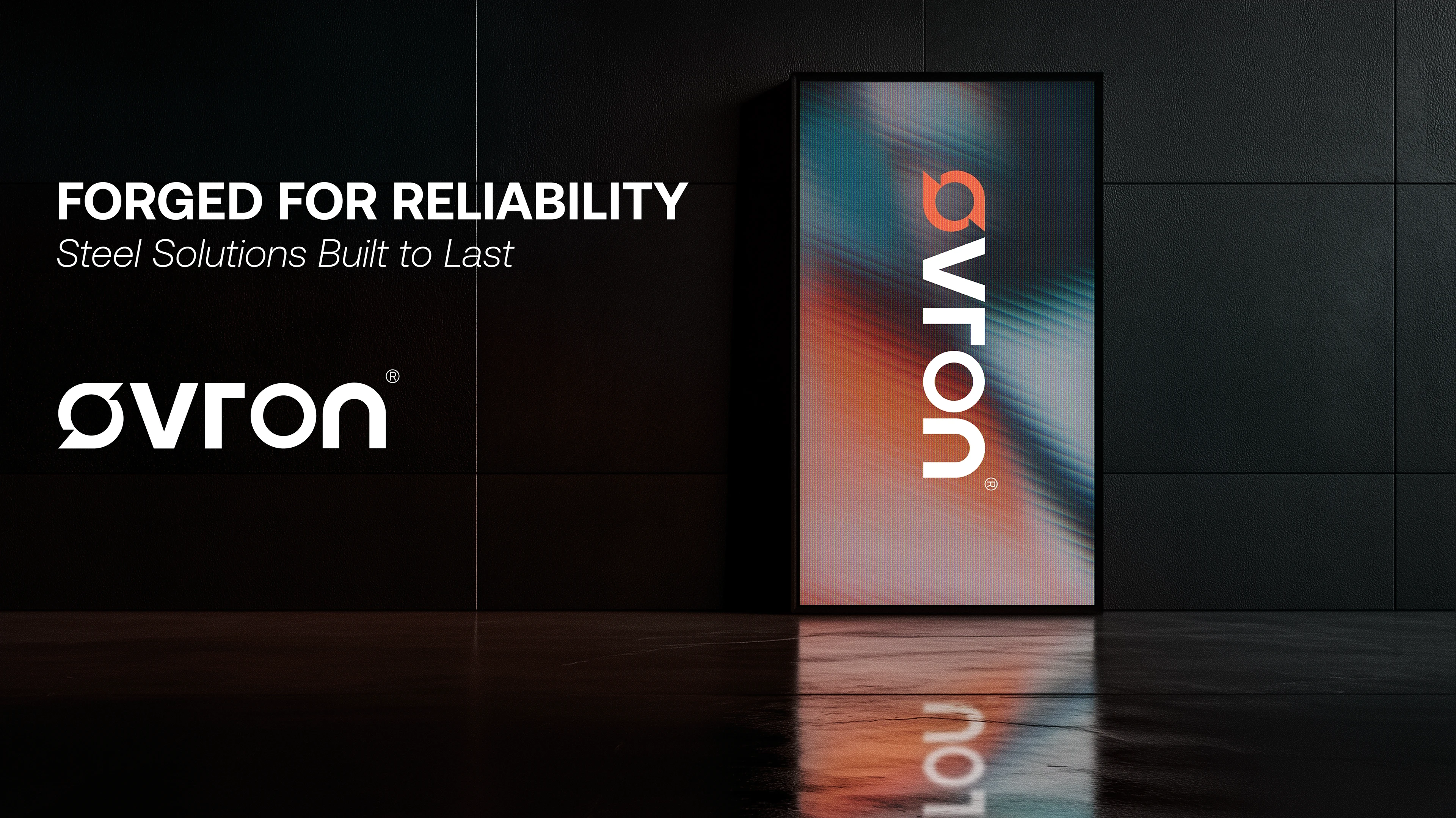
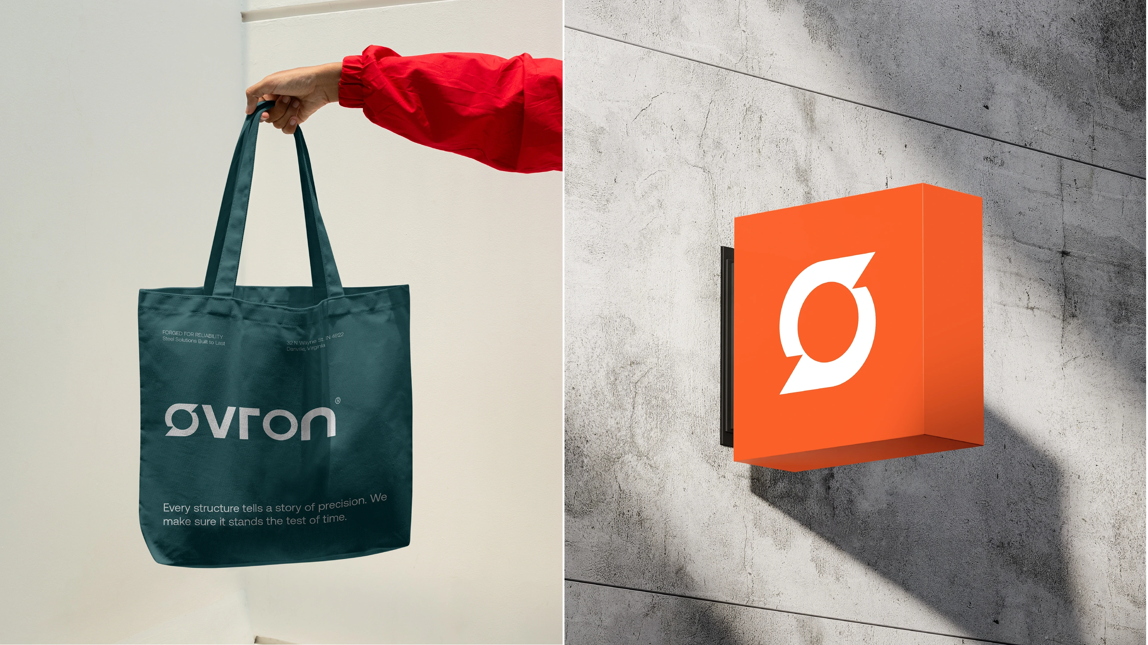
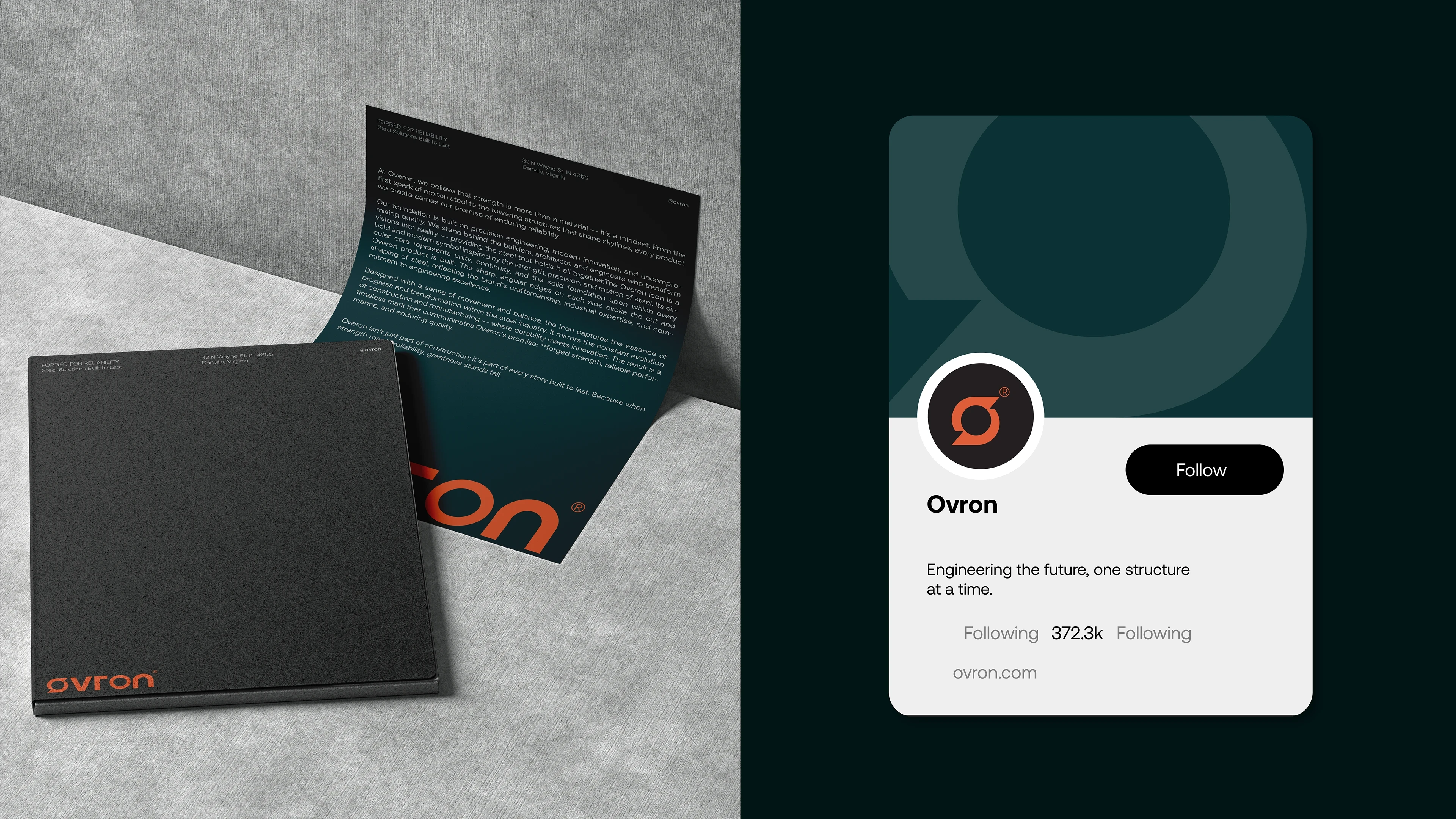
The identity system extends across physical and digital environments, from construction sites and factory signage to social media and marketing materials. Every element reinforces Ovron’s focus on endurance and precision.
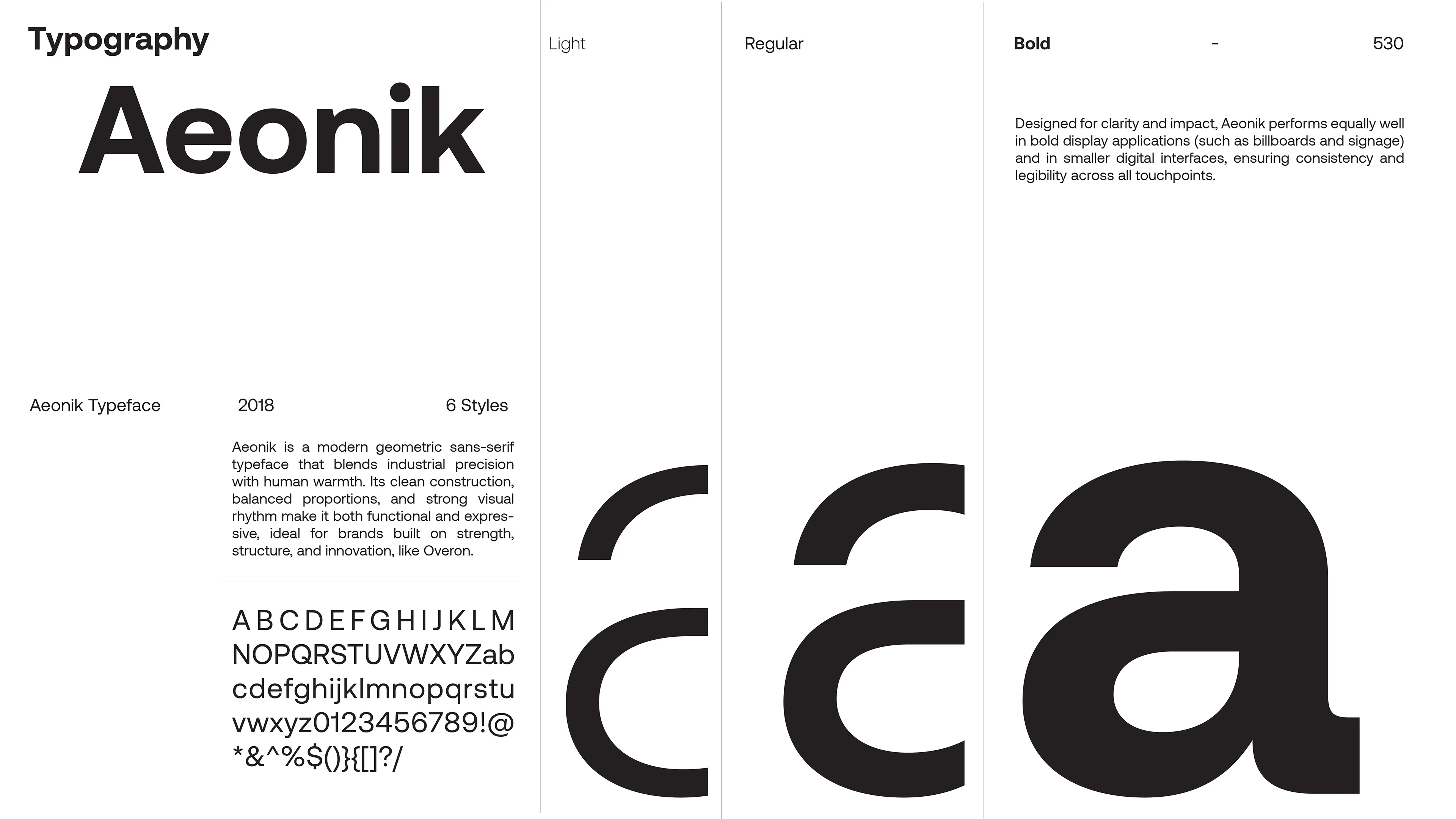
Typography: Aeonik, chosen for its geometric clarity and modern presence.
Voice: Confident, clear, and human, the sound of strength that doesn’t need to shout.
The Result
The final identity gave Ovron a unified, professional image that reflects both its industrial roots and forward momentum.
The brand now feels confident, visible, and built to last, just like the steel it produces.
Ovron’s rebrand turned a traditional manufacturing company into a symbol of progress, showing that even in heavy industry, design can create emotion, trust, and purpose.
Like this project
Posted Nov 5, 2025
How do you make a steel company feel alive? Ovron is a construction steel manufacturer built on strength, reliability, and precision.