Belorah AI - Brand Design
Samer Oukour
For Belorah, I wanted the identity to feel creative, smart, and premium without doing too much.
I wanted to avoid the usual AI look. No glowing brains, no chip icons, no random futuristic symbols.
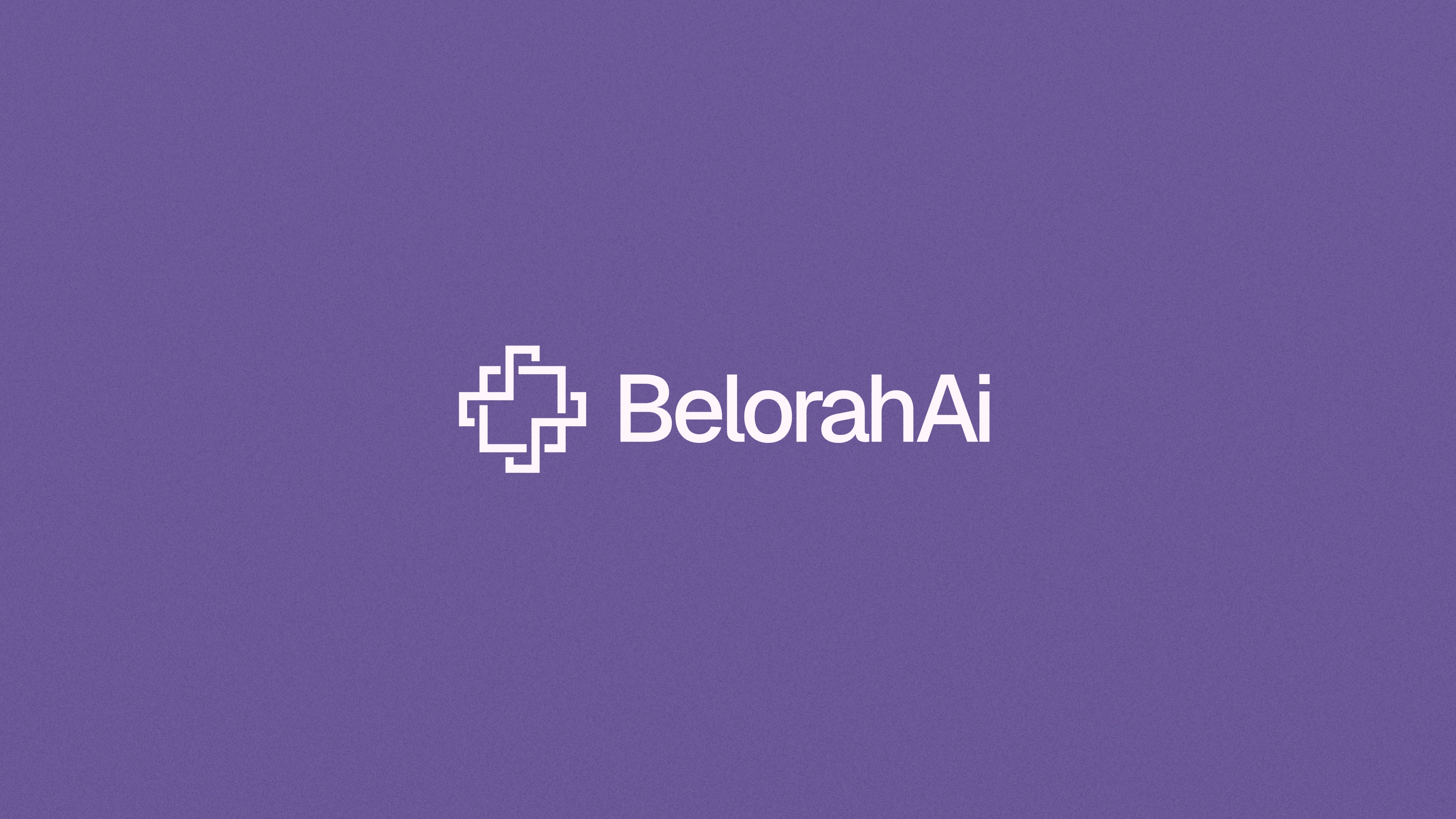
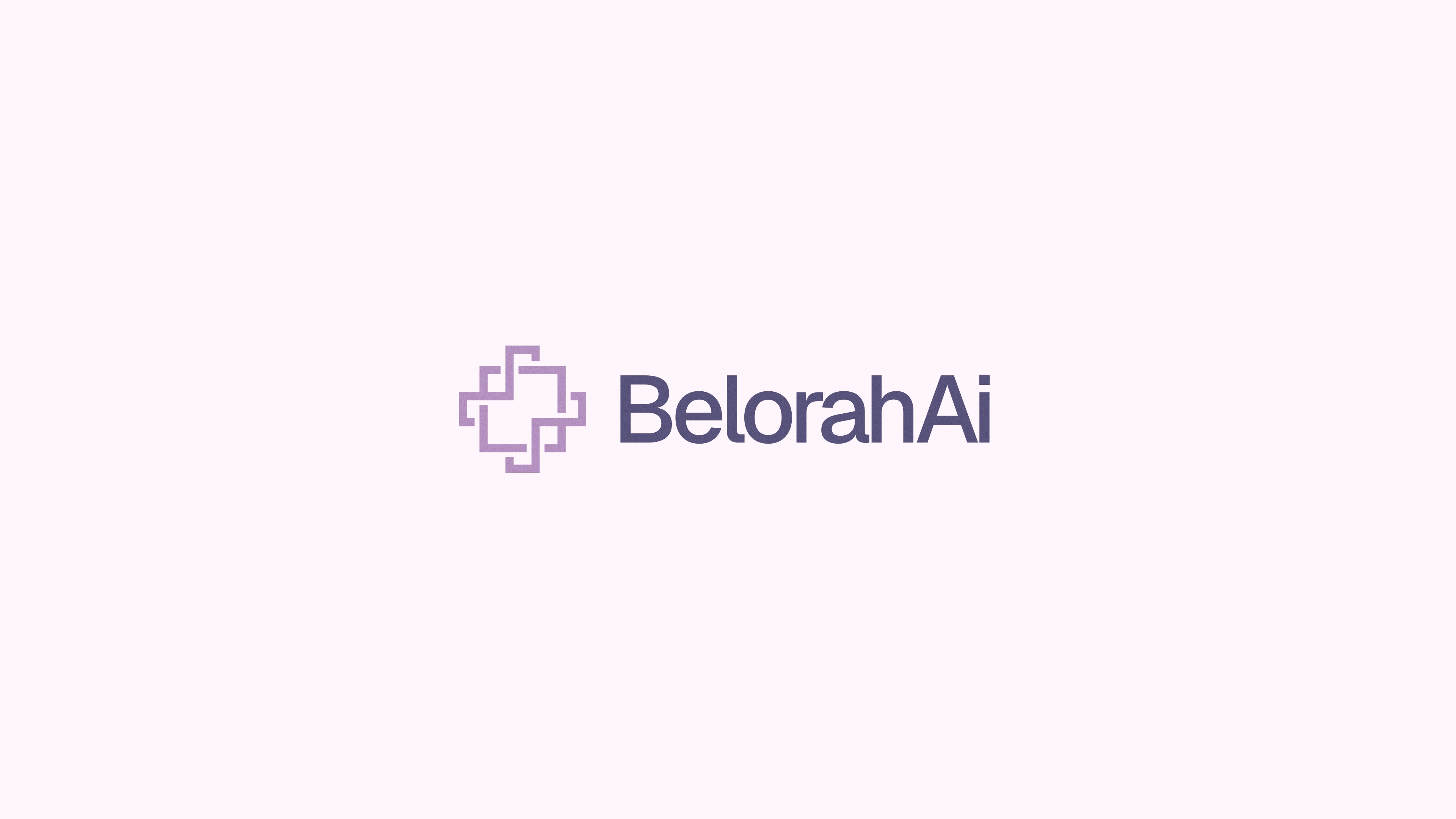
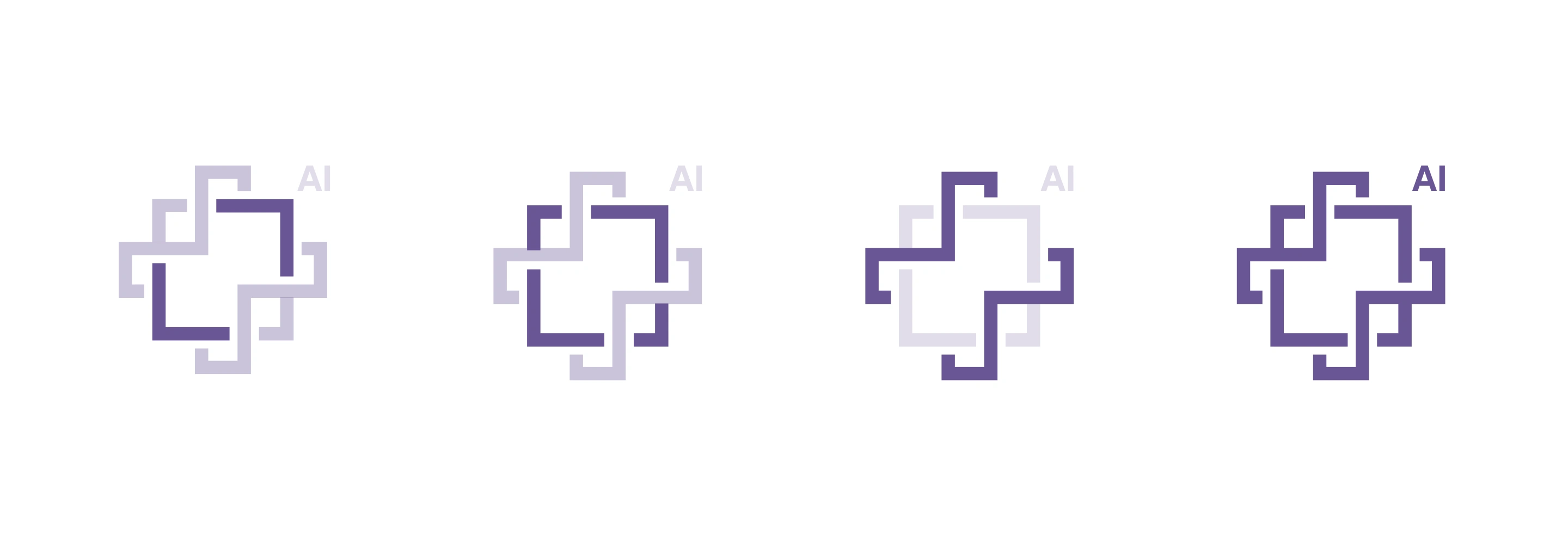
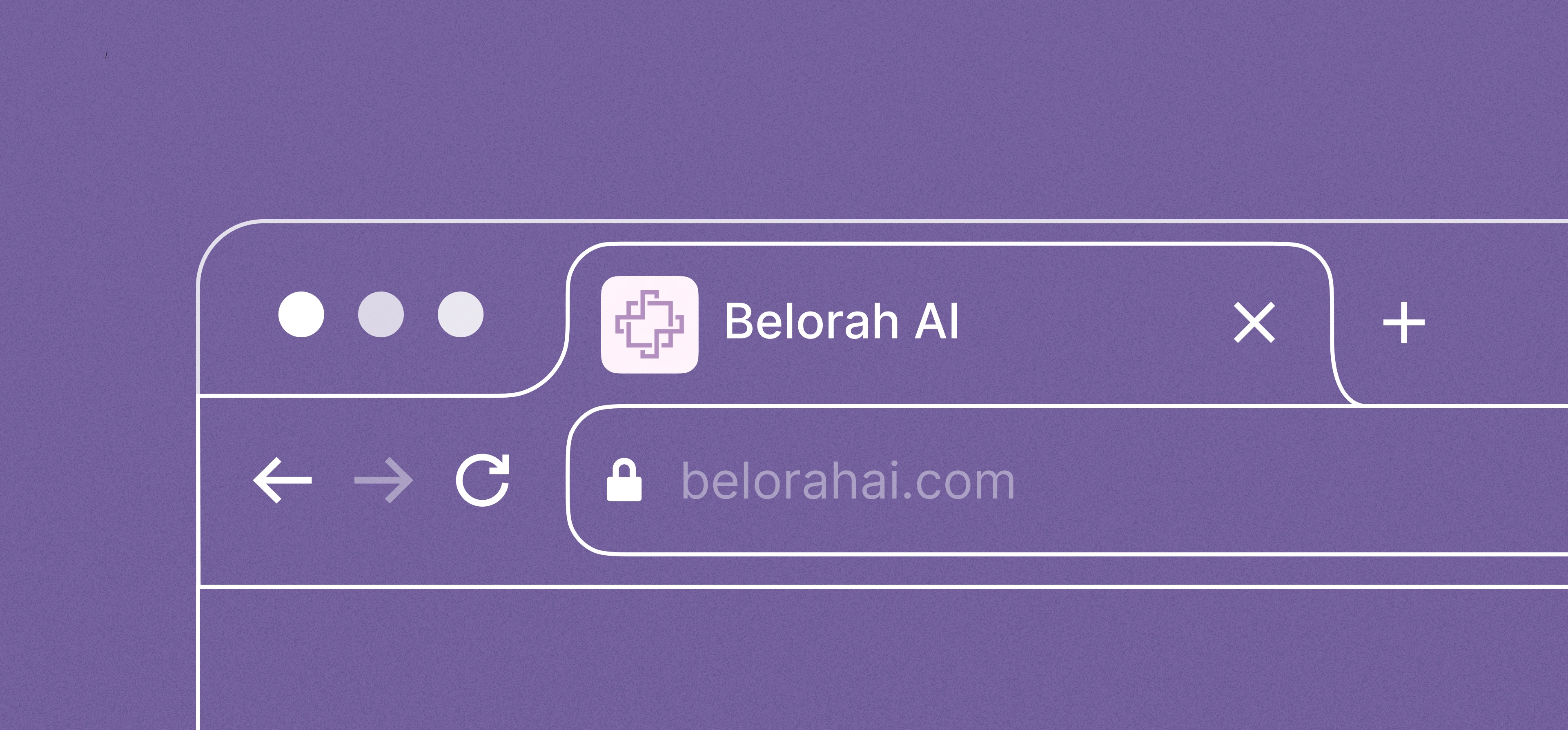
The logo is built around a simple geometric mark. It represents structure, clarity, and creative flow. The open lines give it movement, and the space in the middle feels like a blank canvas where ideas can start.
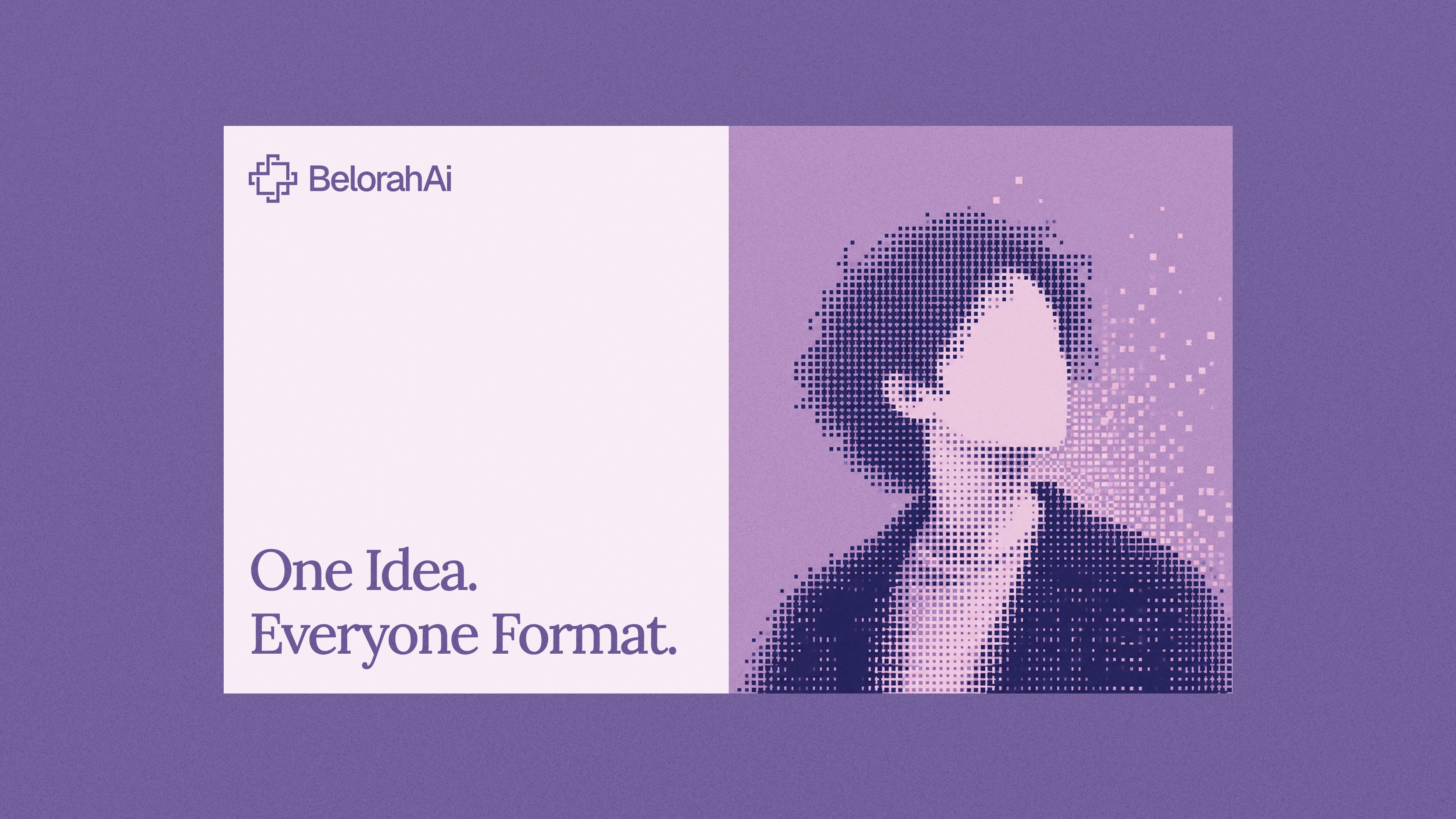
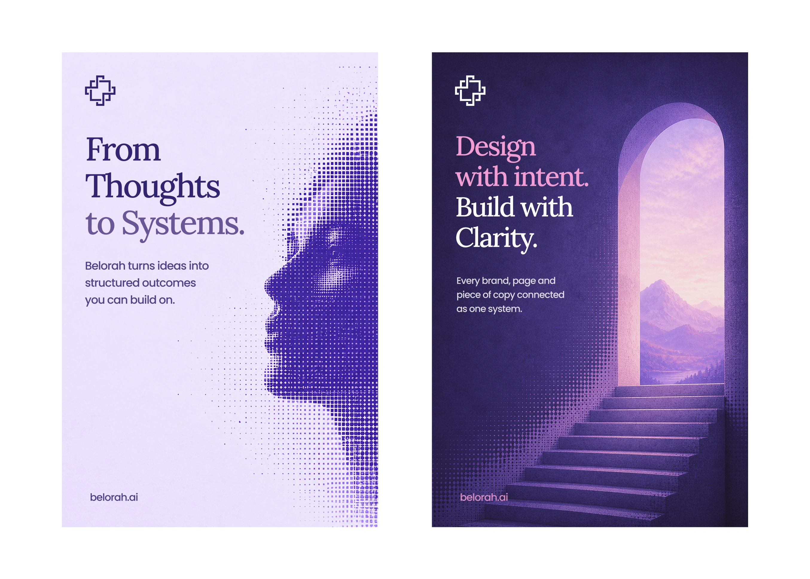
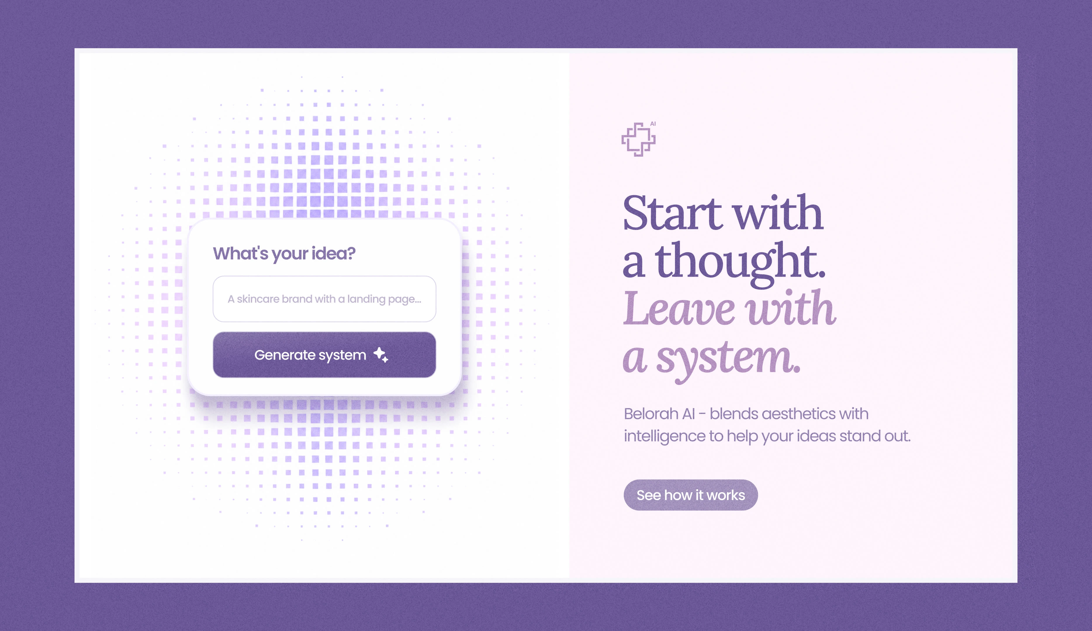
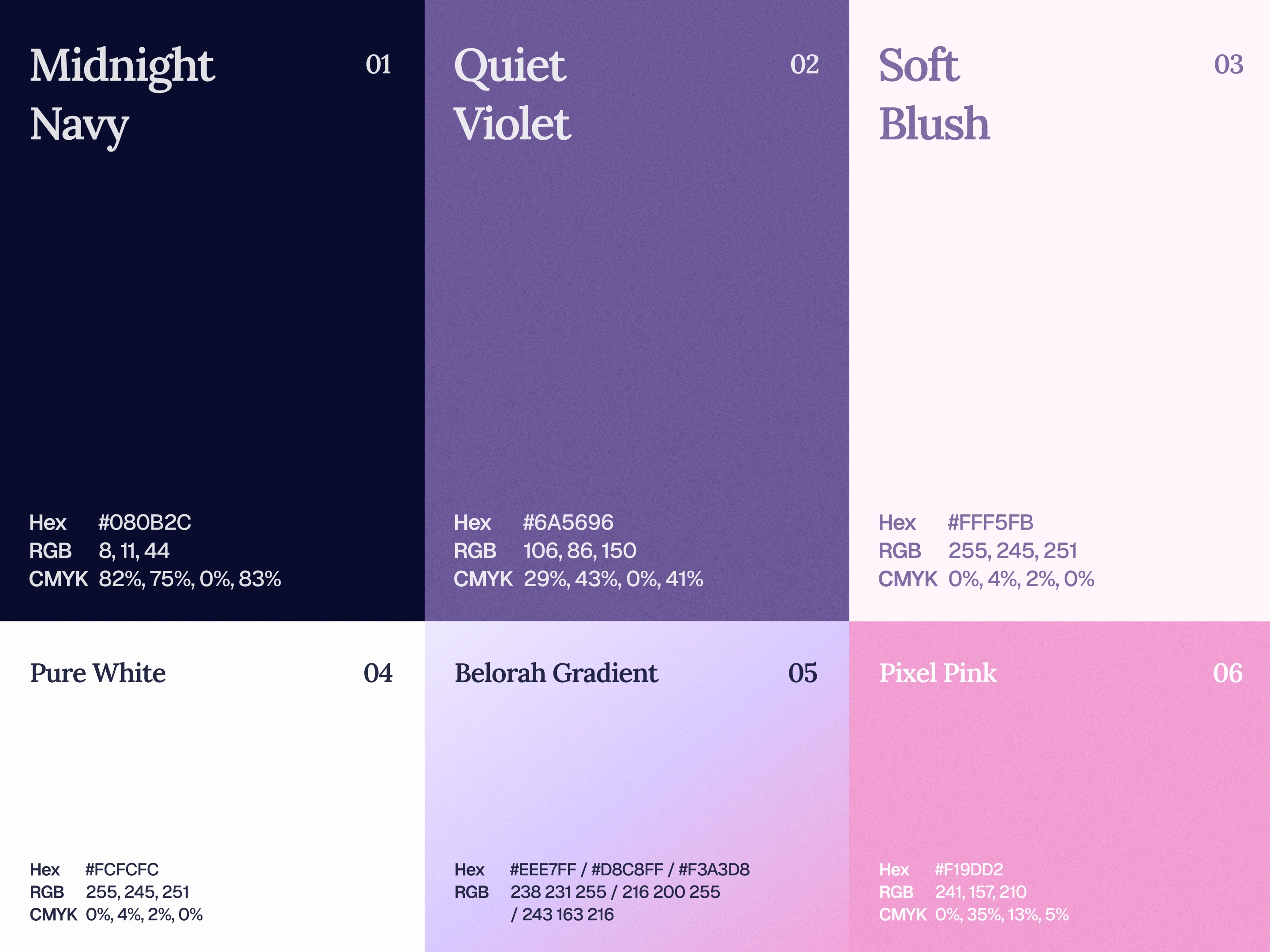
The rest of the visual system follows the same idea. Clean typography, strong whitespace, soft purple tones, and a calm layout style.
What I like most is that it still feels like an AI brand, but in a more subtle way. Clean, confident, and not trying too hard.

Like this project
Posted Jul 11, 2026
Belorah’s identity is sharp, minimal, and refined, built around clean geometry, strong whitespace, and a premium AI Brand.
Likes
2
Views
7