Vidiosa Rebranding Case Study
Md. Tanvir Ahmed Saimon
Vidiosa
Rebranding
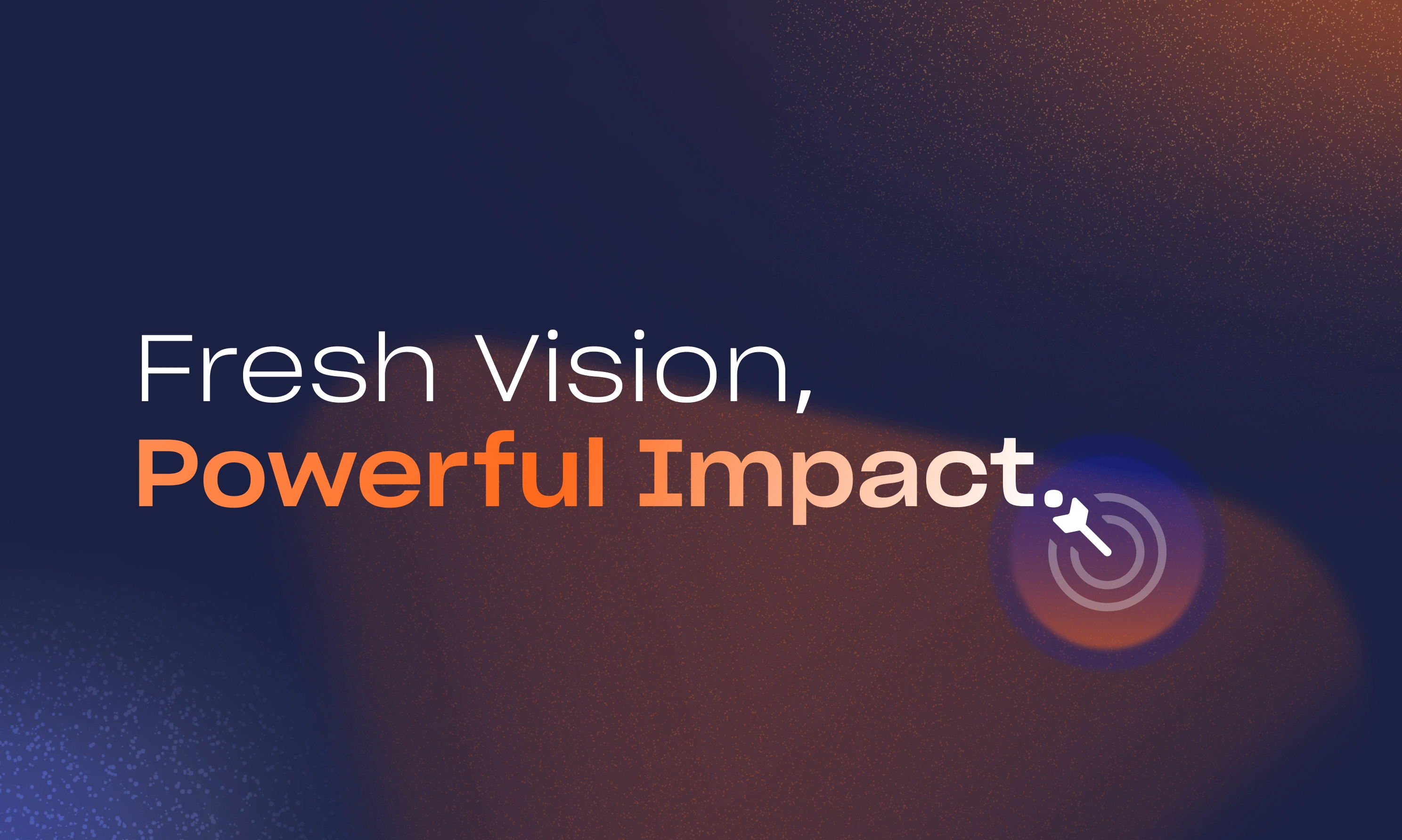
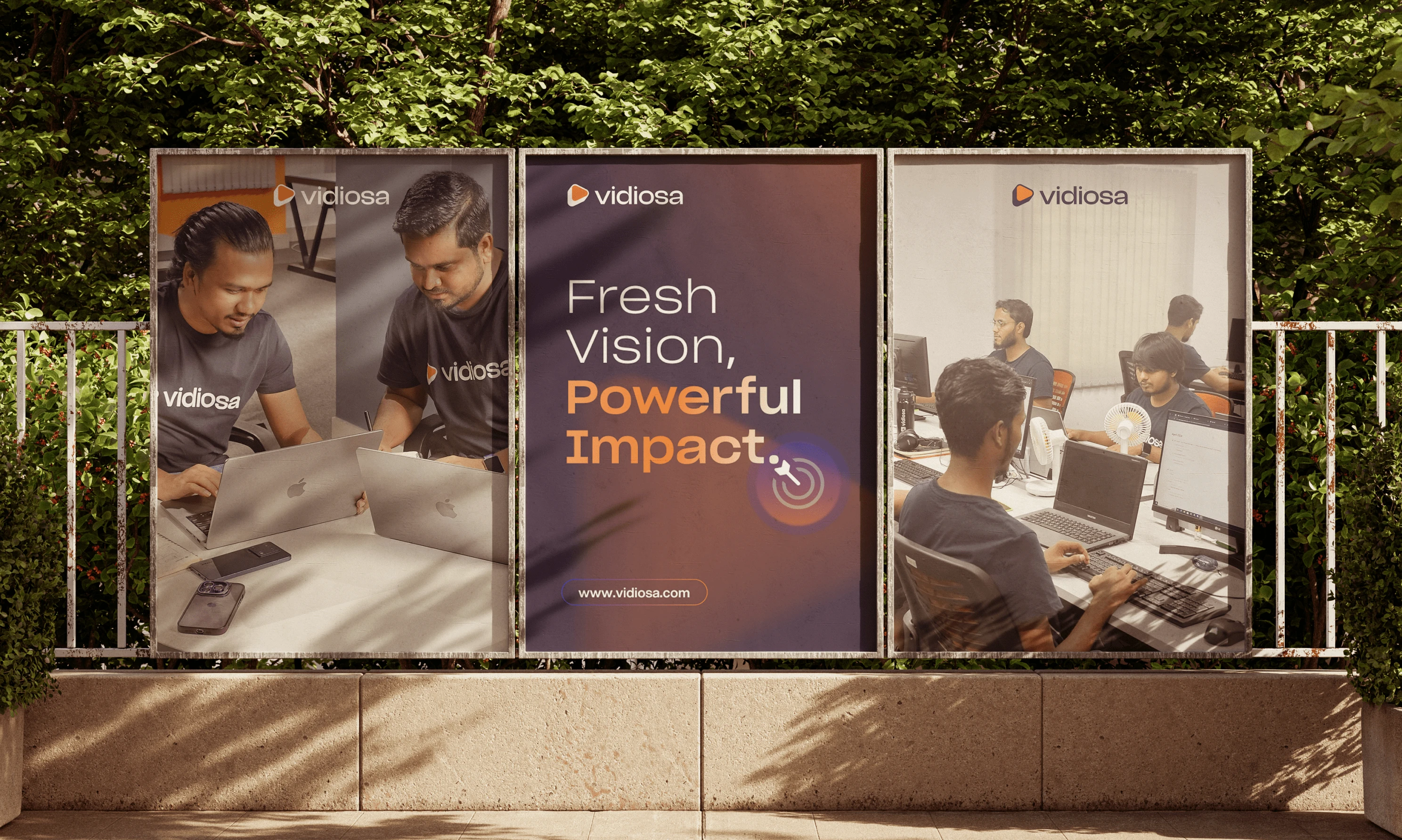
Welcome to the New Vidiosa! 🚀 We're thrilled to share our rebranding with you. Vidiosa now has a fresh vision and a powerful impact.
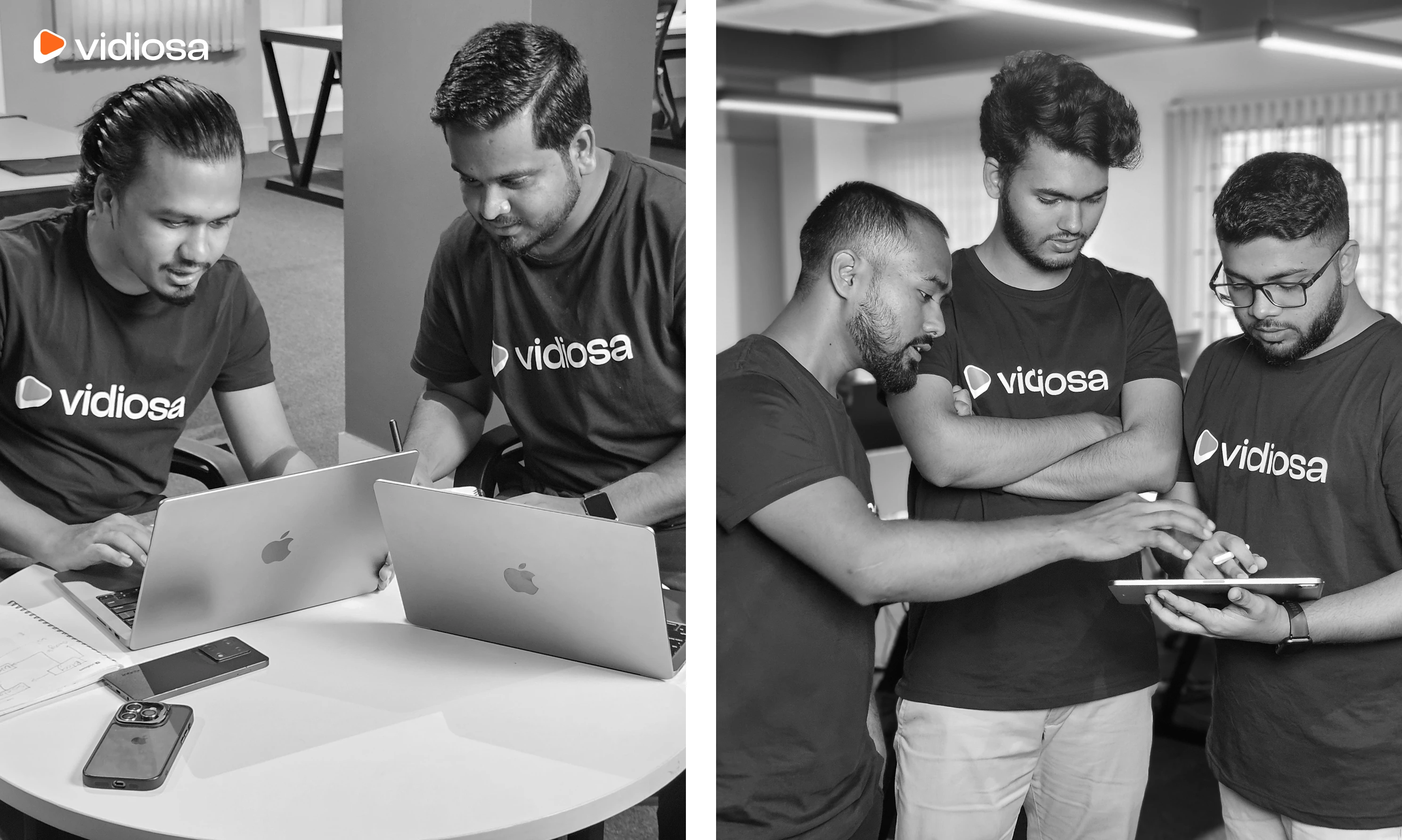
Our story began in 2020 with just one animator. Recognizing the potential in the industry, our team grew, and by 2023, Vidiosa was born with a team of 7 people. In just 1.5 years, we expanded to over 20 in-house members and 12+ global team members, serving clients worldwide.
We invite you to experience the new Vidiosa. Our rebranding goes beyond new colors and visuals; it completely transforms who we are. We're embracing a modern identity that reflects our ability to make a powerful impact.
We're not just updating our look; we're revolutionizing how we serve our clients and dominate the industry.
Welcome to our official rebranding!
Story behind rebranding
Vidiosa started as a startup experiment and, in just 1.5 years, became our flagship brand. Our goal is now bigger and bolder: to empower SaaS and tech-enabled businesses with video marketing. The decision to rebrand was driven by the need to better align our visual identity with our mission and values.
The original branding didn't fully capture Vidiosa's dynamic and innovative spirit. Our rebranding reflects our ambition, ensuring our brand resonates with SaaS founders and key decision-makers, creating a cohesive and appealing image that matches our mission to drive growth and innovation in the industry.

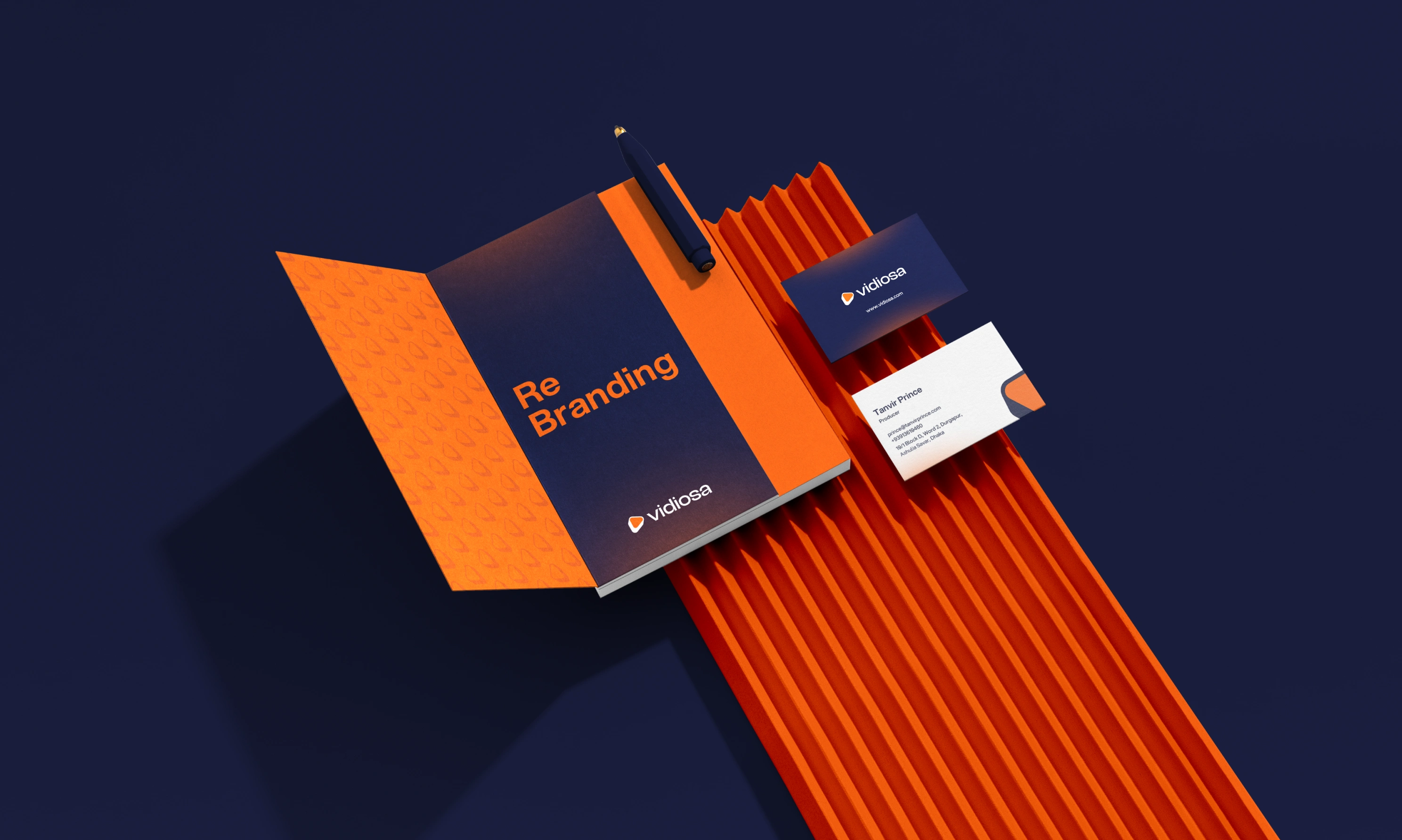
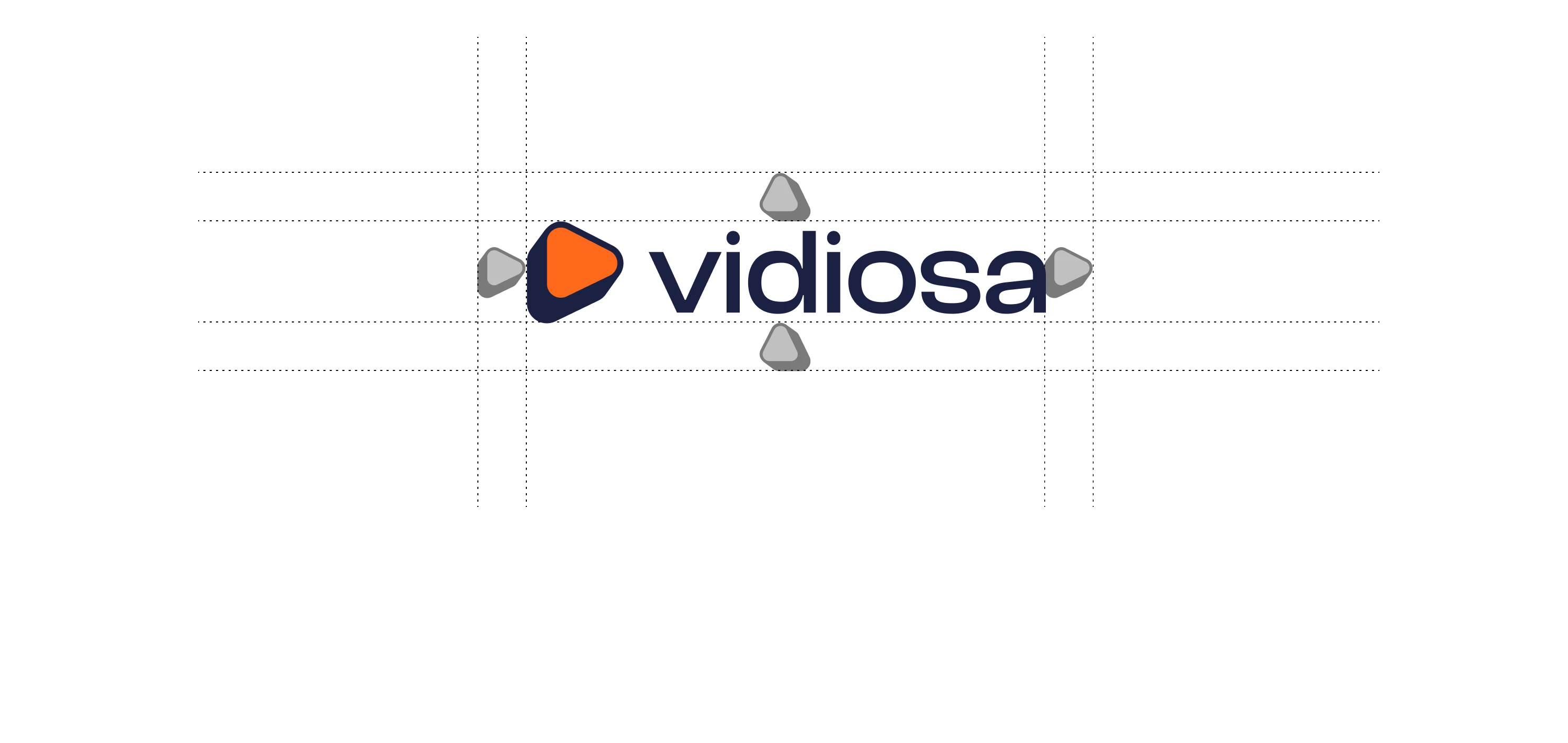
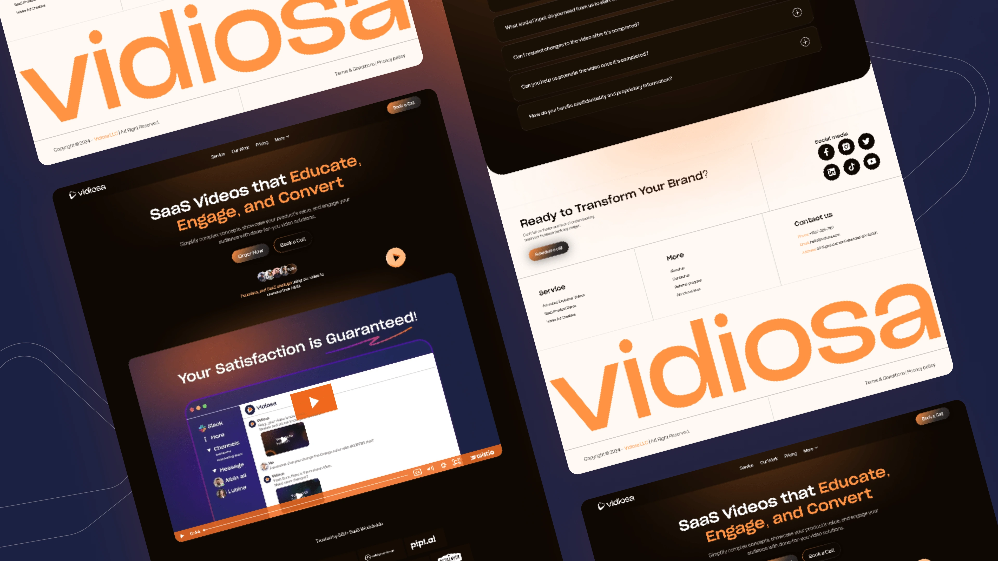
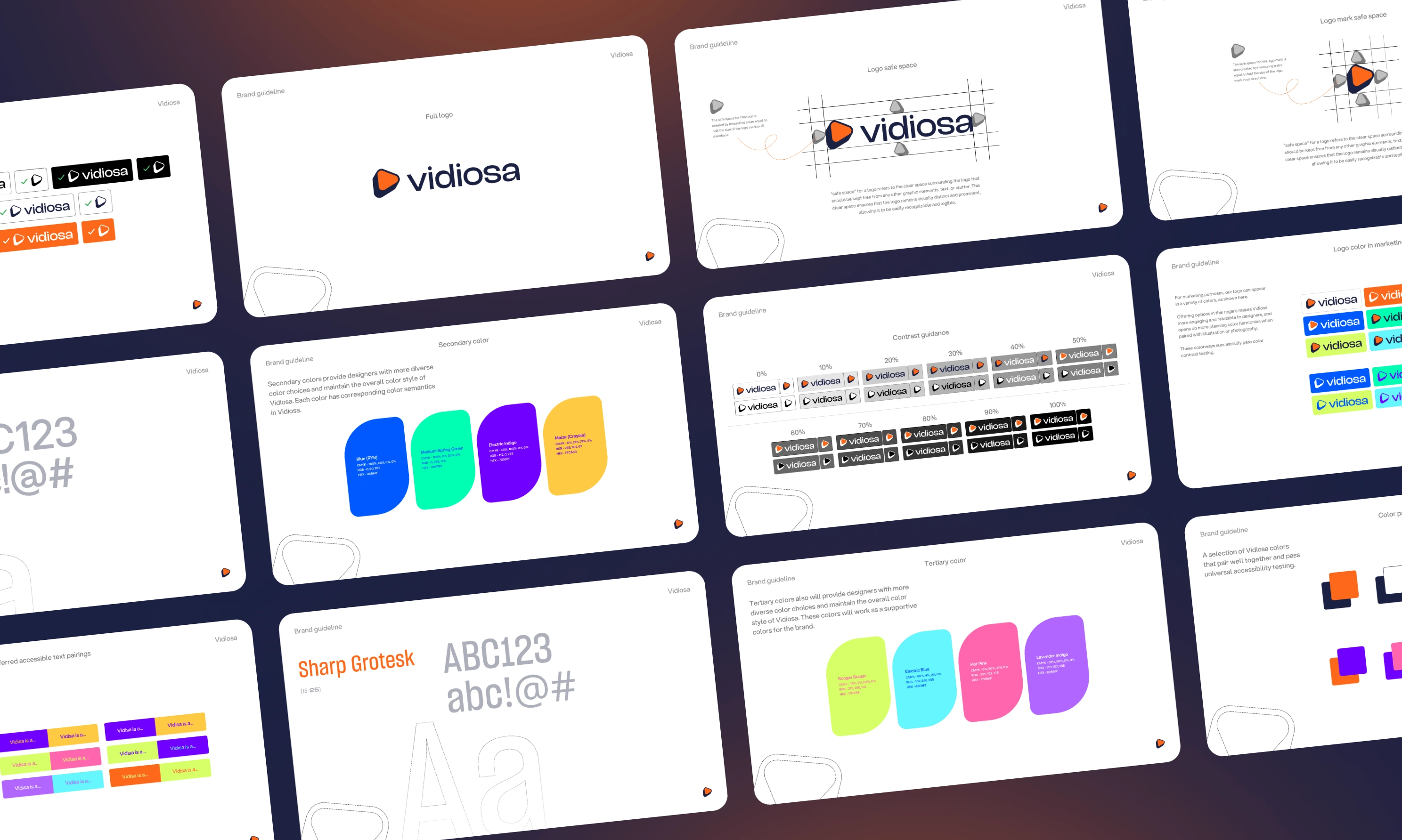
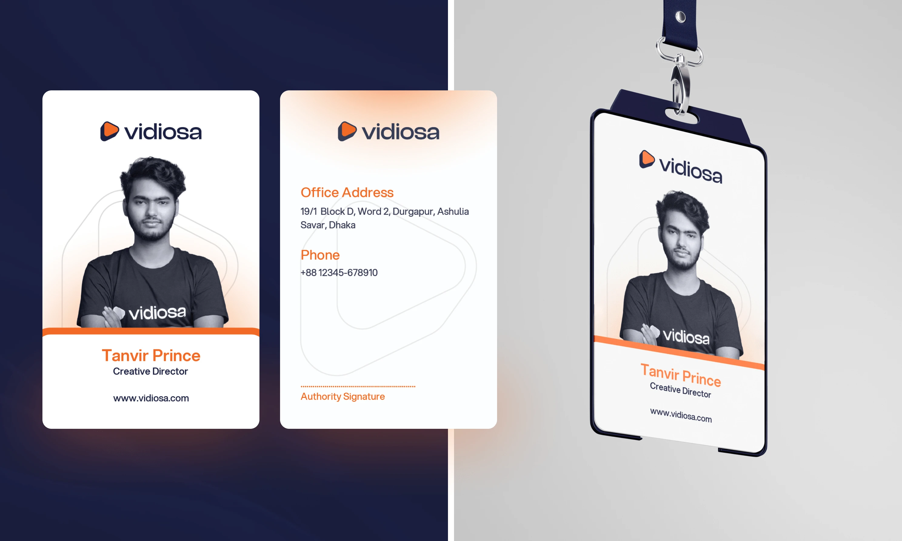
The logo
The new logo features a sleek, modern design that represents our commitment to clarity and engagement. The stylized play button at its core represents our focus on video content, a fundamental aspect of our business. This bold, geometric shape conveys professionalism and creativity, while the rounded edges add a touch of friendliness and approachability, reflecting our brand values.

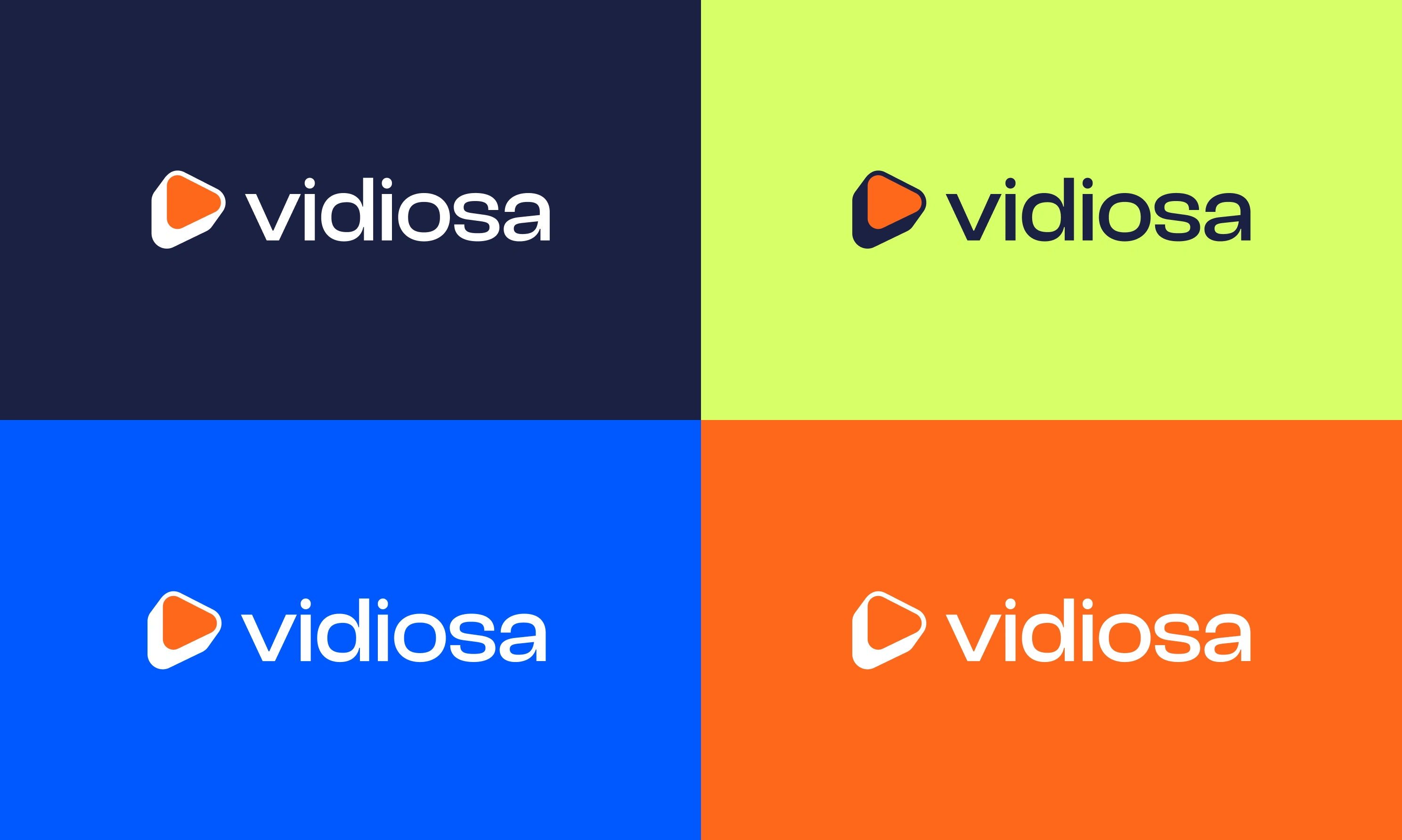
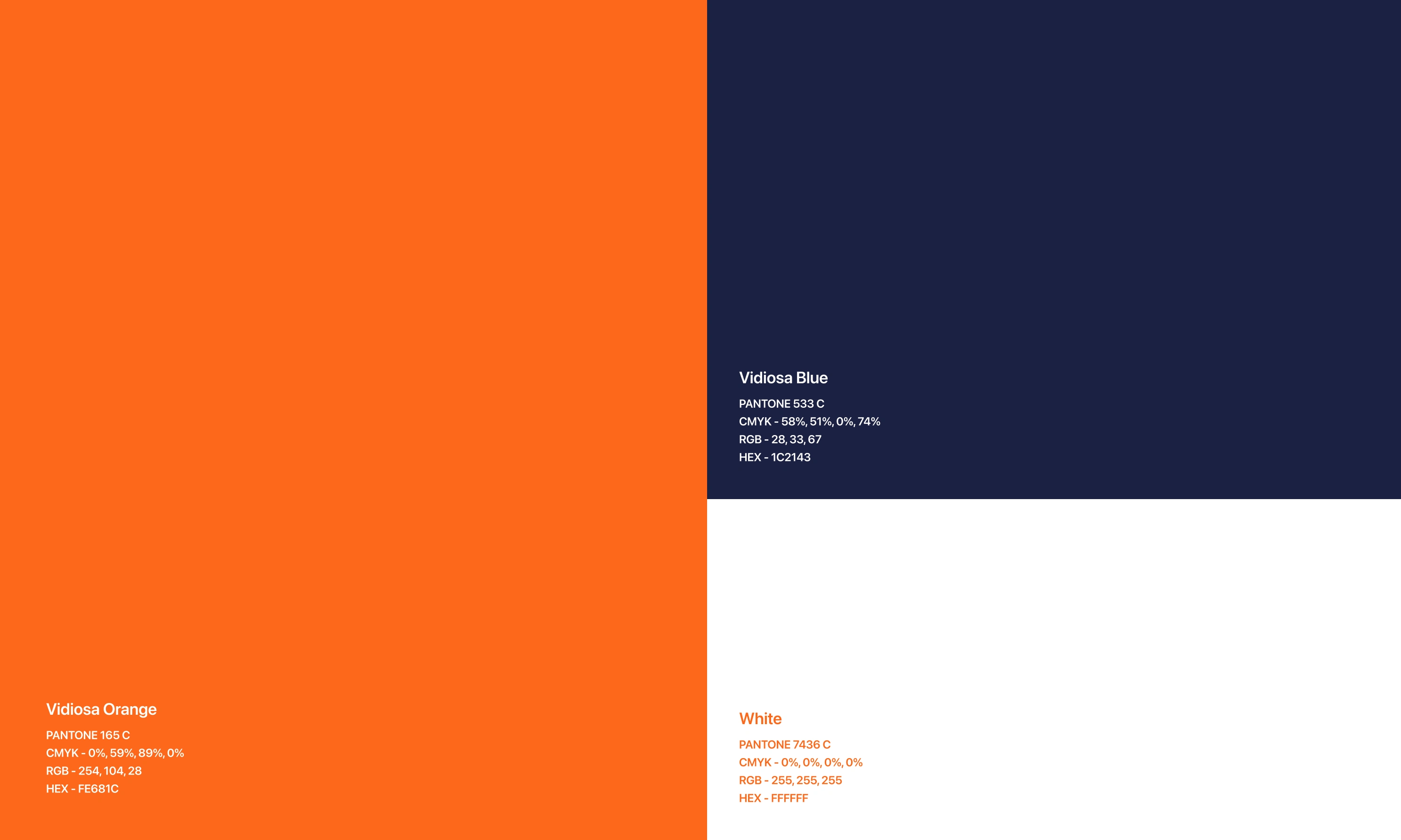
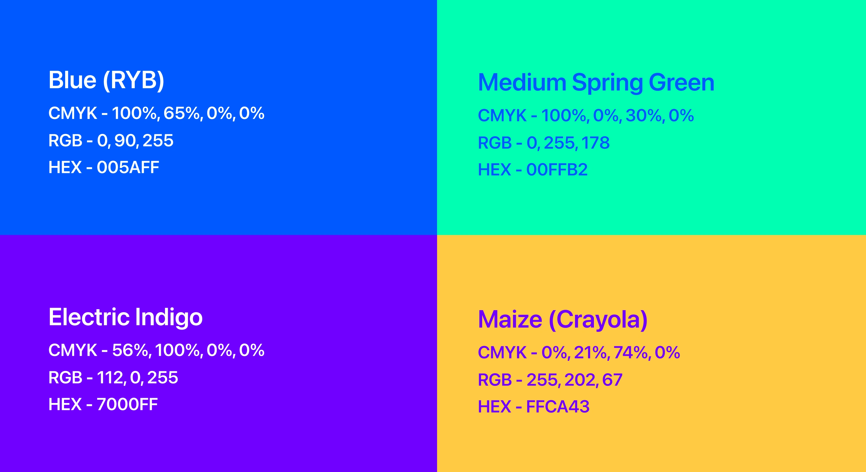
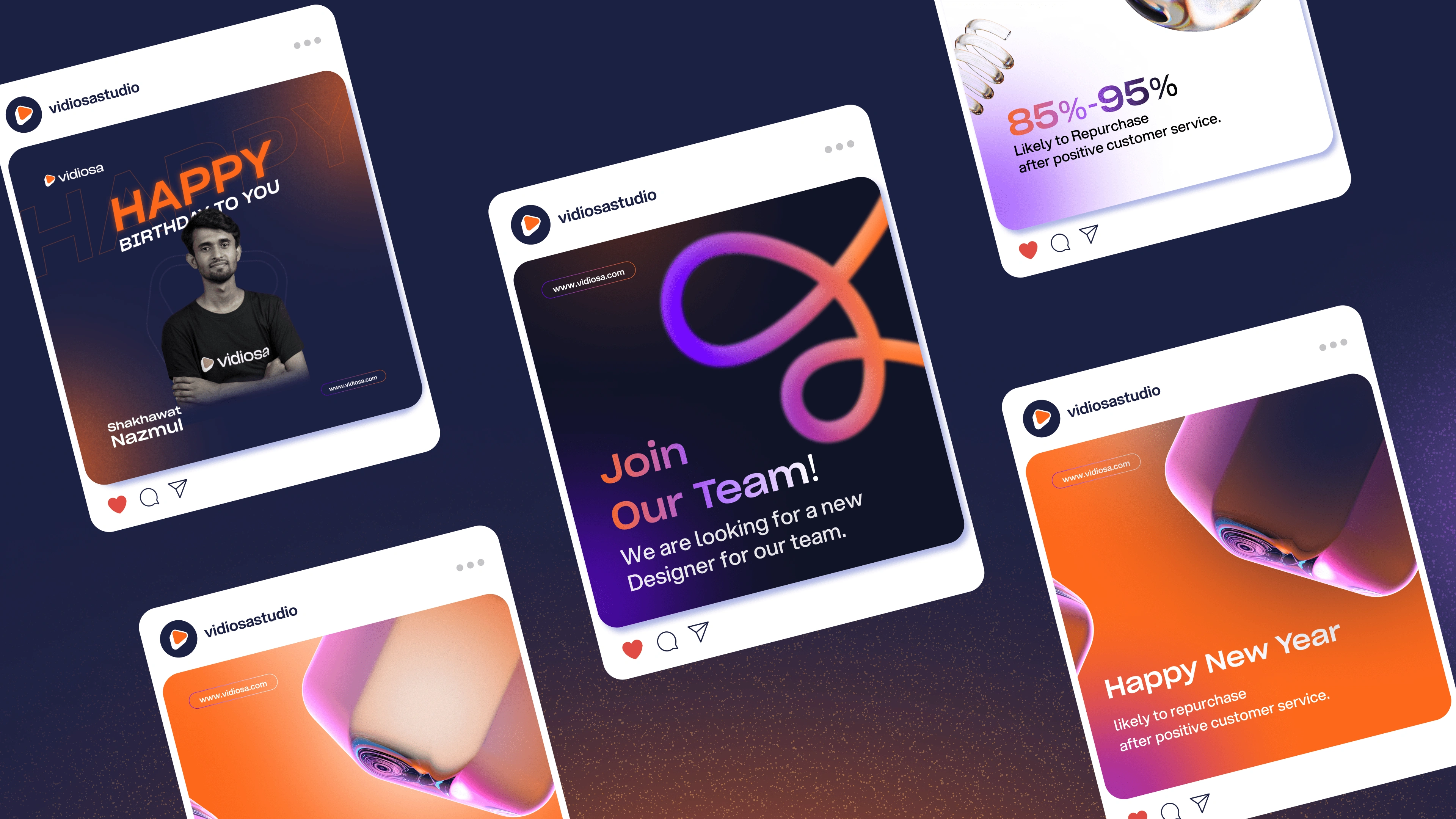
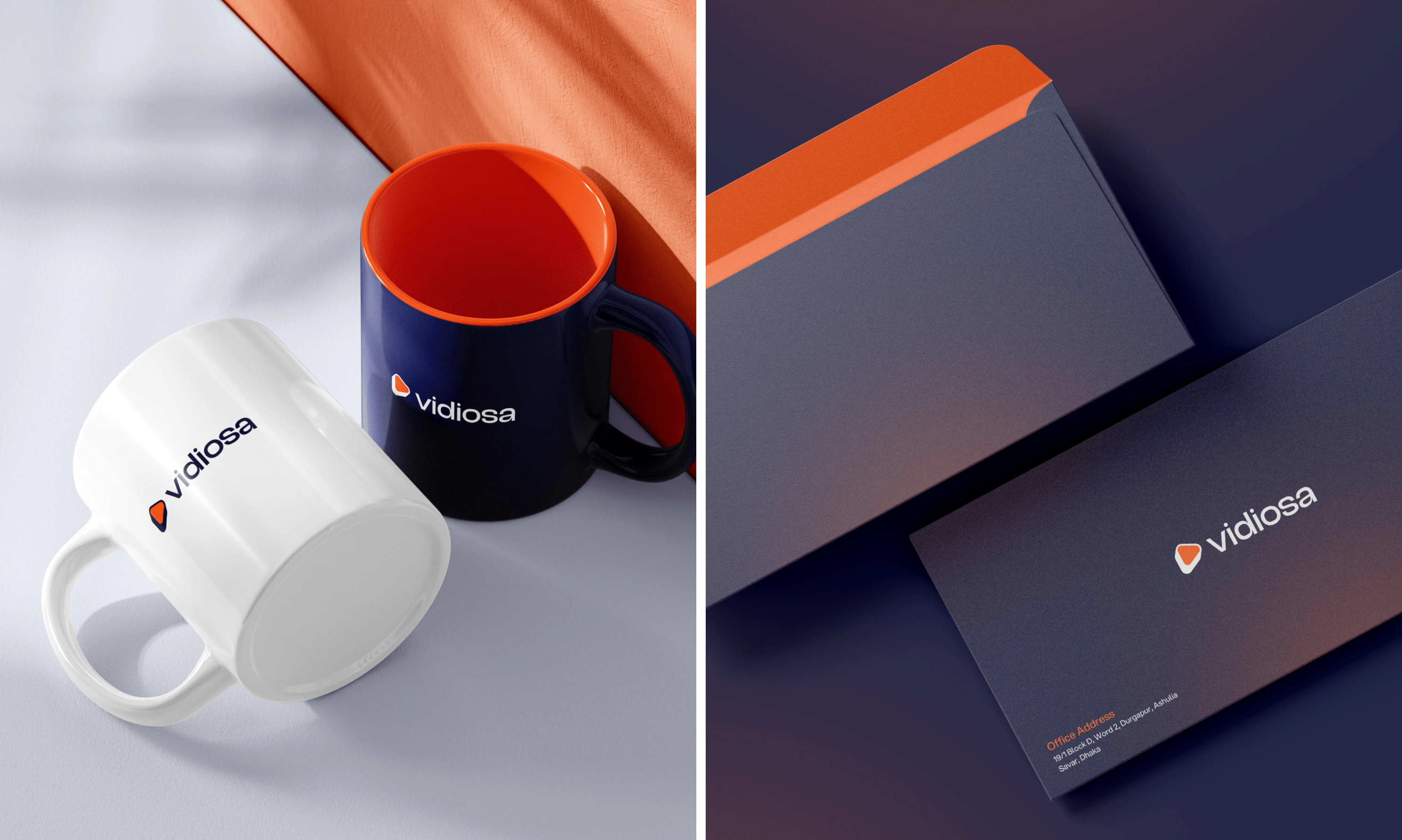
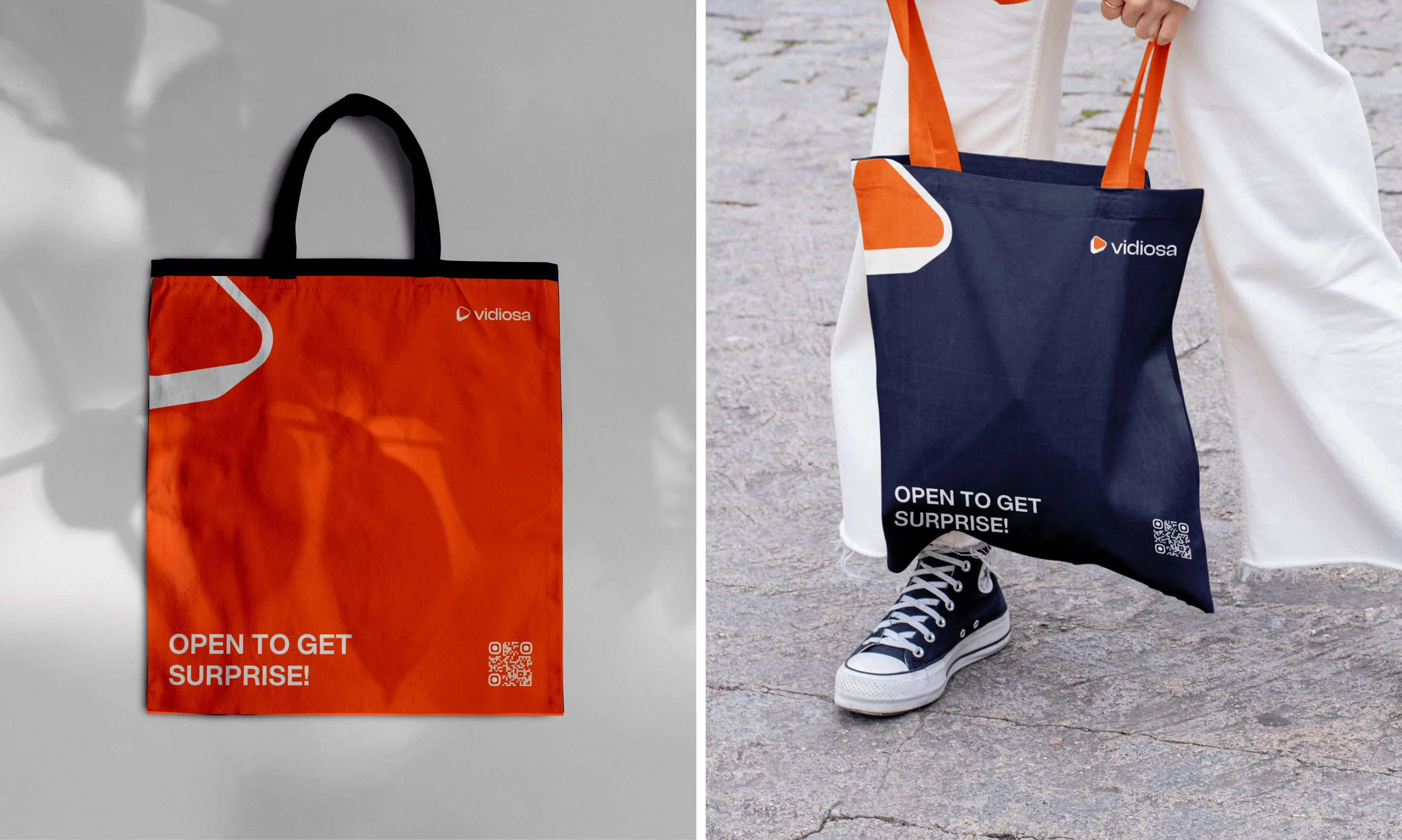
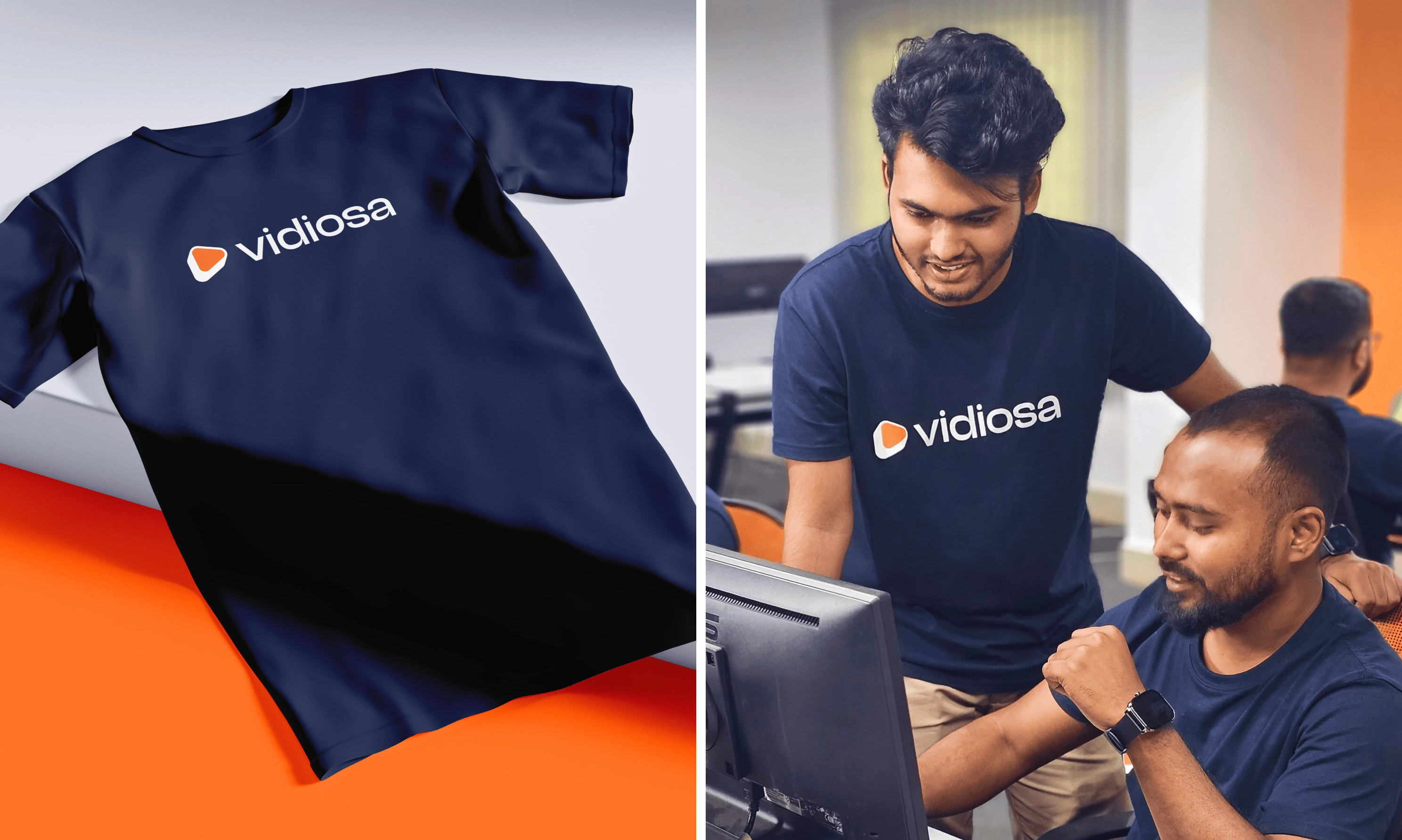
Color
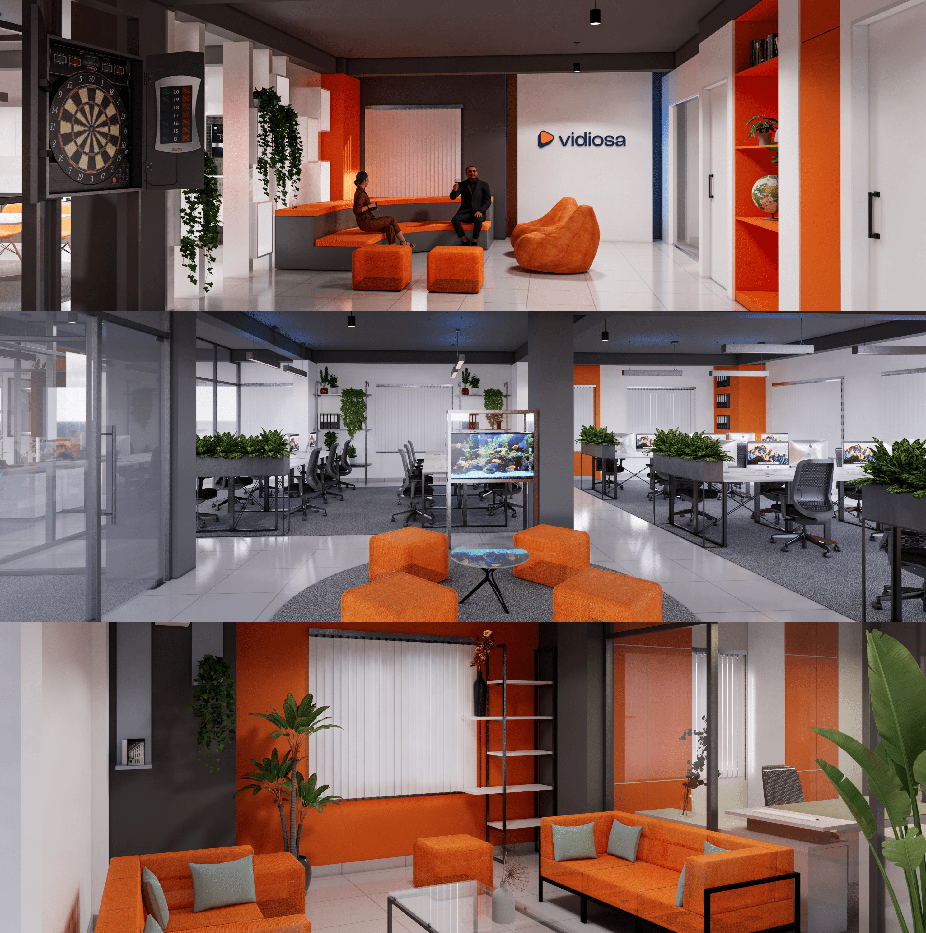
The primary color palette for Vidiosa features a rich navy blue and a vibrant orange. The navy blue symbolizes trust, reliability, and professionalism—essential qualities in the tech and SaaS industries. The vibrant orange injects energy and creativity, highlighting Vidiosa's innovative approach to video production. Together, these colors create a balanced and dynamic visual identity that reflects our commitment to excellence and innovation.
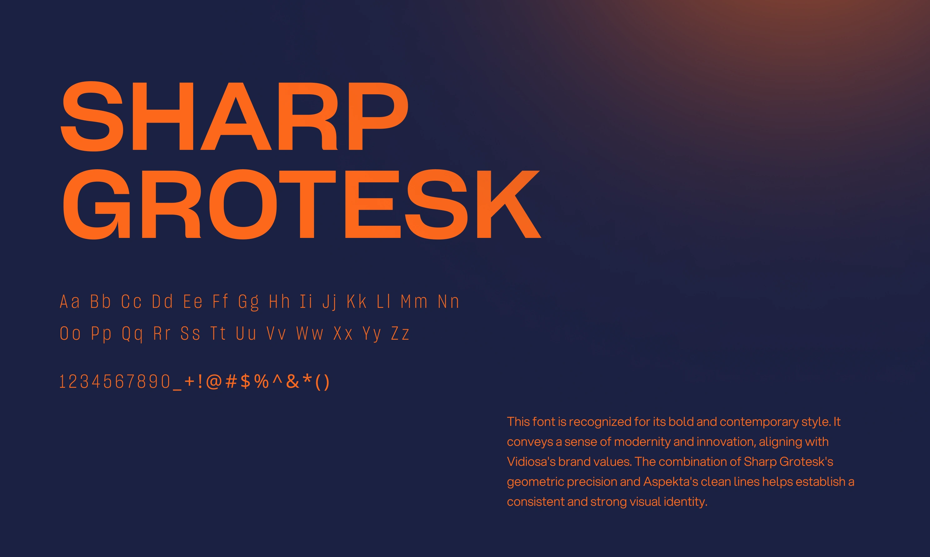
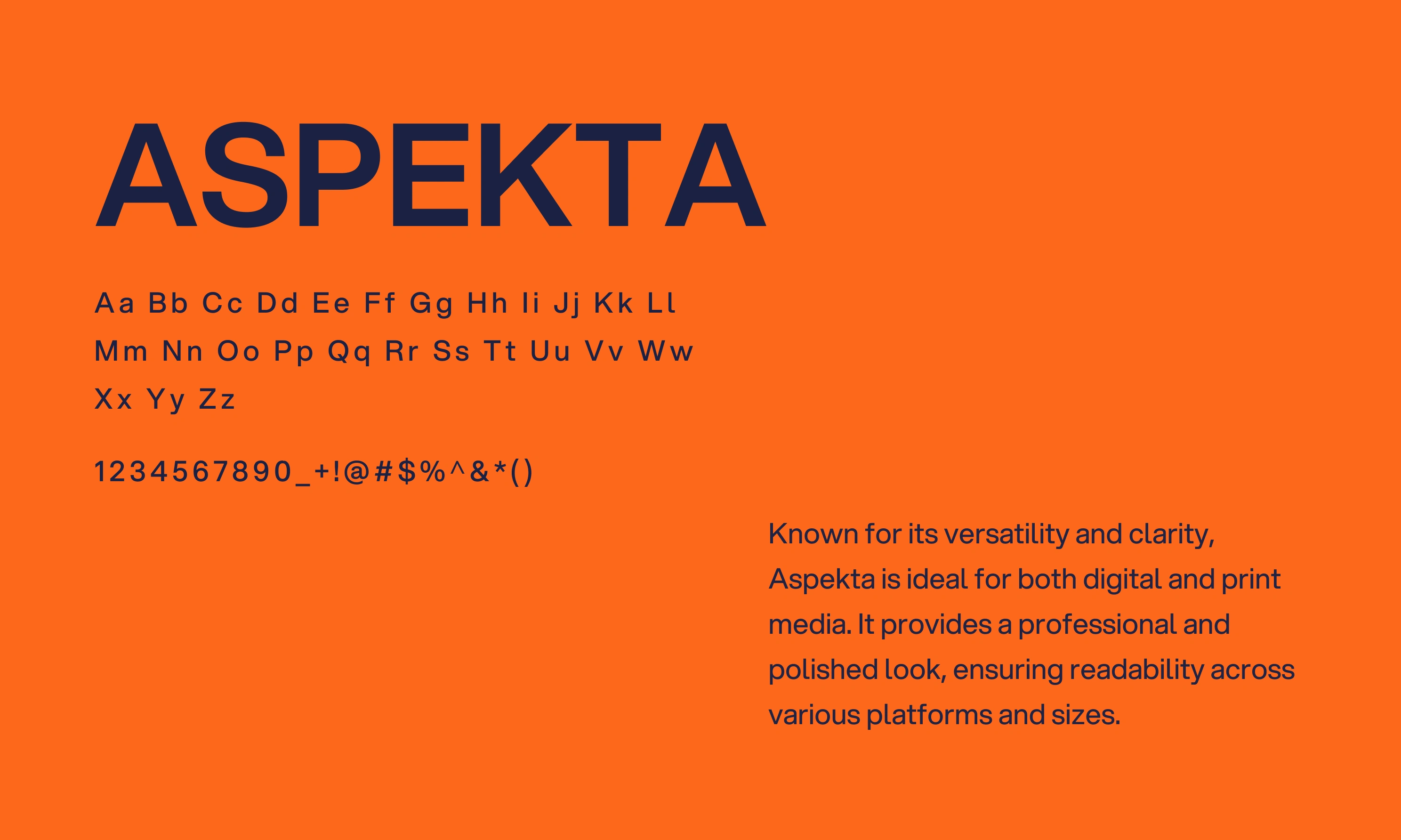
fonts
For the rebranding, we selected "Aspekta" and "Sharp Grotesk" to enhance our modern and clean visual identity, perfectly complementing the new logo and color scheme.
Aspekta: Known for its versatility and clarity, Aspekta is ideal for both digital and print media. It provides a professional and polished look, ensuring readability across various platforms and sizes.
Sharp Grotesk: With its bold and contemporary style, Sharp Grotesk conveys modernity and innovation, aligning seamlessly with Vidiosa's brand values.
The combination of Sharp Grotesk's geometric precision and Aspekta's clean lines helps establish a consistent and strong visual identity.
The Problems We Faced
During Rebranding
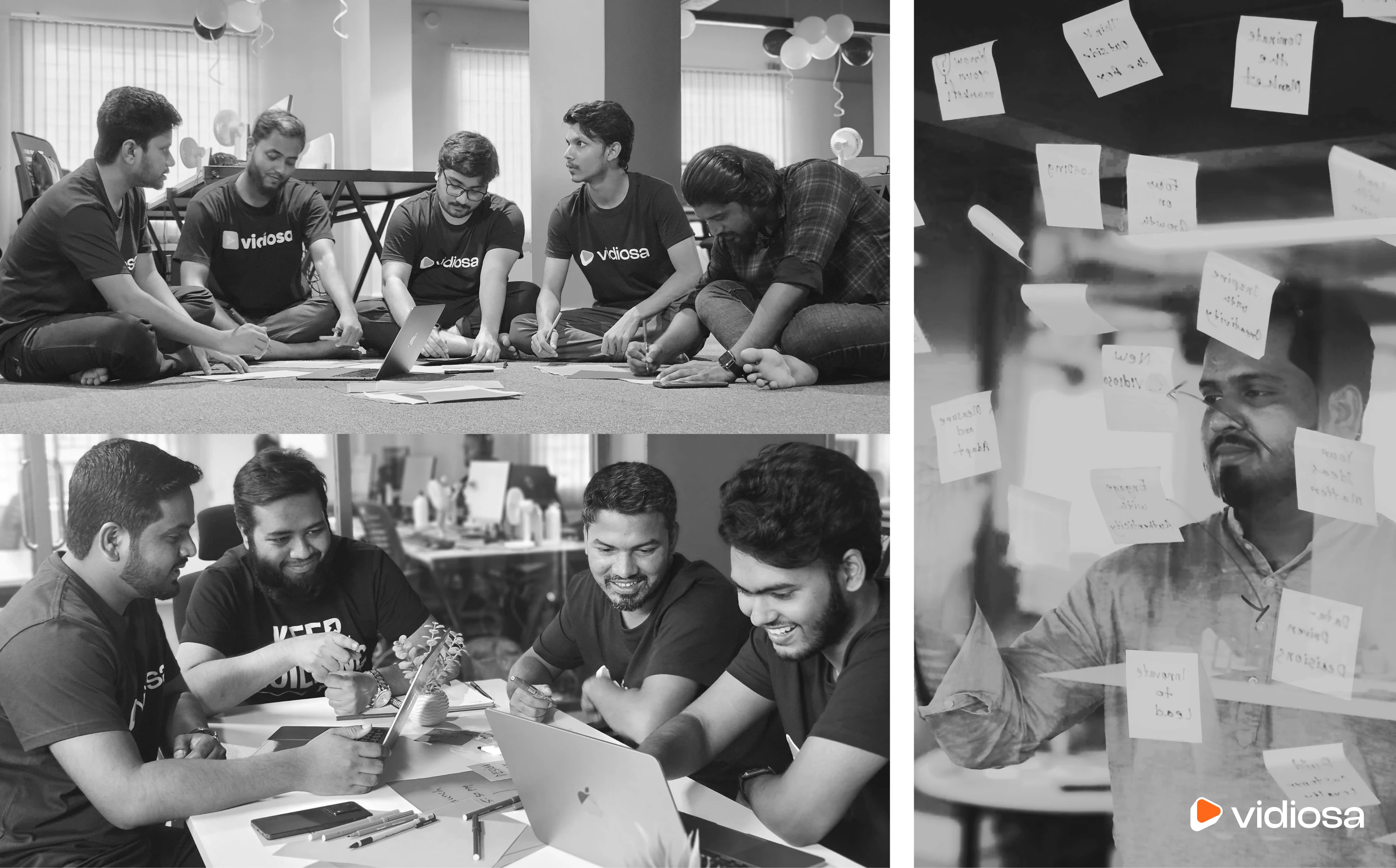
Rebranding Vidiosa came with its share of challenges. One of the primary issues was ensuring that the new brand identity resonated with existing clients while also attracting new international clients. Additionally, aligning the new visual elements with the company's core values and mission required careful consideration and numerous iterations.
The Solutions We Came Up With
To tackle these challenges, our brand designer conducted thorough market research and gathered feedback from current clients. This informed our decisions and ensured the new branding would be well-received. Also, our creative team at Vidiosa collaborated closely with the brand designer to develop visual elements that are both modern and reflective of our core values. Regular feedback and continuous refinement were key to achieving the final result.
Like this project
Posted Aug 25, 2025
This is a rebranding project of Vidiosa, an international video production company