Lo' Frito - A Playful Project Celebrating Culture and Design
Ailís Rinet
Lo' Frito is a typography project I created during the lockdown/quarantine period, inspired by House Industries' Kingpin font and my Dominican culture. Using fried plantains, a staple in our gastronomy, I shaped each character visually to produce the whole alphabet.
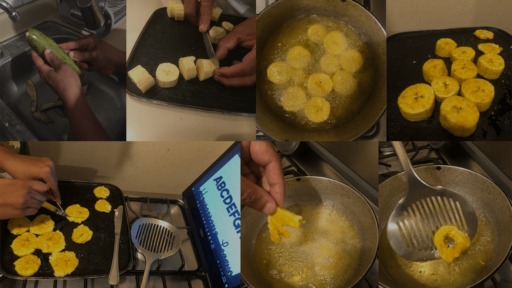
Lo' Frito - Process
With high attention to detail and a self-critical mindset, I refined my skills in typography and challenged myself to constantly grow and improve. This project reflects my love for art and design, while also connecting me to my roots, my core, and my culture in a simple, fun, and entertaining way.
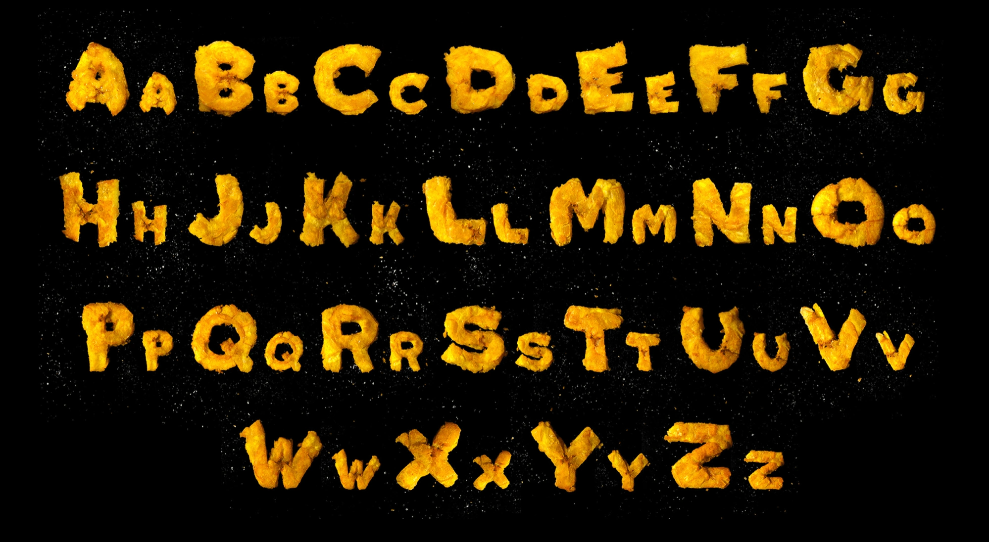
Lo' Frito - ABC Characters
To bring out the salt particles, I photographed the plantains against black paper, creating a visually striking representation of the typography system. While it was not the first element I experimented with, I knew it was the perfect way to showcase my culture as a Dominican woman through art and design.
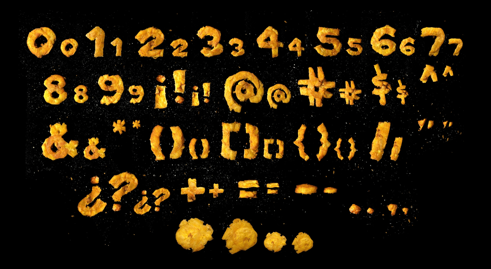
Lo' Frito - Other Characters
Through Lo' Frito, I demonstrate my genuine passion for my craft and my commitment to creating engaging and authentic designs that showcase my unique perspective and creativity.
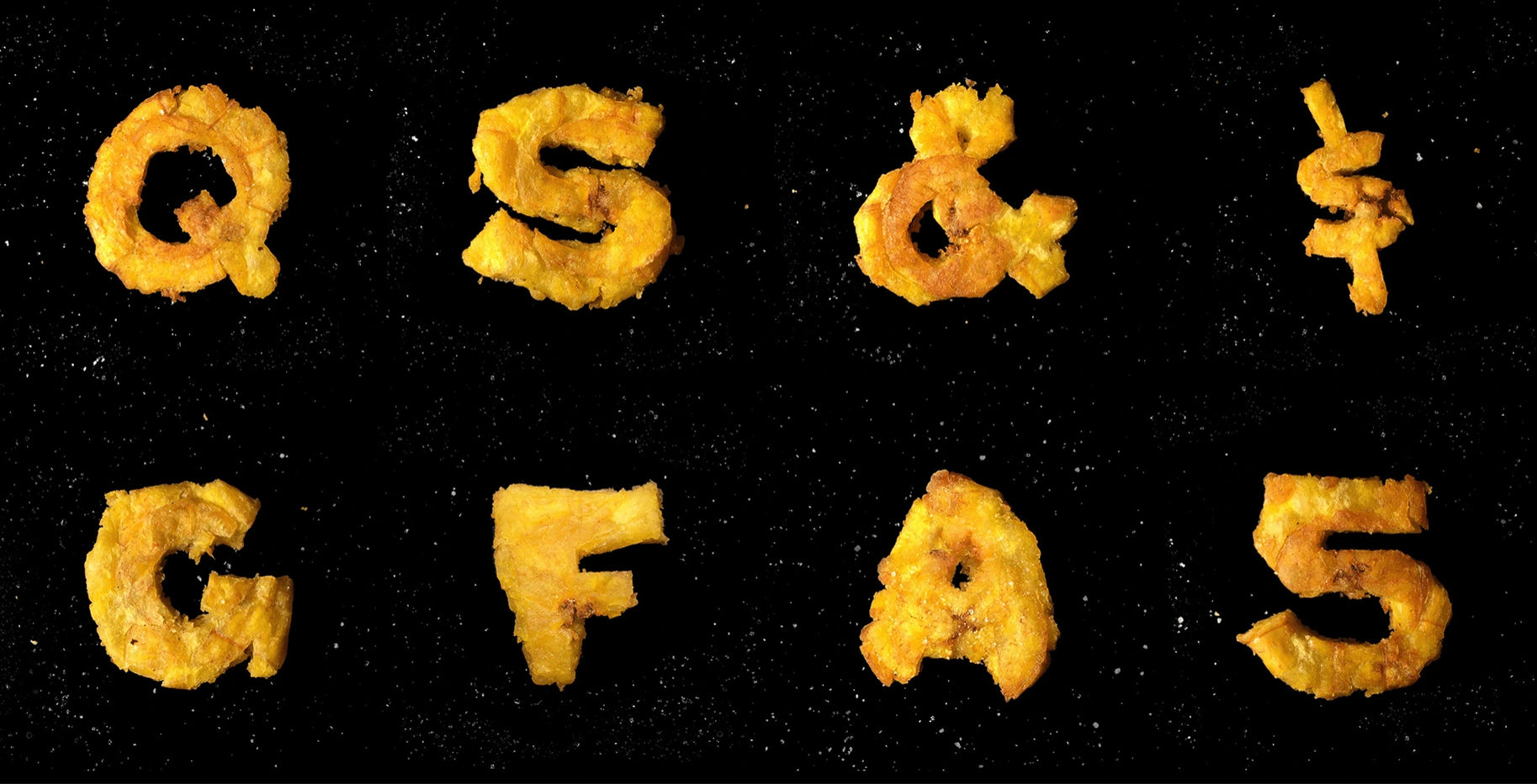
Lo' Frito - Best Characters
Like this project
Posted May 15, 2023
Cultural Fusion in Typography: Lo' Frito - Dominican-inspired project blending art, design, and fried plantains for a visually captivating alphabet.
Likes
0
Views
38