Morenta - Logo & Branding

Infinity | Pitch Decks & Presentations


About the Brand
Morenta is a real estate brand built around property growth, reliability, and long term value. The brand operates in a space where trust is everything and the visual identity has to communicate professionalism before a single conversation takes place.
Problem
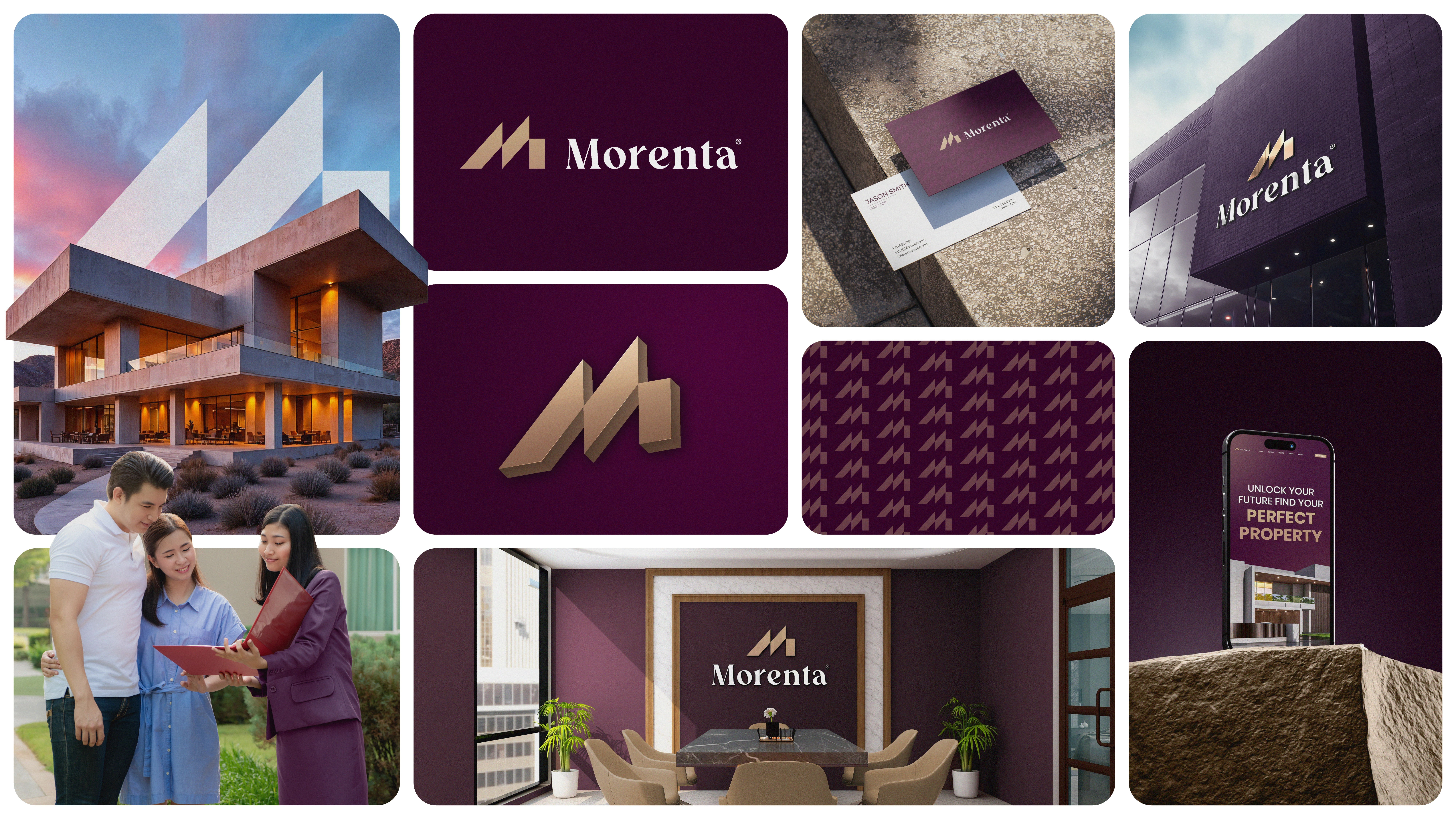
The brand needed an identity that could hold its own across every touchpoint. Office signage, business cards, digital screens, branded interiors. A mark that felt premium without being cold. Established without being dated. The brief called for something that looked like it had always belonged in this space.
Solution
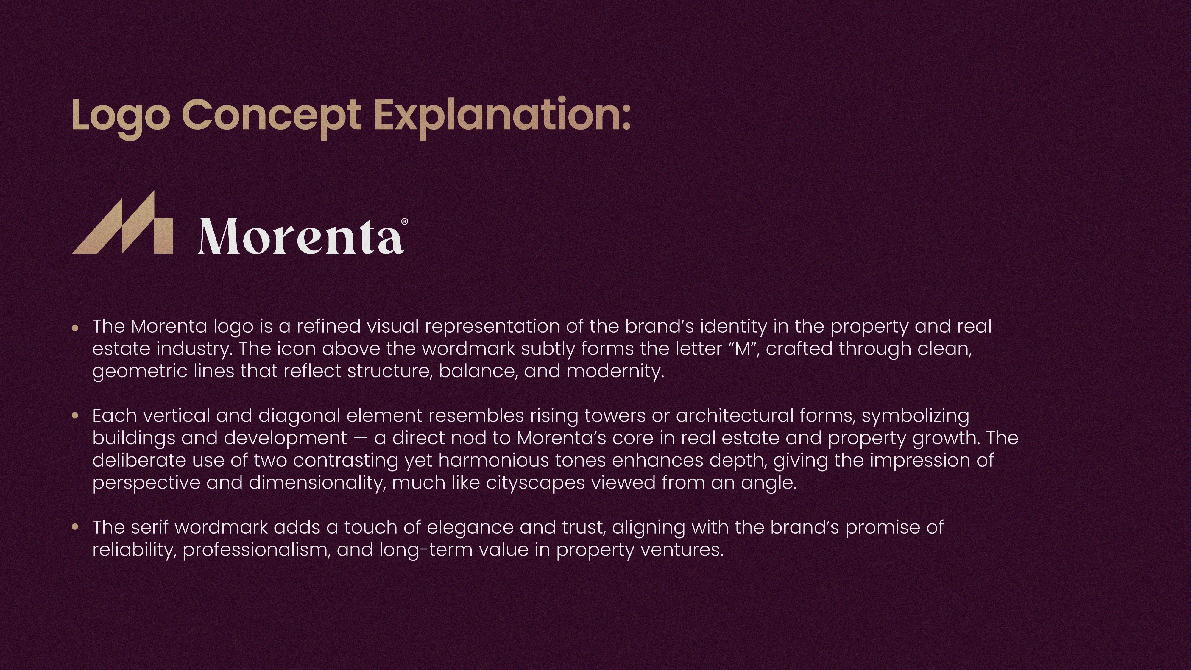
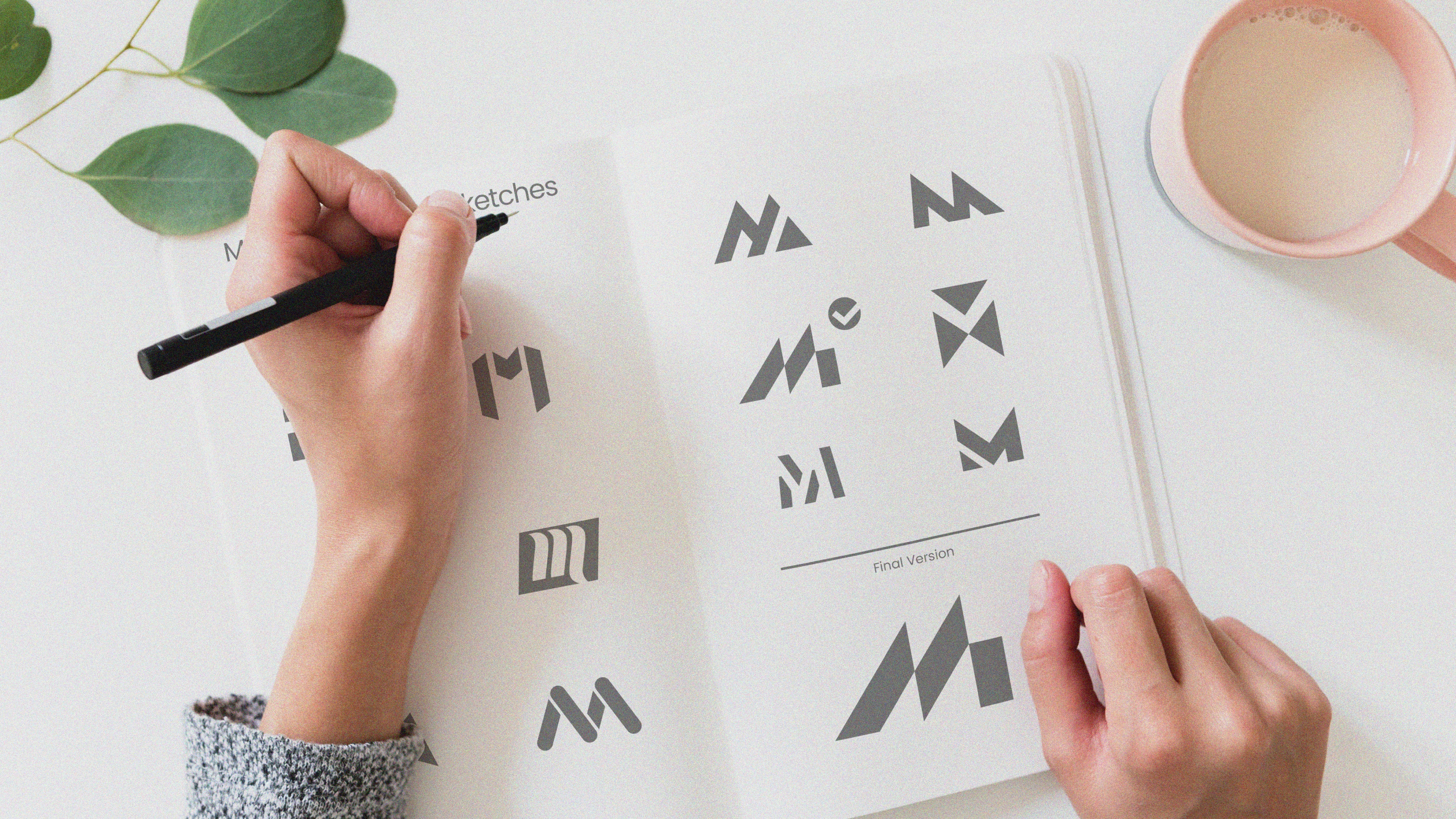
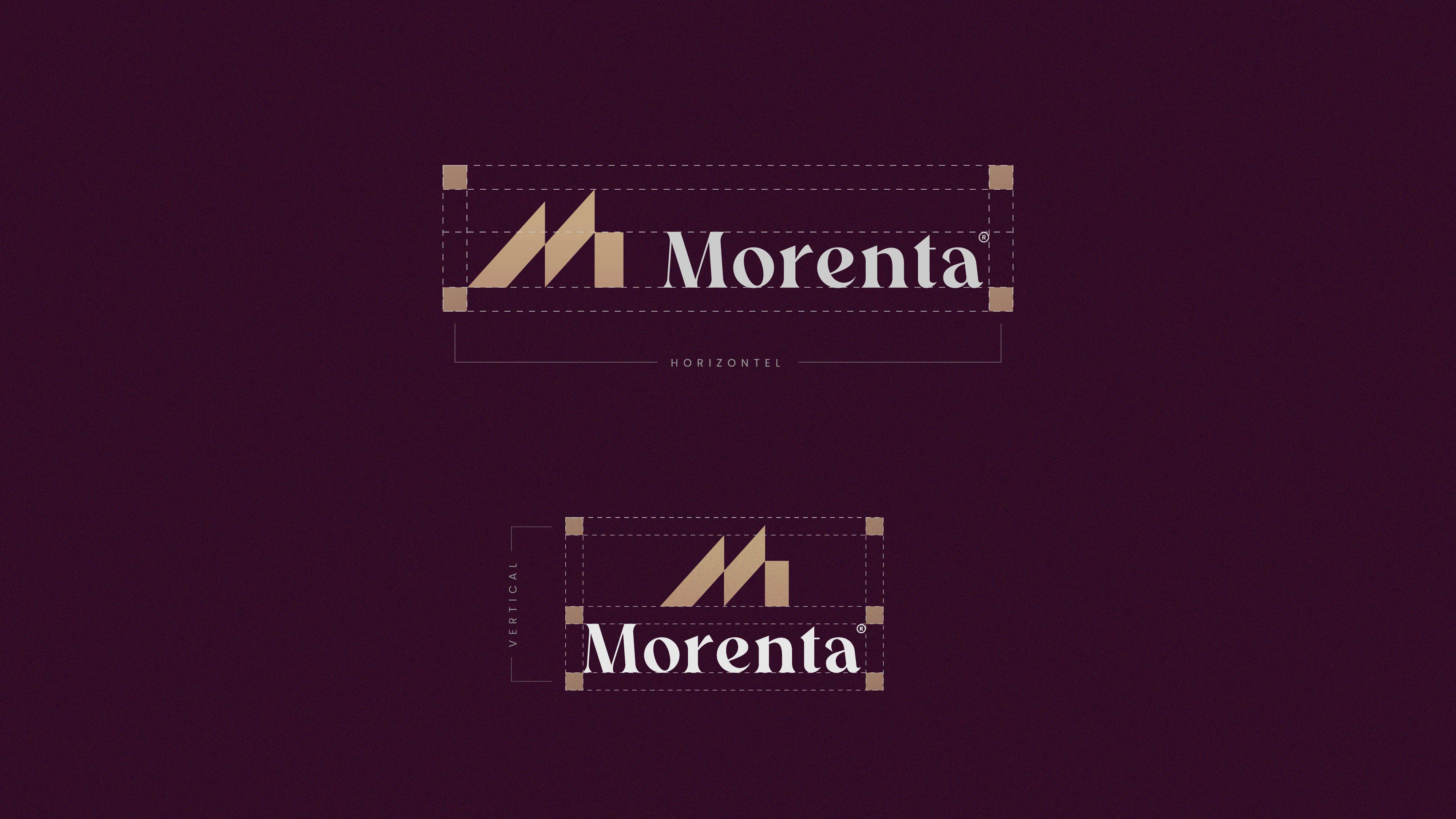
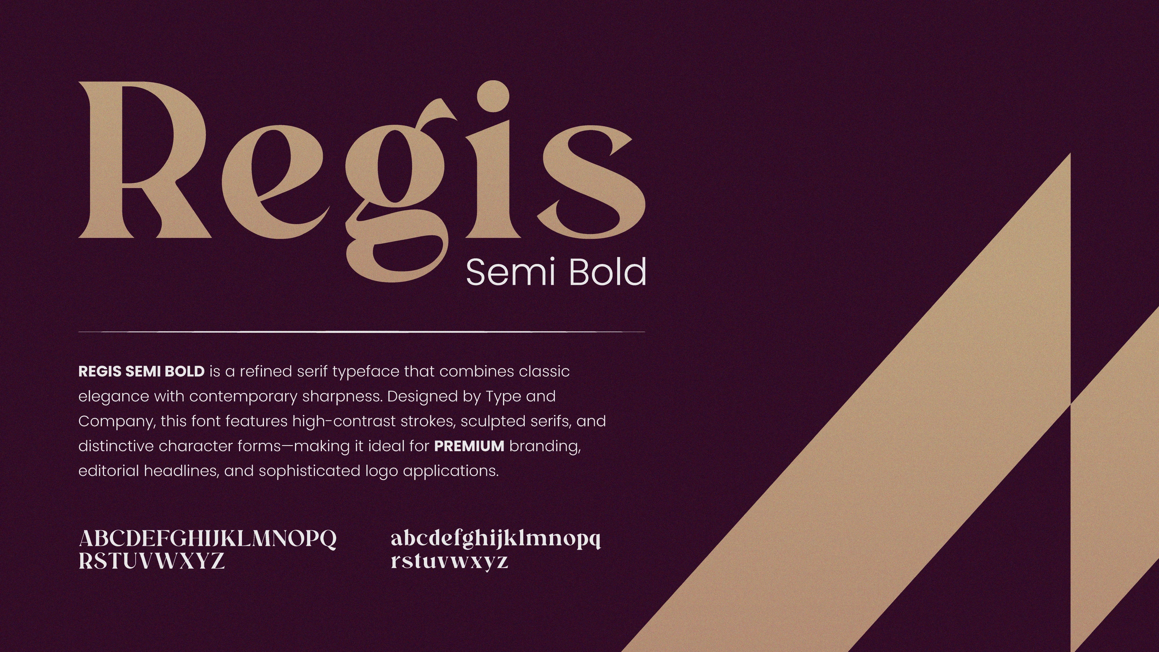
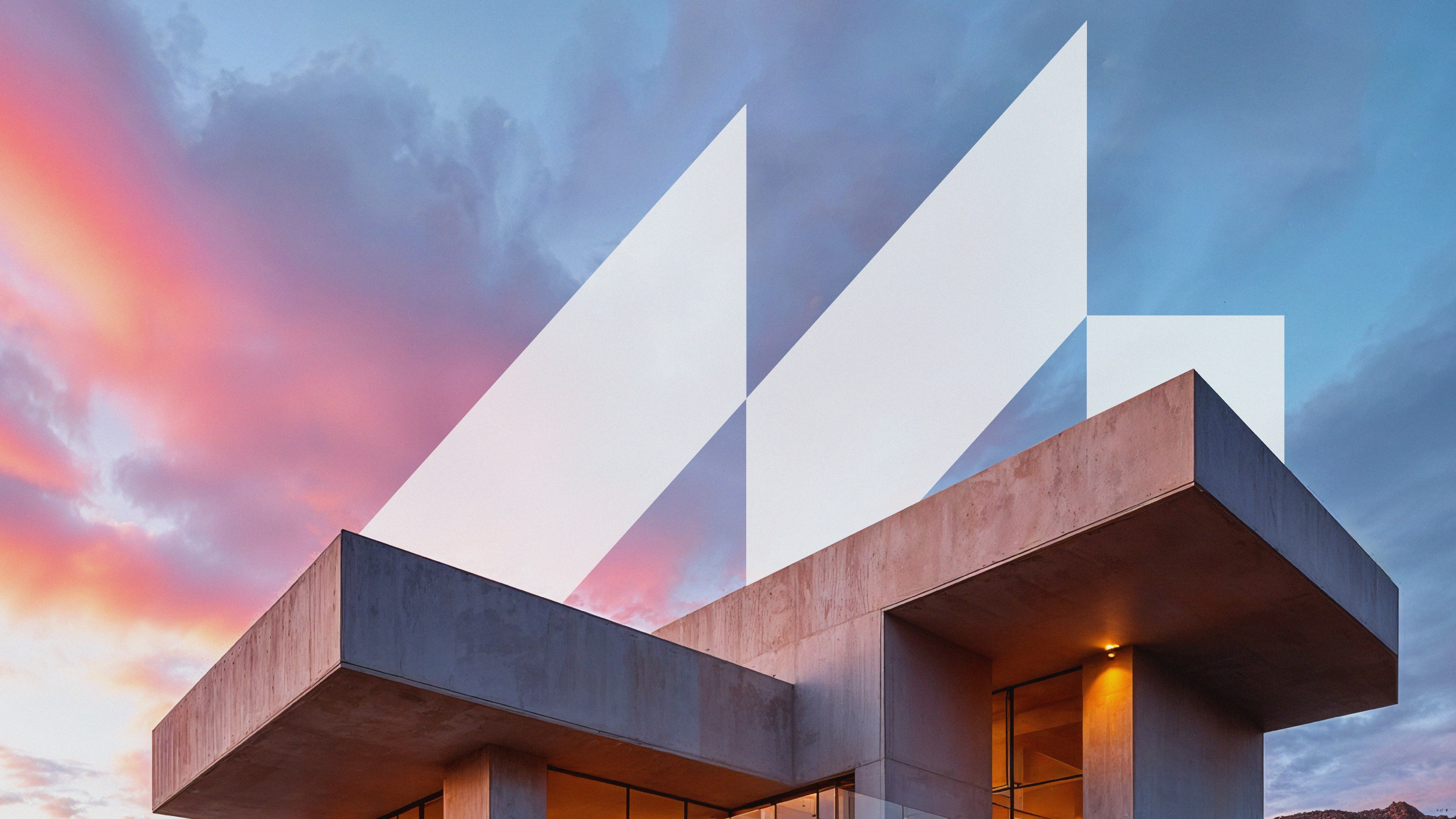
The mark is built around the letter M, constructed through clean geometric planes that echo rising towers and architectural forms. Two contrasting tones give it depth and dimensionality, the way a building looks different depending on where you stand. The serif wordmark grounds it with elegance and trust. The result is a system that travels from a business card to a building facade without losing anything along the way.
Like this project
Posted Sep 13, 2026
Created a premium visual identity for Morenta, a real estate brand. A geometric M mark, serif wordmark, and a system that scales from business cards to signage.