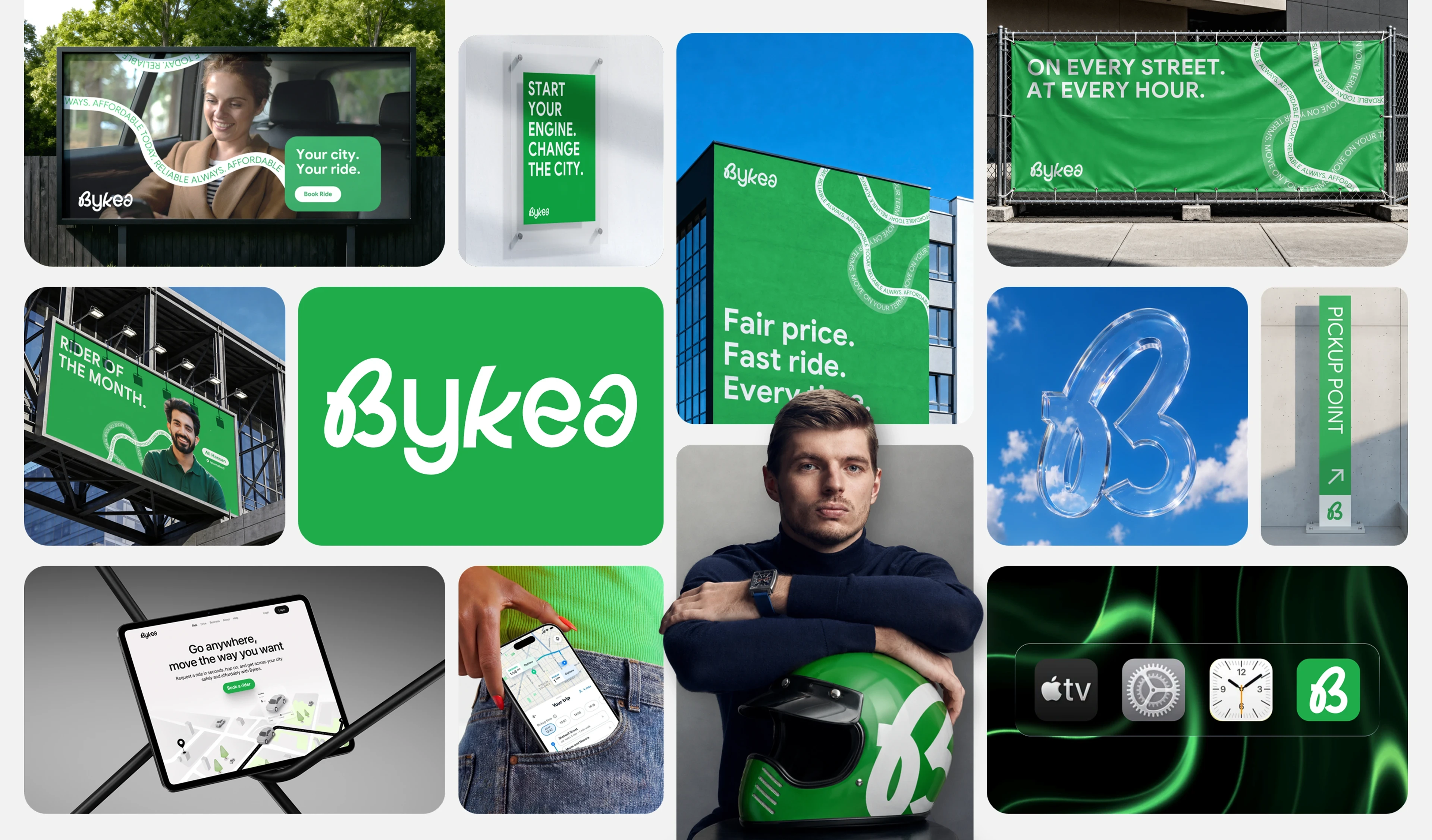
Bykea - Mobility Brand Identity & Logo Redesign

Infinity | Pitch Decks & Presentations


About
Bykea is a mobility and delivery platform built for the way cities actually move. The app connects passengers with nearby bike riders for fast, affordable commutes while also powering last mile deliveries, cash payments, and everyday errands all from a single interface. At the heart of the brand is a simple belief: that getting around your city should be quick, affordable, and stress free for everyone. Bykea positions both its riders and its customers as equal partners in an ecosystem built on trust and reliability. The goal has always been to build something that feels local at its core, modern in its execution, and genuinely useful every single day.
Challenge
The challenge was to reimagine a brand that had already earned real trust on the street without losing what made it familiar in the first place. Most mobility platforms in emerging markets either lean too corporate and lose their local soul, or stay too rough around the edges and never earn wider confidence. For Bykea, the rebrand had to thread that needle precisely: feel elevated and modern without feeling foreign, and feel grounded without feeling dated. A further challenge was unifying the brand across its multiple services, rides, deliveries, and payments, into a single coherent identity that communicates everything Bykea does without making any of it feel like an afterthought.
Like this project
Posted Jul 29, 2026
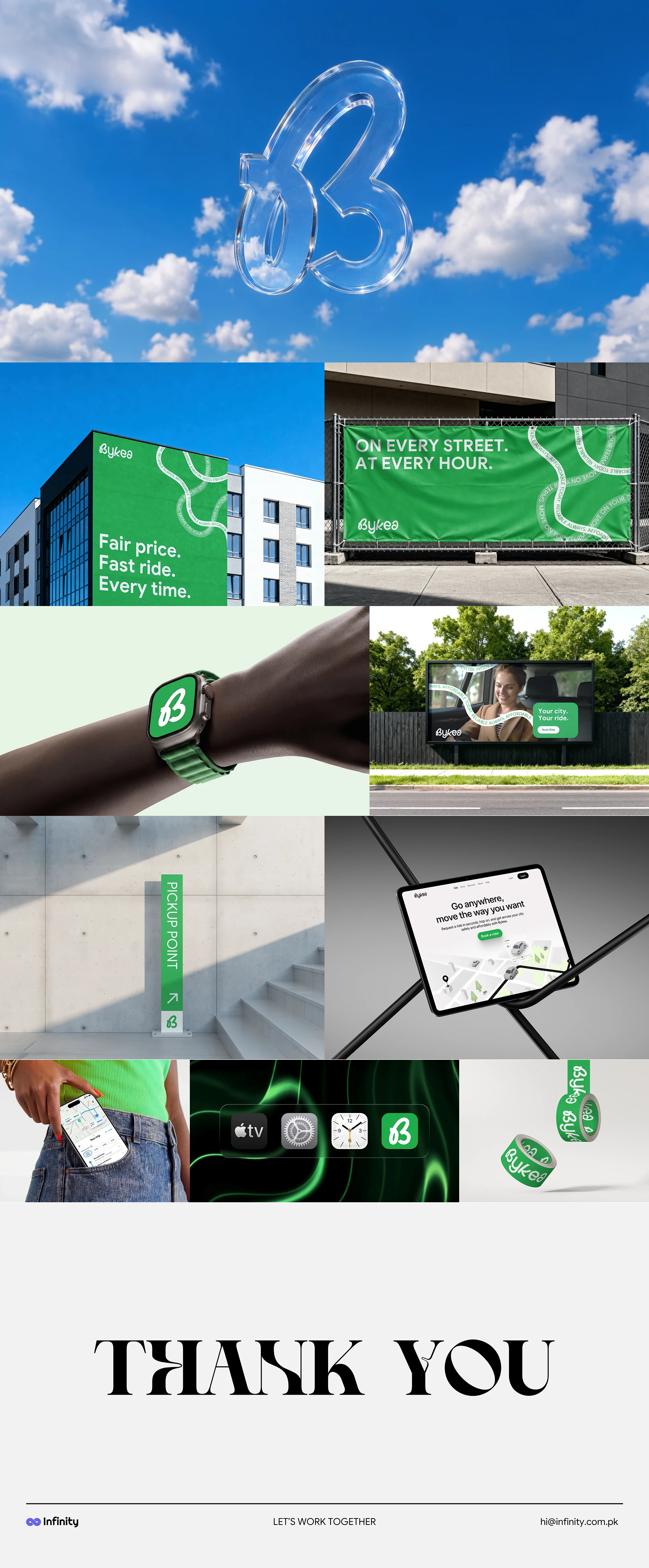
Bykea started as a bike-hailing app and became something closer to city infrastructure. Rides, deliveries, cash payments, everyday errands, all in one place.