Business cards | Logo Design | Graphic Design
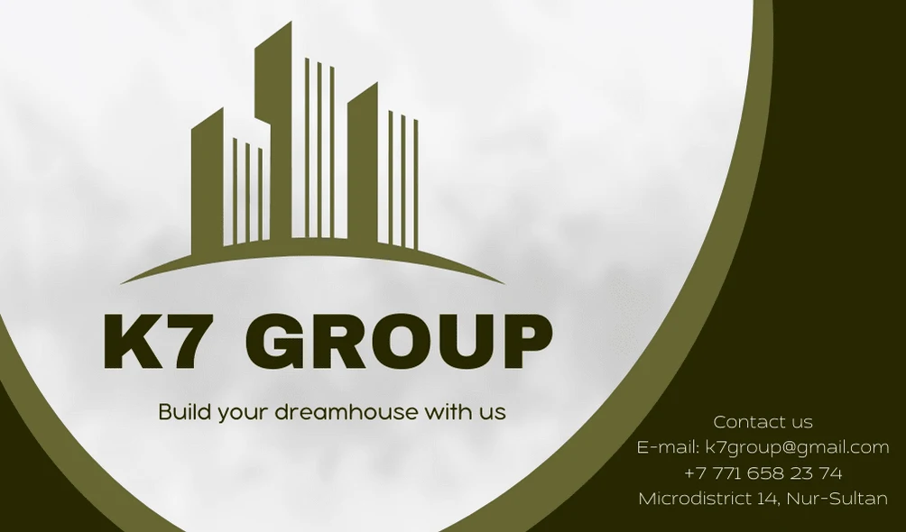
The client needed to create an authentic and simple business card for their construction business. I found out what style I need to follow and picked up the color scheme for it. I thought a lot about the design itself, what visual component should I create and decided to focus on creating towers first. I decided to give some volume to the business card with these frames, but at the same time keep a balance between abstractness and the play of different colors. My client was surpriced with the fact that I made my work quickly and it didnt take a lot of time but at the same time it was still qualitative and fit very well with his expectations.

Like this project
Posted Aug 26, 2022
I make fascinating designs for every type of product|brand|business. If you want a stylish and modern design ideas, you can always contact me at any time!
Likes
0
Views
11
Clients

GCA Capital Partners


