Dureon – Acquired Taste

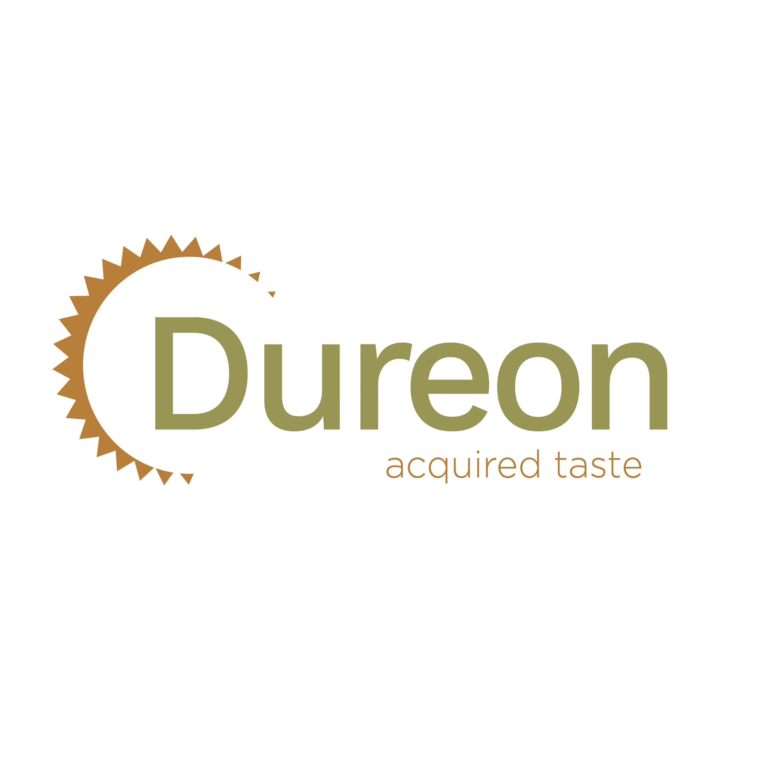
This logo was designed for a conceptual food brand with a sophisticated edge. The minimalist serif wordmark is paired with an abstract sunburst element, suggesting refinement, cultivation, and bold flavor. The tagline "acquired taste" echoes in the earthy green and warm bronze tones, evoking nature and complexity. The logo strikes a balance between clean modernism and gourmet allure.
My Role:
Brand identity development and logo design. Responsibilities included concept creation, typography exploration, color palette selection, and final vector design for scalable use across print and digital platforms.
Like this project
Posted May 14, 2025
Developed a refined brand identity for Dureon, using custom typography and symbolism to express sophistication, uniqueness, and the essence of acquired taste.
Likes
0
Views
1
Clients
ITech


