Futuristic Visual Identity for a Visionary Agency
Martha Rose
Creative Direction
Visual Identity (logo variations, colour palette, typography suite)
Brand Elements + Patterns
Stock Image Sourcing
Instagram Graphics
via Design Intensive service with a focus on branding
Brand Identity Trailer for Scale Your Socials
There are plenty of social media agencies in the world. Or agencies in general. But not many offer a personable 1:1 experience. And even less focus on building wealth for marginalised folks. That's 2 extra points for Scale Your Socials to differentiate themselves. Backing this up with founder Jess' professional background in gender studies and an astonishing array of services, SYS is poised to become THE one-stop shop for all of your marketing needs as a woman, queer, or BIPOC business owner.
The missing cornerstone was a visual identity that encapsulates this level of quality and differentiation. I discovered early on that Scale Your Social's main struggle up until this point lied in creating an identity with substance and longevity that the SYS team wouldn't grow bored of. Another concern was to portray the inclusivity of SYS without resorting to a stereotypical depiction of this value (think rainbow washing).

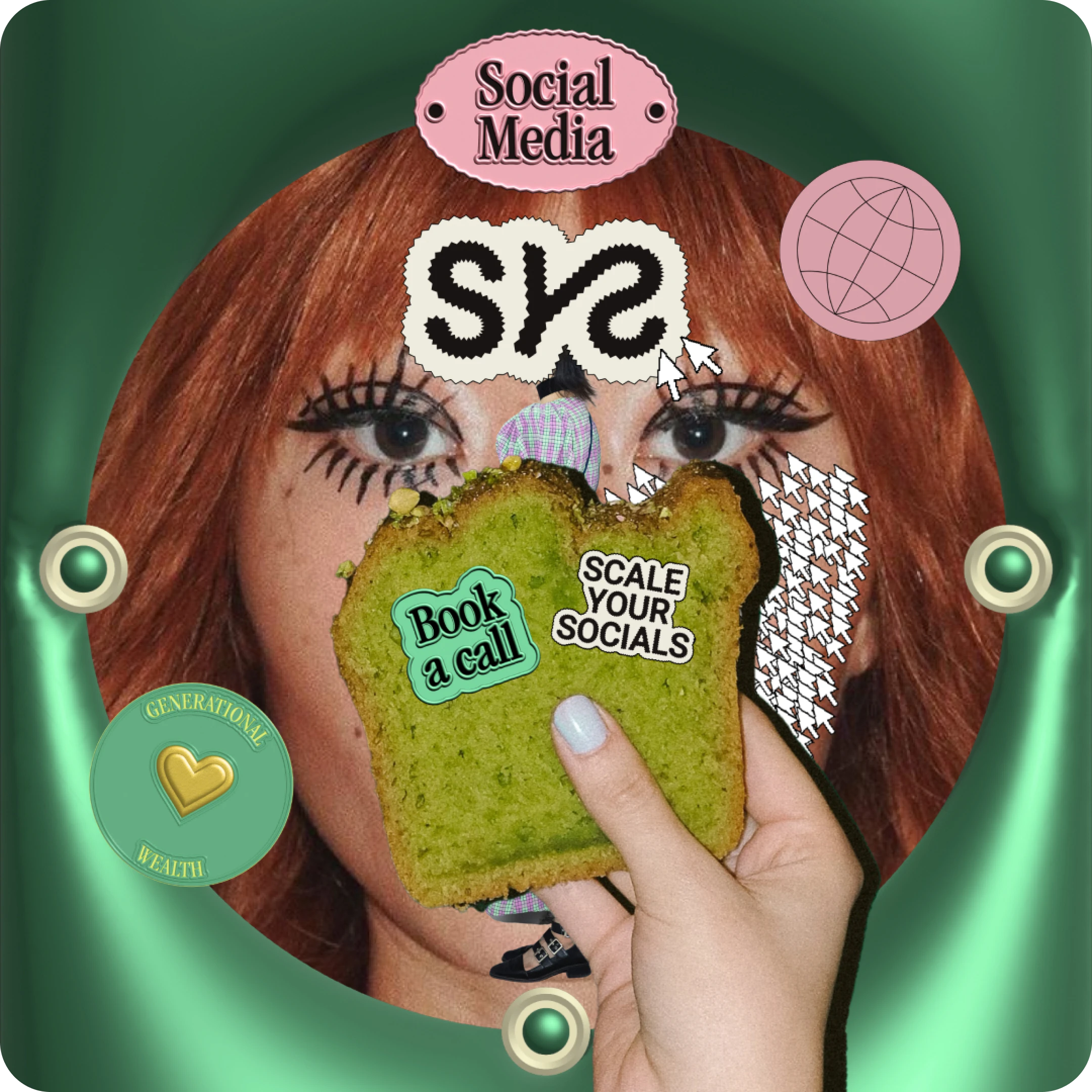
A zig zag logo that exudes (cutting-) edge
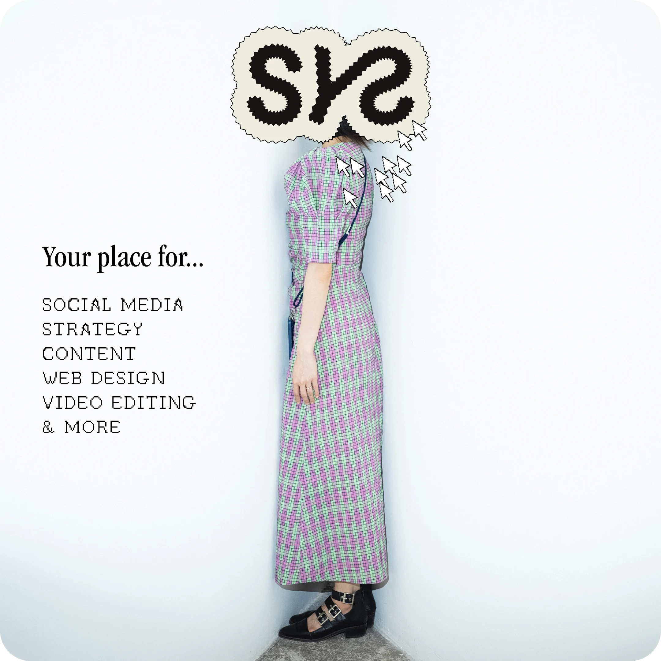
Inspired by Scale Your Socials' cutting-edge mission, I gave the brand a sharp logo suite. The zig zag is dynamic and energetic by nature, tending to create a sense of movement. Stare at it and you'll see it dance in front of your eyes. So not only does it embody the rebellious spirit of SYS, it also allowed me to give SYS a logo that's visually interesting without overwhelming the viewer which is always a challenge with long brand names.

Colours that make everyone feel welcome
Amidst the black and neutral shades sit vibrant green and pink accents. They are unexpected choices since the green and pink combo often evokes a childish feel that would be described as "cute" more than "edgy". But in relation to the other brand elements, we made these colours work. They add softness and excitement to the mix. Red and blue can be used sparingly when variety is needed, predominantly in photography. There's balance within the colour palette itself, speaking to both feminine and masculine people. So no one feels excluded.
Make it retro but modern and fit for the future
The golden thread running through the brand is 'past meets future', and the type is no exception. In the retro corner: a pixelated typeface for subheadings. In the modern corner: a simple sans serif for body copy. Somewhere in-between: a modern take on the classic script font to add flair and ITC Garamond, a timeless choice for headings.

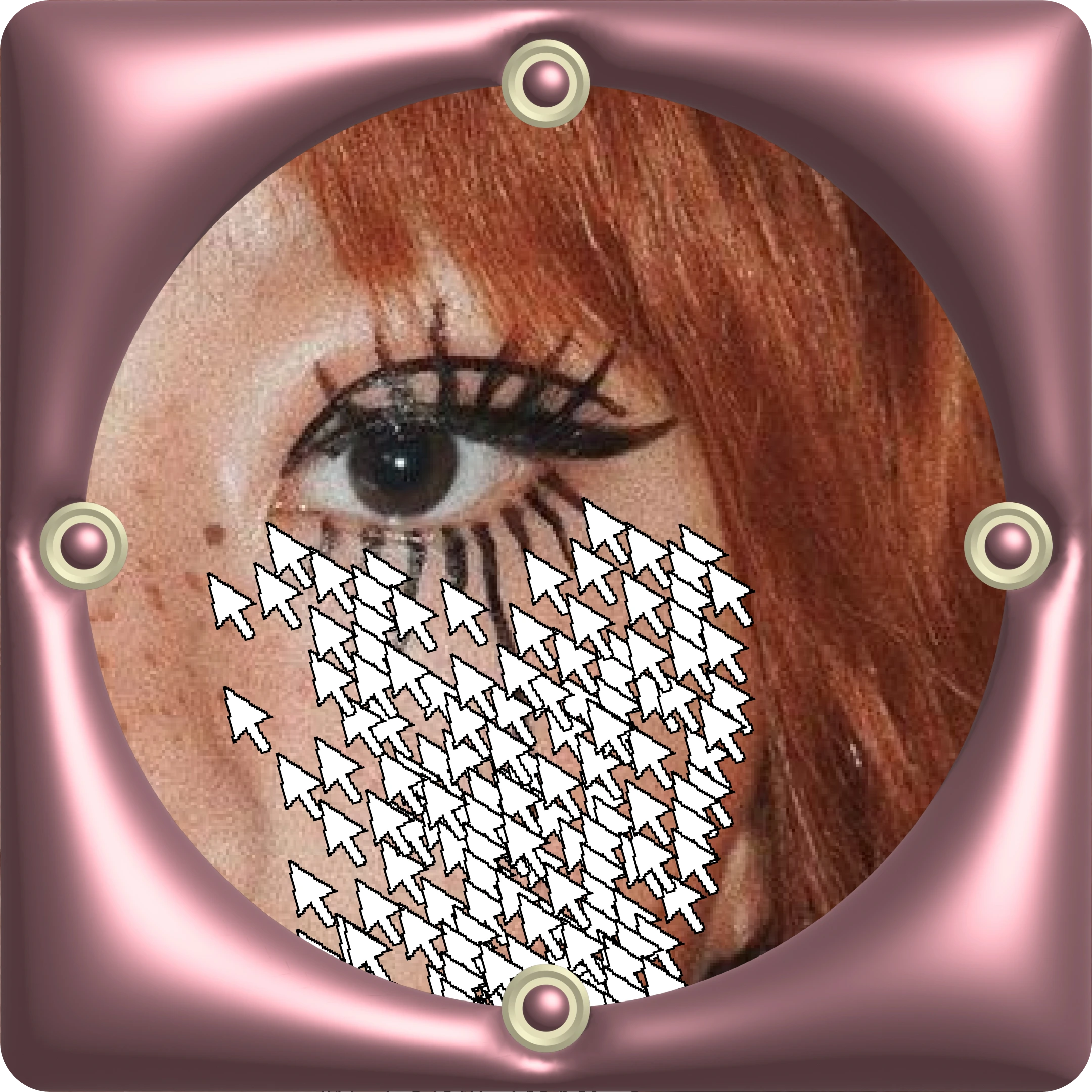
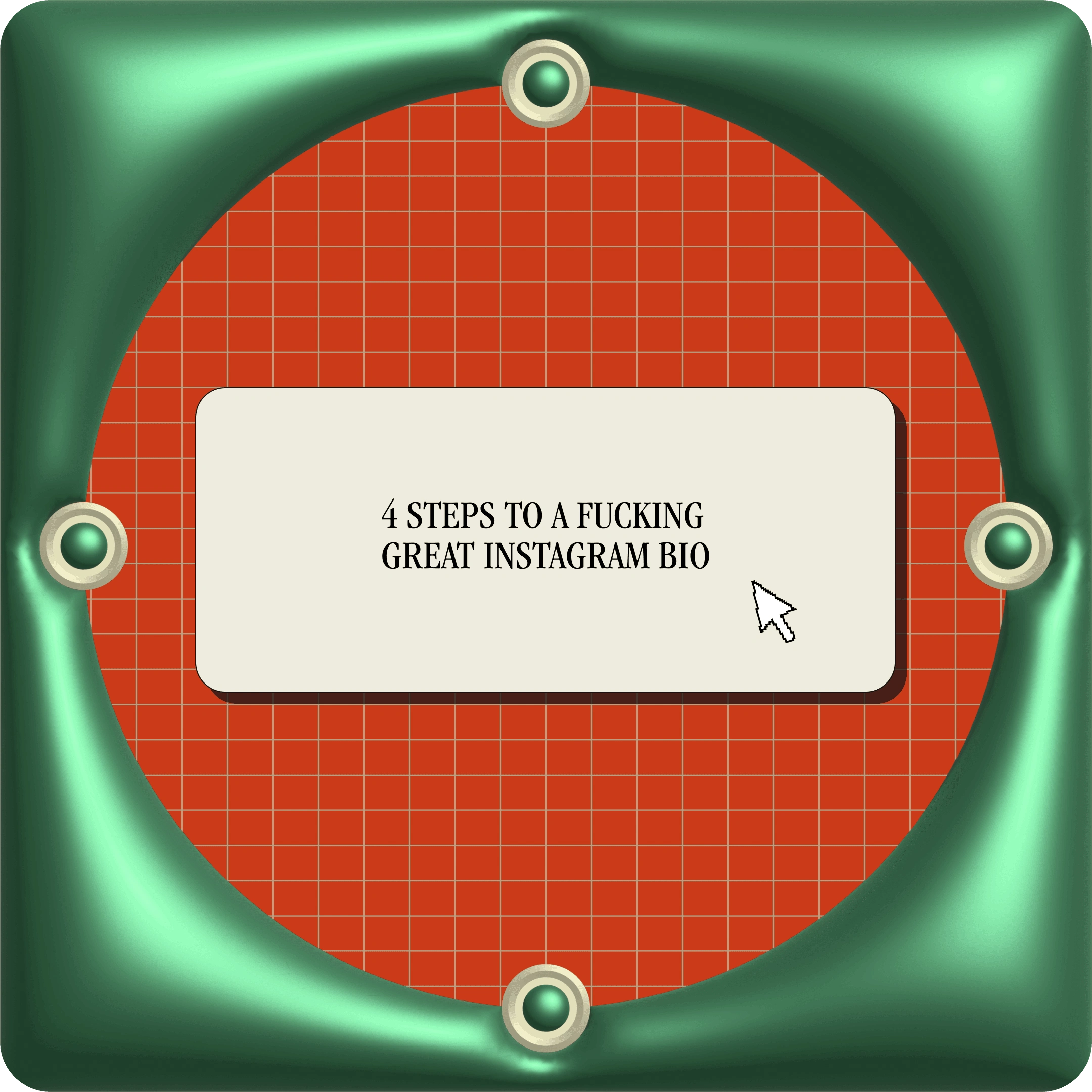
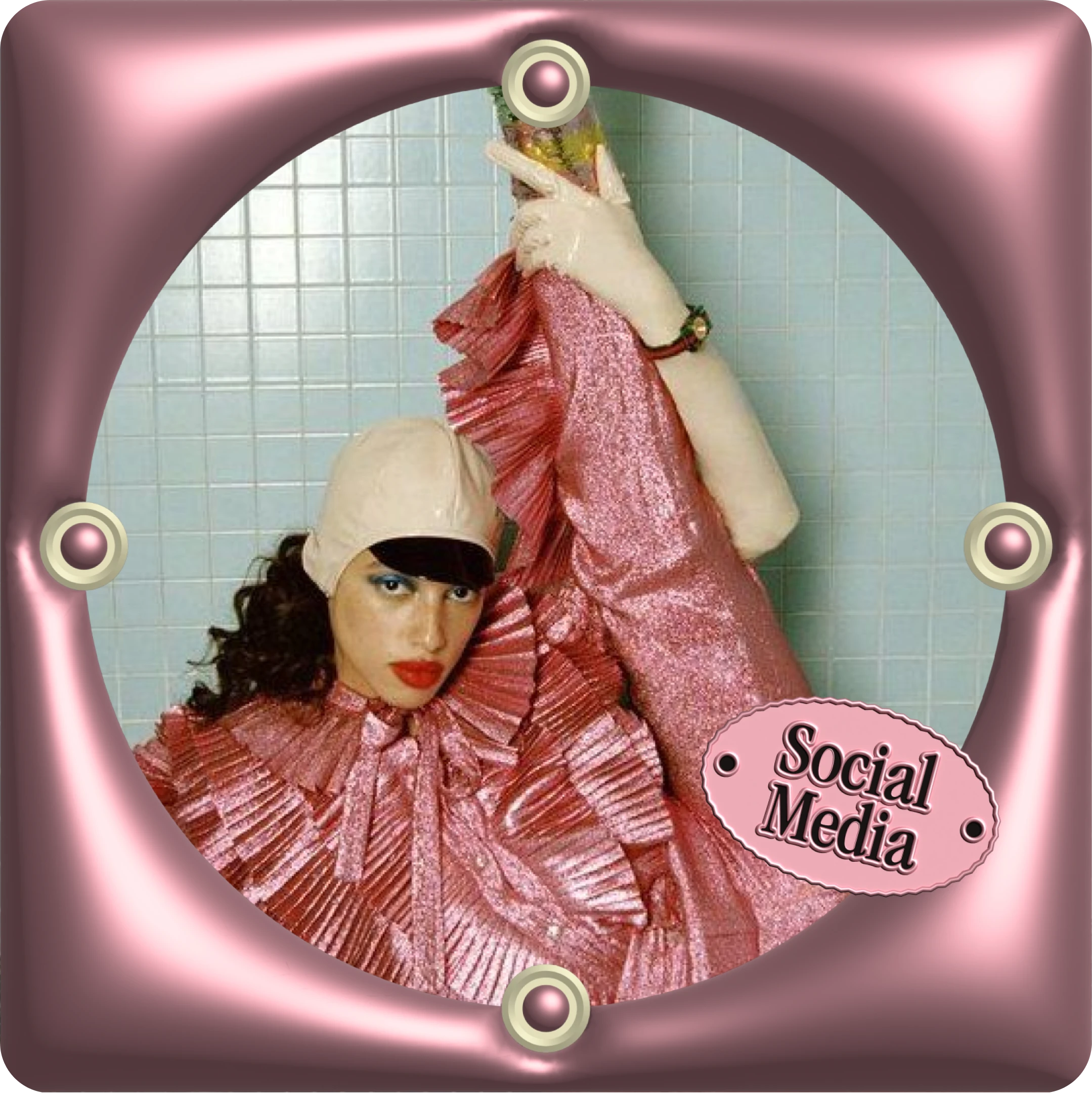
"Really-fucking-cool" 3D elements
When I asked SYS what they would like their business to be described as in the beginning stages of their project, they said "really-fucking-cool". My solution: Custom (3D) elements that add recognition and delight at every touchpoint. The best example: the metallic frames which are futuristic yet retro and tie the photography in with the rest of the design system. That means, every single IG graphic, even if it's just a photo, will be on brand and recognisable.
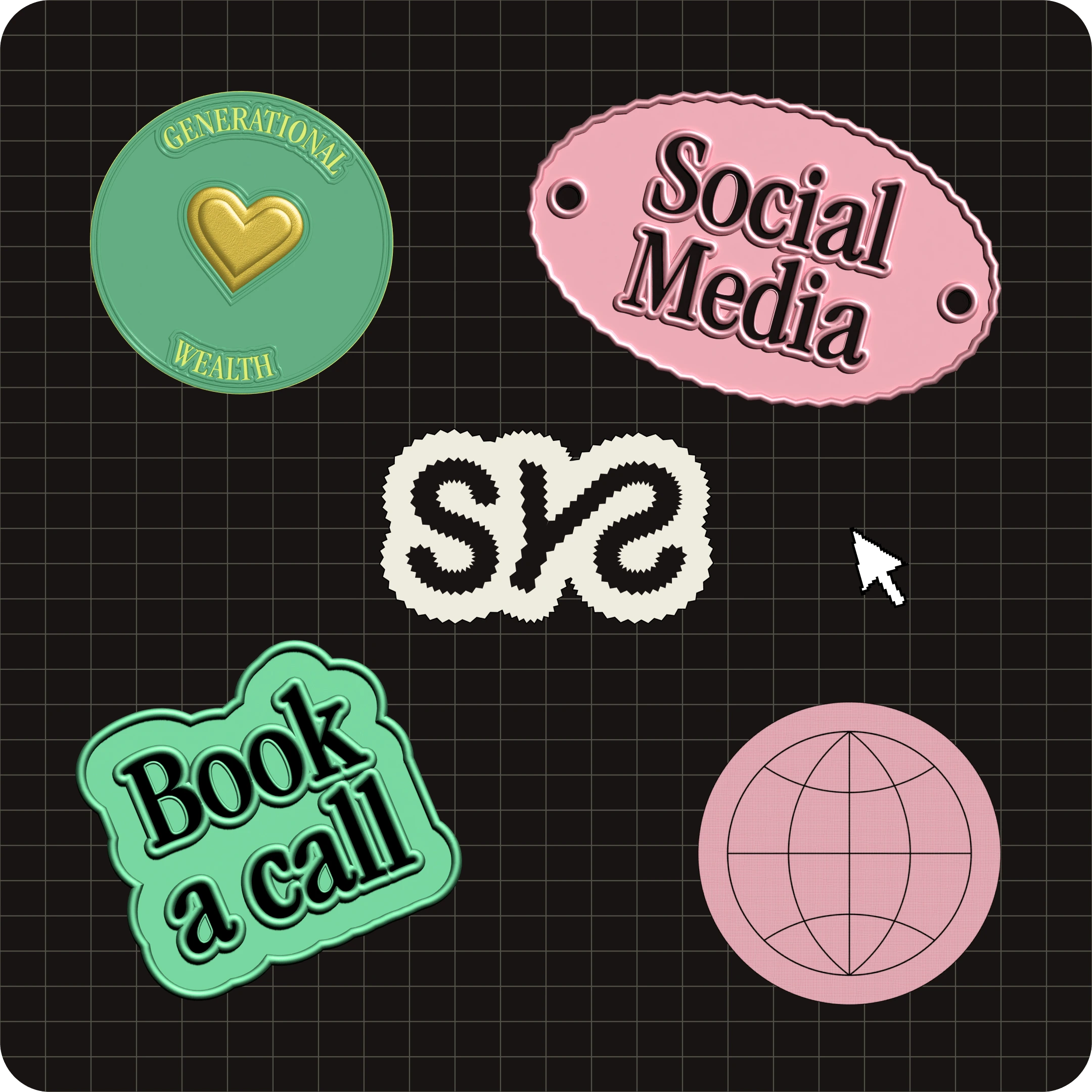
Structure through patterns
On my very own mission to make brands less boring, I gave Scale Your Socials a grid pattern to use where simplicity is needed in place of having plain, flat backgrounds. But they fulfil another purpose – which is arguably more important: These grids add structure. A subtle nod to the organised approach of SYS.
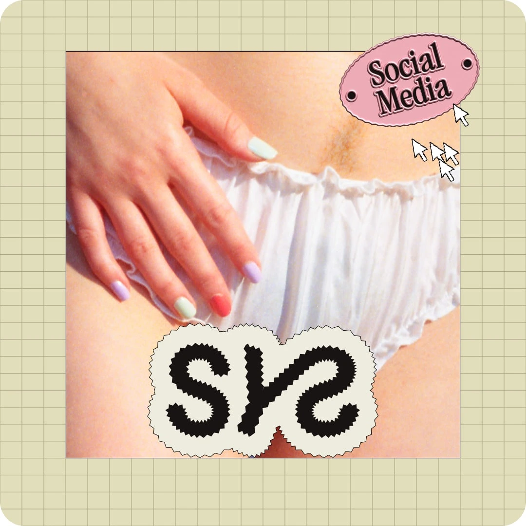
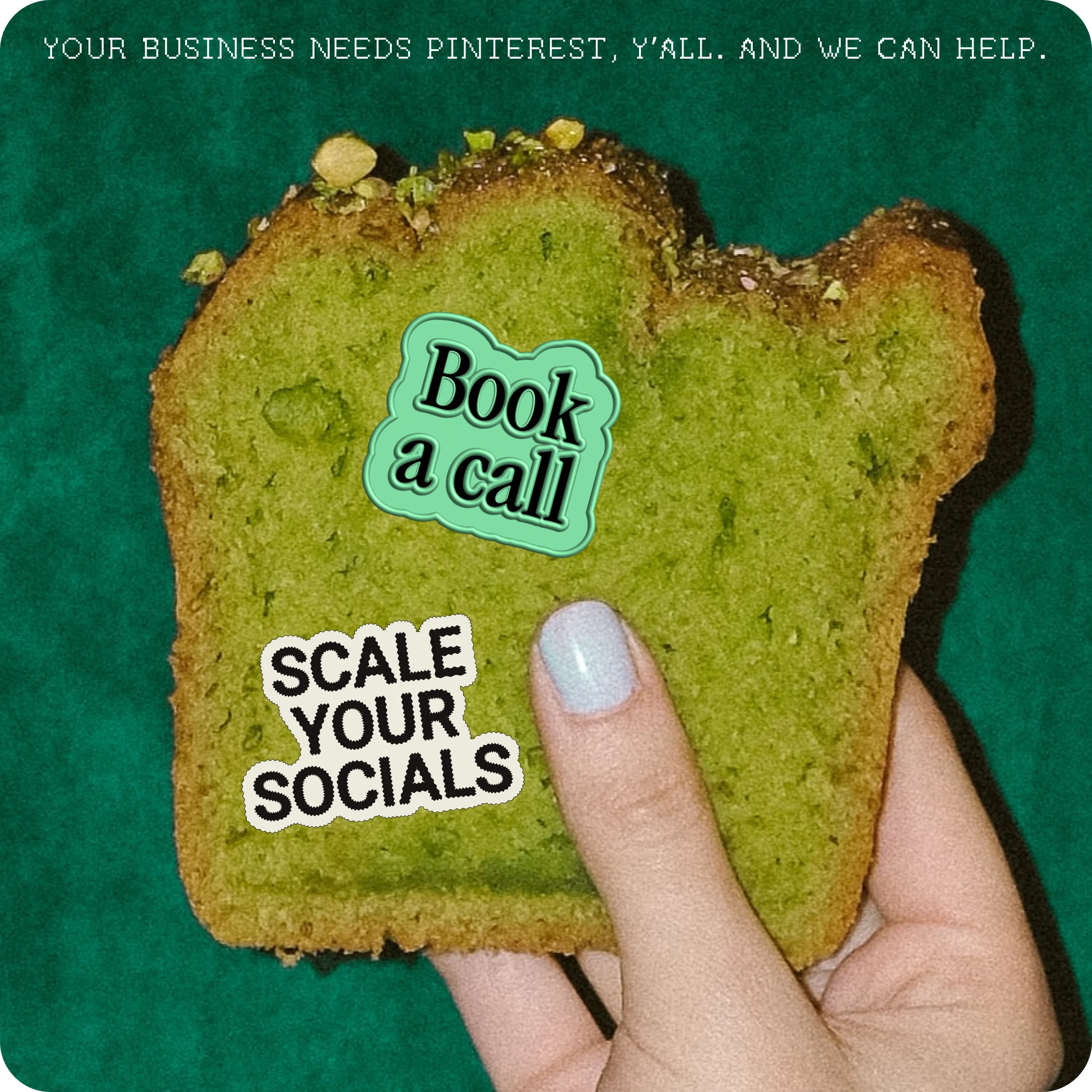
Photography that doesn't make you yawn
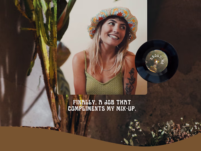
What you typically see (social media) agencies display in their photography is laptops, phones, clean office spaces, laughing people. Sterile. Impersonal. Boring. Since Scale Your Socials is none of that, I sourced stock imagery that's the opposite: fun, approachable, real, creative. And that's the direction for future brand shoots.
And the final result?
In just one day (plus prep), we created a coherent visual identity that embodies everything that Scale Your Socials stands for: cool, structured, inclusive. This is what they now communicate from the moment you enter SYS's brand space. And it didn't cost the world.
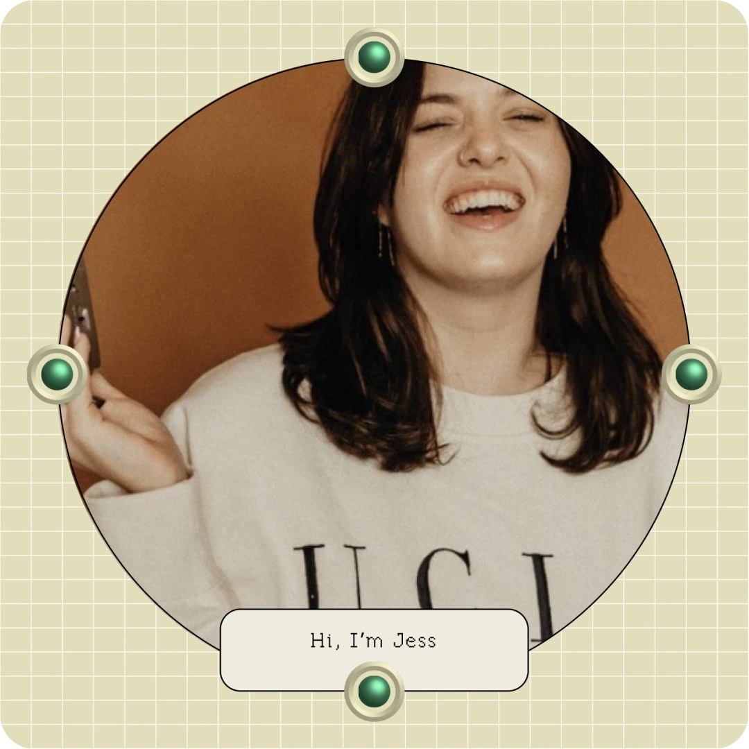
In the words of founder Jess:
"My new branding is all about combining retro and futuristic elements for a look all its own - talk about a tall order but Martha pulled it off spectacularly. This is the branding I've been dreaming of for OVER TWO YEARS?! I want to be a cool retro-futuristic alien cowboy astronaut and somehow Martha saw the vision and pulled it off."
Like this project
Posted May 22, 2023
SYS came to me with a vision: to have a “really-fucking-cool, reliable, and current” brand. “Off-beat and funny while still being approachable and elevated.” ✔️