Jewelry concept redesign
Helen Statsevich
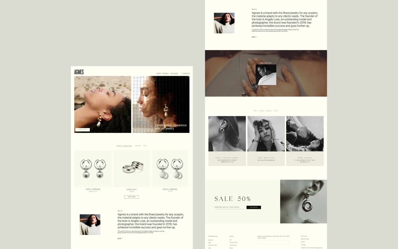
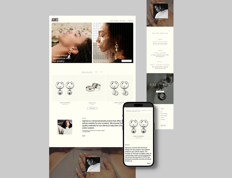
AGMES is a premium jewelry brand, so the website has one job: make products feel expensive and easy to buy.
This redesign focuses on a more modern, editorial direction with a clearer hierarchy, a stronger grid, and more whitespace to let the jewelry lead.
The Problem
The previous experience didn’t match the product’s “gallery-level” feel:
• Visual hierarchy felt inconsistent, with attention split across too many elements.
• Product scanning was slower than it should be for an e-commerce homepage.
• Brand story and shopping competed instead of supporting each other
Goals:
1. Modernize the visual language without losing the brand’s minimal, art-driven vibe.
2. Improve shopability: faster scanning, clearer CTAs, cleaner product modules.
3. Make the brand feel premium by default: whitespace, rhythm, typography, restraint.
Strategy:
I treated the homepage like an editorial spread:
• Mood first (hero photography establishes tone)
• Shop next (products appear early, in a predictable structure)
• Story in the middle (brand message supports trust, not noise)
• Promotion integrated (sale block is present but doesn’t scream)
• Strong finish (oversized wordmark anchors brand recall)
Like this project
Posted May 11, 2025
This redesign of AGMES with a gallery-like, editorial grid and a refined typographic hierarchy that keeps the brand feeling elevated while improving usability.
Likes
6
Views
44