Built with Framer
Quark — Framer Development
Vlad Sydor
Quark — Time Control & Focus App
Quark is a time management and focus app from the creators of Deep Focus Lab. It's designed to help you regain control of your screen time and improve your digital habits, all based on a scientific approach.
They reached out to me to convert their Figma designs into a responsive and optimized website. I recommended using Framer for this project, as it was the best choice for their requirements.
I carefully transferred their designs, animations, and visuals into a Framer website and helped them better understand the platform and how it can scale with their needs.
💡 Project Scope: Framer Development
⚙️ Tools: Figma, Framer
🕘 Timeline: 12 days
🌐 Live Website: quark.to
🪜 Process
Consultation: In our initial meeting, we aligned on the project requirements and the best path forward. I walked the client through the advantages of building with Framer, ensuring they had a clear understanding of the platform and the successful outcome we would achieve together.
Development (Framer): Transferring Figma designs, building components, optimizing for SEO, and ensuring full responsiveness.
Revisions & Testing: Throughout the project, we continuously tested our progress and ensured everything was aligned with the initial requirements.
Project Delivery: Upon final approval, the project was fully transferred to the client's Framer account. My final deliverables included a recommendation for the best Pricing plan and a complimentary two-week period of post-launch support.
🎨 Design System
The design's color palette consists of a primary blue (#1B64D7), a clean white (#FFFFFF), and a dark neutral (#16171A). For typography, Wix Madefor Display was selected as the sole font for all text elements to ensure consistency across the website.
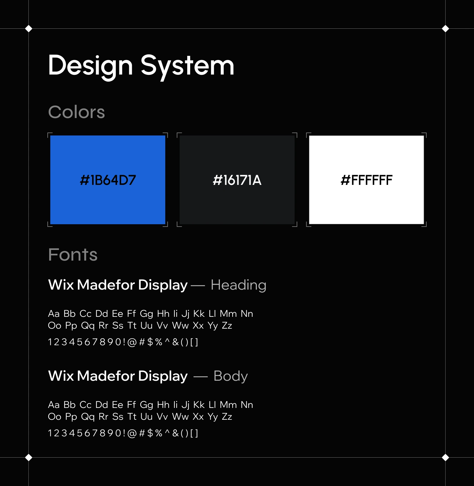
Design System
⚙️ Tools
The primary goal was to convert the Figma designs into a Framer project. I transferred the complete design system (fonts, colors, and visuals) and implemented custom animations.
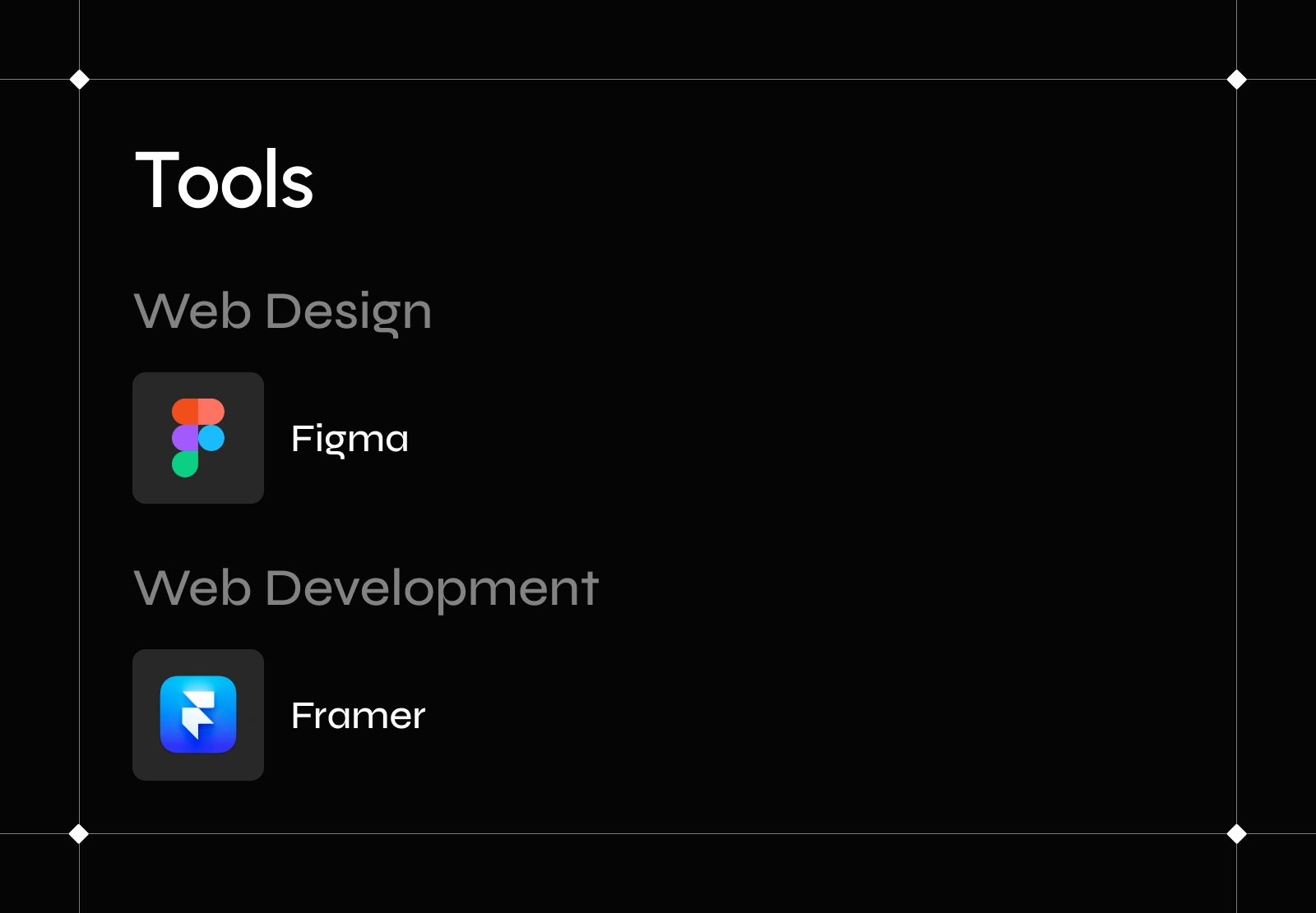
Tools
☎️ Mobile Version
This is a fully responsive website, designed for desktop, tablet, and mobile. The mobile experience is fully optimized, retaining all media and components from the larger screens without compromise.
Mobile Version
⛰️ Main Challenges
Challenge #1: Instead of using fixed breakpoints, the client requested a fluidly responsive design between desktop and tablet sizes, where all components (text, containers, media) scale down proportionally.
Solution: I achieved this by setting the main container's width relative to the viewport width. All child components were then sized using percentages, allowing them to scale smoothly and adapt automatically to changes in screen size.
Challenge #2: The media files in the original design were large and could negatively impact the website's performance.
Solution: I compressed all images and converted them to the WebP format without losing visual quality.
📁 Sections
1) Hero Section
The hero section is a crucial part of any website. We decided to feature the strong message, "Take back control of your screen time," alongside a visual of a phone with the mobile application open.
Hero Section
2) Daily Screen Time
This is a dynamic component that calculates the average time a user spends on their phone. The design features an interactive switcher that dynamically reveals the corresponding amount of hours.
Daily Screen Time
3) Features
This section utilizes a Bento grid layout to showcase a combination of high-quality visuals and key features of the mobile application.
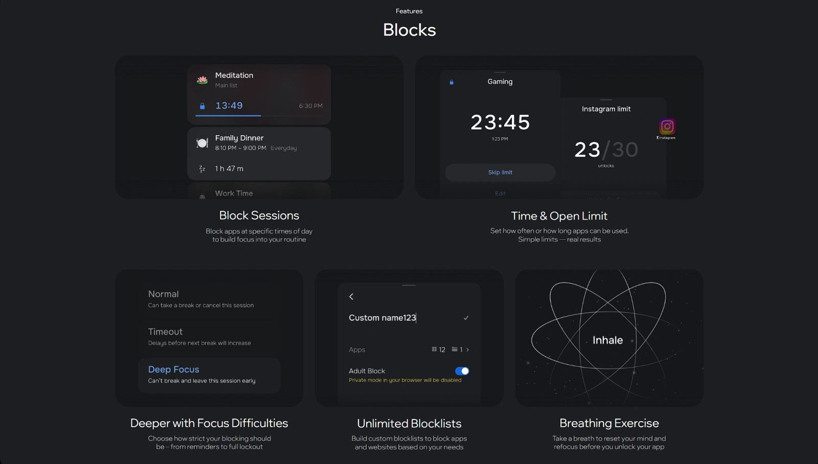
Features
4) Media Addiction
The primary goal of the website was to emphasize the importance of focus in our modern lives. This particular screen highlights the fact that many teenagers struggle with social media addiction.
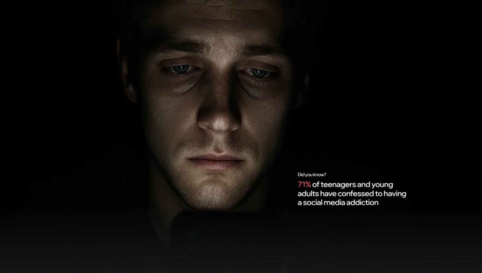
Media Addiction
This section features a comparison between people who use the app and those who don't.
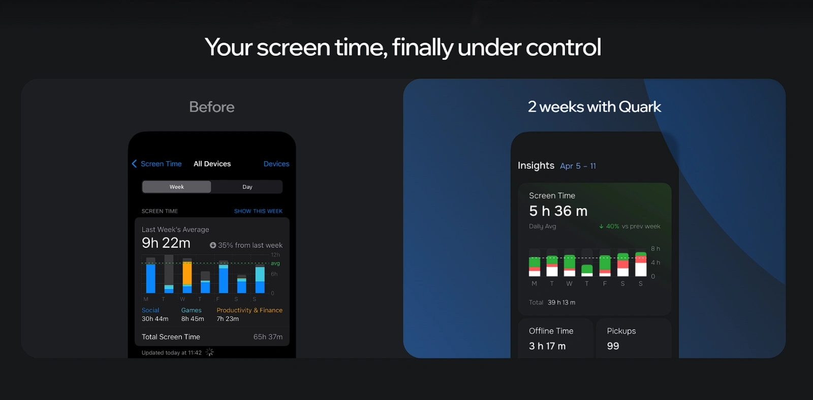
Screen Time
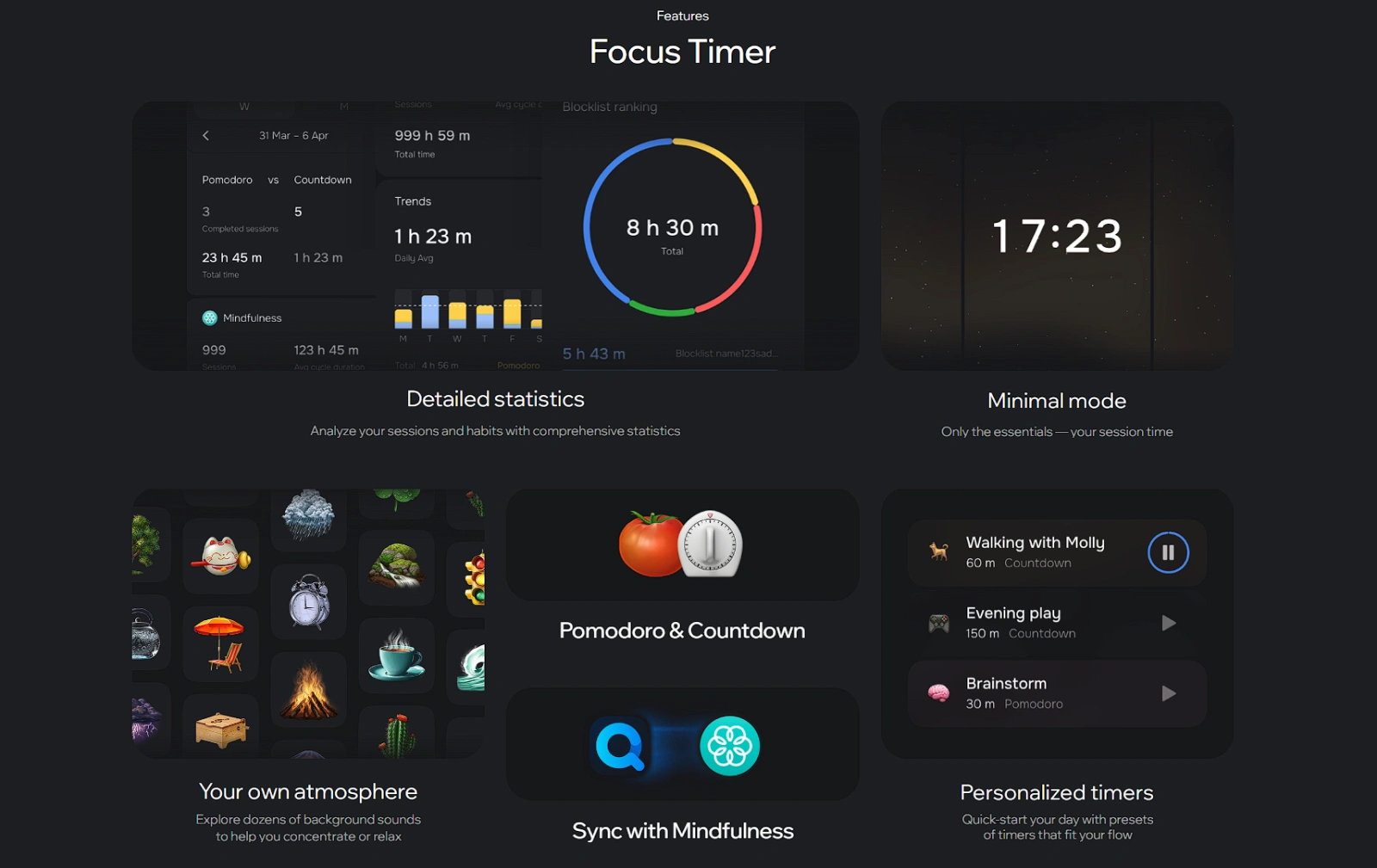
5) Focus Timer
This section showcases the benefits of using the in-app Focus Timer and the features it introduces.
Focus Timer
6) Scientific Approach
It's important for the Quark app to emphasize that its development approach is based on scientific research. This section supports that claim by providing a list of reference links.
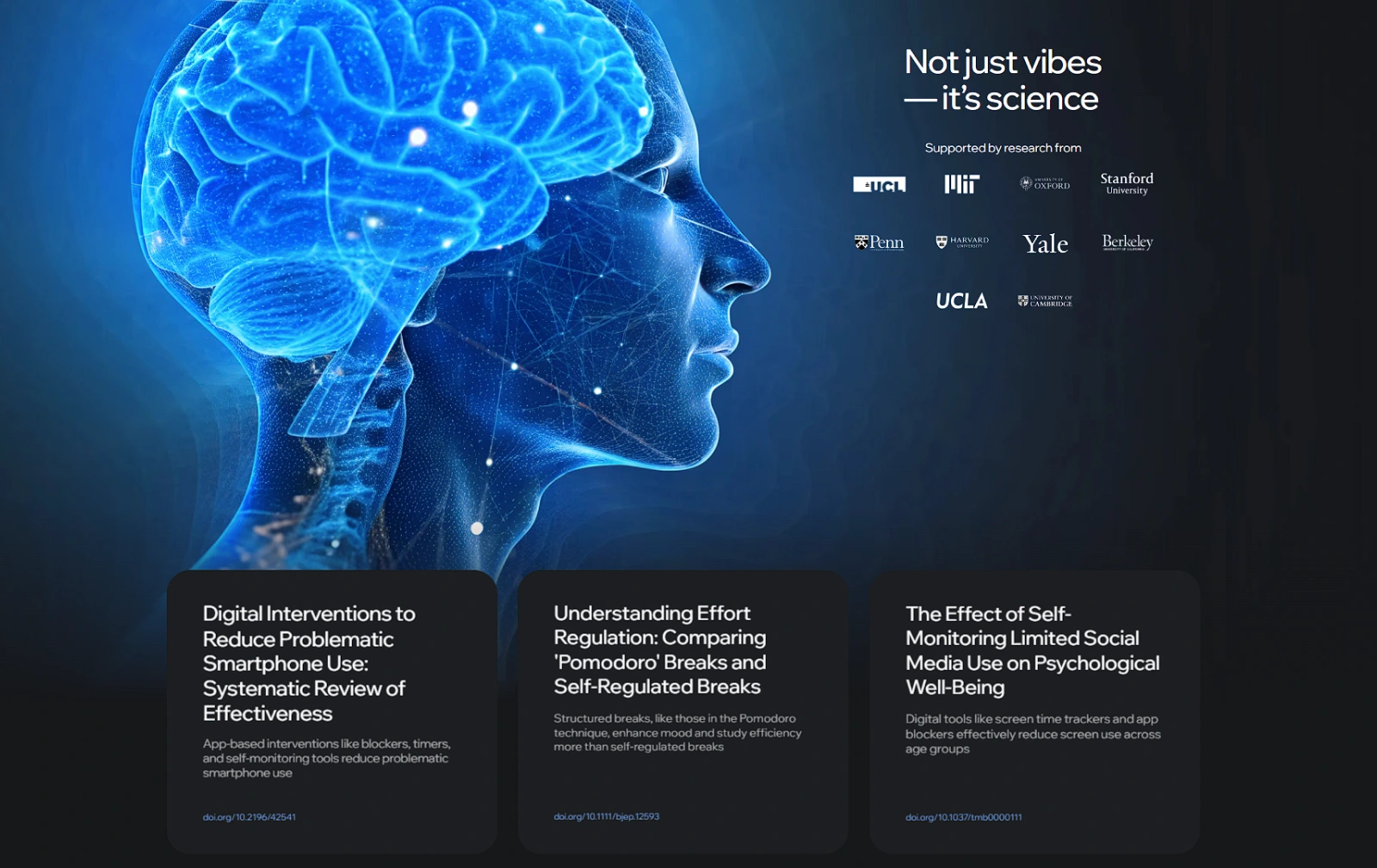
Scientific Approach
7) Insights
This section outlines more features included in the app.
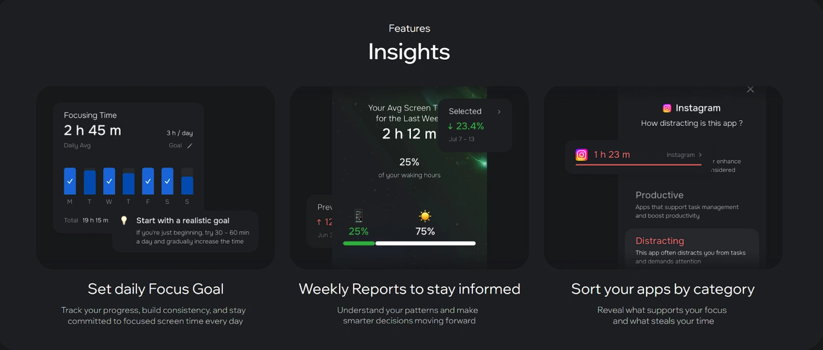
Insights
8) Reviews
This is an interactive slider showcasing recent customer reviews.
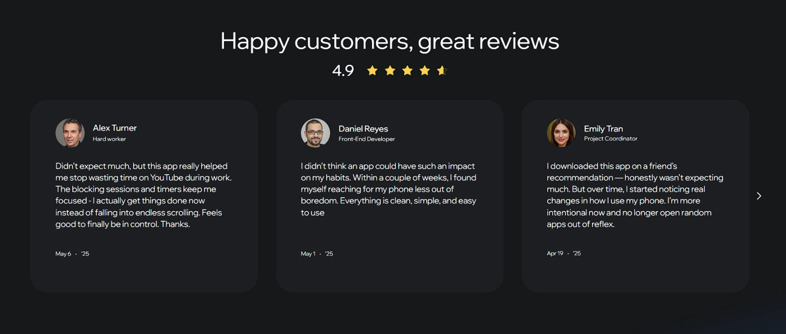
Reviews
9) Footer
The footer, the final section of the website, contains useful links and a QR code that redirects users to the installation page.
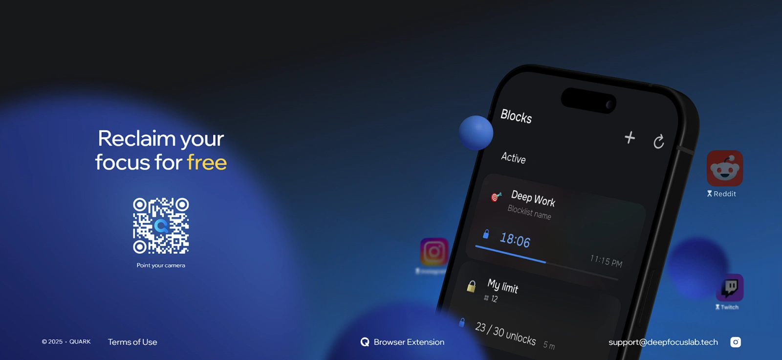
Footer
📈 PageSpeed (Lighthouse)
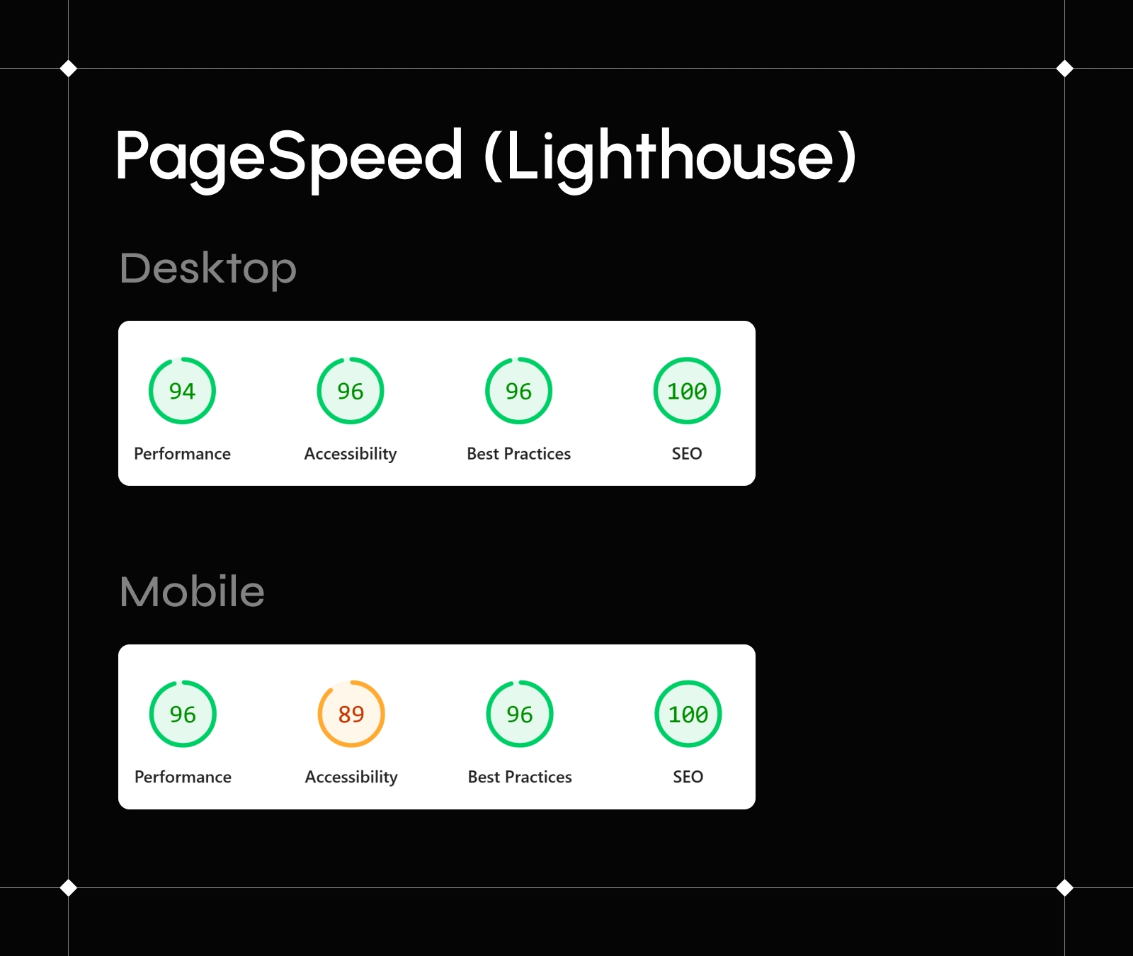
PageSpeed (Lighthouse)
🤔 Looking for a Framer developer with Web Design skills?
🚀 Let's connect!
Like this project
Posted Sep 14, 2025
Quark is a time management app from the creators of Deep Focus Lab. It's designed to help regain control of your screen time and improve your digital habits.
Likes
43
Views
326
Timeline
Jul 8, 2025 - Jul 20, 2025