Muzo Estudio - Web Design, Development and Visual Identity

Renzo Poggio


Muzo Estudio - Web Design, Develompent and Visual Identity
About
The goal was to design a website, a visual identity and a name for a web design and development studio, based on extensive research.
I started by analyzing who they are, the market, the target audience and key references. This led to three core concepts: Innovation, Duality (code and design) and Beyond the visible.
Visual identity
Name
“Muzo” is inspired by the Japanese word “musō”, meaning unmatched, exceptional and excellence. It reflects the studio’s goal of creating unique digital solutions that stand out.
Logo
My idea was to reflect the studio’s connection to technology and innovation. That’s why I designed an “M” with shifted terminals and cuts that break the classic symmetry.
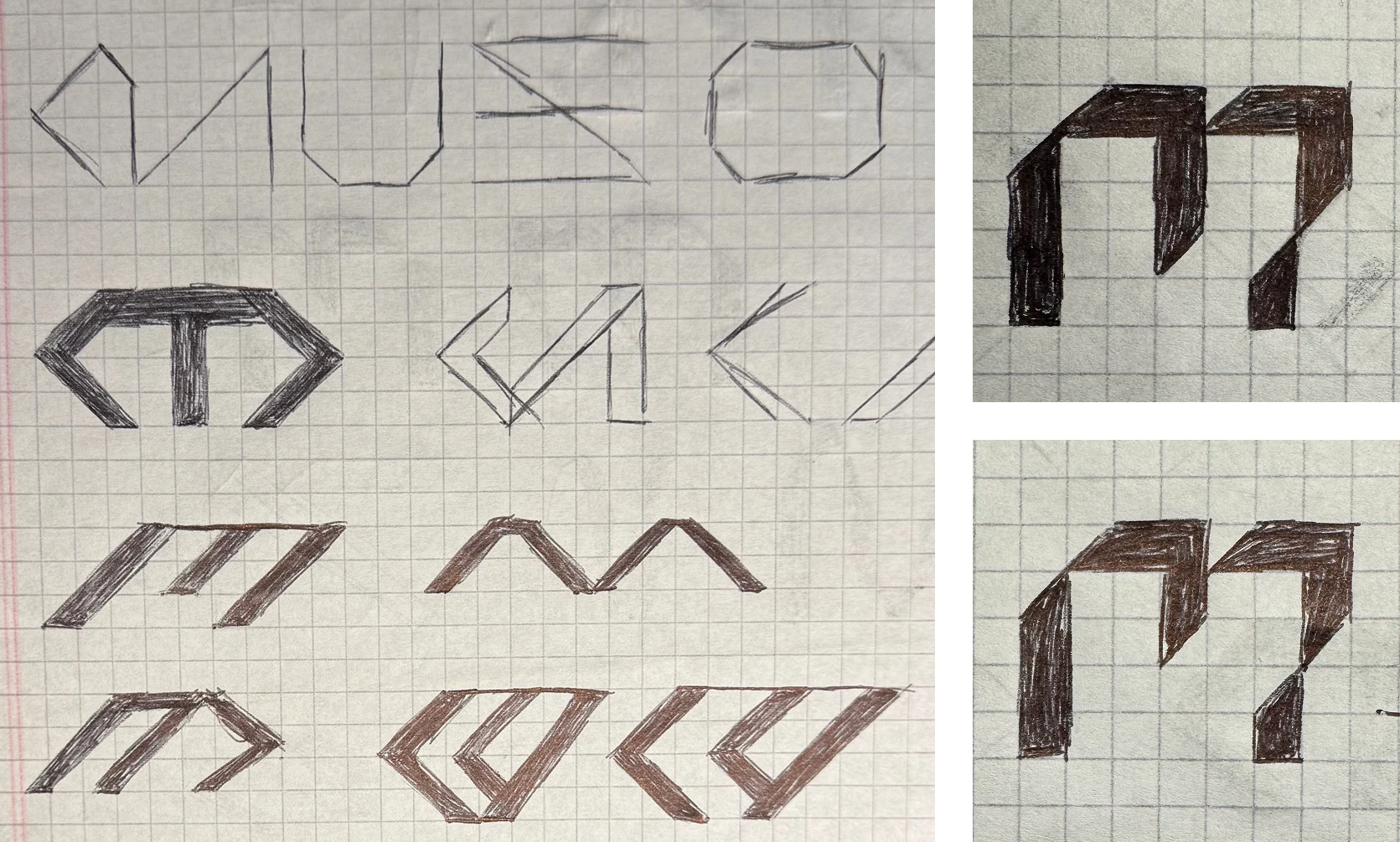
Wip exploration
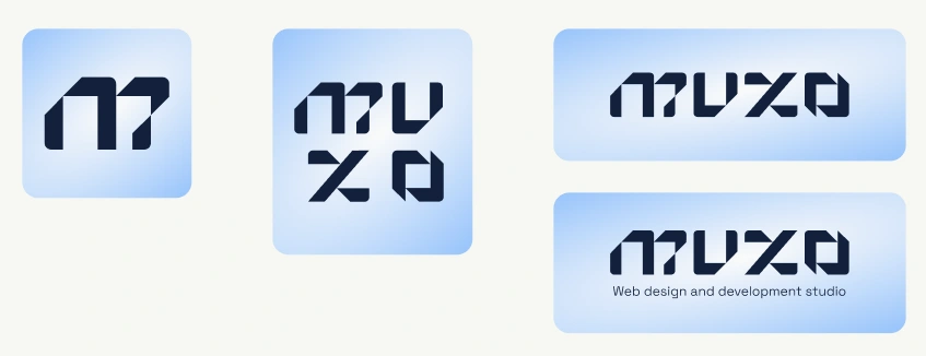
Final logos
Typography
Space Grotesk is used for large-sized titles.
I chose it to reflect the studio’s connection to technology and innovation.
Switzer Variable is used for quotes and body text at smaller sizes.
I chose it to communicate seriousness, trust and professionalism.
Color palette
The color system is made up of two palettes: a primary one centered around blue, and a secondary one intended for use in web development contexts.
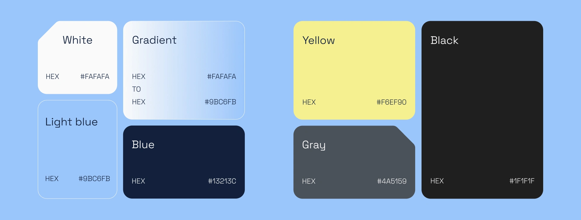
Color palette
Web Design - Components and styles
The website represents the studio’s core concepts, showcases its projects and reinforces its visual identity.
I built the components and styles in Figma around two modes: Design Mode and Development Mode, a visual take on the studio’s duality between design and code.
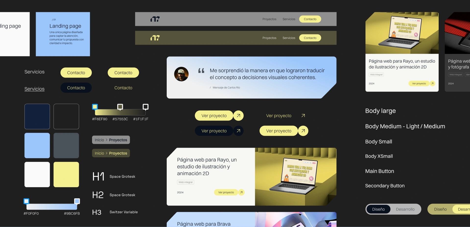
Figma components
Web Development
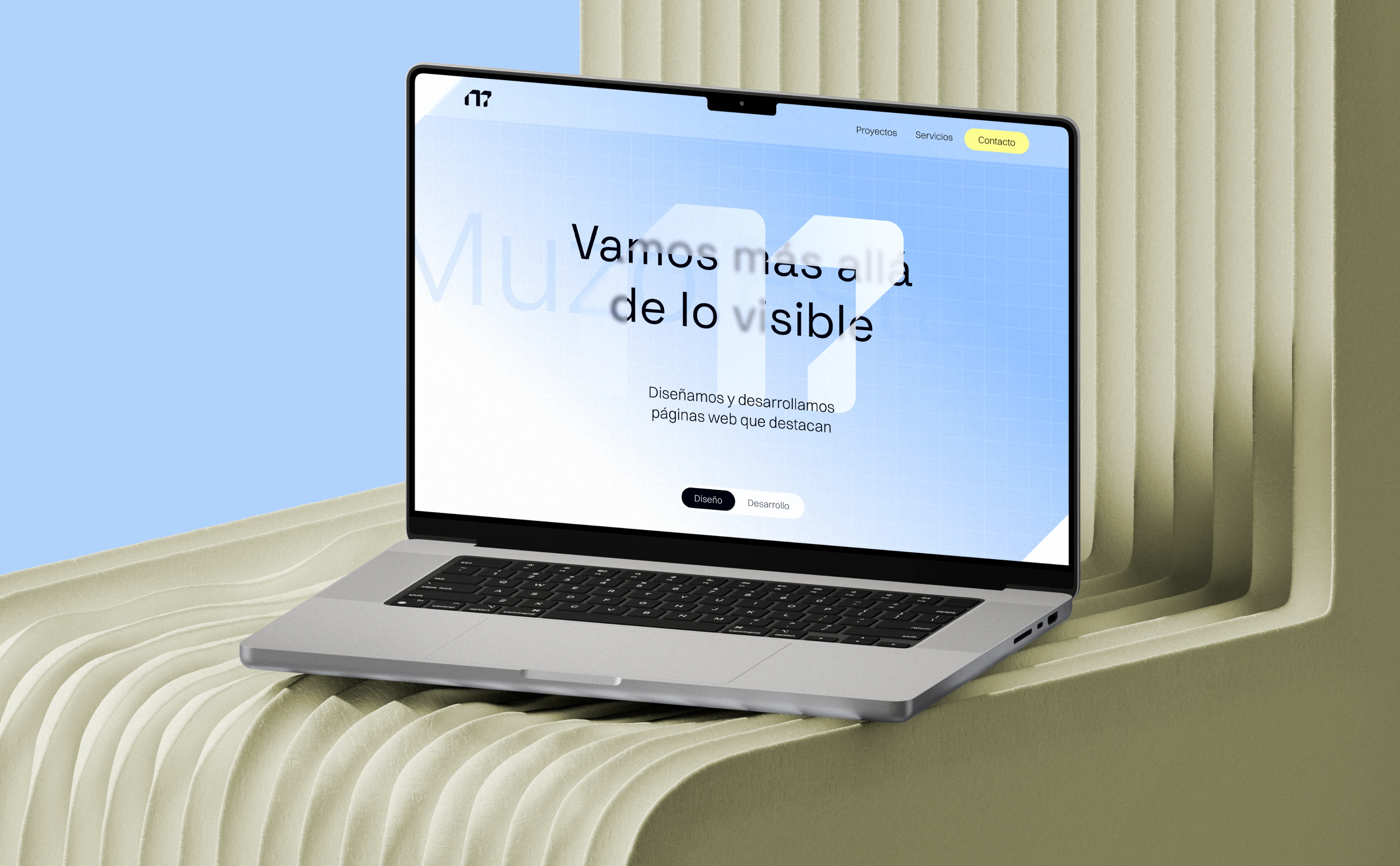
Developed in Framer as a single landing page that grabs attention and communicates the studio’s offer with clarity and impact. It includes a hero section, projects, services and contact.
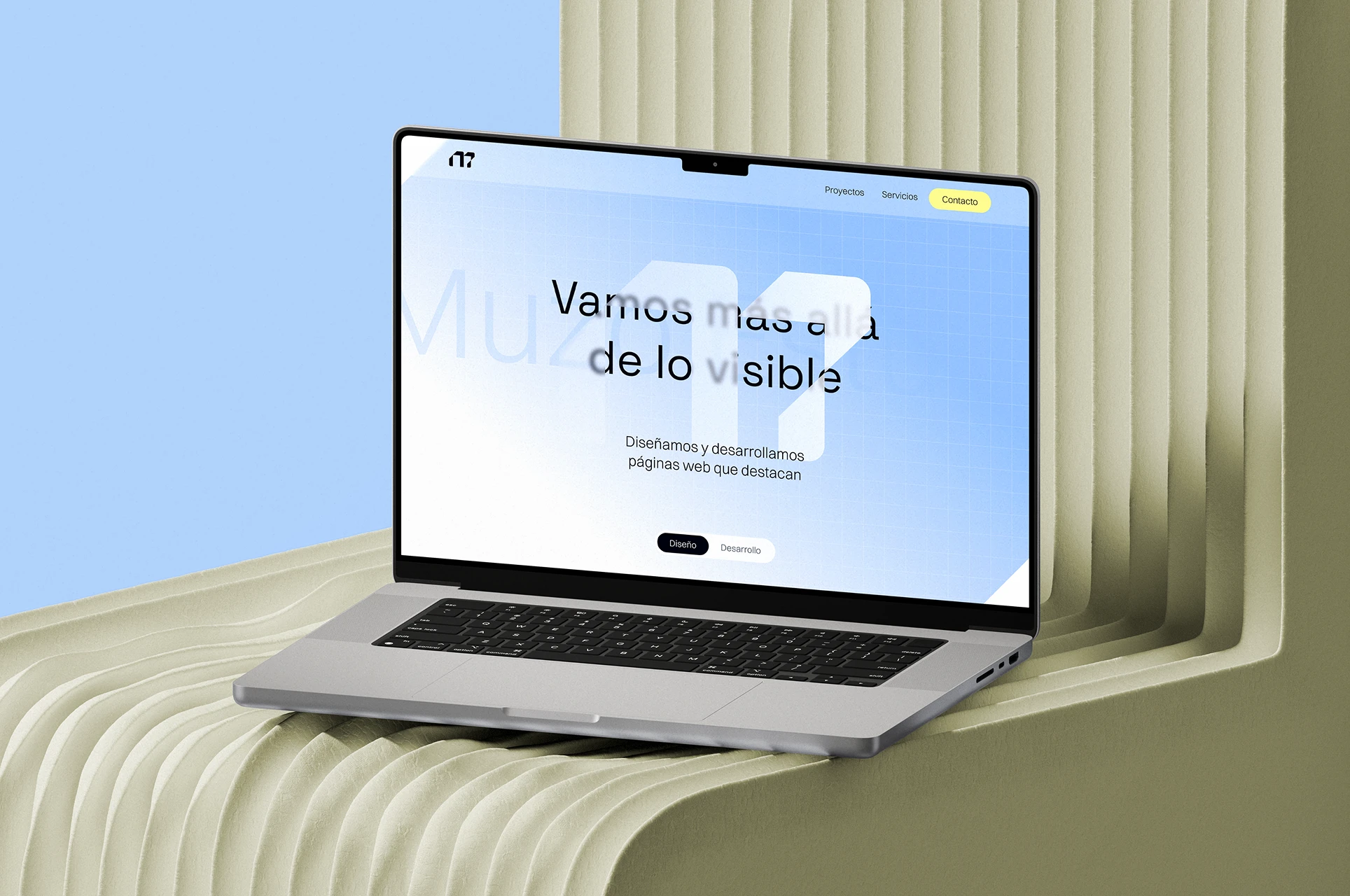
Hero section screen
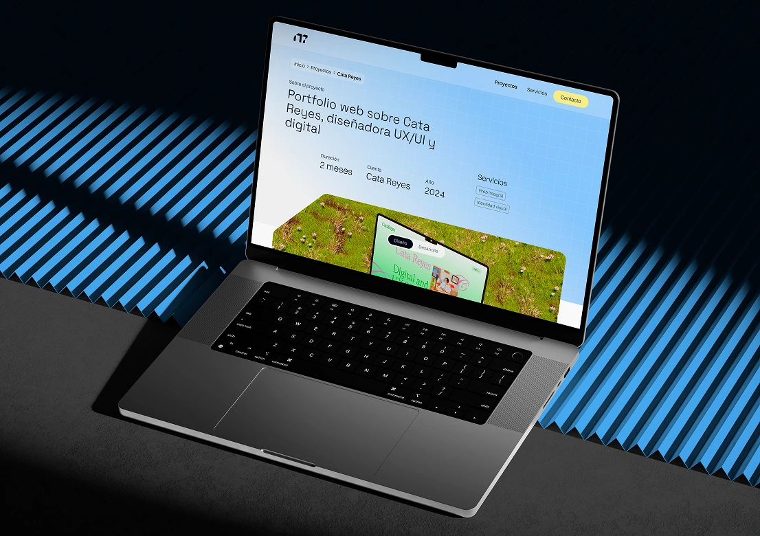
Internal project screen
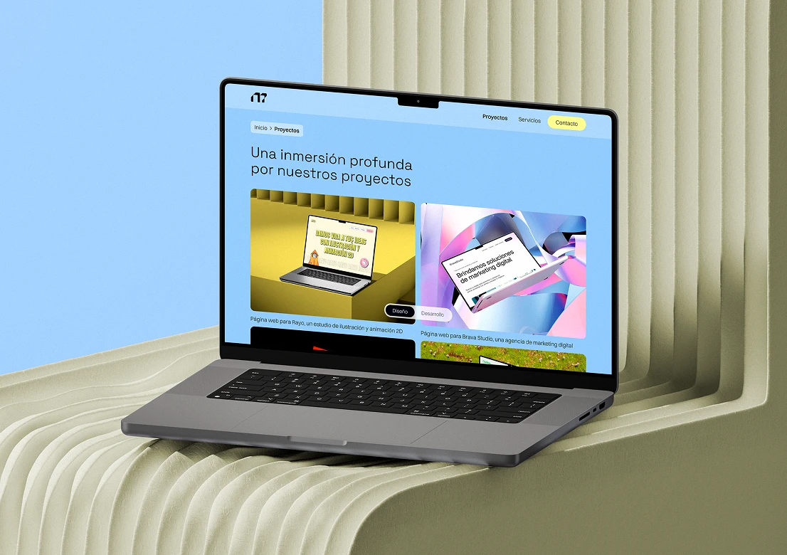
Projects section
Like this project
Posted Oct 15, 2025
Naming, visual identity and website for Muzo Estudio, a web design and development studio. Designed in Figma, built in Framer.