
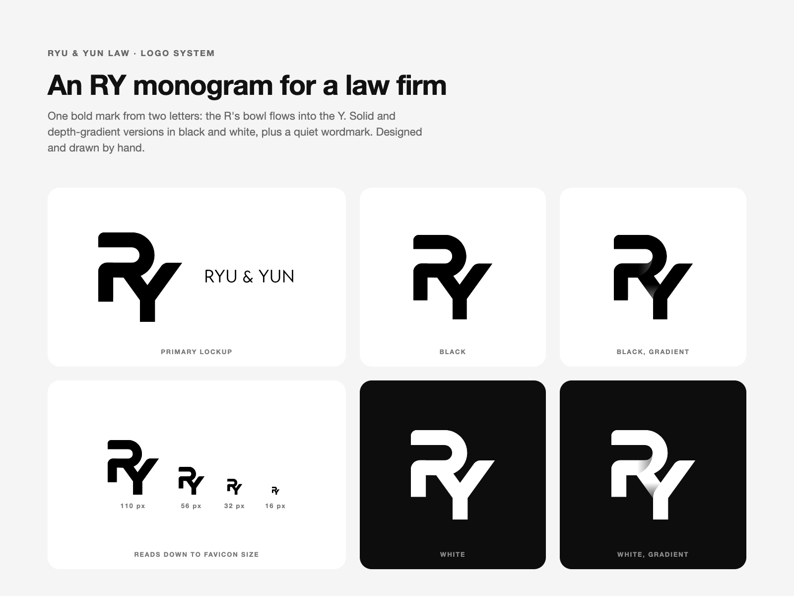
Ryu & Yun is a Koreatown trial law firm run by two partners. They needed one mark that carries both names.
The idea
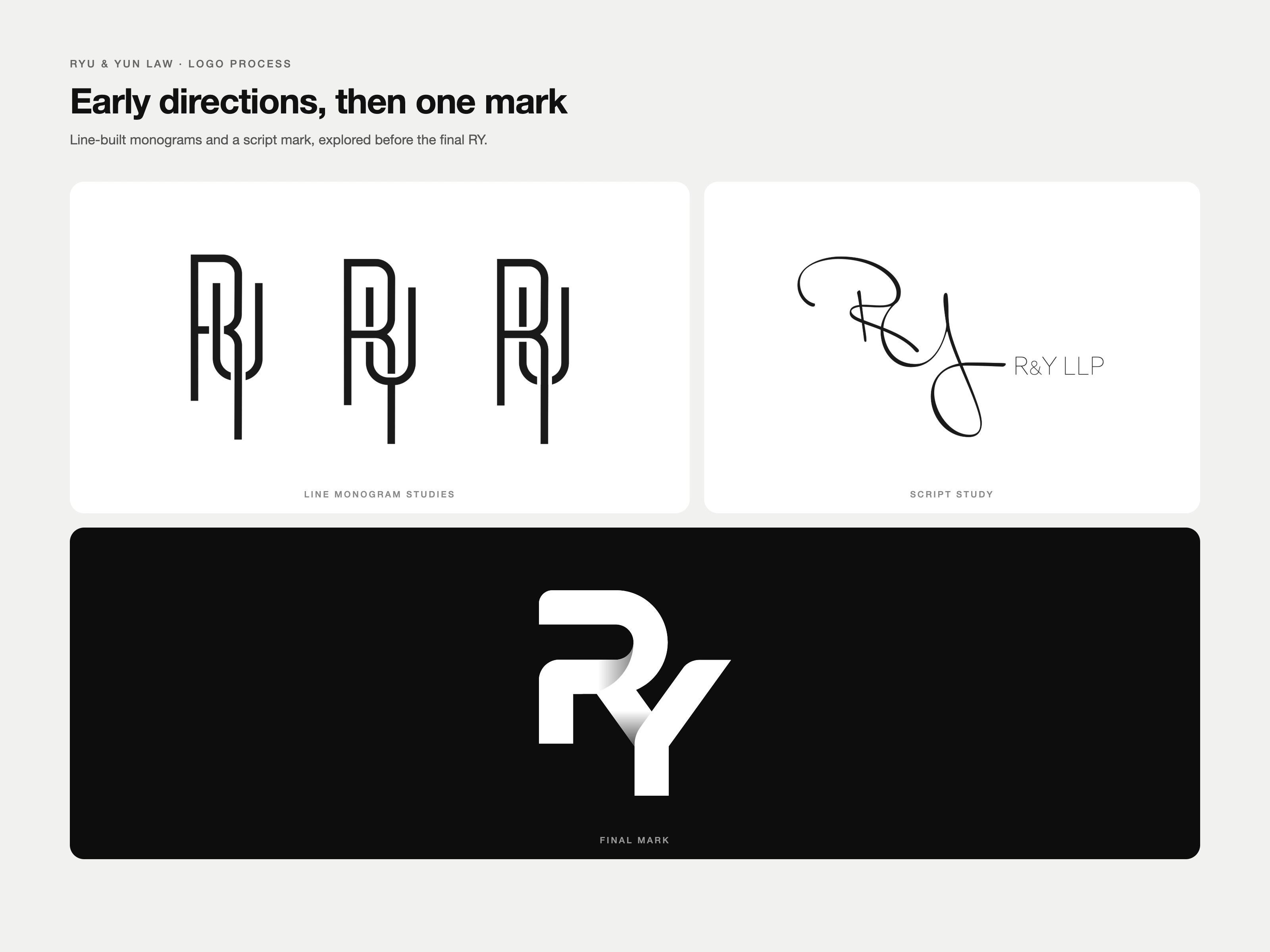
I noticed that most law firms, old and new, go for a script logo or just the name in a plain font, and they all start to look the same. I wanted this mark to be striking and confident. I pictured it stamped on a letter or a legal document, where a logo has to look sure of itself and bold at a glance.
What I did
I drew the monogram by hand, looking for a way to join the R and the Y into one shape. The R's bowl flows straight into the Y, so the two partners' initials read as a single mark, and connecting them made it look modern and minimal. I took it from rough sketches to a clean vector in Illustrator, then built the system around it.
What's in the system
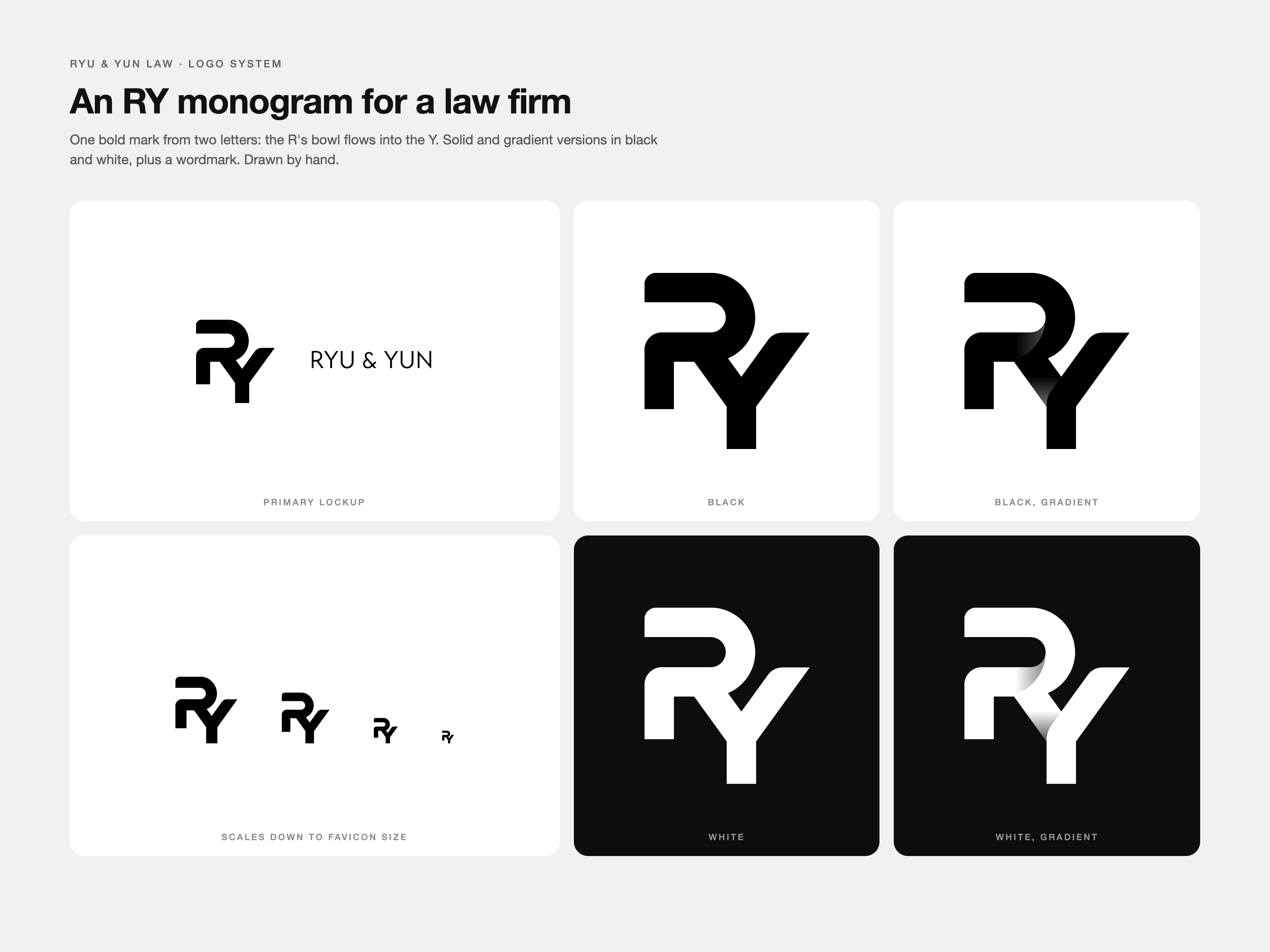
Solid and gradient versions, in black and in white
A wordmark that pairs with the monogram
The mark now leads the firm's trilingual website (ryuyunlaw.com), which I also designed and built.
Tools: Adobe Illustrator. No AI in the logo.
0 likes · 7 views · Oct 20, 2026
An RY monogram for an LA law firm, drawn by hand: the R's bowl flows into the Y. Solid and gradient versions in black and white, plus a wordmark.
