Relay — AI SaaS Launch Kit

Adel Merabet

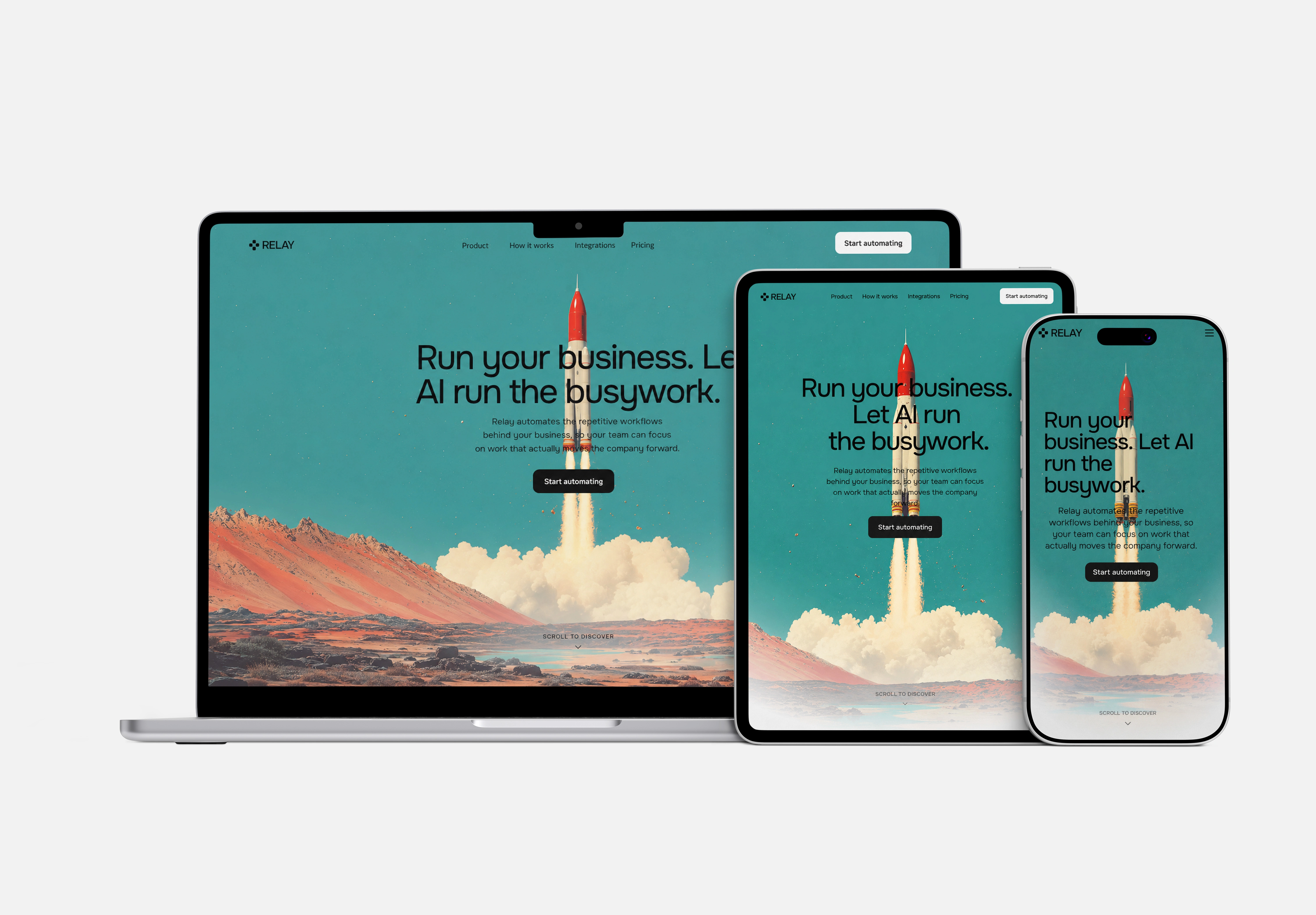
Relay adapts across desktop, tablet, and mobile.
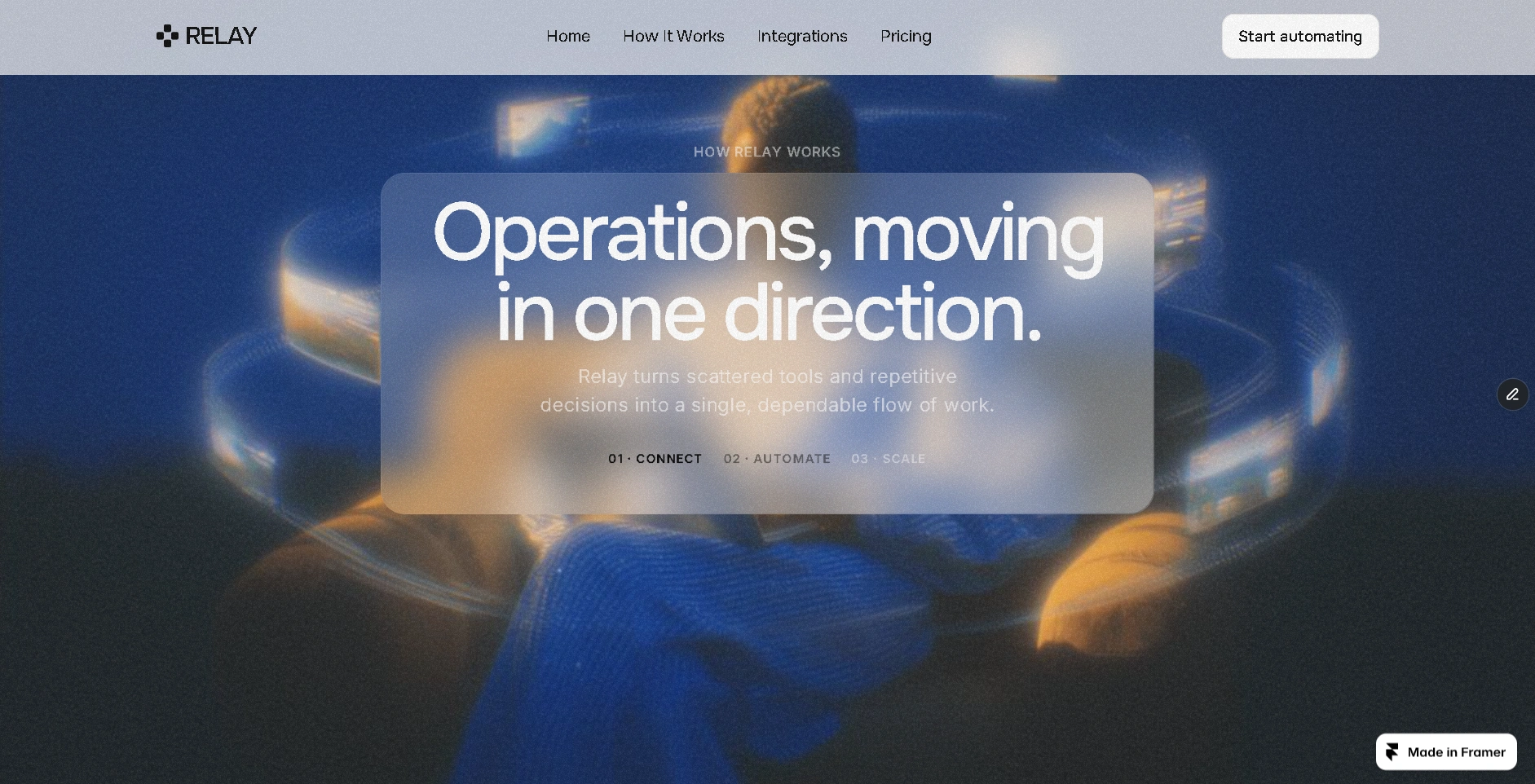
A cinematic How It Works experience built around the Relay workflow.
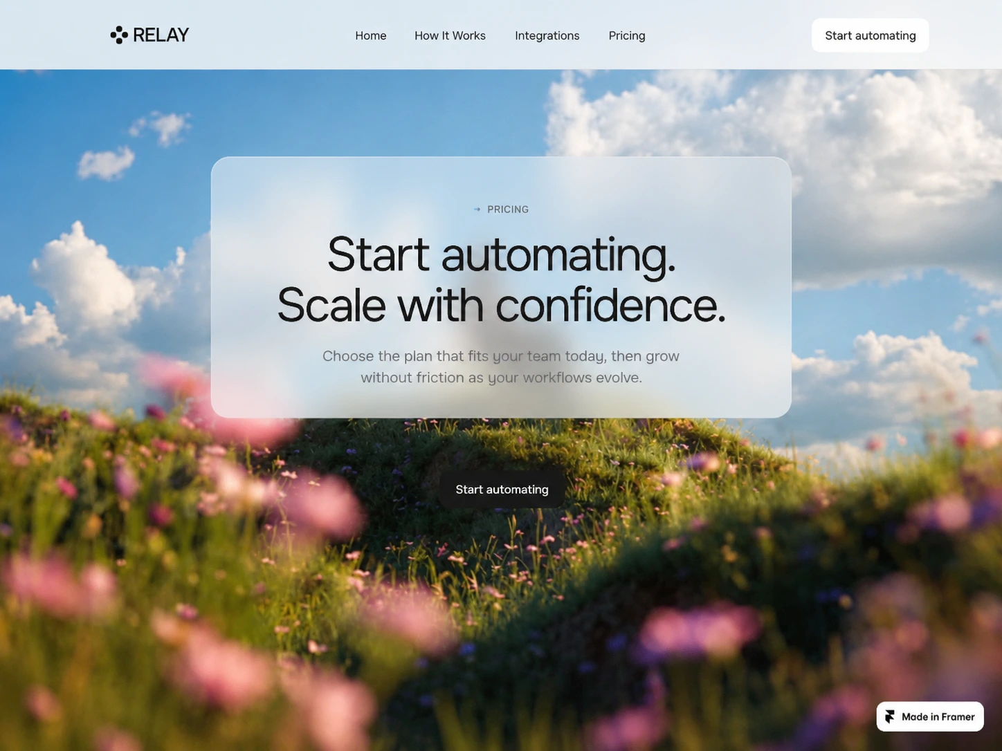
A focused pricing flow designed for clear plan comparison.
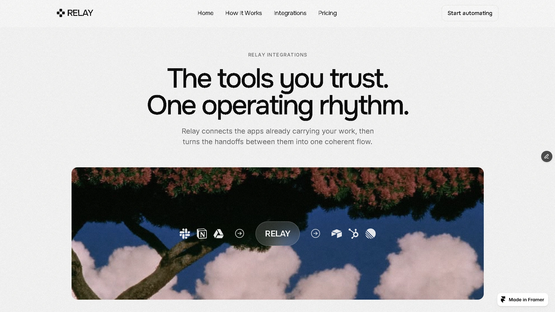
A visual system for showing how tools connect through Relay.
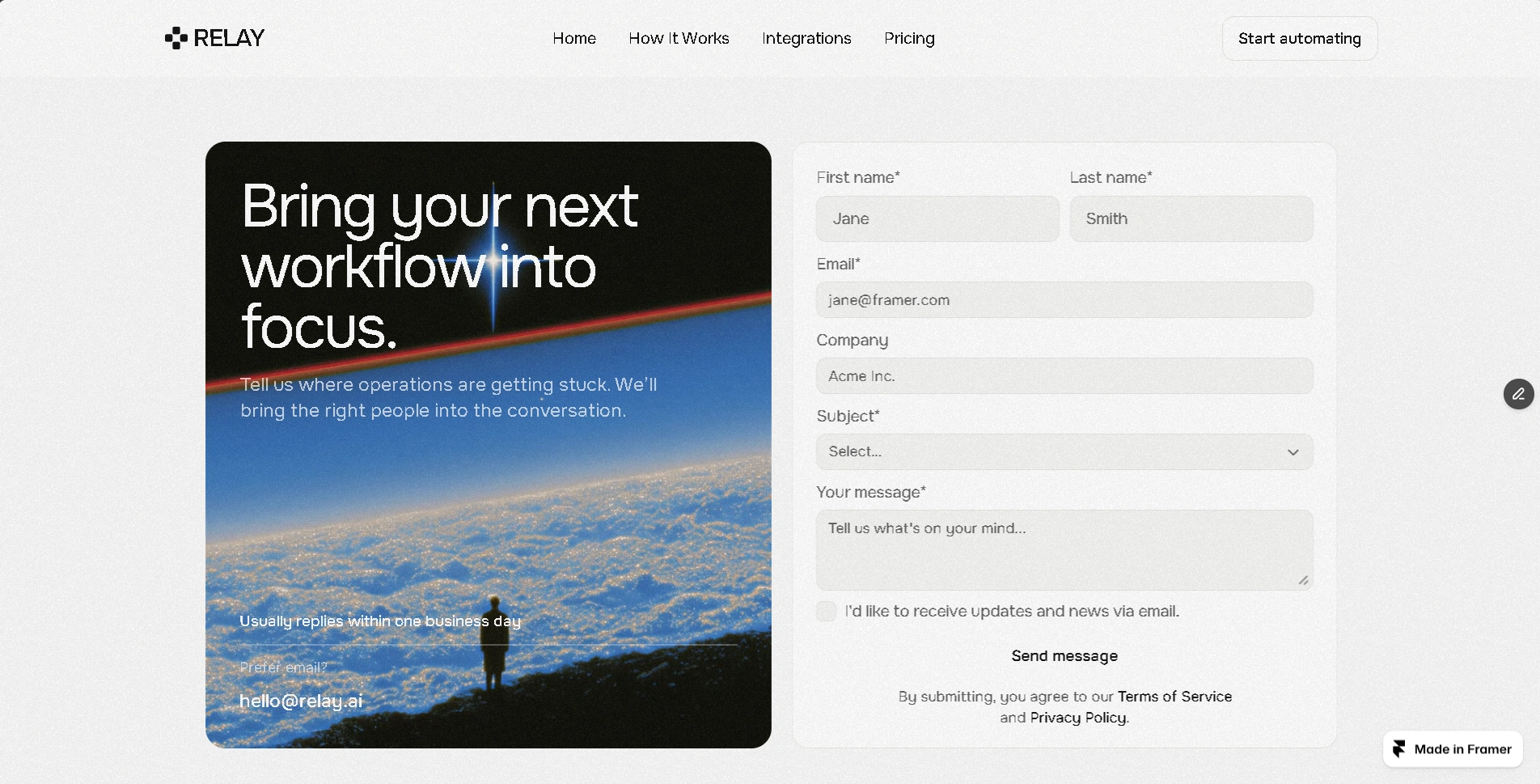
A focused contact experience that carries the same visual language.
A launch-ready Framer website system for AI startups, SaaS products, automation platforms, AI tools, and modern B2B software.
Overview
Relay is a premium Framer website system built for AI startups and SaaS products. What began as a focused AI SaaS landing page evolved into a complete launch-ready website system: seven purpose-built pages, reusable components, responsive layouts, and a cohesive editorial visual language designed to help founders present their product with clarity and confidence.
This is a self-initiated digital product and Framer template, not a client project.
Challenge
The original Relay concept was built around a single, focused AI SaaS landing page. The challenge was to expand that foundation into a complete product website without losing the sharp, minimal character that made the original experience distinctive.
The system needed to support the full launch journey — from product storytelling and education to integrations, pricing, and conversion — while remaining cohesive across every page.
Approach
Instead of rebuilding Relay from scratch, I treated the original visual identity as the foundation for the entire system.
Typography, spacing, navigation, layout principles, and editorial direction were preserved and systemized, allowing every new page to feel like a natural extension of the same product rather than an unrelated collection of templates.
The result is a design system that stays consistent without making every page feel identical.
What I Built
A complete seven-page website system
Home — Introduces the product, establishes the visual language, and creates the first conversion moment.
Pricing — Presents plans with clear hierarchy and an editorial comparison experience.
How It Works — Breaks the product into a simple Connect → Automate → Scale story.
Integrations — Shows how Relay fits into the tools and workflows teams already use.
Contact — Provides a focused, conversion-oriented contact experience.
Legal — Keeps essential legal content aligned with the product system.
404 — Extends the brand experience even when users reach the wrong page.
Every page is responsive across desktop, tablet, and mobile and built from reusable Framer components and sections.
The interaction layer includes smooth scrolling and subtle scroll-based text reveals, adding movement without compromising the restrained, premium feel.
Design Process
The key challenge was extending the visual system without making the experience repetitive or generic.
Each page shares the same core foundation — strong typography, a minimal monochrome palette, refined spacing, subtle borders, and controlled hierarchy — while the composition changes according to its purpose.
The Home and How It Works pages lean into large-scale imagery, cinematic moments, and bold typography. Pricing introduces a denser, comparison-driven structure. Integrations focuses on relationships between tools and workflows. Contact reduces the experience to a direct, focused conversion path.
Across the entire system, the CTA structure remains intentional: every page has a clear next step, creating a consistent path from discovery to action.
Result
The result is a cohesive, launch-ready AI SaaS website system that goes beyond a single landing page.
Relay gives founders a complete foundation for presenting their product, explaining how it works, showcasing integrations, communicating pricing, and converting visitors — all within one consistent Framer experience.
The project demonstrates how a strong visual concept can evolve into a full product system without losing its identity.
Like this project
Posted Aug 13, 2026
Self-initiated AI SaaS launch kit — a premium Framer website system for AI startups, SaaS products, and automation platforms.