Transform Your UX with Engaging Gamified Dashboards
Mimi Akter
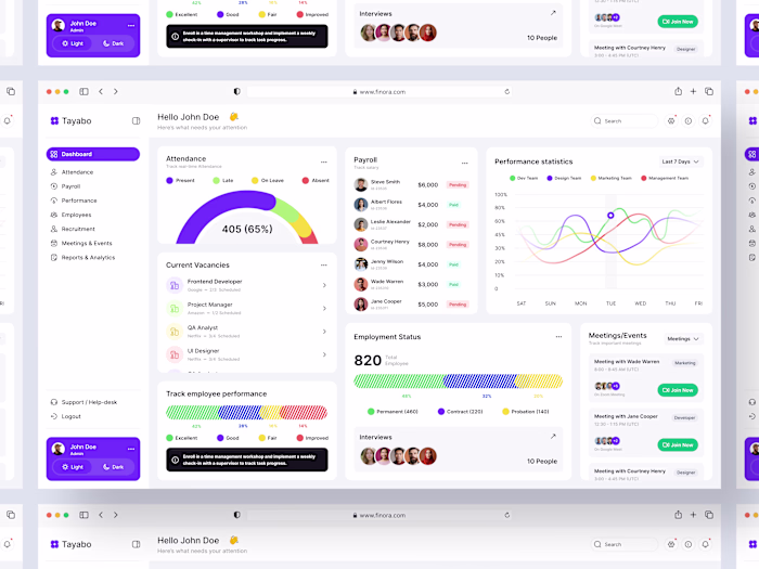
Quest Dashboard That Makes $
This client runs a gamified neighborhood app. When I joined the project, people loved the idea but skipped most events, so sponsor and ticket revenue stayed flat.
I began with a simple UX review of the sign‑in flow and first screen. The key issue: actions were hidden under icons.
I redesigned the layout with large event cards and direct “Join Event” buttons. UX point: clear visual hierarchy so eyes go from stats to events to chat. Early numbers show more event joins.
Need a dashboard like this? DM me.
Like this project
Posted Feb 22, 2026
Quest Dashboard That Makes $ This client runs a gamified neighborhood app. When I joined the project, people loved the idea but skipped most events, so spons...
Likes
0
Views
5