Amelogix

Alamgir Brands


Overview
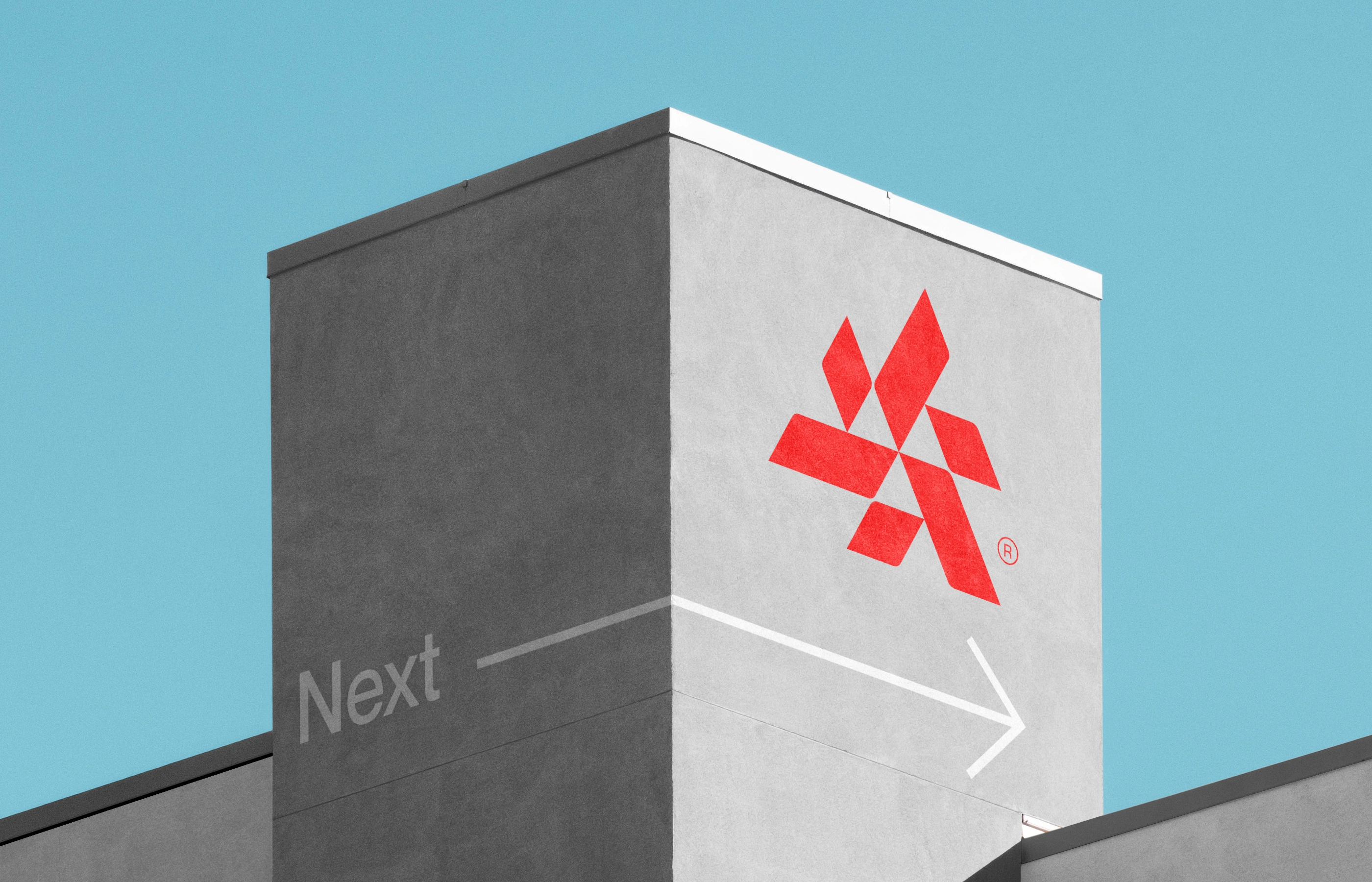
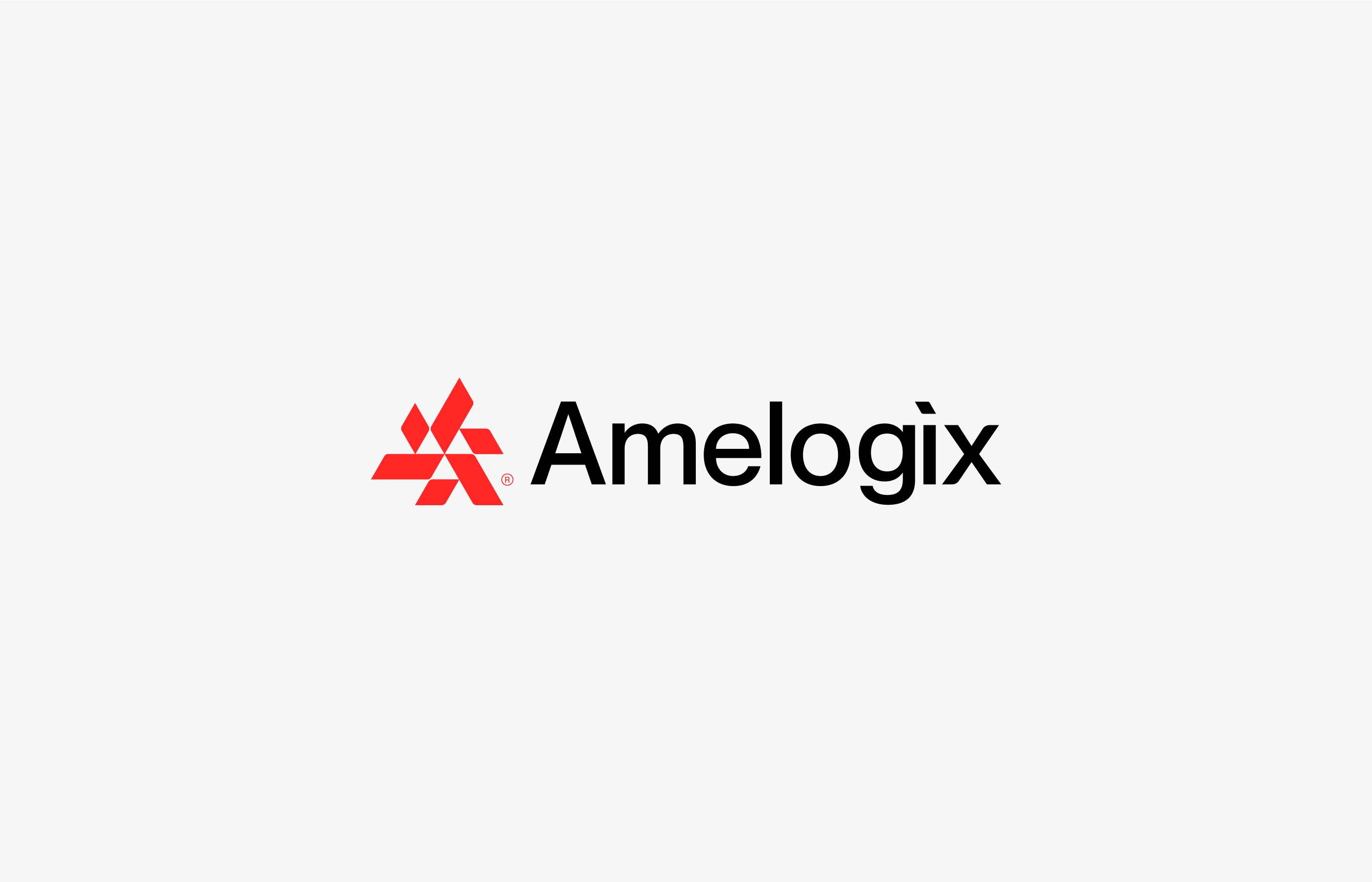
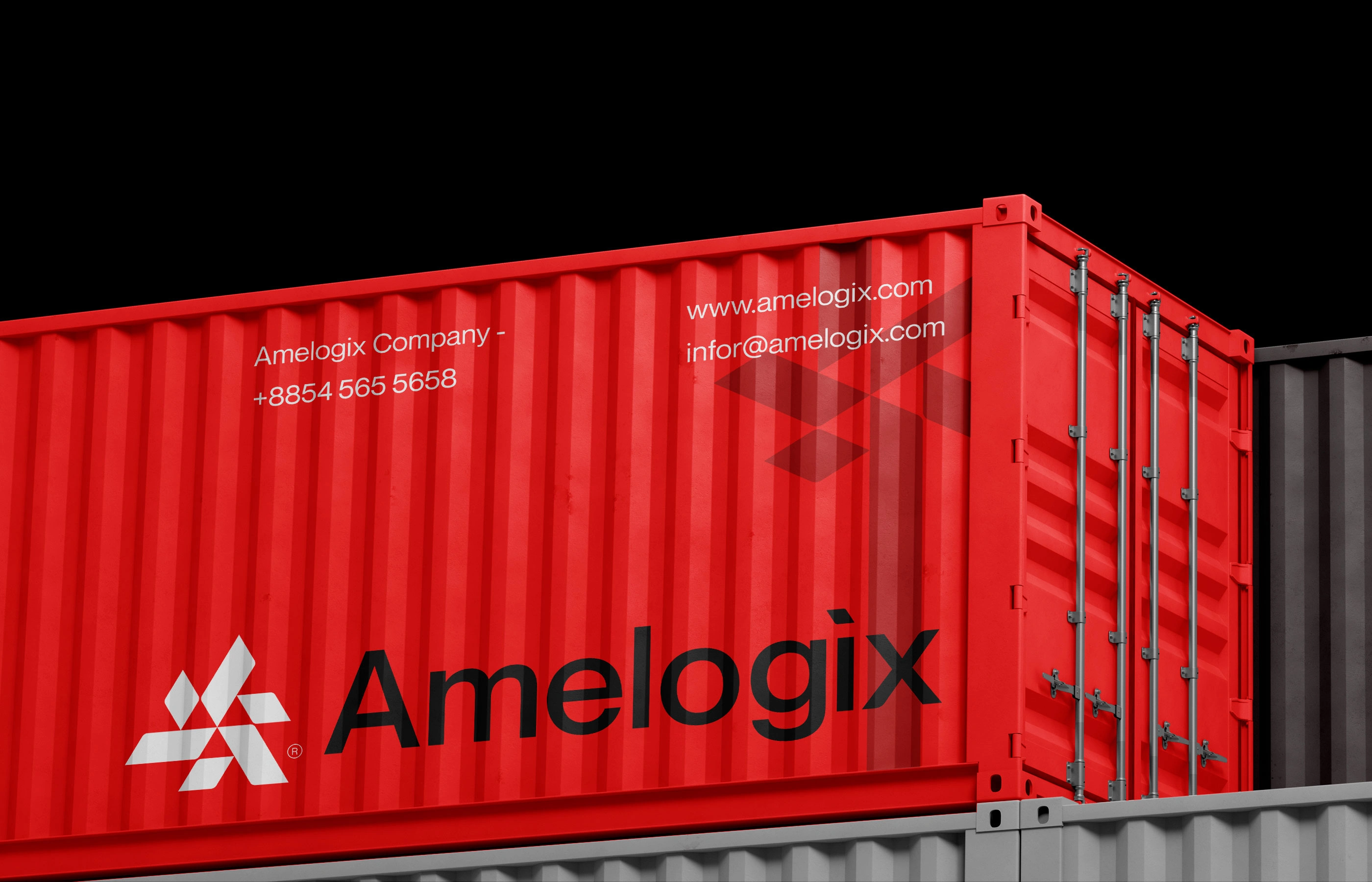
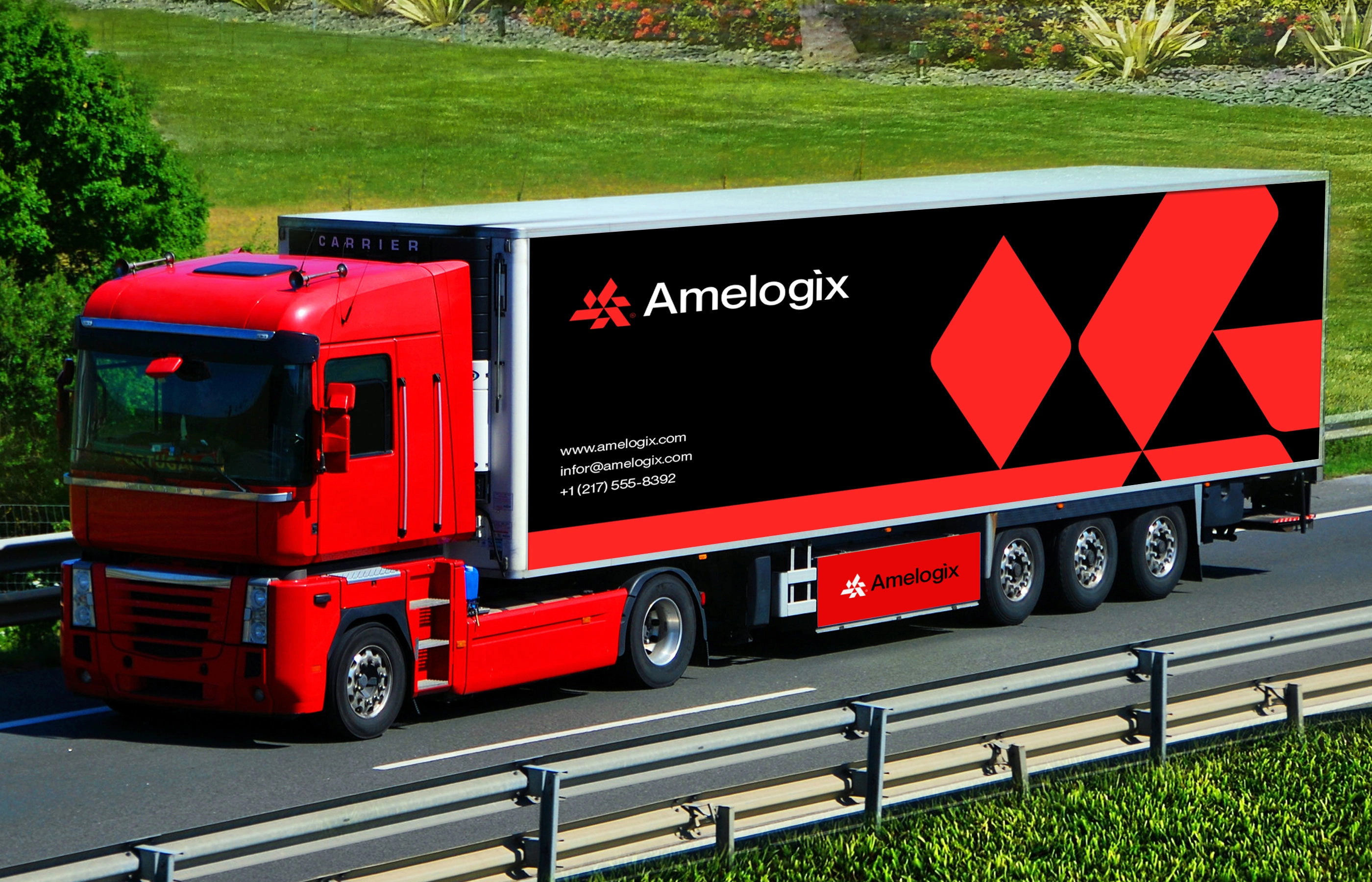
Amelogix is a US logistics company using technology to modernize how goods move from producer to consumer. The identity needed to feel fast, dependable, and forward-thinking — on a shipping label, a fleet livery, or a pitch deck.
The Problem
Logistics branding is crowded and generic — arrows, globes, trucks, wings. Amelogix needed a mark that stood apart while still signaling speed, precision, and reliability, without falling back on literal transportation imagery.
The Solution
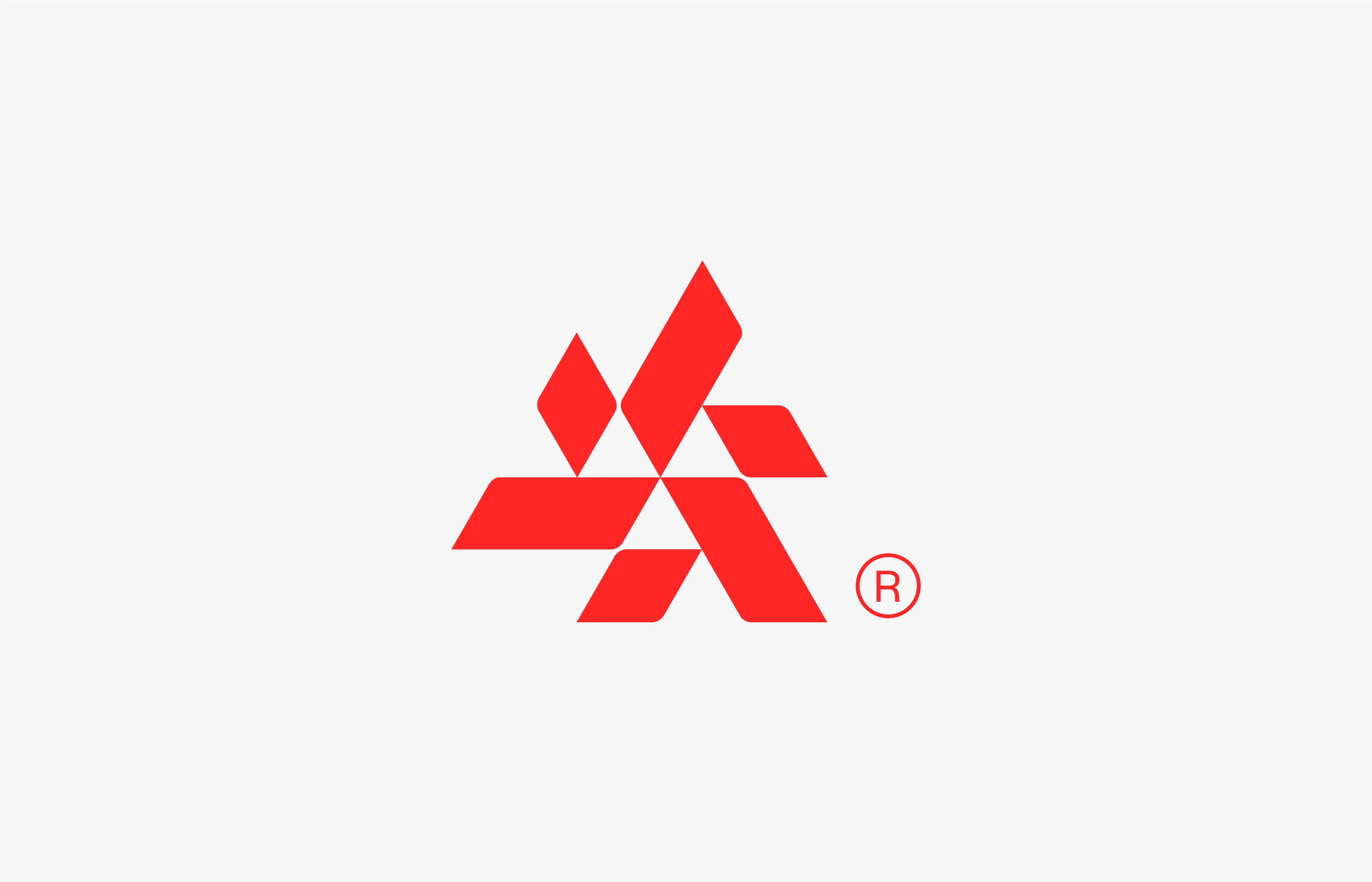
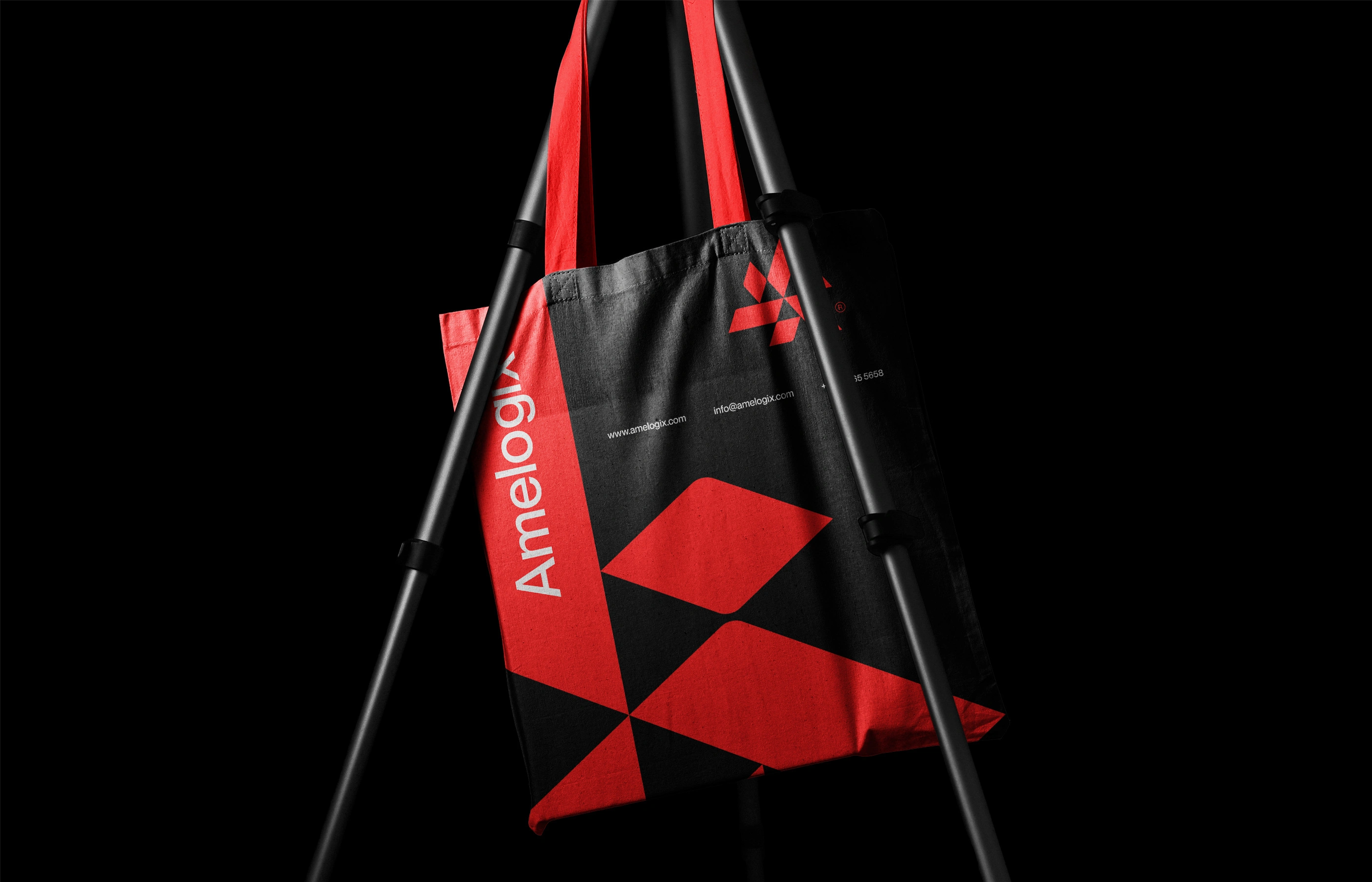
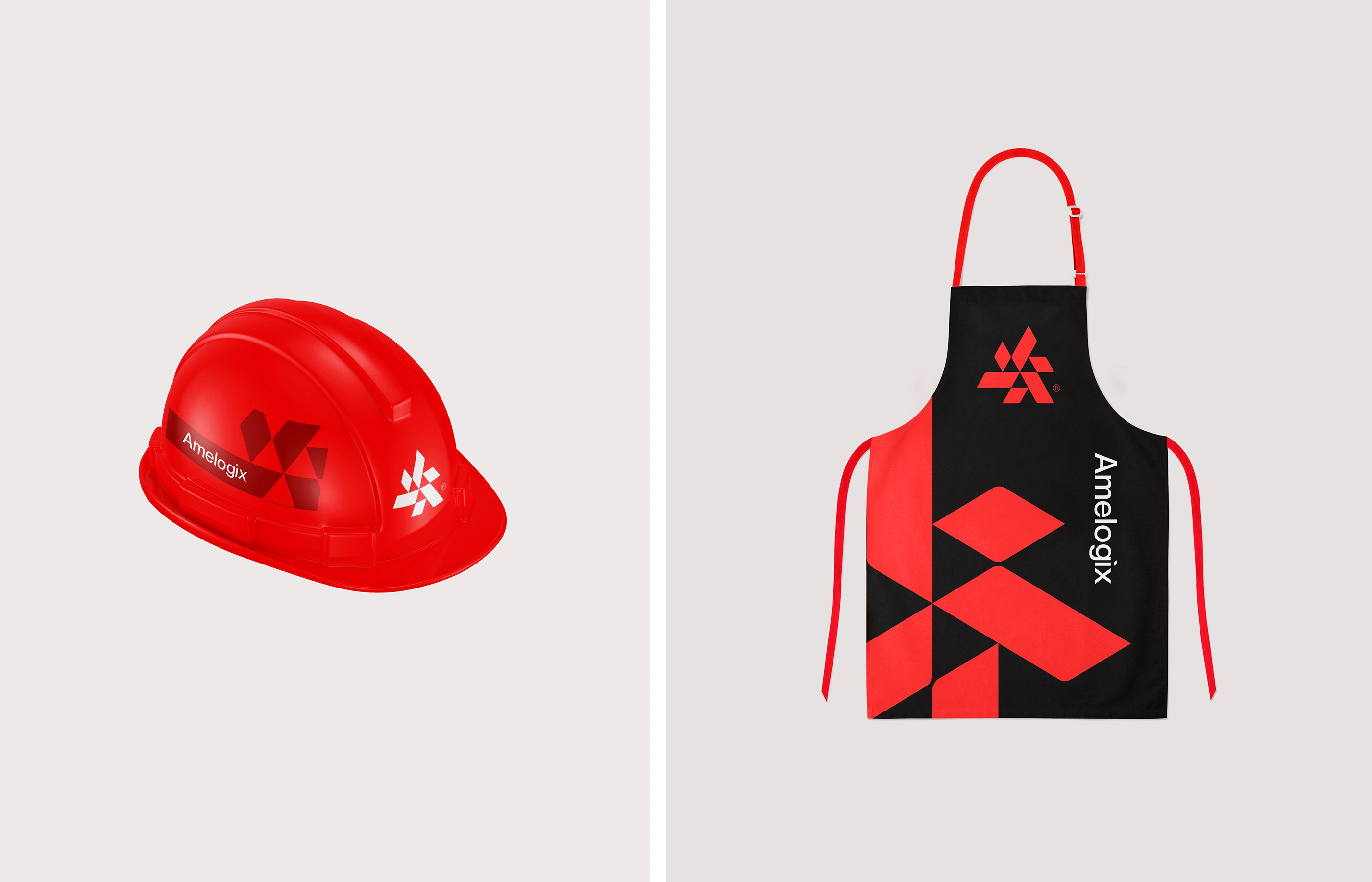
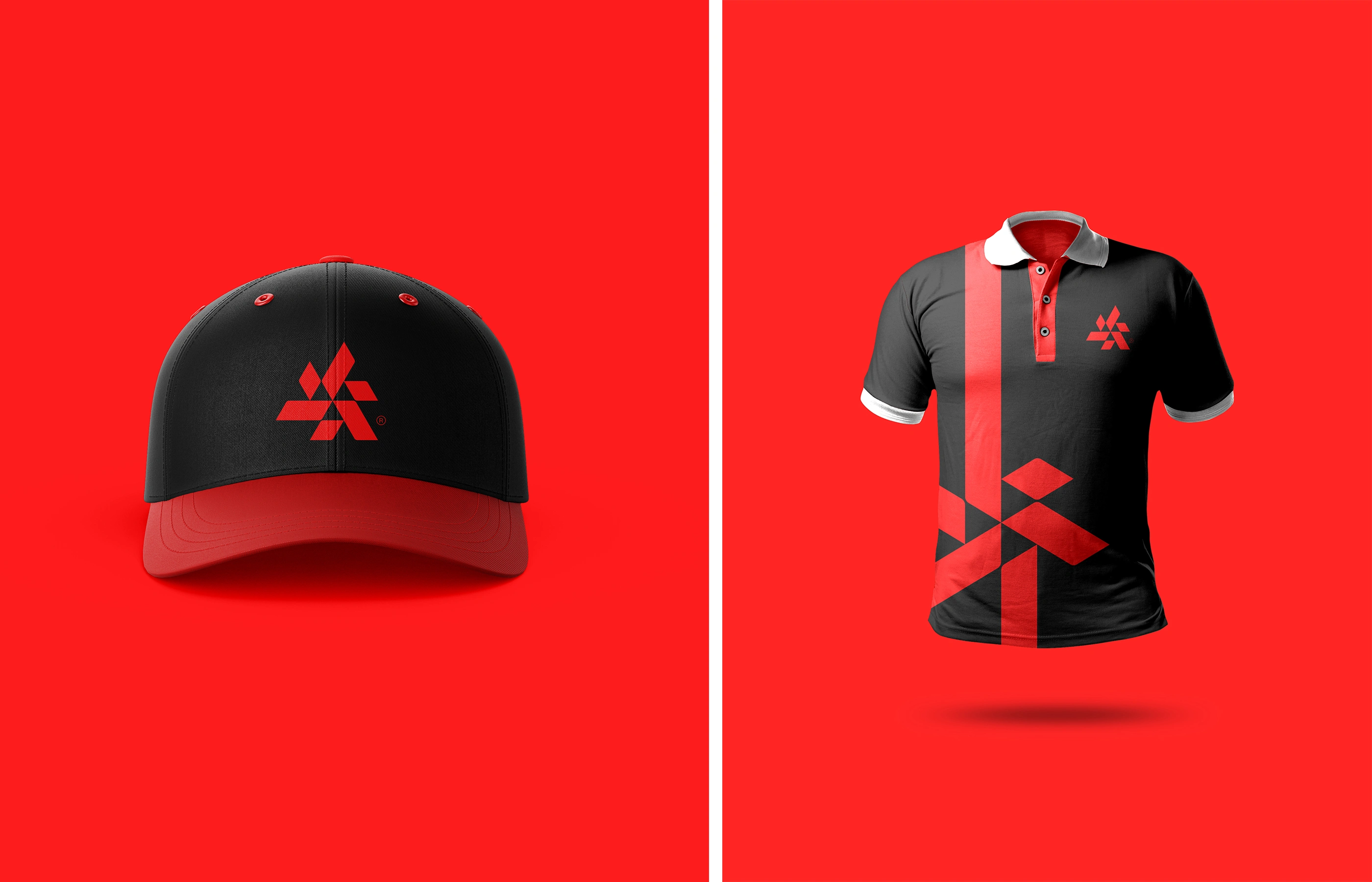
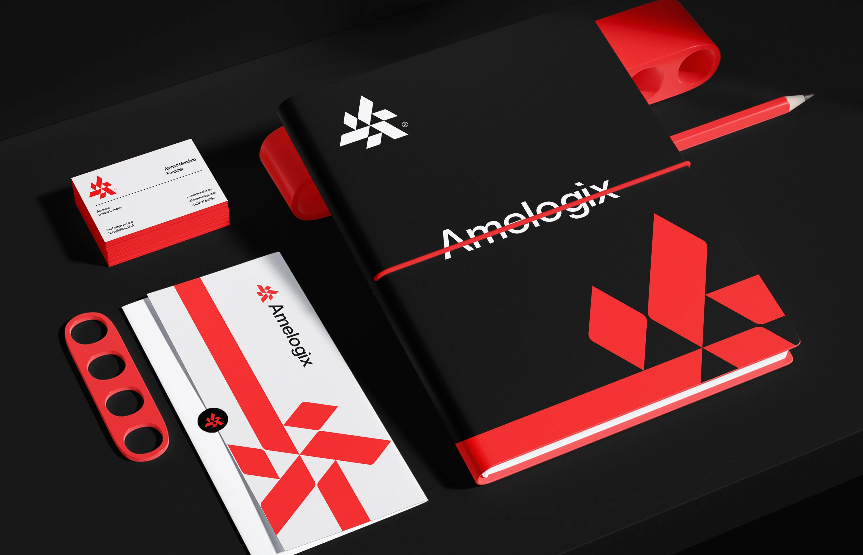
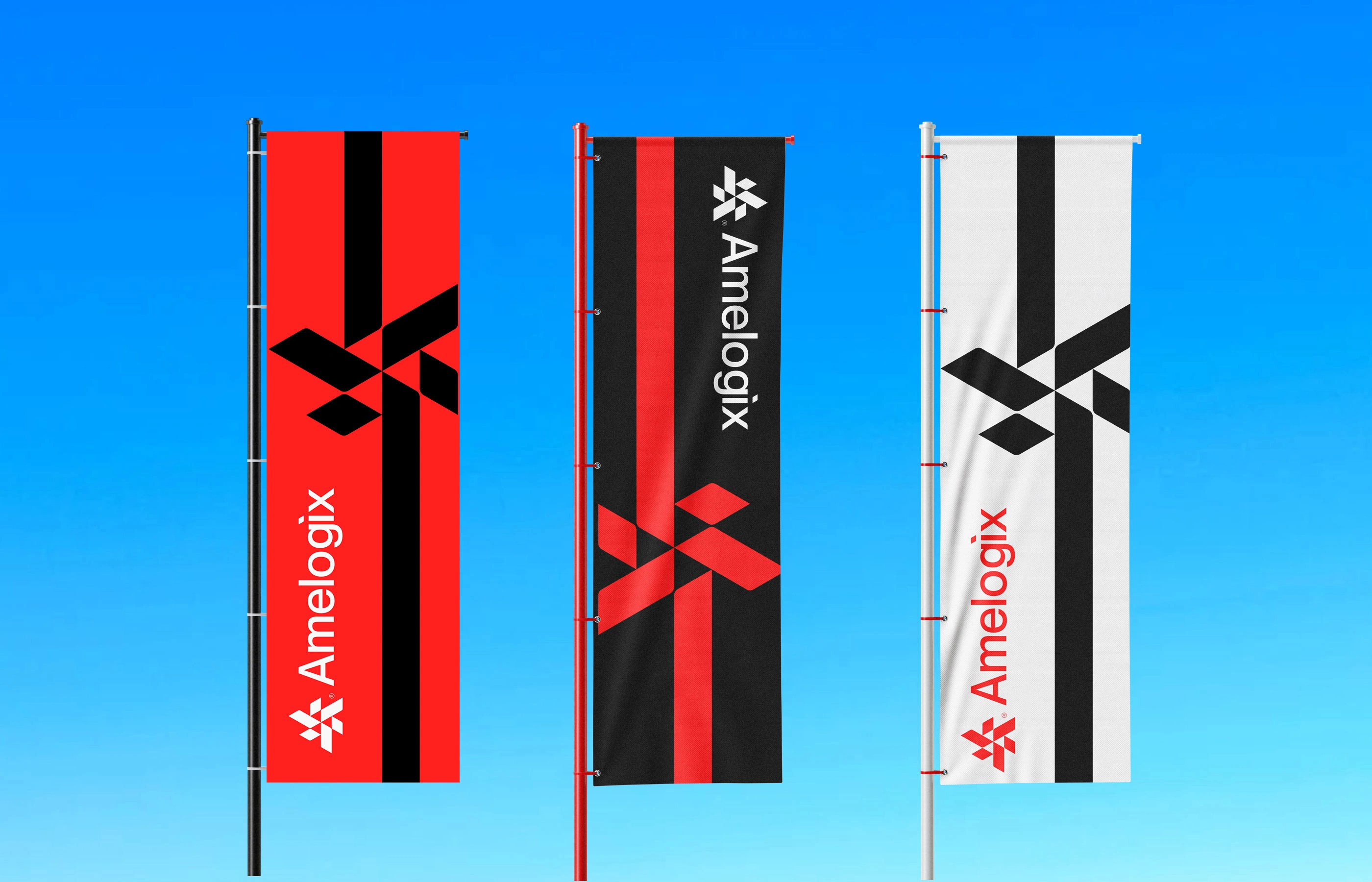
A custom geometric monogram — a faceted "A" built from a strict pixel grid and repeating diamond modules. The angular, modular form suggests routes, nodes, and motion, while its engineered symmetry signals precision and trust. A high-contrast red, black, and white palette adds urgency and confidence; Neue Montreal typography keeps it clean and legible at any scale. The full system — grid, clear space, color, and type — was documented for consistent use across fleet, packaging, and digital.
Target Audience
Businesses seeking 3PL and supply chain partners
E-commerce and retail brands needing freight and last-mile solutions
Investors and B2B partners evaluating the company
Internal teams applying the brand across touchpoints
Industry Fit
Built for logistics, freight, and transportation tech — but the modular grid system adapts well to any operations-driven or B2B tech brand.
Competitive Landscape
Amelogix competes with players like FedEx, XPO, Flexport, and Convoy. Where most rely on literal icons or corporate blue, Amelogix stands out with an abstract geometric mark and a bolder red-and-black identity — reading as a modern, tech-native alternative in a conservative category.
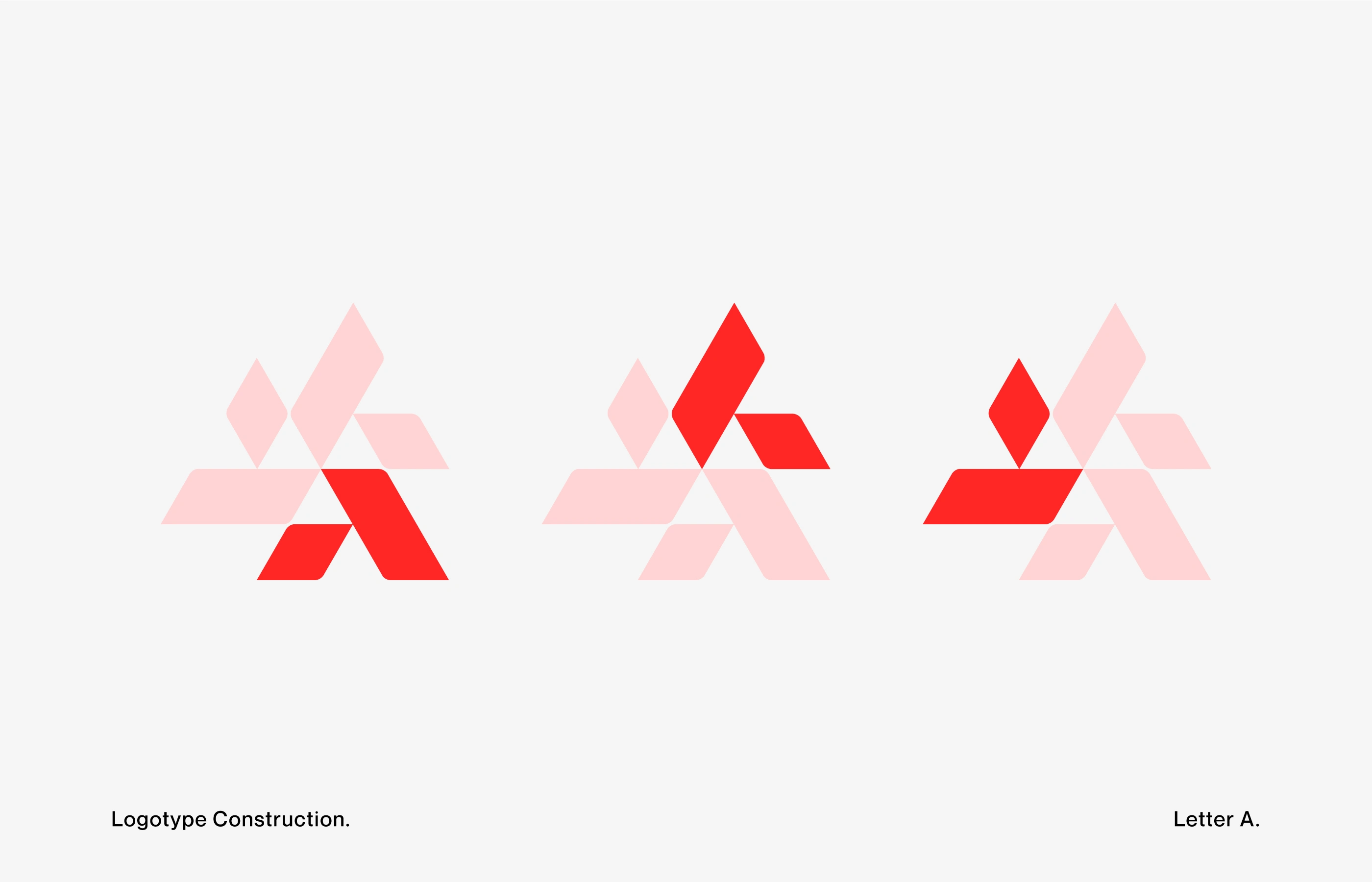
Logotype Construction (3 variations) —
Shows the modular buildup of the mark through layered diamond and parallelogram forms, illustrating how the geometric system creates depth and movement.
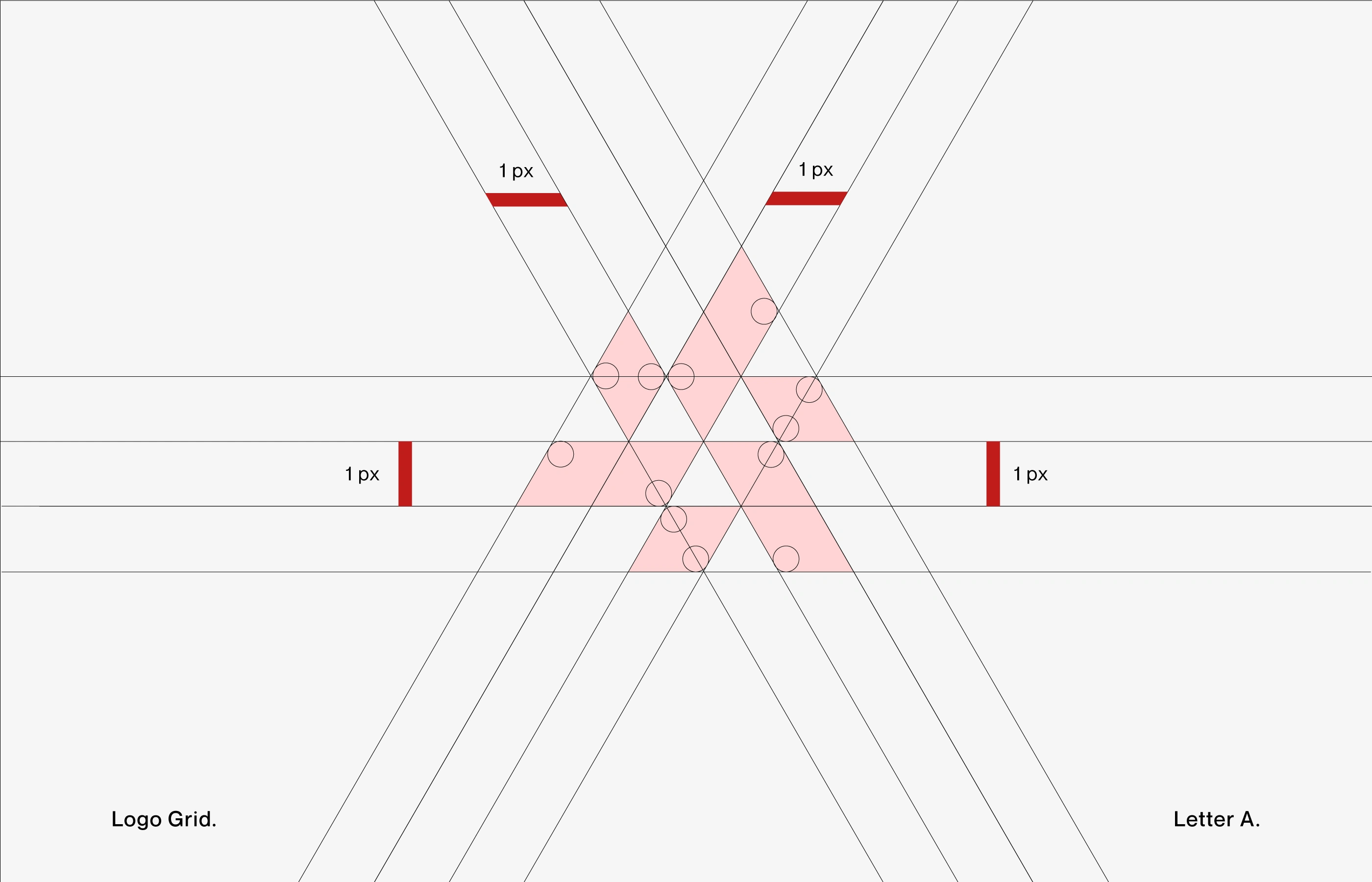
Logo Grid & Construction —
Documents the precise pixel-based grid and angle system used to build the "A" monogram, ensuring the mark can be reproduced accurately at any scale.
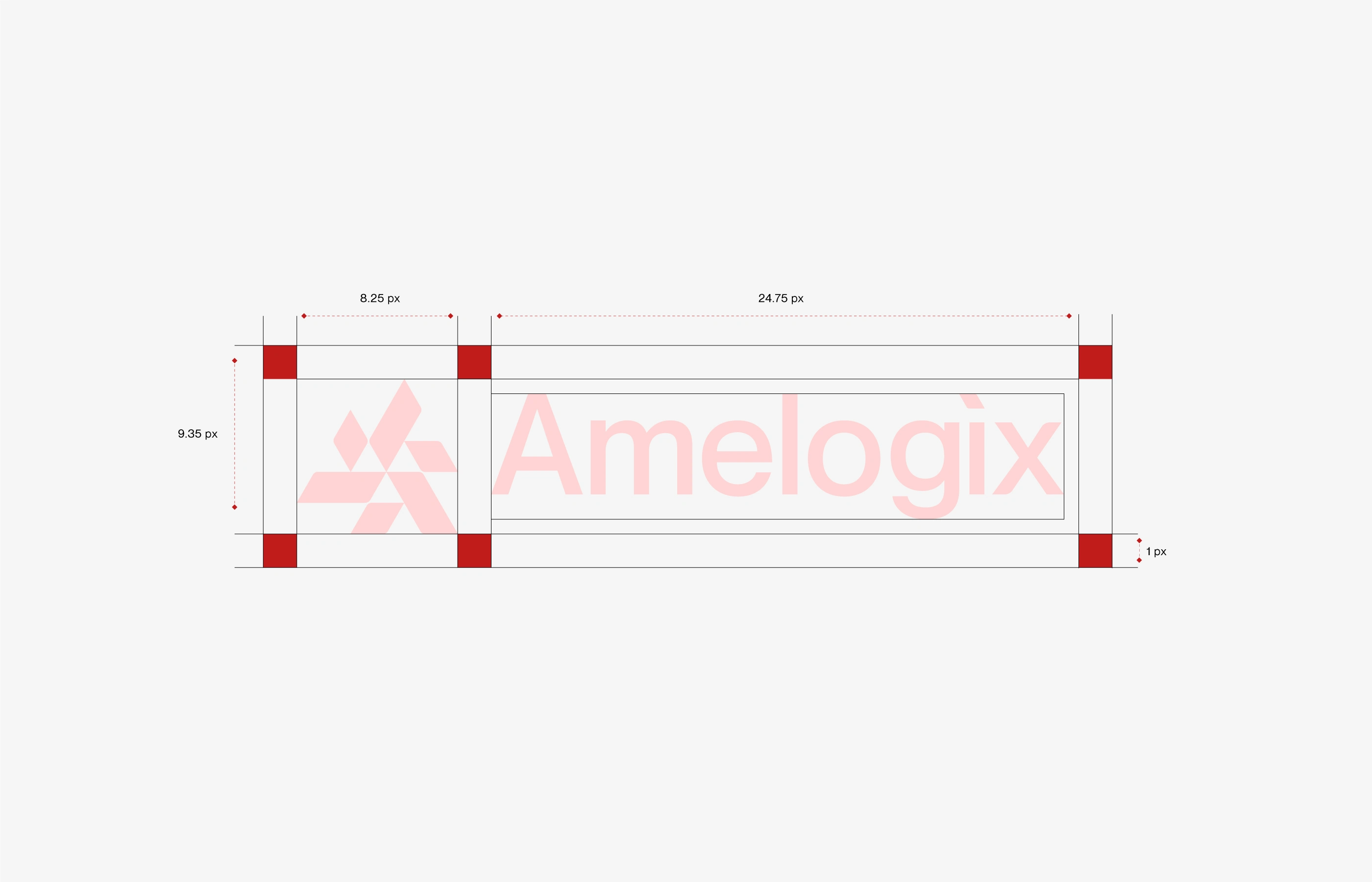
Logo Clear Space & Lockup —
Defines the minimum clear space and proportions around the "Amelogix" wordmark lockup to protect the mark's legibility across applications.
Color Palette —
The brand's four-color system: Bright Red (
#FF2626), Black (#000000), Dark Crimson, and White Smoke (#F5F5F5), specified in Hex, RGB, CMYK, and HSL for print and digital consistency.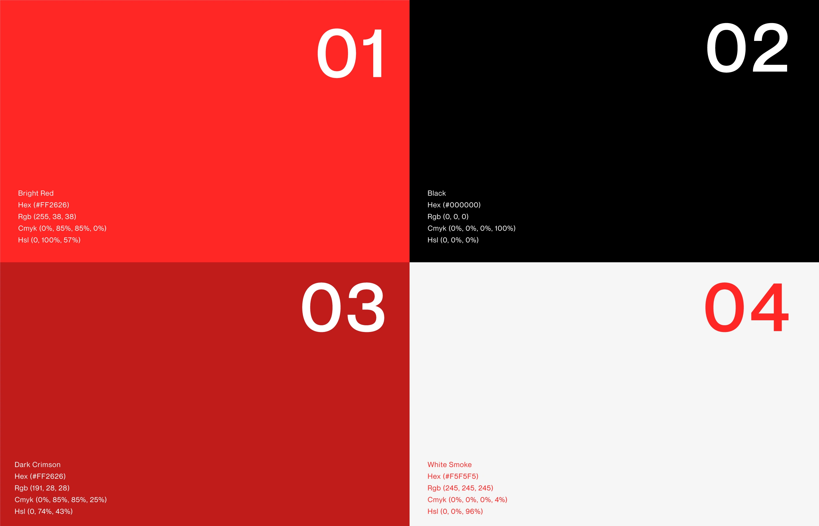
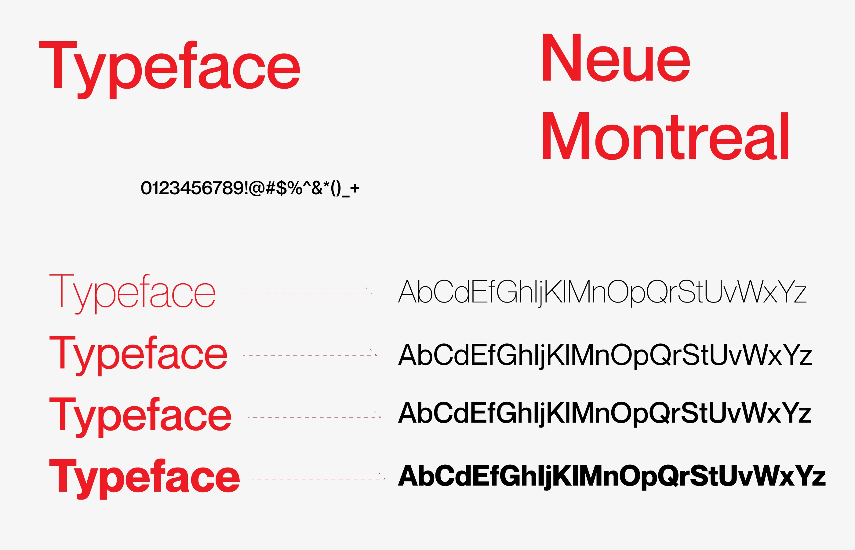
Typography —
Neue Montreal in four weights, selected for its clean geometric character that complements the precision of the logo mark.
Like this project
Posted Aug 12, 2026
Amelogix is a US logistics company using technology to modernize how goods move from producer to consumer.