
The problem wasn’t booking an appointment.
It was everything patients had to do before getting there.
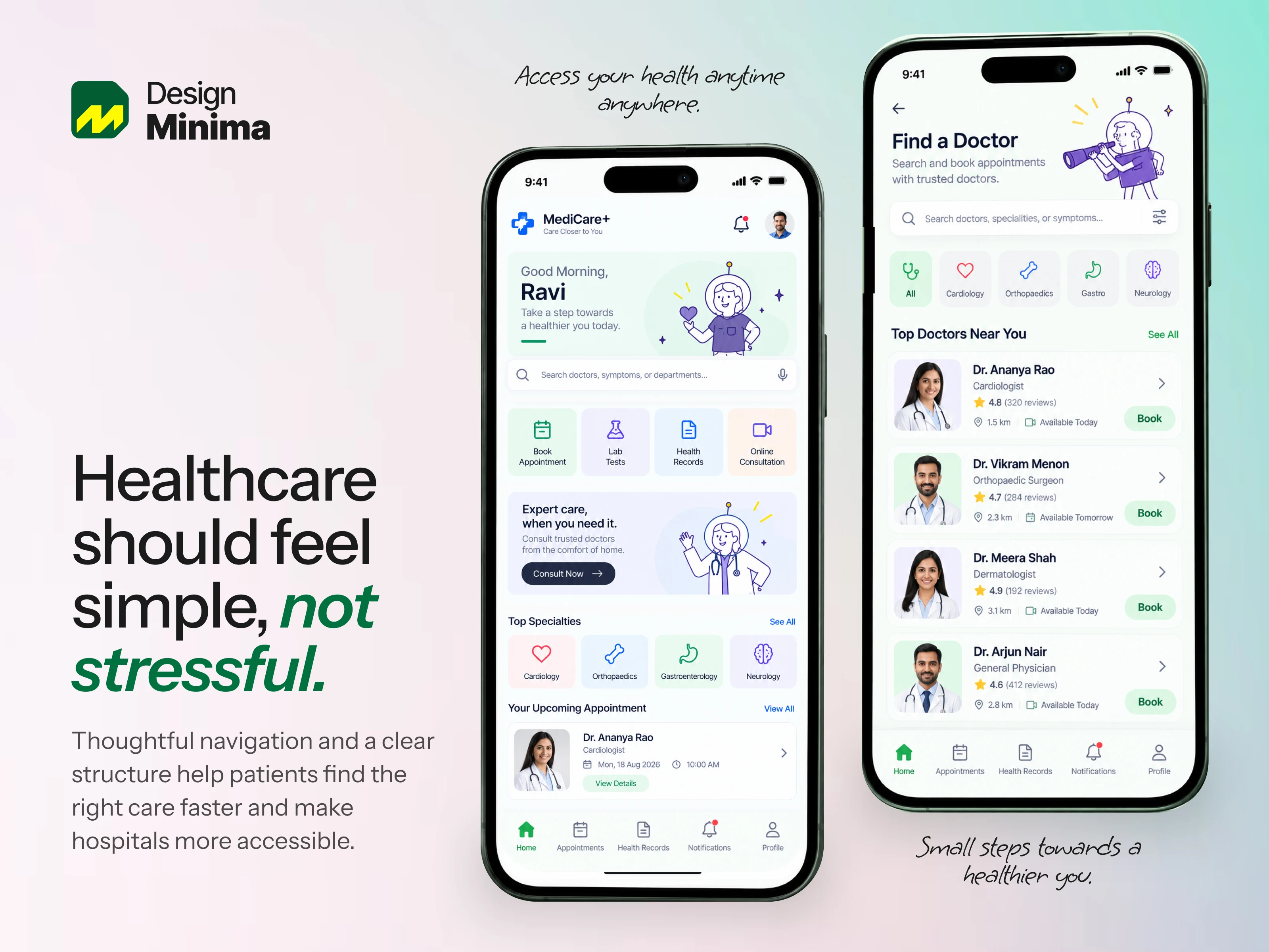
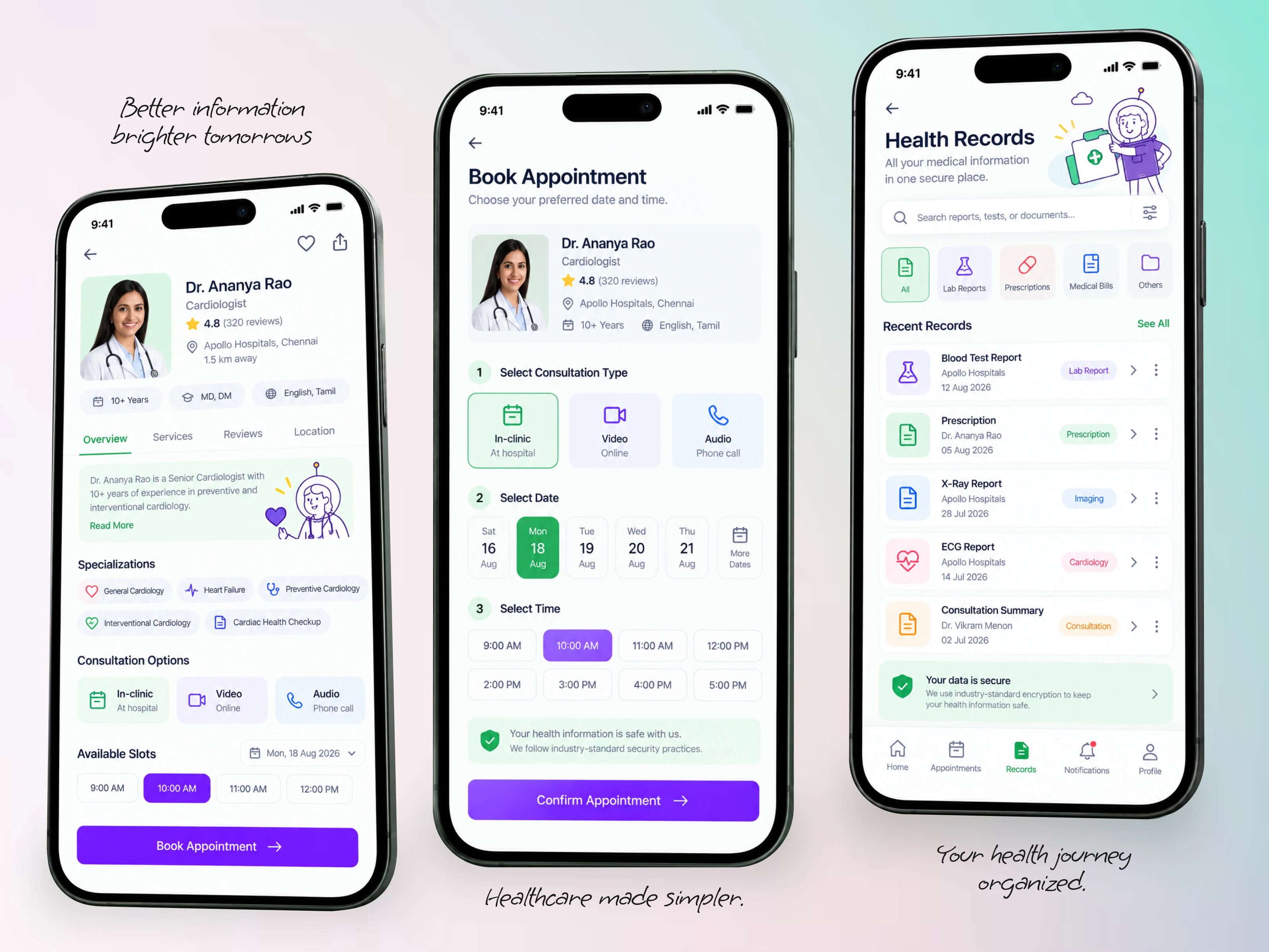
For this healthcare mobile app concept, I redesigned the patient journey around the actions that matter most:
Find Care → Choose Doctor → Select Time → Book → Manage Care
Before: 6 steps to reach booking
After: 3 clear steps
Impact: 50% fewer interaction steps
The experience focuses on clearer navigation, faster doctor discovery, simplified booking, and easy access to health records.
The goal wasn’t just a cleaner interface; it was to make accessing care feel easier.
Have a healthcare or SaaS product that needs a better UX? Let’s work together.
Schedule a call: https://cal.com/d-minima/30min
Mail: hello@designminima.com
#HealthTech #HealthcareUX #HealthcareDesign #DigitalHealth #HealthTechDesign #ProductDesign #UXDesign #UIDesign #MobileAppDesign #AppDesign #UXCaseStudy #ProductDesigner #SaaSDesign #PatientExperience #UserExperience #DesignMinima
0 likes · 0 views · Sep 24, 2026
The problem wasn’t booking an appointment. It was everything patients had to do before getting there. For this healthcare mobile app concept, I redesigned t...

