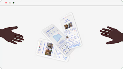
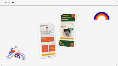
Adding Feature Case Study
Prioritizing how users organize files and optimizing workflows in Figma.

My Role
Feature Analysis, Product Optimization, UI Design, User Research + Testing
Timeline
3 months
Tools Used
Figma / Figjam, Slack, Miro, Notion, Mural, Adobe Photoshop + Illustrator, UsabilityHub, Maze
Defining Existing User Problems
Figma is an interaction design software tool that aids various interface sizes, and makes sharing and synced collaboration on projects possible.
People who have previously used design tools report a shorter learning curve than those with no design background, but every user interviewed has relied on video or article tutorials to aid the learning experience.
Figma is accessible through its site, desktop and mobile applications. Current users have the following issues while utilizing Figma to accomplish design aims:
1. Not organizing files on Figma, or only organizing to a limited extent, because the system in place requires too many steps and does not feel intuitive. Users express a strong desire to have better organization systems in place on Figma.
2. Are frustrated by not being able to open another file while working on a file. Their behavior indicates that opening multiple files for reference while working on current files is very common, in order to revise and update files simultaneously or transfer content over from other files.
3. Want tutorials to be accessible as problems arise, as opposed to spending time searching for a solution (internal vs. external tutorials).
User research indicates that users have a strong desire or need for file classification, but feel overwhelmed and dissatisfied with the current ‘Teams’ system. It confirms that users are discontented with referencing multiple files easily while working on a file. If our users are able to accomplish this, their workflow can become more efficient and they themselves will feel less frustrated in the process of designing.
Designing Useful Features
The updated features on Figma speak to our user’s frustrations in accomplishing their end goals of designing deliverables for coursework, brainstorming, and work projects. In creating systems of organization that are familiar with the user’s understanding of the real world, I allow users to more easily reach these aims and prioritize what needs to get done.
Misplacing items is a commonplace grievance - how many times have you lost your keys, wallet, or phone and spent a significant time looking for those items? Since Figma is used by educators, students, and professional teams, keeping track of large amounts of information is greatly sought after. Figma’s current users ultimately want to access their previous works and to be able to find relevant files, hassle-free.
The new version of Figma directly resolves user confusions of
- not being able to organize files through a familiar path
- not being able to access other files while keeping the current file open through adding a folder
by:
︎︎︎ establishing a project folder system where users can easily drag and drop files and create sub folders, which aligns with user understanding of organizing individual files
︎︎︎ developing a straightforward process to reference to multiple files while currently working on a file, keeping in mind users frequently reference past works to complete work on the current file
︎︎︎ positioning the open feature under the Figma logo, where users instinctively locate to as the first potential location for this feature
In comparison with the unupdated Figma, Figma’s current organization system is ‘Teams’ and there is no open feature present on the web. While our users love the collaborative aspect of Figma across the board, 83% expressed dislike or disinterest in the structuring apparatus.
Recurring complaints:
︎︎︎ taking too many steps to accomplish grouping files
︎︎︎ uncommon naming conventions
︎︎︎ non-central location (not knowing where to navigate to find file groupings)
Additionally, 33% of users stopped using the in-place site to access Figma because there is no way to open existing files from an already open file.
Here is the final site revision:
Screenreader support is currently disabled. To enable it, use the Accessibility settings from the Options menu.
To conduct research with Figma’s users, I recruited six participants that are actively using Figma on a consistent basis to interview about their conventions, deliberation, and courses of actions taken while on the platform.
I then met with each user and collected a combination of responses regarding Figma, as well as observing their decisions while on the site and desktop application. On average, our six users accessed Figma 3-4 times a week for sessions that would last 6 hours depending on the scope of the project they would be working on.
Here are the most common themes that arose as a result of observational and experimental data clustering. The most unexpected insights to come out of interacting with users was how many potential regions of improvement exist - while Figma does fulfill fundamental needs of users, the roadway to the final goal can be tedious.
This process helped me determine which aspects of Figma are not aligning with user anticipations & familiarity, and what would be most valuable if new features are implemented (or modifying/expanding existing features).
Here are the results of six in-depth interviews with individuals frequently employing Figma:


Sketching low fidelity wireframes allows for organized content placement and refining the thought process behind the actual design. I experimented with multiple layouts and referred to Figma’s current framework to reach the general outline of the folder and open features.The changes made based on the usability testing resulted in significant improvements to the Figma user experience, and the prototype received positive feedback from users and industry experts alike - 100% of tested users preferred the modified version of Figma, and reported regular use of both features when using Figma. The simplified navigation and clear sorting apparatus made the tool much easier to use, and there was a high enjoyment feature as reported by our users.
Ready for Handoff
Following several rounds of user testing, Figma’s open and folder features are ready for development.
Style Guide
Using Figma’s existing branding to create seamlessly incorporated features.
Development Stage
Comparing our final product to web content accessibility standards and product design principles, I can report that our designs:
︎︎︎ prioritize the added value to Figma as a product
︎︎︎ reduce user effort required to complete and understand tasks
︎︎︎ are visually consistent with the rest of the product site
︎︎︎ consider hierarchy when it comes to where features are located
︎︎︎ navigable and readable by users
Communication with software developers includes digital and physical assets, explanations for paths taken, answering questions as they arise, and keeping a meticulously organized system for ease of access during product building.
Project Outcomes
Figma’s new features are very well received by current users and reduce time and energy needed to systemize and access relevant files.
Project Conclusion
Welcome to the end of this case study, where Figma has gained two powerful features that are dedicated to user friendliness. These add-on features have been designed to improve product usability by providing a simplified experience when organizing and searching through files. As a result, Figma is able to gain a more competitive advantage in the market and increase customer satisfaction and loyalty.
The success of the usability testing and resulting improvements demonstrated the value of user-centered design (happiness to product designer ears) and the importance of incorporating user feedback into the initiation and development process.
What I Would’ve Done Differently ︎
- if given more time during this project, I would have designed an internal nesting for Figma tutorials on the actual product site so that users can learn design skills rapidly
- further iteration with wireframes prior to deciding on a final result - mistakes or shortcomings allow for creative questioning around what needs to be accomplished with new features
- make adjustments early on - if discovering issues with the UI or uncovering new themes during user interviews, go with the direction that the research dictates!
What I’m Thankful For ︎
Thanks to AIGA for offering so many opportunities for design meetups, as well as Tech Girls Social for introducing me to product design leads and developers. I deeply appreciate my users for enthusiastically participating in ongoing studies, and for offering essential insights in the formation of this project.
I am incredibly grateful for my mentor, Meeta Mathur, and my classmates for offering invaluable advice and pushing deeper to uncover new design insights and directions.
I am also incredibly grateful for my family and my cats, who support me by sitting on my lap as I complete each design project. I am grateful for my friends in offering their knowledge and skills to aid my endeavors, in more ways than one. Finally, I am indebted to spicy tofu soup, which nourishes and sustains me as I work.
Design Reflections︎
I have previously held roles in design that changed my perspective on the ways in which I interact with the world and how people connect with each other. I have loved engaging in multiple projects related to sustainability, social justice, and science education. I am passionate about creating digital products that can change the user’s interaction as the initial stages of user research and ideas turns into practice.
As a UX Designer, I am confident and prepared in advocating for user needs to drive the longevity and success of digital or physical products and services. I’ve learned about the diversification of options at every stage of the design process - there isn’t just one way to solve a problem, but rather many to explore, experiment with, and use towards deriving final insights.
This is a project that I am incredibly proud of, because it allows users to derive high gains out of initial encounters with Figma. I love Figma and am a proponent of the design tool myself, so seeing other users love the new additions as well is incredibly rewarding. I have achieved my purpose as a designer to help people!
Like this project
Posted Jun 21, 2023
Prioritizing how users organize files and optimizing workflows in Figma.
Likes
0
Views
15


