
Four letters. One of them had another job to do.
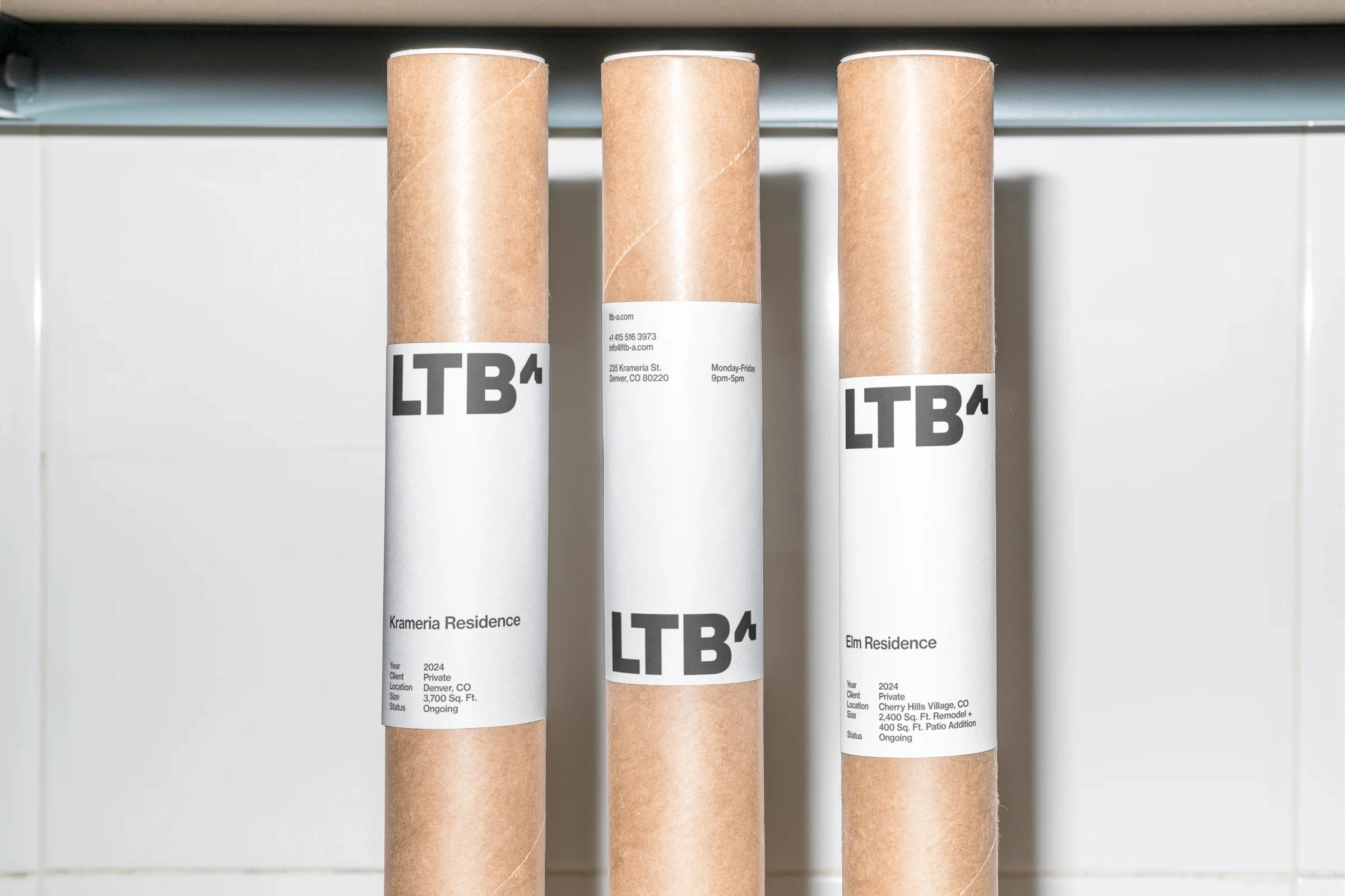
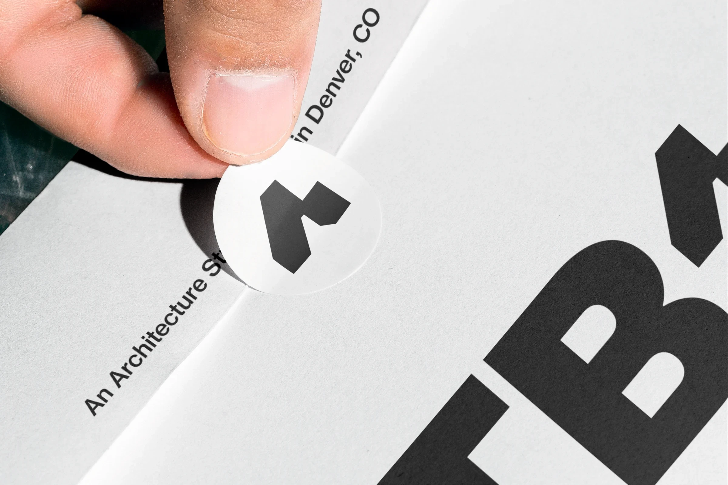
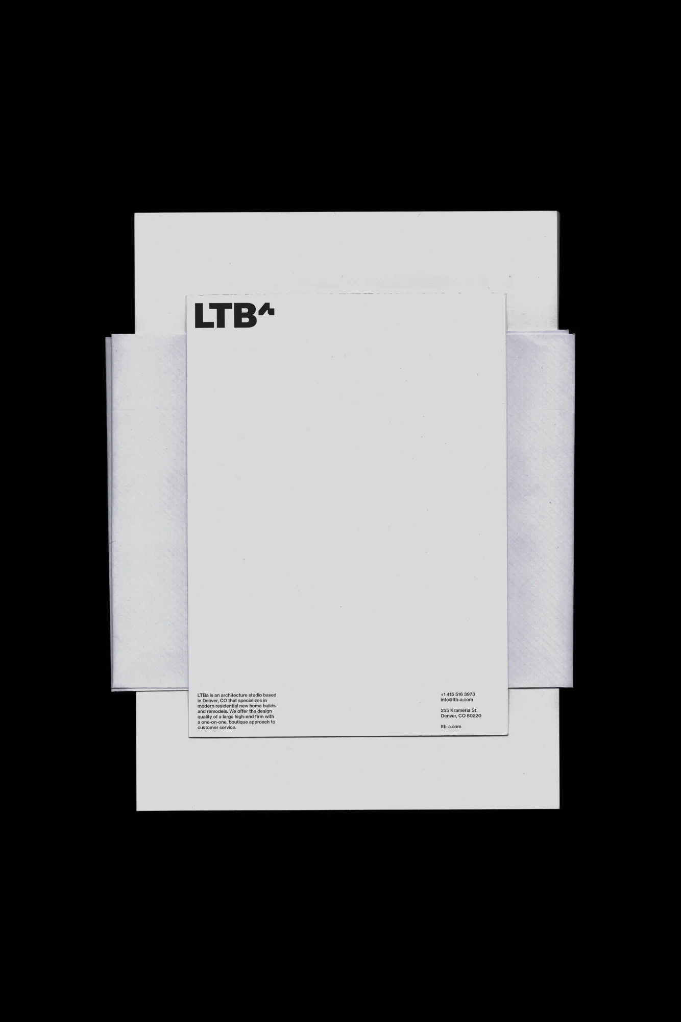
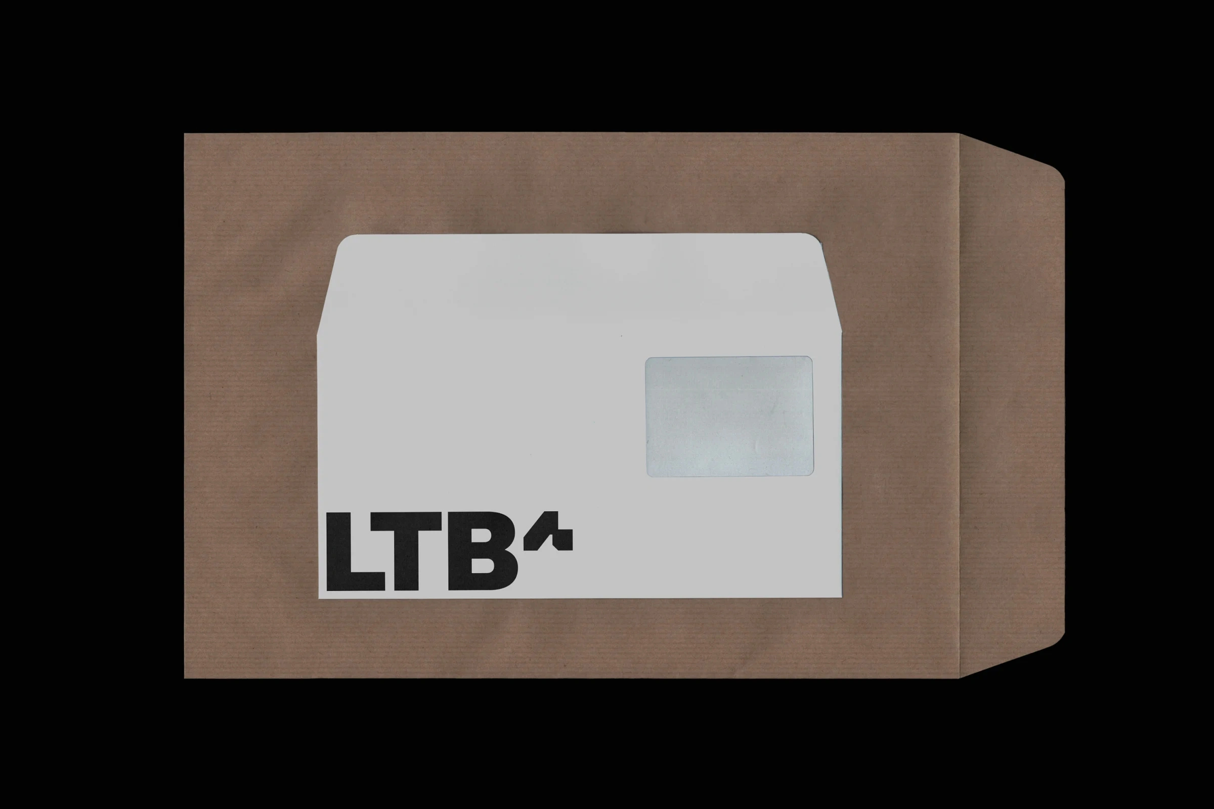
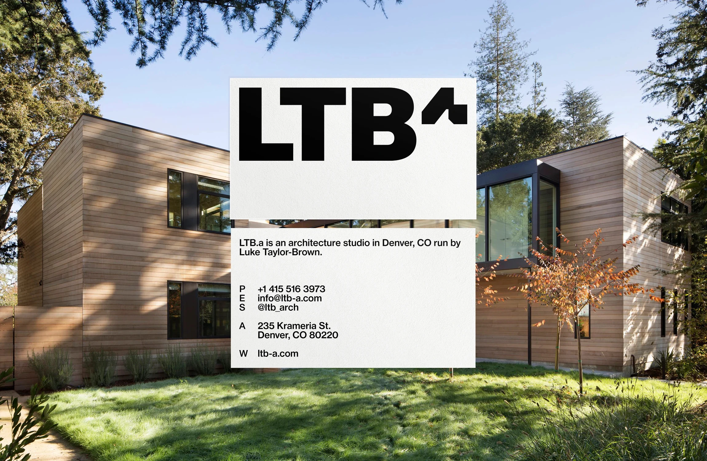
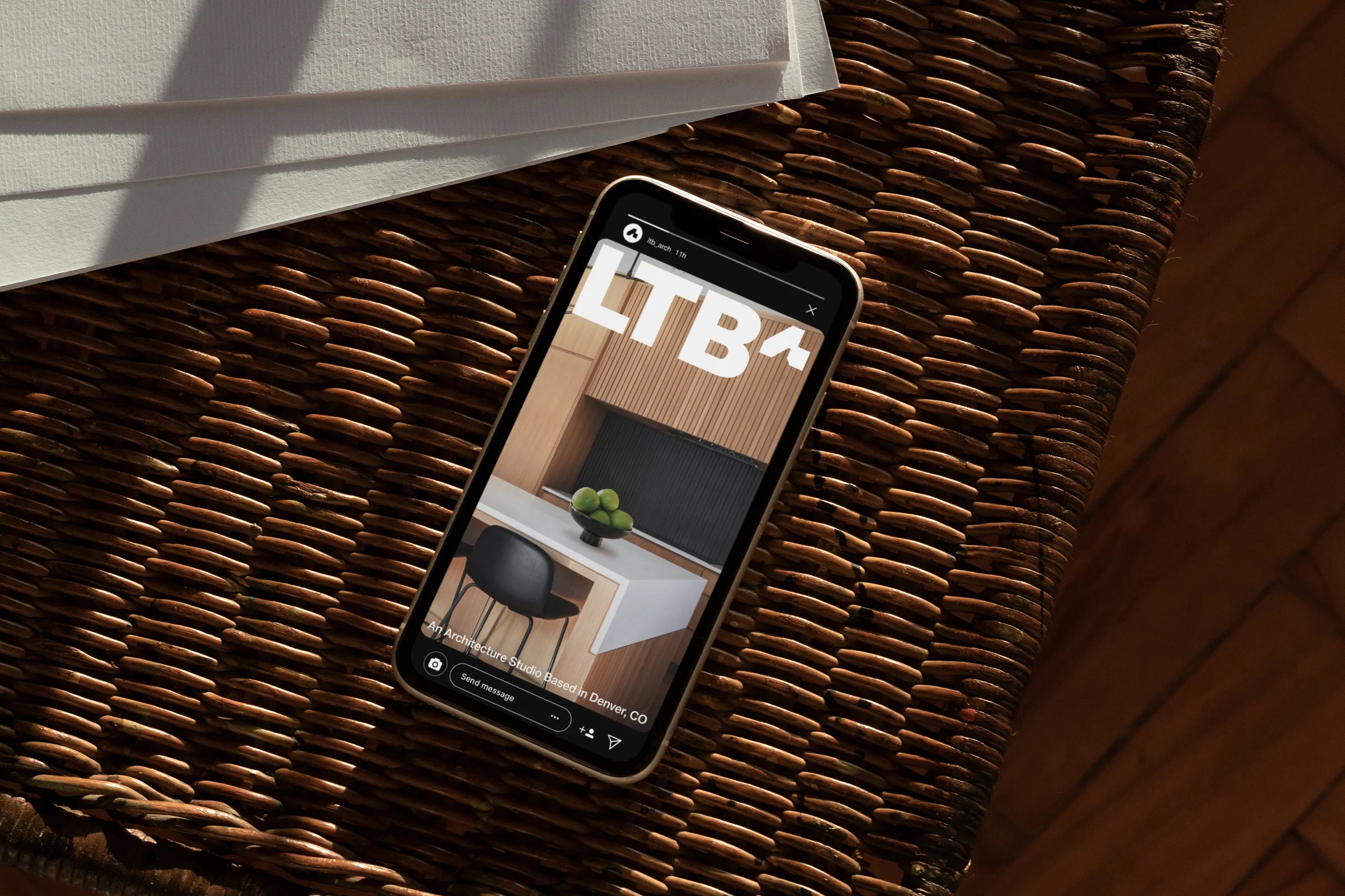
LTB.a wanted an identity that reflected a thoughtful, personal approach to architecture. We kept the abbreviated name and turned the “a” into a house-like symbol. It completes the wordmark and stands on its own when space is tight.
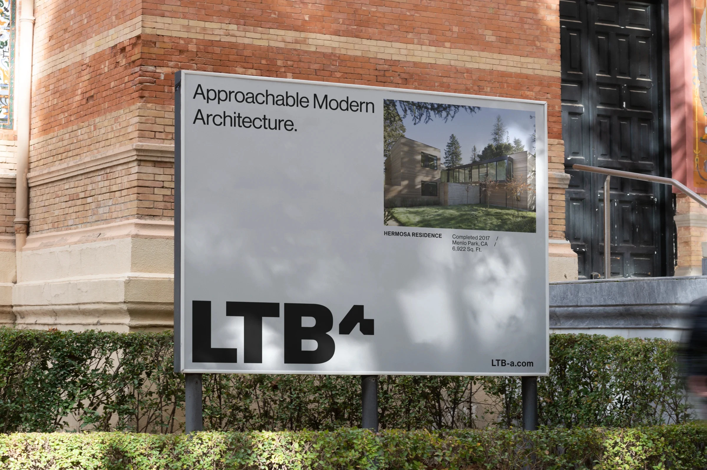
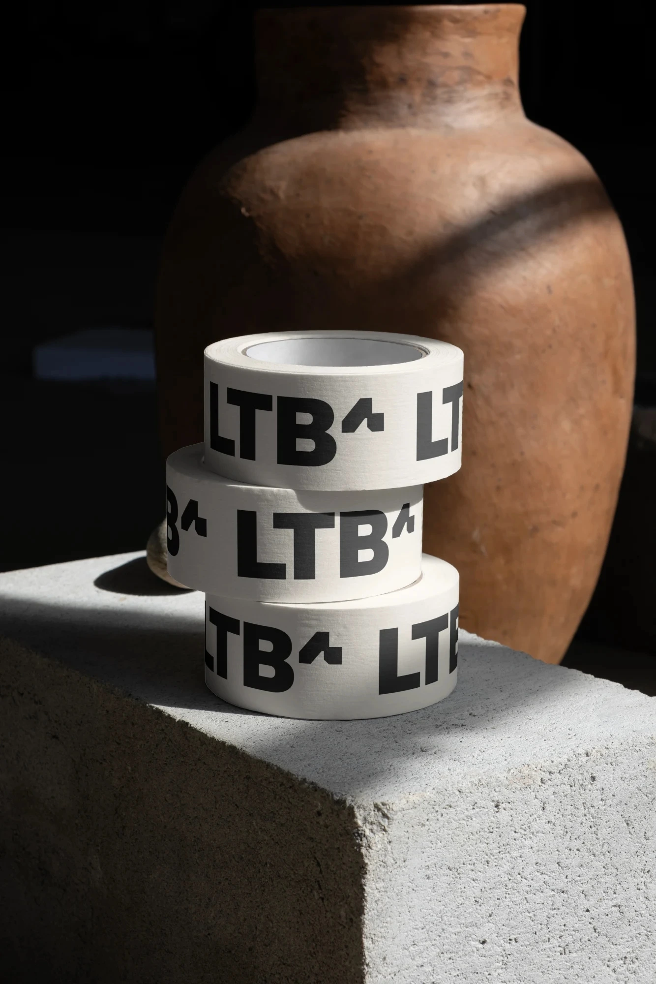
The proposed direction pairs restrained typography with tactile print materials, signage concepts and a website concept that lets the architecture lead. The story centers on the founder’s approach to homes as personal retreats.
This is a proposed concept by Anchovies. The client chose to keep his existing identity. We’re sharing the direction because we still believe it deserved a life outside the presentation.
0 likes · 0 views · Nov 17, 2026
A proposed identity and website direction for an architecture studio, built around a house-like “a” symbol.