UX Case Study: Helping Employees Find Balance
Ashley Bragg
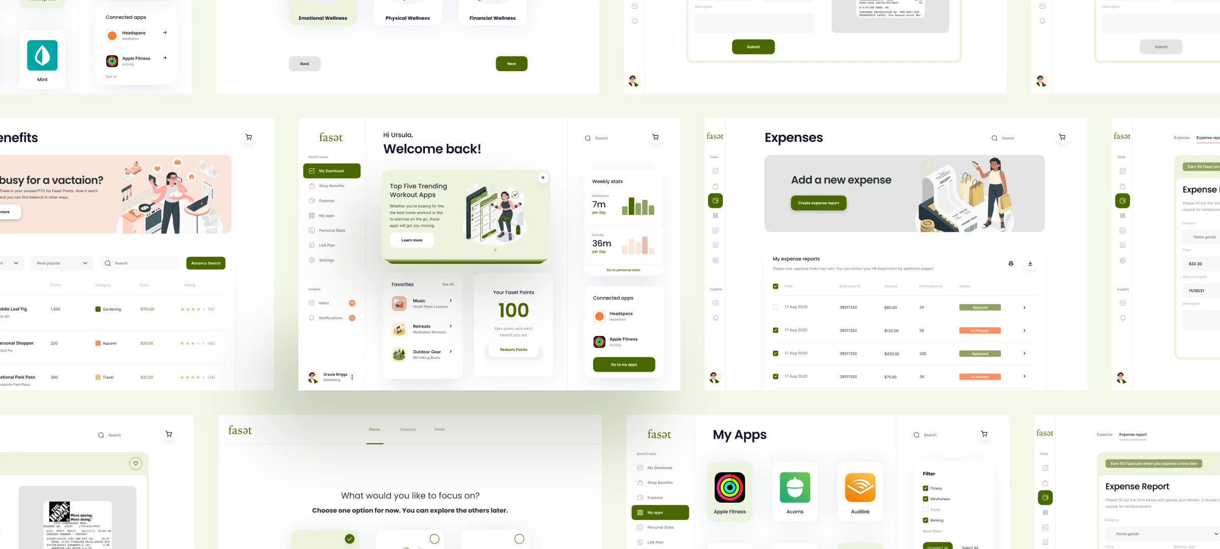
Faset is a product designed to help employees take advantage of their Lifestyle Savings Accounts. With Faset, users can earn Faset points and spend them at participating retailers in the physical, emotional, and financial wellness spaces. Additionally, they can expense approved items to their LSA accounts. At first launch it will be available in a Desktop responsive-web app
Team
UX Designer - Ashley Bragg
UX Researcher - Raul Flores
Project Manger - Kayla Haselein
Duration
8 Weeks
Background
Lifestyle Spending Accounts (LSA) are a means for employers to help their employees pay for health and wellness expenses, and sometimes other costs that aren't typically covered under a group health plan. Employers who offer an LSA choose what expenses get reimbursed and how much each employee gets.
What is Faset?
A product designed to help employees take advantage of their Lifestyle Savings Accounts. With Faset, users can earn Faset points and spend them at participating retailers in the physical, emotional, and financial wellness spaces. Additionally, they can expense approved items to their LSA accounts. At first launch it will be available in a desktop responsive web app
The Problem
The current user experience for employees at mid to large-sized companies with Lifestyle Savings Accounts is not optimal. Employees are facing challenges in understanding the benefits and how to use their accounts within the physical wellness, emotional wellness, and financial wellness spaces. As a result, employees are struggling to achieve work-life balance and this is impacting their overall job satisfaction. To address this issue, there is a need to design an easier and more intuitive user experience that helps employees understand the offerings and how to use them effectively. This will not only improve the employee experience but also help companies to retain and attract top talent in a competitive job market.
Desired Outcome
Our goal was to design a product that enables employees at mid to large-sized companies to confidently use their Lifestyle Savings Accounts at participating retailers within the physical wellness, emotional wellness, and financial wellness spaces. The aim is to create an easier and more intuitive user experience that helps employees understand the offerings and how to use them effectively.
Design Process
Conception
Research
Architecture
Design
Prototyping
Test & Iterate
Reflection & Next Steps
Research
To start the design process, Raul and Kayla conducted user interviews with 6 employees from different companies with a variety of job roles. The interviews aimed to understand their current experience with utilizing their Lifestyle Savings Accounts and the challenges they face in doing so.
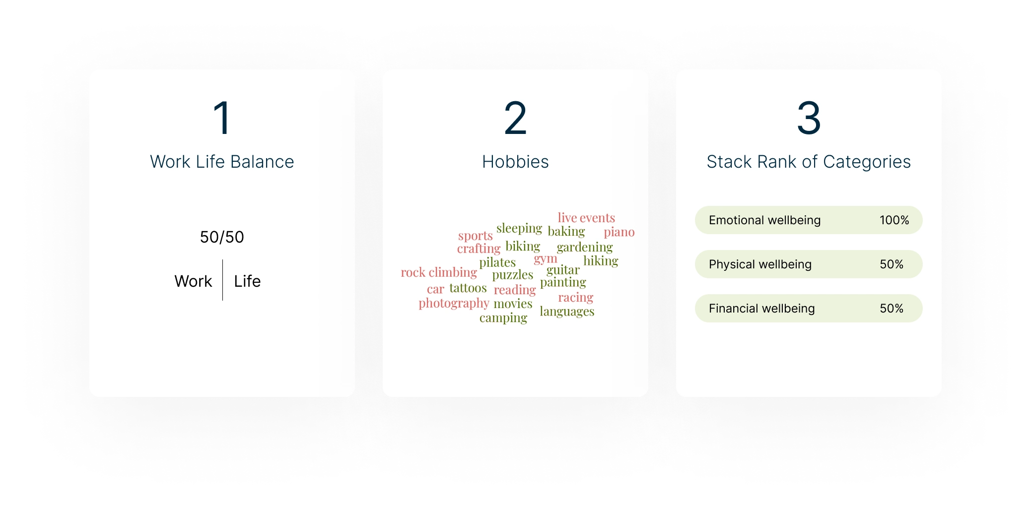
These interviews revealed that of the three categories of wellbeing we were looking at (emotional, physical, and financial) people ranked emotional wellbeing as their top priority. This insight was particularly helpful in guiding the focus of our design on opportunities in this wellness category. Additionally, 50% of users interviewed reporting feeling that their balance was off between work and life with work demanding too much of them compared to their life outside of work.
User quotes:
"We are not born into the world with money so it doesn’t matter much because you can always replace money unlike a body."
"When a company promotes working more they aren't invested in employees"
Additionally, Raul conducted a competitive analysis which dave us insight into this space and what others had successfully implemented.
From this research, as a group we identified the following user needs:
They were more concerned about emotional wellbeing than physical and financial wellbeing
Barriers of time, access, and commitments prevent users from working towards their goals and interest outside of work
Users found it difficult to understand what is covered with LSAs and how to use them
Architecture
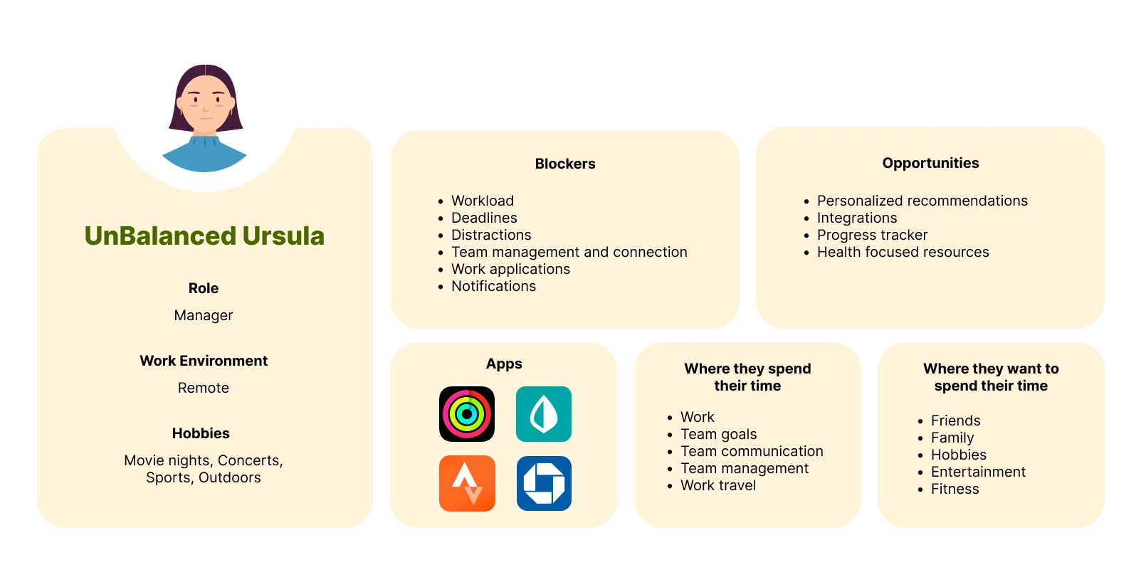
Personas
Based on the user research, Kayla and I created three personas that represented the primary users of the product. For the purpose of the case study I will be focusing on one of these personas.
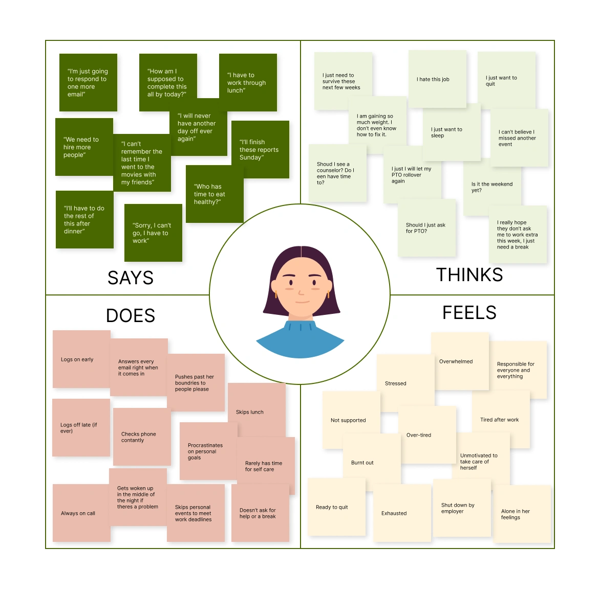
Empathy Maps
We then created empathy maps for each persona to better understand their experiences and to help remove our own experiences from the equation.
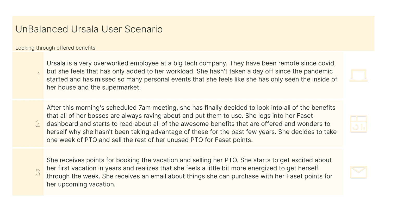
User Scenarios
Next we developed user scenarios to better understand how our product could address user needs.
User Journey Maps
We then developed user journey maps for each persona to illustrate the current experience and pain points for our personas. This helped us to identify areas of improvement and opportunities to create a better user experience.
Design
Once we had completed our exploration and research we held a brainstorming workshop and utilized a dot voting system to decide on our product road map and features.
The following were our mush have features:
Community / Gamification
Personalized metrics
Search and find / scan it / favorite
Habit tracker
Personalized dashboard
These features would be added if time allowed:
App Integrations
Badges
Corporate dashboard
Onboarding Assistant
Wire flows & Wireframes
Using the user scenarios, I then created wire flows, low fi and high fi wireframes to map out the user journey and product features. This allowed us to refine the product design and identify areas of improvement.
Exploring offered benefits
Wire flowLow Fidelity WireframesHigh Fidelity Wireframes
Brand and accessibility testing
Before designing the high fidelity wireframes we decided as a group on the brand and identity of our solution. To ensure the product was accessible to all users, I followed accessibility guidelines and conducted color tests to make sure we were meeting WCGA standards.
Prototyping
Kayla and I developed a prototype from our high fidelity wireframes. This allowed us to test the product with users in the next stage and make design changes based on their feedback.
Onboarding
Viewing offered benefits
Posting to community
Test & Iterate
To evaluate the usability of the product, as a team we conducted usability testing with 6 new participants interviewing two people each. In these interviews we had the users complete tasks focusing on the three flows we built out. After these interview we sent them a survey to determine our The System Usability Score (SUS) which we used to measure the overall usability of the product. We earned a SUS score of 83 which is well above the 68 average of similar systems.
After our user interviews we came together as a group and identified theme in the research. We broke them down into the good the bad and the ugly.
What was working:
The aesthetic
The overall concept
Usability
What needed tweaking:
UI elements / unclear icons
Navigation / IA
Point system is unclear
What wasn't working:
Community / reviews
Difference between shop & expense
Faset point education
From this work we identified three changes to make for maximum impact:
Community vs. Personalization
Changes made:
Removed community in favor of personalization
Added My apps for integrations helping the user track their personal wellness goals
Surfaced personal stats and connected apps on dashboard
Shopping vs. Expense
Changes made:
Split the shopping and expensing sections for better understanding
Renamed the two sections “Shop Benefits” and “Expense”
Built out the Expense flow with additional content to help walk the user through the flow
Education
Changes made:
Gave the user Faset points for completing the onboarding experience. This will not only encourage them to earn more points but also education them on the feature
In first Faset point notification added new content to provide clarity on what they can do to earn and use the points
Reflection & Next Steps
In this design process we successfully built a solution to help employees take advantage of their Lifestyle Savings Accounts. With Faset, users can earn Faset points and spend them at participating retailers in the physical, emotional, and financial wellness spaces. Additionally, they can expense approved items to their LSA accounts.better way to make the most of LSA benefits. Users loved the concept and were wanting this to be a real product available to them.
The most challenging part of this project was letting go of the community feature when our users and data were telling us it didn't work. Ultimately, the goal of the work we do is to bring value to users and companies. If we hold onto ideas too strongly this gets in the way of this goal. I am glad we were able to find something that better supported the user's wellness journey with the app integrations. This feature was part of our nice to have list but through our work and conversations with users it became clear that it was on the user's must have list. In the end, we are not our users and we as designers must listen, empathize and advocate for the user's needs, not ours.
Next Steps:
Testing - Conduct another round of usability testing to see if our changes are successful.
Develop - Bring Faset to developers to start building the product.
Features - Introduce more detailed features to Faset with the support of additional stakeholders.
Like this project
Posted Feb 20, 2024
Faset is a product designed to help employees take advantage of their Lifestyle Savings Accounts.
Likes
0
Views
10