Resy : service design blueprint
Team:
Jordan Jones: Project Manager
Emma Mathewson: Lead UI Designer
Dan Sonenberg: Lead UX Researcher
Ariel Schwartz: UX Researcher/ UI Designer
Jasmine Johnson: UX Researcher/ UI Designer
Scope: Hackathon for General Assembly
Duration: 36 hours
Problem
The restaurant industry has been greatly impacted by COVID-19 and fine dining experiences are struggling to regain bookings. Resy, a restaurant reservation service, aims to help local restaurants by offering a subscription service that allows users to pre-book reservations based on their interests, introduces new restaurant suggestions, and gives loyal users early access to popular restaurants. Resy wants to adapt to the new realities of life and increase bookings while also offering unique dining experiences through pop-up events and exploring individualized dining models around the world.
Solution
Resy leads the way in fine dining experiences with a global spin. But it’s hard to traverse around the globe when we’re still building bridges next door.
As we acclimate to a post-pandemic world we’re re-exploring what it means to be neighbors.
So we reimagined Resy’s mobile design to give a face to local restaurants inspiring users to explore local businesses and encourage a community centered restaurant ecosystem.
The Design Process
01 Competitive/Comparative Analysis: Resy v. Open Table
We began our research by analyzing Resy’s immediate competitors and their offerings. From this, we cited three key takeaways.
Resy has an opportunity to expand. While Resy emphasizes fine dining choices, OpenTable provides a broader selection including more affordable restaurants.
2. OpenTable takes longer to update, whereas Resy's "ResyOS" technology enables real-time updates and simple administration of reservations, waitlists, and seating arrangements.
In short: Resy provides a more streamlined and user-friendly experience overall.
3. Resy and its competitors all have native mobile apps. But there were opportunities for Resy to enhance interaction.
Resy App current design
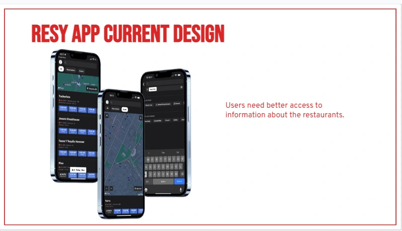
We performed an audit of the app to locate pain points:
Currently, the Resy app gives users the ability to find the information they need.
However, certain design aspects make it hard for them to find said information.
As the app stands right now, The contrast creates difficulty viewing location and style of restaurant. Resy branding is not consistent throughout the app and we aren’t leveraging the visual data in the ways we could be to deliver appropriate information about these restaurants.
This gave us a solid area to begin our research as we moved forward.
02 User Interviews
We then conducted interviews with local restaurant owners in both the South and Midwest to locate any trends or pain points.
What stood out to us was the emphasis of person to person interaction. Events such as supper clubs, beer dinners, and fundraising events helped cultivate community connection.
03 User Personas
User Persona #1: Eliza Sheldon
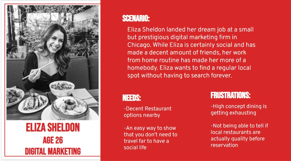
User Persona #1: Eliza Sheldon
Problem statement: Eliza needs a way to easily discover quality restaurants in her community so that she can encourage her friends to enjoy local cuisine with her.
User Persona #2: Douglas Baker

User Persona #2: Douglas Baker
Problem Statement: Douglas needs a hands off but authentic way to increase restaurant exposure so he can grow his customer base without sacrificing attention to culinary experiences?
Reimagining Resy's Mobile Design
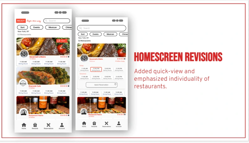
Added quick view and emphasized individuality of restaurants
Resy’s online presence is clear and welcoming, already. The online experience reinforces the tone we wanted to aim for. We wanted to reflect and enhance that same experience in the mobile app, while still conveying as much of the information that the app already has as possible.
We added both a quick and detailed view depending on what a user needs. According to Adobe and other design standards, “Cards ... allow content to naturally reveal itself.” So we showcased the restaurants on cards, which makes their individual identities clearer.
Our Resy interface arranges information to better help restaurant owners too. Making logos and the quality of the food more obvious to the user. Now restaurant owners can put more effort into defining their restaurants voice and because of Resy, don't have to pay for outside advertisement! With the ratings and community voice clear, everyone now knows how good restaurant is.
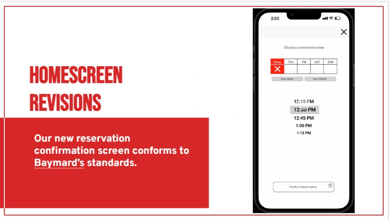
New reservation confirmation screen
Furthermore, we reinforced Resy’s trustworthiness. Citing Baymard’s design standards we redesigned the confirmation screen for ease of use. We wanted to make users to feel confident that they have a space at the restaurant they wants. The following screen after this provides a confirmation as well as notifying the user to their linked email address or phone number, giving as many points of confirmation as possible.
For restaurant owners, this additional confirmation helps ensure that the customers keep their reservations while decreasing the possibility that users could back out of their reservation
https://baymard.com/checkout-usability/benchmark/step-type/receipt
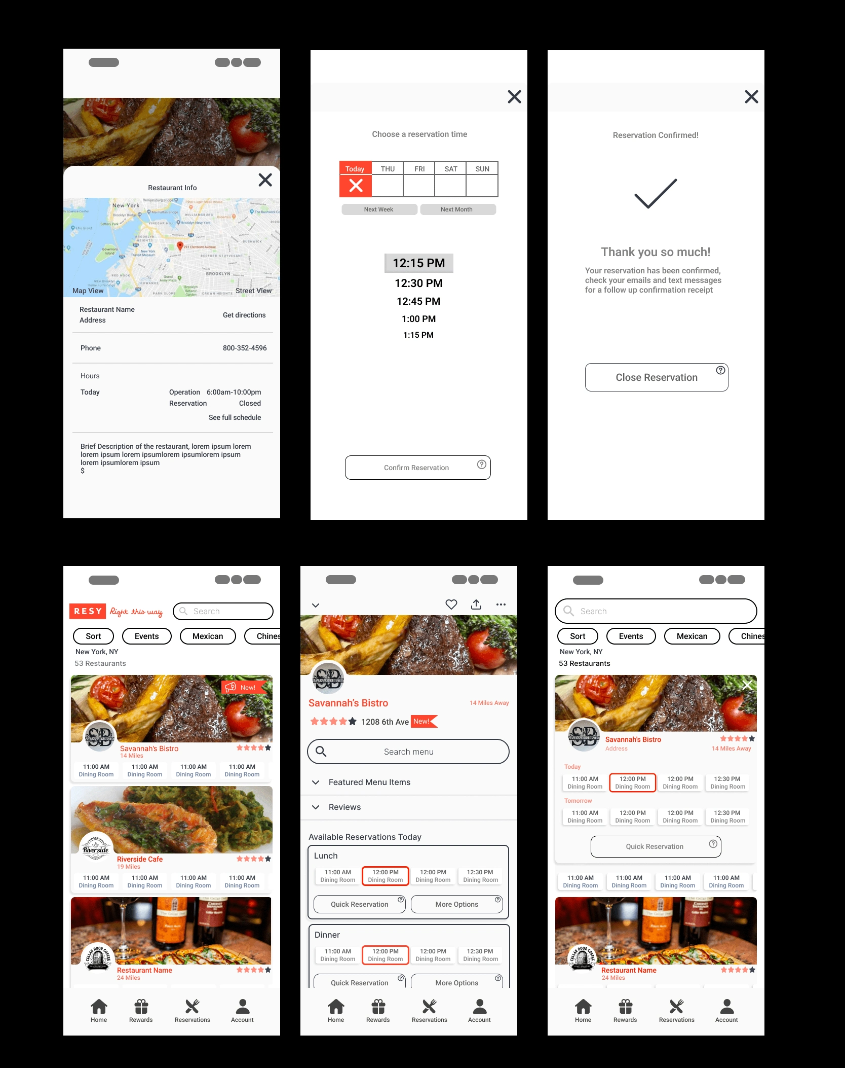
Resy redesign wireframes
Restaurant Info Screen
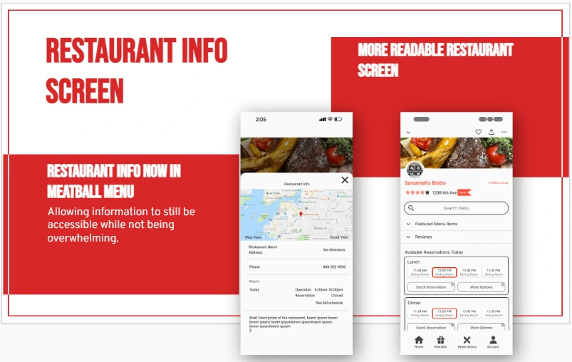
According to Adobe “...reducing clutter will improve comprehension. A simple rule of thumb is one primary action per screen”. On the restaurant info screen users can confirm their reservations and proceed to view all location details on the secondary meatball menu, which is the menu with three dots. This screen features the location of the restaurant, their primary contact info, hours of operation, a brief description and the opportunity to view a street view of the restaurant.
Service Design Blueprint
To understand our user's journey on a higher level we created a service design blueprint from all the accumulated research. A service design blueprint is a diagram that visualizes the relationships between different service components and processes — that are directly tied to a specific customer journey.
Customer Actions
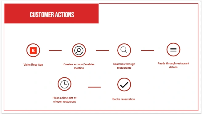
service design : customer action walkthrough
Front Stage Actions
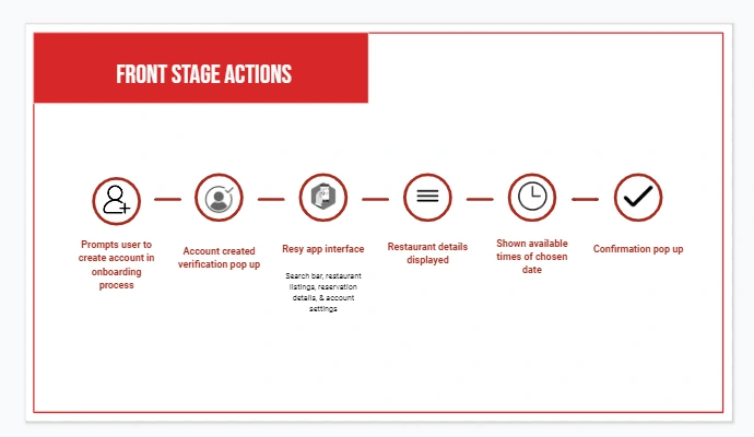
service design: Front Stage Actions
Backstage Actions
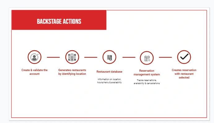
service design: Backstage Actions

Service Design Blueprint
Next Steps
For moving forward, we would like to expand on the app to offer scheduled delivery for users. Not everyone wants to eat out every day, but 84% of people do consider eating out to be better than cleaning up/preparing meals at home so we would like for these users to have the ability to place take out orders. Instead of reserving a table to be ready for you at 7 you would now be reserving your meal to be ready for you to pick up at 7. We also want to expand on the loyalty features through AMEX using points as incentives to increase user retention.
Thanks for reading my case study! Feel free to contact me!
Like this project
Posted Mar 10, 2023
Service Design Blueprint Hackathon


