A Journey into Ecommerce
My Role
UX design
UX research
This was a bootcamp project for General Assembly. My role as the sole UX designer was to determine a users needs and frustrations with a local business through research and address them through myz redesign of that local businesses website. I discovered that the business was not currently ecommerce so curating them an ecommerce experience that met their users needs as well as their own was my main goal.
Problem
The most significant problem I had to solve was that Miller Nursery was not an ecommerce and this was something it's users were looking for. So I set out to solve this. I wanted to create an experience that somehow met both the user and Miller's needs. I truly believed that making Miller Nursery an ecommerce will meet the user's modern expectations and increase the business's digital growth and customer base.
Solution
Through my redesign of Miller Nursery's website I met some core needs for the user as well as the business. The biggest problem I solved was making the site ecommerce. However, to meet both the user and the business needs I created multiple ways to interact with Miller's during the checkout process. Through user testing and iterations Summarize the outcomes of the project! What changes were implemented and what was the impact of your design? You don’t need to go into detail yet! Just give a snippet of your achievements.
The Design Process
01 Surveys
After the project kickoff, I defined my research strategy and objectives. Understanding the target audience and their challenges with ecommerce were my priority. First, I built an online survey on google forms and shared it to Instagram. In total, I received 24 submissions. Based on these, I was able to identify competitors and comparative businesses users used which lead me to the next step which was to ask why.
types of questions in survey: open-ended, multiple choice, ordinal scale
24 submissions
conclusion: Online shopping habits, direct competitors of Miller's
02 Persona
I wanted to form a deeper understanding of our users' goals, needs, experiences, and behaviors. So, I created a persona. Joy Summers was based on a given target user and surveys, and I kept updating her throughout the project as I gathered more data. I used her to empathize with the user goals and pain points
persona was pivotal in defining problem statement
was given influencer target user profile by General assembly bootcamp instructors
Used persona throughout the entire design process

User Persona: Joy Summers
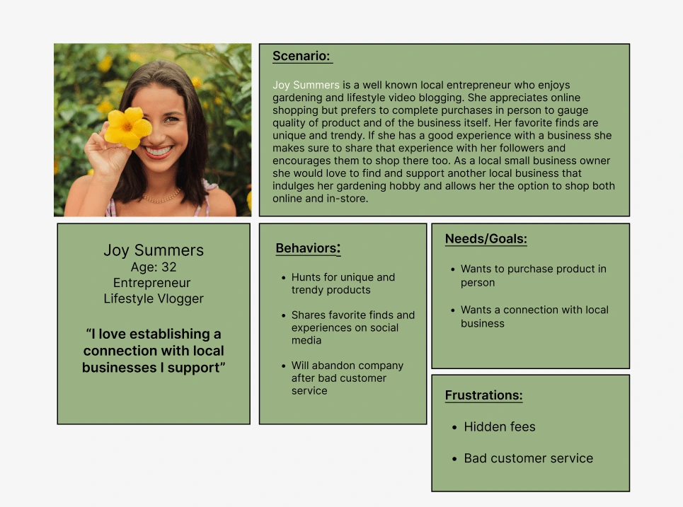
Persona used throughout the design process
03 Card Sorting
To make sure that the site’s information architecture is aligned with user expectations, we had 5 remote card sorting sessions using optimal workshop. Our goal was to find smaller, intuitive groupings for the existing 57 product categories. After organizing the data, i ended up with 3 clearly defined main categories with 3-4 subcategories in each.
Helped define categories for global navigation
Method: Open card sort
Participants grouped products very similarly
I learned that most participants think the same when grouping garden products
Helped further organize the global navigation
04 Sketches
I began the design process with low-fidelity sketches and wireframes to accelerate decision-making through visualization without losing time. My sketches were based on all my research, the business goal, and my proposed solutions. I came back to the sketches throughout the entire design process to make sure that I didn't lose sight of primary goals and ideas.
main purpose: Brain storming possible solutions
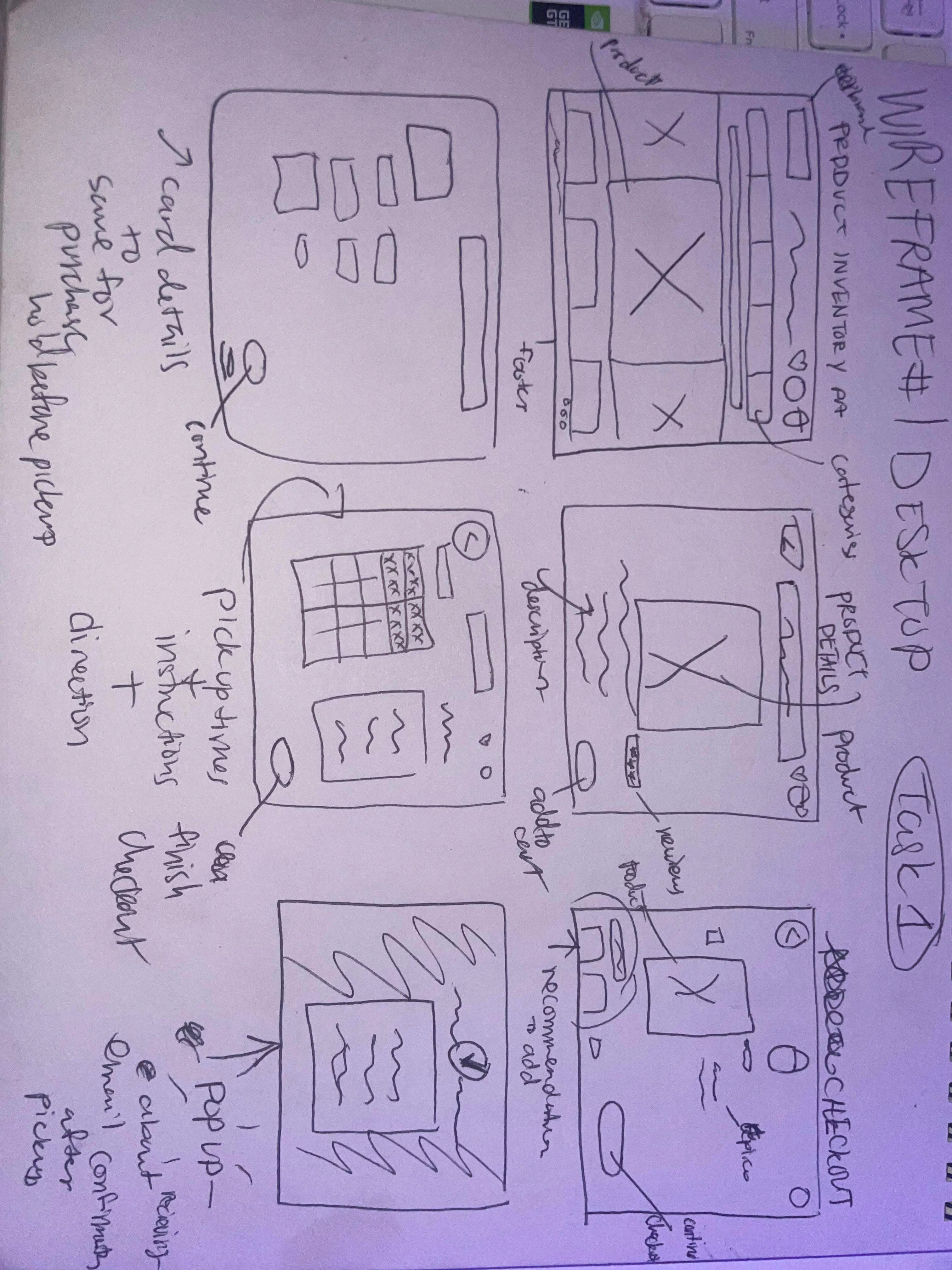
annotated desktop wireframe sketches
05 Wireframes
Using Figma, I translated my first sketches into low-fidelity grayscale wireframes. Then, I improved them by adding a few relevant stock images and copies I found on Unsplash. At this stage, the wireframes were defined enough for some user testing. Based on 5 tests, I’ve made a few alternations and moved on to creating high-fidelity prototypes.
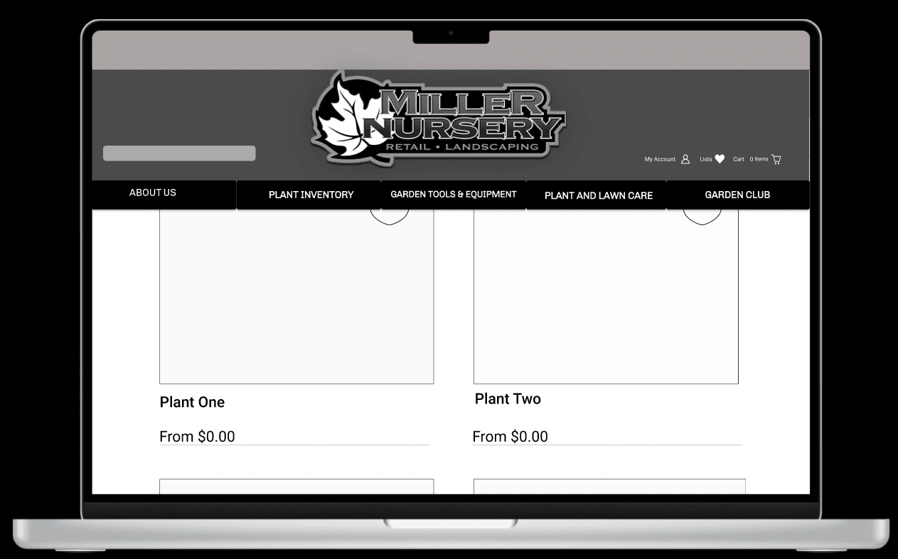
mid-fidelity grayscale wireframe
06 Usability Testing
Before I created a high-fidelity prototype of the new flows using Figma. I started recruiting subjects for the test who fit my criteria. I did 5 usability tests.
Main pain point
No way to navigate back to home during the checkout process
Four out of five users complained about how difficult it was to go back after moving to the next page. They claimed this made them feel stuck.
Solution
Breadcrumbs/ Contextual navigation
Taking into consideration user complaints I revised my prototype and added breadcrumbs throughout the checkout process so that users could find their way back to the home page if it felt necessary.

before breadcrumbs and then after
Next Steps
For next steps I would love to pour attention into creating more accessible features so that everyone has the most efficient experience with Miller’s. I want to spend equal time with each internal webpage to create a simple and straightforward flow through the site.
To increase interaction with physical store and garden experts i would implement a chat feature where users could send in questions, concerns
We can always improve so I would love to run more user tests to find additional pain points and continue creating iterations.
Thank you for reading my case study!
Want to work with me? Feel free to contact me!
Like this project
Posted Mar 9, 2023
I researched/addressed business user needs/frustrations through a website redesign. Main goal: create an ecommerce experience to meet both user & business needs


