Travel Blog web design
Pangea Labs
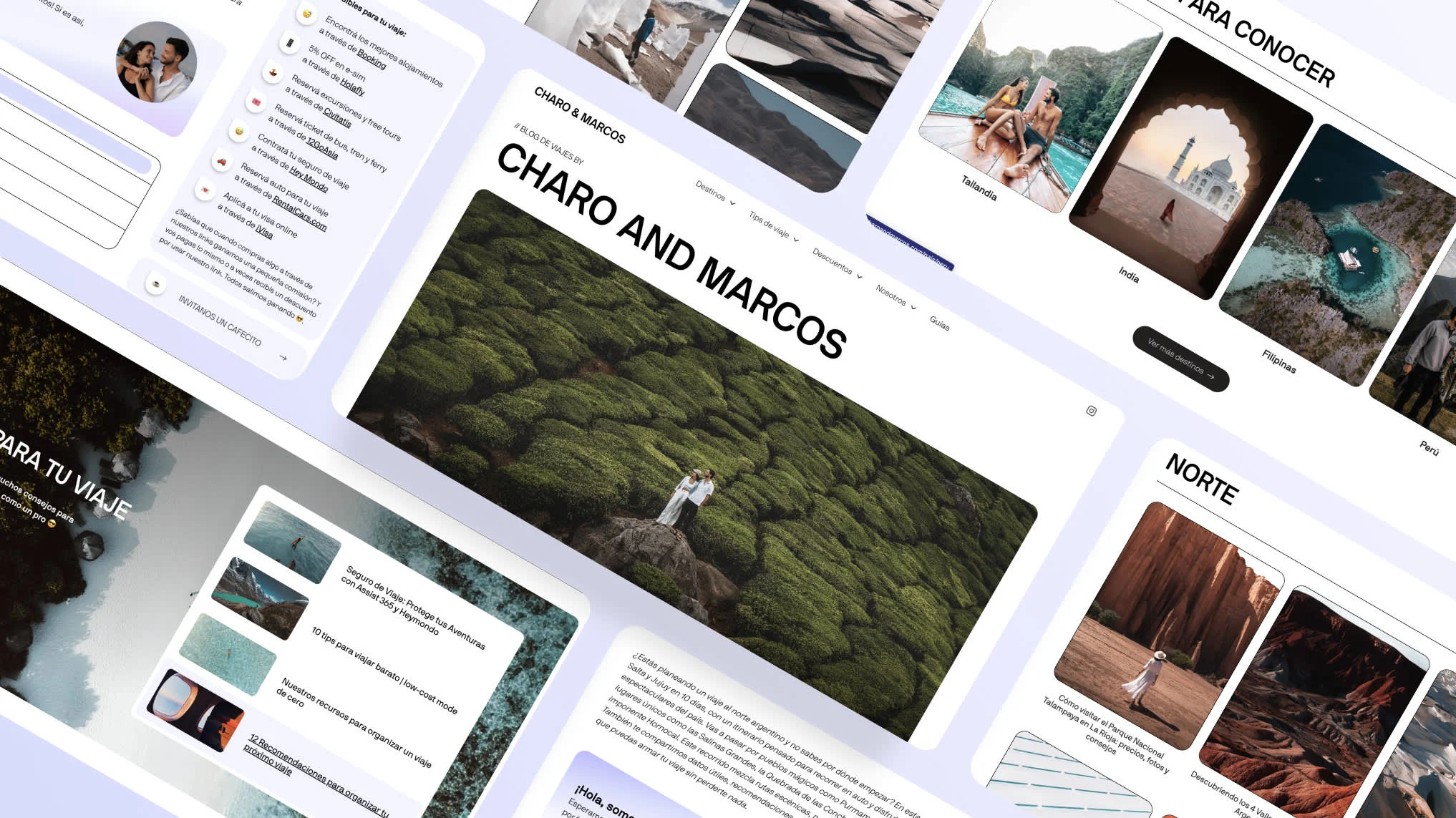
Charo & Marcos — Travel Blog Design & Development
Role: UX/UI Designer & Webflow Developer
Year: 2024
Charo & Marcos was born from our shared love for travel and storytelling. Over the years, we’ve explored incredible places around the world — from remote deserts in Argentina to the mountains of Peru and the islands of the Philippines — capturing moments through photography and sharing guides to help others plan their own adventures.
When I decided to redesign our blog, my goal was to create a space that truly represented who we are: travelers, creators, and storytellers. The previous version had grown organically but lacked structure; I wanted something more immersive, organized, and visually aligned with our photography and values.
My Approach
I started by rethinking the information architecture to make it easier for readers to find what they need — whether a complete travel guide or itinerary. I created clear categories and filters by destination and topic to simplify navigation.
Visually, I wanted the site to feel calm and inspiring. I used a clean layout, imagery, and subtle animations that draw attention to the landscapes without distraction. Every page was designed to let the photography breathe while maintaining a sense of continuity across all guides.
Developed entirely in Webflow, the site features a CMS for destinations and articles, responsive layouts, and a flexible structure that allows us to easily update content as we continue to travel.
Impact
The redesign transformed our blog into a cohesive digital home for everything we create. Readers can now explore destinations seamlessly, discover new guides through related posts, and connect more deeply with our journey.
The new structure not only improved navigation and engagement but also strengthened our visual identity — aligning our online presence with the quality of our content and photography. Most importantly, it feels like us: a genuine reflection of how we see and share the world.
Like this project
Posted Nov 2, 2023
Redesigned our travel blog to reflect our voice and photography — a clean, inspiring space where readers easily explore guides and destinations.
Likes
2
Views
8