SaaS Dashboard & Analytics Platform

Viktor Chyzh

Overview
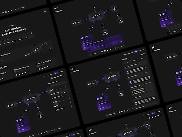
A comprehensive SaaS platform designed to streamline business operations through intelligent dashboards, real-time analytics, and seamless workflow management. The product brings together data visualization, team collaboration, and automated reporting into one unified dark-themed interface.
The Challenge
Modern SaaS platforms juggle massive amounts of data across multiple modules: analytics, user management, billing, integrations, and reporting. The challenge was to design a system that presents complex data clearly without overwhelming the user, while maintaining a premium, polished aesthetic throughout every screen.
Design Approach
Dark Premium UI: Built on a deep dark foundation with carefully calibrated contrast ratios, ensuring data readability and reducing eye strain during extended use.
Data-Dense Yet Clean: Every dashboard view balances information density with breathing room. Charts, tables, and KPI cards are structured using a modular grid system that scales across screen sizes.
Consistent Component Architecture: From navigation sidebars to data tables, modal dialogs to settings panels, every element follows a unified design language with consistent spacing, typography, and interaction patterns.
Key Screens

Dashboard Overview
The main dashboard serves as the command center. Real-time KPI cards at the top give an instant pulse on revenue, active users, and conversion rates. Below, interactive charts break down trends over time, while a sidebar navigation keeps every module one click away.
Analytics & Data Visualization
The analytics view transforms raw data into actionable insights. Multi-layered charts, filterable date ranges, and comparison toggles let users drill into performance metrics without switching contexts. Every visualization follows a consistent color system tied to data categories.
Settings & Configuration
Settings are organized into logical groups with clear section headers and inline descriptions. Toggle controls, dropdowns, and input fields follow the same component patterns used across the platform, keeping the experience predictable even in complex configuration flows.
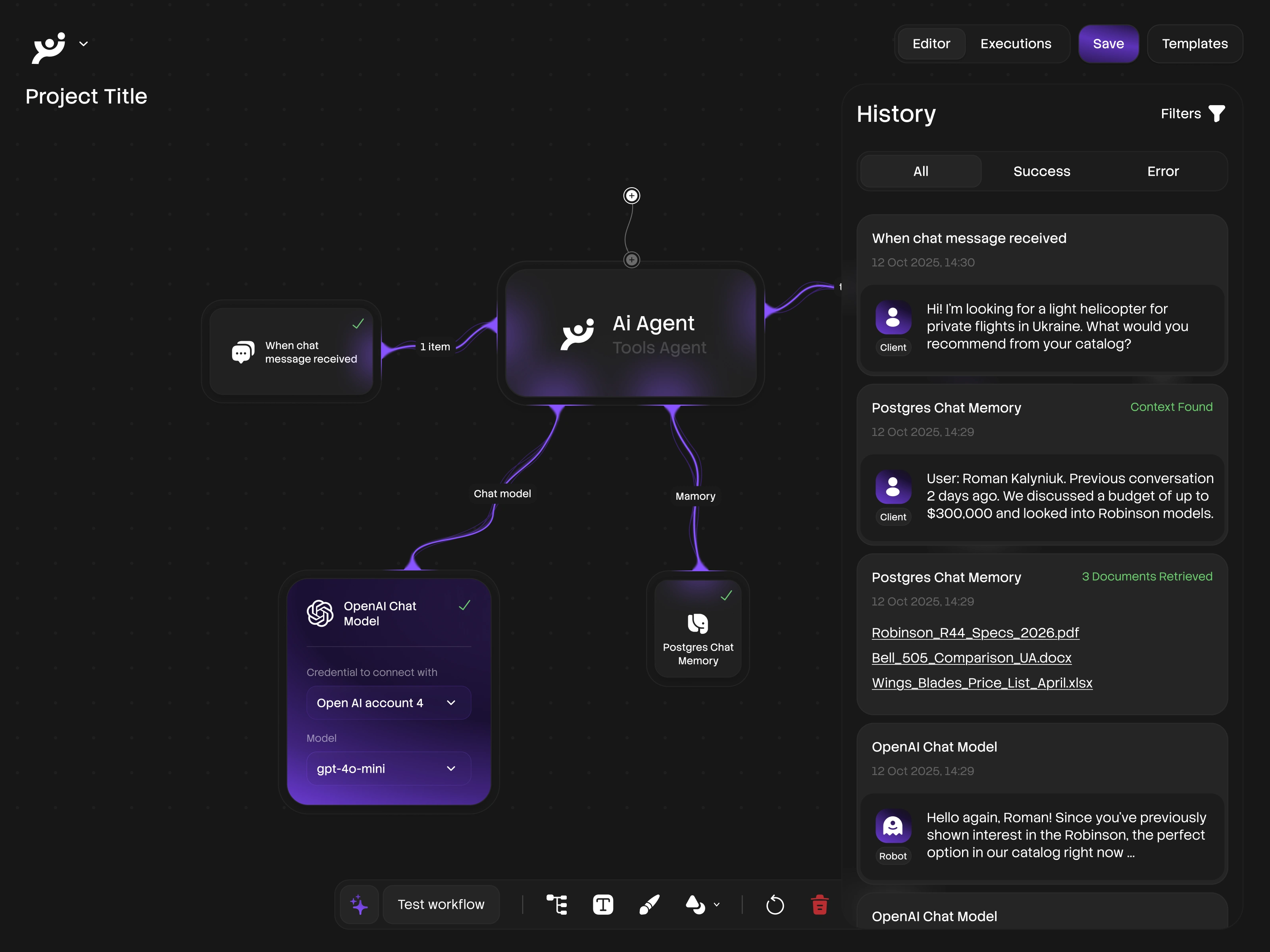
User Management & Tables
The user management module handles large datasets through sortable, searchable tables with inline actions. Role badges, status indicators, and bulk operations are designed to scale from a handful of team members to thousands of users without layout breakdowns.
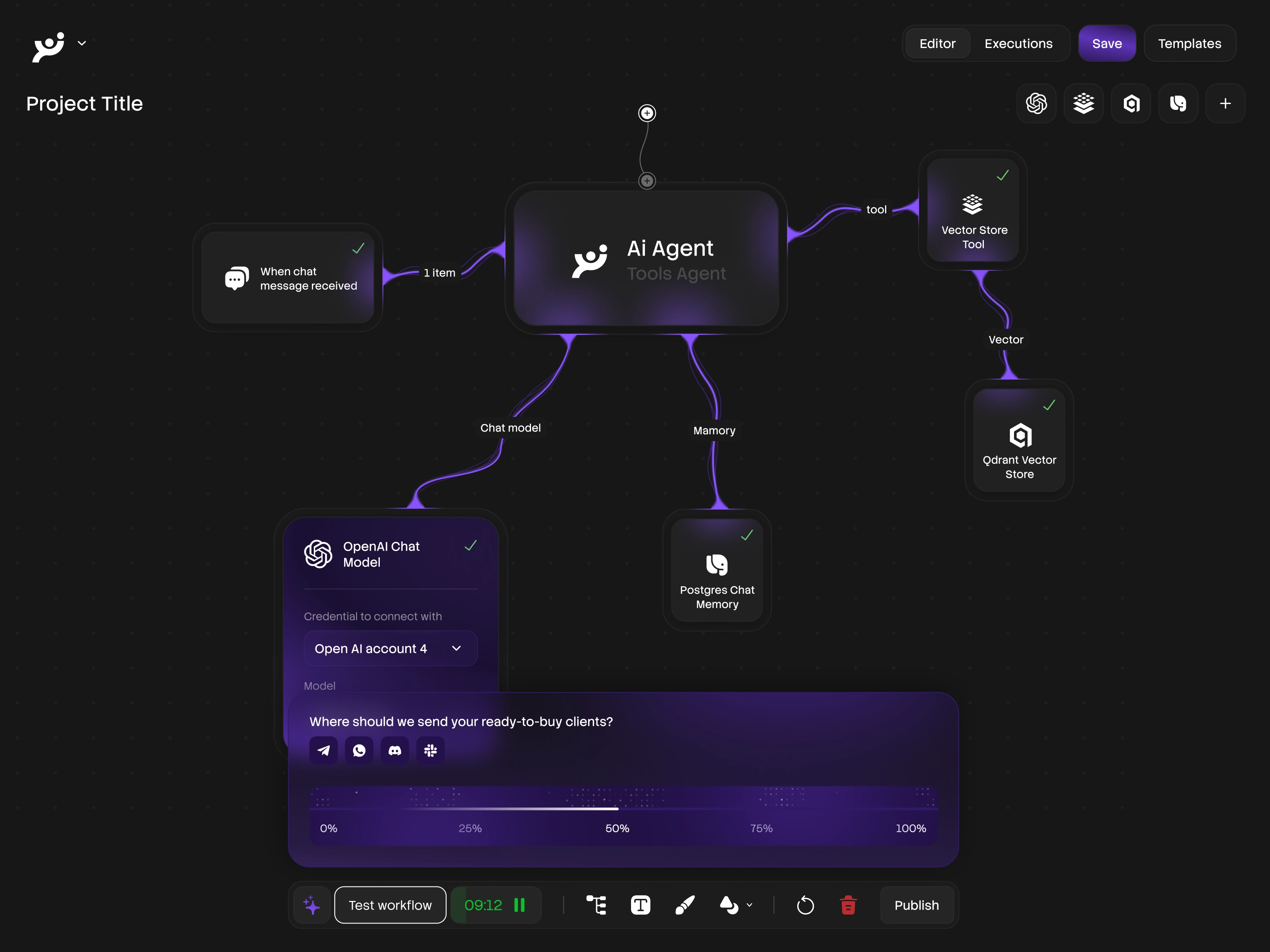
Integrations & Workflow
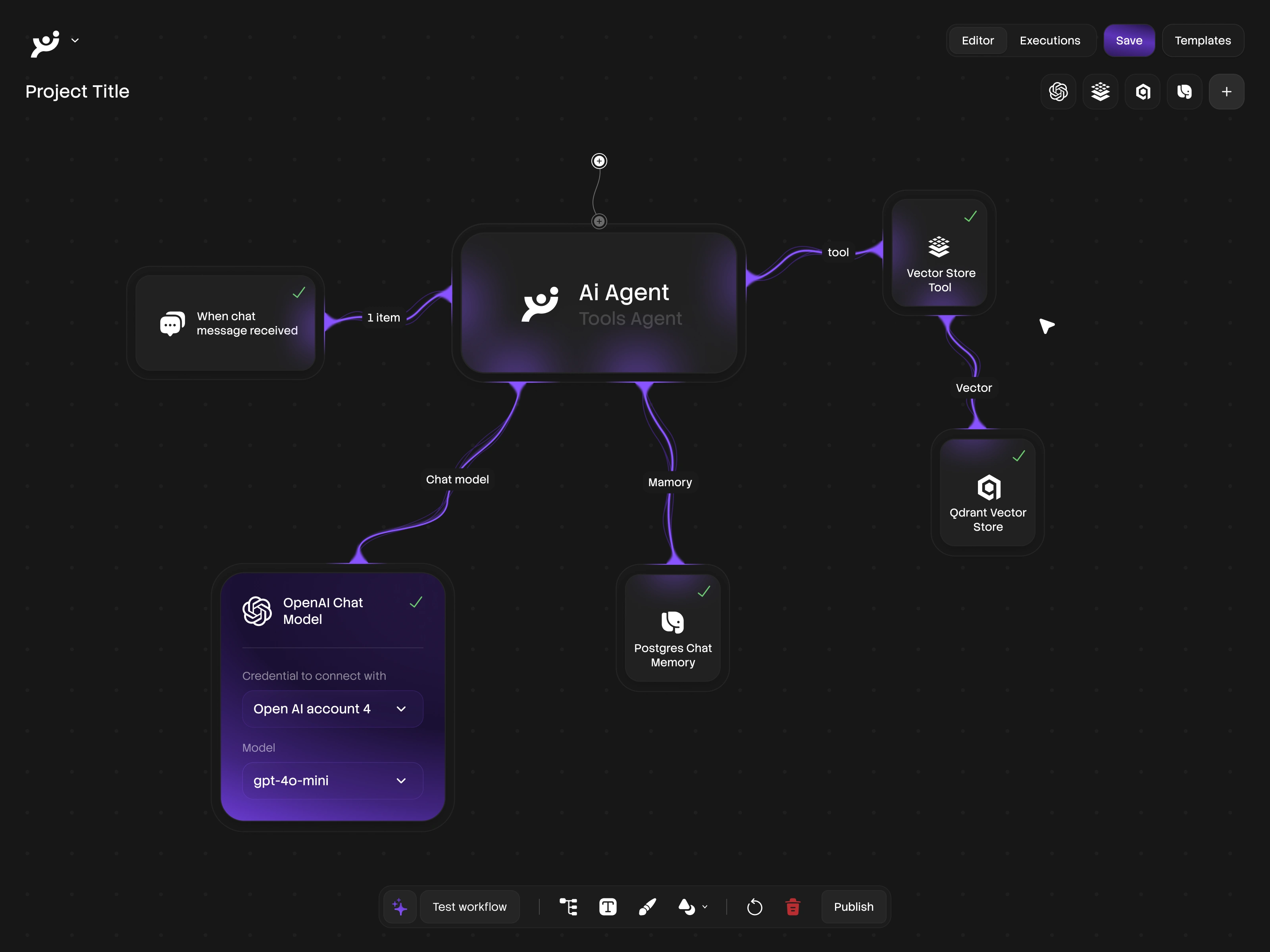
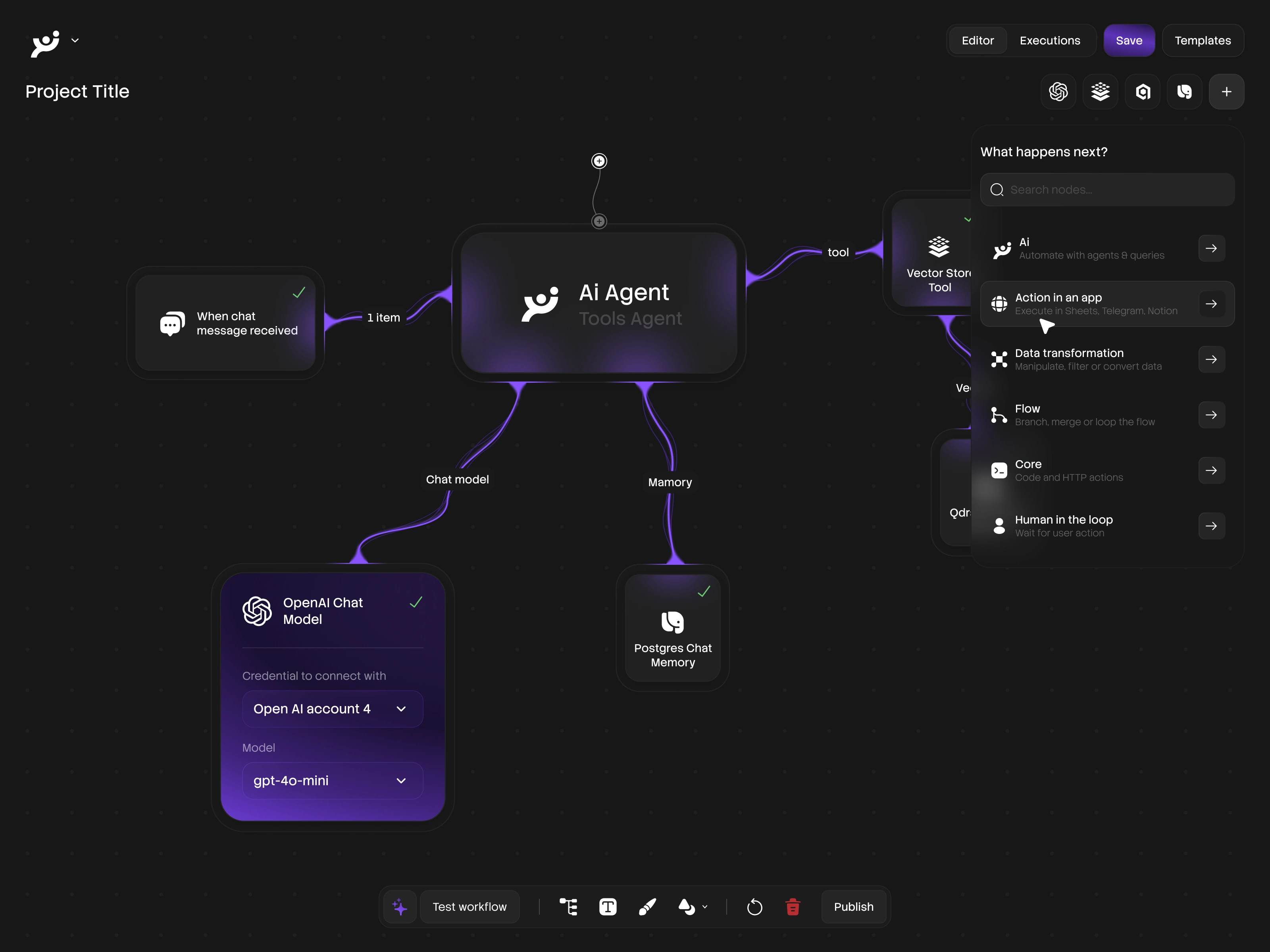
The integrations hub maps out connected services and automation workflows. Card-based layouts show connection status, sync frequency, and quick-toggle controls. The visual hierarchy guides users from overview to detail without losing context of the broader ecosystem.
Additional Screens

Platform Home
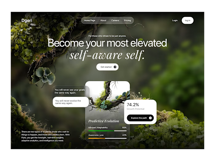
The platform home screen sets the tone for the entire experience. A clean hero section with clear value proposition, feature highlights, and a strong call-to-action. The layout establishes visual hierarchy immediately, guiding new users toward onboarding while giving returning users quick access to their workspace.
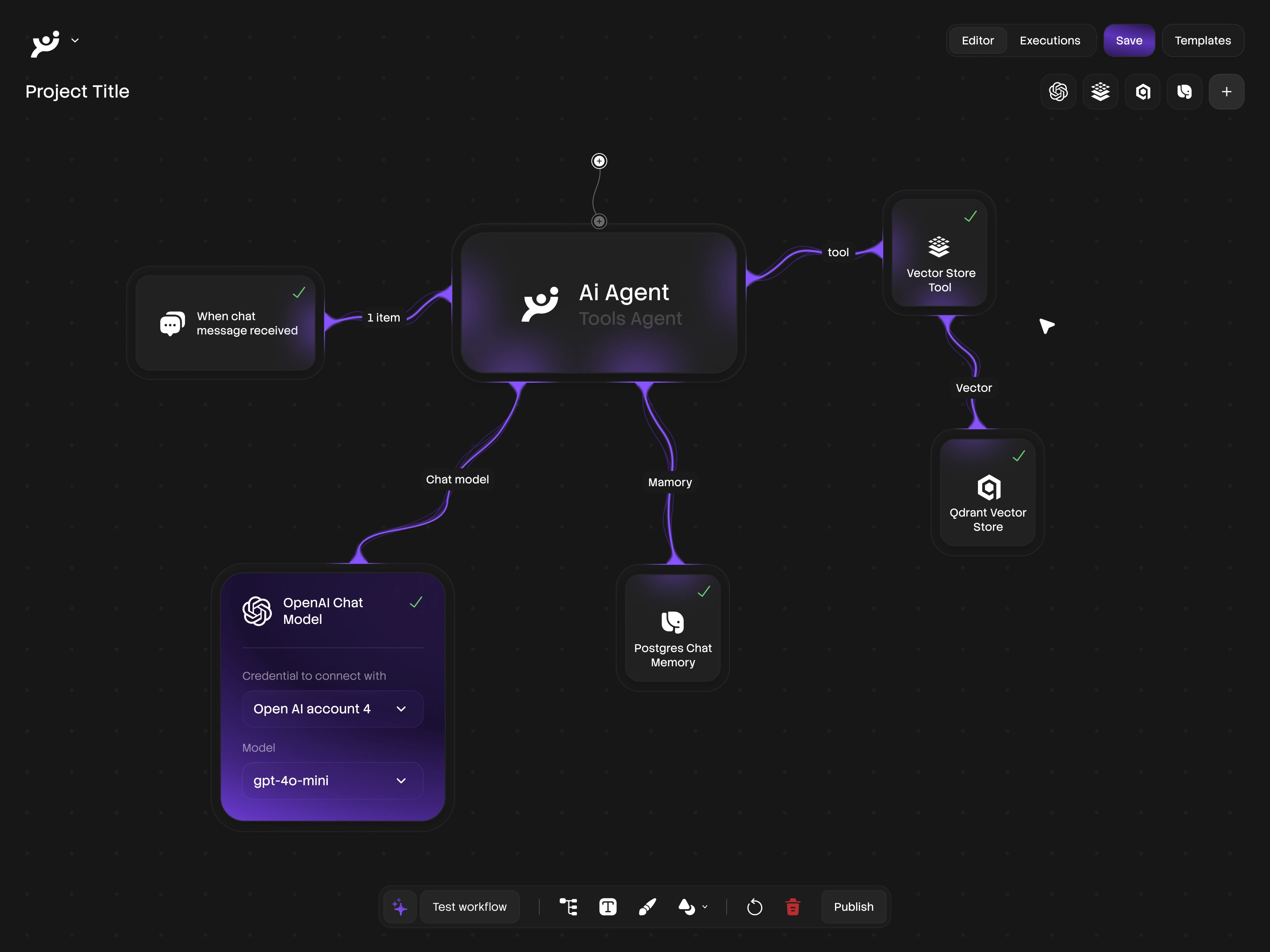
Feature Breakdown
A dedicated feature section breaks down the platform's core capabilities into digestible blocks. Icon-driven cards paired with concise copy communicate complex functionality at a glance. The grid structure keeps the page scannable while maintaining enough depth for decision-makers evaluating the product.
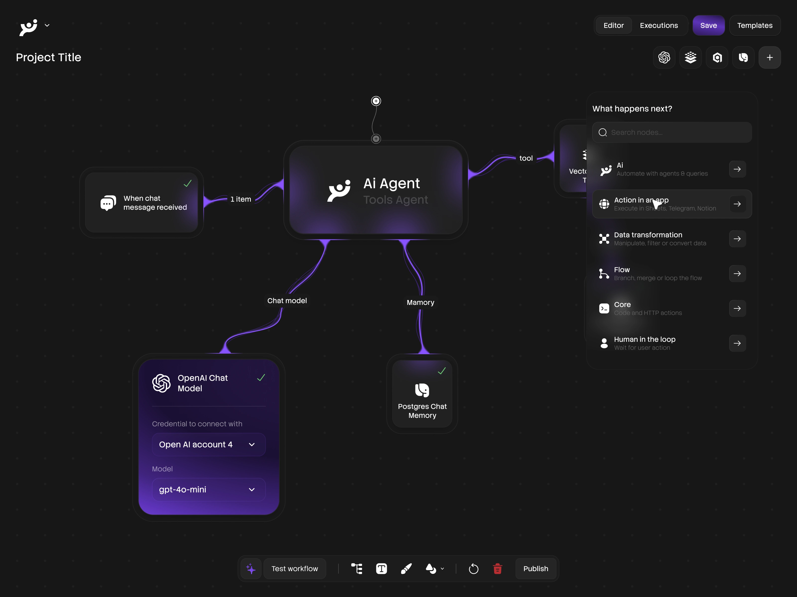
Pricing & Plans
The pricing page uses a comparison-card layout that makes plan differences immediately visible. Highlighted recommended tiers, feature checklists, and clear CTAs reduce friction in the conversion funnel. The dark UI keeps the focus on the numbers and value propositions.
Product Details
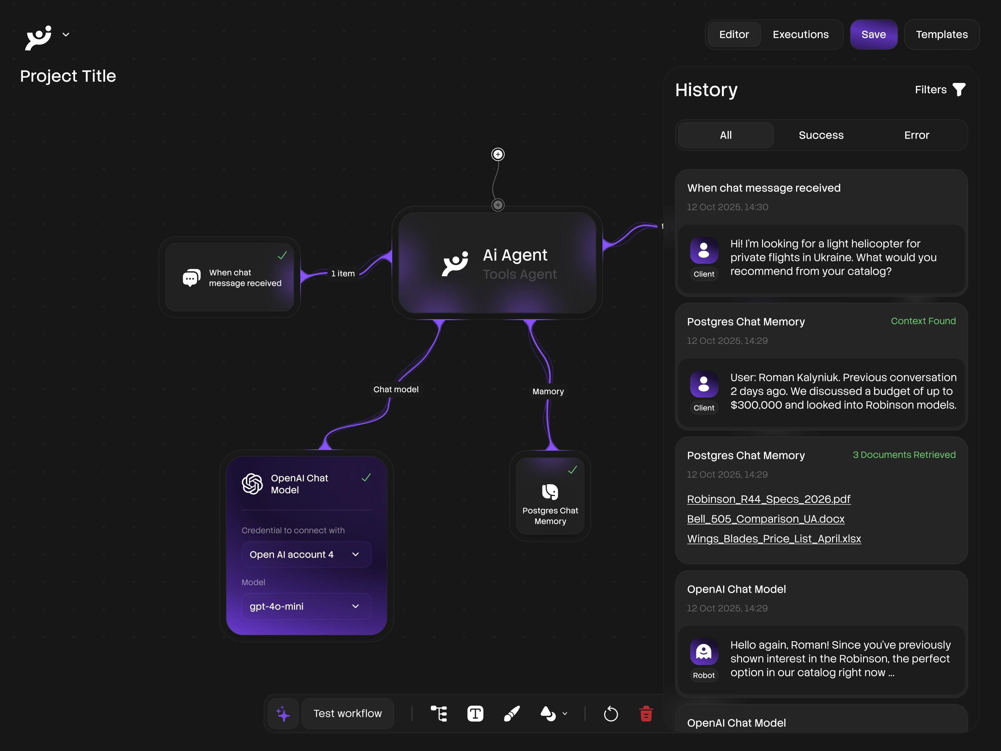
Product detail screens combine rich visuals with structured information architecture. Tabbed content areas, expandable sections, and contextual tooltips let users explore depth without clutter. Every interaction point is designed to answer the next logical question.
Onboarding & Workflow
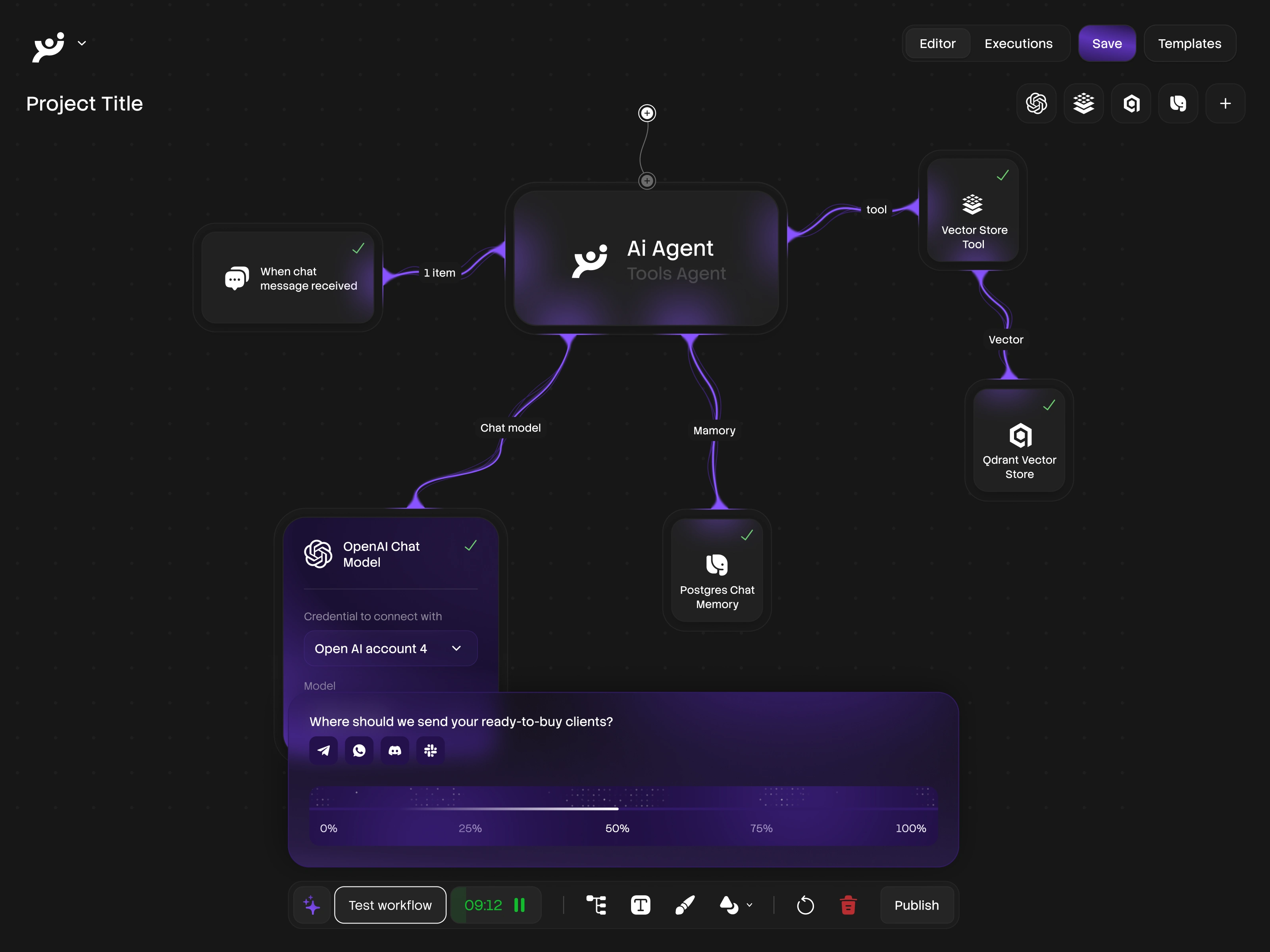
The onboarding flow walks new users through setup with a step-by-step wizard. Progress indicators, contextual help, and smart defaults minimize time-to-value. The design balances guidance with flexibility, letting power users skip ahead while keeping first-timers on track.
My Role & Scope
End-to-end Product Design (UX/UI)
Design System & Component Library
Data Visualization & Dashboard Architecture
Marketing & Product Pages
Responsive Layout Strategy
Like this project
Posted Jul 22, 2026
Dark-themed SaaS platform design: dashboards, analytics, user management, integrations, and settings. End-to-end product design with a scalable component system.
Likes
1
Views
5